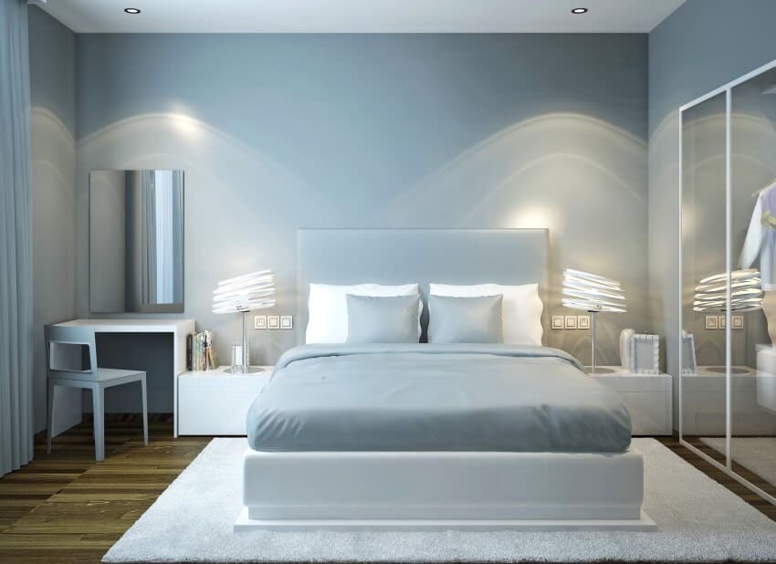
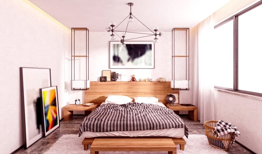
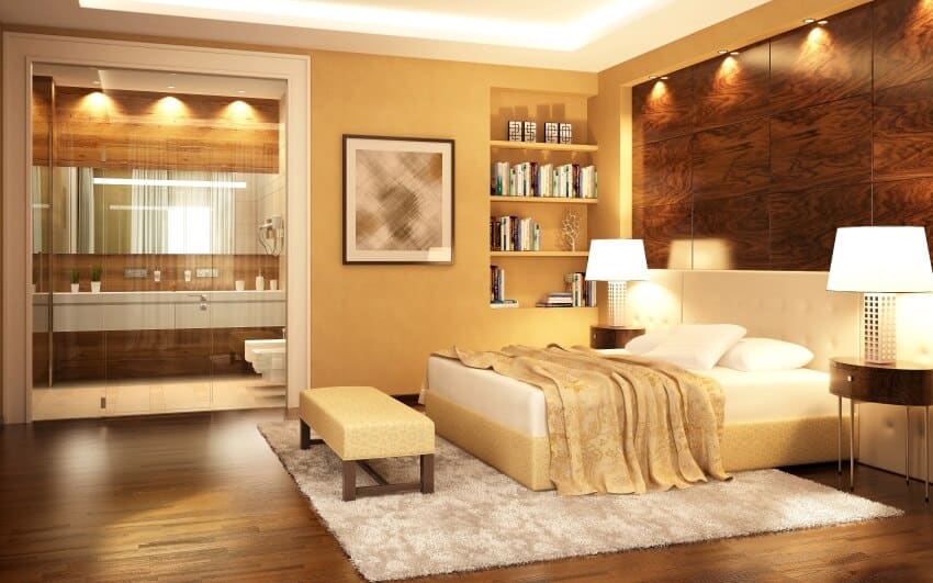
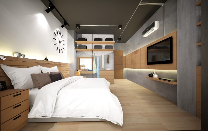
When choosing between several paint colors for a bedroom, it can be challenging to see exactly how the color scheme will work with the room’s lighting, furniture, and general decor. This can be incredibly challenging when deciding what modern bedroom colors to paint the walls.
Every room in a house has its own narrative, and the colors used in those rooms help bring those narratives to life. This is especially significant in the bedroom, as the color of the paint, when chosen well, can create an atmosphere that is calm and conducive to relaxation. It’s common to be overwhelmed by myriad options, from painted ceilings to accent walls and everything in between. Here are some of our favorite modern colors for painting bedrooms to get you started. [toc]
Modern Bedroom Color Ideas
We asked interior designer Willa Mitchell for her best colors to use for a modern bedroom design, and here’s her answer:
And here’s an updated version with the additional column for modern contemporary:
Bedroom Theme
Colors
Modern Style
Warm neutrals like whites, beige & tans. Shades of cool blue and green for accents.
Modern Contemporary
Subdued pastels to vibrant bold colors including jewel tones
and saturated hues.
Medium gray, taupe, beige, cream, brown, mustard gold, avocado green, teal, medium blues
A helpful approach to choosing a bedroom color lies in the direction of a design theme, meaning the design style of a room. A theme is a design element I apply as a starting point for developing a color scheme. It is something like deciding on the best lyrics for a song based on the song’s title. On this note, your theme can be used as a common denominator for choosing colors.
If you are in the process of creating a modern bedroom theme, the theme you choose will guide you in the rhythm of colors associated with it. When working around an established theme, the introduction of new colors can be selected to harmonize with the colors and style of your existing furnishings.
You will find creating a theme will assist in simplifying the color selection process by narrowing your focus to colors that represent the nature of the theme. Applying these insights will help ease overwhelming frustration and challenge regarding color decisions.
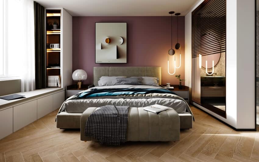
Some of the most popular modern bedroom themes are Modern, Modern Contemporary, Modern Industrial, Scandinavian, and Modern Mid-Century. Here, I will introduce some ideas symbolic of these modern bedroom themes as an inspiration to color.
Warm neutrals like whites, beiges, and tans are frequently used as the basis for modern bedroom color schemes. Cool blue and green tones go well with these hues.
Grayscale images can also be utilized to create contrast and depth. Jewel tones like purples and pinks for a vibrant touch can be included into your modern bedroom to make it come to life.
In addition to combining colors, experimenting with texture can bring vibrancy to a room. Lantz believes that texture is as important as print patterns, and most textures can be combined if applied properly. – Indianapolis Monthly, May 2004
Texture is crucial in contemporary bedrooms because it gives the room depth and visual intrigue. Using textured textiles and finishes can improve the room’s appearance by fostering a cozier feel.
Modern Contemporary Style, another term for modern, opens all color possibilities. Its minimalist concept invites a spectrum of color that offers a broad range from subdued pastels to vibrant bolds, jewel tones, and saturated hues.
The modern contemporary theme allows you to be the artist in residence who brings your vision to life. It is important to keep the colors fresh and alive. With a sweep of a brush stroke, you can visualize a vibrant abstract of ideas for a modern contemporary-focused canvas.
Yet, no need to get carried away here; when designing around an existing décor, consider the colors you introduce will lend harmony with your current overall scheme. For a normal toned-down contemporary style, neutral colors such as white, gray, and beige are popular.
You likely have seen the Modern Industrial style. It ranks as one of the most sought-after themes in the design industry. I love working with colors and design elements characteristic of Modern Industrial.
This is a style that boasts the sophistication of a raw, organic, minimalist design. While it embraces eclecticism in concept, down to earth hues in grays, browns, beige and black are organically reminiscent of this style.
Choose your bedroom accent colors with the intention of creating a contrast as that of pure terracotta, rich teal, bold greens and mustard yellows.
Modern Industrial design embodies materials that infuse an urban lofty feel. Its theme exemplifies structural beauty and integrity with exposed elements, along with the colors you choose for this urban chic style.
Scandinavian, is one of my favorite modern design concepts, as it commands an attention to simplicity with the blend of colors you appoint to the bedroom decor. Its minimalist style features light woods that appeal to colors in tactile earth tones, sedimentary pinks, fresh salmon, sage greens and parfait cream.
The key element is in creating a visual interplay of colors by mixing and matching furniture, area rugs, drapes and other decor. A soft and sedated ambience of Scandinavian inspired colors will bring pure relaxation to your bedroom.
I find designing in a Modern Mid-Century Theme to be quite thought provoking, as it welcomes colors that resonate this iconic era. You can celebrate the theme’s resurgence by weaving in a color scheme of medium gray, taupe, beige or cream for your bedroom wall treatment.
Integrating bolder hues in brown, mustard gold, avocado green, teal and medium blues will introduce accents for furniture and accessory pieces. Designing your modern bedroom with purpose will place your colors into the theme of things.
Light Bedroom Paint Colors
Lavender
This color palette that is lively and subtle can be created using various tones of lavender and light lilac since these colors give off an air of calm for modern bedroom designs.
Recommendations:
Benjamin Moore Dreamy Cloud 2117-70
Dreamy Cloud is almost off-white yet has enough substance to contain the perfect violet hint. Like many popular purple paint colors, Dreamy Cloud has neutral undertones yet still looks purple. It’s colder and hints at dusky lavender without being bright.
Benjamin Moore French Lilac 1403
Not for wimps! French Lilac is purple without being garish, unlike Dreamy Cloud. The effect is better and warmer.
Benjamin Moore Mauve Desert 2113-50
Mauve Desert is a beautiful deep purple that commits without being too purple.
Orange-Brown or Burnt Orange
The use of orange-brown in a bedroom offers an air of earthiness to the space, and it pairs beautifully with plants and dark furniture.
Recommendations:
Sherwin Williams Smoky Salmon (6331)
Sherwin-Williams Smoky Salmon is a bright pinky-nude terracotta. We included a light color for those who didn’t want terracotta or wanted something similar.
Sherwin Williams Persimmon (6339)
Sherwin-Williams Persimmon is a lovely terracotta tone that won’t be too dark. It might read peach instead of terracotta in a large, bright environment. It can be a beautiful fading terracotta shade that’s great for small bedroom sizes.
Valspar Chorizo (303Q)
Valspar Chorizo is a pretty color. It’s still subdued with hints of bold reds, making it a good terracotta shade.
Light Blue
The light color blue, connected with blue skies and sunny days, brings joy and peace to the space.
Recommendations:
Beach Glass, Benjamin Moore
A lovely minty blue-green color. This is what you want for a small bedroom if you’re looking for something new and energetic with a splash of color. In addition to looking great in the summer, this color is also sufficiently warm for the gloomier winter months.
French Moire, Sherwin-Williams
Cornflower blue is the term that most accurately describes the hue of this object.
Mediterranean Sky, Benjamin Moore
These paint colors are reminiscent of the sky blue in tropical locales when you’re out on vacation. It’s soothing and refreshing and definitely worth considering for a modern bedroom.
Cream
The space can have a more open and airy vibe thanks to the creamy colors, which go well with light wood furniture and flooring.
Recommendations:
Benjamin Moore Swiss Coffee
This color is well-liked for a good reason. It isn’t just friendly and inviting, but it also manages to maintain its lightness and brilliance. The LRV for the shade of paint known as Swiss Coffee is 83.93, which is considered relatively high.
Sherwin Williams Everyday White
It is pretty gentle while also being very warm and inviting. Everyday White has a very slight undertone of beige, but it still comes across as the ideal shade of creamy white. It works wonderfully for projects in areas of the home that receive less light.
Sherwin Williams Creamy
Sherwin-Williams 7012 Creamy is an additional favorite of mine when selecting a cream paint color. It is a warm, creamy white that is traditional but not icy in appearance.
It is not dirty, not too yellow, and not at all blue; therefore, it is an excellent in-between for any lighting scenario! This warm cream works nicely for trim, cabinets, and furniture.
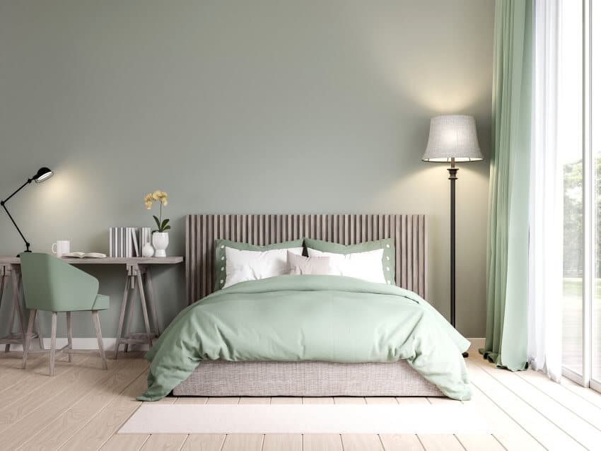
Light Green
A clean, earthy feeling can be evoked with a light green color. If you’re a fan of something light and fresh in the bedroom, this is a color suggestion.
Recommendations:
Benjamin Moore Limesicle
A bright and delicious color, pale green, like Benjamin Moore’s Limesicle (2145-50), is a good example. It works wonderfully as a complement to lighter neutrals like beige and taupe. Still, it also looks absolutely breathtaking when set against deeper jewel tones.
Sherwin-Williams Hazel
The Hazel (SW 6471) green color from Sherwin-Williams adds a soothing presence to a room. And it’s regarded as one of the ideal green hues for a bedroom. It is a lovely, tranquil, calming shade of bluish-green that is ideal for a bedroom.
It is a calming color to decompress after a hard day at work, especially with all the madness and chaos in the world. It may also enlarge a tiny space because of how vibrant it is, which naturally lights up a place. It feels like you are in the center of a vast, shimmering ocean.
Benjamin Moore Soft Fern
This shade is a delicate, classy shade of light green. Because it is serene and emits a sense of nature while still adding some color and flair, it is a perfect green paint color for bedrooms. We suggest combining the subdued tint with warm neutrals or hues similarly light in tone.
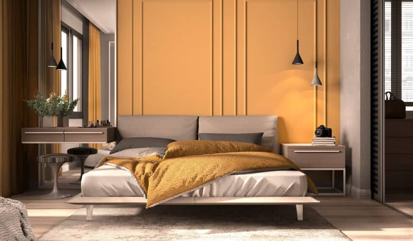
Mustard
The shade of yellow, known as mustard, has muted undertones that are vivid and toasty.
Recommendations:
Spicy Mustard by Benjamin Moore
Even though it has a rooted and organic character, this deep golden amber has a robust flavor. This dark gold color is refined and elegant, but it also exudes an enticing touch of peppery assertiveness because of the rich infusion of black that serves as its foundation.
Mardi Gras Gold by Benjamin Moore
A bold combination of red and violet that emits a fiery and confident sense of color. It’s a gleaming golden orange that exudes joy and brings joyous celebrations to mind.
Oxford Gold by Benjamin Moore
Oxford Gold is an orange color that is so brilliant that it is nearly fluorescent, with strong yellow undertones. Like the French liqueur flavored with anise, Pernod, inspired by herbal ingredients, gives any area an earthy feel.
When pairing orange with curtains using white, beige and cream shades can help tone down the look. On the other hand, a gray or blue can have a bolder effect. Read more how to choose curtain colors here.
Pink
Rose pink tones of a lighter tint combine attractively with accents of warm copper or pale gold.
Recommendations:
Pink Ground, Farrow & Ball
Farrow & Ball’s Pink Ground is warm, sensitive, and goes with every color. It’s elegant and youthful. It’s dubbed Pink Ground because it resembles its color wheel neighbors and opponents. Especially on the ceiling, it flatters everyone.
Pink Sky, Clare
Clare’s Pink Sky is earthy and inviting. This richer pink color is great for any decor that needs character and warmth. It suits many styles and color palettes. Bold walls showcase architectural elements in a lighter color palette.
Bridal Pink, Benjamin Moore
We love Bridal Pink by Benjamin Moore. It’s feminine and peachy without being too sweet and works beautifully in any light.
Bright White
White walls brighten the space and provide the illusion that a room is more spacious than it actually is. In addition, it offers a beautiful canvas on which one may paint colorful accents to the interior design.
Light Gray
On the cooler side, gray tones make the most of the natural light in a space and go particularly well with green and blue accents.
Recommendations:
Sherwin Williams Agreeable Gray SW7029
Sherwin-Agreeable Williams’s Gray is, without a doubt, among our top choices for a gray color for the bedroom walls. It’s a warm, stone-like tint that sits smack dab in the middle of true gray and beige. The undertone of the color is more yellow-orange than green, which is the predominant tone.
Benjamin Moore Revere Pewter HC-172
Nowadays, everyone is obsessed with this particular shade of paint for a good reason. It has a stronger yellow-green undertone and contains slightly more pigment than the light grays manufactured by Sherwin-Williams.
Sherwin Williams Worldly Gray SW7043
The undertone of Worldly Gray is greener, making it a little colder shade than Agreeable Gray. It’s a gorgeous shade that pairs particularly well with organic wood tones.
Apricot
A bedroom can be given a touch of pizazz by decorating in vibrant tones of apricot and peach, which go beautifully with tones of creamy beige.
Recommendations:
Soft Apricot SW 6352
A muted combination of yellow and orange colors. Its beautiful hue can make any room feel more lively and calm.
Apricot Light 280B-4 Behr
This conventional, non-reflective flat sheen does an outstanding job of covering up surface flaws on wood and vinyl walls, and it has a matte appearance.
Apricot Beige 1205 Benjamin Moore
This delicate beige has a blush of pink that brings out its brilliance. This is a timeless paint hue that may be used in either conventional or contemporary interior design. A classic paint hue that lets the apricot undertones come through is an excellent way to complement any design aesthetic.
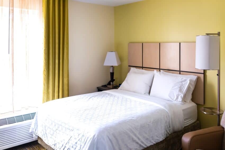
Light Yellow
A room can be made brighter by painting the walls in soothing tones of light yellow.
Recommendations:
Sherwin-Williams Cachet Cream
Suppose you’re interested in experimenting with yellow but aren’t ready to go hot. In that case, you might adore Sherwin-Williams Cachet Cream’s gentleness (SW 6365). This delicate shade of peachy neutral yellow is ideal for living rooms, dining rooms, or foyers. Cachet Cream’s underlying peach makes it go nicely with reddish wood, and its ginger tones will get stronger around green accents.
Behr Turmeric
Although Behr’s Turmeric (M290-7) is not for the weak-hearted, it lends unlimited mood and individuality to the perfect space. This classy deep yellow looks well in dining rooms or living rooms and goes well with other vibrant hues like orange or teal. This is the type of yellow you want if you want something elegant.
Valspar Saffron Ivory
Valspar Saffron Ivory(7003-21) is a subtle and elegant neutral yellow paint color ideal for adding a touch of color to any room. Saffron Ivory, which is almost white but not entirely.
It is well suited to serving as the dominant color in an area with warm and saturated accessories. This calming color would be an excellent choice for your bedroom or visitor room.
Sea Blue
Sea blue hues in the cooler tones are pretty contemporary and minimalist, offering just the right amount of color.
Recommendations:
Champion Cobalt by Benjamin Moore
A deep royal blue is used for the base of Champion Cobalt, and then a touch of teal color is added to give the color some mystery. On the ceiling, choose a warm, rich neutral like Pale Oak for a complementary contrast to the vivid blue; moreover, the use of color rather than White helps to soften the ceiling line.
Blue Danube by Benjamin Moore
The fashionable dark blue, Blue Danube has fascinating teal undertones in good lighting. It is vibrant enough that it won’t make a room look too dark, but it is also profound sufficient to produce some drama. The Blue Danube is an excellent choice if your home’s neighboring rooms are painted gray.
Prussian Blue by Benjamin Moore
Prussian Blue is a jewel tone reminiscent of blue-and-white Chinese porcelain and was inspired by the Old World hue. It is a rich, complex blue with a brightness that always appears elegant. It is a distinctive blue with undertones of indigo and teal that blends seamlessly with classic and modern designs.
Dark Colors for the Bedroom
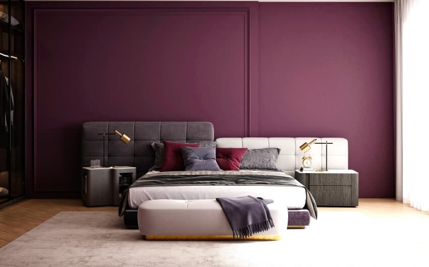
Deep Purple
A bedroom can be given a sophisticated air by decorating in several deep colors of purple.
Recommendations:
Benjamin Moore Purple Poppy TC-14
Purple Poppy is a medium-toned purple color that manages to keep its light and airy quality despite being saturated with deep overtones of blue and violet.
Benjamin Moore Spring Purple 2070-40
This vibrant and highly saturated color helps spaces come to life. The unique and pristine purple color that it exudes shines a light on its surrounding components.
Benjamin Moore Exotic Purple 2071-10
Exotic Purple is a bold, pulse-racing color that exudes relaxed confidence and style. It is an intense, untamed purple that fills a room with its presence.
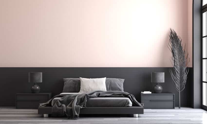
Dark Gray
Deep, warmer tones and a more contemporary feel can be achieved using various rich shades of dark gray.
Recommendations:
Benjamin Moore Chelsea Gray HC-168
Because it has an LRV of 22, Chelsea Gray is a popular choice for cabinetry, exteriors, and even painting the walls of an entire room in this color. Because of its average linear foot volume, it has the ideal depth for giving a room a sense of drama and design without making it feel overly weighed down.
Also, Chelsea Gray has a hint of green, even if it isn’t always visible to the naked eye. It is sometimes known as a warm gray. However, it does not have the appearance of a warm color in the classic sense.
Benjamin Moore Steel Wool 2121-20
Steel Wool has undertones that are completely diametrically opposed to Chelsea Gray’s. Steel Wool is an excellent gray paint color with an undertone between violet and blue, in contrast to Chelsea Gray, which has a hint of warmth with a greenish undertone.
The versatility of Steel Wool is one of its greatest strengths; it may nod at either the blue or the violet end of the spectrum without fully committing to either one. And it accomplishes all of this while retaining a “gray” appearance, more or less.
Benjamin Moore Graystone 1475
The LRV for Graystone is almost 30, which places it among the lighter ones in our suggestions. Graystone holds up rather well in its undertones when contrasted with the slightly warmer gray end of the spectrum. While it nods towards green, it is more of a courteous gesture than an invitation to “come here.”
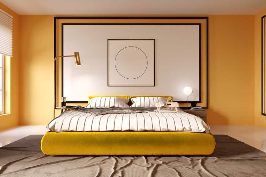
Deep Gold
Metallic paint, such as gold, can make a space appear larger than it actually is. However, this effect is often achieved most successfully when the metallic paint is applied on an accent wall.
Recommendations:
Empire Gold by Sherwin Williams
Empire Gold by Sherwin Williams is our go-to choice when selecting a gold paint color. We adore how this color enlivens a room and works well with other golden tones. It creates a cozy and welcoming space’s ideal luxurious and golden background.
India Yellow by Farrow and Ball
We are fans of the English color palette, especially their preference for ochre and gold tones. India Yellow by Farrow & Ball is a dashing shade that manages to be homey and refined all at once. This is a more severe shade of golden ochre that is quite deep.
This hue is a gloomy yellow gold, which can become totally neutral so that you can layer other colors on top of it. That’s why we love using it.
Mannered Gold by Sherwin Williams
When combined with Sherwin-Williams’ Faux Impressions Metallic range, the color Sherwin-Williams SW 6130 Mannered Gold emerges as a resounding victor in our estimation. The metallic coating can be purchased in a smooth, brushed, or textured finish to cater to each individual’s aesthetic and texture preferences.
The metallic finish imparts an additional shine to the paint, elevating the hue from a typical wall to genuine gold. This goes beyond the capabilities of yellow color alone.
Paint Colors to Update Your Bedroom
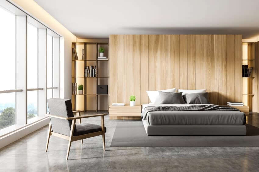
To get started, stock the furnishings already in your space. If most of your bedroom furniture is white or light wood, sticking to a more delicate color palette might be the most effective design choice. In general, darker furniture works well with more deep and richer tones.
After a broad concept of the color, you want to use, look up several color options online. After narrowing down some color selections, pay a visit to the paint store in your neighborhood and ask for a sample you can take when you leave. You can also use paint visualizers to help select the right shades.
Applying the paint sample to a tiny section of one of your rooms will help you better imagine how the entire space will turn out. If you think it looks good, you’re ready to start painting!
There’s a certain psychology behind picking out great modern paint colors for an elegant and contemporary bedroom. It’s been found that looking at specific hues can raise your blood pressure, metabolism, eye strain, and emotions.
For instance, red has been shown to increase one’s appetite, heart rate, and blood pressure (which is why it is a popular color in restaurants). According to the findings of one study, the color black may be connected with mourning and violence. Dark blue or green colors may also evoke feelings of melancholy or indifference.
Benjamin Moore White Dove
The Benjamin Moore White Dove OC-17 paint color is ideal for your bedroom’s walls. There is no denying that this traditional creamy white with warm gray overtones is a very well-liked wall color for bedrooms.
Additionally, the warmth of this bright white color produces a comfortable atmosphere. Additionally, the shade of white on the walls is light enough to elongate small bedrooms.
Behr Light French Gray
Light French Gray by Behr Paints is the next hue on our best bedroom wall colors list. Once more, we adore the adaptability of this cool-toned neutral gray, which has a hint of blue and brown in the undertones.
This tranquil wall hue from Behr, which should not be confused with Sherwin-Williams’ Light French Gray, is better suited for bedrooms. It might provide enough contrast against stark white woodwork and white bedroom ceilings to open up the appearance and feel of a smaller room. Different shades of gray works equally well for contemporary and mid century modern bedroom colors.
Sherwin Williams Origami White
We adore Sherwin Williams Origami White for bedrooms, without a doubt. This is another soft and milky wall color ideal for your bedroom walls. It is a warmer off-white neutral that is equally flexible and serene, similar to White Dove.
It integrates well with any bedroom design because it has a gray undertone. Indeed, these qualities make it easy to match your home decor and bedroom furniture with this popular white paint color.
Linen White by Benjamin Moore
Linen White by Benjamin Moore is another delicate, creamy, off-white paint shade that looks fantastic in most bedrooms from contemporary to modern farmhouse designs.
This is undoubtedly a warm white with faintly golden undertones that makes us think of crisp, clean bedding. Any bedroom that receives adequate sunlight can be made to feel more cheerful by Linen White’s laid-back and friendly atmosphere.
Upward By Sherwin-Williams
So far, Sherwin Williams’ Upward is the best blue for a bedroom wall. This gorgeous shade exudes serenity and is more of a blue-gray or neutral light blue.
Upward is a blue that is light and fresh and clear and peaceful. This makes it the perfect light blue with hints of gray bedroom paint color. If paired with gray or cooler-toned carpeting, it may cause a room to feel overly cold, so make your plans appropriately.
Farrow & Ball All White
Put aside the most recent color fads and start fresh in your bedroom. The perfect pure and crisp white wall color to base your interior design preferences on is All White by Farrow & Ball.
Because it only has white as a pigment, you can match it with a dark blue accent for a striking contrast. It is a vivid, geometric white that looks fantastic on bedroom walls, trim, or ceilings because it is neither chilly nor warm.
PPG Olive Sprig
PPG’s Olive Spring is the bedroom paint color that looks the most natural on our list. This green shade with warm undertones helps bring the outdoors to your interior spaces.
Both original and earthy, Olive Sprig rides the tides of contemporary trends that are anchored on sustainability. This is a lush green shade and is organic in nature. It’s best paired with soft rose tones.
Calm (Benjamin Moore)
Benjamin Moore’s Calm is a calm, flexible, warm gray that works well for painting bedroom walls. Homeowners and designers favor this calming off-white with hints of lilac and lavender-gray. Calm is simply the perfect shade of light gray to help take the stress away after a long day.
Reflecting Pool by Behr
There’s a reason Reflecting Pool is one of Behr’s most popular paint colors for bedrooms. Many describe it as a fantastic combination of blue, green, and gray tones.
Undoubtedly, a neutral gray Reflecting Pool is one of the colors on our list. However, the combination of this bedroom hue with warm-toned or natural wood flooring is what we adore the most.
Paint For Two Colors
Because the effects of color combinations in the bedroom are more potent, making informed decisions and knowing how various hues and color combinations work is essential. The mood you want to create can be achieved through the use of color combinations in a variety of ways.
It can be lively, muted, tranquil, bold, passive, etc., depending on what works best for you. You have several possibilities to pick from, and the one you go with will rely on the kind of person you are and what you’re looking for out of life.
Here are some inspiring two-color combinations:
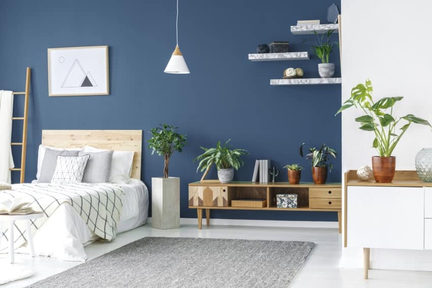
White and Navy Blue
When selecting two color combinations for a bedroom, using white as the base and accenting it with any color you choose are both acceptable options. The dark navy blue creates an eye-catching contrast against the bright white. White is associated with virtues such as purity, simplicity, and new beginnings.
In contrast, the darker tones of blue, such as navy, represent authority and significance. While utilizing this combination on the walls, you can infuse more life into your room by playing with earthy tones on the floor. For example, you could use wooden flooring, a jute rug, or a beige carpet.
Cream and Yellow
Yellow, the color of the sun and full of hope and enthusiasm, is a stellar choice for the walls of a bedroom. When you add a shade of cream to it, you will have a bedroom that exudes a joyful and youthful vibe in its atmosphere.
The cream is a tone that is not only aesthetically comparable to yellow but also congruent with what it extends into its surrounds and maintains this congruence.
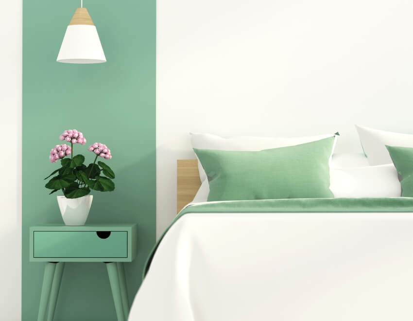
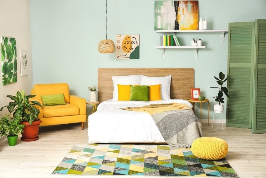
White and Mint Green
If you frequently spend stressful days at work, a color combination of mint green and White could be a good choice for the walls of your bedroom. A soothing impact is produced by the environment when a mint green or a subdued shade of green is used.
The calming quality of the color green can instill a sense of renewed vitality in the bedroom. When combined with a muted version of white, associated with quiet and serenity, you may create a space in your home that is soothing, relaxing, and conducive to a good night’s sleep.
Best Carpet Colors for the Modern Design Bedroom
Carpets and rugs are already experiencing a surge in popularity. This trend will only continue as they provide homemakers with the opportunity to showcase strong design statements, particularly in vibrant colors. Handmade rugs are ideal, but carpets and rugs can be outstanding design elements in the bedroom.
Statement colors are becoming increasingly popular among homeowners for their carpeting. You can make a point because the carpet is not customarily used throughout a house these days. This is especially true for rugs intended for use in certain areas.
The use of jewel tones, oranges, and purples, as well as multicolored carpets and rugs, is becoming increasingly common. Since maximalism is currently in, your carpet can make a statement.
Blue
Blue is a great way to break away from the standard of having neutral carpets since it is understated enough to appeal to many people. It is neutral enough to not trap you into one design approach. It combines perfectly with the fashionable gray decor currently popular.
Gray
In addition to looking elegant and trendy, gray carpets set the tone for a modern area that is cool and contemporary. It provides a blank canvas against which you can decorate practically any color. Your streamlined gray carpeting is compatible with many color palettes, including Aquas, greens, bright, intense hues, and black and white.
Multicolored
This is one of the most exciting new developments in the carpet industry. You are not restricted to picking just one color for your carpet; you are free to have all of them. Bright and vivid colors are going to be seen a lot in carpet runner trends as well as area rug trends especially. A multi-color area rug may make a striking statement on your floor.
Colors to Mix and Match with Brown Furniture
Brown furniture is sometimes considered uninteresting, yet in the proper context, it may look chic. Selecting the right wall colors will elevate even your least-favorite brown furniture. Follow these paint color ideas to showcase your grandmother’s mahogany dining room table or a sleek chocolate-brown sofa.
Mid-tone walls match dark brown sofas and other furniture. Think warm golden yellow, gentle medium blues, tranquil grayish-greens, creamy tans, or soothing greys. You want your walls to wrap you, not pop. Deeper wall colors make mid-brown sofas and medium wood furnishings cozier.
Think burned umber and warm peach for a southwestern palette, rich terra cotta and mustard yellow for a Tuscan environment, green for a verdant jungle atmosphere, a jumble of grays and ivories to simulate river rocks, and sky blue to contrast bark brown. Look out the window for ideas.
Ivory and Other Cream-based Palettes
Browns, from pale sand to deep chocolate, look elegant with creamy ivory walls. The brown color contrast creates a luxurious, timeless look. For contrast, choose a refined cornflower blue or a tonal palette of ivory, sand, camel, caramel, and cocoa.
All ivory walls look great with brown, but pure White detracts from its warmth, so use softer, mellower tones. The tonal contrast is not startling.
Color Pairings for a Sleek Bedroom
The hue one chooses to paint a room is highly personal and frequently carries cultural connotations. In Japan and China, for instance, the hue white is connected with sadness.
In contrast, white is associated with cleanliness and purity in the United States. Some nations in the Middle East believe that the color blue offers protection. Hence, they paint the front doors of their homes blue to keep off evil spirits.
Therefore, when picking a color for your bedroom, you shouldn’t only stick to the concept you had in your head. Think about how the hue makes you feel. But there are tried and true color palettes for modern bedrooms.
Neutral Shades with Warm Undertones
The use of beige, creamy white, mustard yellow, and light grey creates an environment that is warm and inviting, evoking feelings of relaxation and comfort. When it comes to the decoration of the bedroom, a palette of warm tones works really well with colorful accents.
Light Tones with Cool Undertones
When used in a bedroom, lavender, soft pink, soft yellow, and fresh blue create a relaxing and relaxing atmosphere. These hues are also less distracting and simpler to combine with other vivid elements of a room’s design, such as striking patterns.
Vibrant Statement Colors
A dramatic color scheme that is both inviting and elegant can be achieved by combining various tones of gold, dark Purple, and terracotta.
To showcase highly specific designs, some images on this website use advanced AI-generation software to illustrate ideas and room inspiration. See our editorial policy to learn more.
Easily Create Your Own Room Makeover
Upload a photo and get instant before-and-after room designs. No design experience needed — join 2.39 million+ happy users. 👉 Try the AI design tool now
Gray has secured its place as the MVP of modern bathroom palettes, and for good reason. This tranquil hue brings a cohesive yet customizable aesthetic…
The elegant luxury bedrooms in this guide showcase custom interior designs and decorating ideas from top designers. A luxury bedroom should exude elegance and create…
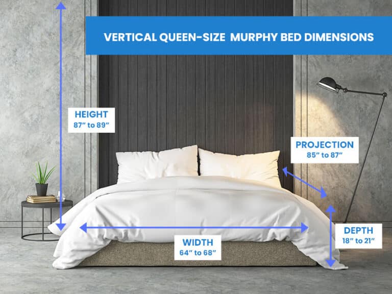
Here’s our Murphy bed dimensions guide, including how to measure them and different sizes. Murphy beds have plodded along from the original, gaining popularity in…
Yellow is bright and eye-catching, immediately brightening a room where it’s being used. The color easily represents warmth and happiness, which you’d want in your…