Living Room Paint Colors For An Instant Makeover
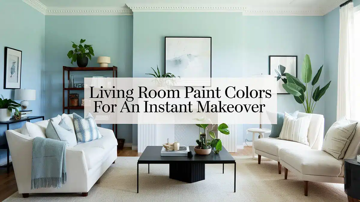
For a long time, oatmeal was the color of choice for a living room. Oatmeal walls, oatmeal furnishings, oatmeal rugs. We fell in love with the neutrals, and things got a little boring. Color is one of the best, fastest, and easiest ways to update your living room and give it a real sense of personality, and of course, good design. Below, we share a variety of living room paint ideas to help you find the color that matches your personal sense of style and gives your room an instant makeover.
Best Living Room Colors to Use
Picking a living room color is less about chasing a trend and more about matching the shade to your light, your space, and the mood you want to walk into every day. Some colors love a bright, sunny room while others quietly rescue a space that never gets much daylight. Here’s a side-by-side look at the nine living room colors above, the kind of light each one flatters, the accents that make it sing, and a real paint pick to get you started.
| Color | Best For | Pairs Well With | Try This Paint | The Vibe |
|---|---|---|---|---|
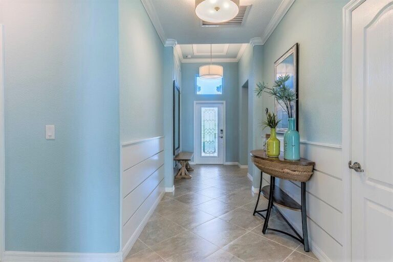
| Light Green | Bright, south-facing rooms that can take a cool, airy tint | Blush pink, warm whites, natural wood | Sherwin-Williams Sea Salt (SW 6204) | Fresh and calming, like a deep breath |
| Pink & White | Eclectic spaces that want personality without going loud | Turquoise, navy, rich wood tones | Benjamin Moore First Light (2102-70) | Playful and grown-up at the same time |
| Light Blue | Cottage-style or traditional rooms of any size | Crisp white trim, black and white patterns, pewter | Benjamin Moore Palladian Blue (HC-144) | Timeless and quietly polished |
| Navy & White | Rooms with good light and warm wood to balance the depth | Cream, greige, honey-toned wood, striped rugs | Benjamin Moore Hale Navy (HC-154) | Cozy and confident, never cold |
| Cream & Gold | Formal or warm, inviting living rooms | Almond, burnt orange, brushed gold accents | Benjamin Moore Ballet White (OC-9) | Warm, luxe, and welcoming |
| Gray | Contemporary or transitional rooms, any light | White trim, plus a touch of green, blue, or pink | Benjamin Moore Gray Owl (OC-52) | Sleek, flexible, easy to live with |
| Brown | Rustic, traditional, or cozy contemporary spaces | Blue, mustard yellow, pastels, pale rugs | Sherwin-Williams Mega Greige (SW 7031) | Grounded and comforting |
| Tan & Blue | Neutral lovers who want one bold personality color | Deep blue, gold, pewter, pops of pink or green | Sherwin-Williams Accessible Beige (SW 7036) | Calm base with a jolt of character |
| Warm Alabaster | Almost any room, especially ones you want to feel bigger | Linen textures, raw wood, greenery | Sherwin-Williams Alabaster (SW 7008) | Soft, sunny, and endlessly easy |
Quick tip: whatever shade catches your eye, buy a sample and paint a big swatch on two different walls before you commit. Paint shifts with the light throughout the day, and the color you fall for at the store can look like a whole different shade once it’s home.
Light Green
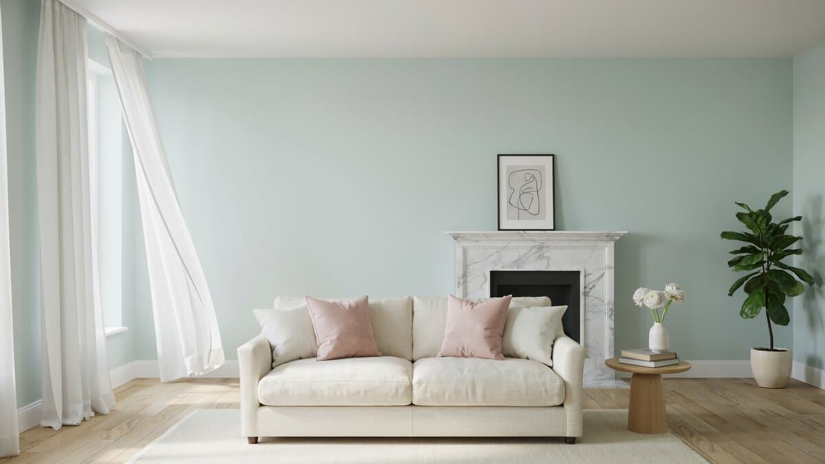
Lately brightly painted living rooms have become popular due to their uplifting color palette and emphasis on showcasing your own personal style. One way to get this right is by going with a light green color palette. Try pairing it with pinks, whites of off white shades for an attractive design. I always test a green on the actual wall before committing, because these shades pull heavily from your light. In a north-facing room I go a touch warmer and sagier, otherwise green can read cold and a little hospital-like by afternoon.
Pink & White
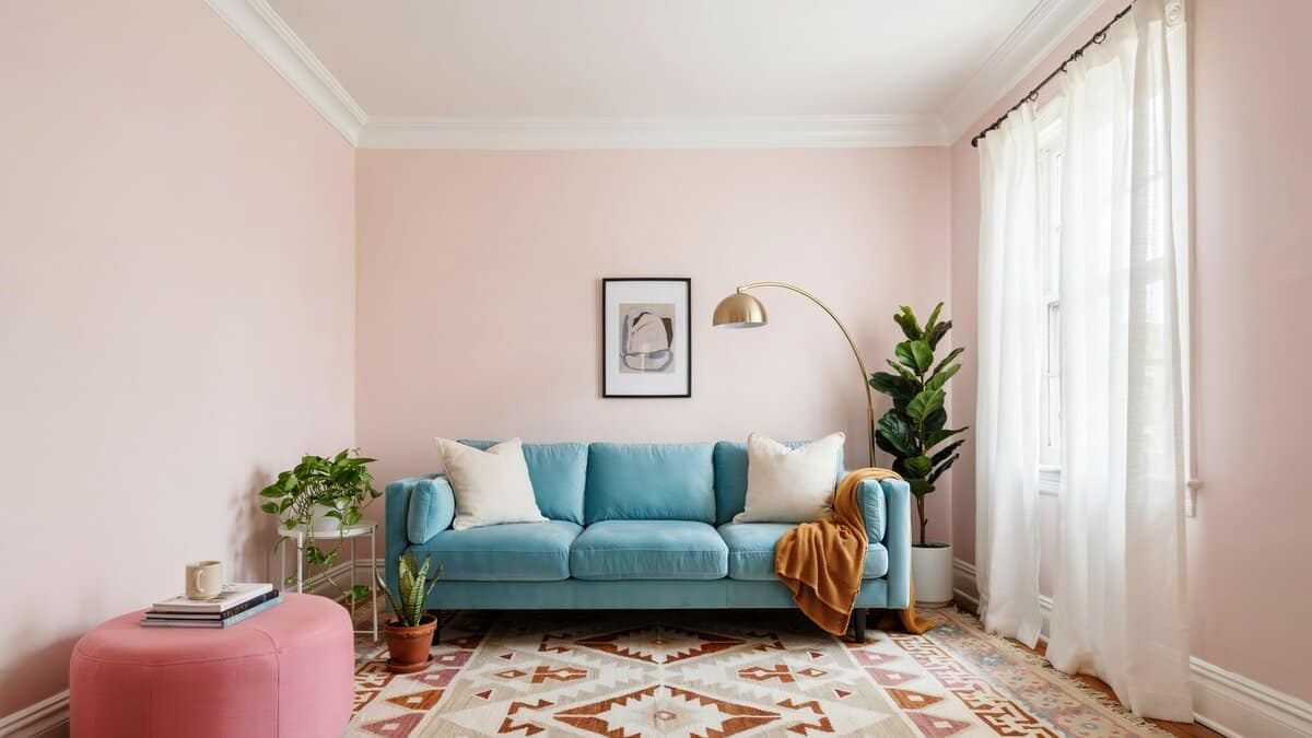
For a fun, eclectic, world-traveler vibe, pair your mid-century antiques and finds from your travels with pink and white. For the more ambitious try combining pink with turquoise, and navy. This bold color combination is bright, fun, and plays off of the masculine and feminine.
A vintage turquoise sofa, a pop of bright pink on an ottoman or some throw pillows, and an occasional chair reupholstered with a wool rug with navy details set the stage for your navy, turquoise, and pink scheme. Fill in more color with potted plants, an interesting area rug, and rich wood furnishings to balance out the space. Keep the curtains light and airy, something wispy and white that lets the natural light flood into the space.
My trick with pink is to keep it grounded, so i like to pair it with something with a little weight, like a wood coffee table or a black picture frame, so the room feels styled and grown-up instead of tipping into a nursery.
Light Blue
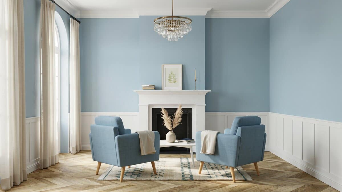
For a traditional cottage style, a powder blue combined with white is a timeless choice that always pleases. If your style is more Manhattan sophisticate, consider black, white, and robin’s egg blue. You typically see a bright color paired with the stark contrast of black and white but using a soft blue gives black and white an elegant update.
Paint your walls a soft, robin’s egg blue and use black and white geometric upholstery on your furnishings to get this stunning and unique look. Accent furniture made of brushed steel or pewter lend and understated polish to the overall look. I treat powder blue like a soft neutral, not a bold color. When I want it to feel current rather than sweet, I lean on crisp white trim and one moody anchor in the room, like a charcoal rug or a black lamp base.
Black or rich, deep brown stains on your wood furnishings add some weight and keep the combination from feeling too airy. Be sure to include some blue accents, they can be a little more bold or understated, think throw pillows, glass accessories, or artwork. To ground the look, use a black and white flat pile area rug, don’t be afraid to go more black than white and make sure the pattern compliments the patterns on your upholstery.
Navy and White
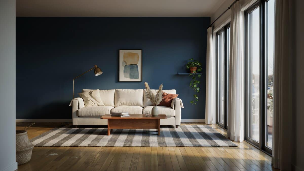
Transitional spaces would benefit greatly from a Navy, white and Brown combination. Rich, dark Navy walls are an unexpected way to make your space feel cozy. Use rich brown wood in your flooring or furnishings. Read more about matching wood floors with paint colors here. However, when using brown keep them light, think framed sofas and chairs, not heavy, bulky case goods that will overwhelm your space.
For upholstery, keep it neutral, cream backgrounds with interesting prints in greige with small pops of toned down reds and blues. Lighten it up with a soft striped rug in grey and white or use a worn antique Persian rug to bring a sense of antiquity to your space. This is a room that begs you to grab a mug of tea, plop down in your favorite chair, and get lost in the world of your favorite book.
Keep a basket full of cozy blankets near the main seating area and make sure to scatter small side tables about the space for handy places to land your mugs and plates of snacks. This color combination is comfortable, casual, and plays well with modern and traditional furnishings. And whenever I use navy on the walls, I make sure warm wood shows up somewhere nearby. A dark blue can go flat and chilly on its own, but a honey-toned floor or a walnut side table instantly makes it feel cozy instead of looking too corporate.
Cream & Gold
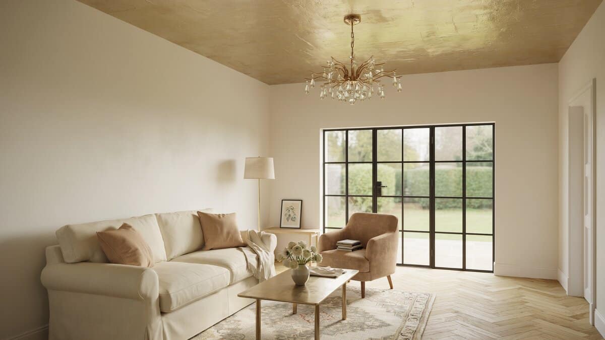
We see a lot of gold popping up everywhere these days, from design showrooms to big box stores, and gold is everywhere. It is a color that can go with just about anything, but it looks especially amazing with the warm, inviting tones. The look can get heavy and dated if not done with a light hand. Keep your large-scale upholstered piece neutral; shades of almond and cream look great here. For extra flair pair gold with burnt orange, the pumpkin spice of colors or accent with burnt orange to get a touch of the color.
Throw pillows, draperies, and your occasional chair or settee get the burn orange treatment. Go with patterns or the lovely striations of a vintage bark cloth. Bring the gold in with a brushed gold frame coffee table. Also, look for throw pillows that have a touch of gold in the fabric, a little goes a long way.
This is the time to use that fabulous neutral colored flokati rug that you’ve had your eye on. Drape a chunky knit blanket across your armchair to complete the inviting feel. With gold, I follow a less-is-more rule and let it appear in just two or three spots, like a lamp, a frame, and a bit of thread in a pillow.
Gray
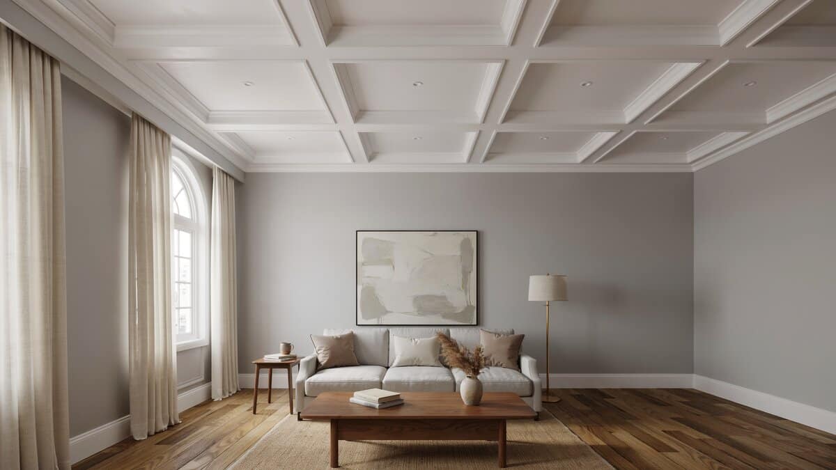
Gray is a color often featured in contemporary living room designs for its stylish and sophisticated look. However, it can do equally well when paired with white molding and trim to create a more traditional feel. Since gray is a neutral color, it can be successfully paired with a variety of accents. Some popular combinations include pairing gray with a touch of green, blue, black, pink, and brown.
I never pick a gray without checking its undertone in the room, because most grays lean blue, green, or purple once they hit real light. I hold the swatch next to my flooring and sofa first, since that’s where a wrong undertone shows up fastest.
Brown
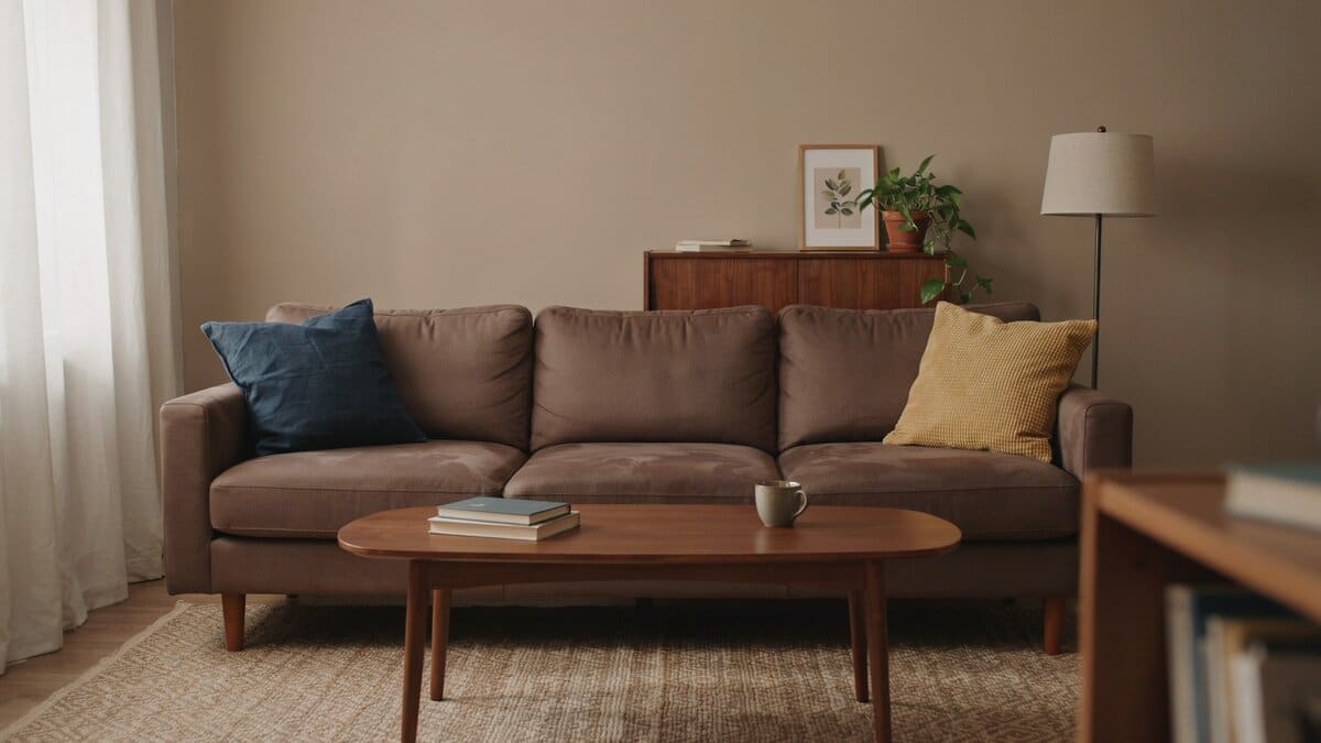
Brown is a versatile color for the living room and can match a variety of styles. Shades of brown can be used for a rustic charm, traditional or contemporary design depending on your furnishings and decor. While brown has been a popular color it can become dull if not paired with other colors to brighten up the space. Complementary colors to use with brown are blue, pastels, yellow, green, and purple, just to name a few.
I love brown for warmth, but I always break it up with one lighter or brighter note so the room doesn’t go sleepy. A pale rug, a few pops of blue or mustard, and suddenly the whole space feels layered instead of heavy.
Warm Alabaster
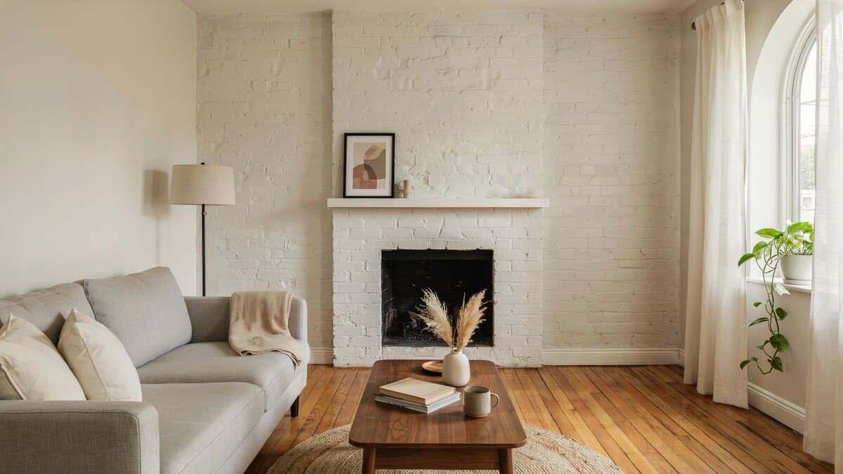
Soft alabaster white wraps this living room in a calm, sun-warmed glow, letting the painted brick fireplace and honey-toned wood floors carry all the texture. It’s the kind of neutral that feels inviting instead of cold, an easy backdrop that lets a linen sofa, a trailing pothos, and a few pampas stems do the styling. With a warm white like this, I lean into texture instead of color to keep it from feeling plain. A nubby throw, a woven rug, and a bit of raw wood give the room all the depth it needs while the walls just glow.
Tan & Blue
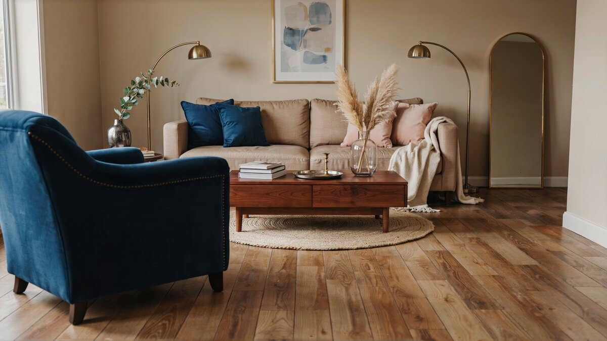
Think beyond neutral, invite deep dark blues and bright pinks and greens into your space. Accent with gold and pewter. When I build a tan room, I let the tan be the calm base and bring in blue as the personality. One deep blue chair or a stack of blue pillows does more for the space than spreading the color thin across a dozen little accents.
Color is a great way to update your space, especially if you take yourself back to your elementary art class and the color wheel. Grab a color wheel and find your favorite color, then find what colors contrast or compliment it and you will find a color combination that works for you. From emerald and black to peacock, gold, and grey, you will find a color combo for your living room paint colors that adds sophistication, fun, and the elements of good design to your space.
To showcase highly specific designs, some images on this website use advanced AI-generation software to illustrate ideas and room inspiration. See our editorial policy to learn more.