Colors That Go With Orange (20 Interior Designer Ideas You Can Try)

Due to its vibrant, bright, and bold nature, Orange could be quite intimidating. However, if you’re more adventurous with your colors, orange will easily bring warmth, creativity, and happiness to any living space. Albeit a little bit daunting, you can create and achieve many different looks and ambiance using orange with the right combination and shades. The color orange primarily represents joy, sunshine, and warmth. It is an inviting color that encourages playfulness and social interaction. The color orange has even been associated with stimulating appetite and success. For these reasons, it can be found in kids’ bedrooms, game rooms, living rooms, and even kitchens.
Colors that Go with Orange Walls
Since orange is a secondary color & on the warm side of the spectrum, orange will naturally go well with other warm colors; however, it can also work well with other cooler colors, especially those of the complementary shade. Below are some colors that go well with orange
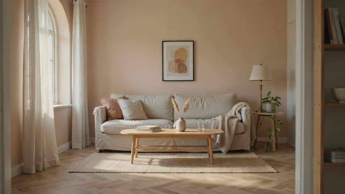
White – White naturally goes well with any color, and combined with orange, it provides a clean background that enables the oranges to take center stage in your design.

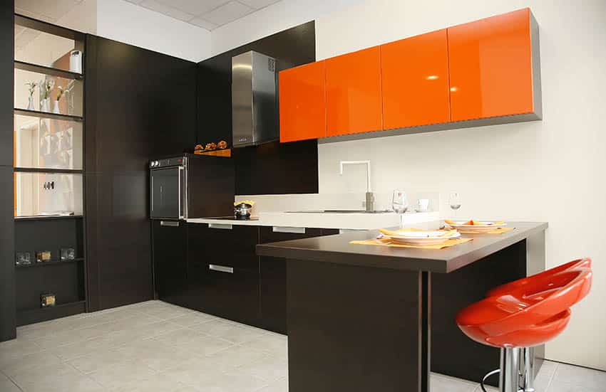
Black – Another color that goes well with everything. When combined with orange, it creates a mysterious, bold, and edgy feel to any space
Gold/bronze/brass – These colors, combined with orange, gives a warm and elegant appeal, that would probably remind you of period interiors and architecture

Yellow – When combined with orange, exudes a fun, exciting, and positive vibe. Orange and yellow also give a summer feel and can also create a relaxing sunset vibe, depending on the shades you are using.
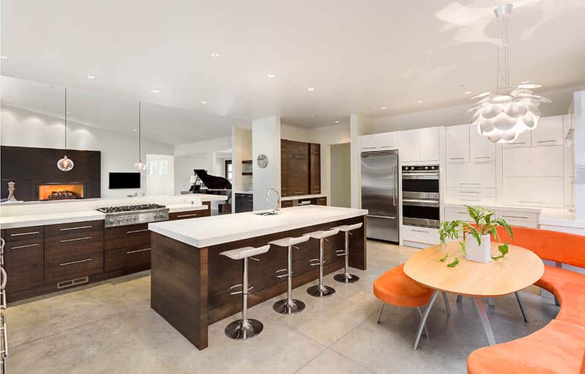
Browns (and similar earthy colors) – Orange will easily look good with any brown shades, as both are warm colors. Together, these two will easily create a homey and relaxed atmosphere.
Other shades of Orange – Of course, when in doubt, you can easily combine different shades of orange to create contrast and depth. You can use more vibrant hues for accents and small items, and use more muted oranges for large areas like walls or curtains.
Red – Combining orange with red is like adding fire to fire. These two colors create a very bold and loud combination, but when successfully executed, they create a fresh and lively feel.

Blush Pink – If reds are too bold for your taste, then toning it down to a blush pink color to further emphasize the vibrancy of orange can do the trick.
Blue – Adirect complementary color of orange which creates a bold and stunning contrast, bringing out the best on the two colors.
Turquoise (and similar colors) – This easily goes well with orange as it is a complementary color. Just make sure you’re using the right complementary shade.
Orange Color Pairing Chart
Orange isn’t one color, it’s a whole family. Terracotta behaves nothing like tangerine, and the partner color that flatters one will flatten the other. This chart lines up the pairings that actually hold up on a wall, with a real paint pick and LRV for each so you’re not guessing at the swatch rack. Higher LRV means the color bounces back more light. Anything under 30 will eat light in a small room, which matters a lot when the other wall is already doing something loud.
| Pair With | Paint To Try (LRV) | Best Orange | Where It Works | Watch Out For |
|---|---|---|---|---|
|
Crisp White |
Chantilly Lace OC-65 (90) | Tangerine, coral | Kitchens, trim, small rooms that need air | Reads chilly next to burnt orange |
|
Warm White |
Alabaster SW 7008 (82) | Terracotta, rust | Living rooms, bedrooms, north facing spaces | Can go creamy under warm bulbs |
|
True Black |
Tricorn Black SW 6258 (3) | Bright orange, tangerine | Kitchen islands, cabinet fronts, window frames | Tips into Halloween fast. Keep it to accents |
|
Charcoal |
Iron Ore SW 7069 (6) | Rust, burnt orange | Media rooms, offices, exterior doors | Needs a light floor or it closes in |
|
Navy Blue |
Hale Navy HC-154 (8) | Rust, apricot | Dining rooms, built ins, upholstery | Equal amounts looks like a sports jersey |
|
Soft Aqua |
Palladian Blue HC-144 (60) | Coral, peach | Bathrooms, laundry rooms, kids’ rooms | Goes minty in south facing light |
|
Muted Teal |
Sea Salt SW 6204 (63) | Terracotta, clay | Bedrooms and baths that need to stay calm | Shifts green, gray or blue by the hour |
|
Sage Green |
October Mist 1495 (47) | Rust, burnt orange | Living rooms, entryways, kitchen lowers | Muddies against orange toned wood floors |
|
Deep Green |
Evergreen Fog SW 9130 (30) | Tangerine, marigold | Accent walls, bookcases, powder rooms | Too dim for a room with one small window |
|
Greige |
Agreeable Gray SW 7029 (60) | Any shade | The safe main wall when orange is the accent | Can look flat if nothing else has texture |
|
Warm Beige |
Accessible Beige SW 7036 (58) | Burnt orange, rust | Open plans where rooms flow together | Blends in so far it disappears |
|
Cool Gray |
Gray Owl OC-52 (65) | Bright orange | Modern rooms with metal and glass | Fights warm oranges. Keep to clear brights |
|
Blush Pink |
First Light 2102-70 (76) | Peach, apricot | Bedrooms, nurseries, dressing rooms | Skews sweet without a dark grounding piece |
|
Soft Yellow |
Hawthorne Yellow HC-4 (71) | Marigold, tangerine | Kitchens, sunrooms, breakfast nooks | Two warm colors need a white break between |
A few things the chart can’t show you.
Room orientation changes everything. North facing rooms get cool blue light all day, which pushes orange toward brown and makes cool grays look dingy. That’s where the warm whites and beiges earn their keep. South facing rooms get the opposite problem, warm light all day, so a bright orange can go nuclear by mid afternoon. Muted teal or sage will pull it back.
Sheen matters more with orange than with almost any other color. Orange pigment is already high energy, and gloss doubles down on it. Use flat or matte on a full orange wall, eggshell if you need to wipe it down, and save satin or semi gloss for trim and cabinet doors where the shine is the point.
One last thing, buy the sample pot. Orange is the color people most often get wrong on the first try, usually because the chip looked terracotta in the store and turned pumpkin at home. Paint a big square, look at it in the morning and again at night, then decide what looks best.
What Color Curtains Go with Orange Walls
For orange walls, the safest curtains you can use are white, beige, and cream. These neutral colors will help tone down the brightness of the orange walls or even emphasize the soft look of the walls if a lighter orange is used. These colors will work no matter what shade or hue of orange you use.

You can also use black for this, as it can match any shade of orange, but do note that using black with orange can look quite bold. If black is too bold or extreme for your tastes, you can try using neutral grays and browns, being very careful with the shade selection as gray and brown have many different undertones.
These are the best and safest colors you can use with orange walls, and they will also look good on any other wall color. You can also experiment with other colors, such as blue, turquoise, pink, other hues of orange, etc., making sure that they match well with the shade of orange you use.
Colors that Go with Bright Orange
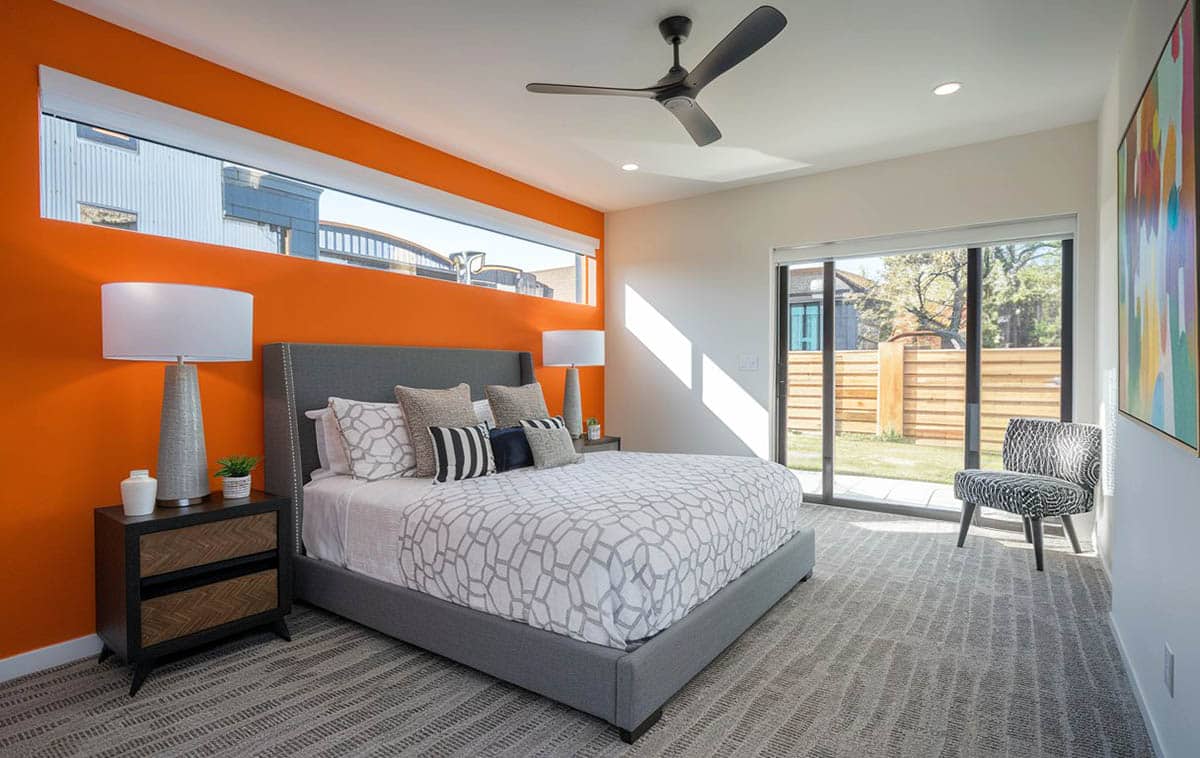
This contemporary living room design features a bright orange accent wall combined with a neutral gray wall color, gray carpet, and platform bed. Additional orange is found in the decor, such as on the bed pillow and wall art, to help tie the color theme together.
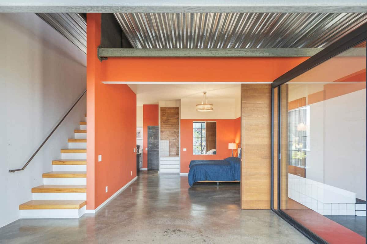
Perhaps one of the trickiest colors to match with would be that daunting bright orange. Be it in clothes, accessories, and interiors, orange pieces are usually loud and stand out, making it quite a challenge to coordinate, but not impossible. Depending on the effect you want to achieve, here are some suggested colors:

Lime and bright yellows – These work so well with orange as they also invoke cheery and positive vibes. Combining these with orange can create a citrusy-inspired look—refreshing, youthful, and positive.
White – Because you can never go wrong with any color + white
Blue – Depending on what shade of orange you are using, blue would naturally work well with it. Consider the same when using it with colors in the same family, such as turquoise, aqua, cerulean, sky blue, etc

Gray – Gray or greige (gray/beige mix) would help tone down and neutralize the loudness of orange, but use sparingly/with caution, as there are also correct shades of gray to use with bright orange.
Green – Kelly green, especially looks good with basic orange shades, similar to how blue complements them well.
Orange Interior Design Ideas
Below are some orange design ideas to help you best utilize this vibrant color:

This large home movie room features orange in a variety of ways such as in its projector screen curtains, soundproofing and accent pillows.

This game room showcases an orange painted accent ceiling which utilizes a creative way to bring the color in to the design.

This large living room features high ceilings that are painted in a tangerine orange color. Red leather furniture and rich wood floors help give this room an uplifting rustic style.

Orange leather arm chairs and other orange decor such as area rugs, artwork or lamps can be another way to bring the color in to your interior design without needing to paint the walls the color.

An orange area rug and throw pillows can be a way to add visual interest and compliment your room with the color.

An orange painted laundry room is a fun way to take some of the drudgery out of this popular household chore. Orange has been shown to increase feelings of energy and abundance which may be just what you need during dreaded laundry day.

This teens bedroom uses a bright orange for its built-in desk area and a gold color for the rooms primary paint color. Light color hardwood flooring further enhances the orange theme of this bedroom.

This cozy living room design offers a burnt orange paint accent wall contrasting against a white sectional sofa and beige textured wallpaper wall to create an inviting space.

This guest bathroom features a bright tango orange paint color combined with a white wainscoting for a refreshing design style.
For more ideas about matching colors with orange, visit our article about matching with the color wheel to find complementary shades.
To showcase highly specific designs, some images on this website use advanced AI-generation software to illustrate ideas and room inspiration. See our editorial policy to learn more.