What Does the Color Green Mean (Interior Design Guide)

When designing spaces, one of the most important factors people decide on is the colors. Some people tend to stick to their favorite colors. Some prefer “safe” colors, such as neutrals and monochromes. Some prefer to choose trendy colors or even refer to the “Color of the Year” to decide their color scheme, while others tend to choose colors based on their associated meaning or the feelings they invoke.
Green is probably one of the most common colors we can see in nature and is mostly associated with nature. As such, green has always been associated with things related to nature, such as life, renewal, and nature itself. As with many other colors, green has many different meanings and associations, depending on culture, and also has different psychological effects.
Know Your Green
Before any of the meaning stuff, it helps to know which green you’re talking about. Mint and olive are both green, but they have almost nothing in common on a wall. Here’s some differences to help you sort them out
| Shade | What it signals | Works best in | Pair it with | Try this |
|---|---|---|---|---|
|
Mint |
Fresh, cool, a little retro | Kids rooms, bathrooms | Crisp white, pale wood | Soft Mint 2041-60 LRV 74 |
|
Seafoam |
Calm, coastal without the theme | Bedrooms, guest rooms | White trim, rattan | Shore House Green 2047-50 LRV 59 |
|
Sage |
Quiet and grounded. The safest whole room green | Living rooms, kitchens | Warm white, oak | October Mist 1495 LRV 47 |
|
Olive |
Earthy and a bit elegant | Home offices, dens | Brass, walnut | Tate Olive HC-112 LRV 22 |
|
Lime |
Youthful and loud. Accent only | Playrooms, a single door | Charcoal, white | Apple Green 2026-40 LRV 66, interior only |
|
Forest |
Traditional, enveloping, cozy | Dining rooms, libraries | Cream wainscoting, dark wood | Forest Green 2047-10 LRV 8 |
|
Emerald |
Rich and formal | Powder rooms, accent walls | Brass, marble | Kelp Forest Green 2043-30 LRV 24 |
Every pick is Benjamin Moore, on purpose. Sticking to one brand means the LRV numbers actually compare, and you can carry the whole list into one store. Apple Green is the only one they don’t recommend for exteriors.

Green Color Meaning
Nature – Green is most commonly found in nature, so it is most often associated with all things nature, such as life, growth, renewal, birth, rebirth, environment, etc. It is no surprise that Sustainable Design is alternatively called “Green Design.”
Wealth/Generosity – This usually applies to the USA & other cultures that use green for their monetary notes. In relation to this, green is also associated with green, envy & jealousy.
Good Luck – In Ireland and similar cultures, green is associated with good luck and good health.
Optimism – In graphics and signage, green is often associated with positive movements; like when stock price rises, they are marked green. When the traffic light is green, it means go, etc.
Psychologically, green reads as calm. It’s the color most often recommended for rooms meant for rest or focus, and there’s some real research behind that, though it’s worth knowing exactly what the research says.
The study everyone cites is Roger Ulrich’s, published in Science in 1984. He compared 23 gallbladder surgery patients whose rooms looked out on trees with 23 matched patients whose windows faced a brick wall, pulling records from one suburban Pennsylvania hospital between 1972 and 1981. The patients with the tree view went home sooner, needed fewer strong painkillers, and picked up fewer negative comments in the nurses’ notes.
Be precise about what that actually measured, though. It’s a view of nature, not a wall painted green. Daylight and something interesting to look at are doing work in there too, and the sample is 46 people at one hospital. It’s the study that started the conversation, not the one that settled it. Forty years of research followed it, which tells you something.
Other similar studies also show how simply depicting nature in art or photos and placing them in a room helps relieve anxiety and the need for pain medication. (source: Monitor on Psychology, “Green is Good for You”)
Some studies also show that seeing green/nature helps in overall mental health, improving positivity, performance, and mood & lowering stress levels. Studies by Terry A. Hartig, Stephen Kaplan, Rachel Kaplan & Frances E. Kuo are some great references citing the positive effects nature has on people.
Depending on the shade of green you use and the colors you combine it with, green will have a different effect and meaning as well. For example, bright lime green will invoke positivity, cheerfulness, and youth, and mossy green is more somber and calming, while olive is more elegant and earthy.
Green and the Color of the Year
Three of the 2026 color of the year picks landed on green, which is a decent signal that the color isn’t going anywhere. Behr chose Hidden Gem, a muted smoky jade that slides between green and blue depending on the light hitting it. Valspar went with Warm Eucalyptus (8004-28F), a muted green with warm undertones. Dunn-Edwards picked Midnight Garden (DE5657), a deep muted green they describe as moss and lichen.
Others went in different directions. Sherwin-Williams named the neutral Universal Khaki (SW 6150), Benjamin Moore picked Silhouette (AF-655), a burnt umber charcoal, and Pantone chose the soft white Cloud Dancer. ArchDaily’s roundup has the wider list if you want to see them side by side. For a look at how green has done in earlier years, we’ve covered paint colors of the year before.
What Color Goes with Green
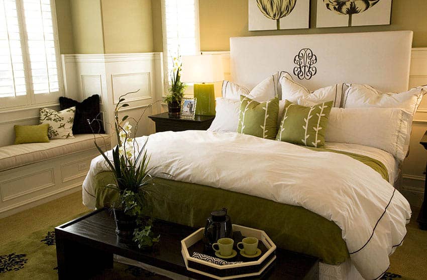
Green is easy to use as our eyes are used to seeing it, and it takes up more space in the spectrum, which is visible to the human eye. Even if it isn’t the main color, you can easily inject greens into your space without making it look out of place.
A great example of such is adding plants – the green surprisingly doesn’t compete with the existing colors, no matter where you put it. However, different combinations with green also have different effects & meanings. It also depends on what shades of green you use. Below are some colors often combined with green and their associated meanings/effects:
productivity increase when plants were added to bare offices in a 2014 field study across real UK and Netherlands workplaces. Staff also reported better concentration and better perceived air quality.
That figure comes from a study led by Marlon Nieuwenhuis at Cardiff University, and what makes it unusual is that it ran in actual offices over months instead of in a lab for an afternoon. The University of Exeter has the summary. Worth remembering the next time someone calls a plant on the desk clutter.
Blue – Combining blue with greens will definitely mimic the feel of nature and have a calming effect. Greens & Blues are often used on interiors that want to give a fresh, sea/beach/tropical theme. Sage walls with a slate blue sofa gets you coastal without anyone saying the word coastal.
Browns/Beige – Browns are often associated with organic materials. When combined with sage green or other warm greens, they have a soothing and calming effect. Using more muted greens with brown and beige can also give a charming, shabby, chic effect. Olive with walnut and unbleached linen is the most forgiving green scheme there is. Hard to get wrong.
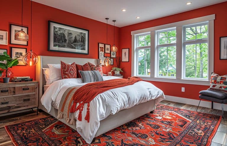
Red – Is often associated with Christmas, especially when using basic greens & red, but this combination will never go wrong as they are complementary colors. Try experimenting with shades of green and red to achieve the desired effect. Skip the Christmas version. A muted terracotta against forest green does the same job without the seasonal baggage.
White – White goes well with any color, but combining it with greens usually produces a bright, crisp & cool feel, especially if you use cool-toned greens such as mint green and kelly green. Mint and kelly green need a cool white next to them, something with a blue lean. Put a creamy white beside a mint and the green turns sour.
Yellow – Using brighter and lighter greens & yellows together gives off a youthful & fresh vibe, while using darker yellows and greens produces a somewhat antique/vintage feel to it. Lime with soft ochre reads young. Olive with mustard reads vintage. Same family, completely different rooms. If olive is where you’re headed, we’ve got a whole page on colors that go with olive green, and another on colors that go with lime green.

This living room looks fresh and inviting by utilizing a sage color palette combined with white trim, colorful accent decor, and hardwood flooring.
Why Green Looks Different in Every Room
Green is one of the colors most affected by the light it sits in. Almost every green carries either a yellow or a blue bias, and the room amplifies whichever one it already has.
In the northern hemisphere, north facing rooms get cool blue light all day. That pushes green toward gray and can make a nice sage look faintly dirty. South facing rooms get warm light that pulls the yellow forward, which is how a sophisticated olive turns into mustard by two in the afternoon. West facing rooms swing hardest of all, cool at breakfast and gold at dusk.
So don’t paint a patch on the wall. Paint a large sample board, move it to three different spots in the room, and look at it in the morning and again at night before you commit. It’s twenty minutes of work that saves a weekend of repainting.
Here’s what that looks like across five real Benjamin Moore greens. Same brand throughout so the numbers actually compare.
The gap between Hunter Green and Soft Mint is the whole story. Hunter Green bounces back 6 percent of the light that hits it, so in a room with one small window it reads almost black after four in the afternoon. That’s not a mistake, it’s why hunter green libraries feel the way they do. Soft Mint bounces back 74 percent and will keep a north facing bathroom from going gloomy.
The middle three are where most people should be looking. Anything from the low forties to the high fifties gives you real color without losing the room, which is exactly why October Mist and Guilford Green sell the way they do.
Green Interior Design Ideas
Here are some examples of green being used in a variety of designs. The rooms below are read the way a designer would read them, looking at what the green is doing against the trim, the flooring and the light, not just whether it photographs well.
One thing to sort out before you buy anything. The same green can look like two different colors on two walls in the same house. Light Reflectance Value, or LRV, is the number that tells you how much light a color bounces back, on a scale where 0 is black and 100 is pure white. Deep greens down in the teens and twenties will swallow a north facing room whole. A sage up in the fifties or sixties holds its color even when the light is thin. If you’re not sure which way your room faces, start with our guide to the best paint colors for south facing rooms.

This bright, modern living room features green throughout with a horizontal striped green accent wall and matching armchairs with a bright area rug.

The living room paint colors shown here feature white wainscoting combined with dark forest green color to create a relaxing ambiance. White-framed picture windows provide a lot of natural light, and a painted white ceiling and light wood hardware floor help keep the room looking bright.

The color works well with cabinetry and is fitting for cottage or farmhouse-style aesthetics.

This transitional kitchen looks beautiful by combining muted sage-painted cabinets with lovely French doors in white with an exposed beam ceiling.

This kitchen features gorgeous granite countertops with cherry wood cabinets and hardwood flooring.

This luxury dining room is well suited to use a neutral green for its main paint color and white wainscoting with white French doors and dark wood flooring.

This kid’s bedroom offers blue-green pattern wallpaper with mint green wall paint and light wood floors to create an attractive layout.

This inviting guest bedroom paint color showcases an olive-hued accent wall, with the rest of the walls in an off-white color combined with dark wood floors. Other accents, such as the pillows and indoor plants, tie the styling together.

A seafoam paint color partnered with white trim and white furniture brings a light and airy atmosphere to the space, which is further complemented by large double doors leading to a small balcony.

This bright kids’ bedroom features a fresh green color painted with a painted flower mural and a large canopy bed.

This fun kids’ bedroom is a football lovers’ dream, with a large mural of a green football field that wraps around the room.

A bathroom can be an excellent place to use a green color palette. Mosaic tiles in different shades of green in the bathroom create a dramatic backdrop that provides a relaxing feel to the space.

This small bathroom uses horizontal wood planks that are painted in pine colors with a white tile shower/tub and white vanity. A large mirror, adequate lighting, and a window over the tub help to keep the space looking fresh and bright.

Tropical wallpaper is one way to bring a touch of green into your interiors. There are a variety of wallpaper prints to find a style that suits your personal preference.

A sage wall paint makes a soothing backdrop for this attic man cave, complete with a poker table, home wet bar, and media center.

A basement can also benefit from a light tea-green color theme combined with light beige carpet, white trim, and white casement windows.

This home office features light olive-colored accents in the wall paint color, a green-colored fabric side chair, a small area rug, and indoor plants to create a soothing work environment.

A light sage wall paint complements this white built-in desk and dark hardwood flooring to make a cozy work corner in this open space.

Paintings are another way to bring a touch of green into your interiors.

This home’s hallway & entryway paint uses a muted seafoam color with white trim on one side and an olive paint color leading upstairs.

This apartment brings a sense of style to the space by using a dark greenish door and a combination of burgundy and blue-green dining room chairs.
Choosing a Green by Room
Same color, five very different jobs. Here’s what actually changes room to room.
| Room | Best depth | Watch out for | Finish |
|---|---|---|---|
| Kitchen | Mid depth sage on lower cabinets | Green going cold next to stainless | Satin or semi gloss |
| Bathroom | Light mint to mid seafoam | Vanity lighting killing the color | Scrubbable eggshell |
| Bedroom | Muted sage or seafoam | Any lime bias reading agitated at night | Matte |
| Home office | Olive or a deeper sage | Screen glare off a bright wall behind the monitor | Eggshell |
| Dining room | Deep forest or emerald | Small rooms closing in without enough white trim | Matte or eggshell |
For room specific picks, we’ve broken these out further in green bathroom paint colors, green bedroom walls, green dining room ideas and home office paint colors that help you focus.
Green Color Meaning FAQ
What emotion does the color green represent?
Calm, balance and renewal, mostly. It’s the color that asks the least of you, which is why it turns up in rooms meant for rest or concentration more than any other hue. Bright limes are the exception. Those read as energy, not calm.
Is green a good color for a bedroom?
Yes, as long as you keep it muted. Sage and seafoam stay restful once the evening light drops. Anything with a lime or acid bias gets busy at night, and a bedroom is the one room where you notice that.
What sheen should you use for green walls?
Matte for bedrooms and dining rooms, eggshell for living rooms and offices, satin or semi gloss on cabinetry and trim. Deep greens especially want a flatter finish. Gloss on a dark green shows every roller mark and every imperfection in the drywall behind it.
Does green make a room look bigger or smaller?
Both, depending on the depth. Light greens with a high LRV push the walls back and open a room up. Deep forest and hunter greens pull the walls in and make a space feel enclosed. That’s not a flaw, it’s the whole point in a dining room or a library.
What colors should you not pair with green?
There’s no green that can’t work, but two combinations fight you. A cool mint next to a creamy white turns the green sour. And a bright lime beside a warm orange gets loud fast in a room you actually live in. Both are fine in small doses on a single object. Neither is a wall pairing.
For more ideas about finding complementary shades to green, visit our page about matching colors using a color wheel. Visit this page for more front door paint colors to find one you’ll love for your home.
To showcase highly specific designs, some images on this website use advanced AI-generation software to illustrate ideas and room inspiration. See our editorial policy to learn more.