19 Primitive Paint Colors (Matching & Design Ideas)
Color trends may change over time, but specific color schemes always seem in style, possibly because they draw inspiration from the past. Primitive paint color schemes based on period architecture can look as modern as they were back in the day, particularly when they get a bit of a modern spin.
When it comes to expressing a sense of primitive style, color is quite crucial. In most cases, these colors are dark, subdued, warm, and earthy hues that showcase a sense of familiarity and beauty that looks weathered or worn. [toc]
What Are The Primitive Colors?
This color scheme has an understated beauty and is rich in earth tones. A simple yet attractive, sophisticated design that doesn’t appear overworked, stuffy, or stark is a primitive color scheme for the living room.
The use of organic materials and earthy hues are among its most recognizable characteristics. Architectural features and furniture are frequently unfinished and appear as if they came from the outside with slight modification.
Colors in primitive art are rich and authentic. Rich earthy tones like greens, browns, and gray are frequently used in the color scheme, which sways largely toward neutrals. The correct interior design elements help create a cozy, comfortable atmosphere in the space.
Earthy tones almost always dominate the palette of colors used in primitive painting. It leans significantly toward earthy tones like green, brown, gray, orange, and red.
The ability to quickly access a variety of colors is the most advantageous feature of working with a palette. You can continually develop your distinctive style with primary hues as your foundation.
Here are some primitive paint colors you can try out for your home’s interiors.
Craftsman colors or warm tones: Choose colors that complement the tones already present in a space, such as orange-tinged woods featured prominently in certain types of carpet, furniture, or casings.
The use of cool hues, such as blue or slate gray, might be one way to strike a balance between the warm tones of wood. The result should be an appearance that exudes coziness and comfort. It entails making use of hues that are analogous to one another, such as yellow and red.
You can bring the ordinarily quiet earth tones in a Craftsman color scheme to a higher level with the addition of red and honey tones.
When displaying unpainted wood, choosing colors taken from nature is sensible. Reduce the intensity of the wall color by choosing an earthier shade of red, and you’ll have a more conventional style.
Deep and rich colors similar to Spanish-styled interiors: This palette is rich and neutral, with traditional browns and gold in its color scheme.
You may add a blue accent that is less traditional but still draws attention to the distinctive visual quality of the style. Alter the level of saturation by combining bold accents with wall and ceiling colors that are less intense.
Mid-century palette characterized by bold strokes: Ready to take a risk? If you’ve been aching to paint your walls a bold color but have been having doubts, this is something you can try.
Discovering a happy medium between color and neutrals is the key to success. The deliberate use of color maintains a clean and uncluttered appearance.
The color scheme is reminiscent of the traditional color scheme of the mid-century, which used turquoise, black, and white, but the less pronounced contrast prevents the space from appearing too dated.
Grays with a cooler undertone are reminiscent of chrome from the middle of the century, although warmer tones also work. These off-white and greige color tones are neutral, but they give a daring wall color the welcome balance it needs.
Colonial palette or muted colors: If your walls have always been white, you should challenge yourself by painting them a color other than white, such as the barely noticeable shade of blue used in this room.
It’s a scheme that’s easy to live with thanks to its monochromatic, with darker trim in the same color. It is due to natural pigments, which are typically quite expensive. Back then, the budget was higher if you painted the walls brighter.
Color is no longer considered a luxury in today’s society. Why not experiment with a different color? The Colonial color palette includes muted and more vibrant tones. It adds visual interest and is historically realistic to choose a trim color darker than the wall color.
Primitive Wall Paint Colors
There are so many primitive wall paint color schemes to check out. It all depends on what you’re trying to achieve for the space and the look of the walls.
Even though some people think that primitive colors are too rough around the edges, this theme continues to be a popular choice for events such as parties, wedding celebrations, and even the interiors of restaurants and even residences.
Fall Colors: This color scheme is primarily orange and green, with a minimal brown presence. Whoever desires some liveliness with wood tones will find it the appropriate option. A more suitable option for the living room is Hues of fall due to the room’s more vibrant color palette.
Rich browns: For designers, this color palette is the stuff of their wildest desires. Imagine a room with walls that are light gray, wood flooring that is light brown, and burnt orange carpet, all working together.
It would be an enclave of peacefulness in contrast to the lively atmosphere. With these hues, your dwelling would exude an air that is more experienced and sophisticated.
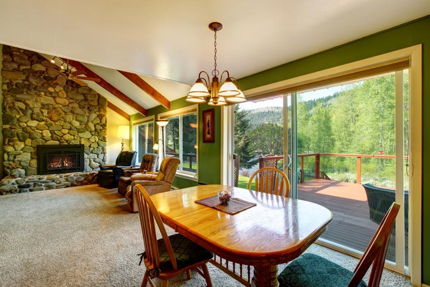
Strong greens: This color scheme comes in various warm red colors, greens, and wooden brown doors. This color scheme works well for rustic mountain lodges or establishments styled after the French countryside.
The hues of gray, black, rosy brown and dark green sea are all appropriate for designs resembling those from the old world.
Neutrals with red accents: Paint colors can do wonders for your space. Creative people know that altering a room’s color scheme can significantly alter how viewers feel about it. This color palette consists primarily of mild browns and sage greens, with a dash of Indian red here and there.
Ocean colors: Houses with accent walls made from salvaged barn wood, hardwood floors, and iron types of windows are frequently well-suited for creating a primitive atmosphere. However, if you are not careful, a space might look dull if the only colors used are browns and beige.
Incorporating chilly tones like grays and blues can quickly transform the unattractive into something appealing. You might utilize this color scheme in a painting or in a condo that faces the ocean that you have.
Weathered reds: Contrast is a component in some color schemes. However, the primitive red scheme uses reds alone. This color scheme has the colors Brick Red, Salmon, Sienna, and Dark Gray, and it has a strong country vibe.
This color combination is helpful if you want to build a posh restaurant or an intimate cabin, which are good candidates for your project.
Blues: You can bring a drab and neutral room to life using the color blue in the paint. While sticking to neutral tones is undoubtedly an elegant option, there are occasions when you want a splash of color.
What could be more beautiful than blue? You can brighten up a dreary room with as few as one or two cushions in blue or purple.
Earthy pastels: Not all colors that are considered primitive have a warm undertone; some of them also have a cool undertone.
You can play with an earthy pastel palette with Steel blue, grey, and tan colors. This palette can inspire you if you want to achieve an elegant look while maintaining a positive quality.
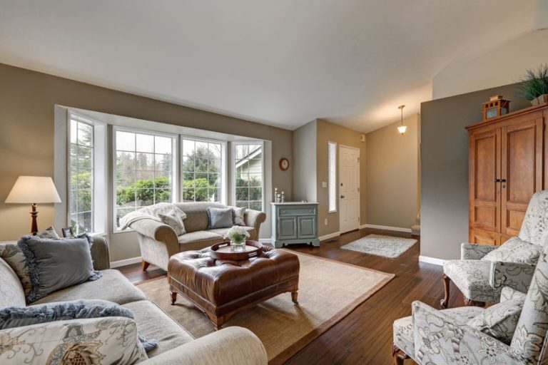
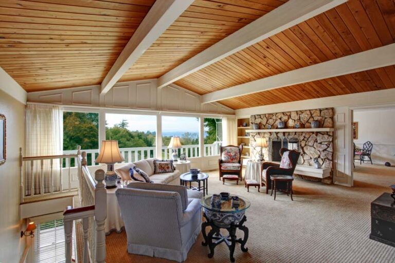
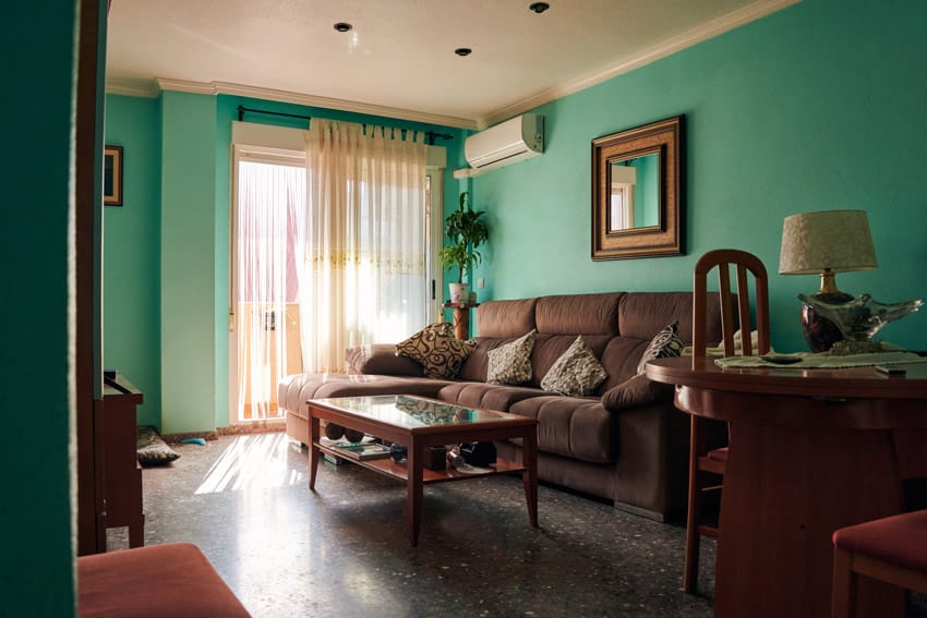
Primitive Colors For The Living Room
The key to successfully achieving this type of design is to create an atmosphere of casual elegance. It means having open floor plans, preserving natural architectural characteristics, and having enough natural light in modern homes.
It is essential to choose the appropriate color scheme to maintain an ancient and contemporary appearance. Keeping this in mind, let’s take a look at three color palettes that will work well in a living room decorated in a contemporary primitive manner.
Neutrals: You can create the ideal living space for a primitive design by using a neutral color scheme (think off-white, beige, light grey, or magnolia). It will provide a beautiful backdrop against which your essential pieces of rustic furniture may take center stage.
For instance, a comfortable brown leather sofa next to a weathered wood coffee table is an excellent piece of furniture to construct the foundation of your primitive aesthetic.
Even while a neutral color palette is an excellent choice for your walls and flooring, if you don’t add the right finishing touches, your space risks appearing sterile and lacking the rustic allure you aim to achieve.
You have the perfect opportunity to add a bit of warmth that will help bring the primitive style together through the additional touches that you can add by way of accessories. These touches can add on as extras in the form of accessories.
Muted tones, such as grey and dusky pinks, will ensure that you don’t go too far from your neutral palette but add some much-needed warmth. Think certain types of rugs, pillows with textures, and even artwork when thinking about muted tones.
Dark and Bold: There is something about having a living space on the smaller side that works really well with more dramatic and dark colors.
The use of salvaged wood furniture, in conjunction with colors like darker greens and deeper blues, helps to create an environment that is cozy and inviting and beckons you to unwind and take it easy.
When creating the ideal living environment with a primitively charming feel, the trick is to be understated and not to go overboard with the details; in this case, less is more.
Utilize a dash of color to create highlight walls or with accessories such as rugs, throws, and cushions, in addition to cozy lighting to produce a warm glow in a rustic setting at night.
Natural elements: The final color scheme we’ll discuss is one that we’ve found to be particularly effective in a living room decorated in a primitive style. It combines natural earth tones to complement the rough surfaces of rustic furniture.
A variety of browns, as well as muted tones like sage green, are some of the colors you should consider using in this area. These hues look fantastic paired with brown leather sofas and other standalone pieces of furniture, such as a wooden side table paired with a lamp.
They also present a beautiful contemporary contrast against natural exposed brickwork and wood paneling, which may either be left unfinished or painted to produce a style that is both modern and primitive at the same time.
Continue the natural motif throughout the space to create a unified primitive aesthetic with some strategically placed greenery; a plant or a stone vase of grasses would work exceptionally well for this purpose.
Primitive Benjamin Moore Paints

Benjamin Moore Shelburne Buff (HC-28): Shelburne Buff is a persuasive statement you can make with this buff tone with a hint of gold. This tone is ideal for those who are searching for the ideal gold color.
The gold is a muted shade, making it a popular neutral you can use with a wide variety of design aesthetics. This shade of paint is part of Benjamin Moore’s historic line, which consists of traditional, ageless tones that are versatile enough to be used almost everywhere in the home.

Benjamin Moore Rainy Afternoon (1575): Rainy Afternoon by Benjamin Moore is a color that is not quite gray or green. It has just the right amount of green to make it an outstanding match with natural gray stone, but it still has enough warmth to blend with natural woods.
Rainy Afternoon’s multifaceted color palette might create an unforgettable scene if used as an accent wall or front door.
Primitive Sherwin Williams Paints

Sherwin-Williams Rockwood Red (SW-2802): Because of their compatibility with warm and cool hues, deep and warm red colors form the foundation of many color palettes associated with primitive art.
Red has a commanding presence and may compete well with the most daring architectural details and natural components. This deep shade looks beautiful with concrete gray, copper, and gold.

Sherwin-Williams Latte (SW-6108): Latte by Sherwin-Williams is the epitome of a beautiful warm neutral beige that provides an instant sense of coziness in any space. The color suggests milk that has been frothed and added to your morning or evening coffee.
This shade is a smooth color that has orange and brownish undertones. It gives the impression of a thick creamy texture due to its smoothness and undertones.
It’s a daring color, so you need to be careful because it can make a space feel smaller if there isn’t enough natural light or the ceiling is too low. The walls of rooms that face south look more yellow and brown, whereas the walls of rooms that face north look darker and sharper.

Sherwin-Williams Antiquity (SW-6402): Antiquity by Sherwin-Williams is a modern hue that is part of the HGTV Home Rustic Refined color palette.
Antiquity is a rustic paint hue that, despite being less traditional than the majority of other rustic paint colors, may give your primitive furniture and accessories in the space a more modern vibe.
If you want your room to have the appearance of being pulled together, when you choose a color that is unexpected or quirky, be sure to select it carefully while taking into consideration the other colors in the room. Cream, brown, and soft white are some colors that combine very well with it. See more antique paint colors here.

Sherwin-Williams Warm Stone (SW-7032): Warm Stone by Sherwin-Williams is a warm brown color with a slight hint of gray. Any shade of greige, whether dark or light, pairs beautifully with natural stone.
Because most natural stones appear to have brown and gray woven into them naturally, a deep greige like Warm Stone can easily pick up those colors and mimic their appearance.
This darker tone does not make the room feel darker when paired with white and much natural light because it warms up the space instead.
Primitive Behr Paints

Behr Paints Hazelnut Cream (750C-2): There is no requirement that every color in your primitive palette is dark and intense. Your palette will have more room to breathe with the help of a light neutral paint like Behr’s Hazelnut Cream.
If you want your colors to look fantastic together, pale neutrals with a warm undertone are the way to go. The color Hazelnut Cream is a warm off-white that looks stunning when combined with wooden beams and rustic furnishings.

Behr Peruvian Violet (660F-6): Yes, even violet was a part of the original color palette for cave paintings. An ominous color like Behr’s Peruvian Violet may add a touch of sophistication to a rustic pallet when combined with dark wood tones and golds.
You can use smokey violet paint in a country-style room with romantic elements, such as a crystal chandelier, soft white slipcovers, or traditionally rough-hewn embellishments.

Behr Sequoia Dusk (700B-6): The name “Sequoia Dusk” for the paint color is remarkably evocative, conjuring images of a forest as the sun sets.
The tranquil atmosphere of a study, den, or family room warmed up with rich taupe with maroon undertones. This paint color goes particularly well with moldings made of dark wood, creamy white, or violet accents.
Primitive Glidden Paints

Glidden Spiced Cinnamon (PPG1071-7): Creating a cozy atmosphere in a space with much natural light from the windows or other illumination sources can take time and effort.
Going for a darker paint color on the walls of a room is one method to give the space more depth and make it feel opulent. Spiced Cinnamon by Glidden is a warm brown with a touch of red undertones. The contrast between the white trim and this color in the space is striking. This color is an excellent choice for residential properties with brick walls in the bedrooms, dining rooms, or the living room featuring a fireplace with brick.
See more related content in our article about Bohemian paint colors on this page.
To showcase highly specific designs, some images on this website use advanced AI-generation software to illustrate ideas and room inspiration. See our editorial policy to learn more.

Upload a photo and get instant before-and-after room designs.
No design experience needed — join 2.39 million+ happy users.
👉 Try the AI design tool now