Colors That Go with Turquoise (14 Beautiful Options)

Colors are a powerful element that not only make a room look good, but also are a great way to express one’s personality and preferences. The hues and tones you choose for your interiors can also influence the mood and atmosphere in the room. There are a myriad of colors to choose from, and one of the more uncommon hues you can explore for your next makeover or newly built project is turquoise. Incorporating this captivating color palette into your living space can transform the entire atmosphere. The turquoise hue is a versatile primary or secondary wall or accent color for various home decor products, setting the tone for a vibrant and inviting environment. [toc]
Turquoise Color Matching
This refreshing color is a blend of blue and green with a tinge of yellow, with the hex code #30D5C8. Turquoise is a name derived from the gemstone with the same hue and comes from the Old French word for Turkish stone.

The captivating sea-green hue falls between blue and green on the color wheel, and shades will depend on the amount of blue or green. With its calming effect and cool undertone, turquoise is a perfect shade for walls and other interior elements that cover a large visual area.
At the same time, when it has a higher color temperature can be an effective accent or focal point in a room. So, what colors look good on turquoise? When used as a primary shade in a room, it pairs well with the colors blue, gray, pink, yellow, gold, and copper, just to name a few.
Blues – Deep And Dark Blues
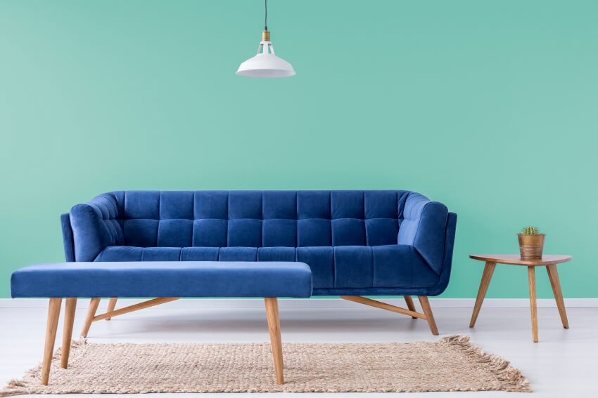
As blue and blue-green are analogous colors, being hues that are beside each other on the color wheel, the pairing will look aesthetically pleasing. This contrasts complementary colors that can make the dominant shade more intense. Turquoise and deep dark blues are great in color layering, creating a monotonous base for your interior and adding gold or other metallic accents.
Have a turquoise-colored wall, for instance, with dark blue furniture, or create depth and variation with a large room by combining different shades of blue with turquoise as the primary color.
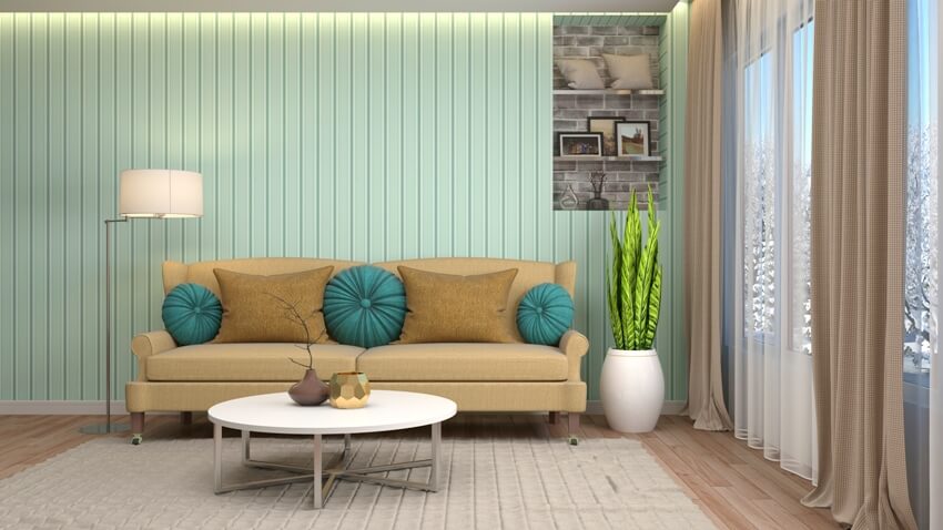
Brown – Brown Wood Shades And Textures
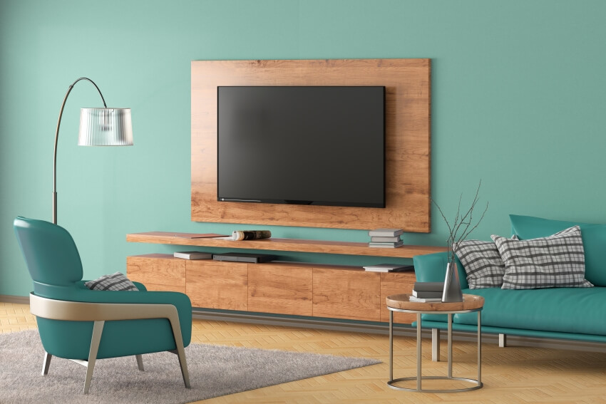
Derived from the natural color of the sea and sky, turquoise goes well with organic colors such as brown wood. The light to dark brown colors of wood beside a blue-green color does not overshadow nor compete with each other. Instead, create a harmonious combination. Set your turquoise as a backdrop and add wooden furniture or the other way around. Have a shiplap wall or more modern wood paneling to pair with your turquoise-colored furniture. Turquoise walls also work well with wooden floors, creating a relaxing surround for your more striking interior pieces.
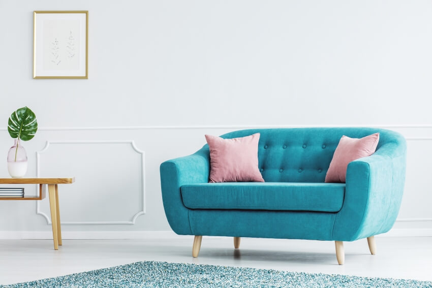
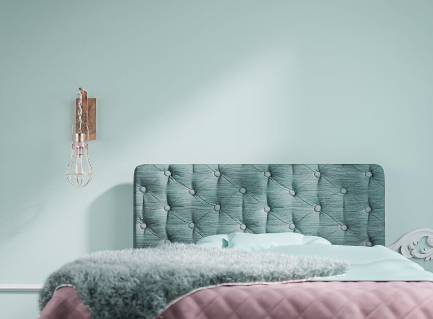
Pink – Light And Feminine Pinks
While associated with femininity, pink, especially warm pinks such as flamingo, coral, salmon, and peach, can be a fitting room color regardless of the gender of its users or owners. With the right color combination, it can facilitate creativity, calmness, and openness. Pink and turquoise go together very well due to their primary colors‘ red from pink and blue or green from turquoise but with muted versions. Primary colors, when placed together, are visually pleasing.

The right shot of pink can stand out from a backdrop of turquoise, making it a great accent or furniture color. The soothing light pinks such as lavender pink (#FBAED2) and Mimi pink (#FFDAE9) are perfect for a calming interior combined with white or other neutral hues.

Pinks with orange or red tinges give a level of contrast from a light turquoise color, such as brink pink (#fb607f), coral pink (#F88379), and flamingo pink #F9A7B0.


The shades of pink with turquoise are effective in flattering complexion and skin tone, making it a great addition to your interior. See more colors that go with pink here.
Gold – Warm Metals
As turquoise conveys a youthful and chic vibe, you can elevate a space to a more serious and sophisticated atmosphere by adding warm metals such as gold, for example, in the form of home decor. Paying attention to details like candles and other small accents can add to the beauty and style of the room.
Gold has a welcoming and luxurious air, add them as accents or even the main focal point in a room with turquoise as the primary color, and you’ve got a sophisticated yet modern interior. Consider incorporating gold in the bedroom for an extra touch of elegance.
If you want to uplevel your cottage home without a major renovation, paint your wood boards turquoise and throw in some gold hardware, decor, or light fixtures. Find what colors go with gold here.
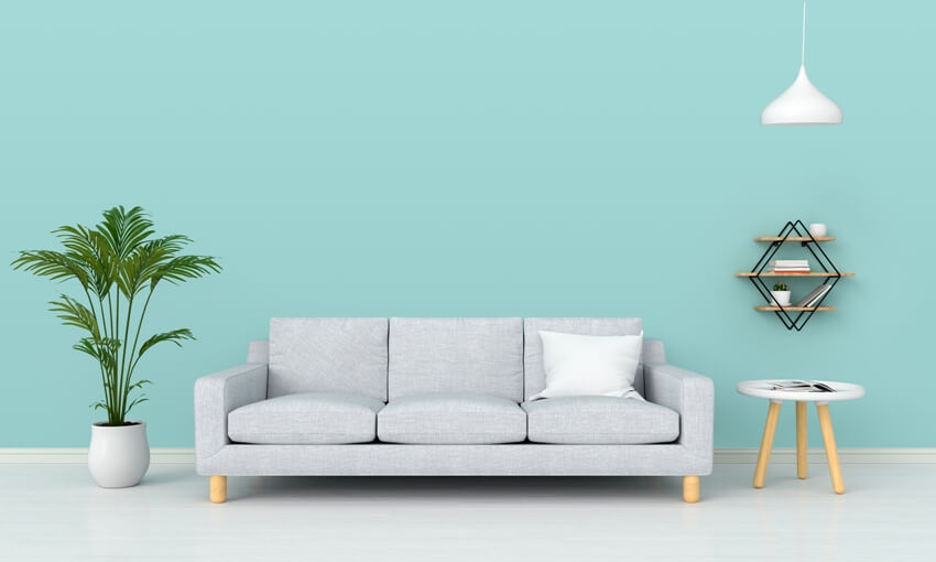
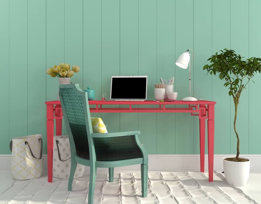
Neutrals – White, Black, And Gray Shades
Turquoise was a favorite color in the 50s, especially as pastel hues together with pink and pale yellow. If you’ve got architectural or interior elements that may look dated when coloring with turquoise, you may want to switch to combining the blue-green hue with neutrals.
White, black, and gray are neutral colors and can be combined with any other hue. White is a popular neutral color to match your turquoise as it allows it to move forward visually, allowing the background to function as it should be the backdrop.
With neutral colors, you’ve got more freedom to design your space, allowing you to make the turquoise shade the focal point of your interior. Neutral hues are also great for introducing textures or patterns without overwhelming the scene with your blue-green display.
You can also choose neutral colors such as white, black, and gray that have undertones with having either a warm or cool temperature. These variations give you more options to work on.
Neutrals are easier to mix and match with neon colors such as turquoise, and you can play around with the depth and scale of your interior.
Lemon Yellow – Zesty Colors
Happy colors such as yellow can truly make a statement and harmoniously go along with the cool and relaxed blue-green colors. A solid color of yellow makes allows you to appreciate the textures and convey a soft and welcoming vibe together with a turquoise wall.
The cool backdrop gives an airy and light feeling, while the warm yellow gives it a splash of bold and energized character.
You can work it in reverse with the yellow as a backdrop and have turquoise furniture that works well with playrooms or craft rooms as the colors are perfect for inspiring creativity and invigorating energy. Add black or white into the combination, and you’ve got a perfect color scheme that gives that bold industrial chic or urban contemporary feel.
Make sure, though, to remember your 60-40-10 rule when combining your bright hues to keep a well-balanced color layering. See more colors that go with yellow here.
Cream – Light Yellows
Light yellow, like the wood shades, look well with the blue-green tinge as it provides a certain push and pulls between the colors. You can make your cream colors stand out with a darker tone with your turquoise color.
This way, you add depth with your turquoise, as cream or light yellow is a subdued hue that is too bright or looks pale against a neutral background.
Cream colors with a high percentage of white can almost pass as a neutral hue, making it a perfect wall color with your turquoise color as the focal point.
Red – Bold Colors
Red is an eye-catching hue that is seldom used as the primary color in home interiors unless used in home theaters or sometimes bedrooms. Consider how red might enhance or detract from your desired decor when planning your space.
Red looks great with a backdrop of turquoise, allowing the bold and bright hue to visually come forward and pop. This makes it a great option for decor or statement pieces such as a freestanding sculpture or even as an accent color in touch-sensitive areas like curtains, lending a sense of depth to the space.
Though you can still work with red as wall colors in combination with turquoise, especially when aiming to create a cozy space. Red and turquoise colors work well in updating a mid-century or eclectic-themed room. Including elements like curtains in a complementary shade can add an extra touch of sophistication.
This is also a great opportunity to have patterned tiles or Turkish rugs with the same hue combination as inspiration or base shades for choosing the rest of your color scheme for your room.
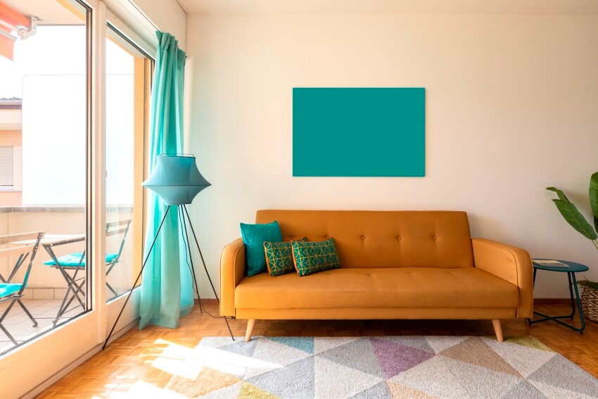
Orange Rust – Tangerine Hues
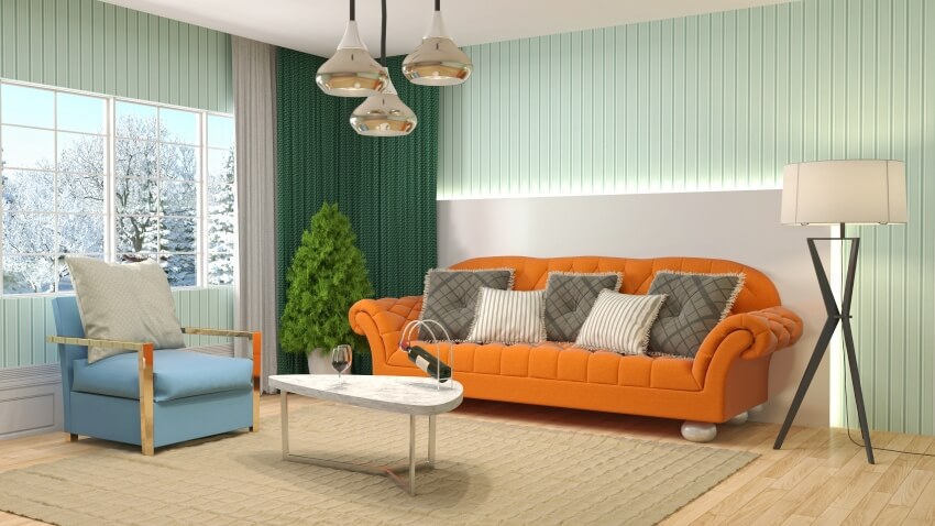
When you’re looking for the highest contrasting effect with turquoise, orange is the best choice as they are complementary colors. The contrasting colors directly sit opposite each other on the color wheel.
As the term implies, the colors complement each other as orange is a warm tone and blue-green has a cool temperature. Using these two colors together in a room creates balance and a visually pleasing interior.
Other color tinges that work well with turquoise are apricot, marigold, salmon, orange-red, and light salmon. See more colors that go with orange on this page.
Lavender – Violets
With the right amount of colors combining lavender and turquoise with an accent or primary color can give you an unusual but creative interior color scheme. Curtains in a complementary shade can further enhance the atmosphere.
Lavender is a pastel color and a hue associated with a wide range of pale violet tones such as purple, periwinkle, and mauve. The hex code of lavender is #E6E6FA. You’ll find that purple, the base color of lavender, is a meeting point between a cool hue (blue) and a warm hue (red).
The color temperature of lavender tends toward a cooler hue due to its green and blue dominating the mixture. However, you’ll find versions of lavender paint with warmer undertones.

The combination of lavender and turquoise is quite an unusual color scheme for rooms but works well with the right amount of accent or primary colors added that are typically neutral tones.
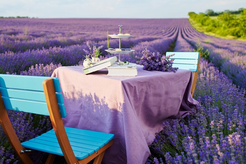
The lavender and turquoise convey an enchanting, mysterious, and calming air into a room. If you perceive the uncommon combination as overwhelming, they can be used as decor combinations such as turquoise and lavender patterned pillows or rugs against a white couch.
Or, if you want to go bold, the combo can be on a whiplash patterned wallpaper to give life to a bathroom space. Lavender and turquoise furniture against a white or cream backdrop also work well, creating a delicate and sophisticated look as well.
Adding to the versatility, secondary color options such as navy, silver, and aqua can enhance the jewel-like quality of turquoise, creating a dynamic visual experience in a space.
For more related content, visit our colors that go with teal design guide.
To showcase highly specific designs, some images on this website use advanced AI-generation software to illustrate ideas and room inspiration. See our editorial policy to learn more.

Upload a photo and get instant before-and-after room designs.
No design experience needed — join 2.39 million+ happy users.
👉 Try the AI design tool now