Open Floor Plan Paint Colors (Matching & Ideas)
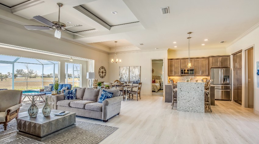
The open floor plan has become a trend today because of how it maximizes space by merging common spaces, from kitchens to living rooms and dining rooms. In minimizing the separation of these spaces, you get a whole large space from all these combined areas. When you choose an open floor plan, you get a bigger-looking space that you have the freedom to style however way you want. You can even creatively create borders through pieces of furniture and other decorative elements.
Designing open floor plans can be tiresome and confusing. You will wonder if you should treat the large space as one whole unit or if should you consider the areas individual from each other even if they share the same space. This is the main reason why working on an open floor plan can be exhausting because starting in itself can be scary. More than just furniture and decor, color is another important factor to look into. The problem with an open floor plan is that the size of the space can be overwhelming and cause a conundrum in your project.

Upload a photo and get instant before-and-after room designs.
No design experience needed — join 2.39 million+ happy users.
👉 Try the AI design tool now
How to Choose Open Floor Plan Paint Colors
To help you with this task here are simple tips you can look into when considering paint colors for an open plan room design:
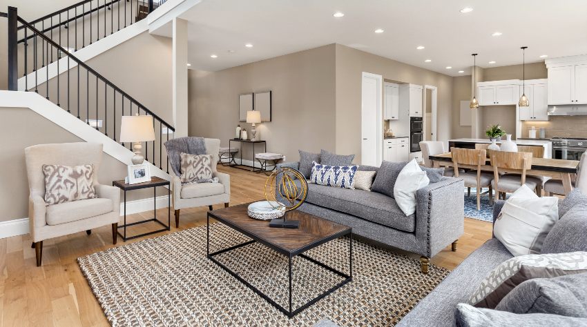
• Be consistent – When designing an open floor plan, there needs to be a feeling of consistency running in the entire space even if it consists of different areas with elements separating them from each other. One way you can make this possible is by choosing a color palette that runs through the entire space.
• Be creative in your selection – If you want to make it an easy task, you can just pick one color and be done with it. But if you want something different, you can use colors to separate one area from another. You can use different colors or just different shades of the same color.
• Use different paint colors – It can sometimes be frightening to be bold in your color choice but you have the option to explore different colors and actually come up with the perfect color scheme for your home.
The different colors will create texture and visually appealing aesthetics, as well as a multidimensional feel to it. You can use a paint color app to help visualize how it looks before using it on your walls.
• Make use of the room’s architectural features – Make sure to not just consider other paint colors used but also the colors that come with other elements in the room. Take into account the colors of the windows, beams, and even the shelves.
• Add other elements, like carpets, to the mix – Lastly, consider other elements in the room to be used as a weapon in styling the space. You can match the carpet, vases, and other decors to the color palette of the walls.
• Select the right paint finish for the area being painted – Depending on whether you’re painting the walls, ceiling or high traffic areas you will want to consider a different paint finish. Read more about choosing the correct living room paint finish on this page.
Paint Hues for Free-Flow Floor Layouts
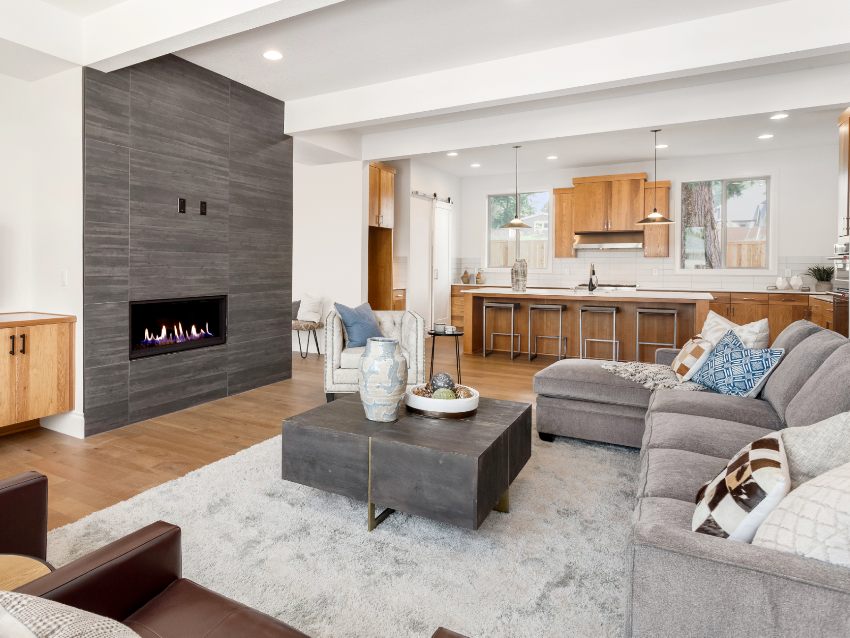
One of the ideal ways to easily style your open floor plan is by sticking to what’s simple and this means going for a single paint color to make sure that the space has a cohesive look despite having many areas united in one space. This is the easy option to go for, especially if you’re in doubt about the patterns and color palette to consider.
The colors you can use in your open floor plan can dictate the ambiance that will dominate all the areas included in that large space, whether it’s the kitchen, living room, or dining area.
This is the reason why it’s very important to really think about the color you will choose for it. But if you are having a hard time deciding, here are possible paint colors you can explore.
White Wall Paints
Chalky eggshell white offers a classic look with a popularity that never really goes away. While they can look aged and rustic, they also offer maturity and gravitas and can absorb light and actually make your room look smaller and cozier. Some paint colors to check out are the following:


Floral Paint Shades
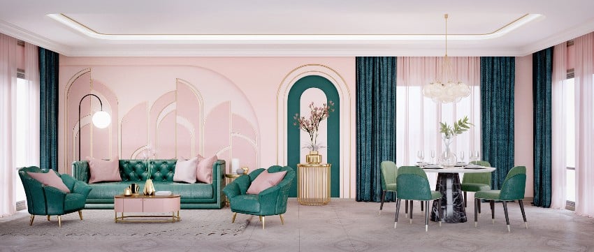
Floral colors like pink feature springtime energy that offers a refreshing vibe that makes your feel optimistic. If you want some inspiration to be thrown in the mix, choose among the different shades of flower colors you can apply to your home.
You can use them as background or a bold accent it that’s what you prefer and some of the options you have are the following:


Blue Green Color Palette
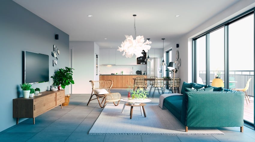
For homeowners who are craving something calming but want to choose more than just neutral colors, blue-green is a color worth considering. More than just optimistic and bold, this color provides you with a vision of the sea on a sunny day. See our guide to colors that go with aqua for more ideas.
Staying in a room with this color will make you feel like you’re on a vacation. Here are some blue-green paint colors you can look into:


Best Neutral Paint Color for Open Space Design
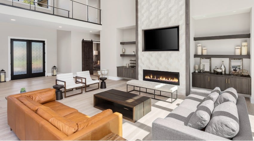
Neutral colors are soft hues that have the ability to blend well with their surroundings. They can be the incredible background for whatever colors, designs, and patterns you have in mind. This means that if you’re thinking about the safest choice for paint colors, going for the neutrals is only to be expected, especially with an open floor plan with a lot at stake.
An open floor plan doesn’t have clear cut-off points, which is pretty similar to neutral colors. It is important to make sure that the colors flow from one area to another, unifying all areas without them clashing with each other. For the best neutral colors, you can take into account gray and sandy shades.
Gray Color Varieties
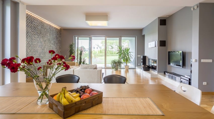
Gray is a neutral color that matches well with wood and brown tones. The hue has a blue undertone that qualifies it as a cool color. Despite the color’s flexibility though, make sure that you know which type of gray to consider especially since some may fall flat.
There are many calming and cooling gray shades you can go for, including the following paint colors.


If you have wood flooring throughout your space there are certain considerations to make. Read more about pairing paint colors with wood floors on this page.
Sandy Painted Color Groups
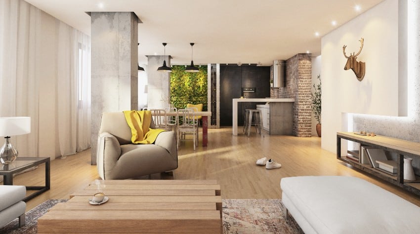
When talking about sandy paint colors, beige will always come to mind. Beige is particularly popular and trendy today, and can easily make you feel warm, mellow, and homey. Check out colors that go with beige design guide here. The great thing about beige is the right balance between yellow and pink. This means that if you choose this color, you avoid having an outdated and aged space in your home.
Sandy colors have the brilliance and warmth of the desert landscape but offer a little bit of coolness from the bright blue sky above it. These colors are very relaxing and pleasing to the eyes at the same time. If you’re looking for the perfect sandy neutral color to use for your open floor plan space, here are some great recommendations.





Color Shades for Unpartitioned Kitchen and Living Room Interiors
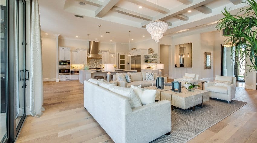
The open floor plan concept is ideal for the kitchen and the living room since both are common areas in the first place. If you are placing these two areas side by side, you need to choose the right color that can unify both areas. Your color choice for the walls and the ceiling will be important to make a large space look cozier but not smaller and more limited. Here are some paint color options to look into.
Pale Color Families for Airy Floor Plans
Pale colors, particularly pink and blush tones, are soft and refreshing to look at. Leaning towards the color peach, they offer a warm undertone similar to that of a golden tone of the sunlight. Soft peach makes a stunning background for other bolder and darker colors.
These pale colors are ideally matched with green so you may want to install indoor plants in the space to maximize the look and aesthetics the color offers. Some of the pale paint colors you can consider are the following:


Wine Hue Family
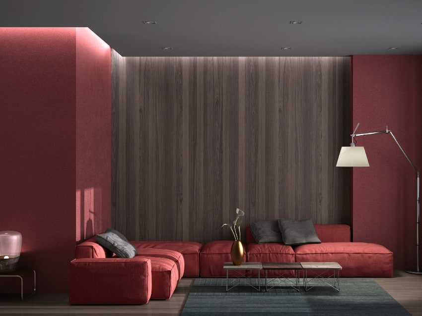
Wine is an elegant red color that will remind you how it feels to enjoy a glass of red wine during your break time. Wine paint colors can range from deep red to dark purple like plum. These colors offer both warmth and a welcoming feel to them.
When considering wine paint colors, it can be difficult to pinpoint which exactly can work well for your open floor plan. To make it a lot easier for you, here are some paint color options you can explore and take into account.


Forest Colors
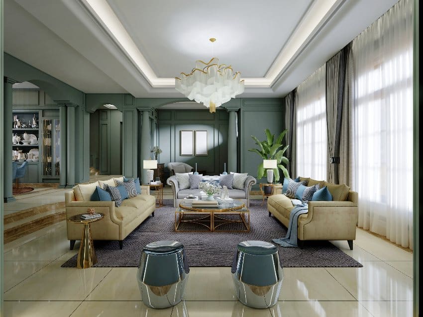
Similar to neutral colors, forest colors offer a safe option you can consider for your open floor plan. This goes whether you are using a single color or you are building a color palette as a combination of these different colors. Some of the forest colors you can consider to create a misty forest shade are the following:
• Muddied greens
• Grayed-out blues
• Deep brown shade
• Hushed sky tones
• Light blues with gray undertones
• Stained or natural wood tones
Copying the color of nature can be difficult but with the right paint colors and the perfect combination, you can make this possible. Here are some colors and their respective paints you can consider for this forest color palette.


Mineral Inspired Colors
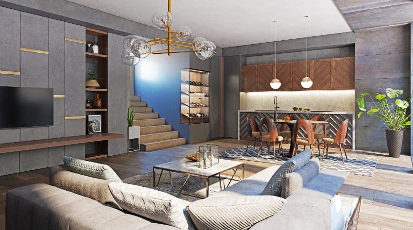
Mineral tones are deep and rich colors that can easily and instantly add drama to a space. Imagine iron and graphite and what these minerals offer in terms of look and appearance. More than just drama though, they can also naturally darken space with light to naturally offset the walls.
With this choice though, make sure that your decor and furniture appear brighter and stand out better. Here are some of the mineral paint colors you can explore and take into account.


An open floor plan usually comes with enough space to look bright so a little darkness from the mineral colors won’t be a bad thing. If you feel like you want one area darker or brighter than the other. You can just use light fixtures to help you create the right ambiance, including task lighting, accent lighting, floor lamps, and ceiling lights.
Color Schemes for Open Concept Layout Plans
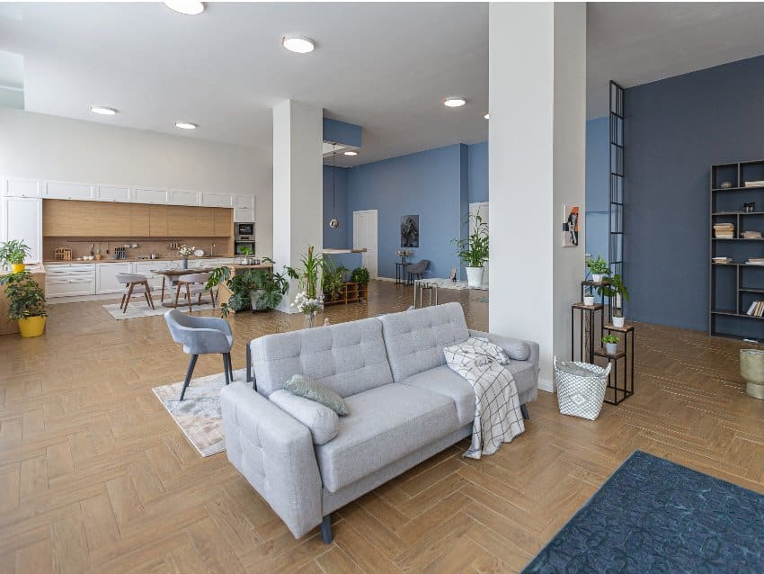
In choosing the colors you can apply to your open floor plan, you will also be able to create color schemes in the process. Here are some worth taking a second look at.
• Monochromatic Color Scheme – Going from one color to another can be a very bold choice so choosing only one is the easiest approach you can do. With a large space like an open floor plan though, it can get dull.
One thing you can do is choose a base color and create variety by using that same color in different shades. With a monochromatic color scheme, you get to have texture and layers even just by using a single color.
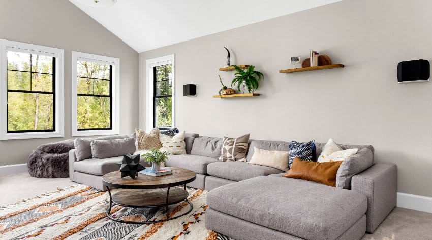
• Light and Cool Color Scheme – An open floor plan especially with a lot of windows is naturally bright but if you want it to be more refreshing, going for light and cool colors can be a good option to consider.
Many open floor plans are integrated into small and limited spaces like tiny apartments and rooms. Airy and light colors like white and light gray can create the illusion of the space feeling bigger than it is.
• Warm Color Scheme – If you feel like you have too much space and brightness in your open floor plan, a warm color palette can balance it and create a cozy atmosphere. You can combine warm colors like red, orange, yellow, purple, and brown to mimic the cozy and intimate feeling you want to have when using the said space.
• Earthy Color Scheme – Combining neutral colors from sandy shades to green shades can build an earthy color scheme that will take you back to nature. You can combine taupe and yellow with green and blue to get the full effect of this cool and refreshing color scheme.
Visit our gallery of open concept living rooms for more open floor plan paint colors and design ideas.



Hi Marisa? I read your article and found it very helpful. I am in the process of painting my house, open plan, and undecided about the paint color selection. Could you please help me with this?
Thanks Bire Washington, DC