20 Paint Colors for Rooms With Lots Of Natural Light
When choosing paint colors for rooms with lots of natural light, it’s important to consider how lighting affects the walls and the best shades to use to avoid glare and an unpleasant environment. Having rooms with lots of natural light is both a blessing and a challenge. It’s difficult to pick out a room color, as the wrong paint color might end up looking washed out or just downright unremarkable. This is especially true during the mid-afternoon when the sun is usually the brightest and the harshest. The good thing is that you have a lot of paint color options for rooms that happen to get a lot of natural light.
The best part of all of this is that they can come in a wide range of colors. You will find that there are light, dark, or even medium-depth colors that can work extremely well with some of the rooms in your house that happen to get the most amount of natural light. Although it is worth noting that for designers, the main favorites are the medium to dark tones, medium colors strike a good balance with intense light while dark colors can kind of offset the warm rays of the sun. With so many options, it can be overwhelming, so we’ve listed down some of the best color pairings for rooms that get a lot of natural light. [toc]
How Direct Sunlight Affects the Colors of Paints
Natural light plays a pivotal role when it comes to how paint colors are perceived at home. One basic rule to pay attention to is how the specific space in the home is positioned. Natural light hits differently and has varying effects depending on where it’s facing.
North facing rooms will mean that the space will get soft light. This results in a warm effect on the paint colors in that space. This means that if you opt for darker paint colors, they will end up looking even darker in the low light while opting for lighter colored paints can intensify the colors a little bit more.
South facing rooms will mean that the space will get a much more intense kind of lighting. If the room is painted with dark colors, they will appear a lot brighter when natural light hits them. Light colors, on the other hand, especially white; can end up looking extremely washed out in this kind of natural light exposure.
East-facing rooms receive varying types of natural light. In the evenings, it tends to get warm light. In the mornings, it tends to get a lot of shadows.
West-facing rooms, on the other hand, are a little different. The natural light can intensely brighten up the room’s paint color and then taper off to a much cooler effect during the evenings.
Due to the positioning of rooms alone, there really are a lot of things to consider. It can even be tricky because natural light changes all throughout the day. Other considerations are the design of the room itself, the amount of windows and it there’s high ceilings.
Luckily, you can rely on the help of artificial types of lighting fixtures to help control how the colors in your rooms look at any time of the day, regardless of the natural lighting. Of course, it would be best to start off with the fundamentals: working with the paint colors for rooms with lots of natural light
White Paint Colors for Rooms with Lots of Light
Here, we share the best white paint colors for rooms with lots of natural light.

Benjamin Moore Swiss Coffee (OC-45): This is a go-to white color for interior design and is actually regarded as a “chameleon white”. This is because this can work well with cool or warm colors paired with it, and it looks great in any type of natural light at any time of the day.

Farrow & Ball Strong White (2001): If you want to go for the type of white that sort of mimics the look and feel of clean plaster, this is the color to go for. It’s a clean type of white but isn’t a blinding kind of white because it has a touch of gray.
It’s the kind of white that isn’t harsh nor overwhelming and is the perfect background color for walls that tend to get a lot of sunlight exposure during the day.

Benjamin Moore Acadia White (OC-38): This white paint is unique in such a way wherein it offers a warm shade without having the undertones of pink or yellow.
It’s deep enough to absorb glare but also neutral enough to work with a wide range of different colors that you might want to pair along with it. If you want a traditional type of white that isn’t too harsh or stark, this is the white paint for you.

Paper and Paints Not Totally White: This is a white paint color that can transition a room easily from warm to cool, depending on the amount of natural light that hits it.
This means that it’s perfect for literally any room in the home. It can make a room warm or bright depending on the light exposure which guarantees that you will always have the right kind of white you will need every single time.

Sherwin Williams Extra White (SW 7006): If what you are looking for is something that is light, bright, and just overall a clean type of white; then this is the paint color to beat. This is best for the spaces in the home that require some liveliness such as the living room and the kitchen. You can count on it to make the most use of the natural light that actually filters in through the windows. It offers a very crisp type of white that’s hard to ignore.
Best Paints for Natural Daylight Use
Here, we share the best paint colors for rooms with a lot of natural light in them.
Blue Paint Types for Rooms with Abundant Natural Lighting
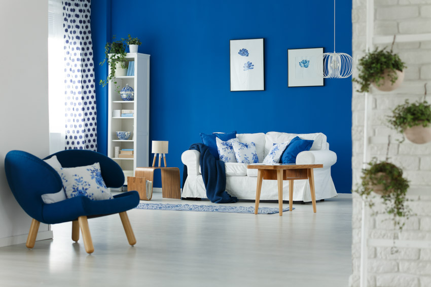
Blue is one of the most versatile colors that you will ever come across in your interior decoration projects. This is because of the fact that the color actually works well and syncs well with different types of rooms in the home, including those that tend to get a lot of natural light. It’s highly flexible in a way wherein it actually changes with the lighting all throughout the day.
What you can always count on is that blue is a color that will look great at any time of the day and regardless of the amount of natural light it’s exposed to.
This makes the color a really obvious choice if you happen to want to come up with a no-fuss solution to the problem of figuring out what to paint your spaces that get a lot of natural light exposure at home. You are guaranteed that it will always look great no matter what.
Here are some of the best blue paints to opt for:

Farrow & Ball Borrowed Light (235): This paint color is a soft wash of the color blue that has a dreamy effect to it. The color is delicate and slightly luminescent, making it the perfect paint color to opt for in nurseries, kids’ rooms, or similarly delicate areas in the home.

Benjamin Moore Breath of Fresh Air (806): As the name suggests, this paint color is really like taking in a lungful of air. It’s a pastel type of blue that’s airy and breezy, extremely relaxing, and unassuming. This is a great blue color to have in the room in place of opting for a white paint color.

The Spruce Breezy Beach (SPR-12): If you want the type of blue that reminds you of summer skies and the clear blue sea, then this paint color will hit the nail right on the head. It looks and feels cheerful and fresh, and can be the perfect blue hue to have in the areas in the home that you’d like to keep lively, such as the kitchen, the bathroom, or the kids’ rooms. This works well for a calm, distraction-free office backdrop.

Dunn-Edwards Worn Denim (DEW378): This paint color is reminiscent of the color of classic vintage jeans. It looks comfortable and “worn in”, as its name implies. If you want to go for something lowkey and unassuming, this paint color lives up to the requirement.
It’s a creamy blue shade that can be perfect when paired with neutrals such as white but it will also work perfectly if you’d like to pair it with darker trims such as black.

Sherwin-Williams Glimmer (SW 6476): This paint color is an ice blue hue that looks like it’s barely there. It’s so subtle and is just more of a whisper of blue that it can easily veer into the white color spectrum, depending on how the light hits it.
If you want a color that kind of hovers in the background instead of something loud and requires to be noticed, then this is the perfect paint color for you. This works well for walls or even certain types of furniture styles, as it will allow the rest of your design elements in the room to really stand out.
Gray Paint Brands to Use for Naturally Bright Rooms
Gray is a great color to work in rooms that tend to get a lot of natural light because it can hold itself and stand on its own. This is an important trait to look for in a color, especially if you have a lot of natural light shining on it.
White is a classic color to pair with gray, not only because they pair well together but also because they look great when exposed to bright sunshine. Here are some of the best warm gray paints on the market:

Benjamin Moore Balboa Mist (OC-27): This color isn’t technically categorized as warm gray but more off-white. However, with the right amount of natural light, it can be highlighted as warm gray with a touch of beige and offers a serene and almost dreamy feel to the room once it’s been painted with it.
If you want to create a space that’s tranquil or peaceful, this is the perfect gray for it. It’s also great when paired with other décor accessories or even artwork hung on the walls.

Benjamin Moore Classic Gray (OC-23): You can’t really go wrong with a classic cream. It’s one of the top-rated neutrals by designers. This paint color is unique because it’s a chameleon.
It can look cool gray with harsh light and can look warm gray with softer and warmer light. If you want something neutral that’s soothing and isn’t visually arresting, then this is the color for you to go for.

Behr Silver Drop (790C-2): This is another warm gray color that can be a chameleon as well. It easily transitions from cool to warm to cool again, depending on the time of the day.
If you would like to go for something that is dynamic and “moves” along with the room, then this is a great paint brand option for you to consider.

Behr Dolphin Fin (790C-3): This paint color is more of a true gray core. However, what’s so great about it is that it still has warm undertones, making it usable for literally any space in your home. This is particularly recommended if the space that you’re painting is South-facing and is getting a lot of natural light.

Benjamin Moore Gray Owl (2137-60): This is one of the most popular warm gray colors out there. It has been a top seller Benjamin Moore paint color for the longest time running, and with good reason. It’s versatile and is light warm and can work with literally most types of room in a house as well.
Green Paint Shades for Sun-Washed Rooms
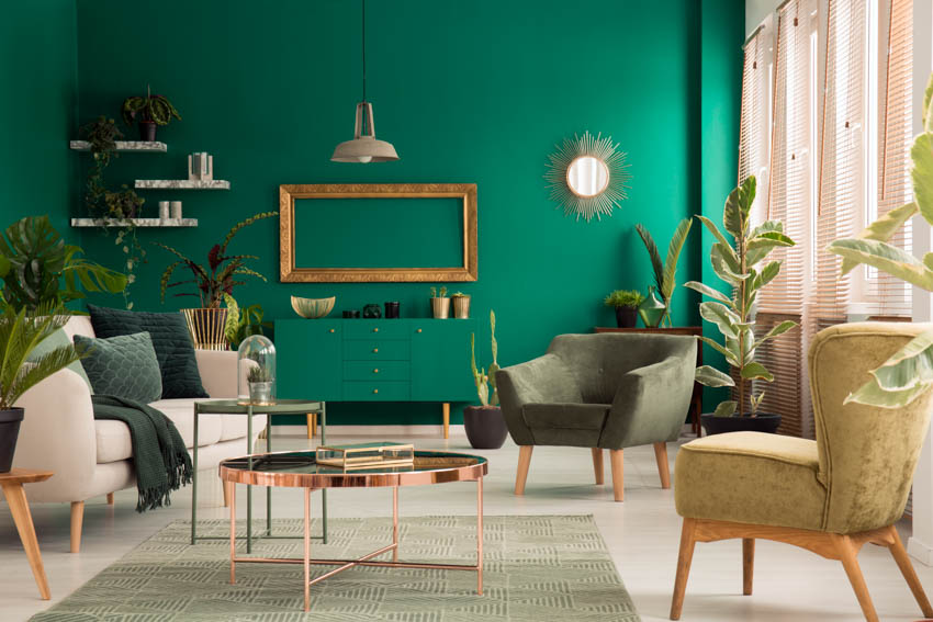
Green walls might initially sound like a bit of a shock to the system, but they really can work. Green can give your walls personality as well as inject a sense of life into them. They can be playful or vintage, depending on the kind of green hue that you opt for at the end of the day.
Green is also a color that doesn’t tend to fade or appear washed out so you can count on it to stand the test of time. Here are the top green paint colors that work well with natural light:

Benjamin Moore October Mist (CC-550): This green shade has a light to medium intensity, but what makes it interesting is that it also has a touch of gray and yellow in the mix.
It’s not too warm nor too cool, not too bold nor understated. It’s just right. That’s why it’s been nicknamed a “Goldilocks” color, referencing the third bear’s porridge, which happened to be “just the right temperature”.

Sherwin-Williams Evergreen Fog (SW 9130): This is one of the most popular green shades this 2022. This color is a somewhat neutral and soft green. It has intensity and depth and is akin to olive green but with more character. Darker tones work well when you have a room with a high ceiling with an abundance of light.

PPG Olive Sprig (1125-4): This color is extremely trendy. It offers a somewhat organic green that makes it versatile and easy to work with for multiple spaces in the home. It also has yellow undertones, which makes it perfect to pair with other warm colors such as rusts, yellows, and burgundies.

Behr Breezeway (MQ3-21): This is a lighter take on the green shade. It’s fondly nostalgic of the light green sea glass you see by the shore. It’s brighter and cleaner and looks stunning when exposed to a lot of natural light. Pair it with coastal-style home decor, throw pillows, candles, and other matching accents with excellent results.

Dutch Boy Cypress Garden (424-4DB): This paint shade offers a “clean” type of green. It has minimal gray and yellow undertones and is more saturated in its greenness. This doesn’t work well as a neutral but may be better off as a stronger color for an accent wall.
Do you have a favorite paint color and finish for a room with a lot of bright light? Please share your ideas, tips, and questions in the comment section. See more related content in our article about the best living room paint colors on this page.
To showcase highly specific designs, some images on this website use advanced AI-generation software to illustrate ideas and room inspiration. See our editorial policy to learn more.

Upload a photo and get instant before-and-after room designs.
No design experience needed — join 2.39 million+ happy users.
👉 Try the AI design tool now