39 Charming Rustic Living Room Paint Colors
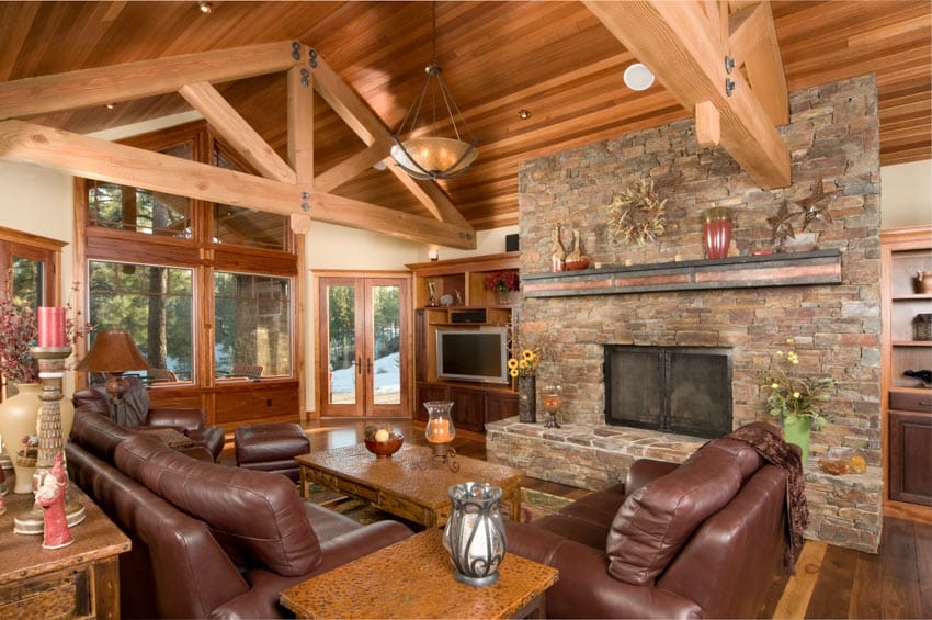
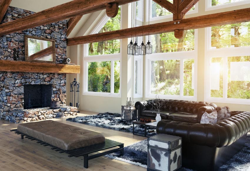
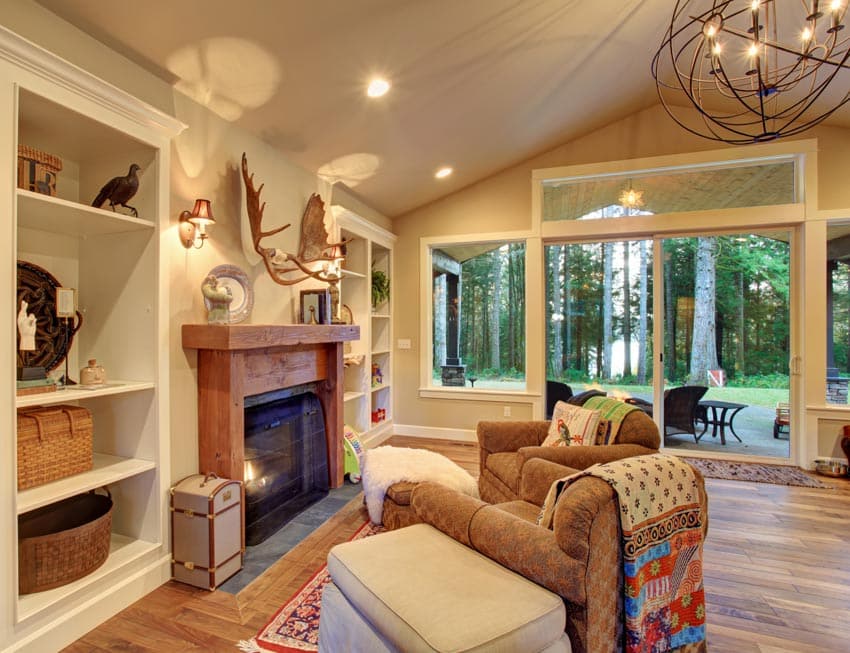
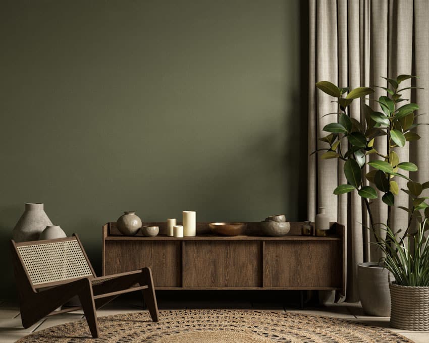
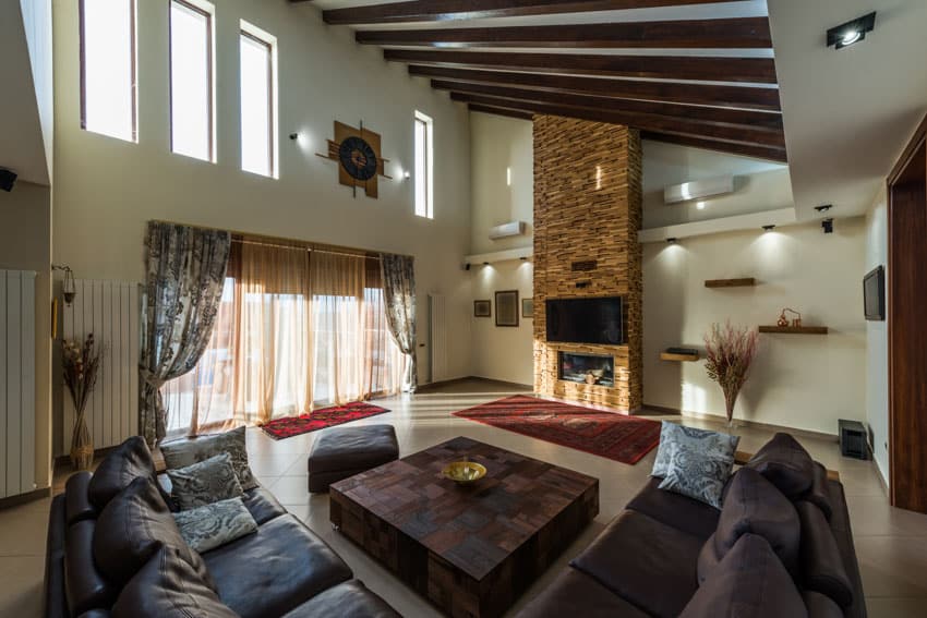
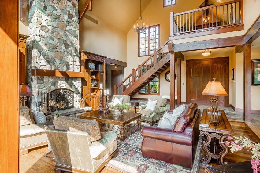
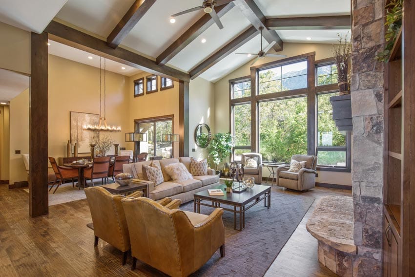
Rustic living room paint colors lean primarily toward neutral, and the most frequently used colors are earthy tones with deep undertones such as green, brown, and gray. The room’s atmosphere is cozy, unwinding, and inviting, thanks to the combination of the appropriate elements. The rustic design aesthetic is uncomplicated yet refined, with a refined appearance that is not overworked, stuffy, or stark. Using natural materials and shades found in nature are two of the most defining characteristics of rustic decorating.
Frequently, the furniture and architectural details have an unfinished appearance and give the impression that they bring in from the outside with only minor alterations. Rustic counts as “not urban,” hence styles considered to be rustic include a country farmhouse, a ski lodge in the mountains, a Tuscan villa, and the French countryside. Deep and earthy tones characterize rustic color palettes.
Best Paint Colors For Rustic Living Room
The following are some suggestions for the most suitable colors for rustic style rooms. Some added tips are for when you’re prepping for repainting:
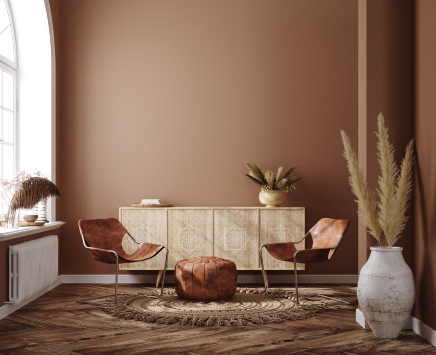
Modern Rustic Colors

Sherwin-Williams Rockwood Red (SW 802): As a result of their ability to work well with warm and cool tones, colors of a rich, warm red hue are frequently the foundation of rustic theme color palettes.
Sherwin-Williams Rockwood is the color name. Red has a commanding presence and can compete effectively with the most daring architectural details and natural components. This deep shade looks beautiful with concrete gray, copper, and gold.

Benjamin Moore Shelburne Buff (HC 28): Shelburne Buff is a compelling statement you can make with this buff tone with a hint of gold. This tone is ideal for those who are searching for the ideal gold.
The gold has been muted, making it a popular neutral that you can use with various design aesthetics. This shade of paint is part of Benjamin Moore’s historical collection, which consists of traditional, ageless tones that are versatile enough to be used almost anywhere in the home.

Sherwin-Williams Warm Stone (SW 7032): Warm Stone by Sherwin-Williams is a warm brown color with a very slight trace of gray in it. Any shade of greige paint colors, whether dark or light, pairs beautifully with natural stone.
Because most natural stones appear to have brown and gray woven into them naturally, a deep greige like Warm Stone can easily pick up those hues and mimic their appearance. This darker tone does not make the room feel darker when paired with white and much natural light because it warms up the space instead.

Behr Paints Hazelnut Cream (75C-2): No rule says every color in your rustic palette has to be dark and intense. Your palette will have more space to breathe with the help of a light neutral paint like Behr’s Hazelnut Cream.
If you want your colors to look fabulous, pale neutrals with a warm undertone are the way to go. The color Hazelnut Cream is a warm off-white that looks stunning when paired with wooden beams and rustic furnishings.

Benjamin Moore Rainy Afternoon (1575): Rainy Afternoon by Benjamin Moore is a color that is not quite gray or green. It has just the right amount of green to make it an excellent match with natural gray stone, but it also has enough warmth to work with natural woods. Rainy Afternoon’s multifaceted color palette could create an unforgettable scene if used as an accent wall or front door.

Sherwin-Williams Antiquity (SW 6402): Antiquity by Sherwin-Williams is a modern hue part of the HGTV Home Rustic Refined color palette.
Antiquity is a paint hue that, despite being less traditional than the majority of colors used for rustic decor, may give a traditional room a more modern feel.
If you want your space to have the appearance of being brought together, when you choose a hue that is unexpected or quirky, make sure to select it carefully while taking into consideration the other colors in the space. Cream, brown, and soft white are some colors that combine very well with it.

Behr Peruvian Violet (660F-6): The rustic color palette does include violet as one of the options. An ominous color like Behr’s Peruvian Violet may provide a touch of sophistication to a rustic color scheme when combined with rich wood tones and golden hues.
A smokey violet paint color is best in a country-style living area with romantic elements, such as a crystal chandelier, soft white slipcovers, or traditionally rough-hewn embellishments.

Behr Sequoia Dusk (700B-6): The name “Sequoia Dusk” for the paint color “Behr Sequoia” is remarkably evocative, conjuring images of a forest as the sun sets.
This warm, rich taupe color enhances the tranquil atmosphere of a study, den, or family room with maroon undertones. This paint color goes particularly well with moldings made of dark wood, creamy white, or violet accents.

Glidden PPG Spiced Cinnamon: Creating a cozy atmosphere in a space with much natural light from the windows or other illumination sources can take time and effort.
Going for a darker paint color on the walls is one method to give the space more depth and make it feel richer at the end of the day.
Spiced Cinnamon by Glidden is a warm brown with a touch of red undertones. The contrast between the white trim and this color in the space is striking.
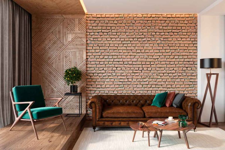
This color is an excellent choice for residential properties with brick walls in the bedrooms or dining rooms, or the living room features a fireplace framed with brick.

Sherwin-Williams Latte (SW 6108): Latte by Sherwin-Williams is the epitome of a perfect warm neutral beige that provides an instant sense of coziness in any space.
The color is reminiscent of milk that has been frothed and added to your morning or evening coffee. This shade is a smooth color that has orange and brownish undertones.
It gives the impression of a thick creamy texture due to its smoothness and undertones. It’s a daring color, so carefully tread because it can make a space feel smaller if there isn’t enough natural light or the ceiling is too low. The walls of rooms that face south look more yellow and beige, whereas the walls that face north look darker and crisper.
Warm Living Room Color Schemes
The most effective technique to create an atmosphere of warmth and coziness in your house is to use colors on the warmer side of the color wheel. You can accomplish this by stacking textures that are neutral in tone or by adding splashes of colors that are bright and lively, such as reds, oranges, and yellows.
Color is one of the most crucial elements to consider when redesigning your house’s ambiance since it helps define the space, creates dimension and contrast, and contributes to the communication of style.
Warm colors may not usually go well with traditional designs; however, creating a chic contemporary room with warm shades rather than cool tones is possible if you want to use warm colors.
The perfect backdrop for turning your house into a home is a color scheme that is warm and inviting, and they can inspire warm color palettes that you can use in every space.
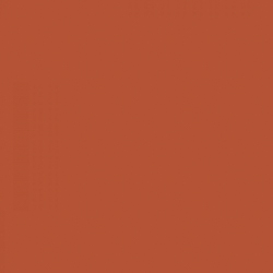
Deep Reds
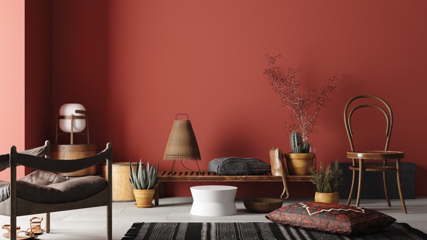
When most people think of a traditional rustic color palette, they see colors like dark burned oranges and rich crimson tones coming to mind first. These hues have a robust appearance and a warm undertone, making them an excellent choice for coordinating with other natural components like stone and wood.
You should consider going on this path if you want the color of your walls to make a statement. This color range is versatile enough for an accent wall, the entire space, or even just a piece of furniture, depending on your preferences.
Sherwin-Williams Rockwood Red SW 2802 is a good option if you’re looking for the ideal earthy deep red atmosphere.
Red remains a popular color among artists and designers worldwide. Its capacity to rapidly bring depth and energy to a room makes it a decorator’s hidden weapon. We asked designers to tell us which paint hues made them go “wow” Get dramatic with these ten red paint hues.

Benjamin Moore Chili Pepper (2004-20): The hue of red was the happiest, brightest, and most happy. The audacity of it may make crucial furniture pieces into a statement and the point of focus in the room.
Farrow & Ball Terre D’ Egypte (247): If warm terra-cotta is in style, we recommend the Terre D’Egypte paint color by Farrow & Ball. It would look fabulous in a high gloss finish on the ceiling of a powder room.

Benjamin Moore Deep Rose (2004-10): It is such a bright and clear red, yet with a little bit of number in it to soften it and take the edge off it.

Benjamin Moore Greenhow Vermillion (CW-340): Greenhow Vermillion, a vibrant scarlet color, pays homage to the rich colors that covered the walls of homes built during the 18th and 19th centuries by paying respect to the color vermillion.

Sherwin-Williams Fireweed (SW 6328): Even though it looks more like a rusty red to me, it’s given the name International Orange. We like it not just because of the apparent relation it has with the Golden Gate Bridge but also due to the complexity of the name itself. The lighting affects how it appears, as it does with most colors.

Farrow & Ball Radicchio (96): When a vibrant, contemporary red with a tinge of magenta is required, the Radicchio paint color from Farrow & Ball strikes a luxurious and sensual note, mainly when used for a rustic bedroom design.

PPG Salsa Diane (PPG1186-6): The vibrant red tones and overtones of pink and orange represent optimism, cheeriness, and an outlook on the future.
Neutral Gold
A muted gold is another attractive hue to explore and experiment with, and it may contribute to the rustic appeal of your home. If you are going for that perfect retro atmosphere, you should avoid shiny gold colors, instead of neutral hues with a bit of gold. It will help you get that perfect vintage vibe.
You should keep in mind while selecting this color that you want to choose something that appears as if you could find it in the natural world. The ideal balance is achievable using a neutral gold, such as Benjamin Moore’s Shelburne Buff HC-28. This color is sufficiently neutral when paired with anything but still exudes vitality.

Sherwin Williams Empire Gold (SW 0012): Empire Gold by Sherwin Williams is our go-to choice when selecting a gold paint color. We adore how this color not only enlivens a room but also complements other golden tones, such as the brass on a lamp fixture or the mustard mohair on your sofa. It creates the ideal luxurious and golden background for a cozy and welcoming space.

Farrow and Ball India Yellow (66): It is a more severe shade of golden ochre that is quite deep. This color is one of our favorites to work with because it is a sultry yellow gold, and it really can turn into a total neutral so that you can layer it with other colors.

Benjamin Moore Lenox Tan (HC-44): The warm gold tone of Benjamin Moore’s Lennox Tan is one of the reasons we enjoy this paint color. When I’m in a room painted with the color HC 44, it makes me feel like I’m wearing a vicuna coat. It brings out the rich quality of every other color.

Benjamin Moore Buttercup Yellow (2154-30): It has an upbeat and happy ochre tone. It brings to mind being within a magnificent maple tree during the peak of its autumnal hues on a day when the sun was shining brightly.

Benjamin Moore Chartreuse (2024-10): Benjamin Moore’s Chartreuse (2024-10) is an ecstatically happy color. It is warm but has an acidic flavor. Any gloomy environment benefits from its presence.
Hints Of Olive Green
Olive green is another beautiful color to incorporate into your home decor. But, just like with the neutral gold, this hue needs to be carefully picked so that you don’t end up with a vibrant shade of a green wall. The recommendation is that you go with a color that is neither green nor gray but rather one in the middle.
Benjamin Moore’s Rainy Afternoon 1575 is the ideal color for creating a transitional space. You may bring out the warmth of this color by adding wooden details, or you can bring out the natural beauty of this color by adding natural stone.

Benjamin Moore Vintage Vogue (462): The name is perfect; it’s called Vintage Vogue. Need we say more? It’s such a mystical shade. It is colorful, warm, saturated, and striking all at the same time. In addition, it is neutral, or at least neutral, according to our definition.

Benjamin Moore Verdigris (685): Verdigris is one of our favorite greens; it’s a one-of-a-kind bluish green from the oxidation process on copper and brass.

Benjamin Moore Largo Teal (742): The Largo Teal paint by Benjamin Moore is one of our favorites because, despite its more vibrant appearance, it possesses a soothing undertone, and you can use it in various settings across the home.
Stone Colors
If you avoid colors but want a darker hue, consider selecting a color found in natural stones. Depending on the style that you want to achieve, an excellent alternative for the color scheme might be either a warm brown or a deep gray.
The paint color Warm Stone SW 7032 by Sherwin-Williams is an excellent option for achieving a look that is intermediate between gray and brown. This versatile color will allow you to experiment with various vibrant accents because it goes well with everything.

Sherwin-Williams Agreeable Gray (SW 7029): There is a good reason agreeable gray is one of the trendiest choices for gray paint. It is a lovely color with a natural look and is on the softer side, and it goes well with various design types. It also looks fantastic in light and dark rooms, making it a very flexible piece. Additionally, most wood tones look great when paired with agreeable gray.

Benjamin Moore Coventry Gray (HC-169): In 2022, Coventry Gray will be one of the best interior gray paint colors. It is a gray of medium depth with neutral undertones that will look good with various decorating schemes.

Sherwin-Williams Lazy Gray (SW 6254): Lazy Gray is a lighter shade that works beautifully in any room in your house, regardless of size. The light color and undertones that range from neutral to blue make most types of room in a house feel much broader and more open than it is.

Sherwin-Williams Gray Screen (SW 7071): Gray Screen is a shade of medium gray that makes the black and white look more attractive. Warm undertones that range from blue to light green give it a friendly and homey vibe, but the lightness of the color ensures that it continues to have a contemporary and contemporary feel. Gray Screen is the ideal paint color for giving your home an appearance that is modern and updated when combined with matched trim and accents.
Shades of Cream
Consider going for a warm cream hue if you like a decent neutral and want to create a rustic living room design without having to choose a deep dramatic color. You can accomplish it by using a warmer version of the color cream.
It will assist in preserving an open and breezy feel while complementing the rustic interior design. The appropriate choice for a warm off-white, Behr Paints’ Hazelnut Cream 750C-2 is an excellent example.
Cream Colored Paints
When painting colors, there is nothing more classic than the ideal hue of cream, and it will never go out of style. Use a cream color all over a room to create an atmosphere of calm by painting the entire space with it, or combine it with vibrant colors in a large, open area. Consider including some of these designers’ go-to cream paint colors on your list of samples, regardless of your chosen design approach.

Benjamin Moore Chantilly Lace (2121-70): This color strikes the ideal harmony of being brilliantly white while having a trace of warm cream in the background. It doesn’t matter if you live in an apartment in the city or a house by the beach; you’ll always come out on top.
The background color Chantilly Lace is my favorite; it shines brightest in both matte and satin finishes. It is a color that can stand the test of time. It is perfect for giving artwork and upholstery the spotlight they deserve.

Sherwin Williams Alabaster (SW 7008): Walls and millwork can be given a velvety texture by painting them in this warm tint with taupe undertones. It is bright enough to appear modern and fresh when matched with medium wood tones and clean lines, and it works brilliantly with crisp white trim. Although it is at home in more traditional rooms, it is bright enough to work wonderfully with crisp white trim.

Benjamin Moore Vanilla Milkshake (2141-70): For the walls, especially in a bedroom, we recommend Benjamin Moore’s Vanilla Milkshake because it combines gray and cream with a strong undertone of cream.
It has a highly mild and calming effect on the eyes. A softer color should be used for the walls so that the patterns on the types of curtains and upholstery you’re using can be visible.

Myland Belgravia (No. 6): The Myland Belgravia is our favorite for use on walls and trim. The pulverized marble powder they use in their Marble Matt finish provides depth, which complements the skeletal structure of classical architecture and highlights the curvatures of beautiful woodwork.

Farrow & Ball White Tie (2002): This light cream is one of our favorites since it can be used as a welcoming neutral and makes any room appear brighter. It also makes an excellent background for works of art and splashes of color.
In contrast to animated wallpaper, you can use it for moldings and trims, as well as in corridors and to liven up rustic kitchen cabinets. It also looks excellent on furniture cabinets.

Benjamin Moore Swiss Coffee (OC-45): Benjamin Moore’s OC-45 Swiss Coffee is our go-to choice for a creamy paint color. It has a tint of beige and a hint of gray, making it the perfect creamy white color.
It is present in almost every room of my house, and I have also put it to use in many other houses. It manages to be cozy and welcoming while also being up-to-date and spotless.

Farrow and Ball Slipper Satin No.2004: This gentle neutral is one of our favorites. It performs a better job of warming up a room than white does, but it doesn’t have an overwhelming amount of pink or yellow overtones.

Sherwin Williams Natural Linen (SW 9109): There are times when creams can either have an excessive yellow undertone or mimic white and read as chilly. However, this one is just right and produces a calming, understated elegance, which allows the furnishings and art to be the actual statement-makers in the room.

Farrow and Ball Pointing (2003): The ability of Farrow & Ball Pointing to simultaneously evoke light and air, as well as depth and warmth, is one of the reasons we adore this painting. It is acceptable to have it in a modern house in the same way it is in an older estate.
For a warm and inviting atmosphere that features a delicate interplay of light, one of my favorite ways to utilize this hue is to apply it in slightly varying finishes to the ceiling, walls, and trim.

Farrow and Ball Tallow (203): This beige tone is so soothing and lovely for a room. It has a delicate peachy undertone that warms a space, but it also has a clean feel, allowing it to be in a contemporary home or a more classic setting.
When Painting
Refrain from making the standard error of ordering excessive paint if you are considering painting a room alone because you are probably trying to save money. To determine how many gallons of paint will cover an area, use a calculator to help you find how much paint you will need for your project.
The living room, as the name suggests, has ever been the place where most of the family life is spent, where friends and visitors arr entertained. Here should be created an atmosphere of comfort, relaxation and quiet refinement. – The Mixing of Colours and Paints, F. N. Vanderwalker
To get a space ready for painting, clean out as much clutter as possible. If you cannot remove all of the items from the area, you should position the furniture in the middle of the space and then cover it with a plastic sheet or a canvas tarp. It will protect it from any paint droplets that may fall on it. See more related content in our article about living room paint colors on this page.
To showcase highly specific designs, some images on this website use advanced AI-generation software to illustrate ideas and room inspiration. See our editorial policy to learn more.

Upload a photo and get instant before-and-after room designs.
No design experience needed — join 2.39 million+ happy users.
👉 Try the AI design tool now