Choosing Paint Colors That Flow From Room to Room

When painting a building with multiple rooms it is best to keep in mind the flow of colors from one room to another. Just because the living room and the kitchen are two different spaces does not mean that painting one in forest green and the other in Christmas red is going to look good by any means. It is extremely noticeable and causes discomfort and need for readjustment when moving from space to space.
Use the Same Neutral Color
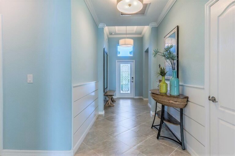
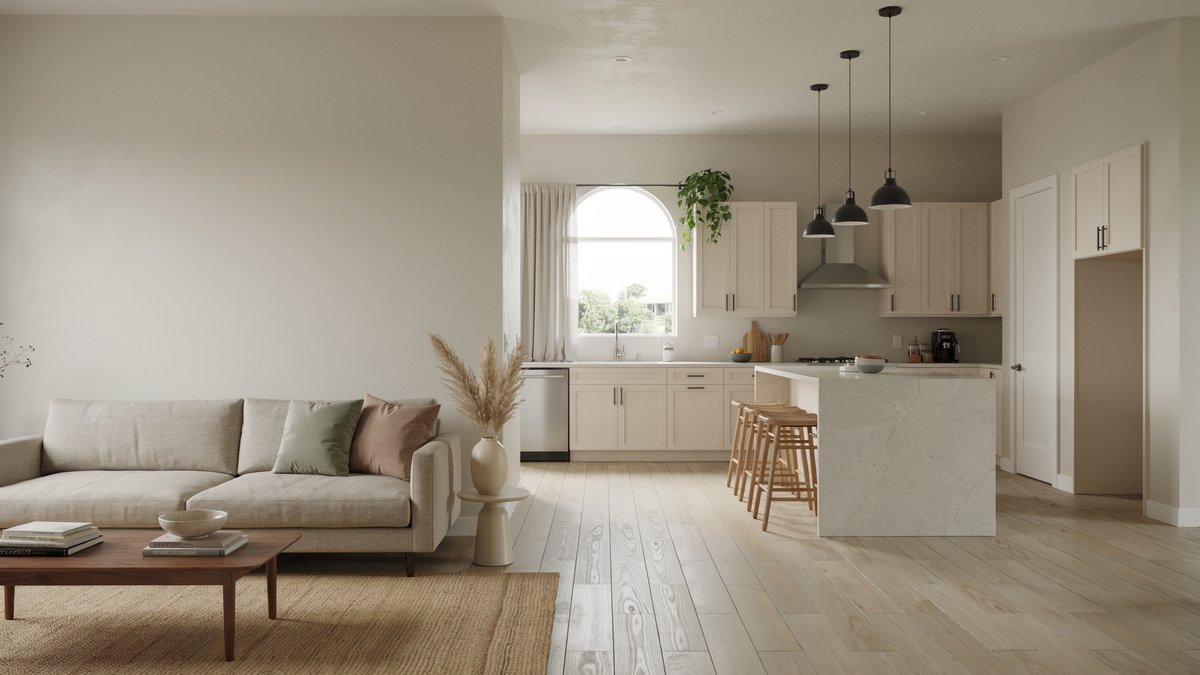
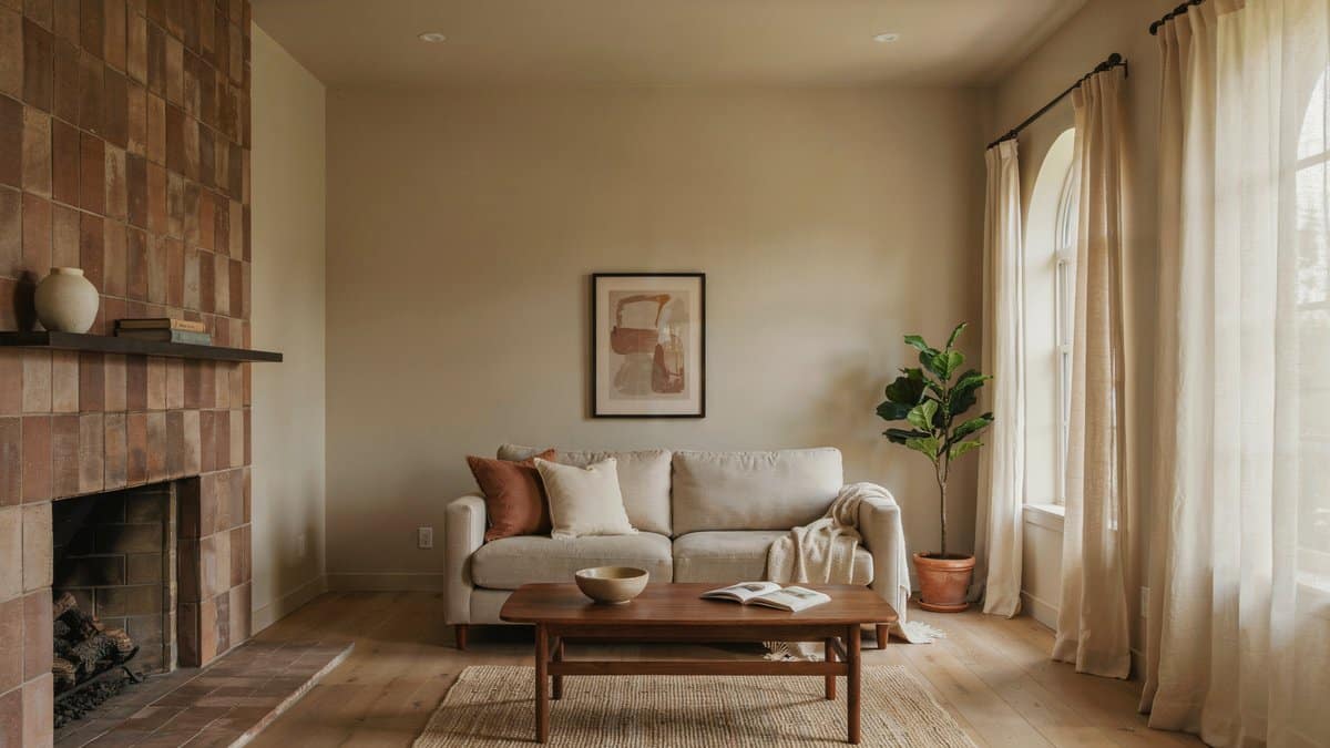
To create the best flow, using the same neutral is an effective idea. Whether the color is beige, gray, greige, white, brown, or black, keeping it the same in each room does two things. One, it makes the accent wall call even more attention to itself, it really gets to be the highlight of the space. Two, it matches the flooring that is likely installed in the entire area.
Why would you want to pick a different neutral for every room anyway, that involves a lot of selections and touch up paint buckets you have to save? Having the same neutral “flow through paint” color is especially useful for open concept layouts. You can then bring in touches of your favorite accent colors through decor pieces, finishes, and furniture to bring the design together.
In addition, all the ceilings should be the same color white. Some people paint the ceilings the same color as the room and that is totally fine, but if they are going to be white, keep it the same throughout the building. This makes it so the ceiling does not call attention to itself, and it does not make your eyes readjust themselves to the color of every different room you go into. In a lot of buildings, commercial and residential, rooms will get a neutral color on the walls and an accent color on the walls.
Use the Same Color Card
Most paint companies make this process super easy for you. They typically have cards with about 5 to 6 colors on it, all in lighter and darker shades or hues of the color. Once you pick the paint card that you like you can use the other colors on that card in place you want to be darker or lighter.
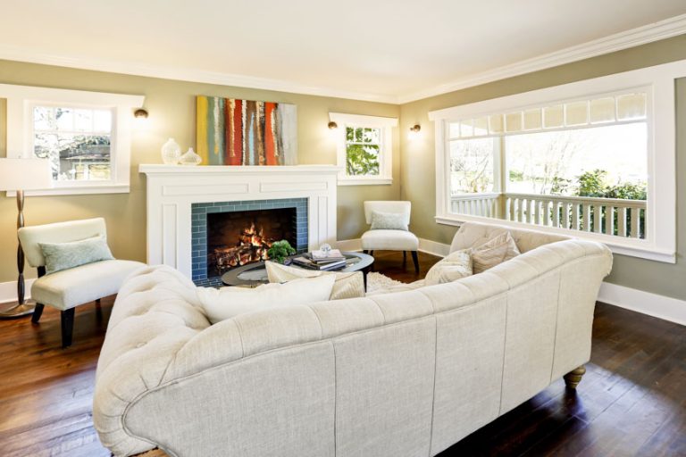
It’s helpful to use light to medium paint colors for the kitchen, living room, and bedroom and darker shades for areas such as dining rooms, hallways, and areas you don’t use as much to keep them from feeling too intense.
In smaller rooms, you may want a lighter color to make the room seem larger. Maybe you do not want an accent wall, but just some walls to be the darker shade and some lighter. Using the same color card keeps the color in the family to avoid clashing. They often give a recommended accent (coordinating) color card as well.
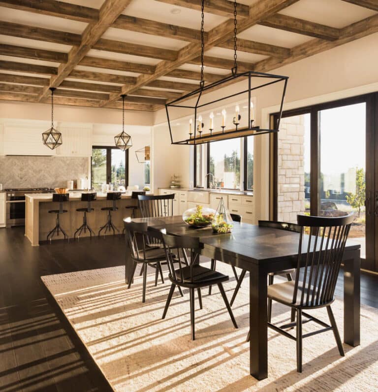
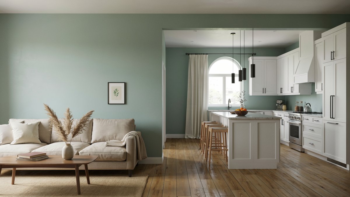
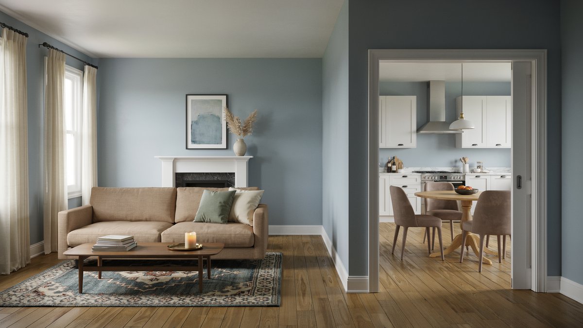
Consider Room Sight Lines
The sightlines are what rooms you see while in another room. For instance while in the kitchen can you see into the living room and dining room? Make sure that you select colors for these adjoining rooms that are cohesive with their neighbors for the most harmonious and pleasing design.
Try restricting designs with more assertive or bold colors to enclosed rooms only. This way you can go wild with whatever color you desire without any other room’s sightline being affected. This works well when choosing paint colors for bedrooms, bathrooms, closets, or other rooms behind closed doors.
Use Complimentary Colors
Another great way to keep the flow going while still getting to use some one the more fun colors is to play with complimentary colors. Colors on the opposite sides of the color wheel look good together and therefore they can be used from room to room to keep the flow of the building, while still being able to focus on multiple different colors.
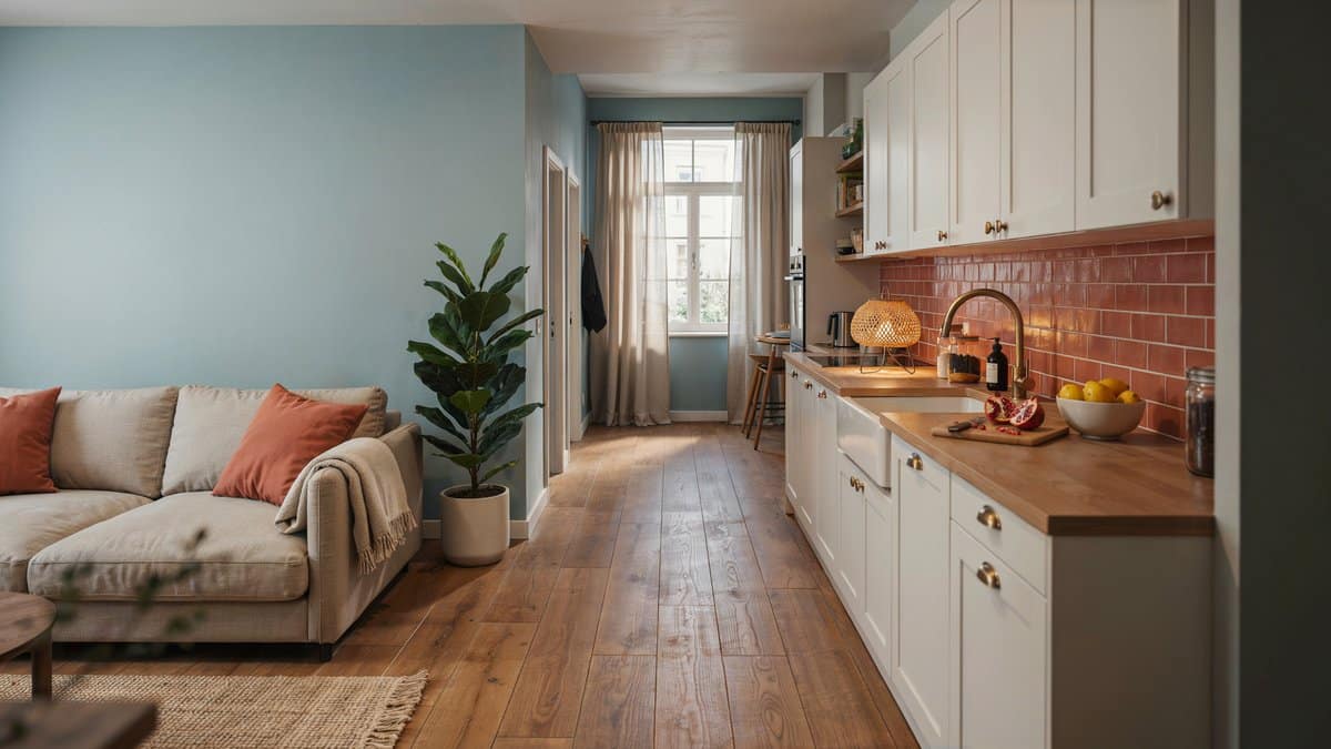
For example, blue and orange are complementary colors. Having a light blue living accented room and a light orange kitchen accents flows great! On top of that orange is a color that promotes eating and appetite, which is good for the kitchen, while blue promotes calm and relaxation. See more living room paint ideas here.
Use Color Groups
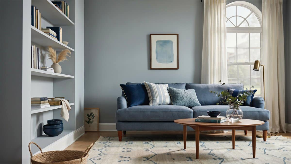
Alternatively, one can use color groups by selecting one or two colors and using variations of those. For instance, if using blue for your color in one room, you could select a grayish-blue, medium blue, and navy as you move from room to room. You can also use the same thought for decor and accessories to create balance. Paint stores can also create a tint of a base color that is lighter than the primary by adding white. this way you can create lighter and darker variations of the paint color for a cohesive look.
Use Accessories for Bold Colors
Using bright colors sparingly can be done with accessories without overwhelming the senses. By limiting bold colors to decor it can highlight the piece, and bring in the needed pops of color without being shocking.
Use Color Planning Tools
Using paint color visualizers or a store color wheel can provide plenty of options for matching and help get the look you want. You can also see how different paint shades look before you buy through a variety of interior design programs that let you create your own plans.
To showcase highly specific designs, some images on this website use advanced AI-generation software to illustrate ideas and room inspiration. See our editorial policy to learn more.

Upload a photo and get instant before-and-after room designs.
No design experience needed — join 2.39 million+ happy users.
👉 Try the AI design tool now