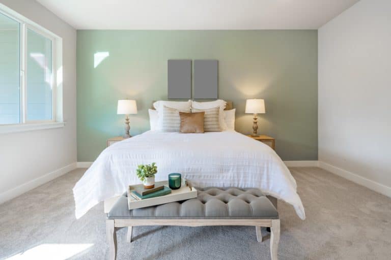
The 15 Best Bedroom Paint Colors for Style & Mood

The color one selects for a bedroom can drastically impact the mood. With this in mind, it’s a good idea to carefully consider the space’s wants and needs, whether it be a relaxing sanctuary bedroom, a romantic spot, a brightening space, or even just preparing to sell the home in the future. Here are some examples of colors impacting one’s general mood and well-being.
Bedroom Color Comparison
Paint chips lie. A color that looks calm under the store lights can read completely different on your wall at 7am. Here’s how the most common bedroom colors actually behave once they’re up, plus a specific Sherwin Williams pick for each one so you have somewhere to start.
LRV is light reflectance value. Higher numbers bounce more light and make a room feel bigger. Anything under 20 will eat light, which is sometimes exactly what you want.
| Color | What it does to the room | Best for | Paint to try | Watch out for | |
|---|---|---|---|---|---|
|
Soft blue |
Slows everything down. Blue receptors in the eye tie into your circadian rhythm, so it’s the one color with actual sleep research behind it. | Light sleepers, primary bedrooms, and anyone planning to sell. | SW 6511 Snowdrop LRV 80 |
North-facing rooms already run cool. Blue there can feel chilly instead of calm. | |
|
Sage green |
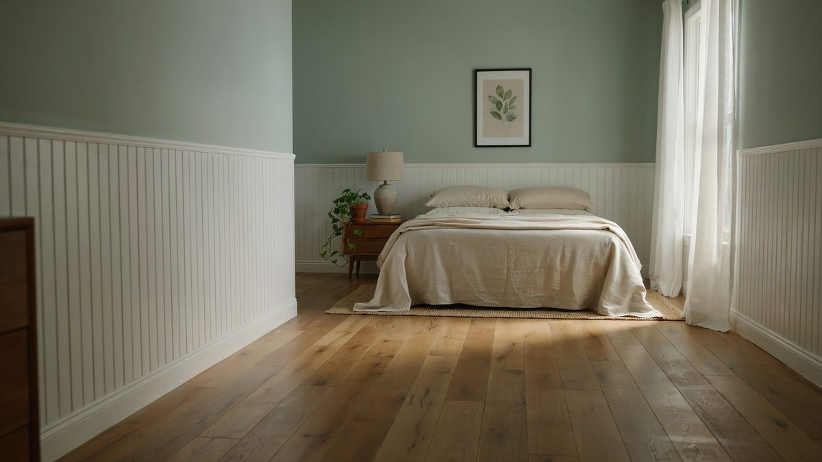
Restful without the coolness of blue. Green sits in the middle of the spectrum, so your eye barely has to work to focus on it. | Rooms with wood floors, wainscoting, or a lot of greenery outside. | SW 6189 Opaline LRV 73 |
Greens shift hard under warm bulbs. Sample it at night before you commit. | |
|
Pale blue green |
Reads almost white but keeps a hint of color, so walls recede and the room looks a size bigger than it is. | Small bedrooms, low ceilings, rooms with one small window. | SW 6217 Topsail LRV 75 |
Paint the trim lighter than the walls or the contrast pulls the corners inward. | |
|
Soft yellow |
Adds warmth and makes a dark room feel like it gets more sun than it does. Cheerful in the morning, which is the point. | North-facing bedrooms and shared rooms where nobody wants a cool palette. | SW 1668 Pineapple Cream LRV 82 |
Saturated yellow gets loud fast. Stay in the buttery range, not the highlighter range. | |
|
Blush pink |
Warms up the light without going orange. At this softness it acts like a neutral with a pulse. | Guest rooms, romantic bedrooms, anywhere plain white feels cold. | SW 6322 Intimate White LRV 77 |
A true pink bedroom can shave a few hundred off resale. Keep it subtle if you’re selling. | |
|
Soft lavender |
Reads as a cool neutral at low saturation and gives you most of blue’s calm with a little more personality. | Couples who can’t agree. It lands between warm and cool. | SW 6814 Breathtaking LRV 63 |
Deep purple stimulates the brain and works against sleep. Keep it pale. | |
|
Warm greige |
Disappears, in a good way. It lets the bedding, art, and wood tones do the talking instead of the walls. | Rentals, resale prep, and rooms where the furniture is already busy. | SW 7036 Accessible Beige LRV 58 |
Without texture like wainscoting or a woven headboard, it can flatten out. | |
|
Deep burgundy |
Absorbs light and pulls the wall closer, which makes a big room feel enclosed and intimate instead of empty. | One accent wall behind the bed in a room with decent natural light. | SW 6307 Fine Wine LRV 7 |
Red family colors raise alertness. Four walls of this is a lot. One is plenty. |
Swatch colors are approximations for screen. Always test a real sample on your own wall.
North-facing rooms get flat, cool light all day, so warm picks work much better there. South-facing rooms get warm light that pushes everything a shade yellower, which is where the cooler blues and greens are attractive. Tape a sample up and look at it in the morning, noon and night to get a complete picture. Sheen matters too, since flat hides wall flaws and softens the color, eggshell is a safe middle ground, and satin holds up to fingerprints. The higher the sheen the more light that bounces , so a small bedroom gets a little help from eggshell over flat finishes.
Blue – Blue is a color that will calm people down, plus bring down heart rate and blood pressure. But blue can also make a room a little colder due to its cool tones. Blue in a room has been shown to lower the heart rate and may even reduce blood pressure. One important thing to note is painting your bedroom a light cerulean to cadet blue has been shown to help increase the resale value of your home when selling.
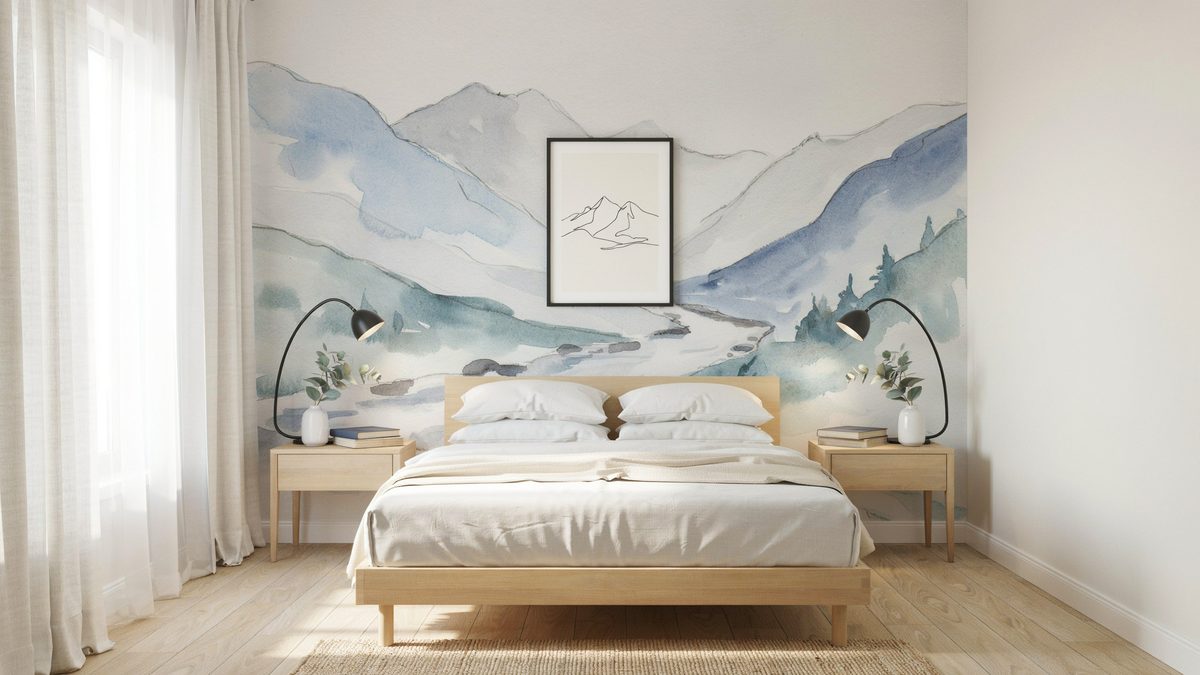
Neutrals – Including all browns, blacks, whites, and anything in between, neutrals take up a bigger part of a color scheme than anything. When designs get out of hand with color, throwing in a neutral will bring any room back into its right space.
Red – Red amps up the energy. Everything is on high alert and adds excitement as well as can stimulate conversation.
Pink – The color pink is associated with love and nurturing. It can give a room a calming vibe and is often related to femininity and love. Pink is a tint of red that is frequently used to paint girl’s bedrooms. According to realtor studies, selling a home with a pink bedroom can actually lower resale values by a couple hundred dollars.
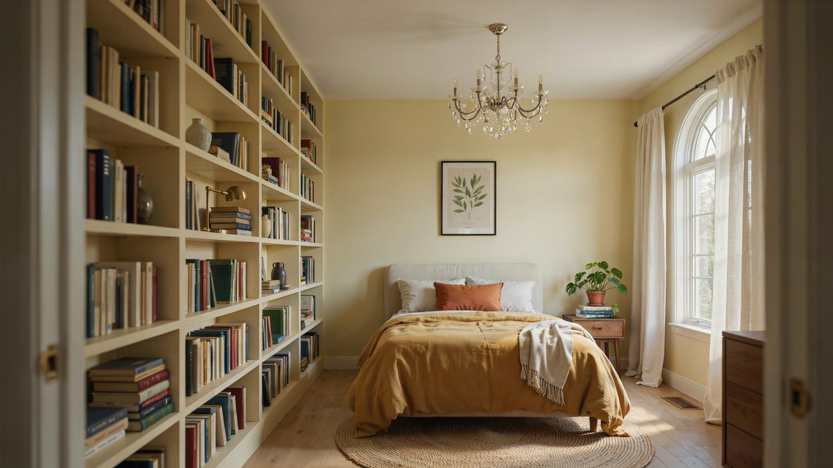
Yellow– Yellow tends to translate to happiness as well as uplifting. However, studies show that it may cause people to have quick tempers.
Green – Green is used as a refreshing color. This color encourages restfulness as well as comfort and warmth.
Purple – Purple is associated with luxury and creativity when using a darker shade. As a lighter color, purple may offer some of the same restful qualities as blue. However, on the negative side, sleep studies have shown that the color purple actually suppresses sleep. Since purple is known to stimulate the brain, it can make it difficult to sleep.
Orange – Orange is an energetic color, filled with excitement, and is often used in creative or high-energy places such as a kid’s playroom, crafts room, or home gym. When choosing a color for the walls, it is important to consider the finish of the paint as well. The three choices of paint sheen are flat, eggshell, and satin.
Flat – To soften a space, one could use flat. A flat sheen is a matte finish that is non-reflective. This makes it difficult to clean but perfect for an adult bedroom that does not receive much wear and tear, made to be soft and light.
Eggshell – Eggshell is the in-between sheen, mildly reflective, and easier to clean. This is the most effective paint sheen to use in regularly used bedrooms.
Satin – Satin, also commonly referred to as glossy finish, is, as the name suggests, the glossiest. This makes it durable and cleanable, suitable for high-traffic areas and mess-prone areas such as children’s and teenager’s bedrooms.
Best Bedroom Paint Colors for Sleep
Everyone needs sleep; everyone wants better sleep. Some will try strange home remedies to get better sleep, from acupuncture to drinking cherry juice. Little do they know the simplest remedy lies right in front of them: the colors of their bedroom. Color theory guides color mixing and the study of the visual effects of certain color combinations. This study is how we know that certain colors affect people in certain ways and why.
For example, blue is the absolute best color for sleeping. This is because receptors in the eyes that affect one’s circadian rhythm are sensitive to blue; therefore, seeing this color reduces heart rate and blood pressure.
Granted, this is not the only thing that can decide if a person sleeps well; it is just a bonus when painting bedrooms blue. These add to the space to create the best calming and relaxing bedrooms, physically and mentally. According to Casper, blue is one of the best paint colors for slumber. With its calming and relaxing qualities, blue evokes a sense of tranquility ideal for rest. More than just an aesthetic choice, blue generates the safety and comfort needed to drift into dreamland with ease.
Recommended Bedroom Colors for Sleep:
Sherwin Williams 6189 Opaline, in the soothing green direction,

Sherwin Williams 6511 Snowdrop, in the relaxing blue direction,

Besides blue, some other surprising best bedroom paint colors for a good night’s sleep are yellow, green, silver, and orange.
Some of the worst colors for sleep include purple, brown, gray, gold, and red. This is according to a Travelodge UK study that analyzed 2000 bedrooms to determine which ones were best and worst for good sleep.
Best Colors for Small Bedrooms
Everything about the home is perfect, except the tiny master bedroom. I bought it anyways because of the to-die for kitchen and bathrooms, but now to deal with feeling cramped every single night. Fear not, there are ways to counteract the feeling of a small floor plan without tearing down any walls or giving up any more space. Light-colored walls are a small bedroom’s favorite outfit. While people usually wear black to slim down, the same idea (just backwards) is used to make rooms look larger.
Generally, using a higher sheen will make the room look larger due to it being more reflective. Another thing one can do to increase the look of the size of the room is to paint the trim a lighter color than the walls. This is just a little optical illusion that will make the walls appear that they are farther back when in fact, they are not.
Recommended Colors for Small Bedroom:
Sherwin Williams 6217 Topsail,


Colors for the Bedroom for Couples
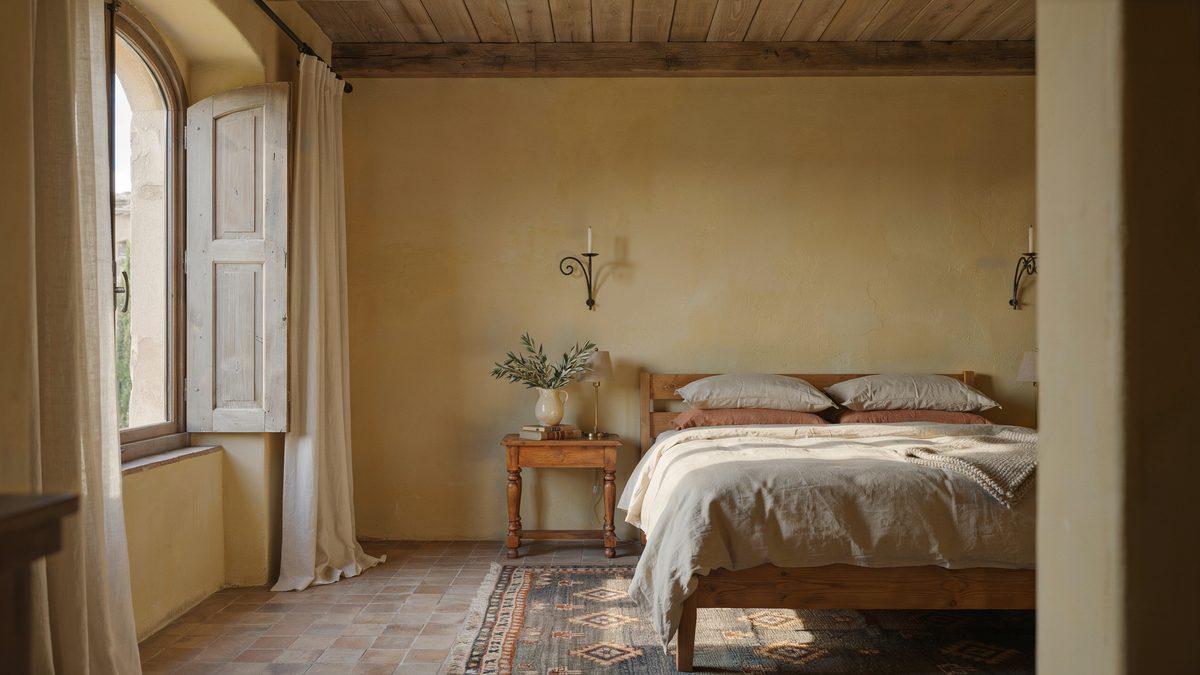
Master bedrooms most frequently house couples, and while one half may want to completely take over with their style, it is important to remember that there are two who will be spending time in the space. Things to consider are: how the space will be used, what mood is trying to be set, and what colors can be agreed upon.
Some bedrooms are used purely for sleeping. In this case, the couple may want to stick with a cooler, more relaxing color. Some bedrooms have sitting areas, spaces to get ready for the day, or even spaces to hang out with others. If any of these are the cases, turning the brightness levels up a bit can create a more energetic environment.
Paint can be any color; if red is a favorite color, it can be incorporated. This can be done in either muted tones or even adding pops of color to furniture pieces, trim, or accessories.
Recommended Bedroom Colors for Couples:
Sherwin Williams 6814 Breathtaking,

Sherwin Williams 1668 Pineapple Cream,

Both gender-neutral muted colors remain not harmful to sleep while still putting a little pep in the step in the daily routines.
Romantic Colors to Use in the Bedroom
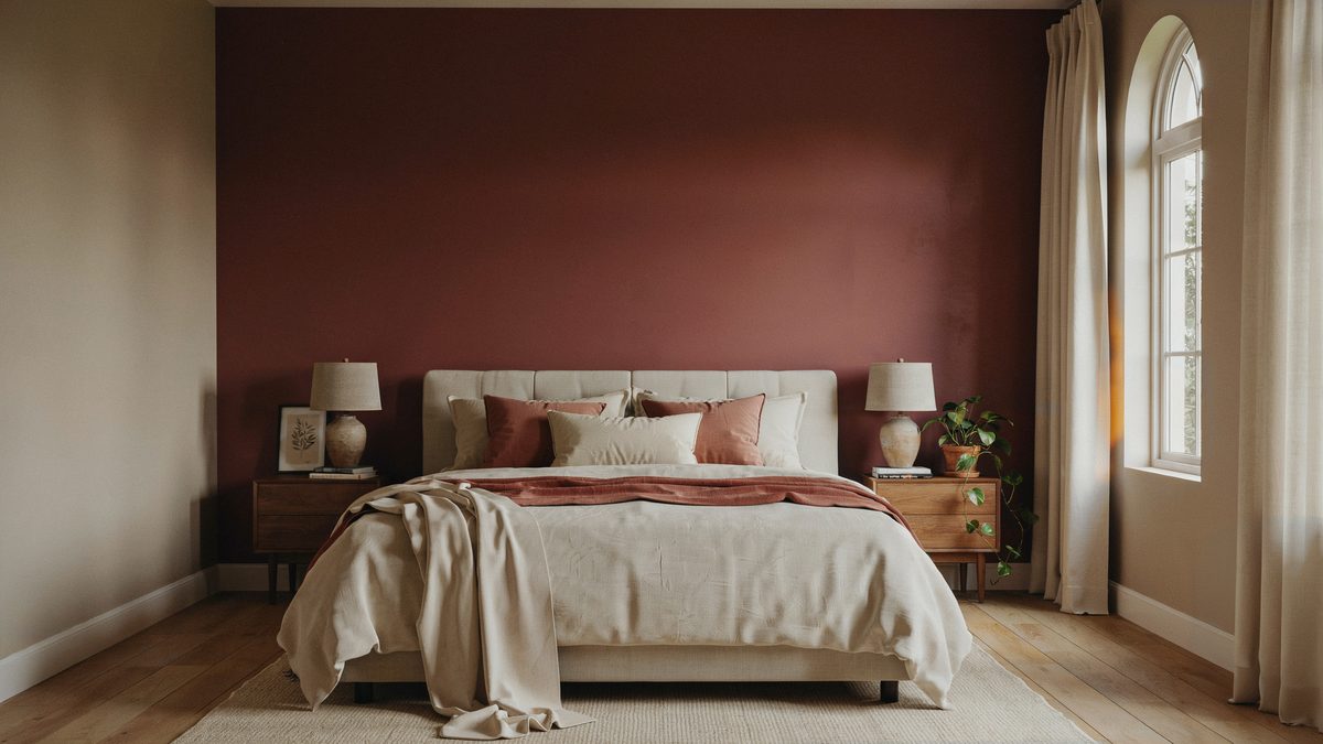
If a calm, cozy hangout is not the right fit, maybe a romantic, dramatic bedroom fits a couple’s style better! This can add many unique qualities and even more paint color options. Once straying away from the soothing blues, we can be whisked away by the romantics of purples and magenta. Often, romance is associated with these colors, as well as red and the colors of fine wines.
Pinks and purples tend to stray towards romance’s flirty and fun side, which can work perfectly for some spaces. For a deep, rich, intimate bedroom, sticking with darker colors will be the way to go. Even black can be a great option if looking for an intimate yet simplistic design option.
Recommended Bedroom Colors for Romance:
Sherwin Williams 6307 Fine Wine,

Sherwin Williams 6321 Red Bay,

Both are darker, more intimate colors to set the mood for romance, humbled so as not to overpower the room.
Suitable Colors for Bedroom Ceilings
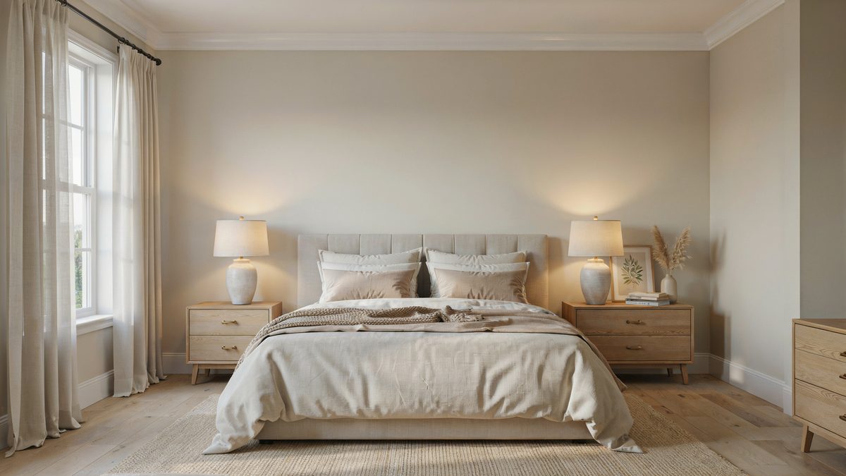
The color you select to paint your ceiling will depend on several factors, including the style you want, the size of the bedroom, and its shape. Painting your ceiling and walls the same color works best for bedrooms with flat ceilings.
If you have a small room, using dark colors will make the space feel smaller and more intimate. On the other hand, painting the room a lighter color will give it a roomier feel. For larger rooms using the same color for both the walls and the ceiling will give it a cohesive look and draw the eye to the furniture and decor.
Painting your ceiling a lighter color than the walls can give the walls the appearance of being larger. In addition, it provides the room with a low-contrast look, making it appear flatter. If you have white walls, you can try painting your ceiling in a pale yellow, light peach, light blue, or light gray to create a cozy ambiance.
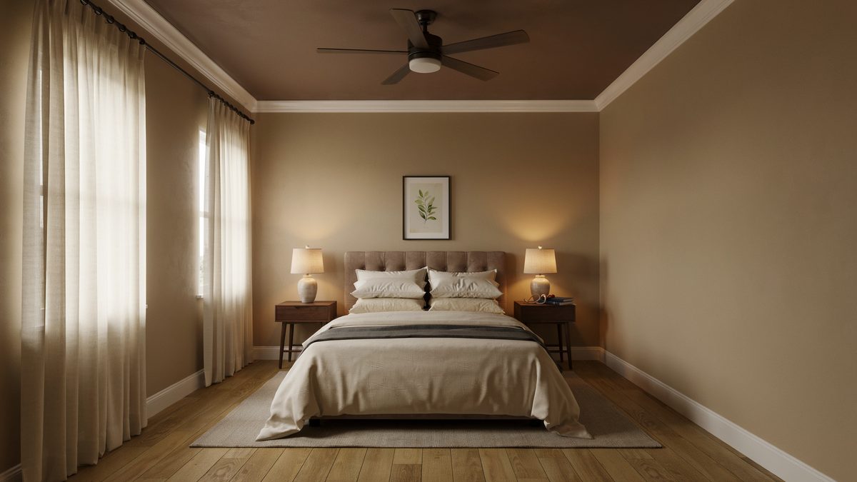
Painting the ceiling in a darker color can bring focus to your molding or trim, add high contrast, and make the room feel more intimate. For a dramatic contrast look, when the walls are white, paint the ceiling in gray, brown, or navy shades.
There are also reasons you may want to paint your ceiling white. For instance, if your bedroom doesn’t get a lot of natural light, going with white is a good choice to keep things bright. If your ceiling has a lot of visual blemishes, going with a flat white can help mask them, while using a color could actually make these imperfections stand out.
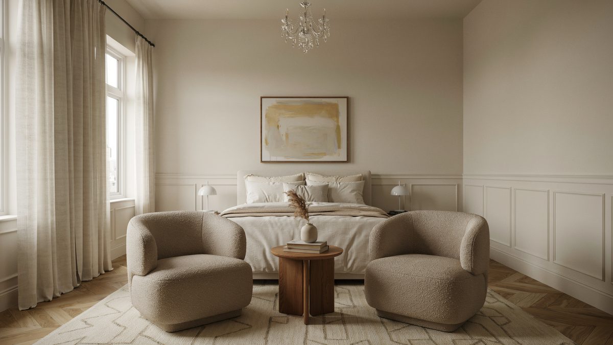
The main focus of your bedroom should primarily determine the paint color for the walls. To get the right color, consider the mood you want to set.
When looking to make a small bedroom look bigger, you may use Sherwin William, Topsail.
Having trouble sleeping at night? Try Sherwin Williams, Snowdrop.
Looking for a color both halves of the couple will enjoy? Try Sherwin Williams, 6814 breathtaking or 1668 pineapple cream will halt all discussion.
If you like to get romantic and need the perfect space, check out Sherwin Williams 6307 Fine Wine, or even 6321 Red Bay to set the mood.
Choosing Bedroom Colors
When picking bedroom colors, one should focus on the temperature and brightness of the colors. These will have the greatest effect on the type and feel of the design.
Temperature – Temperature is usually something one would think about when deciding the clothes to wear that day, and color temperature is strangely similar. Warm colors, such as oranges, yellows, and reds, make a person feel happy, energetic, and optimistic. They can also increase appetite. However, due to their upbeat and stimulating effects, warm colors are typically not recommended for the bedroom setting.
Cool colors, such as blues, greens, and purples, are recommended. These invoke feelings of calmness, serenity, and peacefulness, which is preferable in an area for sleeping and relaxation.
Brightness – Brightness can have a very large effect on a space, just as it can in life. We turn the brightness on our screens up and down, we change the brightness of a room by closing blinds or curtains. Well, we can also do this with paint colors. This can help set the mood of the space as well. After the temperature of the color or at least the color family has been selected, take a look at the brightness.
Remember that bright and light mean very different things. Light green could be a viable option, while bright green most definitely will not. In most settings, a bedroom can look best with a lower brightness, ruling out neon and bright colors. Paler options will bring a lighter and airy feel overall.
Colors also have a psychological value, the way they make people feel just by making contact with their eyes. When painting bedrooms, it is important to remember that the room is pleasing to the primary user and matches their own sense of personality and style. When you find a paint color you like, you can download a paint color app to give you the name of the paint by uploading a picture.
We hope you found some useful ideas for choosing a paint color for your bedroom. For even more ideas, check out our post on using a bedroom layout planner to quickly try out different colors, furniture, and decor on your own design.
To showcase highly specific designs, some images on this website use advanced AI-generation software to illustrate ideas and room inspiration. See our editorial policy to learn more.