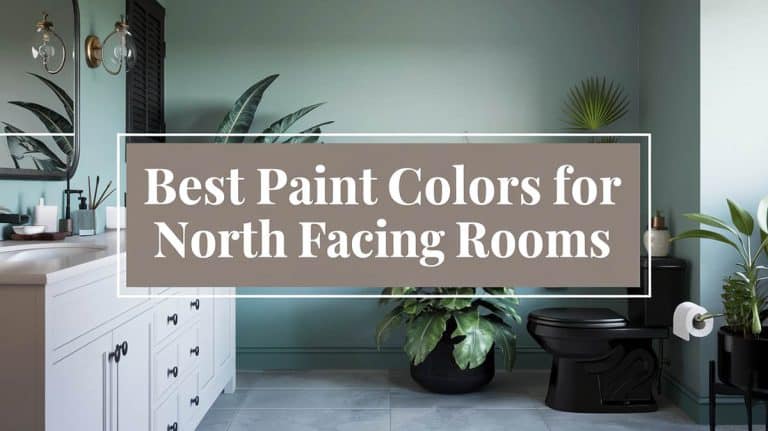
Guide to Bathroom Color Palettes: Match Your Tile, Fixtures & Finishes

If you want to know how to pick a bathroom color that works with your tile, lighting, and fixtures, you’ll want to find the right color schemes and palettes that suit your design. Often, you’ll see what looks like the perfect paint hue at the store, but once you get it home and put it on the wall, it looks completely different. Bathroom color choices can fail because the light can be harsher, and the space is small enough that one wrong color can overwhelm the room. Since you want the bathroom to feel clean, you’ll want to avoid most warm muddy tones, or they’ll appear dingy. With all of this to consider and more, we’ve shared our most popular guides to help you read your bathroom before picking a color, and find the palettes that work for you.
Rules before picking any bathroom color
Most bathrooms have constraints that other rooms don’t, and these are the things that shape every color decision.
- Start with what can’t change: the tile, vanity, and fixtures are usually permanent, so you’ll want to pick paint that works with them upfront. If you’re changing the tile too, pick the tile color first, then the paint.
- Account for the light: bathrooms are sometimes windowless or under harsh overhead light fixtures. Cool whites under cool LEDs look stark and unforgiving. While warm whites under warm bulbs look yellow. To avoid getting the wrong hue, test paint with your actual bulbs in place and see how they look at different times of the day.
- Plan for “wet”: the room needs to feel clean, so there are certain hues you may want to avoid. Heavy warm tones like mustard, terracotta, and burnt umber almost never work in bathrooms because they read as dirty under moisture and steam.
For the broader style decision (modern, farmhouse, spa, traditional), the complete guide to bathroom design styles covers the aesthetic framework. This guide focuses primarily on styles and materials, with a section at the end on color.
Bathroom palettes at a glance
Here is a quick look at bathroom color palettes and some quick rules of thumb to consider.
- All-white: the safest, most timeless, and easiest resale palette.
- Black and white: graphic, modern, never dates.
- Gray-based neutral: calm, modern, works with almost any fixture finish.
- Soft blue: spa-like, expands small spaces, near-universal flatterer.
- Green (sage, eucalyptus, deep forest): the current trend that has staying power.
- Warm beige and cream: cozy, traditional, the cottage and farmhouse palette.
- Dark and moody: dramatic, requires good lighting, divides on resale.
- Bold accent (mustard, navy, terracotta): works on one wall, fails on all four.
The bathroom color schemes guide breaks down color combinations across all these palettes if you want pre-built starting points.
All-white bathrooms
The default bathroom palette is white because it’s a neutral tone that goes with anything. White bathroom design ideas have stayed in style for 50 years because white looks clean, can expand small spaces, and never offends buyers.
- Best when: choose white when the bathroom is small, has limited natural light, or you’re planning to sell within five years. Resale appraisers tend to reward clean white bathrooms.
- Pick the right white: pure white (BM Chantilly Lace, SW Pure White), all look cool and crisp. Warm white (BM Simply White, SW Alabaster) reads softer and more livable. Match the white to your fixture undertones. This can be done by matching warm whites with warm metal finishes, cool whites with cool metal, and using neutral whites if you’ve got mixed metals or competing finishes.
- How to add visual interest: adding a single warm wood element (a teak stool, an oak vanity, a rattan basket) keeps an all-white bathroom from feeling too sterile.
- Texture is the design move: subway tile, marble veining, a textured rug, woven baskets, all enhance their texture. White rooms need texture, or they can look flat.
- Avoid: many different whites in one bathroom. Pick a wall white and a trim white. Two is the limit to use for the best results.
Black and white bathrooms
The most graphic palette on the list is the black-and-white scheme. Black and white bathroom design ideas rarely date because the contrast is timeless, not trendy.
- Ratio rule: lean 70 percent white, 30 percent black. Equal split reads aggressively, and if you go heavier on the black, it can start to look like a cave.
- Where black belongs: floor tile, a single vanity, framed mirrors, fixtures. Pick two for your black and avoid going for all four, as it can overwhelm the senses.
- Fixture pairing: matte black bathroom fixtures feel more modern, and something like polished chrome feels classic. Pick one and commit to it across all of the fixtures.
- Best in: larger bathrooms or powder rooms work well with a black-and-white theme. Small primary bathrooms with too much black feel smaller and too busy.
- Add a third tone (carefully): brass, wood, or one bold color (deep green, mustard). Without it, the room can feel sterile. With too much of it, the graphic punch diminishes.
Gray-based bathrooms
Gray is the safest modern alternative to white. Gray bathroom ideas work because gray pairs well with almost any fixture finish without clashing.
- Cool gray vs warm gray: cool grays (blue undertones) read crisp and modern. Warm grays (greige, taupe undertones) read soft and traditional. Pick based on your fixtures, not your preference.
- Best paint pairings: bathroom colors that complement gray lay out the strongest combinations (white, soft blue, blush, sage) that build a full palette around gray.
- Avoid the trap: all-gray bathrooms with gray tile, gray vanity, gray paint, and gray towels feel like a hotel room from 2015. Break it up with one warm element.
- Floor as anchor: dark gray hex tile or slate floors give the room a foundation. Light gray paint above. Resale-friendly and timeless.
Green bathrooms (the staying trend)
Green is the strongest current bathroom trend, and unlike most trends, it has staying power. Green bathroom paint colors range from soft sage to deep forest.
- Soft sage: the safest green. Calming, near-neutral, reads modern-cottage. Works in small bathrooms.
- Eucalyptus and seafoam: lighter, fresher, with a cool undertone. Best in bathrooms with natural light.
- Deep forest and emerald: dramatic, modern, best in powder rooms or larger primary bathrooms with brass or gold fixtures.
- Olive and moss: warmer greens with yellow undertones. Pair with wood vanities and brass.
- Avoid: mint and pure pastel greens. They date fast and read 1980s under fluorescent lighting.
Blue bathrooms
Blue is the closest thing to a universal flatterer in bathrooms. Having the right blue tone can work with skin tones, look clean, expand small spaces, and go with your tile.
- Soft blue (sky, powder, dusty): this is a popular spa palette. It’s calming, low-saturation, and near-neutral. It’s the safest non-neutral choice for a bathroom.
- Navy and indigo: works as accent walls or below-chair-rail color. Avoid it on all four walls as it appears too dark.
- Teal: modern and dramatic, but harder to pair with warm tile. Stick to teal when your tile is white, gray, or black, but keep it restrained to avoid overwhelm.
- Avoid: bright primary blue is harsh and looks over the top. Skip Cobalt and Royal blue unless it’s a kids’ bathroom, done on purpose, as it will look too garish.
Beige, cream, and warm neutrals
Known as the traditional and farmhouse palette. Bathroom paint colors with beige tile is the most common pairing question for this palette.
- Warm white walls: BM Swiss Coffee, SW Alabaster, and BM White Dove are the default paint partners for beige tile.
- Mushroom and greige: a step up from beige with more depth. These tones work with cream tile, oak vanities, and brushed brass.
- Cream paint with cream tile: only works if the undertones match. Pink-cream tile with yellow-cream paint looks off. Test under your bathroom light, not in the store to make sure it works.
- Best fixture finish: brass bathroom fixtures or oil-rubbed bronze work best for these tones. Chrome looks cold against beige and clashes.
- Cabinet pairing: honey oak bathroom cabinets give you a warm-neutral palette better than painted cabinets.
Dark and moody bathrooms
Going dark and moody is a dramatic option that needs care. Black walls, charcoal, deep navy, or deep forest can work in the right room but ruin the wrong one.
- Best in: powder rooms, primary bathrooms with windows, or larger bathrooms with strong layered lighting. Skip dark colors in small interior bathrooms.
- Lighting is everything: dark walls need vanity sconces and overhead light. Recessed lighting alone makes the room cave-like.
- Floor as contrast: a light or white floor (marble, white hex tile) prevents the room from feeling closed in. Dark on dark on dark only works in luxury hotels.
- Fixture choice matters more: brass, gold, or polished nickel glows against dark walls. You’ll find that chrome disappears, and black fixtures vanish entirely. Pick warm metallics to stand out against the darker shade.
- Resale flag: this palette divides buyers, with half that say they love it, and half wanting to repaint immediately. Skip this idea if you’re selling within three years.
Bold accent colors (and where they actually work)
Mustard, terracotta, deep red, and hot pink are what I’d consider bold color options. Yellow bathroom paint colors is the most-searched bold option that works well in a bathroom.
- Accent wall only: one wall in a bold tone, three walls neutral. The bold color reads as a statement instead of overwhelming the room.
- Below chair rail: bold below, white above. It’s also period-appropriate for traditional and colonial bathroom designs.
- Powder rooms only: guests are in a powder room for a couple of minutes. This allows you to be braver than in a bathroom you’re spending a lot of time in.
- Pair with one neutral: a bold color needs white or cream as a partner to look its best. Bold with gray reads industrial, while bold with beige can appear dated.
Paint pairings by cabinet color
Your cabinet color usually decides the palette, so you’ll want to match the paint to what you already have.
- Dark cabinets (espresso, charcoal, navy): bathroom paint colors with dark cabinets covers the strong matches. Default to light walls (white, soft gray, pale blue) for contrast.
- Light cabinets (white, cream, pale gray): bathroom paint colors with light cabinets opens up more options. Light cabinets pair with almost any wall color, so style choice drives the decision.
- Wood cabinets (oak, walnut, cherry): honey oak bathroom cabinets look best with warm neutrals (cream, sage, soft blue). Cool grays fight the wood undertones.
- Painted cabinets you want to refresh: painting bathroom cabinets color ideas covers the colors that work for vanity repaints (and the ones that don’t).
Paint pairings by tile color
Tile is the second-biggest fixed element, so the color choice has to respect what the tile is already doing.
- Beige tile: bathroom paint colors with beige tile covers the warm-on-warm pairings that work and the cool ones that clash.
- Neutral tile (gray, taupe, mushroom): bathroom colors that complement neutral tiles shows the surprising matches (deep teal, soft pink) that read intentional instead of accidental.
- Carrara or marble tile: carrara marble bathroom designs pair best with cool whites, soft grays, or muted blues. Marble has cool undertones and warm paint fights it.
- Limestone or natural stone: limestone bathroom design ideas want warm partners. Cream, soft beige, warm white. Cool paint reads off against limestone.
Bathroom colors to avoid
The bathroom paint colors to avoid guide has the full list of potential problem hues. These are some of the biggest color offenders:
- Mustard yellow: reads dirty under bathroom lighting. Steam and moisture make it look worse over time.
- Burnt orange and terracotta: great in living rooms, fights with skin tones in bathrooms (people checking themselves in the mirror look unwell).
- Bright red: overwhelming on all four walls, dates fast, and reads aggressive in a room meant to feel calm.
- Lime and neon green: too high-saturation for a small space. Sage and forest are the green alternatives that work.
- Hot pink (outside powder rooms): the same skin-tone problem as orange. People look feverish under it.
- Stark cool blue: reads cold and unwelcoming in bathrooms with no natural light. Stick to softer blues (powder, sky, dusty) instead.
- Trend colors with short half-lives: avocado green, harvest gold, millennial pink, dusty rose. They’ll date the room in five years. Stick with timeless palettes for full-wall commitments and use trend colors as towels and art.
How to pick your bathroom palette
If you’re still torn on picking a bathroom color, the decision usually comes down to three questions.
- How long are you staying? If it’s under 5 years, go with all-white, black and white, or gray for a resale-safe option. If you’ll be there for 5+ years, pick what you enjoy, as the repaint cost is low if you change your mind later.
- What can’t change? Match the paint to the tile and vanity first. If the tile is warm, go warm, and if it’s cool, go cool.
- How much natural light? If you have lots of natural light, any color works. Some natural light, go with light to mid-tones. No natural light at all, stick to whites, soft grays, or pale blues. Dark colors in dark bathrooms don’t work, so you’ll need to add more light or choose a lighter color.
- Style direction: the complete guide to bathroom design styles covers the aesthetic decision (modern, farmhouse, spa, traditional) that shapes the right palette.
The bottom line
Bathroom color is the easiest design decision to redo and the easiest one to get wrong without proper planning. Most paint mistakes come from picking the color before reading the room. Consider how your room’s light, tile, vanity, and fixtures all fit in. A paint chip you chose under store fluorescents most likely will look very different when painted on your wall at home. Sample the paint on the bathroom wall, and check it out under your lighting in the morning, noon, and night. If it still works, then paint the whole room.
To showcase highly specific designs, some images on this website use advanced AI-generation software to illustrate ideas and room inspiration. See our editorial policy to learn more.

Upload a photo and get instant before-and-after room designs.
No design experience needed — join 2.39 million+ happy users.
👉 Try the AI design tool now