Paint Colors That Go With Oil Rubbed Bronze
For many years, we have connected the term “luxury” with chrome, stainless steel, and nickel for the hardware and fixtures found in kitchens and bathrooms. Home decor is seeing the long-awaited return of finishes such as Venetian Bronze and Oil Rubbed Bronze. Not only decorating your home with bronze kitchen and other bathroom fixtures, shower systems, and accessories gives each area a one-of-a-kind style. But these long-lasting pieces are simple to maintain. They will continue to look beautiful for many years to come. [toc]
What Color Is Oil Rubbed Bronze?
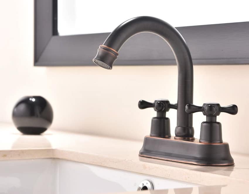
The surface of an item with an Oil Rubbed Bronze finish has been chemically darkened so that it seems to be old bronze. This finish is quite dark and ranges from a very deep chocolate brown to a dark gray. Copper undertones are typically present in this finish.
Within the hardware industry, there is a significant variation in how this finish is interpreted, and not all oil-rubbed bronze finishes are compatible. Samples of the finish should be ordered in advance so that you can make sure it meets your expectations.
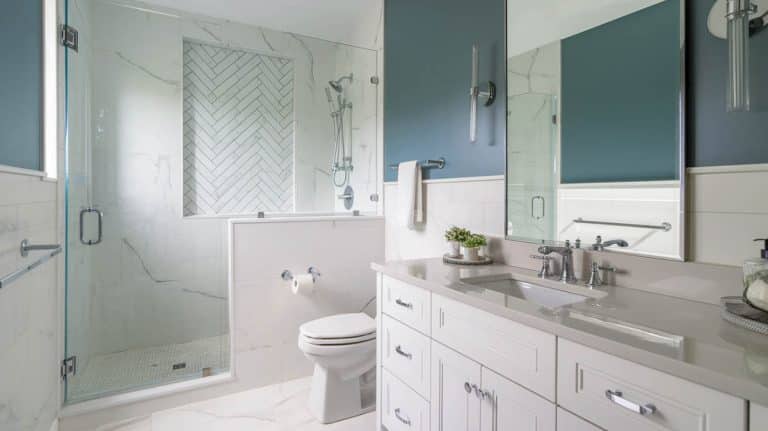
Compared to other finishes, oil-rubbed bronze does not reveal every fingerprint. This is one of the many reasons it is such a popular choice. Because of this, it is an excellent choice for the areas of your home that see the most foot traffic. You may test it out on towel bars, dispensers, toilet paper holders, and faucets.
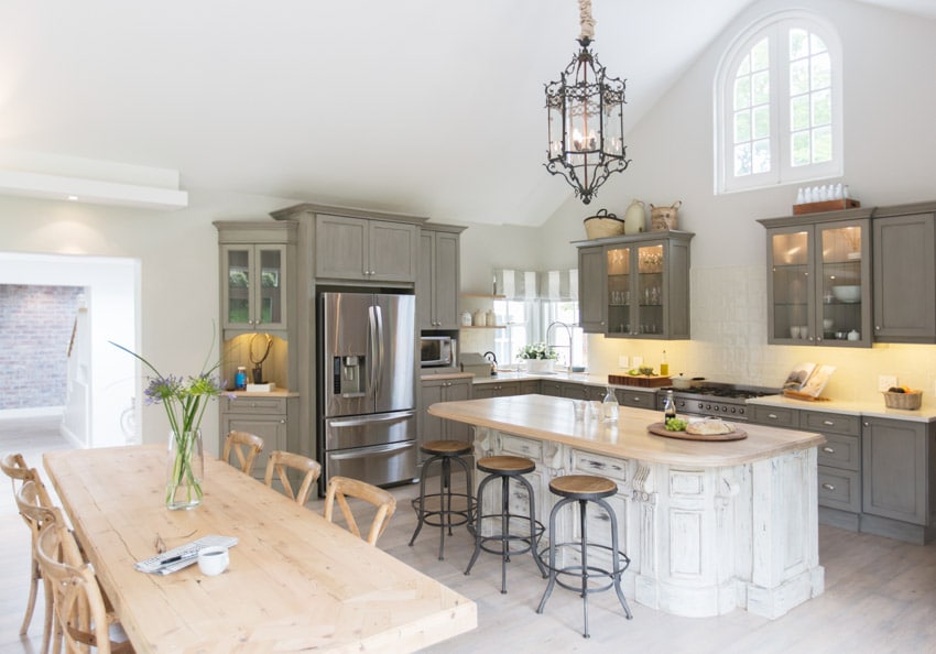
The oil-rubbed bronze finish always creates a strong impression, no matter where it’s applied. Imagine the dark shade hanging above the kitchen sink or gracing a bright white clawfoot tub with a traditional style. If you want your bathroom to have an Old World feel, go all out and replace the plastic drainpipes and hoses with oil-rubbed bronze fixtures.
One type of finish known as a “living finish” is oil-rubbed bronze. This indicates that the surface will transform over time. It is due to its interaction with the air, soap, and natural oils on your hands.
The end effect is a surface that takes on the appearance of being two-toned, with no two pieces being exactly the same. There might be some areas where the finish has worn away, revealing the rosy, gold, or green undertones underneath.
Finishes like this aren’t everyone’s cup of tea, especially if they like everything in a room to be a perfect match. However, this surely gives the room more personality and makes it stand out.
Maintaining the finish’s luster requires some skill as well as experience. Because they will scratch the surface, abrasive steel wool and harsh detergents must be avoided while cleaning the surface. The use of hard water can result in the formation of crusty rings or patches.
Best Paint Colors For Oil Rubbed Bronze
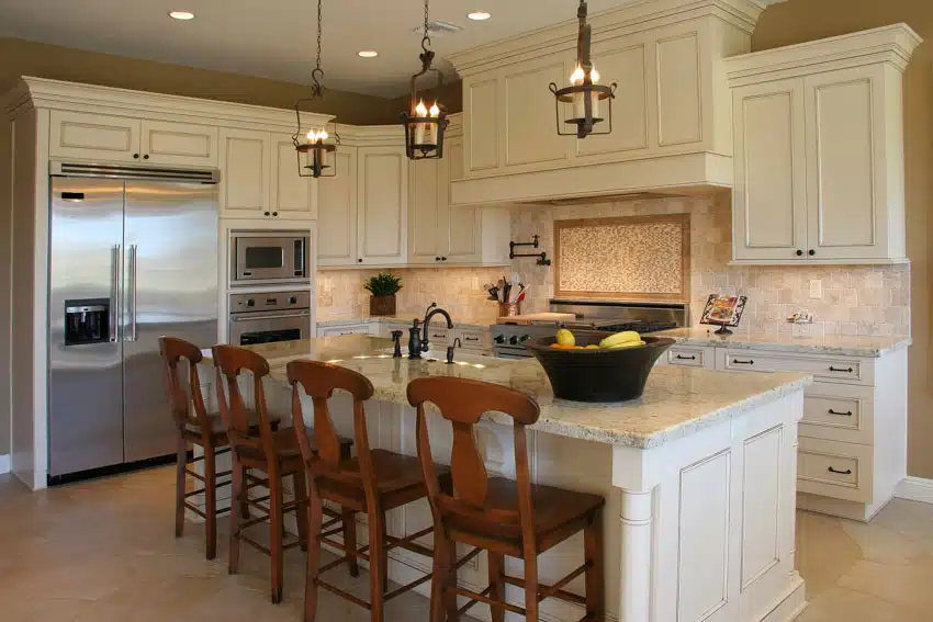
Oil-rubbed bronze in interior design can be either traditional or contemporary. Still, it is more frequently seen in more conventional settings.
Imagine a Tuscan farmhouse, an old-fashioned Victorian, or a Craftsman home from the turn of the century. Furthermore, it is an excellent example of Prairie style and typical Southwestern architecture.
The dark tones and shining surface of oil-rubbed bronze complement the earthy tones of terra cotta, sage green, and luscious gold. It also looks great with marble in lighter tones and rich woods. When you want to make a strong statement, you can also use it to contrast cool neutrals and other metal forms. This works well.
Because oil-rubbed bronze has a variety of undertones or underlying hues, it looks great with a wide variety of paint colors. Consider that some forms of oil-rubbed bronze are vulnerable to change over time.
Consider them just like the Old World bronze patinas they imitate when selecting paint colors that go well with oil-rubbed bronze. In tone-on-tone rooms, on the other hand, you are free to combine several distinct kinds of oil-rubbed bronze and to accept the various changes in the finish as they occur.
When a room has oil-rubbed bronze finishes with different underlying hues, tone can be used to unify the bronze finishes, as can a common undertone. Contrast can be achieved by painting the walls in a complementary color, the natural color across from it on the color wheel.
Warm Fall Colors

The colors that may be found on the color wheel’s warmer side offer many excellent alternatives for a bathroom with oiled bronze faucet fixtures. The warm glow of an oil-rubbed bronze complements the earthy tones of fall colors like rust and ochre quite nicely.
Try a yellow-gold, amber, or light orange color scheme for a fall color palette that is more on the daring side. It is acceptable to combine the colors of fall as long as they are not of an excessively vivid or saturated quality.

Benjamin Moore Cappuccino Froth (CSP-1055): Autumn is a time to enjoy the season’s lovely colors with colors inspired by nature, such as golden yellows, rich reds, and warm neutrals like Cappuccino Froth.
Use these options as a backdrop for splashes of vivid fall colors that go with beige and an oil-rubbed bronze for a more traditional style, or pair it with crisp white and oil-rubbed bronze. You can even come up with a traditional aesthetic of your own.

Glidden Warm Grey Flannel (50RR 32/029): Gray is a wonderful color for the autumn season. They make the oil-rubbed bronze finish stand out and make guests feel welcome while offering a more modern and neutral backdrop against which to party. We recommend combining Glidden’s Warm Grey Flannel with lighter tones such as Silver Cloud or Drifting Snow, also manufactured by Glidden.

Glidden California Claret (12YR 07/279): Try Glidden’s California Claret with a warm neutral like Sahara Desert Sand or Natural Wicker and accents made of oil-rubbed bronze for a more classic look.

Farrow & Ball Tanner’s Brown (No. 255): Given the title of one of Farrow & Ball’s “Key Colors” for the year 2015, Tanner’s Brown makes for moody, dramatic interiors that are perfect for the fall season and the rest of the year.
This earth brown has an incredibly classic vibe about it. Pairing it with oil-rubbed bronze is one suggestion for creating an unexpected accent.

Benjamin Moore Silver Fox (2108-50): The soft gray color of this paint makes one think of the sky in the fall when a snow shower can sneak up on you. On the other hand, the color is not at all icy inside the house.
This color is so adaptable that it goes well with every design aesthetic. Combined with oil-rubbed bronze, it provides a timeless effect appropriate for any space.

Sherwin-Williams Alchemy (SW 6395): Pumpkin, marigold, and rich brown are some of the fall colors that go wonderfully with the color alchemy, which is why it’s called “alchemy.”
Where do we begin? Your home will be filled with a cheery glow thanks to the color, which will also help the pieces made of oil-rubbed bronze stand out more.

Sherwin-Williams Whole Wheat (SW 6121): Whole Wheat, a calming neutral tone offered by Sherwin-Williams, is a “wonderfully warm and inviting color,” according to the company.
It pairs beautifully with natural materials such as stone and granite, woven baskets and linen weaves, wood tones ranging from medium to dark, and oil-rubbed bronze.

Kelly-Moore Folk Tales (KM5069): The energizing green-blue color of Folk Tales by Kelly-Moore is an unusual color choice for autumn. Still, it pairs wonderfully with the more traditional warm and earthy fall colors.
Folk Tales is an excellent illustration of a color that is right on trend and can draw attention to oil-rubbed bronze fixtures in your home. The use of color in the home has taken on a noticeably cleaner appearance.

Kelly-Moore Water Chi (KM5016): Over the past few years, blues like Water Chi have significantly returned to interior design. It can soothe the soul with its calming impact, which comes from its chilly tone.
When blue rooms are covered with various textures and accent colors in the furnishings and accessories, mainly when oil-rubbed bronze is used, they look exceptionally inviting.
Green

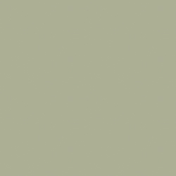
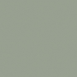
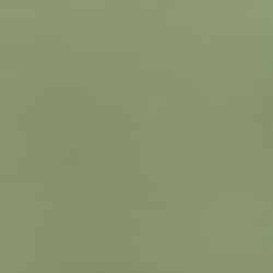
Many distinct tones of green, ranging from light to dark, are complementary to oiled bronze when used in a bathroom. Darker greens found in nature, such as mossy green or forest green, take up the understated sheen of oil bronzes that contain a little green in their patina.
Examples of these darker greens include forest green and moss green (coating). You might try adding an accent wall next to the oiled bronze hardware to prevent the bathroom from becoming overly dim.
On the other walls, choose a neutral beige or a lighter green shade to brighten the area. The cooler, gunmetal finishes of oiled bronze are complemented by a light neutral green with a touch of gray. Examples of this type of green are light yellow-green or light mint.
Benjamin Moore October Mist (1495): This green ranges from light to medium in value, and it has a fair amount of gray in addition to some yellow, which lends it a great touch of warmth. It is neither too warm nor too chilly, isn’t too bright or too dark, not too bold or too subtle.
In other words, it is just right. It works wonderfully as an accent to oil-rubbed bronze and is ideal for the bedroom or living room, both of which are places in the home where a calm and unwinding atmosphere is required.

Sherwin-Williams Evergreen Fog (SW 9130): Another subdued and impartial shade of green is called Evergreen Fog. It is a beautiful, comfortable green with richness and depth and can bring out the patina in your oil-rubbed bronze.
PPG Olive Sprig (MEN7169-4): Evergreen Fog is a more relaxed tone than Olive Sprig, which is why it was chosen for the screened porch in this location.
Olive Sprig has yellow undertones. This color contrasts with other warm tones, such as yellows, burgundies, and rusts. It pairs well with oil-rubbed bronze and looks fantastic.

Behr Breezeway (MQ3-21): Breezeway from Behr, characterized as being suggestive of green sea glass, is a paint color lighter and cooler than the three choices that came before it.
It is a green that is brighter and cleaner than the rest of the group formed here. It is an excellent choice for areas that receive a limited amount of natural light.
Dutch Boy Cypress Garden (424-4DB): Another example of a “clean” green is presented here. However, this one has a somewhat higher saturation level than the others. It is pure green, and there are only very slight undertones of gray or brown, which is why I call it clean.
Consequently, it functions as a neutral less effectively than October Mist, Evergreen Fog, or Olive Sprig. However, combining a wide range of other hues from the families of blue, yellow, brown, and gray is still relatively simple. Additionally, it works wonderfully well with oil-rubbed bronze.
Glidden Guacamole (OOG1121-5): Guacamole is a brighter and greener version of the avocado green that was so popular in the 1960s and 1970s. It is a vegetable green with yellow overtones and a clean appearance.
It is one of the greens in the batch that has a more intense hue, and because of this, it is a good choice for an accent color in the bathroom or the kitchen.

Valspar Blanched Thyme (6001-4A): Blanched Thyme by Valspar is a neutral green color with very minor yellow undertones. This color is comparable to Olive Sprig by PPG. Because of its calming and natural appearance, it is an excellent choice for a bedroom or workplace wall color.
Additionally, we can picture it being used as a cabinet hue in kitchens with warm metallic, oil-rubbed bronze, and wood tones as complementary accents.
Purple And Burgundy

Purple and burgundy are two colors that go with gold-tone oiled bronzes. Nevertheless, these colors also highlight the green in the patina. The best bold burgundies to use are those with rich hues of wine and mahogany for oiled bronzes with brownish, golden, or reddish finishes.
Using dark purples in a room’s overall treatment or as an accent wall is possible. Incorporate lavender into the space if you want to stay true to the color motif, or use ivory to bring more light into the room.
Benjamin Moore Dreamy Cloud (2117-70): Dreamy Cloud is a delicate and understated color that comes close to becoming an off-white. However, it still possesses enough substance to carry the most exquisite hint of violet.
Dreamy Cloud has only been lightly neutralized, unlike many of today’s most famous purple paint colors that contain quite a bit of gray or brown.
Even though it will look purple, it is held back by neutral undertones. It leans toward the chilly side of things and has an understated hint of a dark purple hue, alt. However, the coloration could be more vibrant.
The Light Reflectance Value (LRV) of Dreamy Cloud is 76, which indicates that it will reflect a significant amount of light back into a room. It will lose quite a bit of its color if exposed to a very bright environment that receives direct sunlight. Still, it will acquire the original hue once the lighting conditions change.

Benjamin Moore French Lilac (1403): Not for those with a weak stomach! French Lilac is more purple than Dreamy Cloud, which is more muted, but it isn’t overbearing, or ‘Day-Glo’ like purple may sometimes be.
The color French Lilac is more vibrant and has a higher temperature than the color Dreamy Cloud. It is closer to the light-medium depths than to the light end of things, but it is still in the light end.
The LRV for French Lilac is 56, which is surprising given that it is a shade or two lighter than that. A room outfitted with this LRV will not gain a significant amount of light reflectance. Still, it will absorb a small amount of light.

Benjamin Moore Abalone (2108-60): Because of its understated appearance, the shade of light purple, known as Abalone, is our favorite.
Compared to the colors described above, it will appear gray, and in fact, it IS gray, but a gray with a purplish-brown undertone. It is a beautiful technique to hint at the color purple without fully committing to it.

Benjamin Moore Heritage Red (HC-181): When it comes to red, we never go from the tried-and-true option; instead, we enjoy trying out new and exciting takes on various paint hues.
There is no other hue in Benjamin Moore’s Historical Color deck that compares to the high gloss version of Heritage Red HC-181 in terms of depth, warmth, and vitality.

Farrow and Ball Radicchio (96): The earthy undertones combined with the modern undertones of this color fascinate us. Because it has just the right intensity of brown undertones, it pairs beautifully with a wide variety of warm-toned neutrals and cream cabinets.
Radicchio works wonderfully in tight quarters, such as a cloakroom, where a big statement can still be made.

PPG Red Gumball (PPG1187-7): Although we wouldn’t choose to use this flaming raspberry red by itself, when combined with high-contrast black and white, it creates such a stylish statement.
We would use this very sparingly, either as a splash of color on the trim or to pull together colors from a colorful piece of artwork. We put it to use as a shade for the ceiling. A door with this finish would look fantastic with a lacquer.
Warm Neutrals

The warmth typically found in oiled bronze finishes can be picked up by naturally warm hues such as beige and taupe with just the appropriate amount of yellow added to them.
The adaptability of the neutral color is an important aspect to consider. A deeper neutral can suffocate and restrict when used as a bathroom paint. Whereas a lighter, warmer neutral is more likely to be suitable for the bathroom’s overall design.
Sherwin Williams Canvas Tan (SW 7567): Canvas Tan is a stunning color. Because it does not get extraordinarily golden but also does not go flat, it is one of our favorite tans. This is because it does not go flat, nor does it become overly golden.
It is gentle, comforting, and straightforward, with hardly any nuance. In addition to that, the background has an appearance of almost creamy, and it does not look pink. Pink undertones are a usual concern.
It may take up a hint of green once in a blue moon (or a green one, which may be more appropriate). Still, it does so much more frequently when contrasted with finishes with a pinkish undertone.
Benjamin Moore Ballet White (OC-9): Cream, beige, and greige combine to create the enchanted color Ballet White. There is warmth there, but it is mitigated by a neutral foundation that brings about a marked slowing down of the proceedings.
The LRV for Ballet White is 73, which places it squarely on the border between white and off-white. In most circumstances, it performs the function of a “light” depth color. Suppose you like cream without the yellow undertones.
This might be a complex request, as most paint colors cannot do so. This is where Ballet White truly stands out from the crowd for vanity bathroom paint, or kitchen cabinets. The use of Ballet White is an excellent approach to achieving a creamy appearance without resorting to an excessive amount of yellow.

Sherwin Williams Creamy (SW 7012): Creamy has the group’s lowest light reflectance value (LRV), coming in at 81. This places it squarely in the off-white range of colors.
Because off-whites look washed out in well-lit areas, consider using a paint color with more depth to avoid this effect. Alternatively, use a different color for the rooms in a house that receive the most natural light and reserve this one for the areas that receive less light.

Benjamin Moore Navajo White (OC-96): A stunning warm cream color, Navajo White is a popular choice for paint when mixing metals in such as those with an oil rubbed finish.
It has just the right amount of depth to contrast with white trim without being so dense that it weighs down darker hallways or rooms in the basement.
Navajo White will appear washed out on well-lit walls, as demonstrated in the following picture; nevertheless, this phenomenon will occur with any light color. You need more depth to avoid this, even if switching to the slightly darker Gentle Cream could help.

Sherwin Williams Accessible Beige (SW 7036): Now that we’ve gone through many color schemes, let’s talk about the color Accessible Beige. Accessible Beige has a more somber atmosphere, in contrast to the colors that came before it, which exude a creamier vibe. It has a light-depth beige color but is highly distinctive because it has a subtle gray cast.
The passive and comforting warmth of beige is brought to you in Accessible Beige, devoid of any too-golden tones. Compared to more traditional forms, it is frequently more adaptable to fewer beige finishes.

Sherwin Williams Balanced Beige (SW 7037): The difference between Balanced Beige and Accessible Beige is only one tone lower on the same color strip. And similar to Accessible, it has a slight undertone of gray. It also can take on a greige-like appearance in most of the rooms in the house.
Because it has an LRV of 46, Balanced Beige is classified as a paint color with a solid light-to-medium depth. Suppose you have a home that is flooded with natural light. In that case, you might prefer that this paint color has a bit more body and can withstand the bright natural light better than an off-white or light-depth paint color. However, ensure you can appreciate its beauty even in dimly lit rooms or corridors. This may pair better
Ask the Designer
|
Do you prefer brass, satin nickel, matte black, oil rubbed, or some other finishes for your cabinetry? Let us know what colors you think look good in the comments. See more related content in our article about what color paint goes with dark brown furniture on this page.
To showcase highly specific designs, some images on this website use advanced AI-generation software to illustrate ideas and room inspiration. See our editorial policy to learn more.

Upload a photo and get instant before-and-after room designs.
No design experience needed — join 2.39 million+ happy users.
👉 Try the AI design tool now