25 Colors That Go With Olive Green (Paint Options)
The color olive green is strongly associated with the environment and earth. Its tranquil and pleasant color makes it suitable for use in bedrooms and other relaxing places. This green hue can also be applied to balance rooms with too much brilliant color or vitality. Truly, you can look no further than olive green if you are currently searching for the ideal paint color palette! This adaptable color complements a wide range of other colors, making it an excellent selection for everything from clothing to home interior design. In this article, we will thoroughly examine some of the best paint colors to combine with olive green. We will also give you some pointers on incorporating these colors into your creative home designs. [toc]
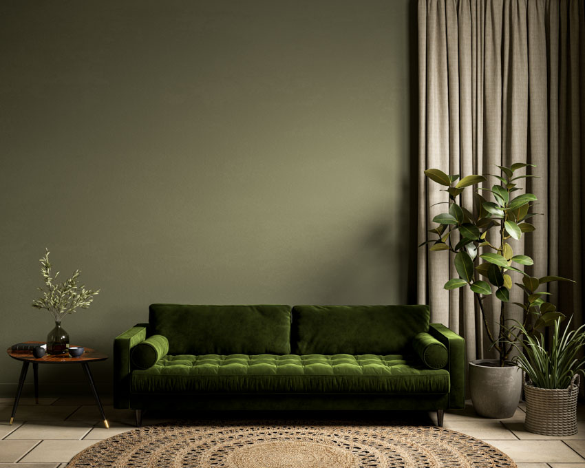
Colors That Go with Dark Olive
Dark olive green is an elegant color that can be used instead of other neutrals. When most people picture green, they think of a tranquil color that relaxes and helps relieve tension. It is by far the most visible color in nature, associated with renewal, hope, and expansion. These dark green-hues promote serenity when employed in interior design. Here are some of the colors that go well with dark olive green:
• Orange: Combining orange with dark greens is a fantastic combination that must be executed carefully to avoid becoming overwhelming. You can use the greens with accents of orange randomly thrown into the mix. You can also choose a rusty orange color to warm the room yet toned down if you want something a little less colorful but not drab.
• Tan: Tan is an appealing color to match with dark greens if you want to create a more farmhouse and earthy atmosphere in the room. You can use these colors in a family room to make an impression of a garden theme if you want a more modern-meets-traditional design. Furthermore, when combined with houseplants and natural materials, a tan combination delivers a relaxed and pleasant vibe to any type of space within a residential property.
• Yellow. This color pairing might seem unusual, but in reality, dark greens and yellow work well together. For example, a dark green sofa with vivid yellow pillows will highlight the yellow undertones in green. It brightens and expands the area. Nonetheless, avoid using a pale yellow color with because the combination might look unsightly.
• Maroon. Another shade encountered in nature is maroon, which appears as the leaves on trees change color in fall. Maroon is a hue that falls midway between red and brown, and it contrasts well with dark green. This color palette is appropriate for creating a pleasant setting for studying or reading areas.
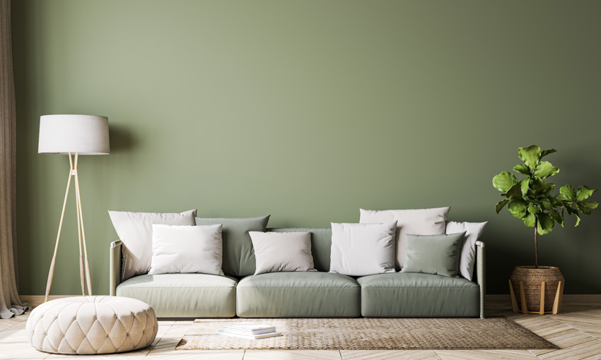
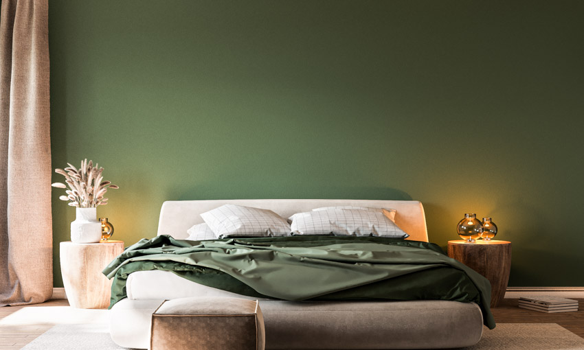
• White: When combined with white, dark green turns snappy and pleasant. You can paint your walls white with splashes of greenery to make them brighter and more appealing. Darker shades of olive green look fantastic with white accents. These decorations could be as simple as white picture frames and candles or as elaborate as a white couch with dark toned cushions or white carpeting.
• Black: If you plan to use a third color, black and dark green would harmonize since they are both dark colors. Without a third lighter color such as white to balance them out, they can potentially dominate one another.
• Gold: If you want to produce a high-class, refined design, you can apply gold accents in combination with darker greens. But keep in mind that you do not need a lot of gold color accents. When it comes to achieving a contemporary style, be minimalistic. Little pops of gold must be seen in the types of furniture styles you’re using, such as couches with gold legs or other golden details.
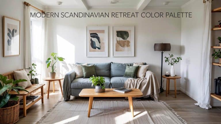
Colors That Go With Light Olive
In some places, we have observed a shift in applying light olive green as an all-over foundation color, comparable to how neutrals have generally been used. Light greens look great in bedrooms due to the quiet, calming atmosphere they provide, and they also look great in rooms that face a peaceful garden or vegetation as they act as a natural expansion, creating the idea of drawing a serene outdoor environment in.
Here are the colors that go well with light olive green:
• Cream: Delicate cream hue brings out the depth of the color. Because light shades are subdued colors, you can make it the center of attention as the major accent and keep the rest extremely neutral like cream.
• Black: The subdued nature of light olive green is harnessed and amplified for a striking effect, especially when paired with black. The entire impression is refined and striking, sleek and exquisite.
• Pink: One of the most beautiful colors to pair with is pink. It is indeed a timeless combination that appears frequently in modern interior design ideas. These two colors complement each other so effectively since they provide a sense of harmony. Dark pink tones accentuate, while softer pink shades maintain the palette looking youthful and joyful.
• Orange: Orange is an ideal way to bring depth and warmth. It creates a strong contrast, can be lively and delightful, and promotes a classic vibe.
• Red: Use red, burgundy, cherry, as well as crimson for a more vibrant contrast, adding zest and vibrancy to the space.
• Blue. Another great combo is to pair the shade with blue. They are precisely related to the color wheel; hence, introducing the two tones to create the impression of extra color without dominating the room is simple. You cannot go wrong with this combo, as it is fresh, earthy, and utterly versatile.
Olive Green Color Combinations
Here, we share the best color combinations with olive green.
Olive And Black

Black can be used as an accent color alongside olive green or the primary color scheme. In any case, these two colors are likely to stand out.
Olive is a soothing, ravishing, yet dramatic color that goes well with almost every other shade. The hue can significantly excite a space and elevate the vibe when layered with elegant black paint.
Black, by definition, is the absence of color, making it the ideal backdrop for practically every other accent color. Sherwin-Williams Tricorn Black (SW 6258) is one of the finest, most neutral blacks that goes very well with greens. This rich and intense black has no undertones and will look gorgeous paired with this shade.
Olive And Blue

Indeed, blue and olive green look great together. Blue, especially the aqua type, is a light bluish color that complements it wonderfully. This is the ideal hue for accents in your home.
Since it is low-key and tranquil, olive would be a terrific color for painting walls. And when combined with aqua blue, these two hues produce an even more soothing and pleasant environment.
Glidden Deepest Aqua (30BG 33/207) is a deep aqua blue that can be a nice part of a gorgeous color-scheme. It is a brilliant option for the majority of spaces. This blue paint is cheerful and suitable for an ocean or nature-themed interior space, thereby making it a great selection to pair with.
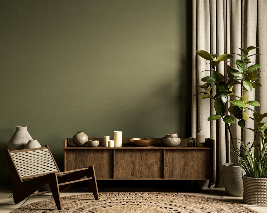
Olive And Brown

Brown and green is a timeless color combination. These two hues enhance each other to generate a homely design. You can use olive as an accent hue to give depth and richness to any area.
Nevertheless, brown can also be employed as a primary or accent hue to achieve a naturalistic aesthetic. These hues are ideal for creating a farmhouse-style or earthy home environment. You can use these colors to create a rustic, pleasant, and friendly atmosphere in your home.
You can try Benjamin Moore’s Charlton Brown (CW-265) for a brown paint color with a significant sense of style. This rustic brown enhances the natural organic feel as it features undertones of clay and red, as well as a classy and grand appearance.
Olive And Navy Blue

The colors olive green and navy blue complement one another well in interior decoration. Navy blue is a powerful, dark tone that has the potential to add intensity to a room, whereas green is a soothing, organic color that can be implemented to create a warm feeling. This combination can do wonders to your home, making it eye-catching for your guests.
Sherwin-Williams Naval (SW 6244) paint is the finest choice to complement the inherent charm of green. This color’s richness works best in spaces such as the library and as one of the formal dining room ideas that can be considered. It can also be used as a striking accent wall. You can freely pair it to draw your attention to the space.
Olive And Pink

Olive green and pink are a perfect color combo as well. In fact, this design is ideal for the winter season. You can use various shades of pink to create a warm and romantic atmosphere in your interiors. You may finish it off with some cream accessories to help balance out the hues.
Farrow & Ball Calamine Pink (No. 230) is a beautiful soft pink paint that is pretty without being overly sweet. The hue is inspired by the calamine lotion that we used when we were kids.
It has a faint gray undertone that keeps it feeling contemporary and looks great as a pairing. You can try it in a small location for a strong splash of color that will not overpower the interior design.
Olive And Orange

Olive green and orange are contrasting hence they go well together as well. They can be incorporated into the home design to create a welcoming and pleasant environment. Green evokes the natural world and warmth and coziness, forming an eye-catching backdrop for oranges. Orange is an excellent method to bring warmth and dimension to it.
You can use the Benjamin Moore New Dawn (133) orange paint color for an amazing pop of character and charm. This shade is a classic orange with cream undertones and a delicate earthy vibe that complements the beauty of greens.
Olive And Burgundy

Numerous homeowners may not believe that these two colors coexist, but in reality, they form a very attractive and sophisticated combination. Burgundy is a rich red, whereas olive is a subtle green. They combine to form a lovely dark green shade. This color scheme can be used in a variety of ways, including in clothes, home design, and even makeup.
Farrow & Ball’s Eating Room Red (No. 43) is a richly pigmented burgundy that will add complexity to your olive green décor. It has a tinge of a purple undertone, much like a premium wine. It has a deep, old-world atmosphere that pairs beautifully in farmhouse-style homes with moldings and furnishings painted in this green to create emphasis.
Olive And Red

Indeed, this is a classic color tandem that will never go out of fashion. The colors olive green and red work well together in home design because they generate a cozy and welcoming ambiance. You can add red accents to your room to add a flash of color or use red paint over an accent wall to generate a bold impact.
Little Greene’s Atomic Red (190) is a powerful primary red that lends a touch of flair to a room and combines well with light to medium greens. You can even add beige accents for a more modest look or gold highlights for a more stunning effect to the mix.
Olive And Gray

In minimalist home decor, these two colors are frequently encountered together. Gray can be employed to brighten the combination or to make it more discreet. Such two colors might appear to some to clash, but with the proper accessories, they can look fantastic together.
Sherwin Williams Dovetail (7018) is an excellent charcoal gray paint with a slight touch of a blue undertone. It is a dark, rather manly tone that really highlights your greens. Since it is a darker gray, it is very ideal for an accent wall in an olive room with abundant natural lighting.
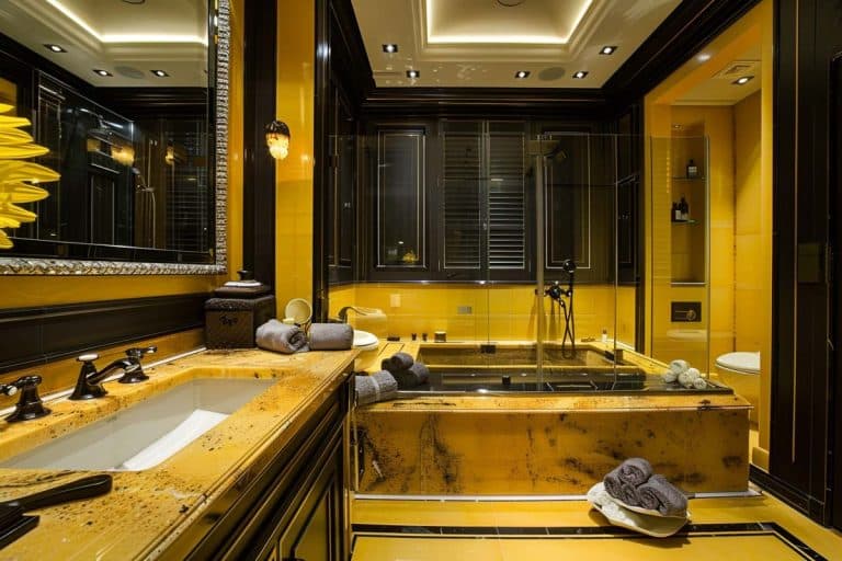
Olive And Gold

These two colors are extremely complementary to one another. Gold is a striking shade that can brighten up any olive-green space. Hence, you should think about adding gold accessories to a room with a lot of olive features.
You may also paint one of your room’s walls gold for a stunning effect. Green and gold are ideal for bringing a touch of sophistication to your home. Sherwin Williams’ Empire Gold (SW 0012) would be a wonderful choice to spruce up a space with green accents or walls. Using this gold paint can pull off a rich golden setting that provides a comfortable and appealing space.
Olive And Yellow

Yellow adds brightness and enthusiasm to a room, whereas olive green adds refinement and earthiness. You can utilize this unique color combination to establish an energetic yet calming environment in your living room or bedroom.
Vibrant yellows are cheerful and mood-elevating, providing your interiors with a complete makeover. If you decide to paint your space with Behr Bicycle (370A-3) Yellow Paint, you will find yourself smiling and feeling energized every time you walk in it, as this paint has a subtle yet energizing color.
Olive And White

Olive green is an adaptable hue that may be applied in a variety of settings. It can serve as an accent color or as the primary color in a room. White is an excellent compliment since it brightens the space while also providing a neutral backdrop for the other colors within the space.
You will not be disappointed with Sherwin-Williams Snowbound (SW 7004) for a proven and tested neutral color that has the abilities of a chameleon. There are no green, blue, or pink undertones in this white paint. Although this appears to be a genuine white when used alone, it also gives a uniquely elegant tone when combined with other natural colors like greens.
Olive And Purple

When dark olive green is combined with a jewel tone, the result is a gorgeously somber room. Deep purples like maroon or eggplant would also look great. This color scheme will look great in a home office or living room.
Valspar’s Rare Wine Purple Paint (1011-9) is a dark purple hue that exudes mystery and fascination. This is a wonderful option for an accent wall, instantly creating a focal point in the room. You can combine this exquisite color with olive and other gold accents for a royal look.
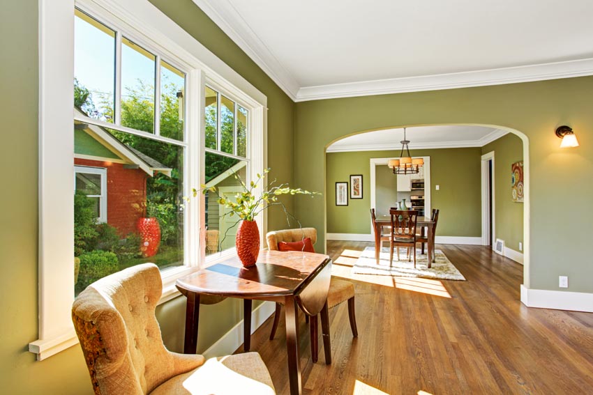
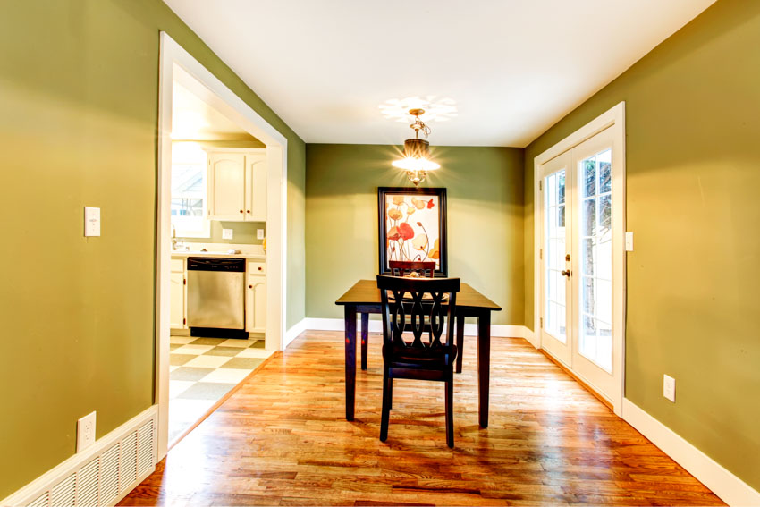
What Colors Match Olive?
Olive green is an extremely versatile color. In fact, some interior designers consider it as a neutral color as it can be matched with numerous colors. Beige, tan, blue, maroon, gray, purple, orange, yellow, and practically anything you can think of can be matched with it successfully.
The colors in this article are just among our top suggestions, but you can also experiment with matching other hues.
Olive Paint Colors
Here are some of the variations of olive green paint colors:

• Oregano: The best option for this shade variation would be Benjamin Moore Oregano (2147-10).
• Sage Green: Little Greene Sage Green (No. 80) would be the best selection for this paint hue.

• Avocado: Benjamin Moore Avocado 2145-10 is the most recommended paint option.

• Sap Green: The best option for this variation would be the Farrow & Ball Sap Green (No. W56).
• Bancha: Farrow & Ball Bancha (No. 298) is the most highly recommended option.
What Colors Go With Olive Walls?
• Orange: Combining orange with an olive green wall can create a stunning contrast that helps make those orange pieces pop out as a centerpiece, but not in an obtrusive way that takes over as the major color.
• Turquoise: Turquoise accents, with their vibrant hue, can stand out against an olive wall while still blending perfectly because both tones have the same green shade. See more turquoise color combinations here.
• Cream: If you want to pair green with a neutral color, try using cream. This would be an excellent neutral shade that complements the hue excellently. A cream tone can add a warm feel to your area while also helping to balance it in a minimalistic yet elegant way.
Is Olive A Neutral Color?
Generally speaking, olive green is considered a neutral color. Many greens are not neutral, but its earthy undertone renders it a warm color, similar to gray or beige. It is also a mid-tone color, which means it looks acceptable with both lighter and darker colors.
Olive Color Meaning
Olive green is frequently associated with tranquility and serenity. It can be utilized to convey a message of comfort and assurance. Additionally, it is commonly connected with nature, making it an ideal color for services or products that encourage environmentally friendly lifestyles.
When employed in branding or advertising, olive green colors can quietly convince customers of the product’s ecologically responsible attributes. Plus, the shade is often linked with luxury, making it an excellent choice for high-end items or services.
Furthermore, the color green represents balance and harmony. It is thought to be the most relaxing color for the human eye. Individuals who favor the hue prefer a sense of discipline and peace in their lives.
Olive green can also imply elegance and sophistication. Those that prefer this color may be thought to be stylish and classy. However some may claim that the shade evokes sadness, but some also believe it is a color of power. It is the fundamental color of the earth, and it serves as a grounding color for some.
See more related content in our article about sage green kitchen walls on this page.
To showcase highly specific designs, some images on this website use advanced AI-generation software to illustrate ideas and room inspiration. See our editorial policy to learn more.

Upload a photo and get instant before-and-after room designs.
No design experience needed — join 2.39 million+ happy users.
👉 Try the AI design tool now