50 Beige Color Living Room Options: Paint & Matching Ideas
Beige is such a reassuring color that’s simple yet conveys qualities of sensibility, strength, and a level of energy. A beige color living room provides a sense of sanctuary when used as a backdrop in social spaces. Like other light neutrals such as white and gray, it’s a versatile hue that can complement and blend virtually with any color and create a particular style or atmosphere depending on its shade or underlying hues.
Like white spaces, beige creates a bright and calming atmosphere, yet more familiar and welcoming, putting occupants at ease. A warmer tone than gray sets a happier atmosphere without being commanding, allowing the architectural and interior features to be the focus.
When unsure which shade to choose, we’ve gathered the best living room beige colors and what makes these shades stand out from the rest. [toc]
Warm Beige Paint Colors for the Living Room

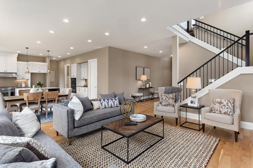
Sherwin Williams Barcelona Beige (SW 7530) – (Medium- Light): The light and soft-beige colors have that subtle gray, pink, and yellow undertones with a good mix of orange, creating an inviting backdrop but not overly warm that pairs best with white accents. The beige color living room is best with transitional and traditional-styled living spaces.

Sherwin Williams Accessible Beige (SW 7036) – (Medium- Light): The Accessible Beige is one of the most popular shades of Sherwin Williams as it creates that airy atmosphere and has that subtle grayish tone.
The beige color creates an elegant touch when paired with neutrals, especially with a white accent. A paint color that’s perfect for small to expand open spaces that can extend towards hallways to bedrooms. It also matches well with wooden textures and silver-hued metals, making it the perfect color for transitional and traditional-styled rooms.

Behr Almond Latte (N260-2) – (Medium- Light): Like the much-loved almond milk and espresso drink, the color has a creamy quality which is a combination of orange and brown tones. It is rosier than your standard beige and adds more volume than ivory but lighter than your tan tones.
The light to medium shade creates a friendly atmosphere that’s perfect for expansive spaces. Add medium to dark-toned wooden textures with white accents to create a relaxing ensemble.

Sherwin Williams Redend Point (SW 9081)– (Medium): The brand’s color of the year for 2023, Redend Point paint color, is a medium-beige shade, which is darker than your usual beige colors with a desert and terracotta vibe. It’s a cozy paint that envelopes a space and can look gorgeous under different types of lighting fixtures.
Layer the refreshing color with pink, white, and cream with gold or rose gold accents. It gives a plush and sophisticated appeal. The paint color is versatile and can suit any style, but it feels at home with modern touches and gives an instant update to transitional living rooms.

Dunn Edwards Light Beige (DE6211) – (Light): The warm and light shade delivers that airy quality that we love about beige, and with sleek and clean profiles and eloquent details, a modern living room will enjoy that subtle warmness. Whether partnered with crisp neutrals or ebony tones, the light beige enjoys a layered
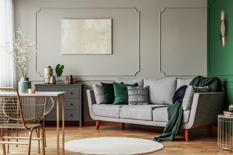
Gray and Beige Color Schemes
A trendy pair, beige-and-gray, opens up multitudes of possibilities; the numerous shades from both colors alone can create an easy-on-the-eyes appeal for any room atmosphere in mind.
Dual-toned or layering the neutrals with bold colors are general approaches in utilizing the combo. Separate elements according to function or areas using the colors or make any of the two as accent colors.
1. Cool Coastal Palette: Navy Blue #7F889F, Dark Gray #646A68, Light Gray #BABDBA, Taupe #F5F5EC and Beige #CE946A
2. Autumn Palette: Royal Blue #C4D4DC, Rust #874332, Gold #BE893A, Dark Red #422525
3. Breige Palette: Beige #EACCAD, Cream #F3DBC3, #848382 Medium Gray, White #FFFFFF
4. Urban Tranquility Palette: Dark Violet #261F3E, Plum #7B608B, Lavender #AC99B7, #DFD9D9 Light Gray, #998779 Medium Beige
5. Tropical Palette: Light Beige #E1D0BC, Ivory White #CFD5C6, #FCAC5A Yellow Orange, Dark Green #2D3E1E
Colors That Go with Beige
While beige can go virtually with any tone, colors found in nature best go with this hue, and popular combinations include white, blue, brown, and pale pink.
1. Cyan Blue #9eb9d4: For a youthful and revitalizing atmosphere, cyan blue is a great combination of the grounding beige. The balanced combination of cool and warm makes it easy to put together with the other design elements.
2. Dark Brown #5c4033: The medium brown shade is also a neutral tone that adds a level of contrast to the lighter-colored beige shade.
Inspired by the elements of nature, it creates that cozy ambiance for a living room and is an excellent grounding color. With this color you have the option of using it for dark brown floors, carpet or curtain color.
3. Peach #ffe5b4: The pastel version of peach is among the colors that go with beige as it simulates bearing fruit from nature and can be combined with any beige shade. The softness of the color makes it also an excellent partner to the more rustic-beige shade. A feminine palette combines peach, beige, and rose gold accents.
4. Rust #b7410e: A medium dark version of the red-orange color, the rust color pairs perfectly with beiges with warm undertones. Recreate the saturated sunset hues and jewel tones in a casual design. Play with the lighting design to create an impressive interior.
5. Blue Green #2a5d78: For that eclectic and explorative design, a blue-green wall with beige flooring and a white ceiling creates an open backdrop but is definitely pale or subdued. Add mural creations of cyan and pink and include organic materials such as rattan or wood furniture.
Accent Colors For Beige
Other neutral tones are your common accent tones, but you can also use bolder colors for furniture and decor to create a personalized space and take advantage of the muted neutral.
1. White: Nothing’s more suitable to highlight the architectural elements of a beige-toned living room than the achromatic white color. It allows the other colors to stand out and doesn’t compete with beige, no matter how light the shade is.
• White – #FFFFFF: Standard
• Pearl – #FBFCF8: Yellowish tinge.
• Alabaster – # FEF9F3: Warner than pear.
• Snow – #F5FEFD: Cool White
• Lace – #F8F2ED: Pinkish tinge.
• Daisy – #FAFAFA: Close to white but with a yellowish tinge.
• Rice – #FAF5EF: Close to white but with a brownish tinge.
2. Gold: Basically, beige is a muted version of gold that goes smoothly with the metallic sheen. Gilded furnishings, shiny brass metals, and other jeweled gold tones complement the muted neutral.
• Golden Orange – #D7942E: The orange color is dominant.
• Young Gold – #DFC026: Similar to yellow but has a greenish tinge.
• Shine Gold – #FFDD43: A close color of a glossy finish.
• Mystic Gold – #AF983F: Has an earthy quality.
• Traditional Gold – #EEBC51: has an orangey tinge
• Arabian Gold – #F4CA3E: The yellow tinge is a dominant color that’s a medium yellow.
• Brushed Gold – #CCBA78: Close to bronze.
• Autumn Gold Color – #BC819: A mix of brown and orange shades.
3. Yellow: Whether used for a sectioned wall or upholstery, adding the color of the sun to your beige living room further warms up the space and can draw attention to details and focal points.
• Honey – #FEC20C: Has an orange tinge.
• Amber – #FEBEOO: Close to Honey color but a little darker.
• Canary – #FFEF00: A bright yellow close to the color Bumblebee.
• Chartreuse – #DFFE00: Close to lemon but brighter having a neon-like quality.
• Bumblebee – #FBE106: A bright yellow that has an orange tinge.
• Banana – #FEE135: A darker version of the standard yellow.
• Lemon – #EEFC5E: A tinge of white that’s bright.
4. Green. Whatever green tone was chosen; it can beige wall color giving it a livelier look. Highlight arches and other architectural features without overwhelming the space. Choose green furniture or add lime-colored throw pillows or curtains to accentuate a layered look.
• Juniper – #3A531: A dark green similar to pine but has a brownish mix.
• Moss – #466D1D: Lighter than juniper but darker than your standard green.
• Pistachio – # B2D3C2: A very pale green.
• Emerald – #028A0F: Close to the shade of green but darker.
Colors That Match Beige Carpet
A beige carpet is the perfect grounding element that can go with any color and style, but there are colors that just love the color and can create that inviting living room perfectly.
1. White-and-Beige: White ceiling design types, beige walls, and wooden floors for a beige-hued area rug.
2. Gray and White: Ivory ceilings and dark gray walls for full carpet coverage.
3. Powder Blue and Gray: White ceilings, gray and powder blue walls for full carpet coverage, or sectional area rugs.
4. White and Red: White ceilings, gray walls, and red accents for full carpet coverage.
5. Mint green and White: White ceilings, mint green walls, and white floors for a beige-hued area rug.
Paint Colors That Go with Beige Tiles
The living room is regarded as the most important space in a house because of its functions. Therefore, it is very important to find a great color to go with the tile. As a home decor designer, I recommend four colors of paint that are splendid for pairing the beige ceramic floor tiles: white, grey, beige, and red.

1. White – Sherwin Williams Pure White (SW-7005): The white-and-beige is a classic combination that makes a living room look spacious and, when combined with the darker neutral, can create depth and definition to architectural features.
The combination creates a flexible canvas to add a layered look or a bold statement. It is one of the paint colors that go with beige tile for a variety of rooms.

2. Soothing Dark Gray – Farrow and Ball Plummett (272): Contrast is a tried and tested approach to creating visual interest, and a cool dark shade balances off a warm beige while creating a canvas for metallic and organic accents. The soothing gray color can be paired with white or wooden textured furniture for a Nordic-stylized living room.
3. An Exotic Red Commands Attention – Dulux Carmen Miranda (A88): Light colors are a staple in living rooms, but for a more dramatic interior, the deep and rich red with accents of beige is an excellent combination for an opulent and traditional design.

4. Zesty Lime Green for a Design With Personality – Benjamin Moore Chic Lime (2026-10): When layering beige tones, it’s tempting to go with neutrals as they maintain an airy feel to a space. However, it can create a monotonous and dreary look, especially with larger spaces.
To add a similar soothing atmosphere without breaking that soothing environment, the energizing lime green is the perfect color to add that right amount of zest to a chic living room. Stylize a palm beach-themed living room by adding rattan and coral elements.
See more related content in our article about the best beige kitchen ideas on this page.
To showcase highly specific designs, some images on this website use advanced AI-generation software to illustrate ideas and room inspiration. See our editorial policy to learn more.

Upload a photo and get instant before-and-after room designs.
No design experience needed — join 2.39 million+ happy users.
👉 Try the AI design tool now