27 Craftsman Interior Paint Colors You’ll Love

Easily charmed by hand-crafted creations, we, continue to love the coziness and familiarity of the Craftsman style, which is one of the most time-enduring styles since the 19th century. Also, integrating art into our everyday lives with a nod to nature’s beauty are two other reasons why we can integrate craftsman interior paint colors in our homes. Perfect for adding a homey feel to a space, you’ll notice that most traditional craftsman-styled homes are in the small to medium-sized square footage. The style is a strong contrast to your elaborate Victorian era, which was popular during that time. In this article, we’ll learn more about what colors are used in the Craftsman style and what other hues can be matched or mixed with the traditional hues. [toc]
Interior Craftsman Color Palette Characteristics

What is craftsman style, and what is the goal of this traditional theme? This is the first question to ask and answer so you can easily identify the best color palette for your home or business use.
The craftsman style was brought about by the Arts and Crafts movement in the 18th century, which it aims to showcase the simplicity of nature and emphasize the value of craftsmanship. Due to this, you’ll find a wide range of wood hues in the material and colors that complement the wood.
Most tones used in the Craftsman Movement have that earthy quality with medium contrast and are more likely to have a soft or muted tone.
Typical color schemes are inspired by nature, with warm neutrals and autumn and vegetable colors.
Craftsman Palette
Hints of Blue and Green: This craftsman color palette includes all colors from the three areas, namely, the sky, sea, and land, giving it a balancing interplay of colors.

#E8DAC8 – Sherwin Williams Champagne SW 6644: a perfect wall color with its soft light hue, can be generously applied without overwhelming the space.

#9F9B7F– Sherwin Williams Green Sprout SW 7728: the warm green with a grassy undertone and saturated smith green.

#A19A8F – Sherwin Williams Intellectual Gray SW 7045: a popular paint color, has just an amount of gray to give a complementary neutral to your stronger tones.

#B1C3C0 – Sherwin Williams Watery SW 6478: This tone gives off a blue-green tone, much like a muted sea green. Also called opal, the color is great as a secondary color but can also be used as accent tones.

#BFA37D – Sherwin Williams Stonebriar SW 7693: A complementary color to your blue-green tone, the mud tone works well with all the rest of the tones, which makes it an easy backdrop or secondary color.

#C49671 – Sherwin Williams Rustic Adobe SW7709: Craftsman colors are usually cozy and welcoming, and this adobe tone is the perfect color for your bedroom and social spaces.
Bold Classic: While craftsman homes have that muted quality, heavy woodwork is showcased in a rich high gloss finish, which usually produces layers of brown colors with a backdrop of bright and light tones such as yellow or white shades.
#68321A – Brown Wood
#763627 – Reddish Brown Wood

#D0A24D – Benjamin Moore Simply White OC-117: The perfect color to balance off the rich tones of the wood material, it can be used as an accent color.

#DAA954 – Benjamin Moore Hawthorne Yellow HC-4: When combined with the bold varnish tones it creates a warm and welcoming ambiance, which makes it perfect for living or bedroom areas.
Classic Colors: The classic colors were inspired by the simplicity of nature, using the three main colors brown, green, and taupe, before the color scheme of the Craftsman style evolved.

#A59789 – Behr Studio Taupe PPU5-7: This sophisticated tone has gray undertones that give off that timeless look and has that inviting quality that can be matched with your typical Craftsman colors.

#596D69 – Behr Meteorological N430-6: Characterized as a deep and moody tone, the blue-gray paint color is reminiscent of the deep ocean or stormy skies. It’s a perfect tone for craftsman style bathroom designs and other smaller spaces.

#655649 – Behr Calvary Brown N220-7: A generous amount of the shade is perfect for rooms that receive ample amounts and can have natural and light hues as home decor and accents.
Arts and Crafts style emigrated to America through the American Arts and Crafts Exhibition in Boston in 1897 and became known as the Craftsman style due to The Craftsman, a popular magazine of that time by Gustave Stickley. – Interior Design Fundamentals, Steven B. Webber
Dune Colors: Through time, craftsman interior paint hues have expanded, usually incorporating layers of colors from the fields, forests, and even desert lands. This color palette gives a monochromatic look with hints of sunset hues.
Room-by-Room Color Schemes
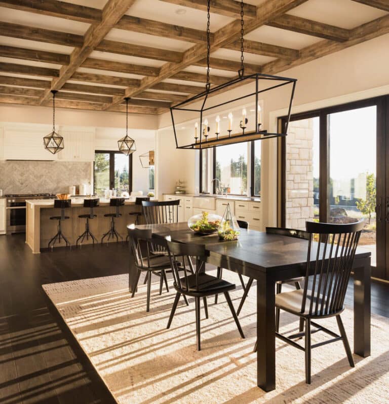
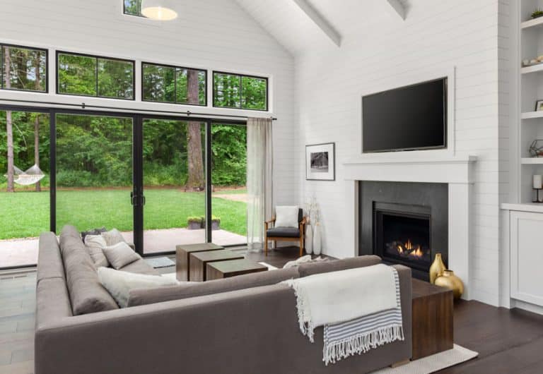
Living Room: Craftsman living rooms are like a gallery of handmade objects, mostly made from leather and wood with touches of corduroy textiles. Traditional craftsman homes usually have that dark brown tone for wood, either as paneling or ceiling beams. But this ensemble creates a welcoming and lived-in feel to the space as the rich tones converge with wood as the most commonly crafted material.
#C68C73
#8EA2A5
#41291B
#7C493B
Kitchen: Like your living room, chestnut tones are typical, but a softer version that uses sage tones instead of the strong red-brown tone can be a great alternative. The earthy green combined with detailed designs and matte black hardware can be a modern craftsman style interior.
#8F8D76
#4A4B3F
#4D2A1A
#443D2C
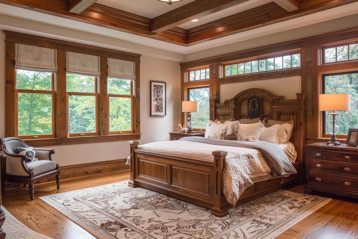
Bedroom: The area of the home requires a more comfy and welcoming ambiance, and most craftsman interiors have a sandy or beige theme. The limited number of colors lessens the visual weight of the space. However, you can always opt for traditional, opulent built-in furniture, especially if you have an expansive bedroom.
#9F9282
#908972
#CFBCA4
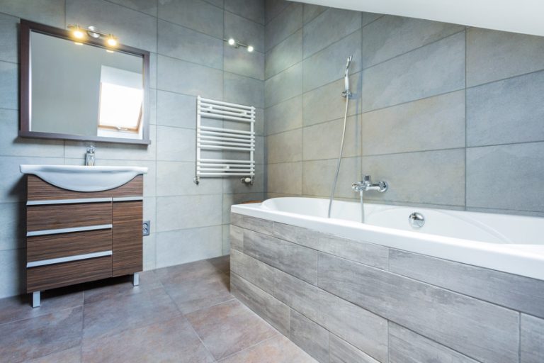
Bathroom: A craftsman-styled bathroom is an opportunity to get more creative using other materials, such as richly colored glazed wall tiling with your typical natural wood moldings. Most cabinets, like those in the kitchen, usually showcase shaker-style vanities with simple pullware or hardware.
#5A2D0C
#312B22
#94805C
#5B503F
Accent and Trim Colors

Benjamin Moore Revere Pewter HC -172: A part of Benjamin Moore’s historical colors, Revere Pewter is a neutral hue that leans toward the outdoors for warm tones, but it will depend on your lighting and the lighting fixtures you’re using.

Benjamin Moore Gray Owl 2137-60: While sage can be combined with warm white to create a striking craftsman house exterior, lighter gray color combinations are great for the hallway or feature walls.

Benjamin Moore Chantilly Lace 0C-65: A crisp white paint hue by Benjamin Moore with a warm tinge that can be a substitute for your pure white. It works great as a trim shade, offsetting your blue-green tones.

Benjamin Moore Mount Rainier 2129-60: Inspired by the stunning peak in Washington State, the color showcases glacial blues that are perfect for toning down your desert tones. It can easily contrast with warmer colors and can be used as a monochromatic hue with blue greens.

Behr Studio Taupe PPU5-07: This taupe paint shade by Behr is a typical main color but can be switched to accent tones as well. Coordinating tones are #596D69, #655649, and #F5F4EC.

Dunn Edwards Navajo White DEC772: The white and creamy hue has a yellow undertone that creates a warm quality. The Dunn Edwards version DEC772 is a favorite exterior shade combined with tan and maple tones. In the interior, it’s the perfect accent color as it has the lightness that contrasts with moodier colors.

Sherwin Williams Wheat Grass (6408): If you’re looking for a hue for your doors and windows in your next Craftsman home, the Wheat Grass paint by Sherwin Williams is the perfect pop of brightness, as it has that muted moss-green look that blends well with grayish and mahogany tones.

Sherwin Williams Hush White 6042: Another Sherwin Williams paint color, Hush White 6042, is a gorgeous choice to alternate with your white colors and is great with gray tones as it contrasts with the reddish undertones.
Modern Craftsman Interior Paint Colors

Benjamin Moore Van Deusen Blue HC-156: This paint hue is a lighter version of your blue-green and with purple undertones. The striking tone works well with white or yellow-tinged colors and also works with reddish-brown wood.

Benjamin Moore Collector’s Item AF-45: This white hue has a warm undertone of pink and can be easily matched with mint, beige, sage green, and grays.

Sherwin Williams Crushed Ice 7647: If you’re looking for an alternative to the stark white paints, Sherwin Williams’ Crushed Ice is a great choice, and you’ll find the modern tone having that medium contrast between white elements.

Benjamin Moore Slate Blue 1648: This gorgeous blue tone has a sophisticated and classic quality that can be used as a secondary color. It has a calming effect in a room and can easily contrast well with warm tones, blending in for a monochromatic color palette.

Benjamin Moore Venetian Portico AF-185: A muted version of your terracotta tones, this soft tone works well as a secondary color and provides a contrasting tone to blues and greens with its reddish quality. The paint can also be generously applied as the primary choice, together with taupe and beige tones.

Dunn Edwards Cinnabar DE5209: This Dunn Edwards paint is a brighter version of your classic terracotta color but more muted in shade. It is a warm reddish-brown color that closely resembles your orange-brown tones. Complementary colors include deep greens or blues and can pair with neutral such as beige, cream, or taupe. The term “cinnabar” is derived from the mineral cinnabar, which leans more toward the red-brown color.

Benjamin Moore Marblehead Gold HC11: Compared to your vintage yellows, this paint color from Benjamin Moore has a touch of sophistication while creating an inviting atmosphere. It can be complemented by deeper browns and works well with gray tones as well as metallic accents. The paint color, when interlaid, works well with a room that receives a lot of natural light.
See more related content in our article about log cabin interior paint colors on this page.
To showcase highly specific designs, some images on this website use advanced AI-generation software to illustrate ideas and room inspiration. See our editorial policy to learn more.

Upload a photo and get instant before-and-after room designs.
No design experience needed — join 2.39 million+ happy users.
👉 Try the AI design tool now