Colors That Go With Aqua (Best Color Palettes)
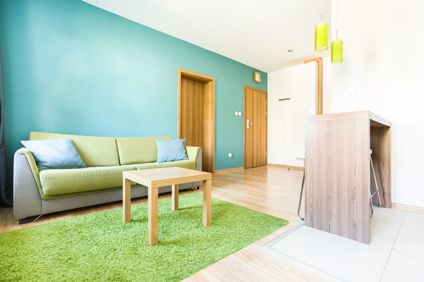
Aqua is a blue-green combination with varying intensities that range from mild seafoam to a deep blue with a green overtone. It comes in a broad range of tones, from bright and joyful to serene and quiet. There is a lot of flexibility in color combinations and patterns because aqua is so versatile for home interior design. There are countless ways to incorporate this beautiful hue into your home.
What Color Goes Best With Aqua?
Below are colors that pair nicely with aqua-blues in various home design styles.

Upload a photo and get instant before-and-after room designs.
No design experience needed — join 2.39 million+ happy users.
👉 Try the AI design tool now
Aqua and Yellow
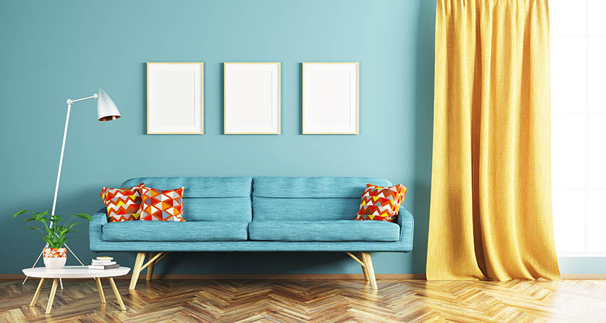
Yellow is a bright, pleasant, and happy color. When used with light-aqua-blue, this color combination may help to create a typical country cottage impression.
Choose delicate floral textiles that include hues and pair them with blue-hued walls and yellow accents like a yellow rug or pillows. The Aqua-and-yellow combination works exceptionally well in a bedroom, creating a cozy ambiance.
For a more Scandinavian look, combine lemon yellow with richer aqua-blues. Paint old wooden chairs a vibrant lemon yellow and add splashes of vibrant aquas to soft furnishings, like certain types of curtains or wall decorations.
Aqua and Orange
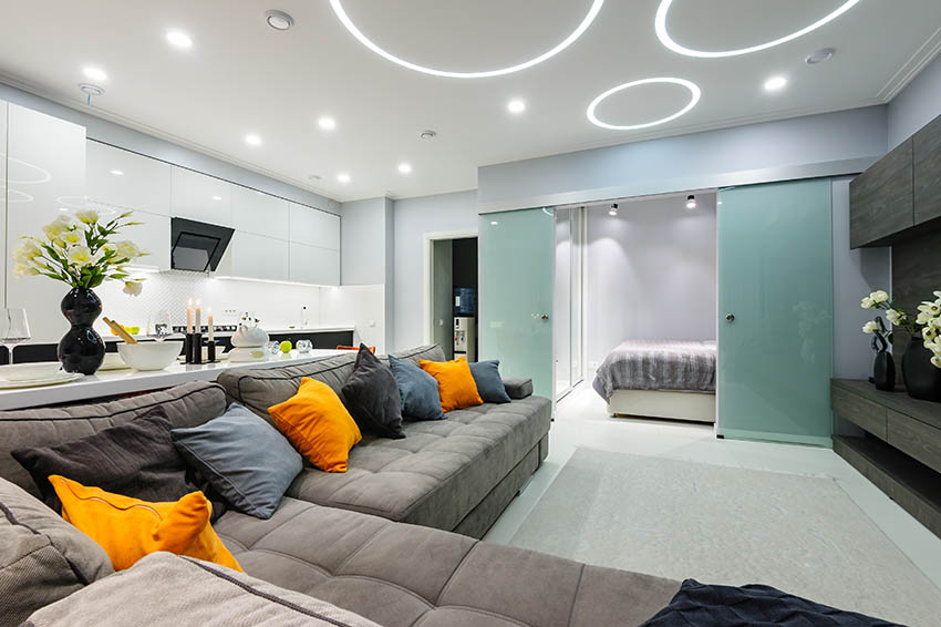
Orange has tan undertones, making it a pretty soothing color that would look great against a blue-toned aqua. Paint the walls pumpkin orange and highlight them with wooden furniture in gentle blue-toned shades.
To utilize orange-and-aqua on a broader scale, use one of the hues in a softer shade, with pumpkin orange or intense shades with peach. Pumpkin spiced orange is a hot hue that resembles a combination of orange pumpkins and cinnamon spice.
You can also use aqua-and-orange as an accent or decor pieces with a neutral base color to add pops of color. Using accent colors in this way allows you to change the look of the room readily and avoid coming across too intense. See more colors that go with orange here.
Aqua and Red
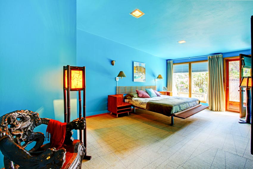
You may achieve a vintage aesthetic by combining bright aquas with cherry red. Paint the walls blue and use red kitchen equipment like a red mixer and a red toaster. You may also create a more eclectic vibe by combining aqua-blue and red with rustic wooden furnishings. For example, use a subtle hue for the walls, cherry red furnishings such as a red sofa, and chestnut types of hardwood floors.
Aqua and Pink
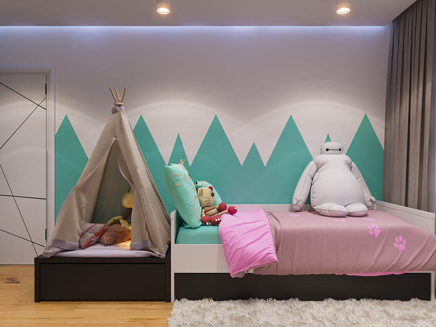
Any shade of aqua-blue goes nicely with pink, but it looks adorable when using mint-colored or softer tones. Use this color scheme in a child’s bedroom for a playful but lovely appeal or a French Riviera atmosphere in a kitchen.
Coral pink-and-aqua often symbolize the colors of the Mediterranean, so they may look great in a dining room or living room to create a bright and happy summer vibe.
Blush pink is also a fashionable hue in interior design, both as a foundation and accent color. Combine pink colors with gentle aquas to create a soothing palette that looks lovely in a room.
Aqua and Gray
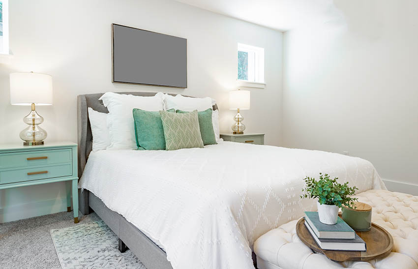
Aquas works well with both light and dark shades of gray. Those who want subtle can pair it with light gray shades. For a bolder look, one can try pairing the hue with dark or charcoal color gray.
Consider using gray as an accent for a modern ambiance to tone down the dark elements. Soft gray furniture can be paired with neutral paint and light blue decor elements and fabrics with great results. See more pictures of what colors go with gray here.
Aqua and White
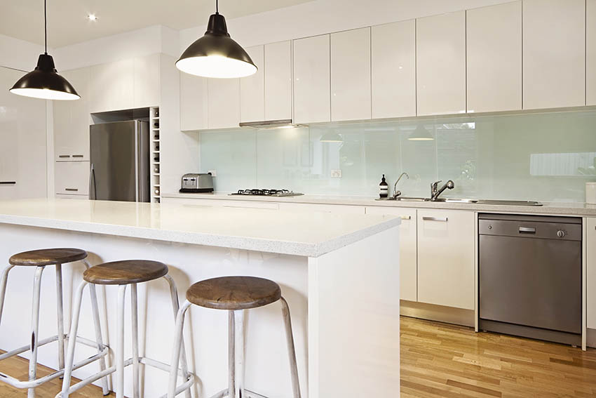
If you have picked a light aqua-toned shade, white is a simple color option to create a relaxing atmosphere. The shade will also go well with ivory, an off-white hue, for a soft interior design with a hint of warmth. Choose an aqua-and-white combination with sharp angles if you want a more contemporary and edgy aesthetic.
Aqua Color Palette
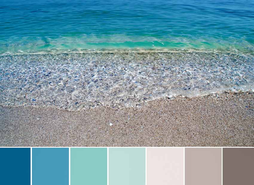
There are several aqua-blue hue variations, ranging from blue to green and everything in between.
Aqua Green

As the name says, the aqua-green hue (Hex Color: #00C0A3) comprises much more green than blue, with hardly a trace of red. Aqua-green may be energizing and refreshing, and it complements various other hues, including oranges, pinks, and purples.
Behr Green-Aqua M420-2 pops out, and you may pair it with warmer hues such as orange, red, brown, gray, or black. Aqua-green also pairs nicely with other neutrals, such as white or cream.
Aqua Blue

The aqua-blue hue (Hex Color: #05C3DD) is a more brilliant cyan color because it contains more blue than green. Because it has a stronger blue undertone, it will contrast nicely with orange, pink, and yellow hues. Aqua-blue has high brightness and saturation.
The impressive interior design suggests pairing Benjamin Moore, Cool Aqua, 2056-40 with light gold colors, white, cream, and various related hues or featuring accents of navy or red. Also, the natural shades of the brown family complement the light blue well.
Aqua Lake

This aqua color is closer to teal and has a pronounced blue undertone. When one thinks of a lake, one imagines darker waters, precisely what this hue is: a darker variation of blue. An aqua-lake hue (Hex Color: #30949d) is ideal for a bedroom space. Choose graphic prints for the walls and a variety of pink touches for the area.
Aqua-lake is the ideal paint color for a teen’s room with its beautiful, tropical turquoise-aqua and a mid-tone aquamarine undertone. As with teal, warm earthy tones like terracotta, it should complement the aqua-lake shade well.
Among the beautiful and serene nursery paint colors, this shade gives the room a contemporary feel with a hint of whimsy. With yellow accents, this paint hue looks fantastic.
Deep Aqua

The deep aqua hue (Hex Color: #00BCBC) is an exceptionally dark cyan with a slight green undertone rather than a blue undertone. You can utilize the hue to give a color scheme a touch more seriousness, elegance, or refinement.
Deepest-aqua is a saturated, muted undertone excellent for a kitchen or dining area. It is also ideal for an ocean-themed playground: capture coral, red, and yellow bursts in accessories for a deep marine vision. You can incorporate a deep, mermaid-inspired design for a child’s room. It looks well with other bright hues like coral and pink.
Aqua Foam

Because of the higher amounts of green and blue present, aqua-foam (Hex Color: #adc3b4) is more of a light, grayish-cyan shade. This color is also from the green family and pairs well with grayish pinks to add warmth.
Behr, Aqua Foam, 2A54-4, is a sophisticated color. This hue is distinctive to every aspect of your house by being open and inviting, with a serene sensation of happiness and intrinsic elegance.
Aqua Color Combinations
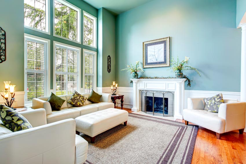
Understanding color theory can help create striking aqua-blue combinations that look fantastic. Here are a few different variations to use.
Complementary Aqua Colors: Complementary colors complement each other and create a lovely contrast. So, looking at the shade on a color wheel, look right opposite it to get its complementary hue. The combination of aqua-and-red is a good example.
Complementary aqua colors also include gray, orange, red, and yellow. A brilliant blue-aqua hue and a red tone provide the ideal blend between nostalgic kitsch and surprising grandeur. Both colors‘ undertones complement each other well, while bits of marble, gold, and crystal provide contemporary and vintage flare.
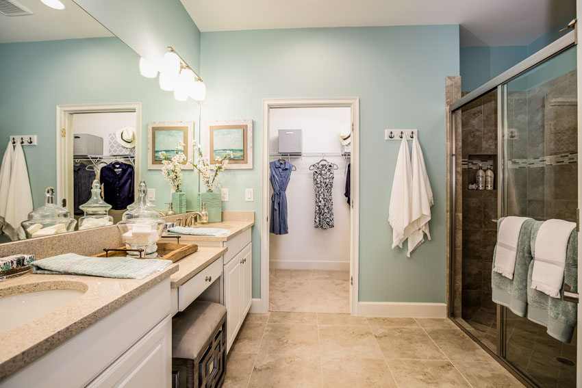
Monochromatic Aqua Colors: A monochrome approach is appropriate if you want colors that do not stand out as much and are easy on the eyes. These colors are all derived from a single hue that exists in a variety of shades.
Monochromatic aqua colors are some of the easiest ways to jazz up a space, and they are also a great option if you want a more restrained look. The first thing to remember is that these monochromatic shades are generally darker than their lighter counterparts.
There are three monochromatic aqua-blue colors: blue-green, teal, and greenish-blue. The first two are bright and lively while maintaining the relaxed feeling that makes them so easy to work in any space.
If you’re going for an airy feel, try using one of these two shades mixed with white or another neutral color for maximum contrast and visual appeal.
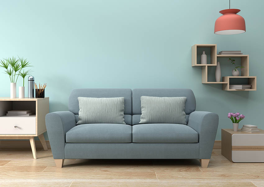
Analogous Aqua Colors: These are also fewer contrasting hues that produce a more harmonious combination. When looking at the color wheel, analogous hues are near one another. When it comes to aqua-blue, the equivalent shades are blues and greens.
You can use the analogous color scheme to create a soothing and inviting atmosphere for a home or office. Aquas also pairs well with white and natural materials such as wood, stone, and metal. It is common for homeowners to use it in their kitchens when building a new one because it looks great with stainless steel appliances and other stainless-looking furnishings.
Triadic Aqua Colors: Triadic hues stand out and generate contrast. The most basic color combination is three colors that make a uniform or equal-sided triangle shape on the color wheel. Four or more color combinations, such as square or tetradic, are more challenging. For instance, aqua, cyan, and magenta are the related triadic colors that look best together and create harmony within a space.
What Color Goes Best with Aqua Infographic
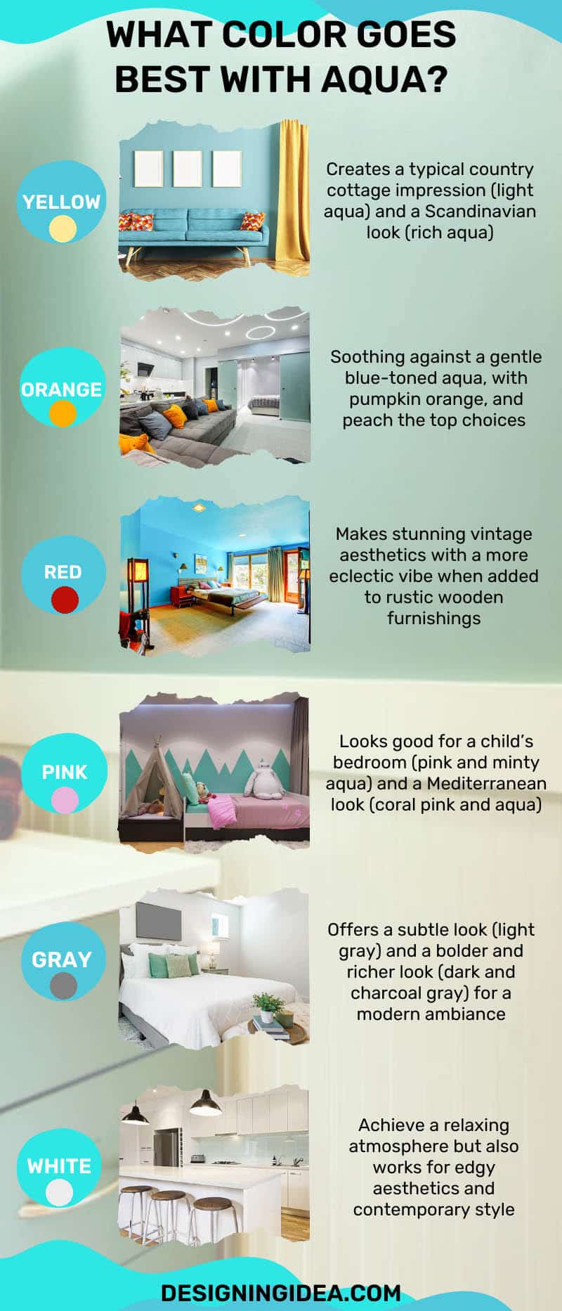
Feel free to use this: what color goes best with an aqua infographic on your own website, provided you link back to this page.
If you’re looking to add a little color to your home or office, you may want to choose aqua, as it is a great accent color that can combine well with almost any design. Whatever you decide, be careful to combine the colors before making any final decisions.
See more related content in our article about colors that go with light blue on this page.
To showcase highly specific designs, some images on this website use advanced AI-generation software to illustrate ideas and room inspiration. See our editorial policy to learn more.




I think aqua and cream or oatmeal color work well together. I have an oatmeal sofa that pairs beautifully with an aqua accent wall in my living room. I get a lot of compliments on it.
I love that combo too, I have Behrs’ Sea Ice in the walls with ivory drapes.