Barndominium Color Schemes (40 Interior & Exterior Paint Picks)
Barndominiums have become quite popular over the years. And rightly so. They combine the rustic charm of a barn-style architectural design. They marry it perfectly with modern amenities, high-end finishes, and anything you want to add to a modern home or dwelling. However, due to their open design, knowing the best barndominium color schemes to use can sometimes be a challenge

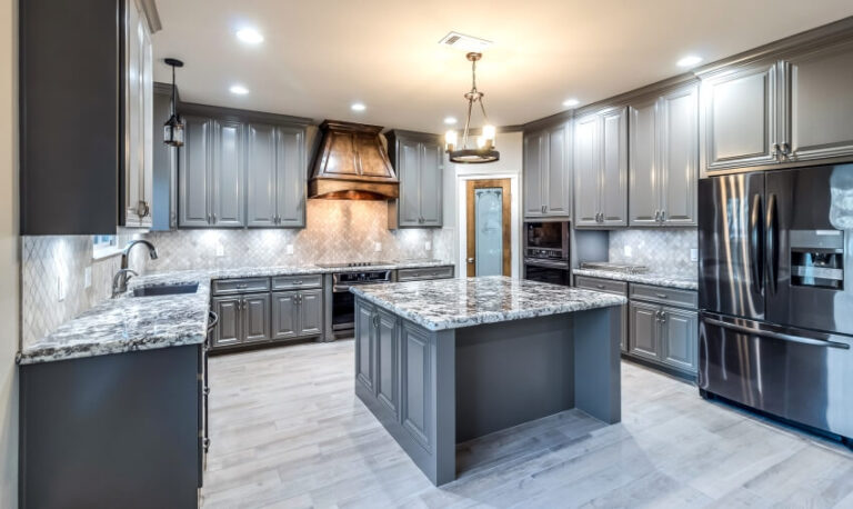
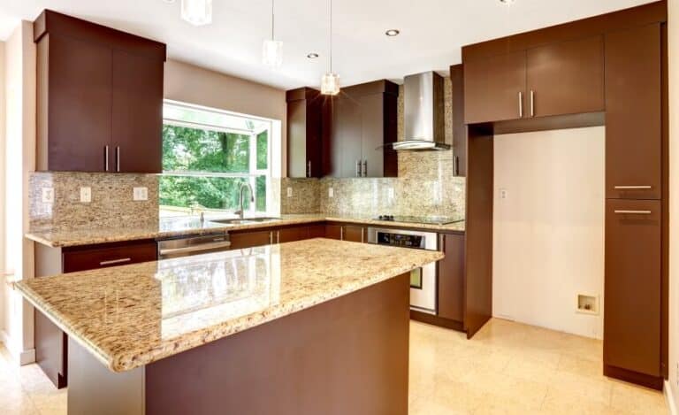
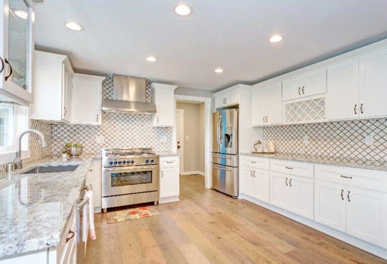
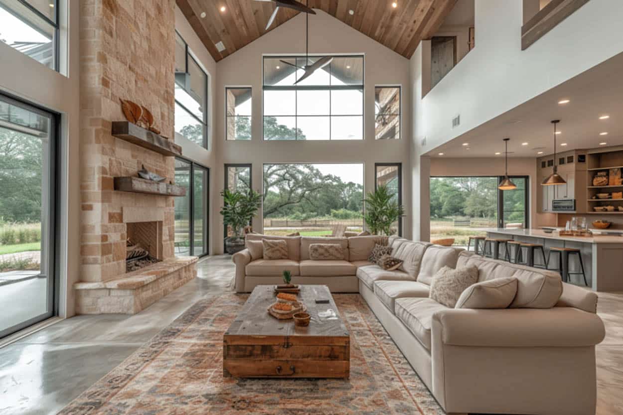
A barndominium’s interior is sometimes a problem, even for interior designers. It can showcase modern kitchens, high-end finishes, airy open floor plans, luxurious bathrooms, and even hardwood flooring. However, with the right plan and an intelligent color scheme, this is something that you can definitely tackle or take on. [toc]
Best Barndominium Colors
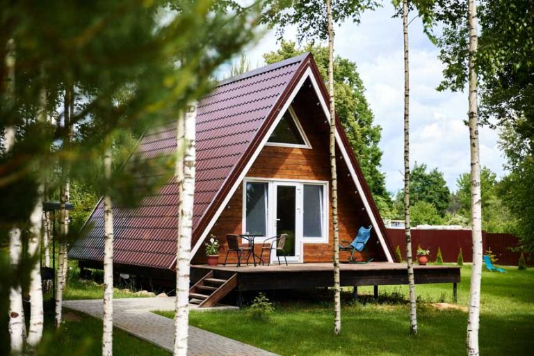
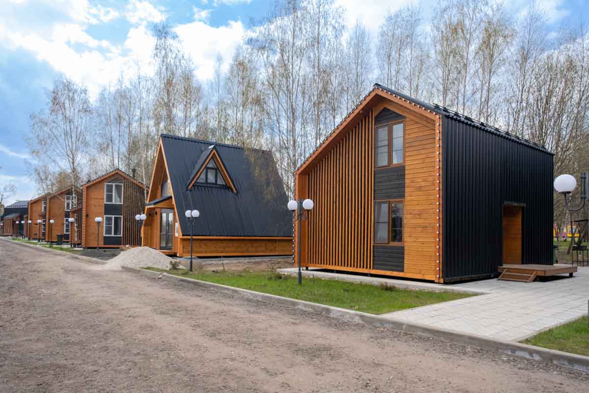
Barndominiums can be a real challenge to design because of their expansive features. It has extraordinarily high ceilings, open floor plans, and wide open spaces that are atypical of a traditional home.
It’s because of these features that really make it a feat to design a barndominium cohesively at the end of the day. On top of that, its sparse and plain exteriors can be tough to match with whatever aesthetic you might initially have in mind.
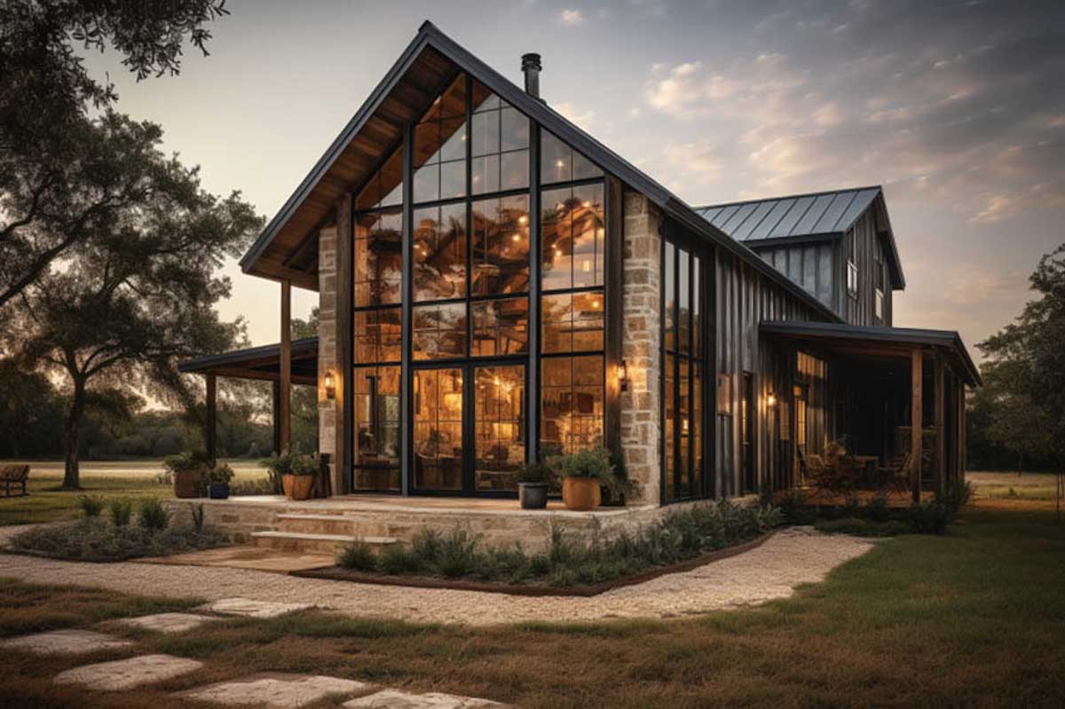
With careful planning and the right color and décor choices, it’s possible to create something that isn’t only functional but hands-down beautiful. You can start by embracing the natural materials intrinsic to it, such as wood, metal, and stone.
Another angle you can look at is taking the modern route by having a lot of neutrals, incorporating modern lighting fixtures, and sleek modern furnishings. The key to this endeavor is cohesiveness from start to finish. Keep that in mind the whole time to have something to “ground” your design.
The best barndominium colors are highly subjective. There are a lot of different options that can actually work well for you. But first off, you need to sit down and think about your sense of style. Next, you should consider the look you would like to achieve for your barndominium.
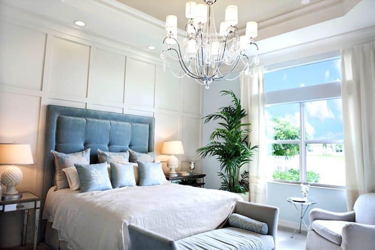
Barndominium Interior Colors
Here are a few popular interior color schemes to consider:
Rustic Neutrals
Opt for rustic neutral colors such as creams, beiges, light browns, and other colors in more or less the same color wheel. These colors are great for barndominiums because what they create is very inviting and warm. Rustic neutrals are perfect for your interiors, especially if you want them to be cohesive with your exteriors.
- Cool Whites: Decorator’s White by Benjamin Moore and Extra White by Sherwin Williams
- Warm Whites: Swiss Coffee by Benjamin Moore or Alabaster by Sherwin Williams
- Beiges: Manchester Tan by Benjamin Moore and Balanced Beige by Sherwin Williams
- Greige: Revere Pewter by Benjamin Moore and Accessible Beige by sherwin Williams
Natural Colors
When we say natural colors, we’re talking about colors that occur in nature, such as blues, greens, and browns. These are colors that you will typically see in outdoor landscapes. Because the ceilings are so high and an open floor plan is throughout, these colors can ground your design well. It will make it easier for you to create a rooted and tranquil look.
- Earthy Neutrals: Stonington Gray by Benjamin Moore or Wool Skein by Sherwin Williams
- Taupe: Taupe Tone by Sherwin Williams and Himalayan Trek by Benjamin Moore
Contemporary Neutrals
Another great color palette to consider when a barndominium design is contemporary neutrals. These colors never really go out of style and always have the aesthetic of looking modern and very high-end.
A palette of blacks, whites, and grays will never really go out of style. Individually or together, they can create a look that puts up a stark contrast against the otherwise rustic exteriors of your barndominium.
- Soft Blacks: Wrought Iron by Benjamin Moore or Tricorn Black by Sherwin Williams
- soft Gray: Agreeable Gray by Sherwin Williams and Classic Gray by Benjamin Moore
Bold Accent Colors
If you want to add pops of color to your barndominium, consider playing with bold accent colors. Deep colors such as greens, blues, and reds used as accents in some of your accessories or furniture pieces can make all of the difference in how your design scheme pans out.
The ultimate answer to the best colors for your barndominium will rely heavily on what you want to achieve for the space in the first place. When you’re deciding, go out of your way to take a look at some color samples home with you. See how they look in different types of lighting at different times of the day before finally settling on a decision.
- Green: Sage Green by Benjamin Moore and Hunt Club by Sherwin Williams
- Blue: Naval by Sherwin Williams, and Breath of Fresh Air by Benjamin Moore
- Red: Caliente by Benjamin Moore and Heartthrob by Sherwin Williams
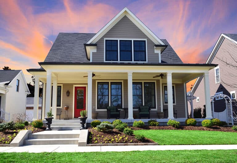
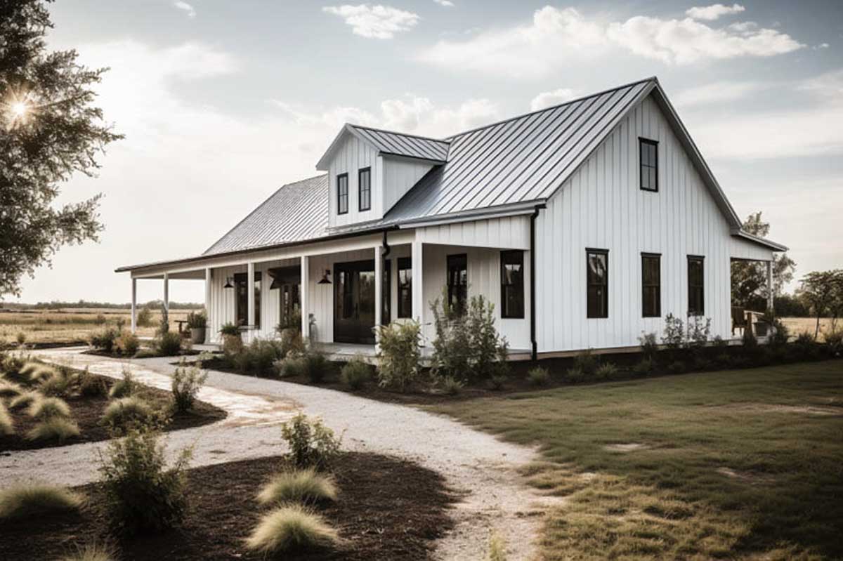
Barndominium Exterior Colors
Here we share the best exterior paint colors for barndominiums.
Whites

Sherwin-Williams – Pure White (SW 7005): This paint color is a bright and crisp type of paint with a really cool undertone. It’s part of the Sherwin-Williams White and Pastel Collection, which features a wide range of off-whites and whites that can work exceptionally well for interior and exterior settings.
The Pure White shade, in particular, works great for outdoor trims and walls and is a rich primary color you can use if you want a clean and modern barndominium. It’s incredibly versatile and neutral. On top of that, it pairs well with various design styles and colors.

Behr – Ultra Pure White (4850): This Behr peoduct is a true white paint hue that’s bright yet, at the same time, has a mild cool undertone. It’s part of Behr’s Pure Color Collection. This paint color has extremely high reflectivity. It can really open up the space and make it appear bigger than it actually is.

Benjamin Moore – Decorator’s White (OC-149): Itis a soft white paint with warm undertones, and it’s part of the Benjamin Moore Off-White Color Collection. What really makes it stand out is its subtle yellow undertone.
That undertone gives it a creamy look that’s warm and welcoming. Decorator’s White is actually quite popular indoors because of the kind of atmosphere it creates. Still, it works just as well for your barndominium’s exteriors. It’s a sophisticated color choice and an absolute classic. It can definitely elevate the building’s exteriors.

Valspar – Swiss Coffee (7002-16): This is a warm, creamy white shade part of Valspar’s Historic Colors Collection. Its mild yellow undertone can give your barndominium’s exteriors a soft and inviting appearance.
It’s a popular choice for walls and trims, but it can work as a primary color throughout and create a stunning look for your exteriors. It also has a historical quality, making it a popular choice for barndominiums. It can add a touch of charm and nostalgia to any building.
Reds

Sherwin-Williams – Heartthrob (SW 6866): It is a vibrant red paint that’s bold with a hot undertone.
The Sherwin-Williams Red and Rust Collection feature a range of oranges and reds meant to evoke excitement and energy. It’s an excellent accent for exteriors, but you can paint your barndominium with this color if you want to create something bold and dramatic.
It can be a rather eye-catching and intense color, making it a great contender if you want to create a strong visual impact. Heartthrob is a bold color choice, but it also happens to be passionate. It’s excellent for adding that pop of personality and color to your space.

Behr – Red Pepper (S-G-190): Behr – It is a warm red paint color with an orange undertone. It’s part of Behr’s Sensational Reds Collection, which features a range of energetic and vibrant reds. This color is lively and warm. It is best suited for creating a sense of warmth and excitement in the exteriors. It’s definitely a dramatic color.

Benjamin Moore – Million Dollar Red (2003-10): If you’re looking for a classic deep red paint color with a muted brown undertone, Benjamin Moore – Million Dollar Red (2003-10) is an excellent paint to consider.
It’s part of Benjamin Moore’s Classic Color Collection, which features traditional colors that have a timeless elegance. Million Dollar Red is luxurious and decadent and best if you want to create something refined and sophisticated. It’s a classic red color that always stays in style.

Valspar – Royal Garnet (1010-6): This regal and deep red paint color has a blue undertone. Valspar – Royal Garnet (1010-6) is part of Valspar’s National Trust Historic Colors Collection that features a range of reds evoking history and tradition. It’s a luxurious and sophisticated color choice and can definitely amp up the elegance and glamor of any space.
Grays

Sherwin-Williams Mindful Gray (SW 7016): This is a versatile, warm gray color with a green undertone. It’s part of the Sherwin-Williams Timeless Color Collection that features classic gray colors that can stand the test of time. Mindful gray is warm and soothing. It’s a versatile neutral that definitely looks great for building exteriors.

Behr – Silver Drop (790C-2): This paint color is a delicate gray with a blue undertone. Behr – Silver Drop (790C-2) is part of Behr’s Classic Collection that features a range of timeless colors that create a sense of comfort and nostalgia. Silver Drop is one of the most popular gray shades for exteriors, so you can’t go wrong with it.

Benjamin Moore – Stonington Gray (HC-170): This is a great color choice for barndomonium exteriors. It’s soft and subtle and has a blue undertone. This makes it a very versatile color choice for interiors and exteriors alike.
It’s neutral, so it’s easy to pair with. It’s stylish and can definitely look current as the years go by. It can work well in many lighting conditions and balance warm and cool shades. It’s also great for adding depth and dimension to your barndominium exteriors. It appears more blue than gray, depending on how the light falls. It’s definitely ever-changing and dynamic.

Valspar – Filtered Shade (4004-1B): It is a soft and subtle gray with a blue-green undertone. It’s a popular and versatile choice for barndominium exteriors because it’s calming. It’s excellent for promoting tranquility.
Although it’s great for bedrooms and areas where you want to promote tranquility, it works well for the outdoors. It’s a fantastic serene backdrop for accents or pops of color you can add to your trims, shutters, or walls.
Filtered Shade is a classic color with a timeless appeal. It was inspired by the colors you see in historic buildings. Also, because it’s neutral, it’s easy to pair with and is a great base color to make your exteriors appear more cohesive.
Blues

Sherwin-Williams Naval (SW 6244) and Indigo Batik (SW 7602): This blue color combination complements each other well. Naval is deep and rich with a gray undertone. At the same time, Indigo Batik has touches of purple in its saturated blue. It is a more vibrant color of the two all throughout.

Sherwin Williams Indigo Batik (SW 7602)
The dynamic is eye-catching because of the contrast that they create. They’re versatile to work with and great for modern and traditional exterior designs. They’re also great when paired with accent colors such as natural wood accents, white trim, and other elements to create different aesthetic effects. This color combination is excellent for creating cohesiveness in the overall design.

Benjamin Moore Hale Navy (HC-154)
Benjamin Moore Hale Navy (HC-154) and Gentleman’s Gray (2062-20): This is another color combination that works impressively well together. Hale Navy is a deep blue with traces of gray in it, whereas Gentleman’s Gray is a medium-toned blue-gray with cool undertones.

Benjamin Moore Gentleman’s Gray (2062-20)
When put together, they produce a sophisticated yet well-balanced color scheme for your barndominium’s exteriors. Both colors are classic and timeless and come from colors inspired by historical architectural styles and periods.

Behr Midnight Blue (N460-7)
Behr Midnight Blue (N460-7) and Dark Navy (S530-7): These colors work great together because they create a lot of depth. If your goal is to create a sense of interest and drama. They can be especially effective when you pair them with trim with a lighter color, such as cream or white.

Behr Dark Navy (S530-7)
This helps you balance out the dark blue shades. Behr: “Midnight Blue” (N460-7) and “Dark Navy” (S530-7) are rich saturated blue shades. Midnight Blue is dark blue with purple undertones. At the same time, Dark Navy is a more traditional type of navy blue with a green undertone. Mixed together, they create a combination that’s sophisticated and harmonious. They’re perfect for exterior designs.

Farrow & Ball Stiffkey Blue (No. 281)
Farrow & Ball Stiffkey Blue (No. 281) and Hague Blue (No. 30): These are a combination that happens to have a lot of complexity and depth. Stiffkey Blue is a dark blue shade with a gray undertone and evokes something very moody and somber.

Farrow & Ball Hague Blue (No. 30)
At the same time, Hague Blue is a more traditional navy blue with a green undertone. Also, these paints are built and formulated for exterior applications. They can be exposed to the elements and still stand the test of time. They’re perfect if you want a great-looking exterior combination that you don’t have to worry about as the years go by.
Metal Barndominium Exterior Colors
When it comes to metal barndominium exterior colors, there is no answer that’s considered one-size-fits-all. They can vary greatly depending on your architectural style, location, and personal preferences.
Some of the most popular options for metal barndominium exterior house colors are neutral shades from white to beige and even gray. You can be more experimental and play around with bolder colors, such as greens, blues, and reds.
One advantage of metal or steel barndos over standard homes is their greater fire resistance capability. – How to Build Your Barndominium, Kelsey Gibbs
Other things you need to consider when picking out your color scheme for the exteriors would be the surrounding landscape. Think about the amount of natural light that actually falls on the building. It would help if you also considered environmental factors such as the location of your barndominium.
Color Visualizer
The great thing about technological advancements is that you don’t have to rely solely on your own subjective eye or your interior designer’s, even. You can opt to use a barndominium color visualizer. This is basically a type of software or tool that will provide you with some insights on how various combinations will end up looking on your barndominium.
How a color visualizer works is that you will have the option to go ahead and upload an image of your barndominium. Once the image is up, the software will scan it, and you can play with the color options. You can experiment with any other part of your barndomiunium. You need to ensure the picture is correctly uploaded to the software.
This tool is beneficial for designers and homeowners deciding on the color scheme for their barndominiums. Imagining how a space will look with specific colors as opposed to actually seeing how they will turn out makes all of the difference in the world. It’s easier to make an overall informed decision.
There are a lot of color visualizers online. Some are entirely free with essential tools, whereas some come with more advanced programs with more comprehensive customization options. When you’re looking for a visualizer, one crucial thing to consider is the level of accuracy and detail you need, along with the tools and different features that matter most to you.
See more related content in our article about barndominium vs house on this page.
To showcase highly specific designs, some images on this website use advanced AI-generation software to illustrate ideas and room inspiration. See our editorial policy to learn more.

Upload a photo and get instant before-and-after room designs.
No design experience needed — join 2.39 million+ happy users.
👉 Try the AI design tool now