8 Dining Room Colors To Avoid Ruining Your Ambiance

Colors play an integral role in interiors not only in terms of aesthetics but also in invoking a specific mood and ambience in a space. Choosing the right color for your dining room can help enhance one’s dining experience — from making guests feel more welcomed, to encouraging conversations and making meals more delightful. Below, we take a look at some of the colors that you need to avoid when designing a dining room along with some insightful designer decorating tips.
Black
Black has the tendency to make a room feel unwelcoming and gloomy. When used dominantly in a space, this color can make a space feel too small and cramped, however, when used in small doses, it can bring in a sense of elegance and sophistication in an interior. Rather than being used as a wall paint, black is more suitable for dining rooms as an accent color.

Upload a photo and get instant before-and-after room designs.
No design experience needed — join 2.39 million+ happy users.
👉 Try the AI design tool now
Designer Tip! Instead of using black all throughout, use it for a feature wall. This design approach will add drama to the space without being too intense.
Dark Shades of Gray

Charcoal, slate and warm gray are best known for the subtle statement they bring into a space. However, dark shades of gray are not the best choice when it comes to dining rooms because they can make it feel cold and uninviting. If not combined with the right accents, dark grays can render a dull ambiance.
Designer Tip! If you want to use dark gray in your dining room, balance it out with warm accents for a more well rounded aesthetic.
Purples
Another cool hue which you should avoid for dining rooms is purple. Although a popular favorite in period and traditional interiors, purple is prone to clashing with natural food colors, thus making it appear less appetizing.
Designer Tip! If you really want to make the purple hue part of your dining room, consider a soft shade like lavender for small accessories such as table linens and accessories to tie the whole space together.
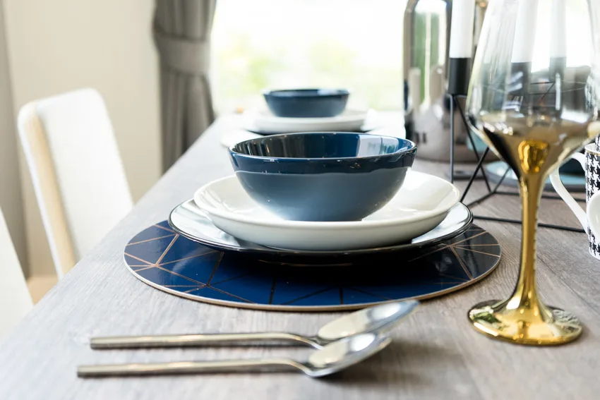
Shades of Blue

Shades of blue are known for suppressing the appetite — a mood which you should generally avoid in a dining room. In addition, color psychology suggests that in general blues invoke a sense of peace and calm, making them more ideal for bedrooms rather than entertainment and dining spaces.
Designer Tip! Use blue sparingly in a dining room setting by incorporating it in patterns of your soft furnishings like your table napkins, linens and under the table rugs, then mix with it soft neutrals like beige. Accentuate the whole alette with a warm hue like mustard yellow to make the space more inviting and cheery.
Dark Brown
Brown is the best color you can use for a monochromatic interior palette. It exudes natural warmth, however, this neutral falls too short of the lively feel you want for a dining room. Dark shades of brown like chocolate brown and umber can bring “heaviness” and dullness especially when used in large quantities. If your dining room is small, it can make it look even smaller. Veer away from this tone especially if you want openness in the space.
Designer Tip! Dark brown can still be used in a dining room not for the walls but for the furniture and wood color.
Mint Green

While mint green is one of the perfect choices for charming cottage style interiors, it is one hue you need to steer away from in dining rooms. Mint green lacks the natural warmth that you want for an inviting dining space. It appears too cold and fails to encourage a mood to spend some time in the space.
Designer Tip! Instead of mint green, try a more muted shade like olive green or sage combined with wooden tones. These shades are more versatile and easier to mix with various interior design styles.
“Electric” and Neon Colors
Neon colors are a popular staple in fun, eclectic interior design. Extremely bright and intense, neons like highlighter yellow, hot pink and lime green can be too overwhelming for a dining room setting.
When dining, the last thing that you would want to feel is to be overstimulated, instead you want a relaxing experience — and that may be hard to achieve with electrifying colors. These options are more ideal for high energy spaces like living rooms, play rooms, etc.
Bright Red
While red is a color known to stimulate the appetite, an overly bright shade can make your dining room too distracting. Dining in a room with a large bright red wall can make it hard to concentrate on your meals and can make the space feel uncomfortable.
Designer Tip! Warm hues like oranges, yellows and reds are the best hues you can use to paint your dining room because of the inviting and welcoming mood they bring into spaces. According to color psychology, these help stimulate the appetite, making them well suited for dining areas. However, make sure to choose the right tint and tone so your space does not look too overpowering.
In a residential setting, stick with light, muted or deep shades of warm hues. Some of the best hues you can use for dining rooms include terracotta, deep red and mellow yellows — all of which provide the right amount of warmth, encourage conversation, energy and fun.
What To Remember when Choosing a Dining Room Color
Before you choose a color palette for your dining room, think about the general mood you want to set in the space. As we have mentioned, color psychology works wonders in interior design. If you want to evoke a laid back, fresh and airy feel, opt for soft shades. For a cozier and more intimate dining experience, warm hues are your best bet.
Lighting will also greatly affect your colors because it can change how it appears. Some options look better in natural daylight but some need to be enhanced by artificial lighting. Before you commit to a wall paint for your dining room, make sure to test it out in different lighting conditions.
To showcase highly specific designs, some images on this website use advanced AI-generation software to illustrate ideas and room inspiration. See our editorial policy to learn more.