How To Use A Contrasting Kitchen Island To Enhance Your Design: 25 Beautiful Ideas

Do you ever look at your kitchen and wonder what it lacks to achieve that lasting “wow” factor in your home? Rich dark cherry cabinets, exquisite beige granite countertops, a stunning accent wall, and a matching kitchen island, yet it still feels like your kitchen needs a little more push to get that extra look you want. Well, we might have just the right solution to help you find that missing puzzle piece that can take your kitchen to another level of appeal – the contrasting kitchen island.
A kitchen with a single color scheme can sometimes appear too drab and boring. Nowadays, people have stuck with the conventional “two tone” scheme wherein light cabinets are usually paired with dark countertops or dark cabinets are usually paired with light countertops. There is nothing wrong with this color combination, in fact, it is considered a classic in the interior design scene.
Many kitchens look stunningly beautiful in a two tone color combination. However, this may not work for everyone. Also, the two tone color scheme is not limited to such application alone. There are many ways to explore it, and by painting your kitchen island in a different color, you can take this classic design principle into greater heights. [toc]
One of the most popular finishes and materials for a contrasting cooktop center is wood. Wood attracts may homeowners because it renders natural warmth and coziness to a space, and its beauty and appeal increases as it ages gracefully.
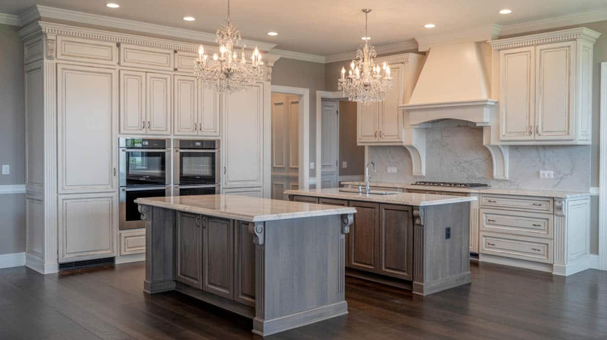
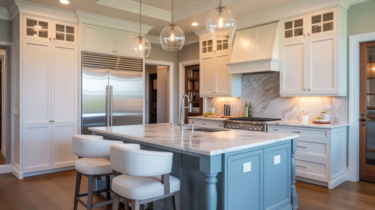
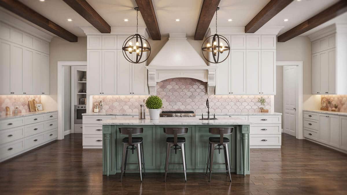
In this picture we can see a double island kitchen with a traditional design which features paneled cabinetry and decorative column details in a weathered wood finish. It is topped with a bianco carrara marble with exquisite gray veining, that are also reflected in the accent splash board. Both kitchen islands project drama and luxury, and produce a strong contrast of color and finish to the surrounding classic white cabinets.
Kitchen islands have gained in popularity over the last decade since they provide a gathering place for friends and family, offer additional room for food prep and can even double as the eat-in kitchen alternative. – House Poor No More: 9 Steps that Grow the Value of Your Home and Net Worth, Romana King
To top off the classic flair of the space, two gorgeous classic glass chandeliers were placed about the kitchen islands, providing an ambient lighting which keeps the atmosphere warm and inviting.
Why Contrast Your Kitchen Countertop and Island Area?
Matching a kitchen island with the surrounding cabinetry can create symmetry and harmonious blending. If that technique results to well balanced design, why should you veer from it and go with another approach?
For starters, painting a kitchen island with a different color than the rest of the kitchen cabinetry can instantly liven up a space, create visual interest and significantly change the character of your home. In addition to that, there are still numerous other reasons as to why you should give this genius design hack a try.
Easy way to update the look of your kitchen: Painting is one of the easiest and quickest fixes you can use to change the overall appearance of your home. By painting your kitchen island in a different color, you give your kitchen an instant “makeover” without changing much of your decor and furnishings. Just make sure that you choose a color that complements and does not clash with the existing color scheme of your kitchen.
Aside from paint, you can also explore other materials to achieve that contrasting color for your kitchen island. Some natural materials have inherent colors and undertones that can serve as space accents.
For example, if the cabinets along the perimeter of your kitchen are in glossy white laminate finish, you can either use stainless steel for your kitchen island. Stone, laminates, wood, tiles and concrete all come in a wide range of color options, allowing you to mix and match endless combinations to obtain the exact contrast that fits your taste and style.
Allows you to create contrast: Painting your kitchen island with a different color is a great way to achieve contrast. As we all know, contrast is one of the key elements to achieve a well balanced design – be it a subtle or a striking one.
Layering of textures, finishes and color can instantly add depth to a space, giving emphasis on dimension. A contrasting island can break the monotony of cabinetry in an “all white” or neutral kitchen color palette. This works particularly well for traditional inspired designs which do not have a lot color.
It is the perfect way to make the kitchen island a focal point of your home: Painting a contrasting color for your kitchen island introduces diversity. At the same time, it helps you put an emphasis on the island, making it a main focus of attention in your kitchen. A contrasting color, whether mellow, muted or bold will instantly draw the eyes to the center of the space.
Makes the kitchen island appear as a separate piece of furniture: Rather than looking like a another piece of kitchen cabinetry, a contrasting kitchen island appears to be separate piece of furniture that sits out on the middle of your kitchen. Think of it as a freestanding table, but only built in.
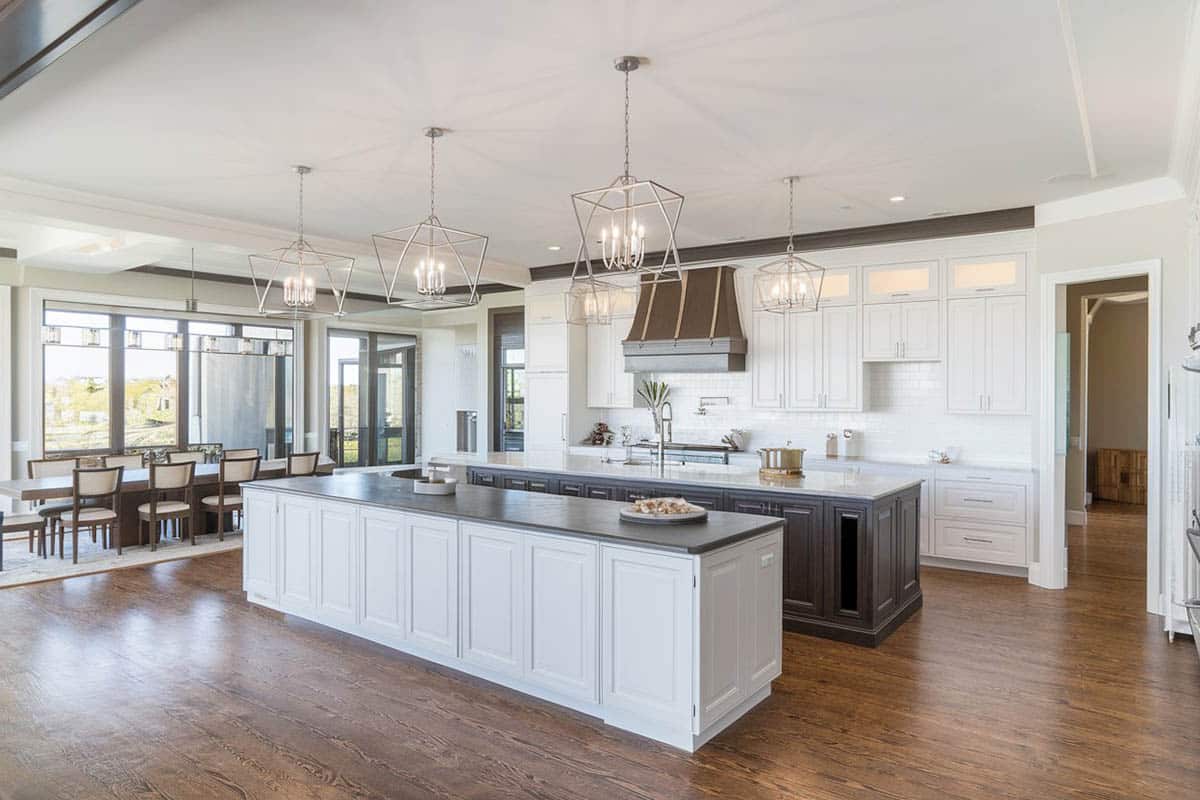
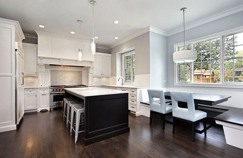
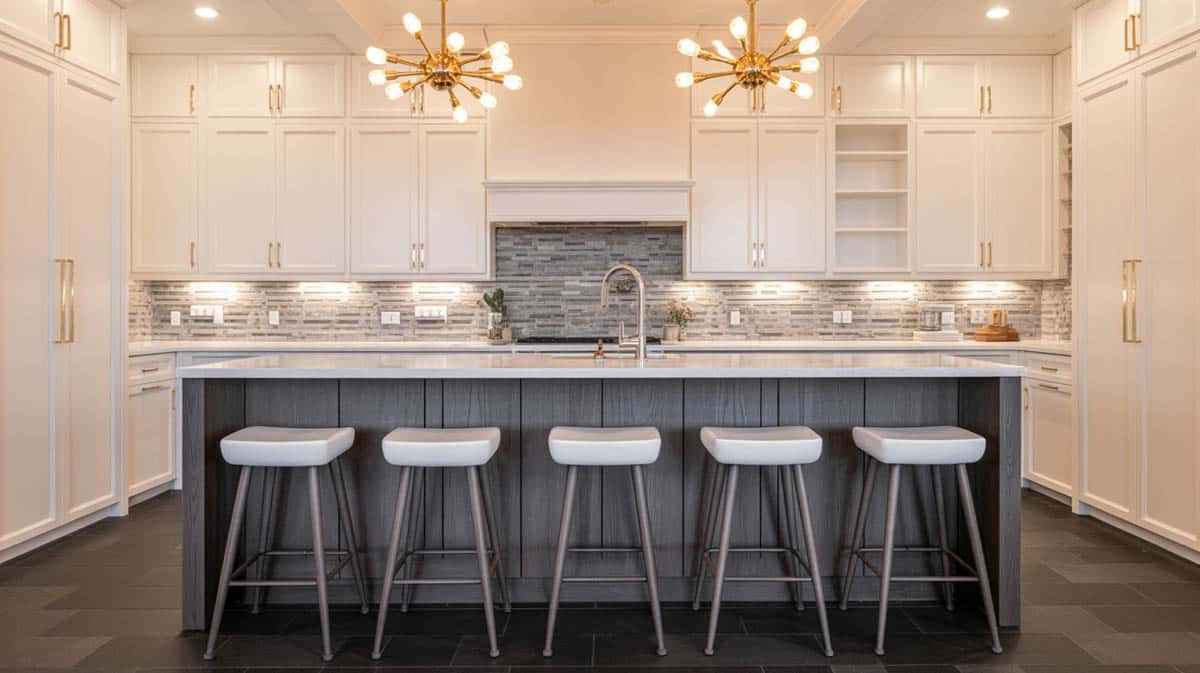
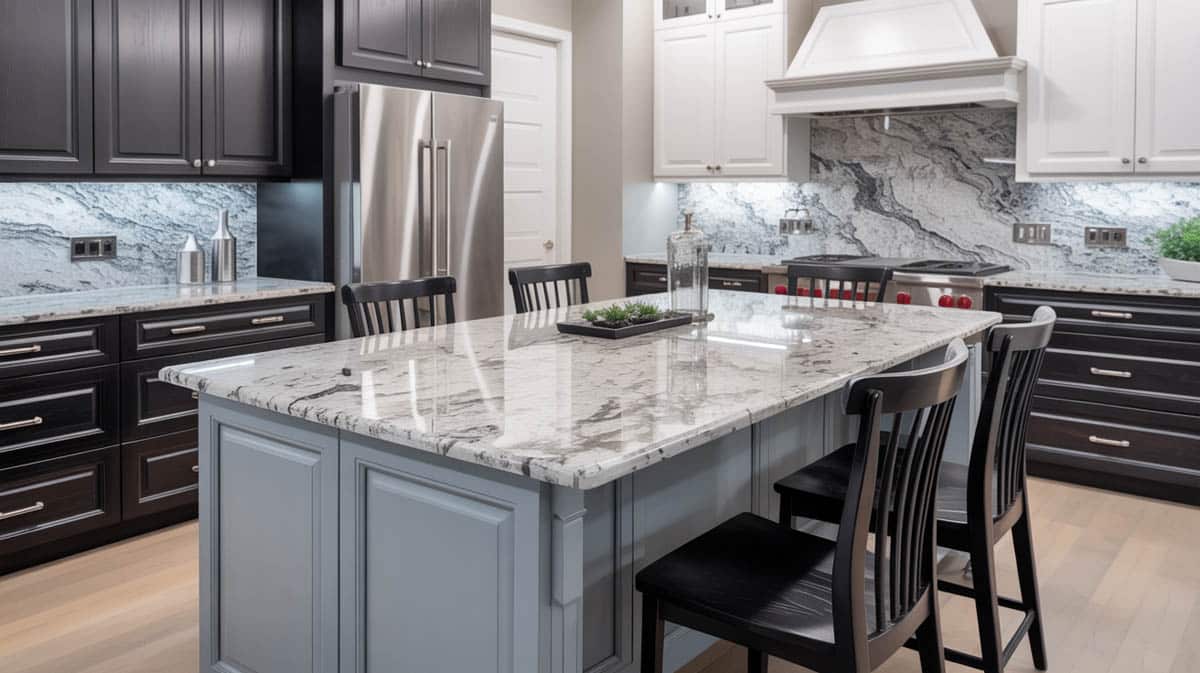
A perfect balance of soft and hard tones, this kitchen features a dominantly white color scheme with accents of gray, silver and brown. The center island is painted in a warm steel gray color which beautifully contrasts with the surrounding white paneled kitchen cabinets. The countertops also exhibit contrast, as soft white marble with delicate gray veins deviate from bold black perimeter countertops. To keep things subtle, sleek metal handles are used for the cabinets, while stainles steel appliances and lighting fixtures are used to accessorize the space. Beneath the contrasting kitchen island are two wooden bar stools with turned legs and a woven fabric cushion that provides a comfy breakfast nook for two.
Kitchen With Contrasting Dining Island Combinations
There is no strict limitation as to how you should design your contrasting kitchen island. However, with all the color and material options that are available in the market, the choices can get you either quite confused or too much excited. It is always good to have a guideline that will help you take out the guesswork in choosing which color combinations work best for a contrasting kitchen island and cabinetry.
Generally, most homeowners use the same color of the cabinets for the kitchen island, but they either tone it down to a lighter shade or intensify it to a darker shade. So if you have light brown overhead cabinets, you can use a darker shade of brown for the kitchen island, while keeping the countertop uniform for both. Keeping the colors under one hue ties the color palette cohesively.
For those who want to introduce a touch of color, they usually go with a different hue but in a more subtle and mellow version. This is an effective solution for those who do not want to commit to the intensity of bright and vivid colors.
For example, beige cabinets can be paired with a mellow version of yellow for the contrasting island to create a chic cottage inspired kitchen. Wooden cabinets can go with an olive green contrasting island for an organic and natural look.
In addition to that, another approach is to use the color wheel as a guide for choosing the right contrasting color. Basically, all colors that are opposite to each other in the color wheel are “complementary” – red goes with green, blue contrasts with orange, and so on and so forth. Since green is the complementary color for red, a sage green contrasting island will not look out of place in a kitchen with cherry cabinets.
You can also choose the color of your contrasting island depending on the mood you want to achieve for your kitchen. Warm hues, obviously add warmth, while cool hues introduce a refreshing vibe. For example, if you want to add a calming feel to white kitchen cabinets, consider painting your contrasting island with a soft blue color.
As for an “all white” and a neutral color scheme, almost anything can match it. Just make sure that you pick out the right intensity of color depending on the style of your space. Bright and vivid accents typically go with modern interiors, neutrals with minimalist styles, deep and rich tones with traditional, warm hues with Mediterranean and subtle pastels for cottage inspired designs.
With regards to the colors that must be avoided, just make sure that the colors that are too shocking as they might clash with the prevailing color scheme of your kitchen. Avoid color combinations which look “off” together, like a bright orange island with fire engine red kitchen cabinets.
Kitchen Island With Different Color Cabinets
Below are some examples of luxurious kitchens with contrasting kitchen islands.
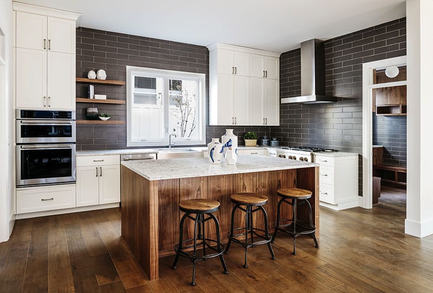
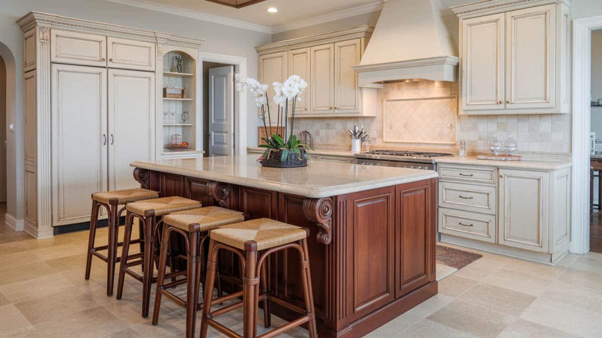
A kitchen island provides the perfect opportunity to showcase a stunning wood finish as people can get a closer look at the exquisite grain patterns and the distinct natural beauty it possesses. This kitchen features a wooden cooktop center that contrasts with the surrounding white classic cabinetry. The contrasting island is finished with a light colored marble countertop that tones down the warmth of the wood. Matching the cooktop center with wood flooring and wooden bar stools create continuity and a smooth transition between the finishes. To add an accent color to the space, interlocking brown stones are used for the walls.
Using navy blue paired with white is a traditional color combination that always looks sophisticated and stylish in the kitchen.
This kitchen brings in a variety of interesting contrasts and textures with its medium-gray base cabinets, white uppers, and white beadboard island with a dark green granite countertop.
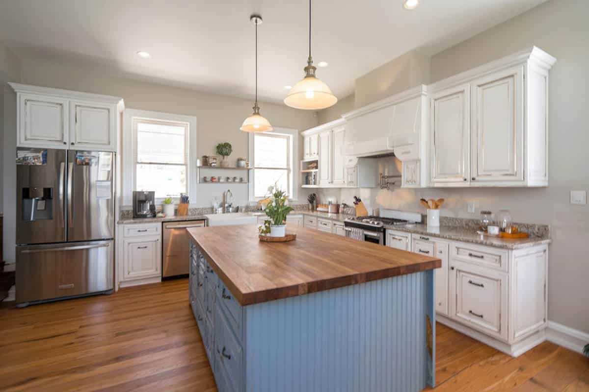
Gray shaker cabinets paired with a white cabinet with butcher block can lighten the overall look and match the other elements like the tile backsplash and wall paint.
The combination of white and dark-colored wood is another classic combination that will surely never go out of style. This contemporary classic kitchen uses white overhead and under-counter cabinets with paneling and decorative cornices. The center island is finished with dark-colored wood and a complementing white marble countertop to achieve contrast. The same color combination is applied in the corner breakfast nook, wherein the tables and the bench are also finished with dark wood. Soft gray metal stools and upholstered dining chairs compete the look of this cozy, sophisticated eat in kitchen.
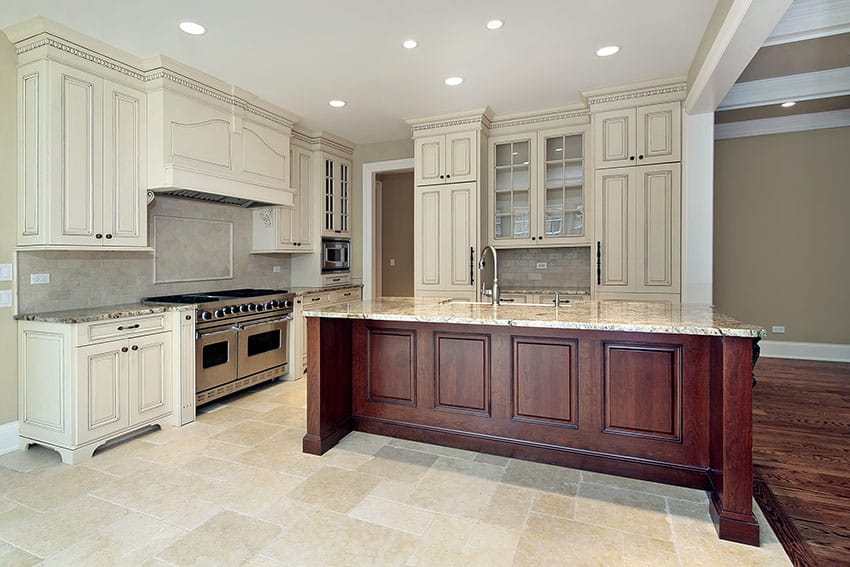
Grand, warm, and striking, this contrasting cooktop center features a dark cherry base with paneling details. When placed against a background of decorative antique white cabinets, the rich color of the center island stands out in the space. An equally elegant marble countertop spans through its surface, providing a subtle accent through its delicate veining pattern and gray undertones.
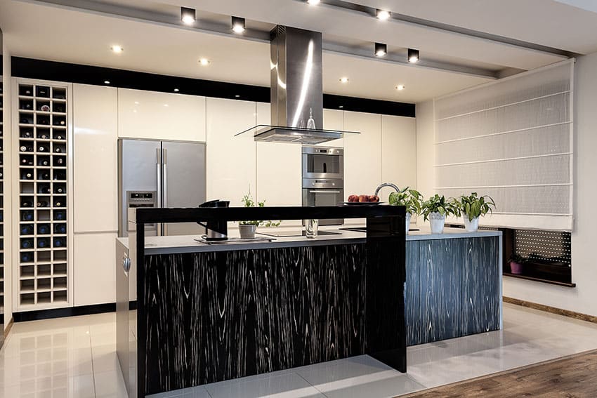
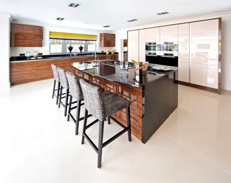
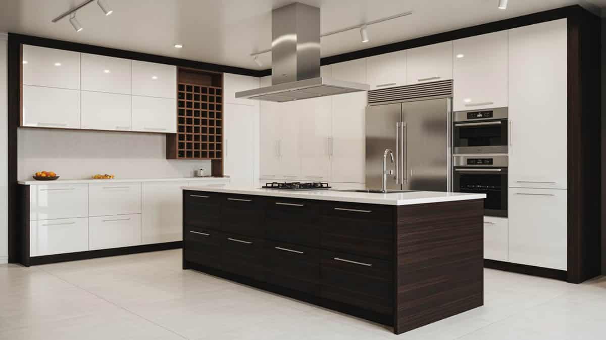
The classic combination of black and white has always been a popular color choice for home interiors. This luxury modern kitchen features white high gloss floor-to-ceiling, ultra sleek and elegant kitchen cabinets. An equally stylish waterfall kitchen island is finished with black laminated wood with a dramatic graining pattern, contrasting the space’s neutral color scheme. A raised secondary kitchen island in a striking glossy jet-black finish is set in front of the main island, instantly drawing the eyes to the center of the kitchen. Complement white polished ceramic tiles are used for the flooring to create balance, while satin stainless steel appliances serve as subtle accents.
A touch of color can instantly transform a plain monochromatic interior into a lively one. This picture shows how the contrasting island instantly pops at the center of this beige traditional kitchen. The pigeon blue shade renders an interesting choice of color, rendering a cool and refreshing feel that contrasts with cream-colored paneled cabinetry. These muted tones work perfectly well for homeowners who do not want to commit to the intensity of bright, vivid colors yet want to make a subtle statement. The overall look is then balanced with warmth from solid wood countertops and cherry wood flooring.
This modern cooking area shines with ultra-white high-gloss overhead and under-counter cabinets, making the space appear brighter. The sleek, shiny finish of the cabinets is complemented by a highly textured tile splash board and icy white granite countertops. Matching glossy white bar stools with chrome metal legs contribute a stylish appeal, while satin steel appliances and accessories tie up the decor as they match the undertones present in the space’s overall color palette. Distressed wooden front panels for the waterfall kitchen island achieve a stark contrast. A grunge-textured sliding door also diversifies the kitchen’s monotonous color scheme.
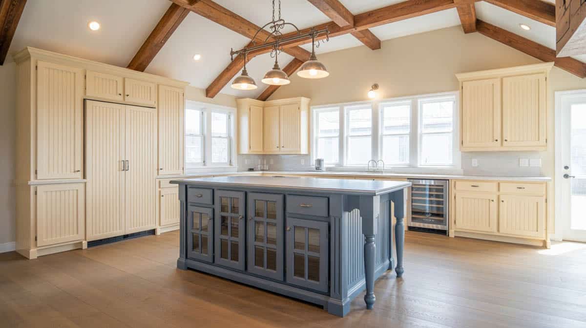
Cobalt blue is a formal yet inviting way to veer out of the conventional plain “all white” kitchen. Adding a refreshing element and calming effect to the space, this contrasting blue kitchen island stands out against a canvas of beautiful paneled white cabinetry. White marble countertops blend harmoniously with the white decorative pillar, moldings and trims, while the use of the same color for the ceiling gives an illusion of increased height and space. The tasteful addition of a thick solid wood butcher’s block, gives an element of warmth and another contrasting color that draws the eye to the center of the cooking area. Matte black tiles are used for the flooring to keep all the other features grounded in the color palette while antique satin finished steel are used for the drop lights, cabinet handles, faucet and appliances.
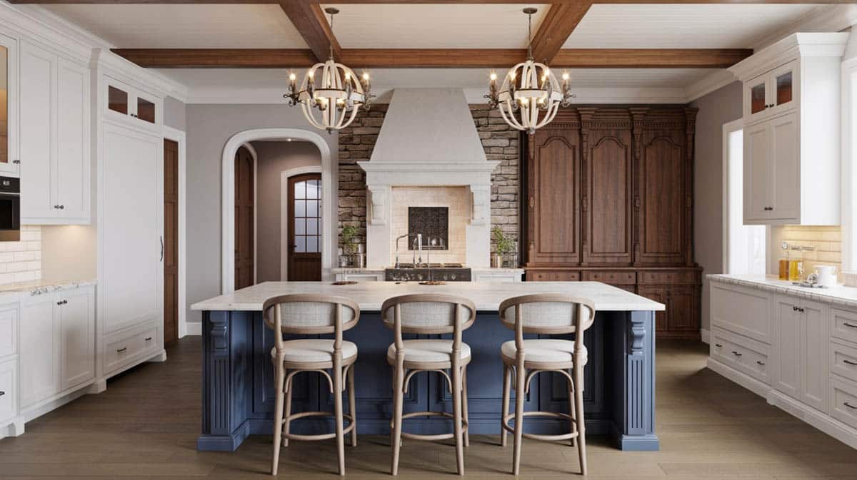
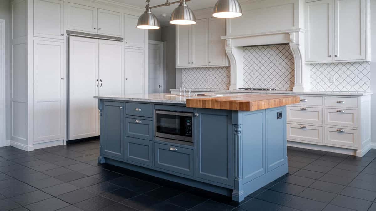
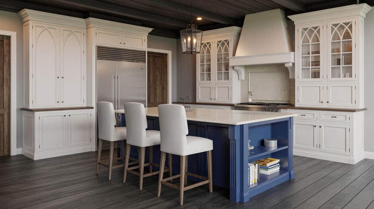
A contrasting island can also modernize the look of a traditional-style cooking area. This gorgeous country kitchen’s overall formality is updated with a contrasting steel blue island with a Bianco Valentino marble countertop. A rich mix of luxurious material finishes are also featured in this design. The walls are accentuated with white decorative stones which form an arch above the cooking area. White paneled under counter cabinets and French glass overhead cabinets span through the wall, complementing the classic flair of the space. A dark wooden armoire is set at the side, giving an accent while natural wood flooring display unique knots and grains which are truly eye catching.
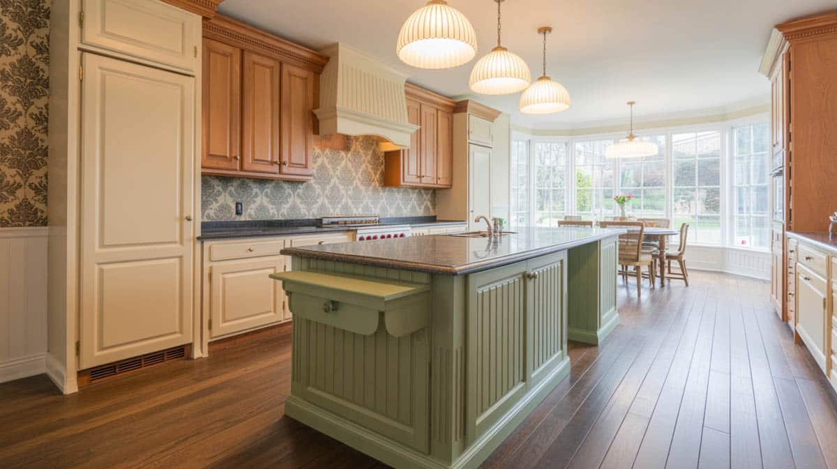
This rich traditional country cooking area looks extra charming with the hint of green in its color palette. Featured here is a beautiful olive green center island that contrasts with paneled beige cabinetry. Both the perimeter and island cabinets are accessorize with antique handles and decorative plinths. The contrasting kitchen island has a warm brown granite countertop that ties the color scheme together. There is also layering use of patterns which makes the interior more Victorian, displaying floral prints in the draperies and the wall finishes. The brocade patterned wallpaper also picks up the beige and gold present in the undertones of the other material finishes in the space.
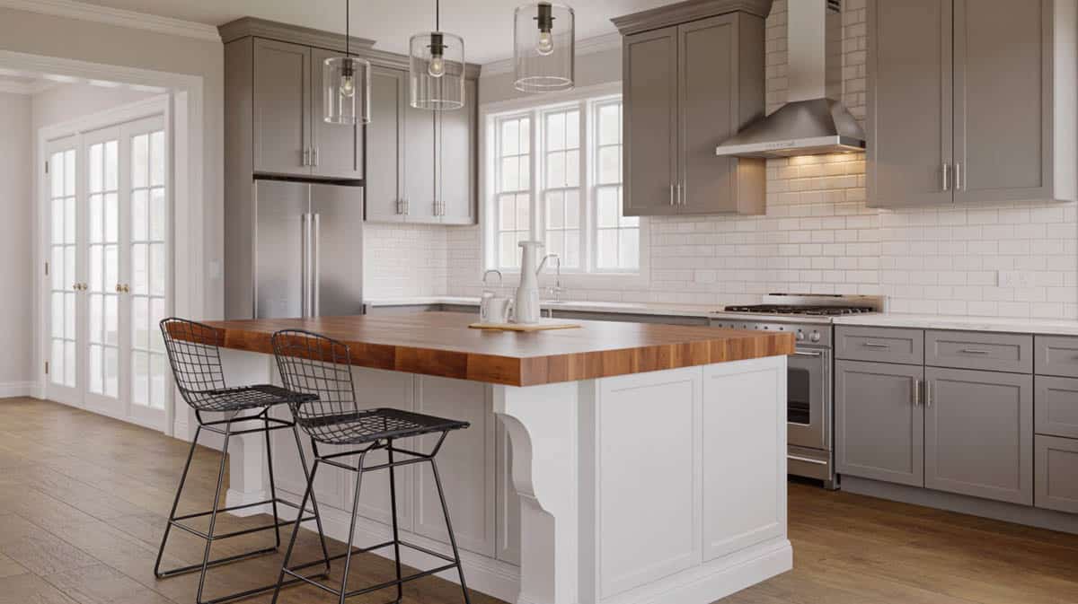
For most contemporary kitchens and houses, brown and white is a go-to color combination that is guaranteed to be fail proof. Exhibiting the perfect balance of light and dark, cool and warm, a brown and white cooking area renders a homey and cozy ambiance reminiscent of the earth’s warm colors. This contemporary kitchen features a wenge bar island counter contrasting with white main cabinetry. Furnished with a beige granite countertop that overhangs to the front, this contrasting island also serves as a casual dining space for four, with polished bar stools as seating. This cooking area also features a decorative stone splashboard in earth-colored undertones, which provide a variation in texture.
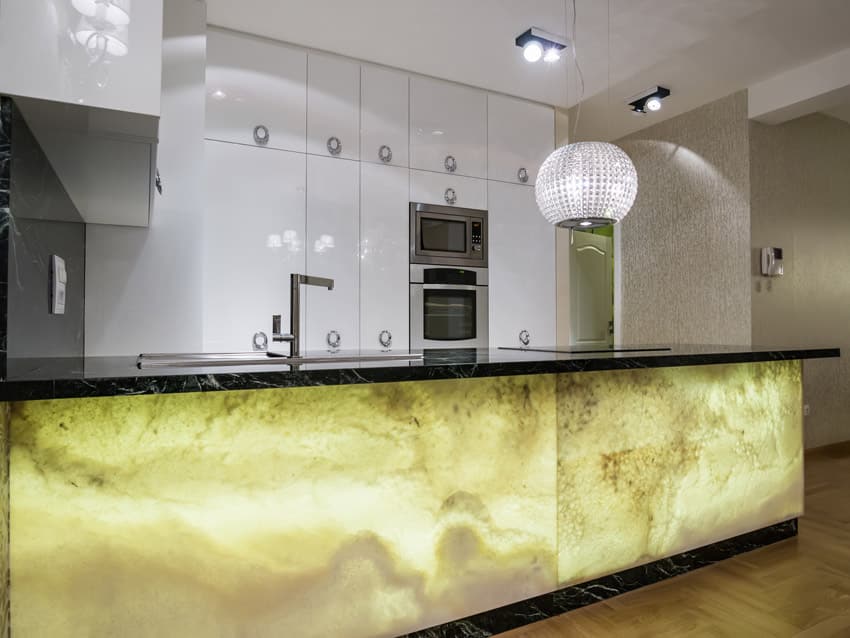
Giving an illusion of a glowing cooking area, this unique contrasting island features an exotic yellow stone with an intense pattern of warm gray and brown undertones. The main cabinets are finished in a high gloss white color, allowing the bold contrasting island to take the center stage in this stylish cooking area. Black marble countertops are added, making the contrasting cooktop center even more dramatic. Stainless steel appliances and accessories provide a complementary color that doesn’t compete with the inherent beauty of the featured stone.
Soft powdery blue hues are a good accent color for traditional kitchens because they create a statement without being too bold and overpowering. This country cooking area looks extra charming with a light stone blue cooktop center that contrasts with creamy beige colored cabinetry. The countertops use the unique blanco tulum granite, which reflects sand and grayish undertones. This cooking area is also decorated with exposed weathered wood beams that hold delicate antique lighting fixtures.
If you want to highlight the beauty of wood and accentuate its natural color, juxtaposing it to light colored walls and cabinetry will help you do the trick. This luxurious traditional cooking area features a rich walnut wood eat-in cooktop center with beige marble countertops. The perimeter cabinets are in an antique white finish with paneling details and decorative moldings. Combined together, the light colors which surround the contrasting cooktop center, makes the color of the wood appear brighter and more prominent. With the natural coziness of the wood given emphasis, the spaces looks more cozy and welcoming.
This gorgeous traditional cooking area uses a formal yet refreshing teal blue hue for the contrasting island. Set onto natural oak gray floors and white decorative cabinetry, the breakfast bar island pops out in the space, rendering an un-overwhelming intensity of color to the neutral palette. Elegant beige upholstered bar stools provide a complementing color which harmoniously blend with the contrasting island’s marble countertops. On the other hand, the decorative stone splash board picks up the cool undertones of blue and gray, providing another point of visual interest in this cozy cooking space setting.
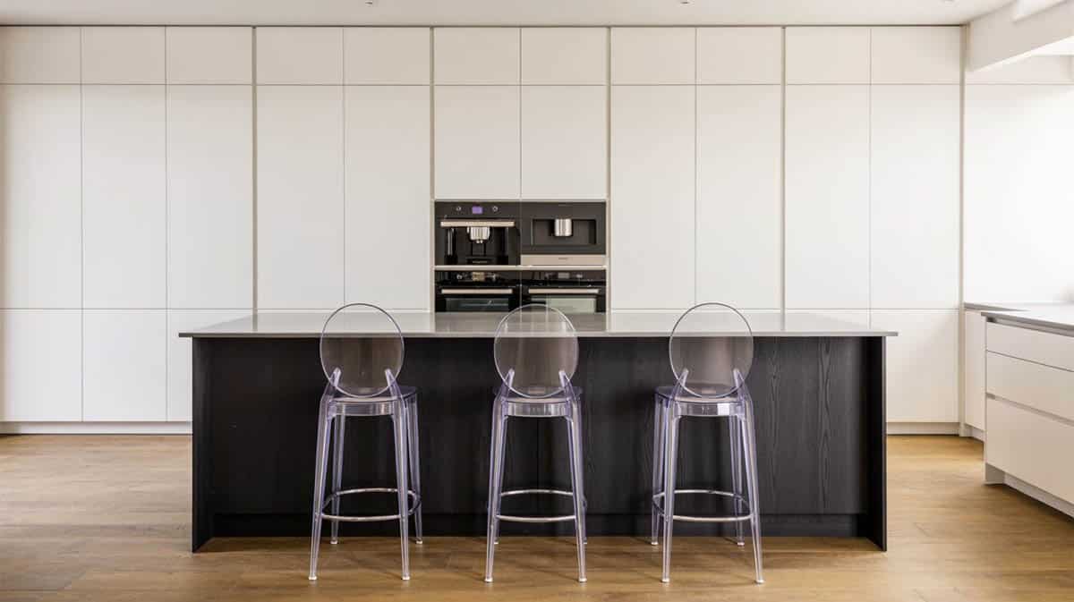
A stylish stainless steel island strikingly contrasts with sleek white floor-to-ceiling modular cabinets in this modern open-plan cooking area setting. Contemporary bar stools with acrylic legs are set in front of the contrasting cooktop center to provide a casual dining space for three. The color and finishes of this seating furniture tastefully match the black paneling in front of the island and the stainless steel countertops. On the other hand, the perimeter cabinets are accentuated with modern lines and elegant built-in appliances. Overall, the combination of neutral colors give this cooking area a balance of delicateness and strength.
A well-balanced color scheme can be achieved by layering contrasting shades and finishes. Aside from creating contrast between the cooktop center and the perimeter cabinets, you can also choose a bold color for your furniture to achieve added depth for the design. This contemporary classic cooking area features classic white paneled cabinets with decorative moldings and antique black knobs. At the center is a contrasting taupe-colored island with paneled base cabinets and luxurious white Carrara marble. An additional accent color is introduced to the palette using black metal bar stools and dark wooden ceiling beams. Natural wood flooring allows all the other elements to stand out in this elegant open cooking area.
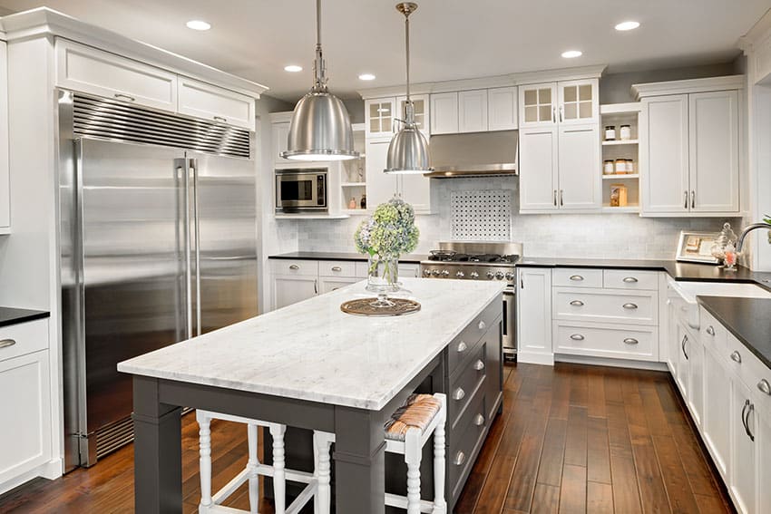
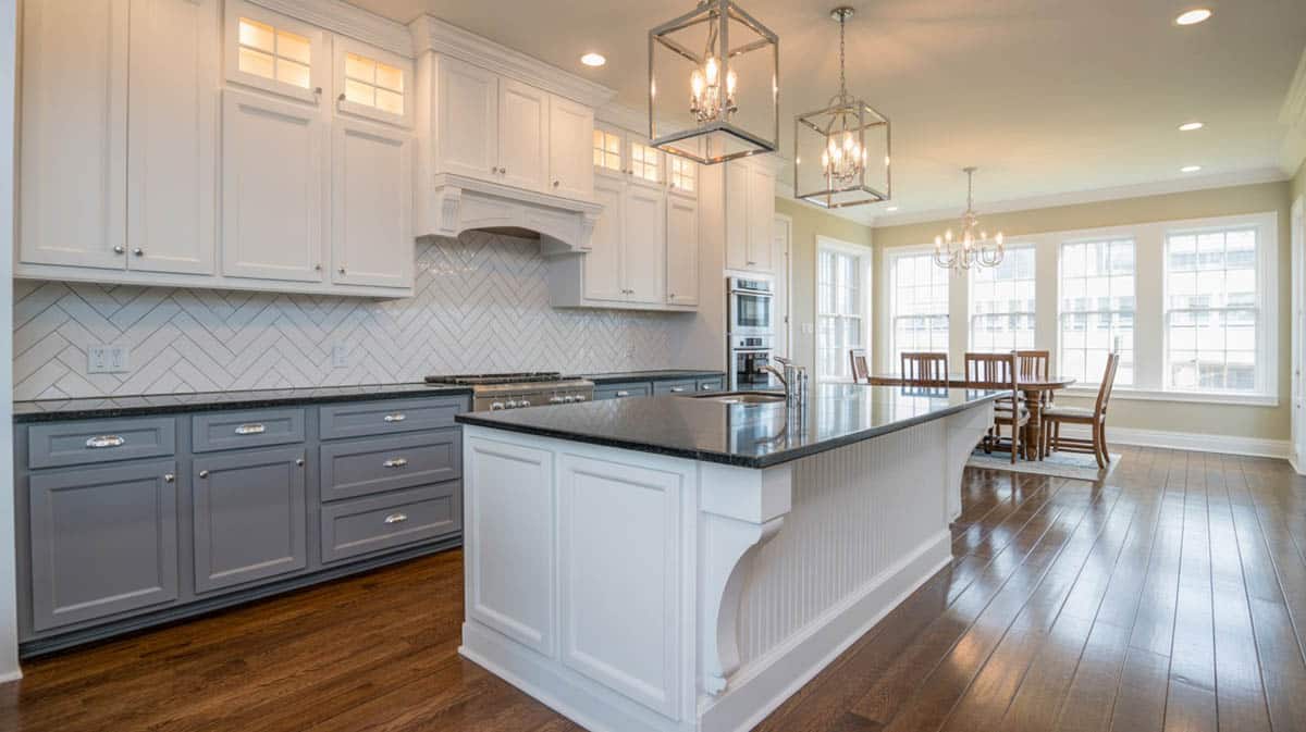
Dark kitchen cabinets can sometimes look too strong and overwhelming, but a good way to tone it down is to use a light-colored countertop and a light-colored cooktop center. This luxurious cooking area features dark black overhead and under-counter cabinets with paneling and stainless steel handles. To break the “heaviness” of the space, a cool gray cooktop center is placed at the center, finished with unique veined white granite countertops. The contrasting island is also a casual dining space for four, furnished with black wooden chairs. The perimeter cabinets also use the same white granite countertop, providing an added element of contrast. At the same time, stainless steel appliances and glazed gray quartz slab act as additional accessories that contribute a modern feel.
Timeless, sophisticated, and classy, this transitional-style cooking area features an open plan accommodating an L-shaped center island and a single wall of minimal kitchen cabinetry. Although the cooking area is generally small, the open plan creates an illusion of added space, making the space appear brighter and airier.
The large counter space of the kitchen island design provides a working area that can be used in various ways. Striking marble countertops were used for the cooktop center, giving an element of drama and decor, while the geometric patterned splash board provides an accent and modern twist to the space. The gray color of the base cabinets creates a mellow contrast with the white cabinets but still matches the undertones of the natural stone surface.
To showcase highly specific designs, some images on this website use advanced AI-generation software to illustrate ideas and room inspiration. See our editorial policy to learn more.

Upload a photo and get instant before-and-after room designs.
No design experience needed — join 2.39 million+ happy users.
👉 Try the AI design tool now