25 Colors That Go With Lime Green (Paint Ideas)
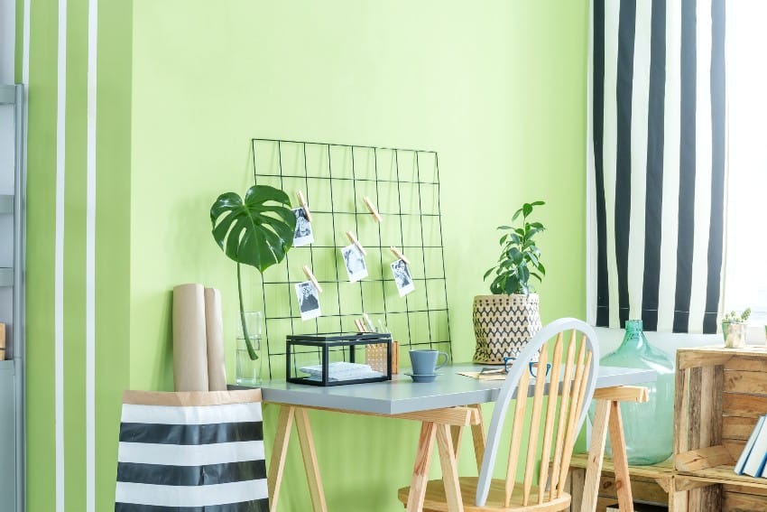
Vibrant and communicating energy, lime green has been a favorite color to break the monotonous use of neutrals and beiges. The lime green shade in the color wheel is found between the yellow and green colors. While it can come in a strong tone, lime green is versatile enough for warm and cool colors, making it easy to achieve whatever mood or ambiance.
Complementary Colors For Lime Green
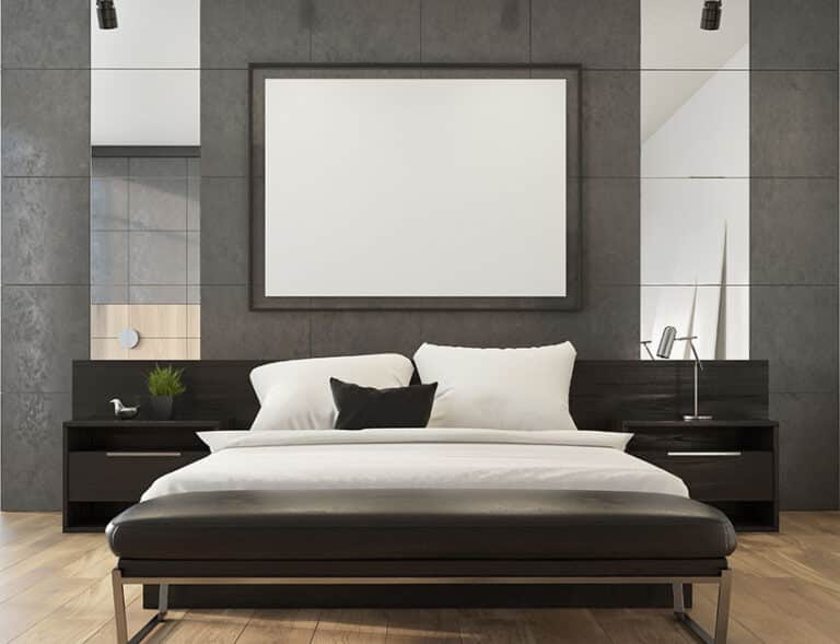
With its vibrant appearance, lime green pops next to black and works well with white. The contrast between black and lime green is perfect for creating a moody space. Resto bars love the combination of black and neon colors and layered lights.

Upload a photo and get instant before-and-after room designs.
No design experience needed — join 2.39 million+ happy users.
👉 Try the AI design tool now
You can use many neutral colors as a base and pair them with a vibrant lime accent to create excellent results. Pair this shade with more earthy tones, such as tan or beige ,to create a restful atmosphere, especially with white or gray hues.
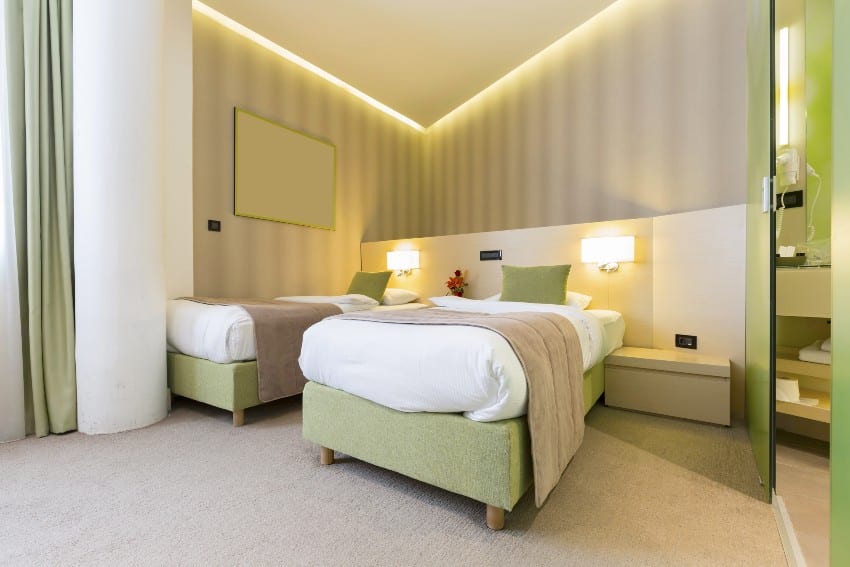
While the neon hue is lively, it can match perfectly with other vibrant colors such as yellow, orange, fuchsia, and hot pink. Don’t forget to consider pairing it with another pastel shade as well, and when combined with another neutral like white, soft gray, or brown, it can balance the room design.
These color combinations are great for creating playful and lively palettes that provide a stimulating environment perfect for kids’ rooms or commercial spaces requiring attention.
Colors that love lime-hued shades include silver, hot pink, fuchsia, tangerine, violet, tan, white, black, and gray.
Lime Green Color Palette
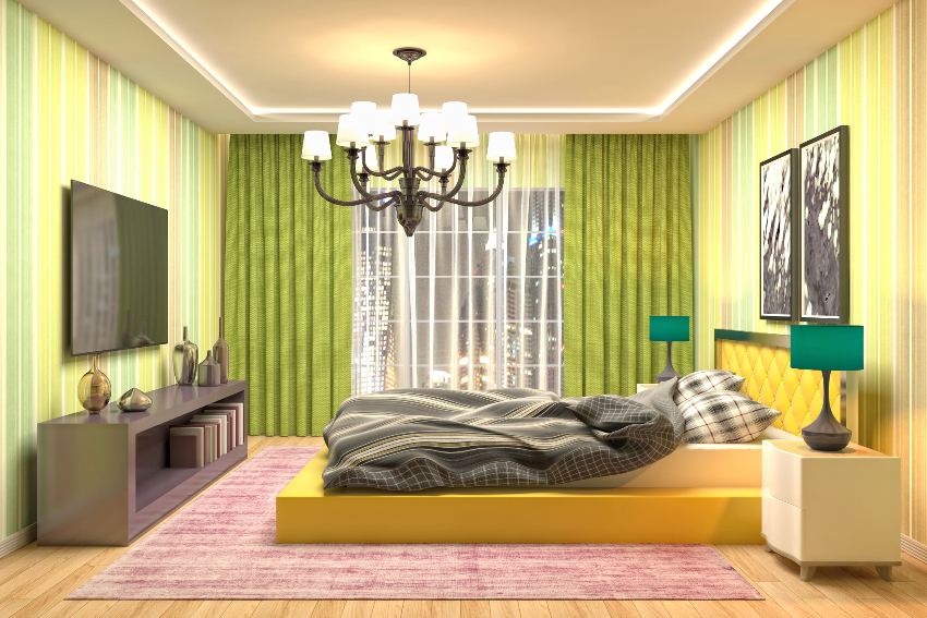
Watermelon Fresh – Dining and Bedrooms. If you’re looking for a summer theme for your bedroom or dining area, the combination of lime green, rose quartz, and white is just a perfect option. The different shades add depth to architectural elements, such as the walls and ceiling.
The pink color rose quartz complements your green-tones and can be used to emphasize a featured sculptural piece. You can choose a white with a warm undertone or substitute it with a light version of beige or tan.

The softness of pastel shades goes well with lime hues. Beyond using pink, you can consider pastels of blue, lavender, mint, yellow, coral, and peach with excellent results.


Northern Lights – Bedrooms
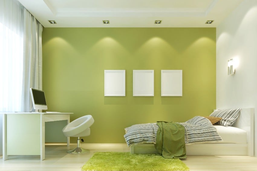
A perfect color palette for a boy’s bedroom, the northern-inspired color includes spearmint, forest, lime, and neon green.
With darker greens as a dominant color, lime can be the perfect accent color, and neon can highlight elements. It can create a relaxing and moody space with a cosmic ambiance combined with black. See more pictures of green accent walls here.


Morning Calm – Living Room
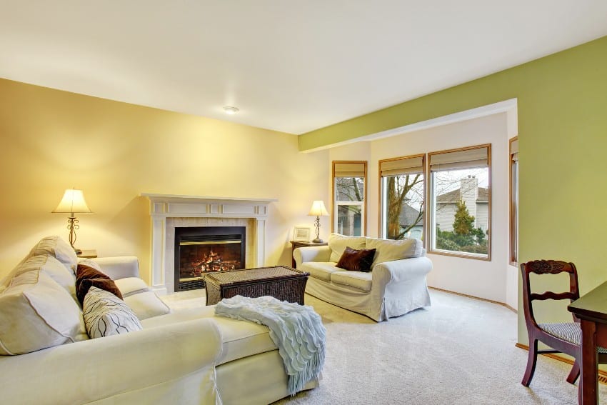
Since green is considered a cool color, taking a break from your screens and having the eyes rest on a cool hue can reduce eye strain. Combining greens with another calming color, such as blue, can reduce eye irritation and stress.
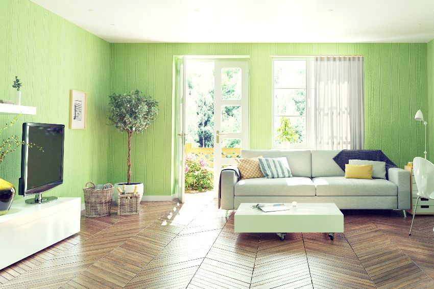
Combine the layer of green colors and blue with white, and you get a soothing color palette that’s perfect for a relaxing living room or other gathering space. The color scheme works with both traditional and modern-themed interiors.


Palms and Sand – Kitchen
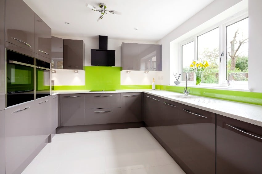
White natural stone with gray veining looks great as a countertop or backsplash. Combine it with sandy colors such as natural wood cabinets, which will look great with a lime and yellow-green backdrop.


Lime Color Scheme Combinations
Lime Green and Purple.Close to fuchsia, purple is also a fierce hue of red that can display luxury, mystery, and wisdom. When paired with lime, it creates an interesting dynamic between a playful color and a regal one.
Please take note, though, that it is more visually pleasing to have purple as a dominant color while lime stays as an accent hue. The combination is great in bohemian, midcentury modern, Hollywood glam, and eccentric styles.
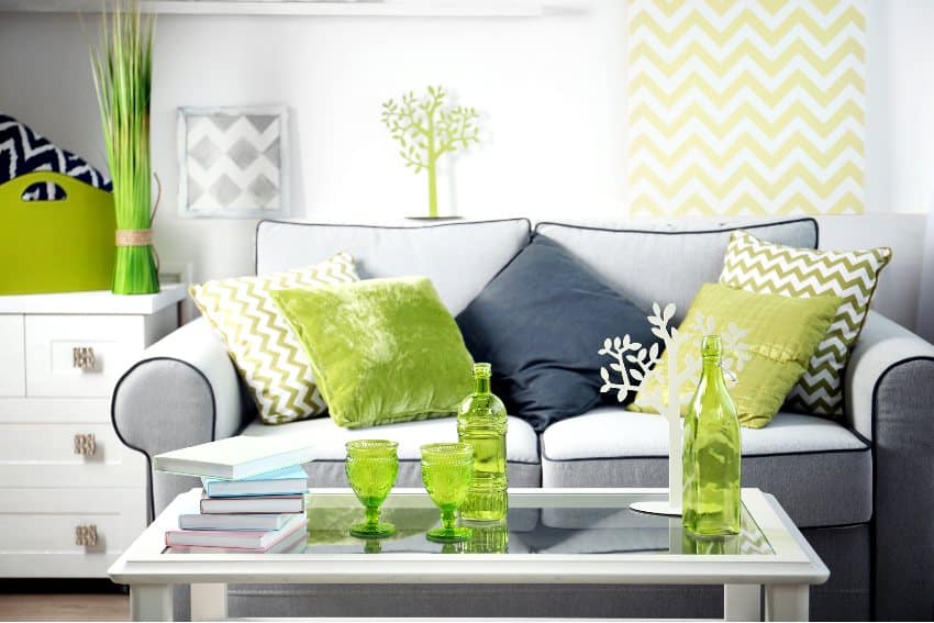
Gray and Lime. Do you want to emphasize your lighter-green elements? A backdrop of gray makes it look modern and easy on the eyes, which is perfect for expansive and busy spaces.
They work well with living rooms or kitchens, where a lime sofa or cabinet can be a featured element. If you love the shade but don’t want it to be too overwhelming, combining them with shades of gray is the perfect combination.
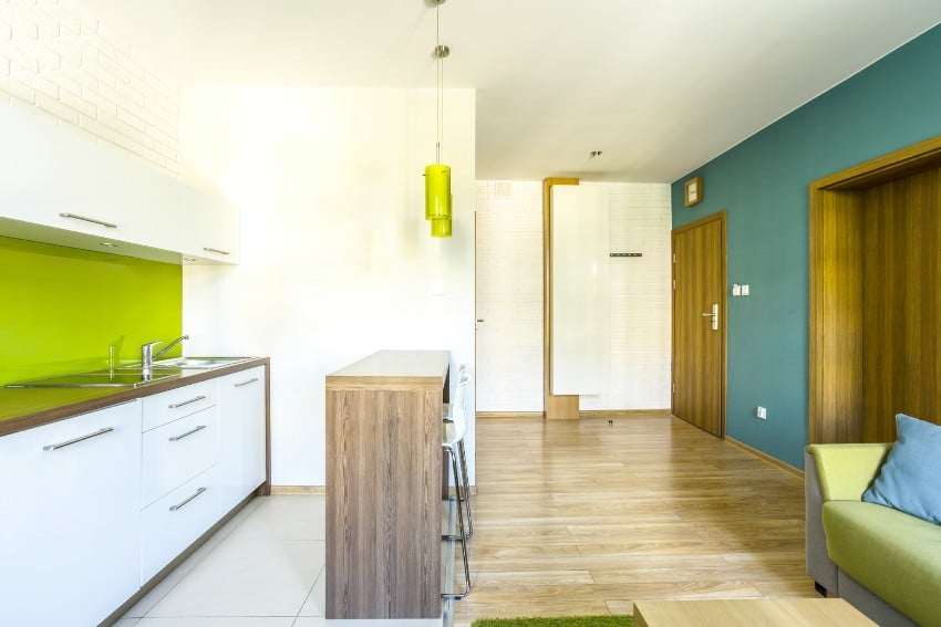
Turquoise and Lime Green. Combining colors with the same family shade is easy and ensures a visually pleasing setting. Turquoise has a mixed-green hue with another cool blue.
Turquoise and lime are vibrant colors and will work well with a playful theme. They can also be dramatic when updating a classical interior, using one wall section with lime and the other with a turquoise hue. See more colors that go with turquoise here.
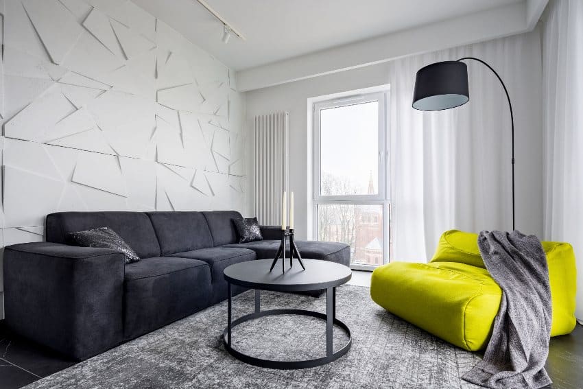
Black and Lime. Combining the vibrant color with black creates a striking look as the bright shade contrasts against a black backdrop. The stark contrast is perfect for creating dramatic interiors and when there are elaborate elements to showcase.
The contrasting combination works either for a contemporary or modern interior. The urban look of black cupboards and kitchen cabinets against a lime green countertop looks perfect in any space.
Paint Colors That Go with Lime Shades
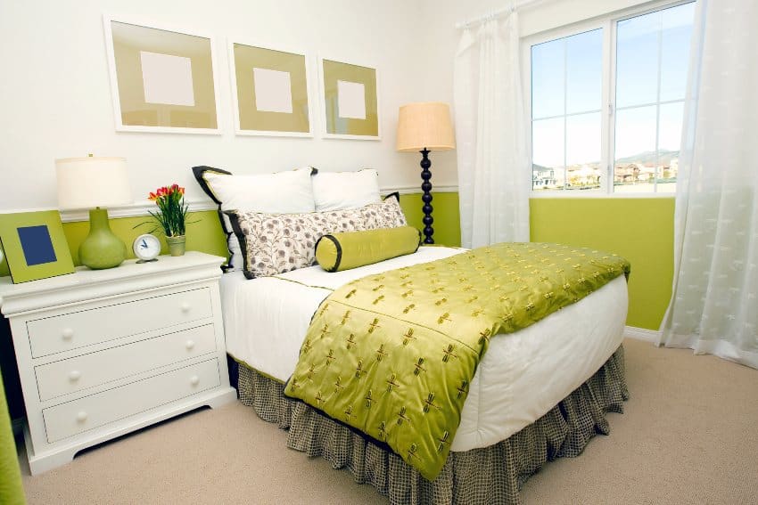

Green Earth SW 7748. While the color looks like a shade of gray, it is a shade of yellow with dominant red, blue, and green-hued colors. The mellow hue perfectly combines the lively-lime color as opposites attract.
The colors create a solemn atmosphere, making it a great combination when you have a lot of architectural details, such as moldings or other types of intricate elements. Use white as an accent shade.

First Light 2102-70. If you’re looking for a pink combo with your lime-hues that’s soft and light, Benjamin Moore’s 2020 color of the year is the perfect option. You’ll find the combination perfect even for expansive rooms or if you plan to use patterns. Stripes with alternating colors can be a striking backdrop without overwhelming the rest of the design elements.

Autumn Blaze Valspar. Tangerine hues have always looked good when matched with a yellow-green color and create a happy ambiance to a space. Orange and lime energize spaces, and with this combination, you get the perfect wall paint for a playroom for your kids.
If you plan to incorporate the paint color in your bedroom, layering the lights and adding lighter elements such as a white curtain or bed help in keeping the color combination balanced.

Old Navy 2063-10. While purists may point out that green and blue should never be seen, there’s always an exception, and there’s no fun in being stringent regarding style and design.
The dark, somber shade complements the lively lime-peel shade and can look modern and updated with the right elements. Other Benjamin Moore colors you can mix with the lime and old navy combo are Polar Lights 400 and White Heron OC-57.

Sherwin Williams SW-2807 – The Rokwood medium chocolate brown creates an attractive contrast. The rich brown color acts as a neutral base for the vibrant accent provided by the green shade.
Best Light Green Paint Colors
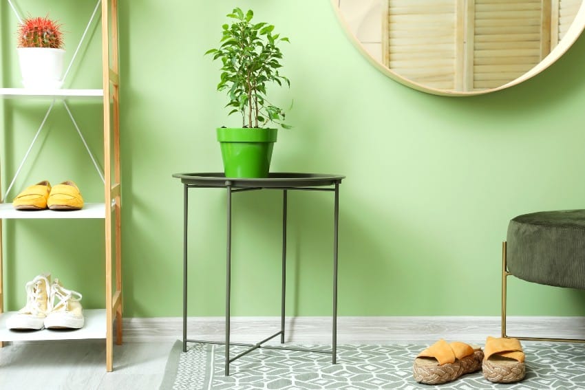

They are perfect for both as architectural elements such as the wall or ceiling, and as colors for furniture. They are perfect for country or cottage-themed interiors.

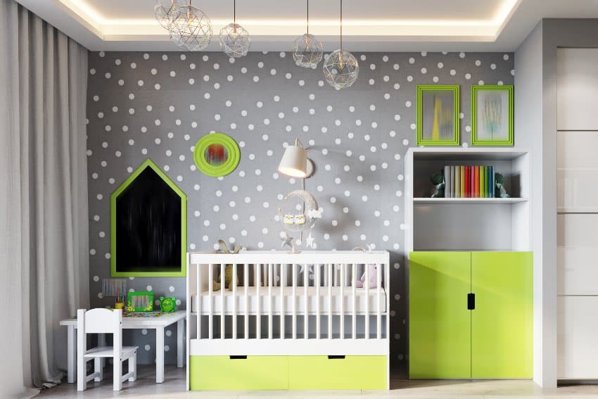
Lemon-colored accents and furniture can liven up the space. Depending on the secondary color used, the shade is perfect for both busy and relaxing rooms. Integrate a gray-blue patina with your furniture to create a romantic country-themed interior, or include chrome chairs to modernize the look.

Celery Ice 410E-2. A Behr paint that’s perfect for a cool and light backdrop for any interior. The paint shade has an almost beige quality, but the green tint can still be seen, making it great for earthy tones and neutral colors.
A kitchen with many black elements can benefit from the cool tint as a backsplash or countertop color. The cool tint makes it possible to use extensively in a large room without overwhelming the space.

Glacial Green. A very light-green shade from Pratt and Lambert, the paint color elicits a sophisticated and feminine feel. Add metallic elements such as chrome or silver, and you get a luxurious yet easy-on-the-eyes interior. The soft-green makes it a great hue for almost any room and combines with stronger grays and blacks.
How To Get A Lime Color
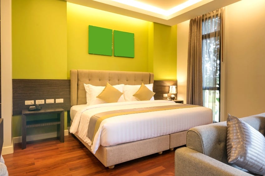
To get the lime green color, mix two to three parts yellow and one-part blue paint. To make lime paint, mix two or three parts yellow and one-part blue paint.
The shade has a positive connotation that symbolizes strength, rebirth, good health, and confidence. In the Middle Ages, green was worn by the upper classes.
To get a lime-hues on the computer, you can use the following hex color of #32CD32 with a Pantone code of 14-0452 TPX.
For more paint and decor ideas, visit our guide on colors that go with green.

