87 Timeless Dining Room Colors That Never Go Out Of Style
While trends may come and go, certain colors stand the test of time and can add a timeless vibe to your dining room. Check out this article for interior paint color ideas that will transcend the change over the years and discover shades and color schemes that that you can build upon and create a classic atmosphere in your dining area.

Timeless Neutrals
Did you know there are plenty of ways to add color to your dining area while still having neutrals as a base? The following timeless neutral colors never grow old when used in different ways such as in walls, trims, or accents – they always stay in style.

Upload a photo and get instant before-and-after room designs.
No design experience needed — join 2.39 million+ happy users.
👉 Try the AI design tool now
Crisp White – this color is always a good and timeless paint choice because it offers an elegant, fresh, and clean vibe to any dining area. For a fresh and modern crisp white with no undertones, try Fresh Kicks by Clare.

Also, try Benjamin Moore’s version of crisp white in its BM Simply White (2143-70) which is one of our favorites when it comes to fresh white color pick. Extra White (SW 7006) is Sherwin-Williams’ version of crisp white that is clean and has high light reflectivity making it an ideal choice for trim and ceilings.
White with Undertones

However, if you prefer whites with undertones choose from any of these recommendations from Benjamin Moore. BM Balboa Mist (OC-27) is a classic white shade with a warm cast of pale gray.

BM Glacier White (OC-37) is a versatile color with grayish-green tones, and BM White Dove (PM-19) is a classic, softly shaded white also known as BM White Dove (OC-17) is a favorite choice for moldings and trim because of its light and luminous characteristics. With its slight gray undertone balanced with yellow undertones, Sherwin Williams’ Snowbound (SW7004) has a softness that works well in both natural and artificial light.

Creamy White – this color allows you to flawlessly transition from the eating area into the other colorful parts of your home or to walls with other wallcovering. Find your perfect white with Benjamin Moore’s Chantilly Lace (OC-65) it’s a classic white that is not too cool or too warm. This clean-looking vibe draws out images of cotton and pure silk.

What can be creamier than BM Swiss Coffee (OC-45) a favorite neutral base color of designers because of its right amount of warmth and adaptability which allows other textures and design elements to stand out and not have to change paint color for years to come. There’s also BM Decorator’s White (CC-20), which has a cool gray that makes your room look sleek, giving it a stylish appeal.
Timeless Paint Colors

The space where dinner parties and family gatherings take place is the perfect place to play with colors. Here are some of our favorite timeless colors that will surely warm up your dining experience.

Soft Beige – are paint colors that have the palest of beige pigments and not just cream colors. Check out our top picks – the Dover White (SW 6385) from Sherwin-Williams is a warm, sun-splashed white that offers a breezy and welcoming vibe to your dining room. Casa Blanca (SW 7571) has a yellow undertone that emphasizes a warm shade, giving your room a romantic vibe.

Divine White (SW 6105) has a beige undertone that brings a sun-kissed glow into your space, offering excitement. Most designers consider Benjamin Moore’s Feather Down (953) an eye-catching off-white color that leans more towards beige. An off-white shade of Indian White (OC-88) from Benjamin Moore has a soft orange-beige tone that goes well with white.

Warm Taupe – is another versatile and classic color that blends warm and cool tones perfect for any dining room color palette. Take inspiration from these designer choices – Edgecomb Gray (HC-173) by Benjamin Moore is a top favorite among designers because it’s brighter and more refreshing. This color has a light and welcoming vibe making it timeless in our designer’s list. Poised Taupe (SW 6039) by Sherwin-Williams is a perfect example of a warm classic neutral color in warm tones of brown and cool hues of gray. A modern twist of deep clay and violet-neutral that adds sophistication to your dining space.

If you want a paint color in mid-tone taupe, check out Behr’s Tranquil Gray (DC-007) this delicate taupe-gray shade offers a calm and serene atmosphere in a variety of spaces including your dining room. Another go-to taupe color is Behr’s Creamy Mushroom (PPU5-13) because of its calming and earthy shade with its pink undertones, instantly adding classic elegance and chic style to your gathering experience.

Making it to the top picks of our designer’s list is Flatiron by Clare, this warm mix of gray and beige is both a fresh and timeless choice for walls, trims, and millwork. It gives a luxurious edge because of its hue being brighter during the day and deepening as night approaches. Hardwick White (No. 5) by Farrow & Ball is definitely not the least in our list of best taupe recommendations – a deep taupe that is also referred to as a traditional gray. This deep taupe color doesn’t take on a tone because it adjusts very well with many color schemes and different decorating styles.

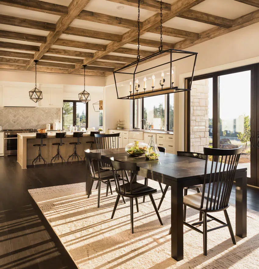
Timeless Black – often considered a classic and timeless color in interior design, black is a symbol of elegance, mystery, and sophistication. Sherwin Williams Tricorn Black (SW6258) is a timeless neutral black paint that is pure and free from cool or warm undertones and is perfect with white for a classic contrast.
A true and deep black color that can add drama to your dining area while allowing other design elements to stand out creating a backdrop for timeless design. Be careful to avoid using this shade if you do not have an abundance of natural light, and excellent lighting to keep it from feeling oppressive.

If you want to go bold in your dining room, check out Sherwin Williams Caviar (SW 6990), this luxurious, deep black paint color has in itself the richness and sophistication that offers elegance, and adds drama to any dining space. If it’s black that you desire but would like to soften the overall look, we recommend Sherwin Williams’ Black Magic (SW6991). Indeed a bewitching color yet with a touch of warmth that creates an inviting atmosphere.

Classic Gray – is also referred to as the new beige found in Sherwin Williams’ Morris Room Grey (SW 0037) with its warm hues that are both classic and timeless. Another classic gray designer’s pick is Grizzle Gray (SW7068) will set a dramatic tone for your dining area creating a timeless simplicity and style. You can’t also go wrong with Benjamin Moore’s City Shadow (CSP-60) because this paint color captures the cozy feeling of gray skies and misty rain that is quite beautiful and comforting.

For a cozier vibe from Benjamin Moore, we recommend Granite (AF-660) for its warm brown-gray tone that brings sophistication to any dining room. Whoever said that gray is boring hasn’t tried Farrow & Ball’s Down Pipe (No.26), this deep gray has blue undertones. A perfect dining room backdrop that changes from almost black when the room is dark and in direct sunlight, it transforms into an irresistible summer afternoon feel.

Elegant Charcoal – Check out Iron Ore (SW 7069) this cool, deep, and mysterious charcoal paint color offers an air of sophistication that is dark without being black. A timeless and classic shade from Benjamin Moore’s Wrought Iron (2124-10) brings depth and character to your design. One of our designer’s top choices is the BM Wrought Iron (2124-10) because of its soft and versatile characteristics that truly represent the allure of charcoal which enhances the visual appeal of any interior design concept.

Farrow and Ball’s Railings (No. 31) is a softer alternative to black and with its bluer undertones becomes more relaxed. This elegant charcoal hue will create a breathtaking and powerful design statement for your dining room. An inky blue-black color but as dark as charcoal, Kelly Moore After Midnight (KM4890-5), offers so much depth that you’ll want to offset it with some lighter elements and decor pieces.

Pale Greige – a mix between gray and beige is exceptionally timeless, greige has two basic neutrals that work well in your dining area because it offers warmth that creates a beautifully timeless look. We recommend Benjamin Moore, Pale Oak (OC-20) color has warm gray undertones and a hint of white oak, Classic Gray (OV-23) an ultra-light gray shade that can be considered as an off-white color, and if you want that perfectly balanced color of light and dark neutral, try the Pashmina (AF-100).

If you want something to go with cool whites or warm neutrals color scheme, try the SW 6098 Pacer White from Sherwin-Williams this warm white color has a subtle pink undertone that would go well in a darker space. Listed as one of Behr’s timeless paint colors is Silver Drop (790C-2) it is a light and airy greige paint color with a slight beige undertone.

Navy Blue – this shade has a classic sense and soothing vibe that complements other design elements in the dining room. It adds depth and richness to the space and can be used as a neutral or a standalone accent color. Benjamin Moore’s Hale Navy (HC-154) is a classic shade of navy with a touch of maritime feel that makes a bold statement that never goes away. Farrow & Ball Inchyra Blue (No. 289), this “aged blue-gray” color can be a great alternative to charcoal.
As a backdrop, it can be quite impressive as it echoes the Scottish skies in your dining space. The midnight skies inspire Farrow & Ball Wine Dark (No. 308), this moody color looks deep in dim lighting making it glamorous in candlelight offering a romantic feel and in daylight, it becomes a bright and refreshing shade—a perfect choice for a sophisticated ambiance.

Benjamin Moore’s Old Navy 2063-10 is one of our designer’s top picks for navy blue paint colors. This versatile navy blue offers a cool and calming effect to the space and pairs well with gray and brown neutral tones.

Soft Pastel Blue – the timeless versatility of soft blue pastel has a league of its own that gives your dining room an optimistic lift and a serene feel. Lulworth Blue (No. 89) by Farrow & Ball is a fresh soft pastel blue that offers a welcoming vibe. Skylight (No. 205) by Farrow & Ball when used in small spaces reflects a definite cool soft blue shade that is perfect for a formal dining room design scheme.

A tropical-inspired color scheme with a soft pastel blue from Sherwin-Williams’ Whirlpool (SW 9135) reminiscent of a calming clear blue sky. From Benjamin Moore is a charming sky-blue shade with a hint of grey – Bird’s Egg (2051-60) makes it feel like living inside a robin’s egg. Picture Perfect (743) by Benjamin Moore is a soft blue pastel color that provokes a sentimental mood and looks pitch-perfect backdrop for other colorful design elements.

Muted Sage Green – there’s no better way to soften a dining room backdrop than with a serene shade of muted sage green found in Lichen (No. 19) by Farrow & Ball. It pairs best with warmer neutrals and offers a soothing calmness as well as inviting warmth. Money Moves by Clare Paints is a playful hue that gives life mostly to a neutral color palette. With cool undertones, this sage green color gives a more modern touch to your space.

Bring in nature in the soft and earthy green by using this muted sage green color by Clare Paints – All the Sage is a creamy hue that offers a bright and refreshing feel to your dining room. Benjamin Moore’s Sage Mountain has a gray-green hue which can be your perfect choice for your wall color if you love the patina look, while also looking timeless. With its yellow and gray undertones, Sherwin Williams’ Green Onyx is a muted and relaxed shade that looks striking against black accents as well as creates a calming atmosphere when paired with a cream color scheme.

Rich Burgundy – when combined with dark wood furniture and brass fixtures, rich burgundy wall paint colors can create an intimate ambiance that is both cozy and elegant. This burgundy color from Benjamin Moore Bewitched (CSP-450) will cast a spell on your dining experience with its captivating rich tint that creates depth for your walls.

Another designer’s favorite from Benjamin Moore is the New London Burgundy (HC-61), a striking deep red shade with violet undertones that offers a regal and luxurious feel, especially after dark by a warm and intimate candlelight. Sherwin Williams Radicchio Leaf is a classic deep burgundy red with a rich violet undertone that adds a classic touch to your walls.

Dusty Rose – or pale pink paint colors bring in refreshing and playful hues for the dining room. One of out best choices is Setting Plaster, No. 231, there is a certain softness to this dusty rose paint color by Farrow & Ball. It creates a beautiful balance of hues that is perfect for a timeless and classic color choice. Imagine light and airy layers of tulle brought to you by Benjamin Moore’s Sheer Pink, 894 that add warmth to your walls.

We also recommend that you check out Benjamin Moore’s Rose Silk, which offers a dynamic and welcoming dining room backdrop. Another dusty rose color from Benjamin Moore is the Chippendale Rosetone (HC-58) designer’s go-to choice for a pure rosy hue that creates a vintage romance into a timeless classic.

Warm Gold – for that ultimate color depth and richness that lasts, check out our designers’ top choices for creating a beautiful family gathering space with the warmness of gold. Benjamin Moore’s Damask Gold (CW-405) is a glamorous greenish-golden shade inspired by a wallpaper design dating back to 1760; proof that gold color offers a timeless beauty for an interior design scheme.

Sherwin-Williams’ Quilt Gold (SW6696) will keep the atmosphere bright while giving a classic luxurious feel that is welcoming. Farrow & Ball’s Citron (No. 74) has a bright intensity with an incredibly warm and refreshing feel.
How Do Different Colors Influence Appetite And Mood?
The colors we see every day can have a great impact on our mood and interestingly these colors can also stimulate our appetites. Studies show that people prefer eating food with warm colors because they find it more appetizing in appearance.
According to research, red is the most stimulating color for our appetites. Red offers a bold, passionate, and dramatic statement that is associated with feelings of love, power, and lust.

In interior design, red is a color that adds a regal sense of luxury and sophistication which gives a sense of distinction in your dining experience. Heritage Red (HC-181) by Benjamin Moore is a classic shade of red that has a beautiful warm undertone that designers love using for a stunning and powerful vibe. For a bold, wine-red look, we recommend Crushed Velvet (2076-10) by Benjamin Moore which has the perfect mix of cool undertones with a touch of purple base.

Red Bay (SW 6321) by Sherwin Williams is a perfect red dining room wall color that is closer to a cooler base and neutral undertone. Another designer’s favorite is the Chinese Red (SW 0057) by Sherwin Williams which goes well with other bold colors and warm whites. This color gives your design an intense feel while still offering a soothing and romantic experience.

Orange on the other hand is a color that excites and is considered an attention-grabbing color which could be an indirect stimulant for appetite. Peach Sorbet (2015-40) by Benjamin Moore will make you think about your favorite orange food – for fans of bold and delicious feasts. Laughing Orange (SW 6895) from Sherwin-Williams will excite the mind, produce feelings of casualness, and encourage socialization which could influence one’s appetite.

Summer Citrus (S-G-270) by Behr is a rich orange hue that makes your guests feel welcome, they become at ease and compels them to enjoy their meals more. Making it on our list is Ripe Pomegranate (2009-3) from Valspar Paints is a medium reddish-orange hue that works well with other neutral colors and complements other design elements.

Studies also show that yellow is a color that can make you happy and is associated with energy because it is related to natural sunlight. This energetic feeling and happiness can boost people’s mood and affect their appetite for food. Our first pick is Yellow Finch (2024-40) from Benjamin Moore is a charming yellow shade with a unique green undertone that is perfect for a dining room to pick up the yellow greens color scheme.

Next is Funky Yellow (SW 6913) by Sherwin-Williams brings the warmth of sunshine into your dining space while keeping it classy. If you are not into bright yellows, Lancaster Yellow (No. 249) by Farrow & Ball is a fresh pale yellow perfect for a calming and comforting feel that makes you and your guest optimistic and more likely to enjoy dinner. It’s not BTS, but it is Like Butter (3005-2A) from Valspar Paints giving your room a soft glow with a warm butter-yellow color scheme perfect for a warm and cozy dinner with family and friends.

Green is associated with freshness, nature, growth, peace, and security. People often view green foods as being safe and healthy to eat. Designers use this color for dining room color schemes because it gives a calming effect to the ambiance and offers a positive vibe. Starting with Rosemary Green (2029-30) from Benjamin Moore is a vibrant color that is a perfect choice for an energizing setting.

Dinner Mint (450-C1) by Behr is a classy shade of green that creates an exclusive and sophisticated vibe in your dining experience. Sherwin-Williams’ Vegan (SW 6738) offers your area a dash of garden freshness and a sense of healthy diet vibe. Farrow & Ball Calke Green (No. 34) has a flat matt look that creates a rich dark green backdrop that is unique and versatile, fresh and familiar without overwhelming your space.
Best Colors For Creating A Cozy, Elegant, Or Vibrant Dining Atmosphere
Colors influence the dining experience and enhance the atmosphere for every meal. Colors have the power to alter the mood and dynamics. You know that you have chosen the right color because it complements and brings harmony to every design element in your space.

A dining room with deep red or crimson walls and a crisp white color scheme is a great backdrop for intimate dinner parties. This rich and cozy color combination brings a sense of luxury to the space. Add a touch of drama and elegance to your walls with Royal Garnet by Valspar and layer your design scheme with a warm wood finish, velvet upholstery, and antique brass for a timeless cohesive look that emanates sophistication.

Another glamorous dining room aesthetic is Magenta (2077-10) by Benjamin Moore is a classic hue that combines the elegance of red and the indulgence of violet. It pairs well with other design elements such as polished brass and chrome as well as black and other bold and bright colors.

Combining muted colors such as olive and rose creates a feeling of calmness and warmth. Farrow & Ball’s Bancha (No. 298) is a modern darker version of the olive shade with a sober tone that offers a serene feeling especially when combined with the red-based neutral by Farrow & Ball Oxford Stone (No.264). This color palette brings depth with its subtle richness that is pleasant and welcoming. Both colors pair well with other neutral shades and other vibrant colors enhancing a timeless color scheme for some of life’s most precious moments.

Another sure way of making a statement in a dining room is by combining fun colors that are in total contrast. Try going for primary colors such as yellow and blue to add a youthful vibe and mix it with neutral hues for a vibrant and sophisticated color scheme. Benjamin Moore- Hawthorne Yellow (HC-4) and Blue Nose (1678) offer balance and a timeless style.

Meander Blue (SW 6484) has a teal undertone that offers a cheerful mood and when paired with Pineapple Cream (SW 1668) which is a bright yellow shade by Sherwin-Williams adds extra joy and sunshine bringing in the outside elements into your living space.
In conclusion, always remember that colors can enhance the mood and design of your space. With our designer’s tips and our top picks of color, you are now ready to transform your dining room into a timeless space that is visually stunning, reflects your unique style, and will leave a lasting impression on your dining experience.
To showcase highly specific designs, some images on this website use advanced AI-generation software to illustrate ideas and room inspiration. See our editorial policy to learn more.