Psychology of Curtain Colors: How They Affect Your Mood

Did you realize that the colors you choose are more than a visual tool that can enhance the look of your interiors? Different hues can be used to create a specific vibe, improve the room’s ambiance and even affect the mood you want to feel. When designing interiors, even the color of the smallest decor elements in the space needs to be carefully considered, including your curtains. Curtains can help make or break the overall aesthetic and can also significantly influence your mood. That’s why it helps to know a thing or two about the psychology of curtain colors so you can make intentional choices for your home decor.
With the right colors, you can reinforce a theme, promote particular responses and target your specific personality to have a space that reflects your unique sense of style. Below, we take a look at the different curtain colors and the psychology behind them.

Upload a photo and get instant before-and-after room designs.
No design experience needed — join 2.39 million+ happy users.
👉 Try the AI design tool now
Calming Blues – Reminiscent of the peaceful beauty of the sky and the sea, the color blue has always been associated with calmness and relaxation. This cool hue is known to bring in a soothing feel to spaces, making it the best choice for areas that need to promote rest and relaxation. So if you want to turn your bedroom into a calming and peaceful retreat, try blue curtains.

Refreshing Greens – Commonly associated with nature and anything organic, the color green is known to promote harmony and balance in spaces. Similar to blue, green is calming and refreshing,making it the perfect curtain color for spaces where you want to unwind and relax like bedrooms and living rooms.

Green is also tied with nature — like being surrounded by trees, plants and grass which all give a restorative effect on the mind. Not only is it the perfect curtain color for bringing a touch of the outdoors in, but it is also an ideal choice for home offices where you want to promote focus and enhance creativity.
Luxurious Purples – Historically, purple dye was difficult to reproduce making it expensive and accessible only to the noble, thus it became known as the color of royalty and the symbol of opulence, wealth and power.
In design, the color purple has been often used in extravagant traditional interiors to render a luxurious feel to a space. Additionally, this color projects a sense of drama and sophistication making it the most ideal choice for curtains in formal living rooms and dining rooms — Think deep plum velvet drapes or mauve brocade curtains.

Purple is also known to stimulate the imagination and spark creativity, so it is also the best curtain color you can use in home offices, studios, workshops, craft rooms or studies.
Softer shades of purple like lavender or lilac can help bring in charm and a romantic mood in spaces. Since it is a cool hue, it also gives a feeling of rest and renders a tranquil mood, making it another excellent option for curtains in bedrooms.
Energetic and Stimulating Reds – Ever wondered why most fast food chains and restaurants used the color red in their logos and interiors? It is because this hue can highly trigger one’s appetite and make food look more appealing.
Considered to be one of the most powerful colors, red is best known as a highly stimulating hue that promotes energy and greatly affects one’s enthusiasm, passion and even hunger.
While red can be an overpowering color for walls, it works best as an accent making it an excellent choice for curtains. It is best used in spaces where you want to feel energized and stimulated like dining rooms, kitchens, studios and gyms.
If you want to add vibrancy and dynamics to a room, red curtains are your strongest choice. However, make sure to pair it with neutrals like white, gray or beige to create a more balanced look and to avoid overwhelming the space.
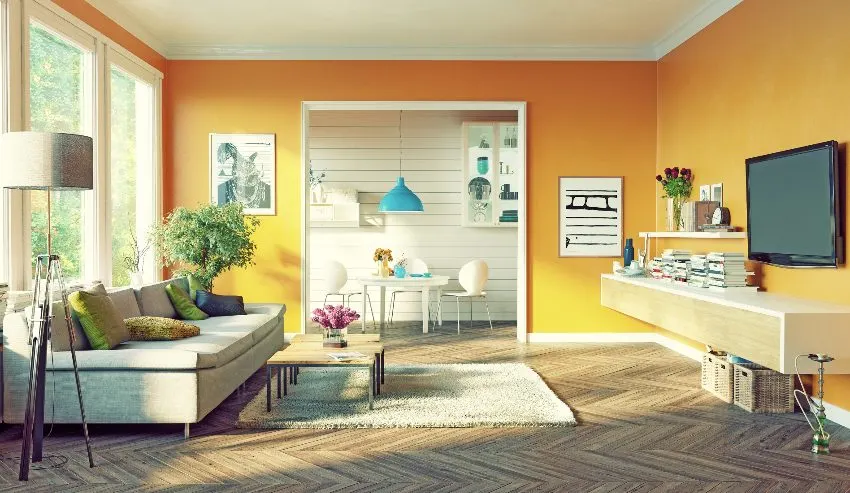
Warm and Welcoming Oranges – Orange is another lively color that is often associated with warmth and excitement. It is best known for uplifting one’s spirits and encouraging social interaction.

In interior design, the color orange is known for the warmth it brings in spaces. You can typically find it in social areas like family rooms, lounges and living rooms where you want people to feel invited, welcomed and where you want to promote communication. Additionally, this hue is your most reliable curtain color choice when you want something cozy and comforting.
The color orange is also the best choice for dining areas because it also stimulates the appetite. Muted and softer tones like coral, pumpkin and terra cotta are also the best shades of orange to use for curtains.
Cheerful Yellows – The color of sunshine and happiness, yellow is best known for boosting one’s energy and for encouraging optimism. The bright, cheerful shade of yellow is also popular for reducing feelings of sadness. In interior design, the color yellow can instantly make space feel more lively. It is often used in upbeat environments like play areas, kitchens and living rooms.

Yellow curtains can easily brighten up a space, making it the most reliable option for rooms where you want to add a dose of happiness. Similarly, you can use this curtain color for workspaces or study areas where you want increased mental activity and productivity.
When it comes to the best shades of yellow for curtain color, opt for soft tones or muted versions like mustard, warm golden yellow, ochre, butter yellow and lemon yellow. Yellow curtains are best paired with neutrals to prevent it from being too overwhelming.
Serene and Timeless Whites – Connected with purity and cleanliness, the color white is known for its simplicity and unmatched versatility in design. It promotes a sense of calm, serenity and tranquility, while making spaces look clean, airy, bright and uncluttered.
The color white is often used in interiors where cleanliness is a must like hospitals and clinics. In homes, white is a popular choice for rooms where you want a crisp appearance. This timeless color is fail-proof if you want a neutral background where you can easily introduce accents.

White curtains are perfect for spaces designed for relaxation like bedrooms, spas and bathrooms. You can easily create a serene escape in your own home with an all white color scheme paired with white sheer curtains. Additionally, you can use white curtains if you want to create openness and make a room appear larger and brighter.
When it comes to matching with other colors, you can pair white curtains with any color and use it for any interior design style. You can also use white curtains if you want to tone down bold wall colors or enhance pastel walls.
And don’t forget to experiment with textures and materials. Smooth and silky textures, like those found in silk or satin tend to promote a feeling of elegance and luxury. Heavier options such as cotton, and velvet can promote warmth, while sheer and lighter types of fabrics offer a more light and airy feel.
Interior Designer’s Tips on Choosing the Right Curtain Colors
Here are some additional Interior Designer tips on how to apply the psychology of colors when choosing curtains for your home:
Consider the room’s purpose. Determine the function of the room and use it as your primary guide in choosing the color of your curtains. Here are some examples:
- Spaces for relaxation – For bedrooms opt for calming curtain colors like whites, blues and greens because they help promote rest and relaxation.
- Spaces for productivity – Home offices, studies or workshops need colors that help boost energy and stimulate creativity, so choose yellow, purple and muted shades of reds.
- Spaces for social interaction – Living rooms, lounges, family rooms and dining rooms need a welcoming ambiance and a cozy vibe so go with warm toned curtains like oranges, yellows and earthy reds.
Match your curtains with the mood you want to foster in the space. Each room in your home requires a specific mood and you can match your curtains with the vibe you want to create. Here are some examples:
- Energetic and Dynamic – Opt for bold and bright curtain colors like red, orange and yellow because they can make a space more vibrant and lively.
- Calm, Peaceful and Serene – Cool hues like light shades of blue, greens and soft lavenders can inject tranquility in a space. Likewise, neutrals like white and gentle grays can also help create a relaxing and soothing environment.
- Cozy, Warm and Inviting – Warm and earthy tones such as brown and muted shades of orange like terra cotta are some of the best curtain colors you can try if you want a space to feel welcoming and cozy. You can also layer colors with a brighter shade paired with more neutral options to create a cohesive design that matches with other elements in the space.
To showcase highly specific designs, some images on this website use advanced AI-generation software to illustrate ideas and room inspiration. See our editorial policy to learn more.