27 Neutral Exterior Paint Colors To Boost Your Home’s Curb Appeal
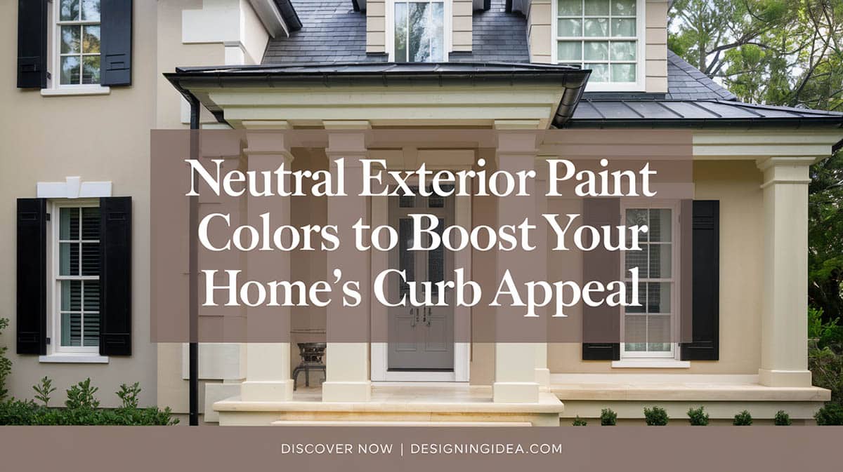
When you want to choose the best neutral paint shade for your home, you’re hit with many options. When selecting involves understanding color theory, architectural considerations and application, where do you even start? Let me walk you through the most popular neutral exterior paint colors for your home and offer some helpful tips to help you choose.
Popular Neutral Colors by Shade
Light Neutrals: If you want a clean look, you can go with whites that have subtle hints of other tones like gray or tan. Soft creams are also popular for providing a warm, welcoming vibe. And for a more modern, sophisticated look, check out pale grays – they keep things feeling bright while still being neutral.

Upload a photo and get instant before-and-after room designs.
No design experience needed — join 2.39 million+ happy users.
👉 Try the AI design tool now
Mid-tone Neutrals: These are some of the most versatile shades, working well on many architectural styles. “Greige” combinations beautifully bridge the gap between gray and beige. Classic beiges are a safe choice for evoking traditional charm. And medium grays give a refined, timeless look.
Deep Neutrals: On the deeper end, you’ve got rich tawny tans, elegant charcoals, and earthy browns. Sophisticated taupes provide depth while avoiding gloominess. For dramatic curb appeal, a chic charcoal grey could be the way to go. And deep, cozy browns work nicely to ground a home with organic warmth.
Here’s our list of paint picks with their brand, color name and shade. Find more details about each of these options below.
| Brand | Color Name | Description |
|---|---|---|
| Benjamin Moore | Swiss Coffee (OC-45) | Warm cream |
| Manchester Tan (HC-81) | Soft beige with pink undertones (May be too warm for some areas) |
|
| Simply White (OC-117) | Warm white | |
| Revere Pewter (HC-172) *Safe choice |
Contemporary greige | |
| Gray Owl (OC-52) *Safe Choice |
Light warm gray | |
| Stonington Gray (HC-170) | Light gray with blue undertones | |
| Metropolitan (AF-690) | Silver-toned gray | |
| Chelsea Gray (HC-168) | Slate-inspired deep gray | |
| White Diamond (2121-60) | Cool white with blue notes (Best for modern homes) |
|
| White Heron | Off-white | |
| Sherwin-Williams | Alabaster (SW 7008) | Refined cream |
| Agreeable Gray (SW 7029) *Safe Choice |
Balanced greige | |
| Repose Gray (SW 7015) | Gray with subtle blue undertones (May be too cool for traditional homes) |
|
| Silverpointe (SW 7653) | Contemporary silver-gray | |
| Slate Tile (SW 7624) | Rich slate-inspired (May be best as an accent) |
|
| Site White (SW 7070) | Cool white | |
| Passive (SW 7064) | Stone-inspired neutral | |
| Peppercorn (SW 7674) | Dark graphite gray | |
| Urbane Bronze (SW 7048) | Deep earth tone | |
| Farrow & Ball | Elephant’s Breath (229) | Dynamic greige |
| Pavilion Gray (242) | Cool gray | |
| Blackened (2011) | Gray-white with blue notes | |
| Behr | Perfect Taupe | Balanced neutral |
| Graphic Charcoal (N500-6) | Dark slate-inspired | |
| Carbon Copy (N520-5) | Sophisticated graphite (May work best as an accent) |
|
| PPG | Silver Screen | Contemporary silver-toned |
| Gray Stone | Stone-inspired neutral |
Warm Neutral Exterior Paint Colors
Warm neutrals are a solid go-to option for creating a welcoming atmosphere. These inviting hues contain undertones of yellow, red or brown, allowing them to complement traditional architectural styles beautifully.
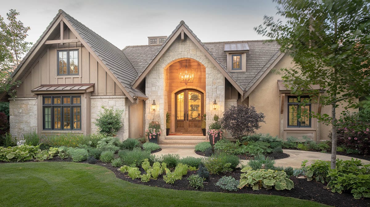
Creamy-off whites: For those with classic Colonial or Craftsman homes, you can’t go wrong with a creamy off-white that celebrates their vintage charm. Select a refined cream hue like Benjamin Moore’s “White Heron”, “Swiss Coffee” or Sherwin-Williams “Alabaster” to enhance and add warmth without looking too stark white. For a warm white, check out Simply White by Benjamin Moore. Or opt for a soft beige with whispery pink undertones like Benjamin Moore’s “Manchester Tan” which adds just a touch of feminine vibrance.
Rich taupe: On the other hand, grounded taupes like Behr’s “Perfect Taupe” effortlessly bridge brown and gray for timeless versatility. Ultimately, traditional homes shine best in warmer, nature-inspired neutrals that feel gracious yet quietly elegant.
Sophisticated greige: If you have a transitional or contemporary space, dial up the cozy factor with on-trend greige blends which balance gray and beige beautifully. Explore refined options like Sherwin-Williams “Agreeable Gray” or Benjamin Moore’s popular “Revere Pewter” which offer a crisp modern edge with approachable warmth.
Warm gray: Or make an intriguing style statement with the ever-changing dimension of light-reactive warm grays like Farrow & Ball’s “Elephant’s Breath.” For a lighter feel, Benjamin Moore’s beloved “Gray Owl” delivers sophisticated style with a whisper of brown to keep things inviting.
Earth-tones: A rich earth tone with warm brown undertones that doesn’t overwhelm is Benjamin Moore’s Kingsport Gray. And for major modern drama, I’m currently obsessed with deep, lush earth-inspired tones like Sherwin-Williams “Urbane Bronze” which celebrate nature’s rich textures. Behr Ancient Earth is a grounded neutral that brings natural warmth to contemporary homes.
Cool Neutrals
Cool neutrals offer a contemporary feel and are frequently used in modern architectural designs. These shades typically are made using blue, green, or purple undertones.
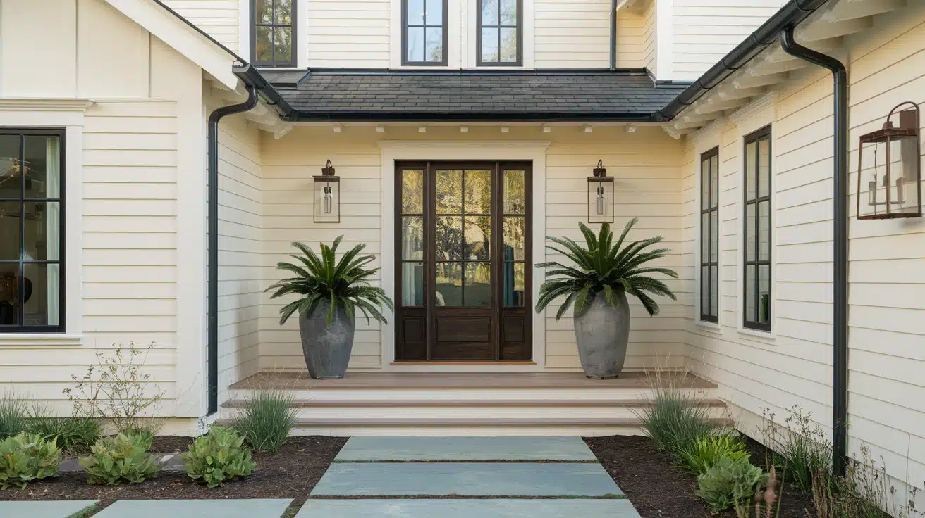
Pure Grays with Blue Undertones: For a light gray with gentle blue hints, consider Benjamin Moore’s “Stonington Gray.” This adaptable neutral creates a refined impression across various lighting conditions. Alternatively, Sherwin-Williams’ “Repose Gray” incorporates subtle blue pigments to add depth without overwhelming architectural details. Farrow & Ball’s multidimensional “Pavilion Gray” also maintains a cool attitude through shifting times of day.
Silver-Toned Neutrals: If opting for more metallic silver-grays, Benjamin Moore’s “Metropolitan” reflects light beautifully while keeping things sleekly modern. Sherwin-Williams’ “Silverpointe” mixes gray and silver tones for contemporary elegance. Similarly, PPG’s “Silver Screen” channels silver’s sheen in a neutral that complements contemporary homes.
Slate-Inspired Colors: Some prefer the deep look of shade for its drama and sophistication. Benjamin Moore’s “Chelsea Gray” incorporates multiple cool undertones to emulate natural slate’s complexity. Sherwin-Williams’ “Slate Tile” replicates slate’s variation in a rich neutral. And Behr’s “Graphic Charcoal” balances dark slate essence with modern sensibilities.
Gray-whites: There are gorgeous, refined grays with subtle cool undertones that add visual interest while still reading as neutral. A few of my favorites are Benjamin Moore’s “White Diamond,” Sherwin-Williams’ “Site White,” and Farrow & Ball’s “Blackened.” These chic whites and gray-whites incorporate hints of blue that give a contemporary coolness without looking stark or cold.
Stone-inspired: Another elegant option is neutral paints inspired by natural stone. Shades like Sherwin-Williams’ “Passive” and PPG’s “Gray Stone” emulate the organic variation found in materials like concrete, limestone or granite.
Graphite tones: On the darker end, sophisticated graphite neutrals also have a strong modern appeal. Sherwin-Williams “Peppercorn,” and Behr’s “Carbon Copy” are all bold, dramatic grays that read as very refined neutrals. Though dark, their complex undertones keep them from feeling flat or overly somber. These rich, multifaceted neutrals provide contrast and architectural presence while maintaining a cool, elegant vibe.
Neutral Color Schemes
When selecting a main wall color, go for a versatile neutral that won’t go out of style. Popular options like warm grays, greiges, and linens work with many home styles. We recommend lighter tones to keep things fresh and bright. Stay away from stark whites that show every scuff and dirt mark.
Now comes the fun part – picking accent colors to make things pop! Use deeper shades on windows, doors, and shutters to frame views. Try bolder hues like black, navy, or dark green for a dramatic look on craftsman or contemporary homes. For traditional spaces, stick to classic black or dark brown trim.
Don’t forget about the edges and transitions around porches, overhangs, and pathways leading up to your entry. Paint these zones in a lighter neutral to seamlessly blend from siding to trim. This pulls everything together into one cohesive-looking exterior palette.
Choosing Neutrals for Different Home Styles
Choosing timeless neutrals that work with your home’s architectural style is the secret to having a long-lasting color you’ll be happy with for years. Traditional colonial homes look inviting when painted in warm creams, taupes, and rich browns suggestive of clay bricks and weathered wood. Play up the grandeur of Victorian homes with lighter gray-taupes that accentuate intricate trim details. Earthy beiges and sages bring out the simplicity of Craftsman bungalows.
For sleek modern homes, cool hues like stony grays, chic charcoal, and even bold blacks create a chic, contemporary vibe. If your modern home leans more minimalist, stick to pristine whites and soft dove grays to keep the focus on clean lines. Industrial modern homes call for a dash of color – try matte deep reds, oxidized coppers, or rustic brick reds. They’ll make weathered surfaces pop while paying homage to the buildings of old.
Why Use Neutrals?
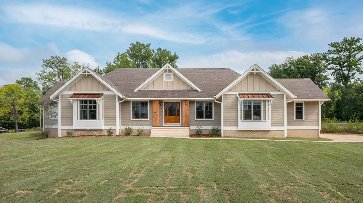
The thing I love about using neutral paint colors is they never go out of style. Their versatility to enhance any architectural style and blend with a diverse amount of home styles and landscaping is appealing. Neutral exteriors project a classic, inviting curb appeal that delights potential homebuyers. Neighbors appreciate neutrals for their ability to integrate harmoniously into any community aesthetic.
Beyond visual appeal, neutral paint imparts valuable resale value. By selecting an exterior color with widespread appeal, homeowners can recoup a greater return on their initial paint investment. When the time comes to sell, neutral backdrops allow a home’s architecture and landscape to shine.
How to Choose the Right Neutral for Your Home
When finally picking a neutral tone you should consider what matters most – how the shade will look on your house throughout the seasons.
First, think about the environment and lighting. Does bright southern sunshine bathe your walls in midday sun? Or does a canopy of trees cast cooling shadows? Maybe stormy gray skies dominate your weather landscape. The amount and type of natural light exposure impacts color perception, so pay attention to these details.
To get an idea, stand outside and look at each exterior wall directionally. Which way does it face – north, south, east or west? That gives you clues as to the light exposure. North-facing walls tend to appear cooler-toned and more shadowed. Go for warm-hued neutrals like tans or peaches to perk things up. South walls soak up serious sunlight, which can make some paint choices look screaming bright. Tone these down with muted grays, taupes and lightweight beiges.
Now check out the east and west sides during both morning and late afternoon hours. See how the color and shadows drastically shift? Snap pics at each time. Cool undertone neutrals can handle these light swings best.
Choosing the best option also depends on where you live, and the typical weather conditions. Those of us in coastal areas need to pick fade-resistant neutrals that can withstand exposure to salty sea air. If you live in a hot, dry desert climate, go for heat-reflective neutrals that won’t fade as easily under the blazing sun. And for mountain regions, think about how all that reflected light from winter snow may impact your perception of a color.
Next, test out some large (4×4 foot) paint samples and observe them during varied times and conditions. That creamy beige that looks gorgeous at noon may appear dull and flat on a cloudy evening. View the color options at different times of day and in all sorts of weather to make sure your final choice is a winner every time.
The right neutral has the power to complement your home’s architecture and seamlessly blend with the surrounding landscape. So don’t rush this important decision about your home’s exterior facade. Thoughtfully consider the lighting and environment to pick a timeless neutral that always feels just right.
To showcase highly specific designs, some images on this website use advanced AI-generation software to illustrate ideas and room inspiration. See our editorial policy to learn more.

