Modern Scandinavian Retreat Living Room Color Palette

If you love rooms that feel calm, bright, and have a lot of charm you’ll love the modern Scandinavian retreat living room color palette. This design is all about overflowing the room with soft whites, pale wood tones, subtle grays, and a touch of sage green. These colors work together to make your room feel lighter, brighter, bigger, and more relaxing without looking sparse or too clinical. In this guide, you’ll see exactly how I use each color so your living room feels like a restful retreat you’ll want to spend time in.
How To Use The Modern Scandinavian Retreat Palette
A Scandinavian Retreat living room is all about calm, light, natural warmth, with a minimal elegance. Here’s a quick breakdown to let you see where to use each color so you get the look. Later on, I’ll cover each aspect in more detail.

Upload a photo and get instant before-and-after room designs.
No design experience needed — join 2.39 million+ happy users.
👉 Try the AI design tool now
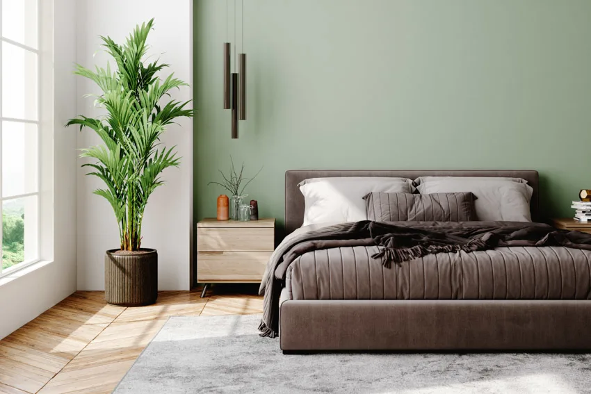
- Cloud White #F9F9F6 – Use for the walls.
- Birch Beige #E3D9C6 – Use for the wood furniture tones or accent textiles.
- Misty Gray #D2D2D2 – Use for the sofa upholstery or large rugs.
- Charcoal Ink #4C4C4C – Use for the lighting fixtures, hardware, or picture frames.
- Sage Leaf #A7B9A1 – Use for plants, pillows, art, or an accent chair.
How to Use Each Color in a Living Room
The palette is best for small living rooms, apartments, and anyone who loves a modern minimalist style. Here’s a more thorough look at where to use each element.
Cloud White (#F9F9F6): The Airy Backdrop

Use this soft daylight white, with a hex code #F9F9F6, on the walls, ceiling, trim, and even interior doors if you want to have a more seamless look. This is really ideal for rooms that don’t get a whole lot of light, because the hue reflects rather than absorbs. It’s soft enough that it doesn’t feel cold, and it lets your furniture, art and architectural details become the focal points. An excellent design tip is to make sure to keep the trim the same color or just a half of a step brighter.
Birch Beige (#E3D9C6): Add Warmth to the Wood and Textiles

For the furniture and textiles, I recommend going with a tone like birch beige, hex code #E3D9C6, as it works best when it represents real materials. This tone can be used in pieces like a light oak or birch coffee table, sideboard, or TV stand. It also works for textiles like those found in woven baskets, linen curtains, or throw blankets. You can even use the hue for picture frames or woven wall decor. The pale, natural wood tone warms up all the white and gray in the palette so the room feels inviting instead of sterile. As a tip, if you already have darker wood furniture, use this earthy beige for just the textiles like the pillows, throws, or curtains to introduce more softness and natural Scandinavian character to the room.
Misty Gray (#D2D2D2): The Soft Base Layer

You want a misty gray hue like #D2D2D2 to ground the room without stealing all of the attention. This shade is perfect for a sofa, especially in a small space, as the lighter than charcoal color doesn’t feel heavy on the eyes. It can also be used on a large area rug that covers most of the floor and designates the seating area. It can work for storage pieces like a low media console or sideboard if you prefer to use painted furniture. Since it’s mid-light and neutral, it hides everyday wear and tear better than a pure white, but still looks lighter overall. As a tip, if you use this light gray on the sofa, choose a textured fabric such as a linen blend, or subtle herringbone pattern to avoid a flat look.
Charcoal Ink (#4C4C4C): Clean Lines & Modern Contrast

You’ll want to use this charcoal ink #4C4C4C shade sparingly as your modern, graphic accent tone. For this, I’d focus on using it on light black metal or charcoal frames around your art and mirrors. It also works for floor lamps and pendant lights with off-black or charcoal bases. Additionally, you can use it for table or chair legs, or bolder as a single charcoal side chair or ottoman for more depth. The overall strategy is to outline the room rather than darken it. Adding too much charcoal, will make the palette shift from light Scandinavian to a more moody industrial design. To get the look right, try to repeat the charcoal hue in at least three small places so it feels intentional. As an example, you could use it for the lamp base, picture frames, and cabinet hardware.
Sage Leaf (#A7B9A1): Soft Green for Life & Calm

This sage leaf tone #A7B9A1 brings a “retreat” feeling to this palette. You can use it for throw pillows, a single accent chair, or as a bench cushion with excellent results. You might want to incorporate the hue for real or faux plants where it makes sense to use this soft green tone. Another strategy is to find the hue in an abstract artwork that has both soft greens and warm neutrals that match the other tones for a cohesive feel. The sage color feels relaxing and organic, especially next to the birch and soft white, and gives enough vibrancy so the room doesn’t feel monotone. As a tip, you’ll want to keep the green muted and avoid using bright emerald or neon greens, which interrupt the quiet mood. Check out our coastal palette here for more inspiration.
Common Mistakes to Avoid
Using too many accent colors – Stick to the five core colors with one or two extra accents like a soft blush or warm tan, but don’t go wild.
Having big, dark furniture pieces – A massive charcoal sofa or dark and heavy bookcases can overload a small Scandinavian-inspired room. Use lighter tones on the bigger furniture pieces to prevent visual overwhelm.
Too much décor and cluttered surfaces – The Scandinavian style relies on negative space, so leave some shelves and tabletops bare to get the minimalist feel.
Too much shine – Avoid using high-gloss finishes. Target a more natural vibe by opting for matte or satin finishes instead.
Styling Formulas You Can Use
Here are a couple of easy ways to nail the modern Scandinavian retreat style without going overboard.
Sofa combo – A light gray sofa, with sage green pillows and a birch beige throw.
Coffee table trio – A birch beige serving tray, with a small plant with sage tones and a white ceramic candle.
Wall staging – Soft white walls with three black charcoal frames, and a hanging artwork with hints of green and beige.
Reading corner – An accent chair with birch beige legs, light gray cushion, a sage throw blanket, and charcoal black floor lamp.
Why This Palette Feels So “Scandi”
Most Scandinavian design leans on three big ideas, which are light, simplicity, and nature. The soft white on the walls reflects natural light, making even smaller rooms feel brighter. The light gray and beige tones create a neutral base that’s easy to style and fits with the simple philosophy well. The sage green hue and pale wood tones focus on targeting the natural feel, which is a core part of Nordic design. The charcoal finishes help ensure the room doesn’t feel washed out by adding just enough depth and contrast to keep things exciting. All together, the colors stay quiet, but work well together, giving a feeling of peace and tranquility.
To showcase highly specific designs, some images on this website use advanced AI-generation software to illustrate ideas and room inspiration. See our editorial policy to learn more.