Matching Bedroom Colors with Bedding and Decor

The right bedding can significantly enhance the room’s visual appeal. Though they may seem like a small part of your room’s overall design, the bed sheets and accessories you use in a bedroom can make or break the aesthetic, have an effect on the ambiance and mood of the space. By thoughtfully matching bedroom colors with bedding and decor you can create a space that is not only cohesive, pleasing to the eye and comforting to the soul, but also adapted to your own unique personal style.
Your wall paint can serve as the foundation of your overall color palette. The wall color of your bedroom is your best reference when choosing the colors of your bedding and decor. Most homeowners prefer neutral wall colors like white, beige, or light gray because a neutral base allows you to experiment with a wide variety of bedding and decor colors.
Depending on the color harmony you want to apply, you can choose a contrasting or coordinating hue. Here are some examples: For a bedroom that has a blue wall paint, you may use its complementary color yellow for the fabrics to establish high visual contrast and interest. However, if you want a more restful atmosphere, you can opt for a monochromatic color scheme using light tones and dark tints of blue.
In addition to the wall color, you can also use your furniture as a reference for choosing your bedding and decor. A neutral colored wall like white or beige works with almost any bedding design because of the flexibility it offers.
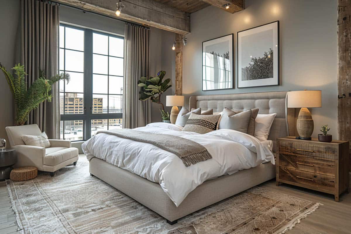
Use Shades In The Same Color Family. Another design approach is to choose fabrics in a lighter or darker shade than the wall color. This way you still create variation without the stark contrast.
Layer textures. Playing with different textures can also help increase the visual appeal of your bedroom decor. Combine smooth cotton sheets with knitted throws or plush pillows. Aside from your soft furnishings, you can also layer different textures in your accessories by mixing materials like metal, glass and natural finishes.
Layering textures is an effective design trick especially if you choose to go with a monochromatic color scheme because it will prevent your bedroom from looking too dull or flat.
Incorporate patterns. Aside from textures, you can also mix prints and patterns depending on the overall style of your bedroom. Bedding provides the best opportunity to introduce contrast and add visual dynamics in the space, especially if the wall color is neutral.
Opt for striped and geometric bedding for modern bedrooms or traditional motifs like brocade and florals for classic style. If you are a fan of fun and retro design, look for bold prints and patterns.
You can mix patterns and prints but ensure that they have a common hue. For example, striped pillowcases and geometric bedding goes together if they belong to the same color families.
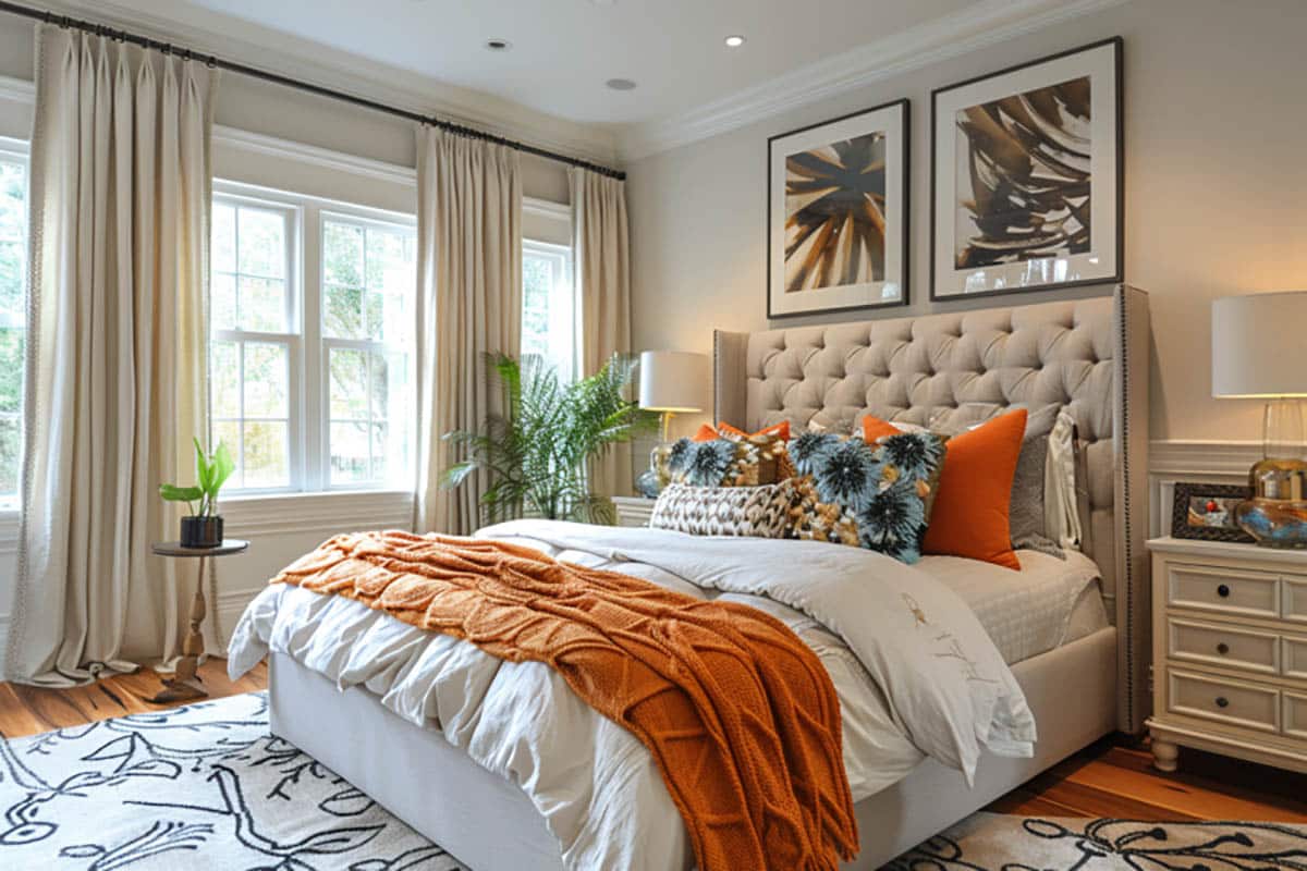
Decors and accessories can be used for accent colors. As mentioned earlier, the remaining 10% of your color scheme is dedicated to an accent color. This accent color can be reflected in decorative items like artworks, lamps, throw pillows and other small items. This way, you introduce pops of color to the space without overwhelming it.
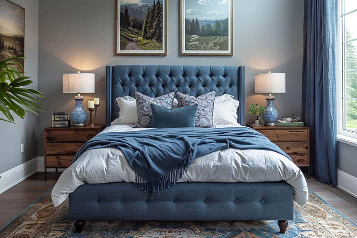
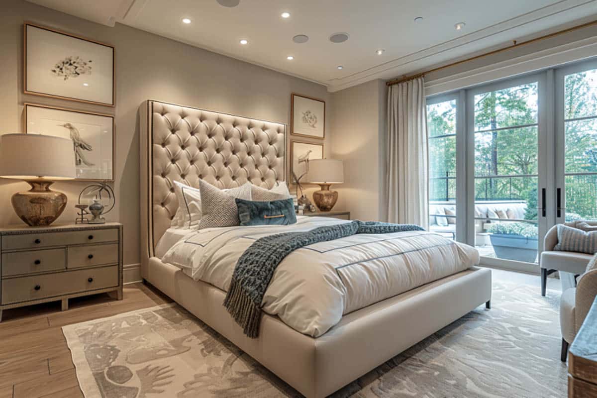
Match your walls and bedding for a serene atmosphere. Using one color for your walls, decor and bedding create a saturated, seamless aesthetic that is naturally soothing. An “all white” bedroom, for example, is a popular choice for those who want a calming, comforting ambiance.
Match your bed and fabrics with window treatments to tie the room together. Another design approach is to coordinate the colors of the bedding with the curtains or blinds. This will unify the room and enhance the overall color theme.
If your bedroom has an accent wall, match your decor with it. If you have an accent wall, choose decor and bedding that belong to the same color family so it integrates well into the overall design of the space. However, do not go overboard as it may deviate attention from it. Even if you coordinate their colors, the accent wall should still be the focal point of the room.
If your bedding is printed, choose an undertone from it and mirror it in the accessories. Repeating the undertone of your bedding in the small accessories will create visual harmony. For example, your bedding has a cool undertone, you can choose blue, green and purple decor. While if your bedding has a warm undertone, go with yellow, red and orange accessories.
Interior Designer Tips for Choosing Colors in Your Bedroom
Determine the mood you want to achieve in your bedroom. Colors greatly affect our mood. If you want to promote deep relaxation and a restful sleep in your bedroom, incorporate cool hues such as blue, greens and light shades of purple. Allow these colors to dominate your bedroom decor for a soothing and calming effect.
On the other hand, if you want something uplifting, warm hues like red, yellow and orange can help stimulate one’s energy when used in small doses. While if leaned towards a balanced mood, opt for neutrals like beige, grays and white.
Likewise, the saturation and intensity of colors will have an effect on your room’s ambience. Soft muted shades create a serene atmosphere, while bright, bold colors bring in positive energy.
Light colors can help make a bedroom feel larger and more open, while dark colors add coziness. If you want to make your bedroom appear larger and feel more open, choose light colors for the walls and large design elements which include the furniture and bedding. On the other hand, if you want to add coziness and depth to your bedroom, use dark colors generously, especially if your room has natural light in abundance.
Ensure that you have one dominant color which will anchor the overall palette of your bedroom. Perhaps the most important principle in matching your bedroom colors and decors is to have one color which will dominate the space. Then choose soft furnishings and accessories that have a touch of the same hue. Having one common color will produce cohesiveness and harmony all through.
Keep in mind the “60- 30 -10” when formulating your bedroom’s overall color palette. Ideally, 60% of your bedroom should take up the main color. This consists of the largest design elements in the space like the walls and your furniture pieces. The next 30% includes the trims, soft furnishings and accent pieces like the bedding, window treatments and area rugs. The remaining 10% is for the accessories and artworks. Following this rule establishes balance in the space and helps achieve a cohesive color scheme.
Use “color theory” as your guide. Knowing the basics of “color theory” comes handy when choosing bed sheets for your bedroom. Designers highly recommend this effective trick when it comes to designing choosing color palettes for interiors.
To give an overview, the “color theory” are principles based on the “color wheel” which are used to create visually appealing color combinations. These colors are divided into primary, secondary and tertiary colors and are combined to produce color harmony and a sense of balance. Complementary colors or those opposite each other the color wheel create high contrast. Analogous color or those next to each other provide a more harmonious feel. Monochromatic or lighter shades and darker shades of one hue renders a coordinated look.
For example, three adjacent colors in the color wheel like blue, green and blue green makes an analogous color scheme. Pairing two hues opposite each other in the color wheel like blue and orange creates more energy and visual depth. Read more about choosing bedroom paint colors here.
To showcase highly specific designs, some images on this website use advanced AI-generation software to illustrate ideas and room inspiration. See our editorial policy to learn more.

Upload a photo and get instant before-and-after room designs.
No design experience needed — join 2.39 million+ happy users.
👉 Try the AI design tool now