47 Color Drenching Bedroom Before and After Makeover Ideas

If you’ve ever wanted a bedroom that stands out like it was created by a designer and makes you feel like you’re completely wrapped in your favorite hue, color drenching might be for you. It may be the easiest way to get that high-end look you crave without changing the layout or buying all new furniture. In this bedroom before and after gallery, you’ll see transformations using the same layout and primarily focus on changing the color palette to a single hue. With the help of advanced AI image software, for each makeover, we change the color and some other elements like lighting, bedding, and styling, so you can visualize how these designs may look in your own home.
Color drenching is when you paint the walls, trim, baseboard, and ceiling all the same shade. It removes visual breaks and stops your eye from bouncing around and looking for a place to rest. It can make the room feel custom and curated because everything is unified around the same palette. Color drenching can even make ceilings look taller, corners feel softer, and have an overall calming effect. The technique allows you to use whatever color you love best, whether it’s calming neutrals, moody deep shades, or striking jewel tones, whatever fits your personality.

Upload a photo and get instant before-and-after room designs.
No design experience needed — join 2.39 million+ happy users.
👉 Try the AI design tool now
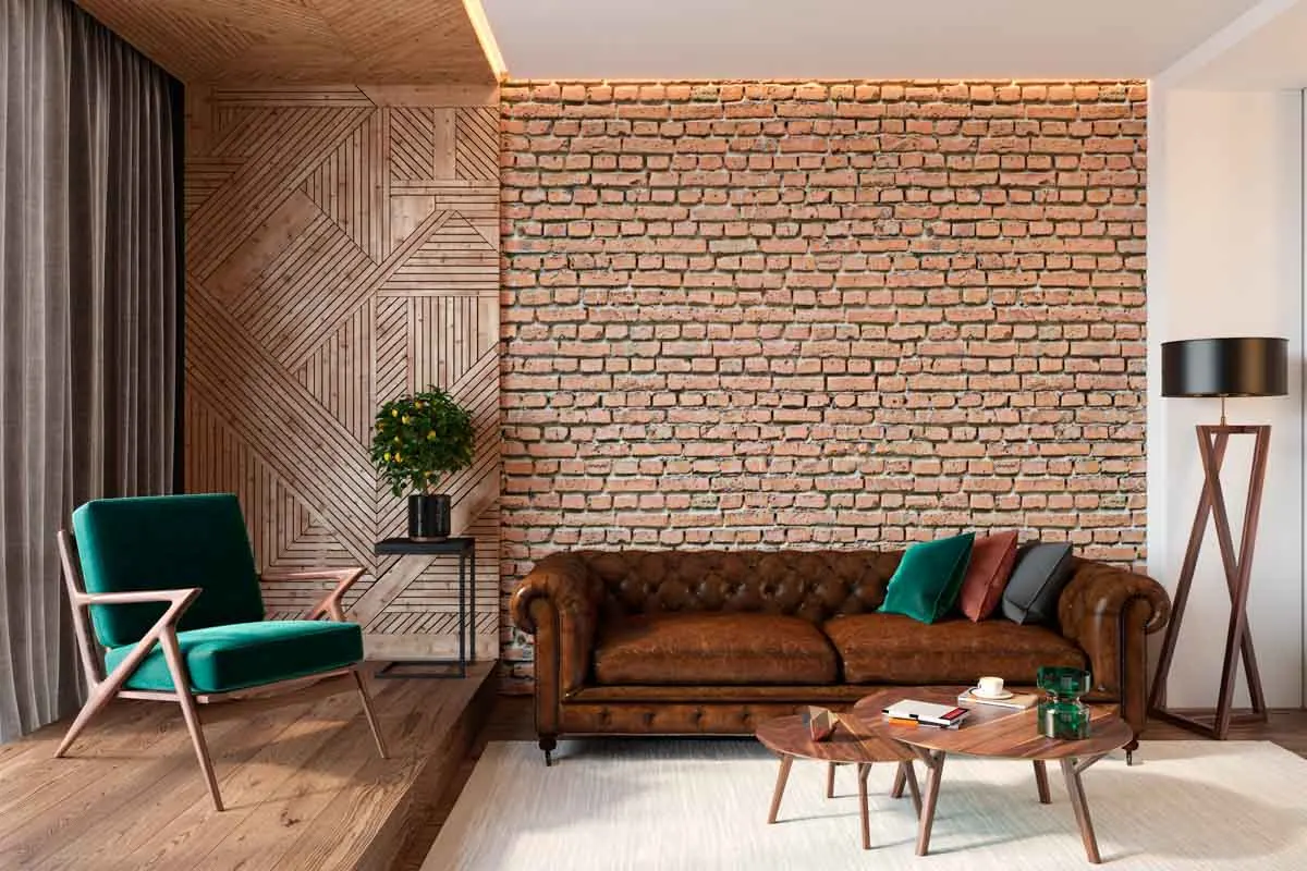
The before picture we use is basically a blank canvas primary bedroom that has a soft, neutral palette with an abundance of natural light. It features an upholstered bed with a fabric bench at the foot. There is a small sitting area to one side with accent chairs and a round table. The overall color palette is warm white walls, paired with creamy textiles and light wood tones. It has light oak plank flooring and a backlit cove ceiling that gives the space a modern design.
Scandinavian Sand Monochrome (Bright & Cozy)

This timeless after creation works because it swaps the white for the warm sand family, using it for the walls, trim, textiles, and even the rug, making the room feel calmer without getting any darker. The primary paint hue is a sand-beige, and to get your room to look like this, you can try Sherwin-Williams Natural Linen (SW 9109), Sherwin-Williams Accessible Beige (SW 7036), Benjamin Moore Bleeker Beige (HC-80), or Muslin (OC-12) if you want a lighter sand vibe.
When painting, use the same sand tone on the walls and trim for a wrapped monochrome color-drenched appearance. For a sheen, use matte or eggshell on the walls and satin on the trim for a subtle definition. For the window treatments, swap in a sand or taupe linen drapery with ripple-fold pleats that are layered over light-filtering sheers. Install a soft, sculptural white cluster-style globe chandelier as a statement piece.
Sea-Glass Blue Breeze (Coastal Design)

If you love the coastal design but don’t want to go overboard with drastic amounts of color, you may love this idea that stays within the sea-glass range of blue-green + gray. It takes that hue and repeats it for the drapes, upholstery, rug, lamps, and art. It also brings in a brass fixture to add some warmth. The primary paint hue is sea-glass blue-green, and you can try Sherwin-Williams Rainwashed (SW 6211), Sherwin-Williams Sea Salt (SW 6204) if you want a little lighter, or Benjamin Moore Palladian Blue (HC-144). Paint the sea-glass tone on the walls and trim for a color-wrapped design and use a matte or eggshell finish so it looks soft in daylight.
Slate Teal Statement (Sophisticated Edge)

If you desire a look that is dramatic and moody at the same time, this slate teal might impress. It’s paired with darker drapery, matching furniture, a smoky metal and glass fixture, and a slightly stormy artwork with the same tones to give depth and make it appealing. There is also a plus that tiny hit of metallic and the same warm cove lighting to give it a warm glow in the background. To get this deep slate teal makeover, try Sherwin-Williams Dark Night (SW 6237), Sherwin-Williams Riverway (SW 6222), or Benjamin Moore Aegean Teal (2136-40) if you want a slightly softer palette.
Warm Greige Cocoon (Mushroom Modern)

Using a warm mushroom hue like this after image feels expensive because the greige hue moves from wall color to a full-room palette with a lighter tint of the same base tone for the textiles, rug, and furniture. All the elements use a variation of the same warm mushroom range, so everything reads softly designed. To get this look, try using a mushroom greige like Sherwin-Williams Shiitake (SW 9173), Sherwin-Williams Perfect Greige (SW 6073), Benjamin Moore Pashmina (AF-100) for a deeper, cozier option, or Benjamin Moore Edgecomb Gray (HC-173) for those wanting a lighter mushroom appearance. For lighting, choose a large fabric drum or pleated linen pendant, and add in a pair of vertical brass sconces flanking the art for gallery-style layering.
Coastal New England Navy (Classic & Updated)

Navy tones look excellent when using a color drenching technique because they are bold and pair well with white to make it all stand out and make an appealing statement. This room design uses navy everywhere, with some lighter textiles, decor, and furniture tones mixed in for contrast. There’s a strong abstract ocean horizon artwork that signals coastal and brings everything together. For classic deep navy walls like this, try Benjamin Moore Hale Navy (HC-154), Sherwin-Williams Naval (SW 6244), Farrow & Ball Hague Blue (No. 30) if you want richer and inkier, or Benjamin Moore Gentleman’s Gray (2062-20) for a navy-tone with a touch of teal depth. To get the drenching effect, take the navy across walls and trim, and if you want the full dramatic version, the ceiling too. Use a matte finish for it to resemble a modern and moody theme.
Emerald Velvet Deco Glow (Luxe & High-Contrast)

Using a jewel-toned emerald green makes a statement since the results are saturated and theatrical. When paired with brass lighting and velvet textures, it makes it feel like a high-end designer hotel every night when you get ready for bed. To get a jewel emerald paint like this, consider Benjamin Moore Hunter Green (2041-10), Sherwin-Williams Rookwood Dark Green (SW 2816), Farrow & Ball Calke Green (No. 34) for a heritage emerald, or Benjamin Moore Essex Green (HC-188) if you want an even deeper and moodier backdrop. For lighting, pick a brass globe cluster or a modern-looking Sputnik chandelier, and keep the light bulbs warm. Add a pair of brass vertical sconces to bring out an Art Deco vibe. Another tip is to choose a large abstract art piece with the same emerald and dark tones, with a hint of gold to give it some metallic texture for a signature feel. Don’t forget your texture too; use an emerald velvet headboard with a matching bench and emerald rug to target that deco glow. Keep any of your neutrals creamy and simple so the green is what stands out.
Japandi Ink Blue Serenity (Minimal & Warm)

Going for a Japandi design, this bedroom uses a deep ink blue that reinforces the clean lines and looks refreshing with its combination of ink blue and blue-black, lighter oatmeal and stone bedding, soft paper lantern lighting, and minimal brush-painted art that feels calm. To get walls like this use Benjamin Moore Hale Navy (HC-154), Sherwin-Williams Inkwell (SW 6992) for a darker, blue-black, Farrow & Ball Railings (No. 31) if you want more inky with some softness, or Benjamin Moore Midnight Blue (1638) for a slightly softer ink feel. To avoid it from feeling too dark during the daytime, keep light sheers, but swap the outer panels to a deep charcoal/ink linen with ripple-fold pleats so the windows feel intentional. Go with a paper lantern pendant for that warm, diffused Japandi glow to go with the table lamps, regular recessed cans and a pair of sconces above the bed.
Modern Mediterranean Olive Plaster (Textural & Relaxed)

For a relaxed look that feels Mediterranean, this olive-drenched bedroom reads sunbaked and earthy. The walls look like they have a limewash or plaster movement without any discernible pattern. To get this olive, plaster-friendly appearance, use Sherwin-Williams Olive Grove (SW 7734), Benjamin Moore Saybrook Sage (HC-114) for an olive-leaning sage, Sherwin-Williams Rosemary (SW 6187) for a deeper, moodier olive-tone, or Benjamin Moore Vintage Vogue (462) for a choice with depth. Mix your olives with warm neutrals such as cream, flax, and sand in your bedding and rug texture so the room stays bright.
Sage Spa Wrap (Muted Green-Gray)

This after bedroom picture is reminiscent of a spa because of its calming sage hue that is carried through almost everything. Sage is used for the paint, bedding, upholstered pieces, and even the lamps, and warmed up with its large area rug under the bed, throw, lamp shades, artwork, pillow, sheer curtains, and warm cove lighting. To get this muted sage green-gray in your own design, try Sherwin-Williams Evergreen Fog (SW 9130), Sherwin-Williams Sea Salt (SW 6204) if you want lighter, Benjamin Moore Saybrook Sage (HC-114) for a bit richer, or Benjamin Moore October Mist (1495) for a soft modern sage. For lighting, go with a simple globe pendant on a warm brass drop to help keep the space from looking cold. For your artwork, a minimal botanical silhouette or soft organic abstract with the same sage-tones and warm cream looks beautiful.t.
Sapphire Night Hotel Mood (Modern & Dramatic)

If you want your bedroom to feel just like a boutique hotel, then you’ll appreciate this sapphire, which is saturated and wrapped, but stays crisp paired with white bedding, sheers, artwork, and warm layered lighting. The primary paint hue for this rich sapphire blue resembles Sherwin-Williams Naval (SW 6244), Benjamin Moore Blue Note (2129-30) for a deep, inky sapphire, Benjamin Moore Hale Navy (HC-154) for slightly softer, or Sherwin-Williams In the Navy (SW 9178) for a bold, popular choice. Layer in white or ivory sheers with deep sapphire drapes for some contrast that keeps daylight bright. For your lighting mix, a classic chandelier with warm metal with globe wall sconces if you’d like that hotel-style glow.
Smoked Denim Wrap (Calm & Contemporary Cool)

Using gray denim is cooler and more modern because the blue tone is slightly grayed out. By color drenching the blue-gray across the paint, upholstery, rug, and art, the entire room looks stylish and is sharpened with hanging globe lighting. For something like this, smoked denim blue try Sherwin-Williams Smoky Blue (SW 7604), Benjamin Moore Van Deusen Blue (HC-156) for classic denim, Sherwin-Williams Distance (SW 6243) for a deeper, moodier option, or Benjamin Moore Kensington Blue (840) for a slightly brighter option. Use a layered blue abstract art piece with inky washes, and tonal blocks above the bed, so it echoes the paint but adds movement.
Terracotta Clay Warmth (Modern Desert)

This idea features a terracotta color-drenched bedroom that is warm and earthy and distributes the hue across the walls, bed, bench, rug, art, lamps, and ceiling. The tone stays in that clay-to-rust range with the addition of creamy neutrals to lighten it up. To get a modern terracotta clay look, try using Sherwin-Williams Cavern Clay (SW 7701), Sherwin-Williams Redend Point (SW 9081) for a muted clay-rose shade, Benjamin Moore Terra Cotta Tile (2090-30) for a deeper, richer hue, or Benjamin Moore Canyon Clay (1221) if you want a softer warm-clay mood. Go with beige or caramel linen drapes with sheers behind since the warmer tones makes the clay feel more cozy.
Amethyst Plum Soft Glam (Romantic & Trendy)

For those wanting a bedroom design that feels romantic, a plum hue wrapped everywhere, then softened with warm brass, and creamy bedding accents can look welcoming and stylish. This creation features velvet textures that enhance the color’s perceived value. To showcase a amethyst or deep plum hue like this in your own home, try Benjamin Moore Passion Plum (2073-30) for a rich, saturated appearance, Sherwin-Williams Plum Brown (SW 6272) for a deep, moody-plum, Farrow & Ball Brinjal (No. 222) for a classic aubergine, or Benjamin Moore Raisin (AF-720) to target a darker, more dramatic style. For lighting, go with a brass globe chandelier and slim brass sconces with warm bulbs to keep the plum from turning flat. Bring in texture through a velvet headboard and matching bench, with a tonal plum rug and one cream layer with the chairs and bedding if you crave a soft glam formula that still feels airy.
Dusty Blue Quiet Mood (Softly Moody & Bright)

By using a muted gray, paired with sheers and pale bedding, this room still remains bright and airy but is great for sleeping. It’s perfect for those wanting a moody but livable space that firmly fits in the Pinterest worthy category. To get the look, use a primary paint of dusty, gray-blue like Sherwin-Williams Stardew (SW 9138), Sherwin-Williams Sleepy Blue (SW 6225) if you want to go slightly deeper, Benjamin Moore Smoke (2122-40) for a soft, designer favorite, or Benjamin Moore Boothbay Gray (HC-165) for a deeper coastal-gray-blue. For window coverings, stick with cool gray-blue sheers and add matching dusty-blue side panels if you want extra depth. Choose lighting that goes with your style, such as a modern black or dark bronze multi-arm globe fixture, which adds contrast without introducing a new color.
Pistachio Haze Retreat (Fresh & Designer Feel)

You just love the appearance of pistachio than this designer hue is right up your alley with its green hue that is light and optimistic. The monochrome pistachio paint is used across the walls, drapes, bedding, rug, and chairs, and they all sit in the pistachio family. To add some visual interest, there are brass finishes in the amazing modern chandelier, sconces, and furniture that bring some warmth. To get your room looking like this, pistachio or light yellow-green style, use Sherwin-Williams Hearts of Palm (SW 6420), Sherwin-Williams Filmy Green (SW 6190) for a lighter, airier choice, Benjamin Moore Soft Fern (2144-40) if you desire fresh, and gentle, or a more punchy feel Benjamin Moore Fresh Cut Grass (2037-40). Hang a warm brass chandelier with opal globes to give it that luxe upgrade since a fresh green and brass combination always looks elevated.
Smoky Charcoal Suite (High-End Hotel)

A smoky charcoal backdrop looks luxurious because it’s a true dark wrap with layered lighting. Using glowing cove edges, mysterious sconces, and a statement chandelier adds drama and intensity, making the palette alluring when kept strict in black, charcoal, warm gray, and soft white. To try this for yourself, use a paint hue in smoky charcoal or near-black, such as Sherwin-Williams Iron Ore (SW 7069), Sherwin-Williams Tricorn Black (SW 6258) for a true-black, Benjamin Moore Wrought Iron (2124-10) for a softened black-charcoal, or Benjamin Moore Black Beauty (2128-10) if you want rich and dramatic. It’s important that you maintain good natural lighting throughout the day so it doesn’t resemble a cave, and hang sheers with charcoal blackout drapes to frame the windows. For your light fixtures a modern globe chandelier, plus black wall sconces with warmer bulbs on dimmers can provide that romantic hotel glow.
Butter Beige Glow (Warm Minimal)

For those wanting something different this idea is similar to sunlight on a wall by using a warm butter-beige wrap paired with creamy textures, light wood, and linen. This elevated style uses a butter-beige or warm creamy beige to get its calm feel. Try paints like Sherwin-Williams Napery (SW 6386) if you want warm and buttery, Sherwin-Williams Creamy (SW 7012) for something soft, Benjamin Moore Pale Oak (OC-20) for a popular, warm greige-beige, or Benjamin Moore Tapestry Beige (OC-32) for those seeking a slightly deeper tone. To go with this tone hang warm oatmeal linen sheers combined with sand-beige drapes and keep them more wheat than gray. For lighting, hang a linen drum pendant so the walls glow at night.
Parisian Modern Blush (Elegant & Tailored)

Those who get excited by the thought of making your room feel like a European vacation will delight in these muted rosy walls, paired with tailored drapery, brass lighting, and soft velvet textures. It all feels Parisian because it’s restrained and feels neutral-friendly. To target this muted blush or dusty rose style, try out Benjamin Moore First Light (2102-70) for an airy blush, Benjamin Moore Pink Bliss (2093-70) for a soft, pale pink, Sherwin-Williams Intimate White (SW 6322) for a warmer blush-neutral, or Sherwin-Williams Romance (SW 6323) if you want a slightly deeper rosy beige. For your curtains, pair dusty-rose drapes with white sheers in a matte, linen blend or brushed poly-linen fabric. Hang a brass chandelier with opal globes above the bed that are enhanced by petite brass sconces.
Warm Cinnamon Wrap (Cozy Modern Earth)

These cinnamon walls, ceiling, and trim bring an earthy feeling to this room that is enhanced by the warm cove lighting, bronze accents, and rich velvet textures. The result is a high-end design that doesn’t feel heavy. To get an ambiance like this, use a cinnamon or warm terracotta-brown such as Sherwin-Williams Cocoa Whip (SW 9084) for a soft cocoa-tan, Sherwin-Williams Redend Point (SW 9081) for a rosy clay-cinnamon, Benjamin Moore Potters Clay (1221) for an earthy-clay, or Benjamin Moore Cinnamon (2174-20) for a deeper cinnamon-brown. Install a warm-toned drum pendant with a linen shade and an aged brass fixture, along with compact bronze reading sconces that are equipped with dimmers to better control the illumination and make the color feel luxe. For your furnishings, select rust velvet chairs, a cinnamon bench, matching bedding accents in rust, amber, or caramel with a creamy base layer so it doesn’t appear dark.
Blush Taupe Romance (Soft Modern)

If you want a modern romantic bedroom that still feels neutral-friendly, a blush-taupe paint, with soft rosy textiles, and warm brass lighting will give that cozy effect that you’ll want to enjoy. It’s a great choice if you want a blush that doesn’t make you think it’s just a pink room. Try one of these blush-taupe or rosy greige options, Sherwin-Williams Redend Point (SW 9081) for a perfect blush-taupe, Sherwin-Williams Abalone Shell (SW 6050) for a rosy taupe-beige, Benjamin Moore Pale Mauve (OC-31) for a soft, muted mauve-neutral, or Benjamin Moore Dusty Rose for one that’s not too bright with muted rose-beige tones. Go with a brass chandelier with opal globes or one of those modern brass cluster fixtures with warm table lamps to get a beautiful golden glow.
Cool Seafoam Mist (Bright Coastal Modern)

To go coastal without the obvious beach house decor, you can choose a cool seafoam paint envelope that is combined with soft layered sheers for some added brightness. Use the color wheel to go darker with the bench and the same tone with the accent chairs and nightstands, so it all feels bright and airy, but still designed to resemble a boutique seaside hotel suite. To get the design right, use the same misty color family that goes from seafoam to pale mint to soft aqua, then ground it with light wood and warm metal touches so it avoids feeling cold. Try a cool seafoam or pale aqua, such as Sherwin-Williams Sea Salt (SW 6204) for a soft seafoam-gray, Benjamin Moore Palladian Blue (HC-144) for an airier aqua-leaning option, Sherwin-Williams Rainwashed (SW 6211) to get a clean mint-aqua, or Benjamin Moore Breath of Fresh Air (806) for a crisper light-aqua hue.
Mid-Century Walnut and Mustard Ochre (Retro & Clean-Lined)

A mid-century color-drench using mustard ochre on the walls is a definitive choice that feels confident and bright. By pairing the hue with walnut pieces, long metal table lamps, and matching sculptural lighting, you instantly benefit from a retro hotel energy that is bold and eye-catching. A tip to make this work for you is to pair that warm ochre with deep walnut and little brass elements, so it feels designer-inspired. To get a mustard ochre or golden amber paint like this, test Sherwin-Williams Nugget (SW 6695) for a true mustard-ochre, Benjamin Moore Golden Honey (297) for a warm amber gold, Sherwin-Williams Honey Bees (SW 9018) for something slightly softer golden, or Benjamin Moore York Harbor Yellow (2154-40) for a deeper ochre-gold result. Use a statement piece light fixture like a Sputnik chandelier and brass swing-arm sconces to get a modern twist on the classic mid-century theme, as using warm lighting is a non-negotiable here, so it works right.
Burnished Copper Envelope (Modern Warm Luxe)

Color drenching in warm, coppery walls, with matching drapery, and tonal layers make the room feel styled, plush, and expensive. It’s the perfect vibe for someone wanting to enjoy a high-end hotel ambiance because everything is coordinated. To make this work, keep the styling minimal and the metals warm by using aged brass or bronze so the color feels sophisticated and doesn’t feel orange. To get a burnished copper or spiced terracotta hue similar to this, go with Sherwin-Williams Cavern Clay (SW 7701) for a warm terracotta-copper, Benjamin Moore Terra Cotta Tile (2090-30) for a deeper clay-copper, Sherwin-Williams Redend Point (SW 9081) to get a muted rosy-clay, or Benjamin Moore Potters Clay (1221) for an earthy copper-brown shade. Install light fixtures such as opal globes with aged brass or bronze and a couple of warm lamps so the paint glows at night.
Desert Modern Terracotta (Warm, Architectural & Minimal)

This is terracotta with a subtle plaster vibe, which feels calm and modern, instead of rustic, which is often associated with this hue. The overall palette stays earthy and restrained, and the secret is the texture over pattern that uses a soft plaster look that makes the room feel elevated, even with almost no decor. The primary paint is a desert terracotta or clay red, and you can get similar results with Sherwin-Williams Redend Point (SW 9081) for a muted clay-rose, Benjamin Moore Terra Cotta (2090-30) for classic depth, Sherwin-Williams Cavern Clay (SW 7701) for a spiced desert-clay, or Benjamin Moore Potters Clay (1221) for an earthy red-brown. Pair the main walls with warm neutral drapes in taupe or greige) with white sheers. Keep them simple so the room stays minimal. For lights, hang a large drum pendant and slim, minimal sconces.
Lavender-Gray Whisper (Quiet Trend)

This is a barely-there lavender that’s combined with gray, so it reads sophisticated first, and sweet second. It’s gray and lilac mix is the kind of color that feels calm all day and cozy when you need it at night. To get a lavender-gray or smoky lilac hue like this, consider Benjamin Moore Violet Mist (1437) for a soft gray-lilac, Benjamin Moore Silver Violet (1561) for a cooler lavender-gray, Sherwin-Williams Gris Morado (SW 9156) for a muted purple-gray option, or Sherwin-Williams Exclusive Plum (SW 6263) if you desire a deeper smoky-plum. For an enveloping paint feel, do the walls and trim in the same lavender-gray, then keep the ceiling to a lighter tint or use a soft white. A matte finish on walls is what makes it look designer. Bring in charcoal or smoky taupe drapes layered with white sheers so there’s a contrast that helps avoid it all from feeling too pastel-like. To enhance the design, hang a globe chandelier with warm bulbs so the lavender doesn’t feel cold.
Stormy Blue-Teal Wrap (Sophisticated & Modern)

For those looking to go bold, but not live in a navy man-cave, this blue-teal can give the appearance of a boutique hotel. As long as the room is bright enough with plenty of lighting and windows, you can avoid it taking on a moody personality. To get this look, use a deep blue-teal or stormy teal by choosing Benjamin Moore Aegean Teal (2136-40) for a blue-green, that’s modern and rich, Benjamin Moore Gentleman’s Gray (2062-20) for a deep teal-leaning charcoal, Sherwin-Williams Cascades (SW 7623) for an inky blue-green, or Sherwin-Williams Oceanside (SW 6496) for an interesting saturated teal with depth. To go full-glam, wrap the walls and trim, and if you want to take it extra luxe, cover the ceiling too. Use matte finish for the walls and satin for the trim, which gives that extra bit of punch.
Modern Farmhouse Sage (Soft Rustic & Contemporary)

This is a creation that goes for a farmhouse sage without coming across as too country cute. It’s got an earthy, relaxed, and modern vibe, since the greens stay muted and work well with the soft white linens. For a sage green or olive-leaning muted-green like this, look at Sherwin-Williams Evergreen Fog (SW 9130) for the best modern sage-gray, Benjamin Moore Saybrook Sage (HC-114) is slightly richer, Sherwin-Williams Clary Sage (SW 6178) is more rustic, and Benjamin Moore October Mist (1495) if you want lighter and airier. To offset the one-note look of going all in on sage, augment it with cream, oatmeal, and soft olive accents. If you want a more modern farmhouse vibe, bring in some black light fixtures and accents in the furniture, so the whole thing is soft but still sharp.
Moody Cocoa Wrap (Warm Modern Hotel)

Imagine yourself wrapped in the embrace of chocolate-brown that feels exactly like a high-end suite that’s rich, warm, and a little bit dramatic. That’s how this dark brown bedroom design feels, and the key is pairing it with creamy whites and warm metals so it looks luxe, instead of dark. For cocoa-brown or espresso-leaning warm brown similar to this use Benjamin Moore Bittersweet Chocolate (2114-10) for a deep, saturated cocoa, Benjamin Moore French Press (AF-170) for an espresso brown, Sherwin-Williams Turkish Coffee (SW 6076) to get a dark-brown or Sherwin-Williams Sealskin (SW 7675) if you want more of an edge.
Warm Pewter Wrap (Modern Minimal & Slightly Industrial)

This is the greige version of quiet luxury that uses warm pewter walls with drapes that provide a chunky texture. The effect is a space that looks modern-minimal, but the darker textiles and metal finishes give it a subtle industrial edge. For a paint pick like this, consider Benjamin Moore Revere Pewter (HC-172) for a classic warm pewter, Benjamin Moore Pashmina (AF-100) if you want deeper and more taupe, Sherwin-Williams Dorian Gray (SW 7017) for a smoky greige, or Sherwin-Williams Anew Gray (SW 7030) for a warm, soft-greige option.
Art Deco Emerald Velvet (Luxe & Refined)

This emerald and glossy brass bedroom design is all about jewel-toned luxury and velvet textures. It’s bold and dramatic, but still stylish and composed. The Art Deco vibe comes from its geometric symmetry found in its lighting, furniture, and artwork, combined with the limited palette of green, brass, and cream. To realize a deep emerald or jewel green for your own home, look at Benjamin Moore Hunter Green (2041-10) for a deep-emerald, Benjamin Moore Salamander (2050-10) if you want a rich, moody green-black, Sherwin-Williams Rookwood Dark Green (SW 2816), or Sherwin-Williams Jasper (SW 6216) for a deep evergreen with depth. Pair the walls with a brass chandelier with clustered globes and matching brass sconces so you have the symmetry that the Art Deco design craves.
Blackened Navy Calm (Deep, Soft Contrast)

For a deep, cocooning, and calm navy that avoids feeling nautical, this room stays sophisticated because of its level of contrast. It combines navy with charcoal, resulting in a blackened navy that goes perfectly with a warm off-white. For shade similar to this, consider Benjamin Moore Hale Navy (HC-154) for a true classic navy, Benjamin Moore Gentleman’s Gray (2062-20) if you want inky, and slightly teal-leaning, Sherwin-Williams Naval (SW 6244) for a deep, saturated tone, or Sherwin-Williams Inkwell (SW 6992) for a near-black option.
Vintage Celery Wrap (Cheerful & Fresh)

Crisp and cheery, this green is similar to celery and is softened with cream and warm light. It’s a cheerful idea with tonal styling that keeps it mature and designer-minded. I’d call it a vintage celery or muted yellow-green. To get something similar, try Benjamin Moore Saybrook Sage (HC-114) for a sage-celery, Benjamin Moore Soft Fern (2144-40) for a fresh, muted-green, Sherwin-Williams Clary Sage (SW 6178) for an earthy shade, or Sherwin-Williams Liveable Green (SW 6176) if you desire a softer, more neutral option.
Apricot Daylight Glow (Fresh Cozy Contemporary)

This ideation brings to life apricot walls, with soft peachy textiles, so the room feels upbeat and flattering. Keeping the apricot tones slightly muted makes it appear more modern and avoids a feeling similar to a nursery. The primary hue is what I’d call a soft apricot or peachy terracotta. To get this hue, go with Sherwin-Williams Persimmon (SW 6339), Sherwin-Williams Intimate White (SW 6322) if you want a blush-leaning neutral, Benjamin Moore First Light (2102-70) for an airy, peachy blush, or Benjamin Moore Coral Gables (2010-40) for those desiring a richer apricot-coral.
Deep Umber Wrap (Rich Earthy Modern)

This one is dark and earthy and looks reminiscent of a modern lodge suite. It works by pairing its deep umber, espresso brown tone with cream bedding and warm lighting, so the brown reads rich. To get a similar result, use Sherwin-Williams Sealskin (SW 7675) for a deep warm brown, Sherwin-Williams Turkish Coffee (SW 6076) for a rich espresso, Benjamin Moore Wenge (AF-180) if you’d like a dark brown-black, or Benjamin Moore Bittersweet Chocolate (CSP-895) for a warmer, luxe-brown.
Industrial Loft Graphite (Urban & High-Contrast)

This industrial design is monochrome done right with graphite walls, black accents, and an urban vibe. The idea relies heavily on texture through leather, wool, matte metal, so the gray doesn’t feel cold. The paint hue is graphite, also known as charcoal gray. To get results like this, use Sherwin-Williams Cyberspace (SW 7076) for a deep charcoal with depth, Sherwin-Williams Iron Ore (SW 7069) for a soft black-charcoal, Benjamin Moore Kendall Charcoal (HC-166) for classic graphite, or Benjamin Moore Amherst Gray (HC-167) for a charcoal with some sophistication.
Deep Olive Organic Luxe (Earthy Statement)

This olive bedroom design features warm metals and organic shapes that feel designer. It’s a dramatic style that still manages to be calming. The hue is a deep olive or earthy green and can be mimicked by using Sherwin-Williams Ripe Olive (SW 6209) for a classic deep-olive, Sherwin-Williams Shade-Grown (SW 6188) for a moody, forest-leaning shade, Benjamin Moore Salamander (2050-10) for a deep, smoky green, or Benjamin Moore Dark Olive (2140-30) for a more earthy olive tone.
Eucalyptus Retreat (Modern Spa Feel)

This one feels like a boutique spa suite due to its calm eucalyptus-green walls, which are beautiful next to its soft white textiles, and warm brass lighting. The primary green tone is slightly muted and tonal, so it reads fresh to the senses. For a muted eucalyptus, soft sage-green try one of these: Sherwin-Williams Sea Salt (SW 6204) for a spa green-blue, Sherwin-Williams Contented (SW 6191) for a soft muted sage, Benjamin Moore Saybrook Sage (HC-114) if you want a touch richer, or Benjamin Moore Hollingsworth Green (HC-141) for a quiet green with depth.
Soft Black Plum Envelope (Modern Moody Glam)

Moody glam is the definition of this bedroom that uses inky charcoal walls with plum accents, velvet textures, and romantic chandelier lighting. The plum is the secret ingredient as it keeps the dark palette from leaning too cave-like. The primary paint color is a blackened plum or smoky aubergine-charcoal. It can be achieved by using Sherwin-Williams Black Swan (SW 6279) for a deep plum-black, Sherwin-Williams Plum Brown (SW 6272) for a moody, warm plum, Benjamin Moore Wenge (AF-180) for near-black with warmth, or Benjamin Moore Velvet Cloak (CSP-480) for an inky hue with dramatic depth.
Stone-Linen Beige Wrap (Bright & Designed)

This is Creation goes for a neutral washed style by using a warm stone-beige envelope, with soft linen textures, and a gentle contrast. This is perfect for someone who wants it cozy, airy, and quietly high-end. For a stone-linen beige, or warm sand backdrop like this, take a look at Sherwin-Williams Accessible Beige (SW 7036) for a versatile beige, Sherwin-Williams Natural Linen (SW 9109) for a soft, creamy tone, Benjamin Moore Edgecomb Gray (HC-173) for a greige-beige classic, or Benjamin Moore Muslin (OC-12) for a light-beige pick.
Smoky Aubergine Cocoon (Modern Dramatic)

This bedroom gives the effect of a dramatic cocoon using smoky eggplant walls that feel modern. It benefits from soft purples in the textiles that stand out against the inviting lighting. The bold eggplant shade stays in one color family, so it feels curated and custom. To get this smoky-eggplant look, try Sherwin-Williams Darkroom (SW 7083) for a moody purple-brown, Sherwin-Williams Exclusive Plum (SW 6263) for a deep, sophisticated plum, Benjamin Moore Shadow (2117-30) for a smoky violet-gray, or Benjamin Moore Blackberry Wine (2072-20) for a rich, dramatic eggplant shade.
Oat Milk Neutral (Minimal Cozy Luxe)

Using a warm oat milk neutral like this makes everything look expensive. You have oat milk walls that go perfectly with soft beige textiles, and some caramel wood furniture, so it all feels cozy, minimal, and stylish. For oat milk paints like this, consider Benjamin Moore White Dove (OC-17) for a soft, warm-white, Benjamin Moore Swiss Coffee (OC-45) for a creamier backdrop, Sherwin-Williams Alabaster (SW 7008) for a modern creamy-white, or Sherwin-Williams Creamy (SW 7012) for those wanting a touch richer.
Romantic Oxblood Velvet Room (Moody, Candlelit Glam)

Here’s a design that goes fully into a romantic vibe by using oxblood walls, paired with warm brass, and velvet pieces that make you want to stay. The key is keeping the red deep and brown-leaning so it avoids feeling like a bright burgundy. The hue shown is oxblood, or deep wine red. You can get something similar with Benjamin Moore Wine Cellar (CSP-190) for a rich, saturated wine shade, Benjamin Moore New London Burgundy (HC-61) for a classic deep burgundy, Sherwin-Williams Cordovan (SW 6027) for a deep wine-red, or Sherwin-Williams Merlot (SW 2704) for a deeper, brown-leaning red.
Graphite Mist Modern (Loft Style)

This is just like a cool, city bedroom with its gray, graphite-leaning walls, black accents, and sharp contrast, which helps it feel livable. It reads like a loft because everything is dark and tonal, giving it that industrial ambiance that lofts are known for. To get the appearance of this modern graphite gray, consider Benjamin Moore Kendall Charcoal (HC-166) for an iconic feel, Benjamin Moore Chelsea Gray (HC-168) for those wanting a strong, modern mid-deep shade, Sherwin-Williams Peppercorn (SW 7674) for a stylish charcoal, or Sherwin-Williams Grizzle Gray (SW 7068) for a cooler, moodier-charcoal.
Soft Celadon Lift (Fresh Green Bounce)

This is a color called light celadon that seems to brighten the whole room. It’s fresh, clean, and playful, with a green that is muted and airy. To see something like this soft celadon tone, or pale mint-green on your own walls, try Benjamin Moore Palladian Blue (HC-144) for a blue-green option, Benjamin Moore Woodlawn Blue (HC-147) for a soft, light pick, Sherwin-Williams Rainwashed (SW 6211) for a fresh lifted idea, or Sherwin-Williams Sea Salt (SW 6204) for a gentle green-gray that is easy on the eyes.
Desert Sand Wrap (Warm Minimal Glow)

If you love the golden hour time of day, then why not wrap your entire room in it with these sandy beige colors that are used on the walls, trim, and ceiling? It pairs sand tones with creamy textiles and warm brass details, so it remains elevated and quietly luxe. You can find a similar product by using SW Natural Tan, SW Accessible Beige if you want a deeper mix.
Muted Ochre Honey (Golden Hour Warmth)

This one leans bolder through its honey-ochre envelope that makes the room feel sunny. You can combine the rich wall color with tonal bedding and upholstery, so it stays sophisticated, and works with warm lighting and matching drapery for an elegant style. Try paints like BM Golden Straw, SW Cavern Clay if you want lighter, with more honey, or SW Nugget for a deeper ochre shade. Pair it with tone-on-tone bedding in sand or camel in a velvet or performance fabric and a darker bench in amber with the same fabric in the accent chairs for a complete design.
Blue-Gray Mist Wrap (Polished & Contemporary)

This is a cool-leaning blue-gray bedroom wrap that works perfectly for color drenching, instantly making the space feel custom-designed, but still relaxing. Get the look by using paints such as SW Krypton, or BM Boothbay Gray for a soft blue-gray. Keep the bedding and upholstery in a combo of soft grays and pale blues feels cohesive. Install a big globe chandelier with dual table lamps so it has a modern, finished look.
To showcase highly specific designs, some images on this website use advanced AI-generation software to illustrate ideas and room inspiration. See our editorial policy to learn more.