15 Bathroom Paint Colors To Avoid At All Costs

A bathroom is often a space for unwinding and relaxation with an atmosphere that is fresh and clean. Remember that color affects mood, so choose colors with a sense of cleanliness when painting your bathroom. Let us guide you to some bathroom paint colors to avoid and some recommendations of shades that you should use instead.
Dull And Dark Hues
Avoid using dull hues like beige and tan because these saturated brown tones often make the bathroom feel dark and dated. However, if you want to incorporate earthly brown hues into your bathroom, we recommend using natural brown tones as an accent color through other bathroom accessories such as towels, jars, and cabinet handles, or in moderate use of wooden accents.

Upload a photo and get instant before-and-after room designs.
No design experience needed — join 2.39 million+ happy users.
👉 Try the AI design tool now
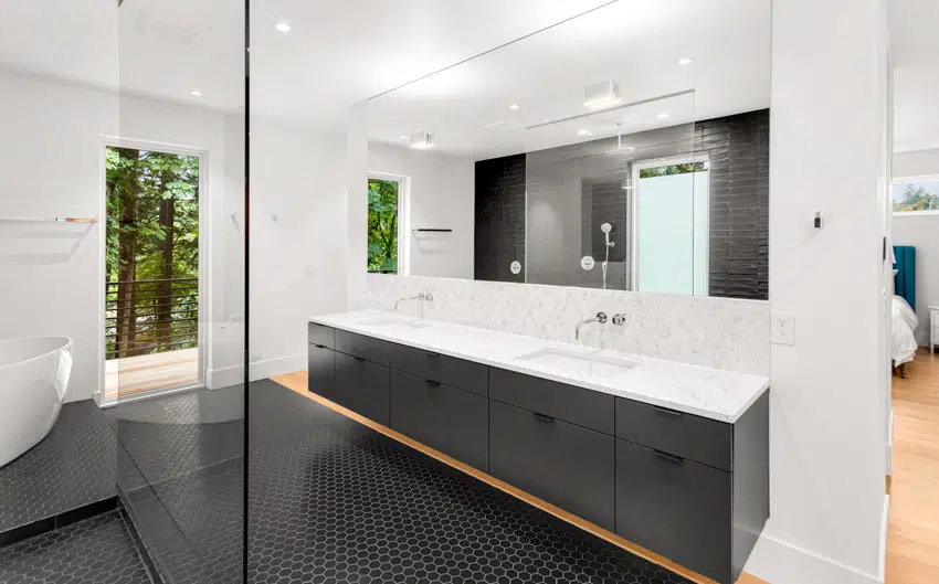
Greige is also another color to avoid using for bathroom color schemes because gray is too muted and comes off feeling cold. It can make the bathroom feel muddy, dreary, and uninviting. While the gray color looks fine, warmer neutrals and warm white paired with natural elements are now becoming a popular shade for bathrooms because they offer a calming space to relax in.
Overly bright whites should also be avoided since they can evoke a clinical feeling that is so sterile and cold. Although white can help make bathrooms look clean it can also look boring and impersonal. It’s best to go for warm white, this will give your bathroom a clean and modest look. You can also opt for creamier and softer whites, or off-whites that can make a space still feel fresh and open.
Don’t use excessively warm tones for your bathroom, colors with warm undertones can make a bathroom feel humid and muggy. Hues like intense reds, deep orange, bright yellows, burgundy, maroon and gold should be avoided. Instead, go for cool tones because these colors offer a sense of calm and tranquility.

Colors That Make the Space Feel Smaller
According to the experts, any dark colors can make a room seem smaller and more enclosed. Dark colors absorb rather than reflect light, making the space feel smaller. Avoid using dark brown color because it is usually drab or overly saturated. They make the room feel closed in, especially in bathrooms without much natural light coming through. Although a black bathroom can make a strong design statement, it can easily feel oppressive and can make the bathroom feel tight and unwelcoming.
Instead of the darker shades, go for a more neutral palette to create a similar sense of sophistication and these colors are easier to balance throughout the color scheme.
Avoid using too many varied color schemes. Too many accent colors in a small layout feel scattered and give the appearance of a cramped space. Make sure to stay with two to three unified overall color schemes. Be inspired by the environment around your home, these nature tones can give your bathroom a fresh and positive vibe.
Consider using a monochromatic color scheme, this will give your bathroom a cohesive look without overwhelming the limited space.
Heavily patterned wallpaper can contribute to making the space feel even smaller. Instead, creating one accent wall with fun patterns or prints may be best. Pastel colors for bathrooms tend to bring more light into the space and give out a spacious effect.
Colors That Show Dirt and Stains Easily
White is often used for bathrooms because of its simplicity and ease of retouching, it may not be an ideal color as it will easily show dirt and stains as well as requires more maintenance. Dark hues such as black and dark blue colors will highlight dirt and imperfections more.
When choosing colors for your bathroom keep in mind that light dust will show more on dark walls while light colors will expose dark dirt more. Look for a mid-tone neutral paint color that can help hide dirt marks or stains.
Did you know that the finish of the paint can affect how well it hides dirt and stains? High-gloss paint finish reflects light more so it is harder to conceal unwanted marks and make moisture more noticeable in the bathroom. Using eggshell, satin, or semi-gloss paint finishes won’t be as reflective, and thus will conceal dirt and stains easily.
Overly Bold or Bright Colors

While it’s fun to select bold paint, vibrant, intense colors like red, blue, or green can be overwhelming and juvenile. Red is an invigorating and energizing color that is a bit too intense and can seem to be overpowering for a bathroom color scheme.
Bold blues like cobalt and cerulean can look too harsh and loud for bathrooms. This strong shade should be avoided since these colors make the space feel cold. Although typically associated with nature, green can pose visual challenges in the bathroom atmosphere since it tends to make your skin look a bit green.
Although bold or bright colors can be eye-catching for a bathroom, avoid using highly saturated colors that evoke excitement and high energy since they are not ideal for bathrooms that call for a calming and relaxing atmosphere. Remember, anything too vibrant can be visually overwhelming, especially in bathrooms.
Colors That Affect Lighting

Light and color can have different effects on the bathroom’s overall design. Natural light, task lighting, and cool tone colors can help create a bright and airy bathroom atmosphere.
The direction in which light hits a wall and the time of day can influence how light can affect our perception of color. The soft natural light that comes through the North-facing bathroom produces warm effects that cause dark paints to look darker and light paints will be dimmer. Whereas, South-facing bathrooms will have more intense light, thus, dark colors will appear brighter, and light color paints will make the bathroom look washed out.
When painting, we recommend that you test the paint on each wall of your bathroom and observe how it is affected by natural light at different times of the day. Standard soft white incandescent or LED lights make bright colors appear more intense while cool tone paints look duller.
It is important to choose colors that do not unnaturally recast light. Some colors like bright blue, green, and yellow have the most impact on altering light that affects your skin when applying make-up or grooming.
Trendy Colors that Might Go Out Of Style
Gray was once an extremely popular bathroom color but we are seeing less of it because it comes off feeling cold and homeowners want more warmth in their homes. Other emerging trends such as warm whites and neutrals as well as wooden accents are rising in popularity nowadays. Many are opting for nature-inspired colors in their bathrooms, they are leaning towards airy tones such as “Upward” SW6239 and “Aleutian” SW 6241 by Sherwin-Williams which offers calmness and peace in the bathroom’s ambiance.
Like gray, light blue has always been a popular color choice for bathrooms but it is starting to look a bit washed out and boring. It is best to use more gentle cool tones such as soft blues or greens that offer neutral shades like Farrow & Ball’s Green Blue (No. 84) this color gives a sense of calm and tranquility to your bathroom oasis.
Stark white is also a color that has been getting out of style because it doesn’t leave much impression and doesn’t have much sense of appeal. Homeowners are now going for rich buttercream hues and warm beige such as Valspar Cozy White, 3008-10C. These colors offer a more comforting feel to the space and pair well with natural materials.
Colors That Create the Wrong Mood
A peaceful and tranquil mood comes from nature-inspired elements and evokes a feeling of wellness in the bathroom.
A bold peach color will make your bathroom feel dated and unappealing, instead of offering a welcoming feel, this color will make anyone want to avoid going to the bathroom. They make the space feel confined and muffled.
Another color that is known to damper one’s mood is Pantone 448C, this greenish-brown color can easily leave the homeowner feeling drained and decrease one’s energy. Voted as the world’s ugliest color by designers, this color has been described as uninviting and has a dirty appeal.
Orange and bright yellow are colors that stimulate the senses and are considered cheerful colors. However, these colors can also quickly increase one’s mood, and excite the senses to the point of anxiety which is contrary to the ambiance of a bathroom.
Bathroom Paint Designer Tips
If you are working on small bathrooms, extend your wall color to the ceiling. This technique will create a seamless visual flow, making the room feel larger and more spacious. Using colors that help camouflage dirt like wall patterns such as stripes could also help draw people’s eyes away from dirt stains.
When incorporating bold colors in your bathroom, use them sparingly on an accent wall or other accessories as a statement piece just enough to inject personality and visual interest into your bathroom without overwhelming the space.
Layering texture and pattern on your bathroom walls like incorporating wallpaper and tiling will add character to your bathroom’s aesthetics.
If you have one wall in your bathroom that receives more light, try making this an accent wall and go a shade lighter or darker on that wall so that it fits cohesively with the other bathroom walls.
A great substitute for white paint is “Tailor Tack” by Farrow & Ball, this color has the lightest and most delicate pink which will make your bathroom feel the warmth of sunlight.
“Raspberry Blush” by Benjamin Moore this coral shade with a tinged of pink is perfect for adding a pop of color to any bathroom cabinetry or accent wall.
To showcase highly specific designs, some images on this website use advanced AI-generation software to illustrate ideas and room inspiration. See our editorial policy to learn more.