Antique Paint Colors (40 Top Picks & Picture Gallery)
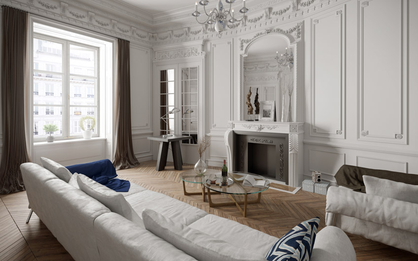
Colors play an integral role in both design and architecture. They help set up the mood in the space, help achieve a particular visual effect and also aid in conveying a specific design style. Choosing the right color palette to go with your home is a significant element in preserving its original style and architectural integrity.
There are hundreds of paint choices you can opt for to build the right color palette, but some remain timeless over the years. And if you are looking for colors that have the best-staying power, vintage colors are one of your best bets. Below, I share my favorite vintage colors along with some paint choices and tips that help me build the right palette that will fit when designing for the traditional home.
What Are Vintage Colors?
The word “vintage” means “of age”. It is defined by Ruby Lane as a product that reflects the era it was created in. For example, furniture created in the ’70s that embodies the prevailing style and taste in that era is considered to be vintage. However, because of the word’s open meaning, there are different interpretations of it — some use the term vintage for anything that is older than 20 years, while antique dealers say that an object needs to be at least 40 years old to fit the category.

Upload a photo and get instant before-and-after room designs.
No design experience needed — join 2.39 million+ happy users.
👉 Try the AI design tool now
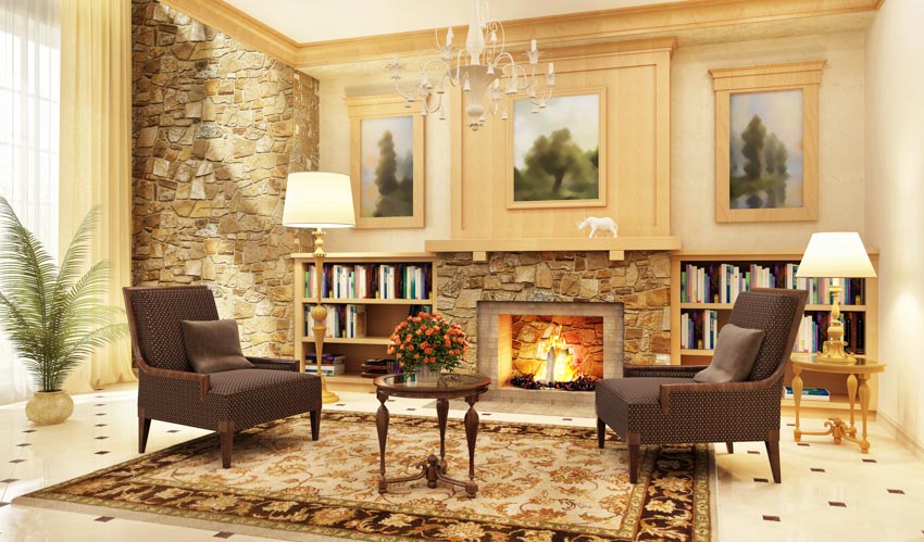
Essentially, anything from the past centuries can be considered vintage. The term vintage is widely used in many industries, including the interior design and architecture scene — from furniture, artwork, decor, and accessories, all designed with signature colors that reflect the era they were produced in. These colors are often called “vintage colors”.
By definition, vintage colors are colors that represent a particular era. A vintage color palette is a collection of colors that reflect a “vintage feel”. For example, bold shades of red, orange, black, and white are all vintage colors that belong to the Mid Century Modern era (1954 to 1969), a retro color palette with warm orange, yellow and light teal all evoke the nostalgic feel of the ’70s, and so on.
Antique Color Palettes for Traditional Houses
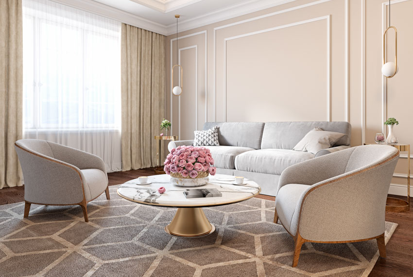
Color palettes for traditional houses vary depending on the architecture style and interior they belong to. Each specific period style has its own signature color, which helps recreate its iconic look. Below is a guide on different color palettes for traditional houses:
Victorian Colors
The Victorian Era is best known for its opulence and passion for combining earlier styles — from Gothic Revival architecture to medieval motifs, bold prints, and elaborate decorative ironwork.
When it comes to colors, the Victorian style favors rich dark colors like forest green, dark blue, deep purple, and ruby red.
Combining jewel tones and layered brights is also the best palette to use to evoke this lavish style. Another approach is to stick to a single color and incorporate three shades of it in the different interior elements of a space.
Victorian Paints


Craftsman Colors
In contrast to the ornate style of Victorian homes, Craftsman-style houses featured simple details which placed emphasis on straightforward forms, honest construction, and use of local materials.
Several features that make them recognizable include horizontal lines, low-pitched roofs, and exposed beams. When it comes to the interiors, utilitarian built-in cabinets were a common feature.
The color palette for the Craftsman style was dominated by neutral earth tones and warm colors. This includes brick reds, leafy greens, honey, and warm browns — all of which are colors that help emphasize details and enhance warmth in a space.
Natural browns found in solid wood materials are also a trademark of this traditional house style.
Craftsman Paints



Spanish Revival Colors
Deep and rich neutrals make up the lush palette of Spanish style homes. Typically composed of a neutral palette that is dominated by cream or white that is paired with rich golds and browns, these houses featured arch details, dark beams, and black iron railings.
Spanish Revival Paints



Mid Century Colors
Mid-Century design is well known for its use of bold and vibrant colors.
Saturated hues and bright shades of orange, teal, mustard yellow, tangerine, aqua, ochre, and fire engine red — whether paired together or used as a monochromatic scheme help reflect the organic vibe of mid modern century design.
Mid Century Palette



Colonial Colors
Classic colonial paint colors include muted hues and modest earth tone colors like white, ochre, almond, beige, taupe, reddish-brown, creamy yellow, and muted green.
These antique paint colors were common during this era because the pigments for the dyes used were derived from natural resources like plants, minerals, and soil.
Though low-key colors dominate a colonial palette, saturated shades can also be used for the accents.
Colonial Palette



What Colors Were Popular in the 1920s?
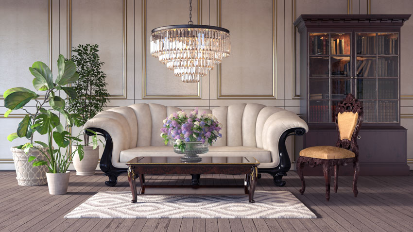
Popularly known as the “Jazz Age”, the 1920s was the flourishing era of the Art Deco style. It was characterized by geometrical elements, sharp lines, and symmetrical designs. The houses then were smaller and typically square, four square, bungalow, or a single story.
When it comes to colors, interiors and exteriors were painted in distinctive schemes that combine light neutrals with vibrant accents and accessories.
This era’s color palette took inspiration from its historic precedents like the Victorian Era’s vivid colors and the early shades of American Craftsman style.
However, the vivid colors were toned down, muted, and washed out — often containing large amounts of gray. Pale cream and light gray walls are also very common as they allow the architecture to take the center stage.
Below are some of the most popular paint colors in the 1920s:
• White – White was used either as an accent or a main color. Typically, white was paired with dark antique paint colors like green trims, maroon, or amber brown to make it less dull looking.
This color was also used to modernize older Tudor style and Arts and Crafts style homes.
An alternative to white was cream, which was also commonly used for the walls.
• Grays: Shades of gray like light gray, French gray, and slate were popular during the 1920s as a main color rather than an accent color.
Considered to be attractive and durable, gray was typically combined with black and red brick to make it more lively.
Other shades of gray with tinges of colors like bluish-gray or grayish blue-green can be used in a bedroom setting and are commonly paired with a deeper shade as an accent on the windowsills and doors.
• Muted shades of Green: Green was another popular color of the 1920s.
Leaning towards darker shades with slight bluish tints rather than bright or yellowish greens, this paint color was used both as a main color and an accent color in both interiors and exteriors.
Popular green paint shades during this era were commonly known as “shutter green” or “blind and trellis green”.
• Brown: Earth tones were also favored during the 1920s and one of the most used colors for interiors and exteriors was brown.
Paint manufacturers produced a broad range of different browns like copper per brown, tan, and “rich buff” which were typically applied to trims and accents.
In some cases, bungalows were painted whole in this color. Browns were frequently combined with red tones, greens, and white.
• Muted and Faded Reds – Reds in the 1920s were typically muted shades like terracotta or brick red.
However, some interiors also use brighter reds and are often combined with brown tones, greens, gray and black.
Sample Color Scheme to Recreate the 1920s Palette
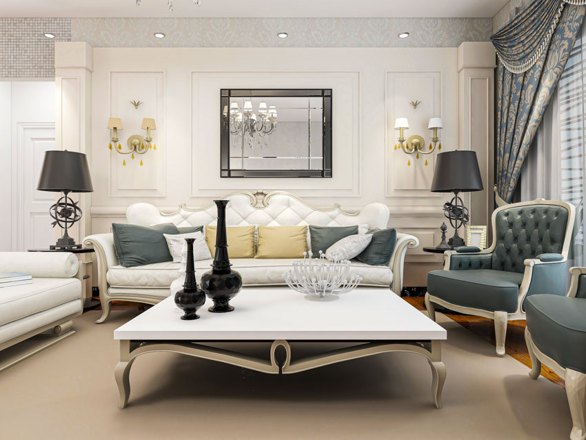
If you want to pay homage to the Jazz Age, combine gray cream neutrals with muted shades of olive green, mauves, peacock blues, and faded reds.
For example, you can try painting your interior walls in a medium tone like rose and dusty peach, then pair it with a lighter shade of cream for the trims or chair molding.
For paint brands, Sherwin Williams has a complete range of “Jazz Age colors” which you can try out to recreate the 1920’s vibe. Here are some of the paint colors we recommend from this product line:







For more artistic palettes check out our Bohemian paint colors gallery here.
Antique White Paint Color
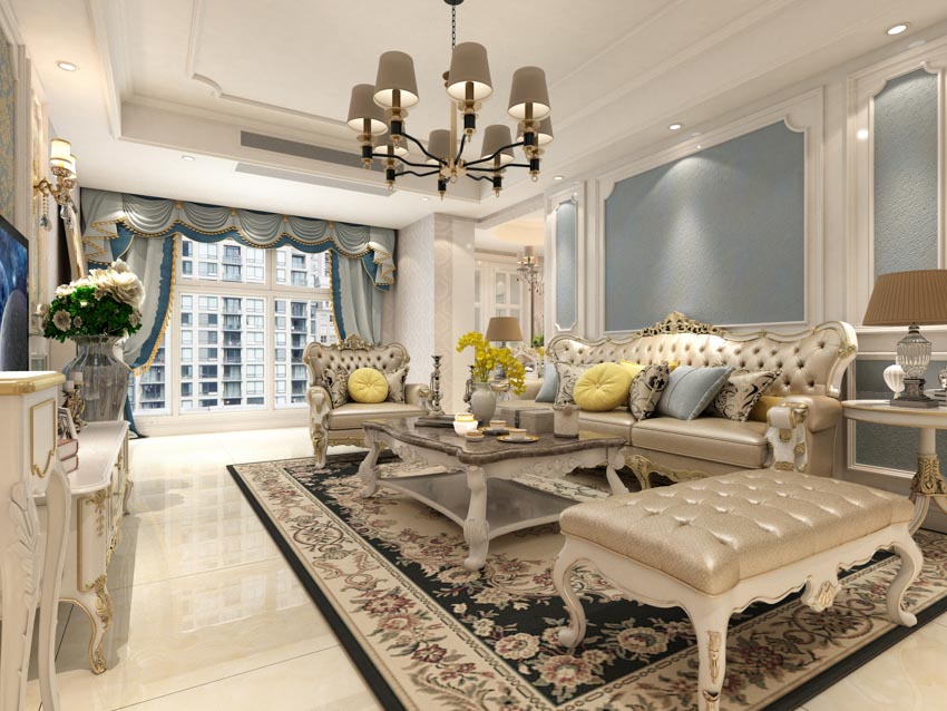
What is the color of antique white? Antique White is a warm shade of white that has a yellow undertone. In fact, it is actually yellow paint with a neutral base added to tone it down.
Along with yellow, it also has small tinges of pinkish red, a bit of orange, and a wink of green. Antique white is also very similar to off-white, cream, milk-white, and caramel white.
Compared to optic white and ultra white, antique white is less bright and looks more subtle. Meanwhile, if compared to beige, it is less warm. So it makes a perfect choice if you are looking for a balanced neutral antique paint color.
Antique white pairs well with warm colors like brown, oatmeal, red, yellow, and orange. You can also complement it with gray if you want to create an elegant statement in any historical style space.
Nowadays, Antique White paint is offered by a lot of paint manufacturers like Sherwin Williams, Benjamin Moore, Behr, Glidden, Valspar, Kelly Moore, Pratt and Lambert, Nippon Paint, Olympic, Pittsburg Paint, Jotun, Johnstones, Rust-Oleum, and Dulux.
Below are some of the best Antique White Paint colors you can try for a vintage home:

• Antique White (909) by Benjamin Moore: Part of the Classic Color Collection, Benjamin Moore’s antique white has a soft creamy white shade with a mixed undertone of yellow and tan.

• Antique White (OC-83) by Benjamin Moore: Also offered by Benjamin Moore, this shade has a slightly richer tone than the 909 counterpart.

• Antique White (SW6119) by Sherwin Williams: Sherwin Williams only has one choice for vintage white paint and it has a stronger undertone to it — more hazelwood instead of white. Compared to beige, this antique white paint has a less yellowish tinge to it.

• Antique White Interior Flat Enamel (1823) by Behr: Compared to other white vintage paint colors, this particular brand has a softer tone. A perfect choice for those who want a subtle shade for their home.

• Kelly Moore Antique White (49): A bit similar to “greige”, Kelly Moore’s vintage ivory white paint has a slight grayish tone to it. This shade is perfect if you want to give your space warmth. It is best paired with brown accents.

• Antique White (14-31) by Pratt and Lambert: Another vintage ivory paint that has strong Neoclassical vibes is Antique White 14-31 by Pratt and Lambert.
Quite similar to the choice mentioned above, this paint has a beige tone with a bit of gray in it. The perfect subtle ivory to give a space a warm and calm look.

• Antique White (369) by Nippon Paint: Antique white by Nippon Paint has an off-ivory color and is not too beige or too yellow. Compared to other paint brands, it has a cooler tone to it.

• Antique White (OL225) by Olympic: Olympic Paint’s version of vintage ivory is part of its off-ivory collection. This is very similar to Nippon Paint’s Antique White 369 and has a less creamy tone to it.

• Valspar Antique White (7002-20): Categorized as a “yellow neutral”, Valspar’s vintage ivory is cream in color and is perfect to use if you want to create a cozy, warm and classic space.
• Antique White by Pittsburgh Paint: Pittsburgh Paint offers two vintage ivory paints to choose from.
One is Pittsburgh Paint Antique White (40YY 83/043) which belongs to the Harmony paint color collection and Pittsburgh Paint Antique White (PPG1024-2) which belongs to the off-ivory color collection.

Antique White 40YY 83/043 is a pale dusty ivory with a blush undertone. This pairs perfectly with tan and other paints that have a tinge of pink.

Whereas, Antique White PPG1024-2 is a darker shade and has a combination of light gray and caramel ivory paint color with a bronze undertone.
This pairs beautifully with gray and beige paint to create a sophisticated statement in a historical style space.




• Jotun Antique White: Very similar to the color “bone white”, Jotun’s classic snowy paint has a strong light brown undertone to it. It is warmer than other classic alabaster paints and is best paired with earth tones and warm accents.
Antique Colors for Furniture
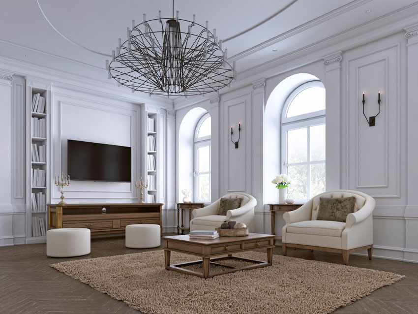
There are several paints and painting techniques you can use if you want to give your furniture a classic finish.
What Are the Best Antique Hues to Use for Furniture
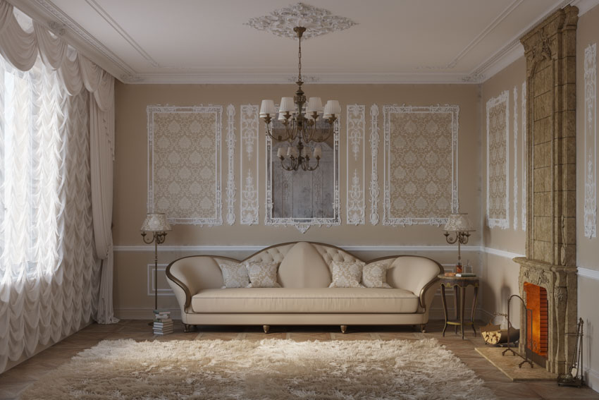
The best classic paint colors to use for furniture are shades of white and brown.
Regardless of the style, these two colors are fail-proof choices for painting wooden furniture because of their timelessness and versatility.
Choices for alabaster paint will include classic ivory, cream, off-white, and beige, while for brown shades, this will include dark brown and the natural color of the wood the furniture was made with.
Antique white in distressed finish is one of the top choices for ivory paint for furniture.
Although this particular shade is offered by leading paint brands, there are several finishing techniques that can be applied to furniture to make them look more weathered. This includes sanding, ragging, and dry brushing.
Distressing can be done using regular flat latex paint. Flat latex paint is easy to sand and can be layered. Alternatively, an antiquing glaze can also be applied to paint to give it more depth and a timeworn appeal.
What Type of Paint Should I Use for Antique Wooden Furniture?
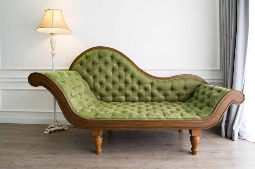
Natural wood finishing is the best treatment for classic wooden furniture. This will help highlight its aged details, patina and enhance its natural brown tones. Typically, the original type of finishing used in any classic piece will also help you identify the period it was created.
Oil, wax, shellac, and lacquer are common finishes that help bring out the deep grain patterns of wood, enhance their natural color and give them a more polished and lustrous look.
See more related content in our article about the best type of paint for wood furniture on this page.

