Choosing Accent Wall Colors (Designer Guide)

Everyone loves to have colors around. Colors play an important role in decorating your home. No matter how much you stock your home with expensive furniture and décor, sometimes using a single color is all you need to make your home look appealing. However, using accent wall colors can give your home more personality and charm. The question is how well you can do it. Too much colorfulness might spoil the plan, making the colors force sensory overload and appear overbearing. That’s why accent colors are planned and used carefully around your home in various elements to bring out the true essence of the color. [toc]
How to Choose Accent Wall Colors
Accent colors are one of the best ways to accentuate your home and give it a much-desired appeal. We often adore seeing accent colors used in hotel rooms, fancy restaurants, and homes, but we hesitate to use them in our own homes. It leaves us wondering about many questions pertaining to the right colors, the right amount, and the combinations. Using accent colors seems like a big commitment, and it is; that’s why it is essential that you carefully select your accent colors to enhance your room’s overall color scheme.
The Accent Color Rule
When you think of accent colors, you expect a sudden pop of color in your room. Many people think that using contrasting colors in décor causes visual disruption or separation. But the truth is, it does the exact opposite. When used correctly, accent colors give your home a put-together look. The most risk-free way of using colors is to follow the 60-30-10 rule. When you think of your living room, the color that you want to be the base color is the one that has the largest portion of the color palette.
60% of your room will be this color, which mostly goes on the walls. If you do not mind some colorfulness around, people prefer neutral tones like white, beige, and cream or pastel hues of mint and aqua blues. 30% of the color is the one that breaks the monotony of the base color and adds some appeal to your space. This color goes to the upholstery in the room. The remaining 10% of the color acts as the accent color. The accent color adds visual interest to your room and keeps the color scheme interesting even with its minimal usage. From the floral prints on the curtain to the rim of the flower vase, the accent color can be added with as much detailing as possible to make it look well-placed and subtle.
While this is the safest way of using an accent color in your home, you can amp it up a little bit by playing around with its amount. Accent colors can take up some portion of the base color, too, by being on one of the walls or even being used as the upholstery on the sofa.
When choosing the location of the accent wall, many interior designers first look to see if there are any architectural features in the room to highlight with color. For instance, this can be design features such as a fireplace, built-in bookcase, wainscoting, nook, or another architectural element. Color can be used effectively to highlight the feature and make it stand out, further enhancing its visual appeal.
Accent Color Ideas for Walls
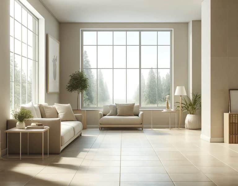
Accent walls have been the most popular method of adding some color drama to living rooms, bedrooms, and even bathrooms. Using an accent color on the wall adds depth and personality to the room. For living rooms, accent walls can be just perfect.
The living room is where you spend most of your time entertaining guests and enjoying a good time with your family. Put in some extra effort to make it an extension of your personality. For a peaceful yet stylish atmosphere, shades of green & blue as accent walls work best for the living room. Belonging to the cooler shades on the color wheel, greens and blues are popular choices to create a calm and relaxing setup in your living room.
However, warm tones like shades of orange and yellow are also loved as accent wall colors for living rooms since they brighten up the space and give your space a chic look. Shades of red ranging from crimson, blush, and scarlet to deeper tones like wine, maroon, and marsala are super apt for spaces like the kitchen and dining area. Red relates well with elements of food and dining, so spaces where you make food or serve food get the right bit of drama with an accent wall carrying a shade of red.
When it comes to accentuating your bathroom walls, your choice of color can be totally versatile. Neutral shades have been popular picks for bathrooms. But that doesn’t mean you can’t add color here. While the base hue is usually white, grey, or beige, you can choose anything from blue, dark grey, and black to lighter and brighter shades like yellow, mint green, and aqua blue as accents.
Colors for Furniture
Accent furniture is your way forward to creating a home that is impressive at first glance. While a lot of people like accentuating the décor by popping some color on the walls, accent furniture is for those who are in for a serious commitment. Giving your furniture accent colors is not an easy decision, but when done right, it defines your space and your personality. For homes that have mostly whites and off-whites in the decor, it’s quite easy to choose the accent furniture color. Since white blends well with every color, you can pick anything from a deep blue sofa in your living room to a dark brown wooden-finish dining table.
For homes with pastel-colored walls like yellow, mint, and powder blue, opting for a dark shade of the same color for your furniture would be perfect. Think of an emerald green painted console table set against a fresh mint green wall. The layering of shades over each other is one of the best ways of creating a harmonious home.
If your home has darker colors on the walls, like navy blue or marsala, your accent furniture can be in rustic white to make an impact amidst the dark walls. Adding prints instead of solid colors can make things a bit more fun. For example, a bright home with yellow walls can have an ikat fabric or a floral print sofa in a yellow and grey combination that is chic and impressive. Another option is to accessorize colorful prints with a throw blanket or pillows.
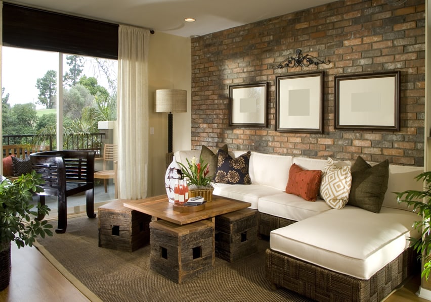
Brick feature walls can give your living room a stylish appeal that can be matched with a wide variety of paint colors. Picking just the right shade to match your brick may be a challenge. A few of the best paint shades are mint green, mustard yellow, bright red, white, and tan.
Best Colors for Walls
A home with an accent wall undoubtedly makes a classy statement. But what makes that happen is the right choice of colors. Choosing an accent color for your walls, furniture, or other décor accessories needs to be a well-thought-out decision. Certain colors tend to combine well with others and present a well-balanced home.
Popular Mix and Match Colors for Feature Walls
Grey Walls – One of the most popular questions regarding color combinations is what accent colors go with gray walls. A popular trend when using gray, greige, beige, or other neutral primary wall colors of a light to medium shade is to balance them with strong accent colors.
Grey walls and yellow accents are a bold combination loved by many décor enthusiasts. Subdued grey and attention-seeking yellow are one of the best classic color combinations for those who like a uniquely balanced room design. A grey sofa with yellow throw pillows is a classic example of how bright colors blend effortlessly with neutral grey. Grey also works well with shades of blue to create a peaceful and relaxing home. For a more glamorous look, try combining grey with magenta.
Brown Walls – Shimmery gold is a popular pick if you are looking for accents in a home with brown walls. Brown, being an earthy tone, works best in combination with the most royal shade itself, gold. Your accent in a living room or bedroom with brown walls could be anything from gold damask prints on one of the walls to a large ornate gold-bordered mirror.
Beige Walls – The accent color can be bold and poppy for homes with lighter beige walls. Beige is a muted tone, but it can be balanced with shades of red as accents or other strong colors. A living room with beige walls can be stylishly accentuated with a maroon sofa set and curtains for an elegant appeal. Beige or tan wall paint also looks great when combined with a variety of blues, including turquoise, teal, navy, and a mix of yellow and blue.
Green Walls – Green represents being in nature, renewal, and relaxation, and a room of this color can be complemented by a variety of colors. Some of the popular combinations with green are white, gray, blue, pink, and beige. One color you may want to avoid using green is red, as it’s closely associated with Christmas.
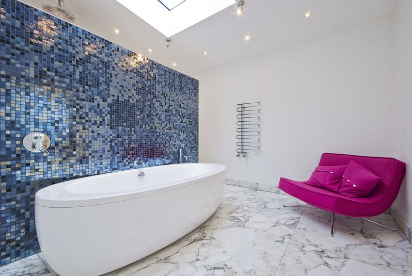
Blue Walls – Blue is one of the favorites when it comes to home décor. From carrying a cool undertone to offering a peaceful & calm atmosphere with its presence, shades of blue can be quite exciting to work on. A lot of colors blend well with blue, but nothing like two cool tones coming together.
When matching pink and blue, you can also use white, beige, gray, and some greens with eye-pleasing results. Another option would be to pair blue walls with green accents and see a beautiful color combination come alive. Think of an emerald green Chesterfield sofa amidst rich blue walls! You can also pair blue walls with red for a rich combination.
Blue represents water & calmness, while red stands for passion; the combination of the two will be something to look out for. It could work great in a bedroom, where you would love to set up a private and intimate atmosphere.
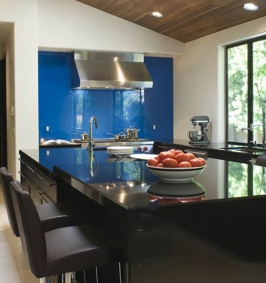
This modern kitchen features a blue glass backsplash and white and dark cabinetry. Read more about using black accent walls here.
Red Walls – Red is a romantic color that adds warmth and energy to a space. However, it can be too stimulating for some spaces and must be used carefully. It works well in a vibrant dining or living room. It can boost creativity in a home office and make a strong first impression in an entryway. It should generally be avoided in the bedroom or a small bathroom, which may feel too intense. If you decide to use red, balance it with white, gray, beige, and abundant natural and warm lighting to soften the look.
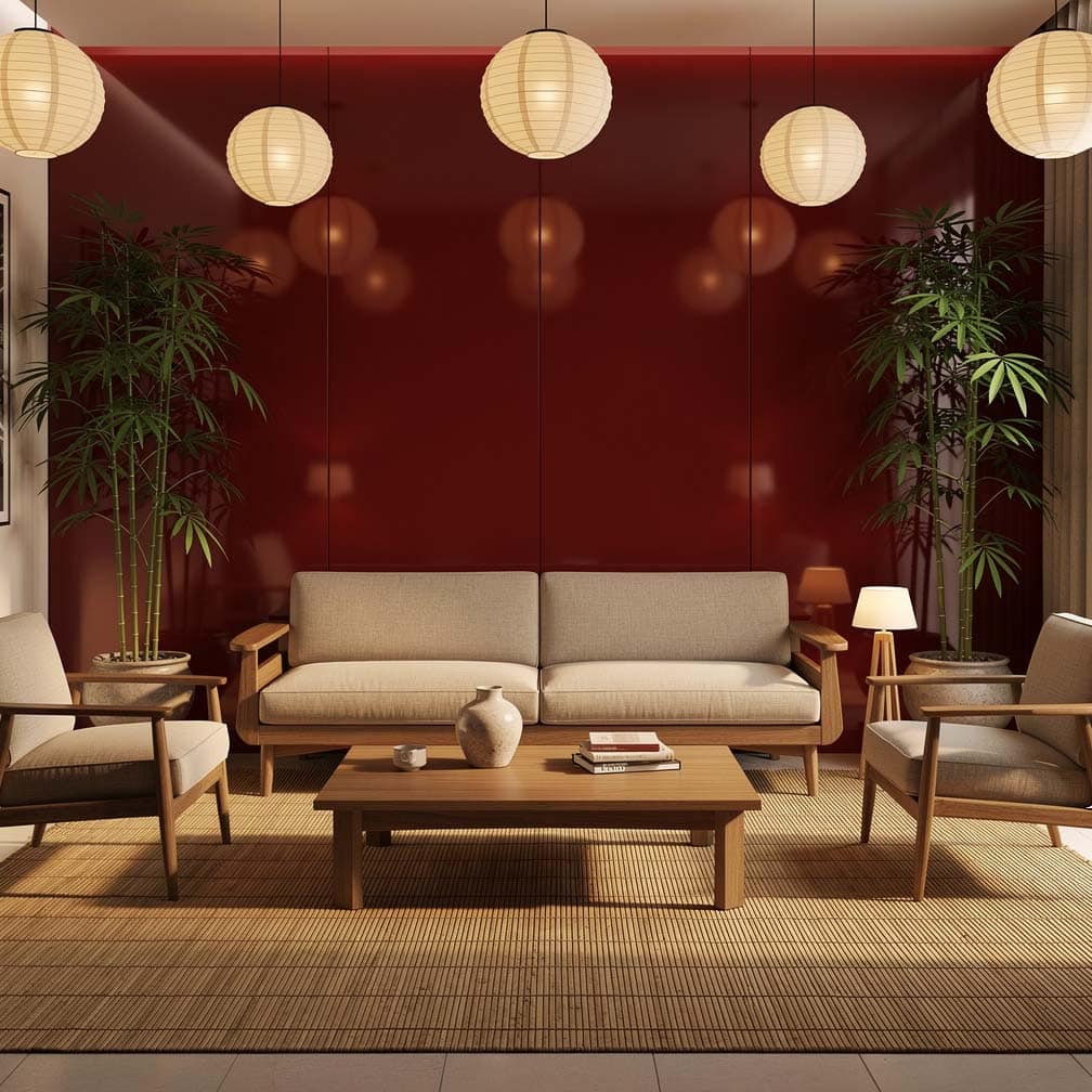
An Asian-inspired living room with a rich red feature wall that is offset by plenty of lighting, a bamboo area rug, cream hue sofa, and cushioned chairs. A wood room divider is positioned against the red wall, further highlighting its Asian design appeal.
This interesting bedroom offers a roll-up door to let in plenty of light. It’s got a primarily white base paint for the walls with a bright turquoise green feature wall to give it plenty of character.
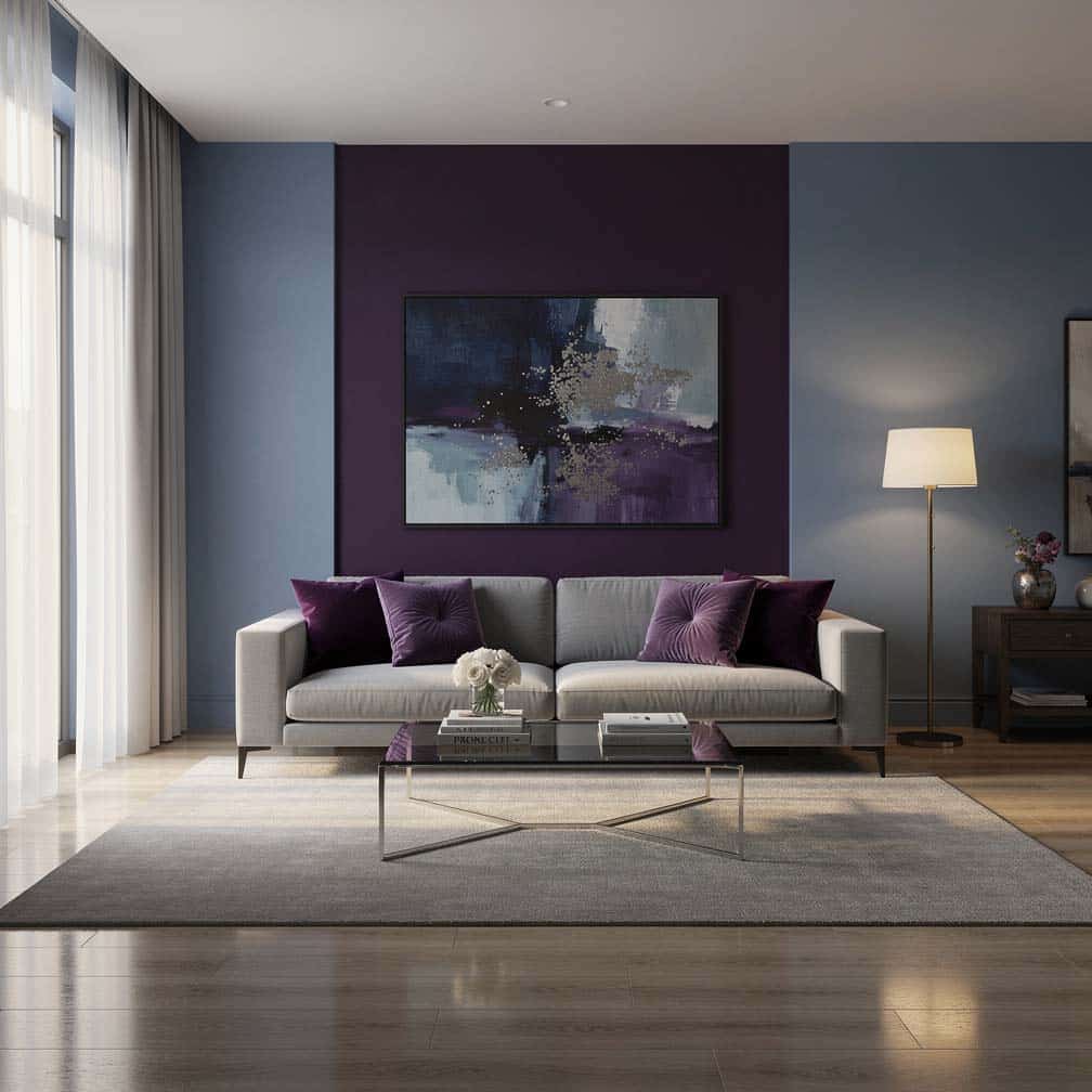
This blue room, combined with a purple accent wall, makes for an alluring design. Purple decor pieces such as the large area rug, bed accessories, and throw blanket help provide pops of color throughout the layout.
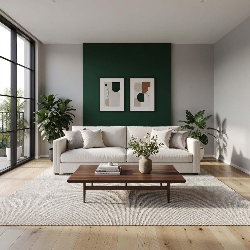
This contemporary living room features a light gray primary paint color combined with a rich green color with attractive results. Throw in some additional pops of color with such as yellow and green pillows and colorful artwork, and you have a cohesive design.
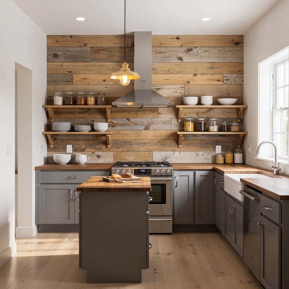
A reclaimed wood feature wall makes the perfect complement to this cottage-style kitchen with gray base cabinets and white upper cabinets.
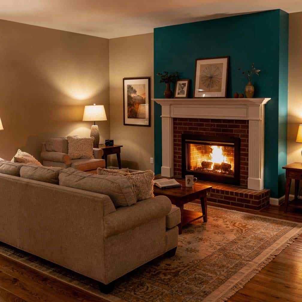
This cozy living room design is painted primarily in beige with a turquoise statement wall. A brick fireplace with a white painted mantel provides another nice touch that is warm and inviting. Want even more designs? Visit our accent wall ideas page for more creative ways to use color, texture, and patterns to generate visual interest.
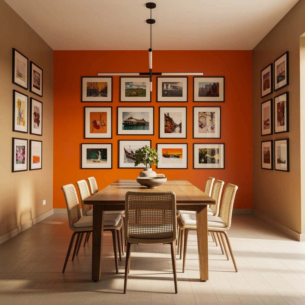
This dining room pairs tan with a bright orange statement wall. Hung artwork helps calm the orange theme and tie in the white elements in the base molding and trim.
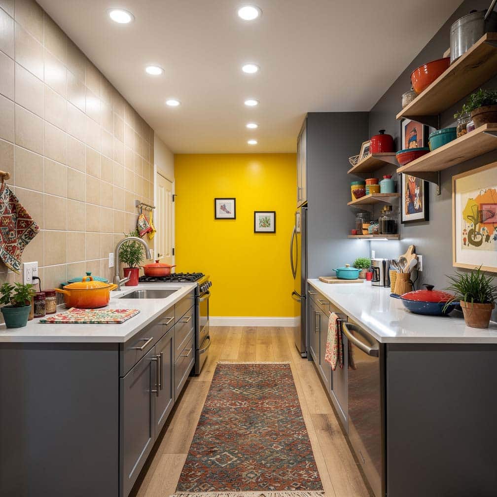
This eclectic galley kitchen has beige tile walls with gray paint and a yellow statement wall. Recessed lighting throughout keeps the space well-lit and further enhances the pop of hue.
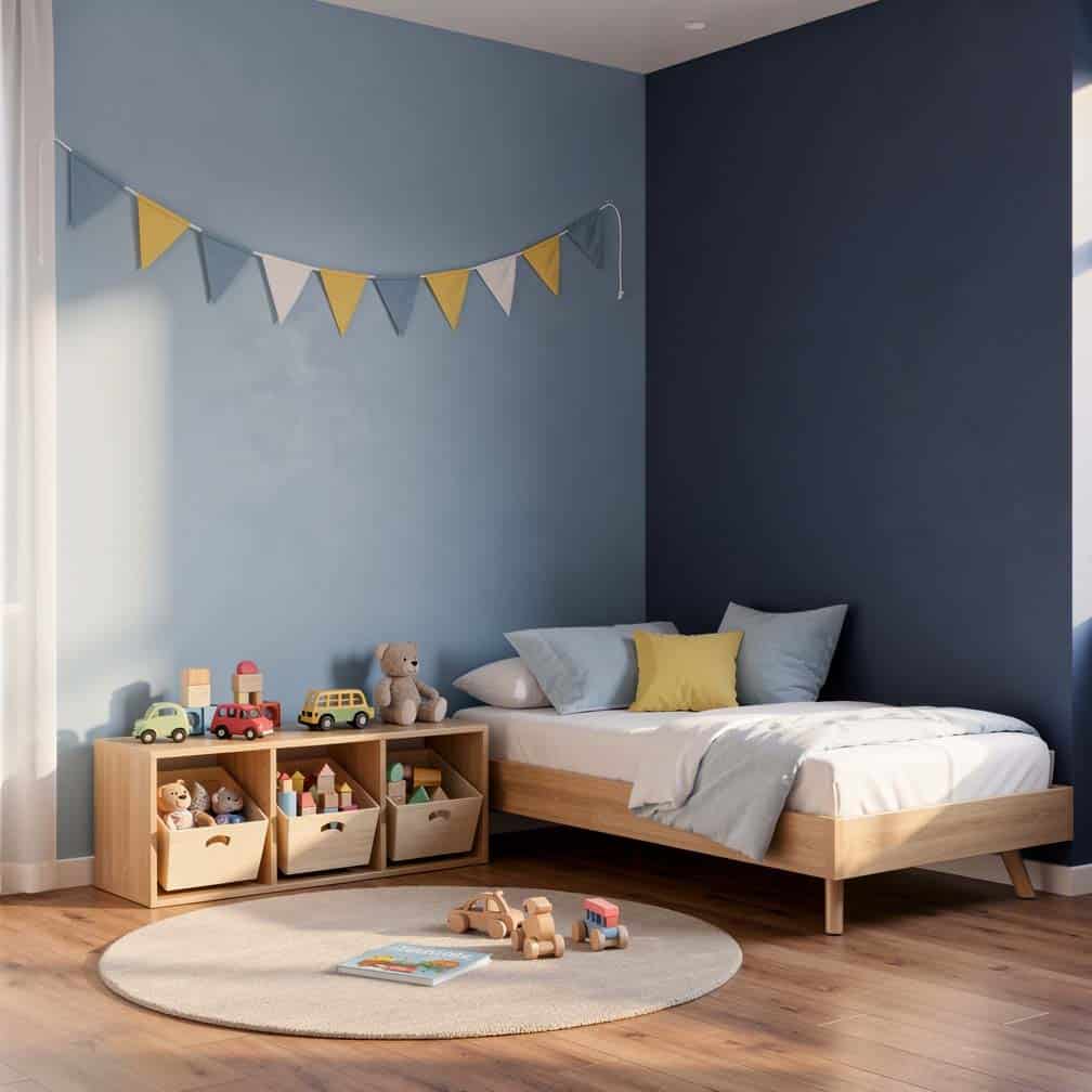
This kid’s bedroom showcases how you can use two types of blue colors to create an inviting design. A light powder blue is used for the main wall color, with a dark navy blue accent wall that really makes the white molding and decor stand out.
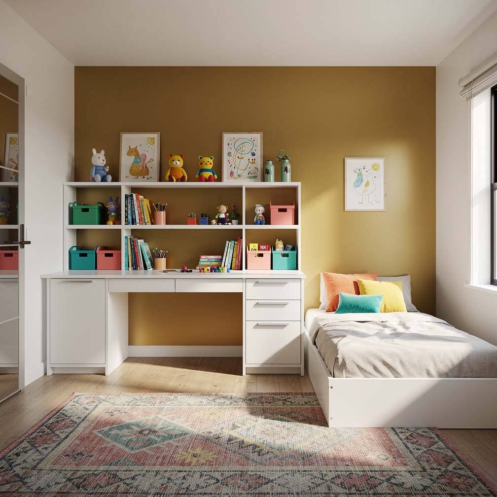
This cheerful kids’ room features a gold paint color palette with a built-in desk and feature wall in a dormer window.
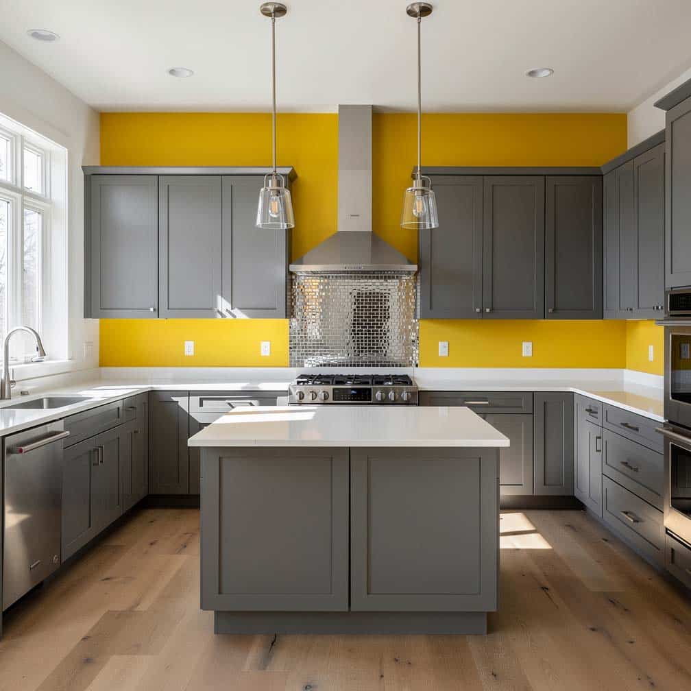
This kitchen boasts a variety of feature shades with its bright yellow paint above a stainless steel mosaic backsplash and next to a tropical green hallway.
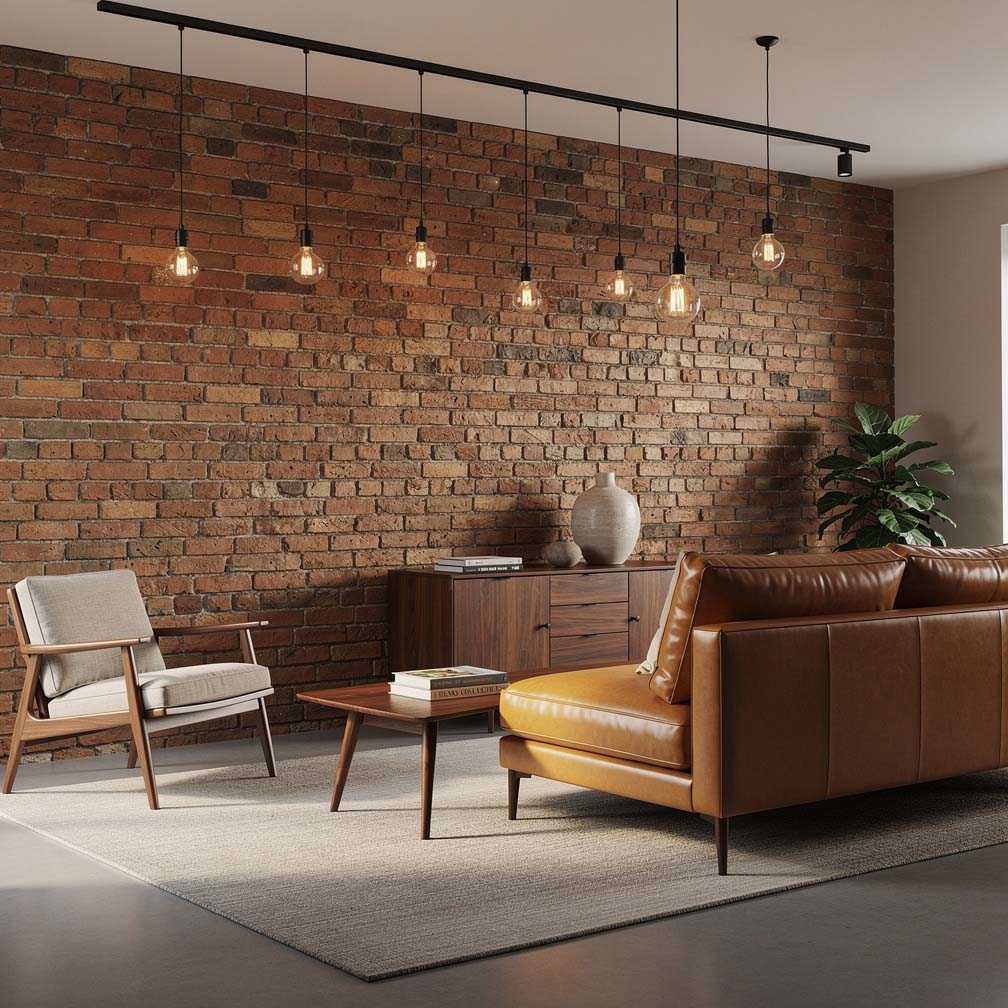
Brick feature walls can give your living room a stylish appeal that can be matched with a wide variety of paint colors. Picking just the right shade to match your brick may be a challenge a few of the best paint shades are mint green, mustard yellow, bright red, white, and tan.
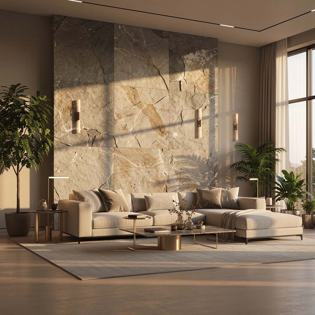
This luxury living room has a stone feature backdrop that cohesively blends the colors of the wall paint with the flooring to create an attractive design.
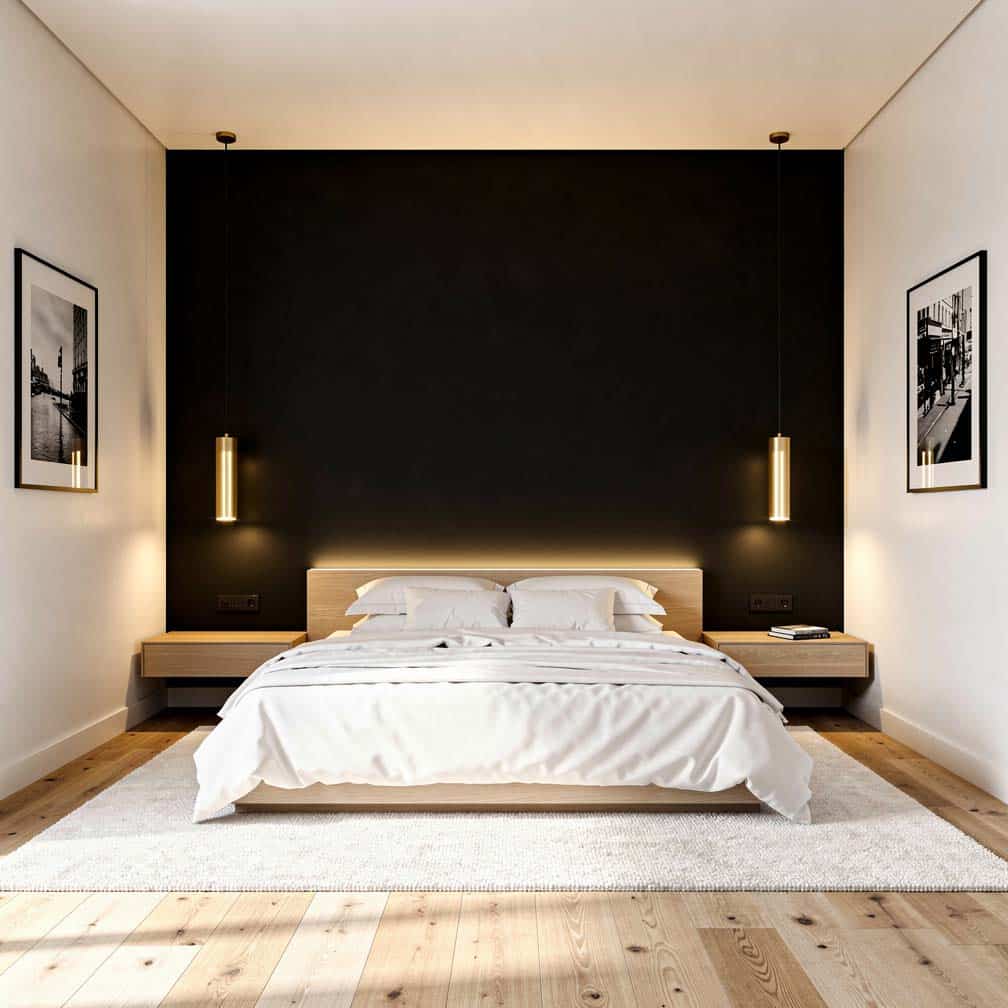
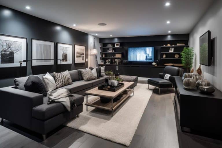
This master bedroom offers a black accent wall contrasting against the off-white shade of the adjacent walls. Light wood flooring, recessed and drop lights help keep the black theme from becoming too overwhelming to the senses.
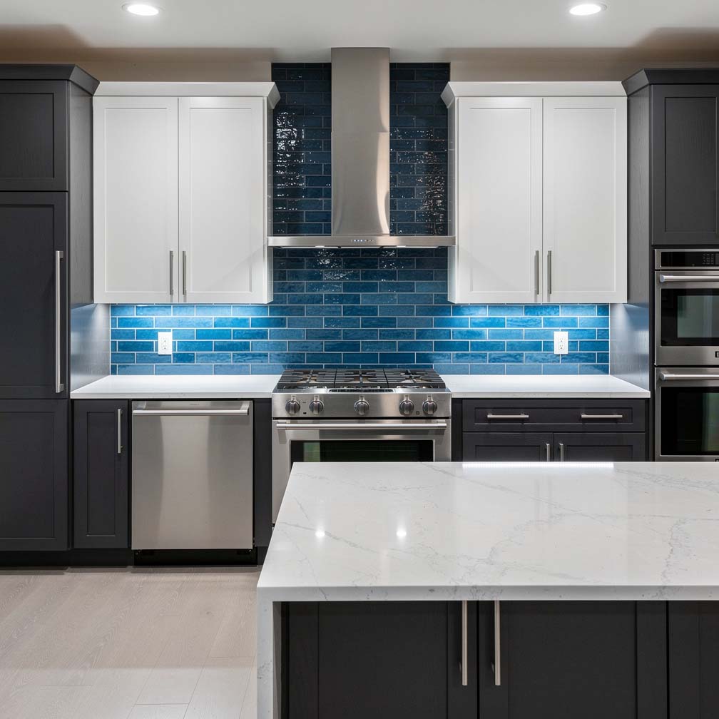
This modern kitchen features a blue glass backsplash that looks great paired with white and dark cabinetry.
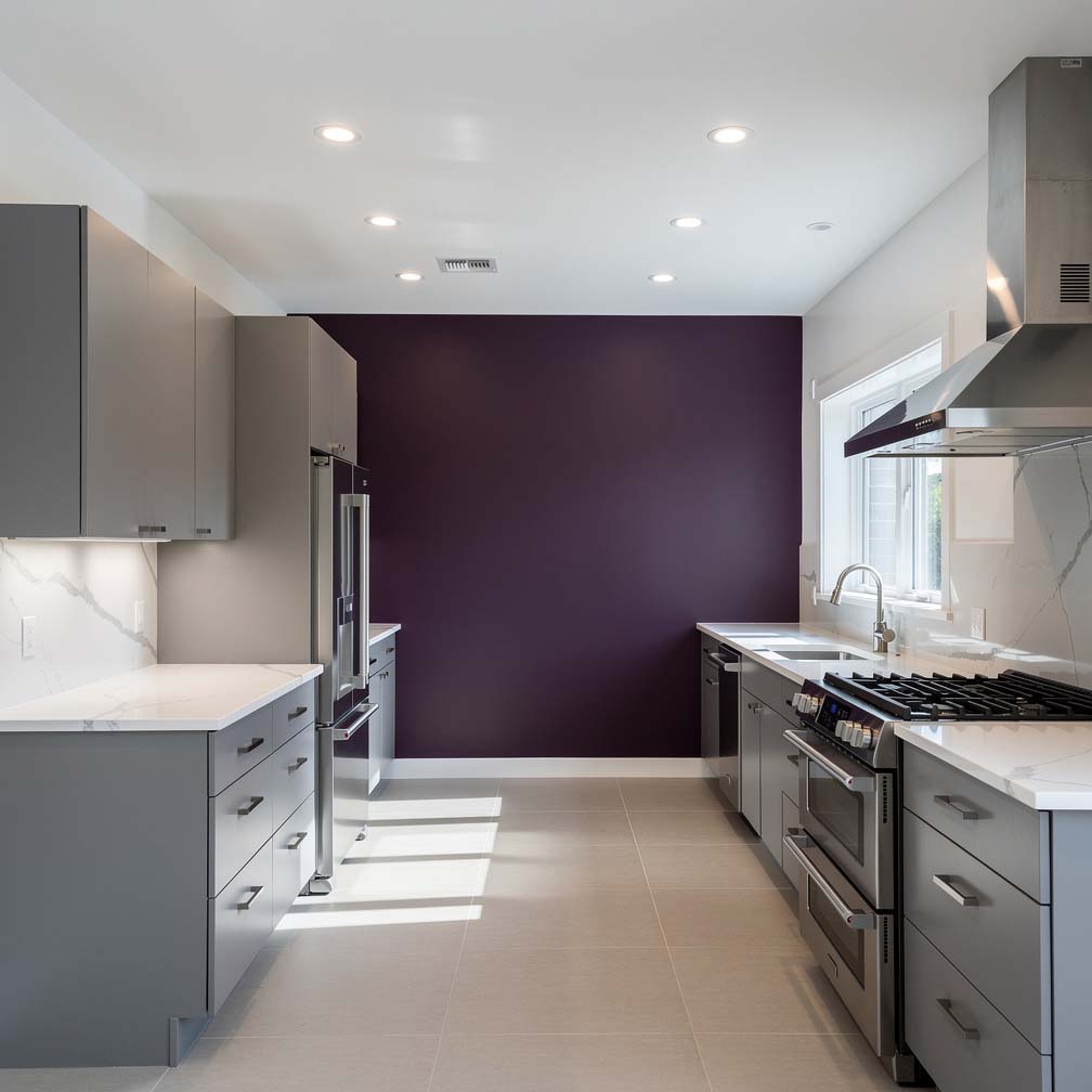
This modern kitchen is full of character, with its gray cabinets and furniture contrasting against a bright purple statement wall and colorful decor.
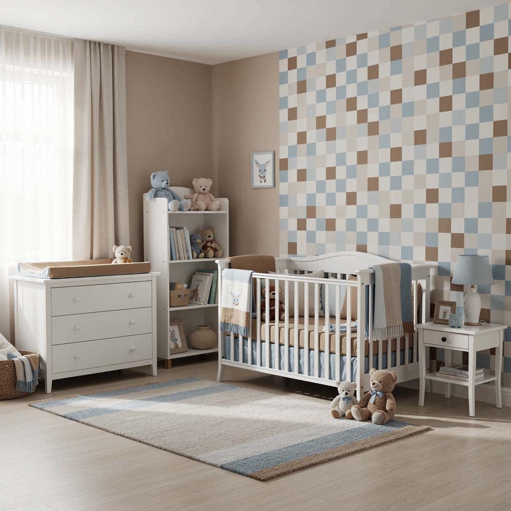
This fun child’s nursery is painted in beige with a whimsical blue, brown, and white checkered pattern. Color-coordinated brown curtains, couch, and dresser provide additional features to match the overall theme.
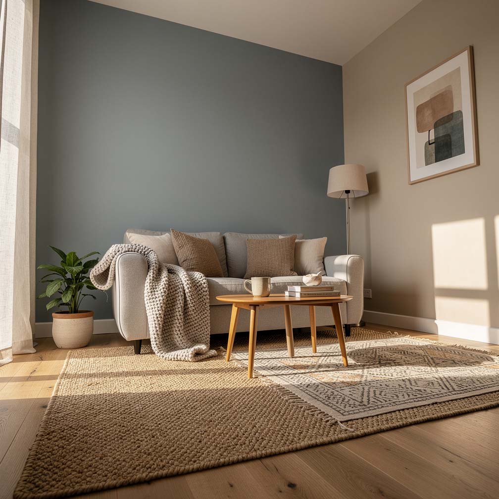
This small living room space has a Nantucket fog feature wall facing a beige-painted wall with an adjacent wall with a stencil for added effect.
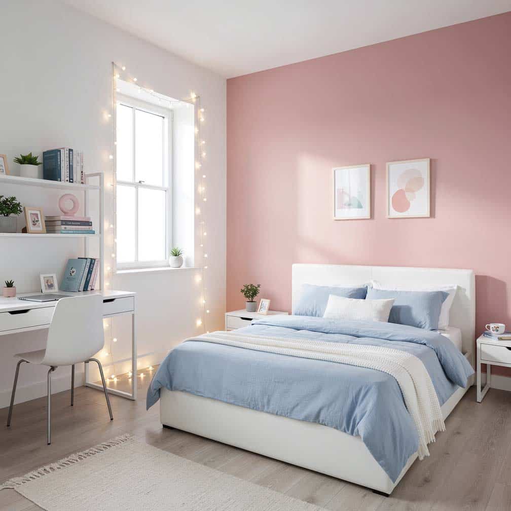
This teen bedroom design pairs light blue painted walls with a pink accent ceiling. Other decor items further bring out the style of the room and give it personality. When matching pink and blue, you can also use white, beige, gray, and some greens with eye-pleasing results.
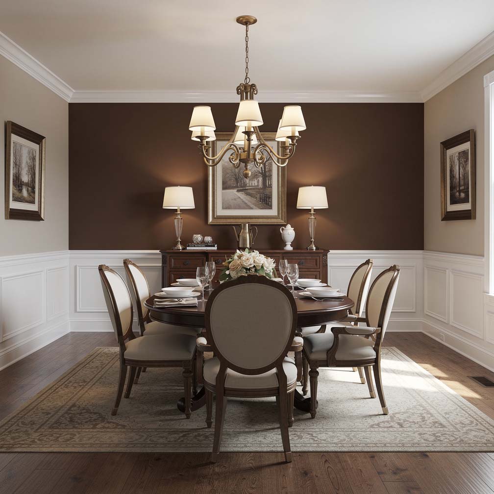
This elegant traditional dining room has white wainscoting with beige paint for the walls combined with a mocha brown feature wall. A white tray ceiling, chandelier, and large picture window help to brighten the space and offset the brown of the paint and the wood flooring.
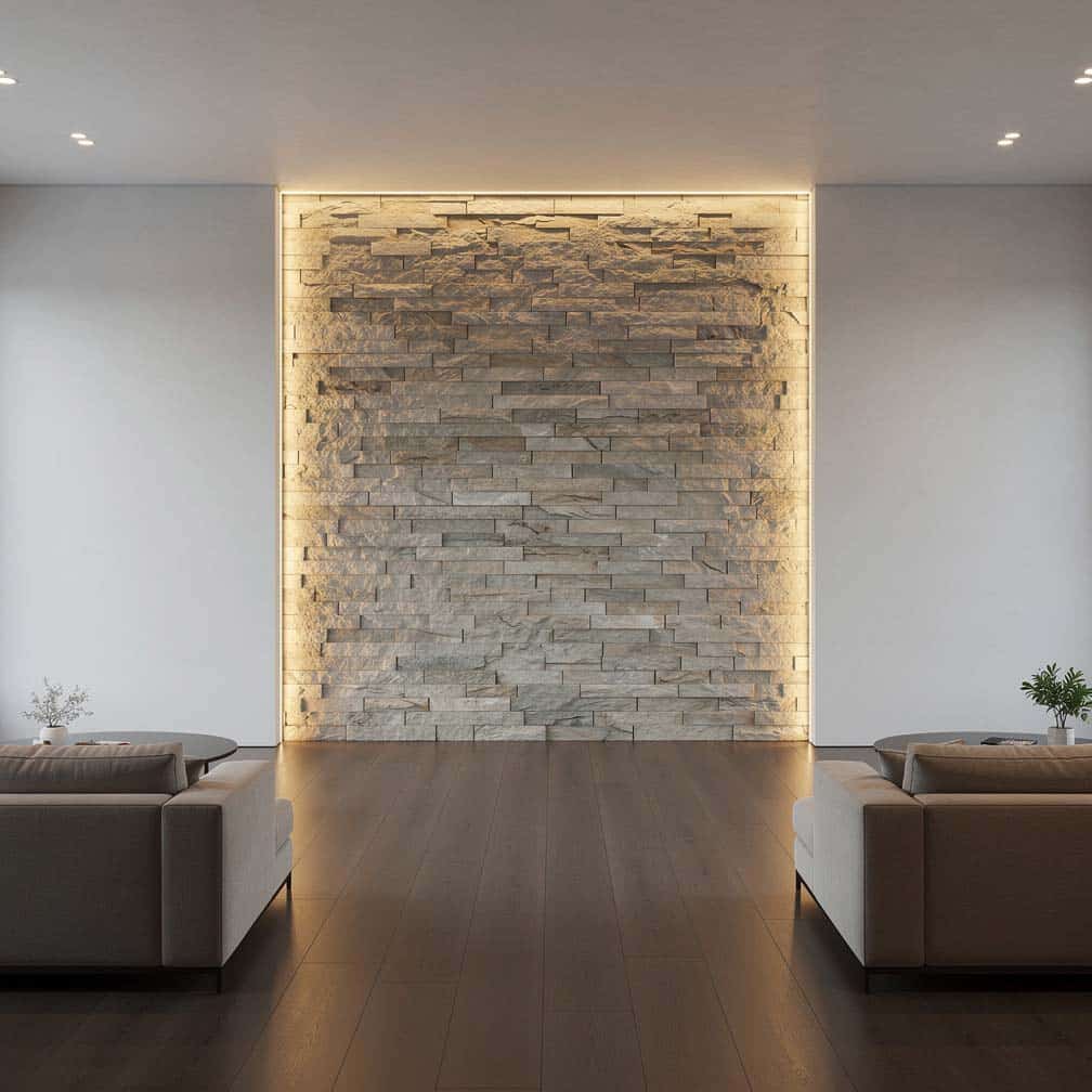
A wall alcove can be an ideal place to create drama and showcase an illuminated stone feature wall.
Want even more designs? Visit our accent wall ideas page for more creative ways to use color, texture, and patterns to generate visual interest.
To showcase highly specific designs, some images on this website use advanced AI-generation software to illustrate ideas and room inspiration. See our editorial policy to learn more.

Upload a photo and get instant before-and-after room designs.
No design experience needed — join 2.39 million+ happy users.
👉 Try the AI design tool now