Modern Urban Edge Living Room Color Palette: Cool & Stylish

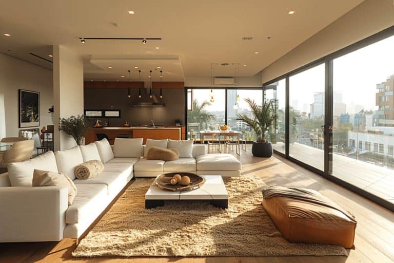
Your living room should feel like a stylish retreat, not some cold, unwelcoming showroom. That’s often the challenge when it comes to modern design: how do you create a space that’s sophisticated and stylish while still having warmth and livability? That’s where the Modern Urban Edge living room color palette comes in. This carefully curated collection of five colors goes for the perfect balance of industrial cool and inviting comfort. With inspiration taken from the aesthetic of city lofts and contemporary condos, it combines graphite depths, concrete neutrals, and muted blues with just enough warm finishes to keep things feeling welcoming. Let’s take a closer look at what this color palette is and how to get the look in your home.
What Is The Modern Urban Edge Color Palette?
This city-inspired palette focuses on using sharp contrasts and cool undertones to create a structured and inviting atmosphere. It’s the ideal choice for modern apartments, lofts, and condos where you want to make a statement , while still feeling livable. The secret lies in a careful blend of graphite neutrals, concrete-inspired tones, and muted blues, all softened by just a hint of warmth.

Upload a photo and get instant before-and-after room designs.
No design experience needed — join 2.39 million+ happy users.
👉 Try the AI design tool now
Here’s a quick look at the colors and how to use them:
- Graphite — #3E3E3E Use for a media wall, fireplace surround, or on metal decor. This gives a dramatic but modern effect.
- Warm Concrete — #A8A29E Use for the sofa upholstery or for a large rug. It adds softness to the bold contrasting hues.
- Steel Blue — #607D8B Use for an accent wall, built-ins, or on statement chairs.
- Blush Taupe — #C1A192 Use for the room’s throw blankets, textiles, or as an accent ottoman for subtle warmth.
- Polar White — #F1F1F1 Use for the trim, ceiling, and overall walls as a balancing color. It’s best for lofts, modern condos, and masculine-leaning spaces.
The Bold Anchor – Graphite #3E3E3E
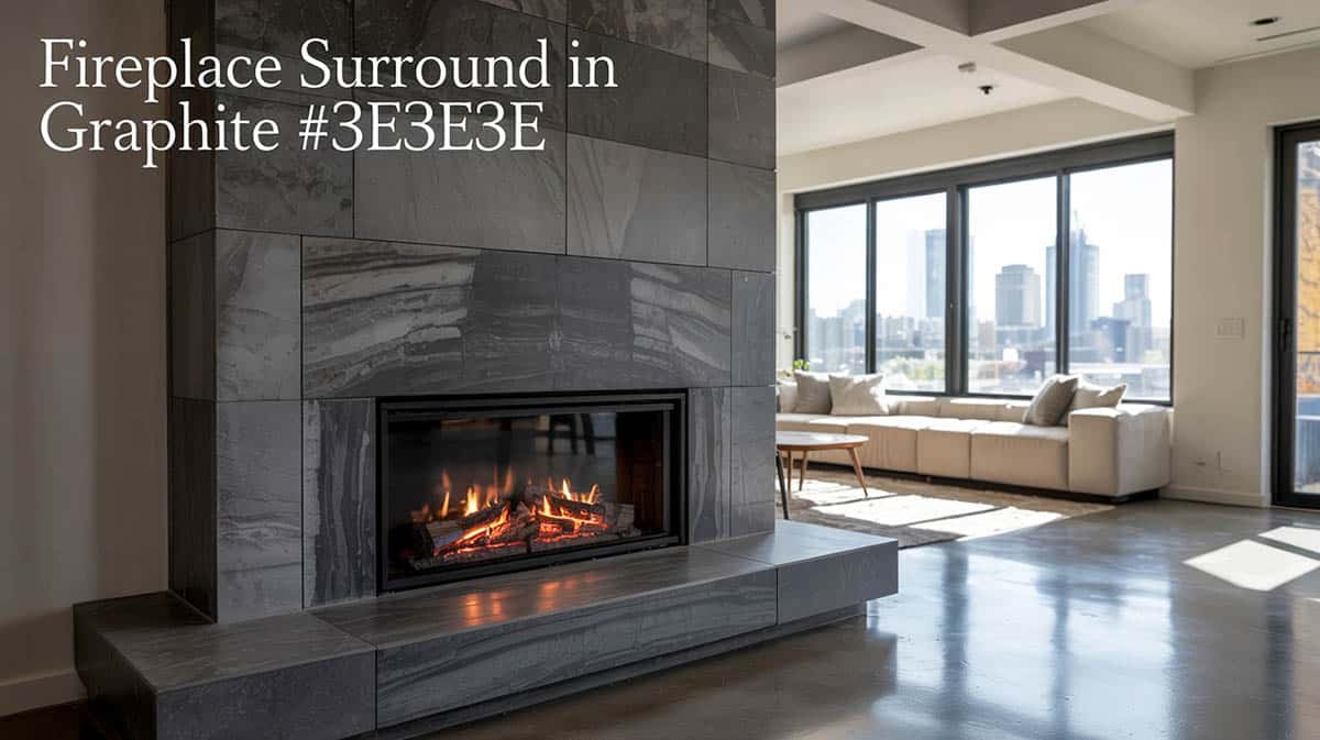
Graphite serves as a foundational color that provides drama and depth without the harshness of going with pure black. This sophisticated shade elevates anything it’s used on with its modern sensibility.
Where to use it: Apply it to media walls, fireplace surrounds, metal décor, built-in shelving, or on feature walls
Why it works: The graphite tone adds instant structure to large, open spaces and pairs with industrial materials like steel, glass, and concrete. Consider painting a full fireplace surround in graphite, or use it for accent columns and on metal-framed furniture pieces.
The Soft Neutral – Warm Concrete #A8A29E
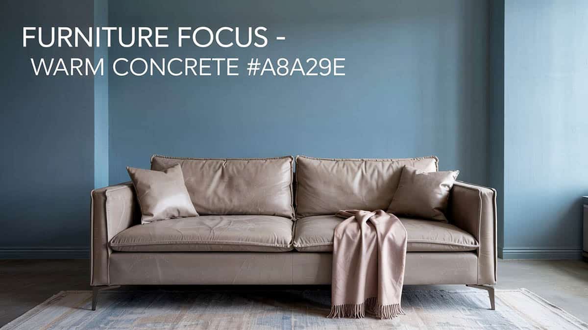
This versatile shade helps find a middle ground between cool and warm tones, preventing your space from feeling too industrial.
Where to use it: Apply it on the sofa upholstery, for large area rugs, poufs, or on your window treatments
Why it works: Concrete neutrals are always going to read as modern and timeless. These tones work really well on large surfaces and create a visual break in the room for the eye. A low-profile sofa in warm concrete can act as the perfect neutral backdrop when paired with layered accessories.
The Cool Statement – Steel Blue #607D8B
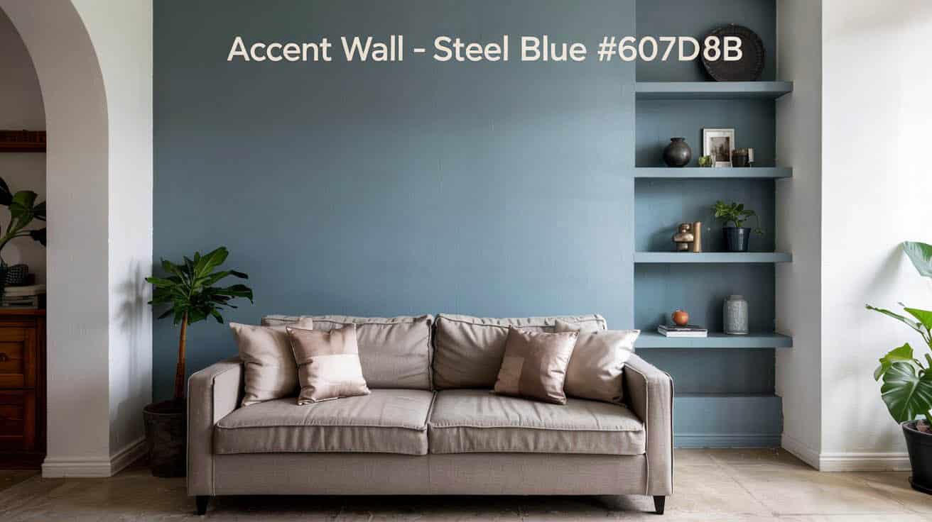
A steel blue hue adds a sophisticated touch to the room design, maintaining the urban, polished mood of the color palette.
Where to use it: Use this hue for accent walls, built-in cabinetry, statement chairs, or on large-scale artwork
Why it works: This shade functions as a “color neutral”, adding more depth and interest, but is still easy to coordinate with wood and metal finishes. Try using it on an accent wall behind your sofa, or invest in a pair of textured blue-gray accent chairs for extra impact.
The Warming Touch – Blush Taupe #C1A192
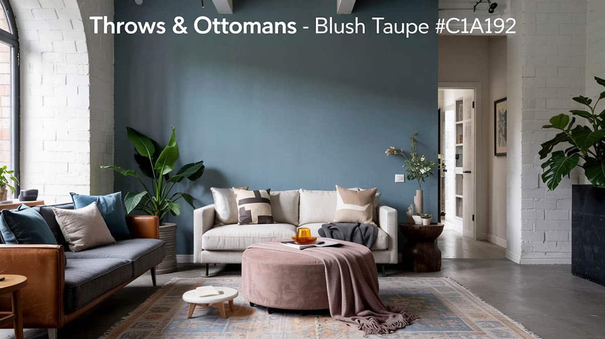
This subtle warm accent can help your room from feeling too cold or sterile by adding a touch of color. Use it with texture to bring in softness to keep the space inviting and not feeling too cold.
Where to use it: Use it on throw blankets, ottomans, decorative pillows, or on abstract artwork
Why it works: Blush taupe offers warmth without appearing overtly pink or feminine. It’s particularly effective when used for textiles such as knit throws, suede cushions, or as a round ottoman.
The Clean Backdrop – Polar White #F1F1F1
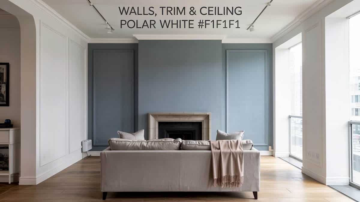
This color helps brighten the room with its crisp appearance that is not too stark and balances the darker elements. It works well to help smaller spaces feel more expansive.
Where to use it: Apply it to the walls, ceilings, trim, and the backgrounds of built-in shelving.
Why it works: This white tone works harmoniously with both cool and warm undertones to offer visual relief while enhancing the room’s natural light. Use it liberally on walls and ceilings to prevent the space from feeling too heavy. It can be used for the overall walls and paired with a darker accent wall, with interesting results.
Breakdown Behind the Palette
The Modern Urban Edge color palette follows a proven dark-to-light contrast structure that creates visual interest, style, and sophistication:
- Graphite anchors the space with bold drama
- Warm Concrete provides a soft and neutral foundation
- Steel Blue delivers a cool color statement
- Blush Taupe warms up the overall composition
- Polar White offers a clean, bright balance to the darker shades
This careful progression prevents the space from skewing too industrial or too soft, making it perfect for gender-neutral room styling that appeals to a wide range of homeowners and their tastes.
Designer tip: When it comes to using the polar white hue (#F1F1F1) for your main walls, trim, and ceiling, there are a couple of recommendations to consider. First, for the walls, you’ll want to use an eggshell or matte paint finish. Use satin or semi-gloss on the trim and doors, and a flat on the ceiling to hide any imperfections.
Ideal Spaces for This Palette
The Urban Edge color scheme thrives in:
- Urban lofts with exposed beams or some brick walls
- Modern condos featuring large picture windows and open floor plans
- Masculine or gender-neutral living rooms with an edgy look
- Compact spaces that need structure without the visual chaos of some industrial plans
- Rooms with existing metal, glass, or concrete architectural features
Materials and Textures To Use
Colors alone don’t create the full Modern Urban Edge aesthetic; you also need the right amount of textures and materials to complete the look.
Metals: Choose blackened steel, brushed nickel, or aged iron finishes for light fixtures, furniture legs, and decorative accents.
Textures: Incorporate concrete (real or faux), bouclé or textured-weave upholstery, matte paint finishes, ribbed wood paneling, and wool-blend rugs.
Wood Tones: Stick with more cool-toned woods like espresso, charcoal oak, natural ash, or weathered gray. Avoid using orange or red-toned woods, which will compete with the cool palette.
How To Get A Complete Modern Room Design
Anchor Pieces: Start with a warm, concrete gray sectional as your foundation, add in steel blue accent chairs for visual interest, and create a graphite media wall with integrated built-in lighting for more drama.
Layered Textiles: Drape a blush taupe throw over one corner of your sofa, and choose a patterned area rug that combines graphite and concrete tones. Hang sheer polar white curtains to soften the windows, while benefiting from the natural light.
Décor and Accessories: Select metal lamps with geometric shapes in an industrial style. Display abstract artwork featuring graphite and steel blue tones on the walls. Style shelves with stone vases or ceramic pieces that match the palette’s color restraint.
Lighting Considerations: Choose warm white bulbs that range from 2700K to 3000K throughout the space. This amount of light temperature is warm and softens the cool palette, making the room feel more inviting during the evening. Put lights on dimmers so you have better control over changing the mood, depending on what you’re doing at the moment.
For another modern color palette, check out our coastal calm living room here.
To showcase highly specific designs, some images on this website use advanced AI-generation software to illustrate ideas and room inspiration. See our editorial policy to learn more.

