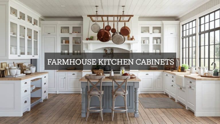
15 Kitchen Paint Colors To Avoid for a Stylish Space

Dark and Gloomy Hues
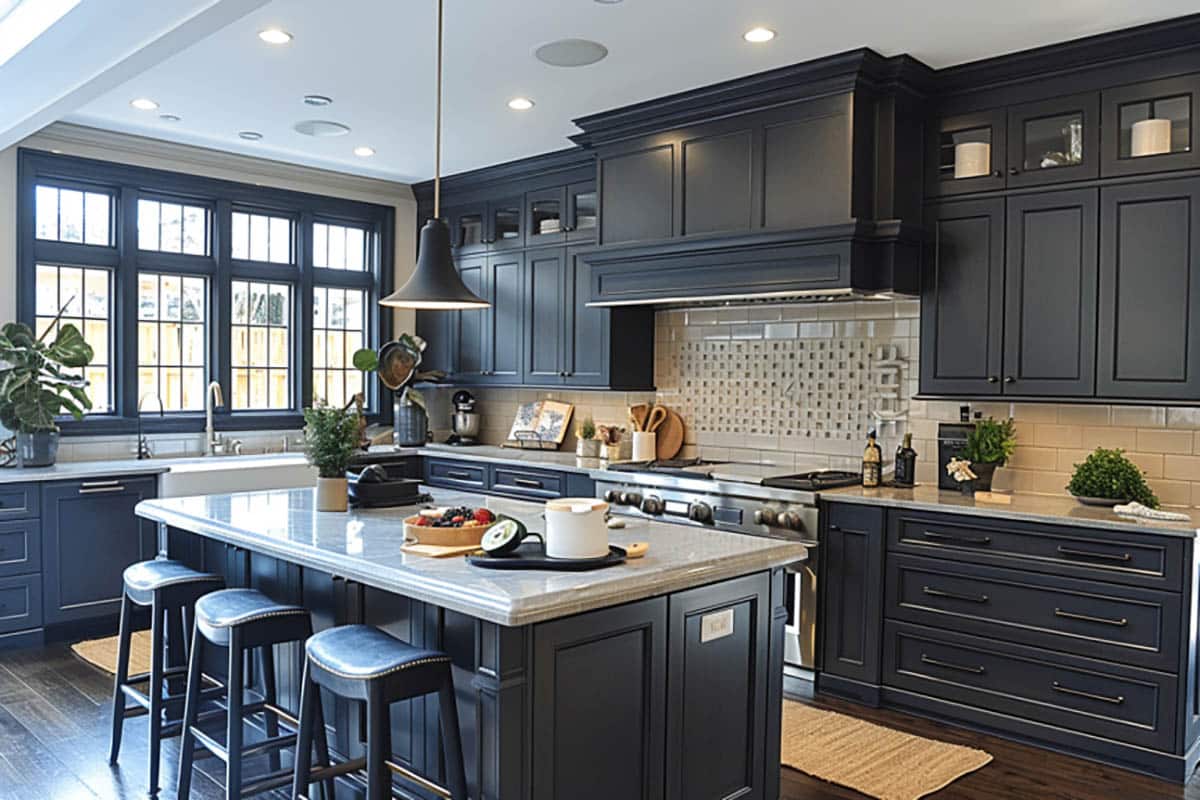
Very dark hues, especially if your kitchen lacks natural light, can make the space feel smaller and less inviting because they can absorb light and make your kitchen feel gloomy and dim. While dark colors like black, navy blue, and deep brown may be modern and trending colors of today’s homes, these are not ideal colors for a space where cooking and meal preparation take place.
The kitchen is where family and friends can share meals, and if you prefer a more dramatic look, consider using dark colors as accents on cabinets or kitchen islands rather than the main color for your kitchen walls. Choose lighter neutral shades for the walls, creating an open, airy atmosphere.
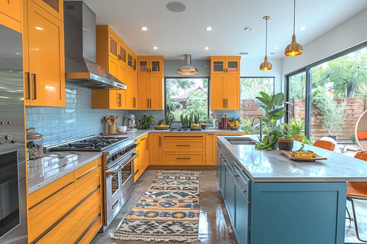
Bright and Bold Neon
While white kitchens are classic, bright white has become undesirable because it gives the kitchen a colder, sterile, and less welcoming atmosphere. Instead, choose a muted soothing color scheme with warmer undertones that create a calming ambiance.
Overly saturated colors may get attention, but bold and neon colors are hyper-saturated colors that can be overwhelming and distracting when used as a kitchen color scheme. When combining two similar colors that are bright and bold often leads to an incoherent fiasco of colors.
Chic colors such as bright pink, bold blue, and neon green are lively, fun, and dynamic colors but they can make your kitchen feel disorderly. Bright and bold colors are best used in moderation such as using them as accent colors through accessories like curtains, rugs, or artwork. You can use vivid colors in the kitchen provided that you use them as highlights to add an element of joy to your kitchen.
Try selecting softer shades of bold colors or incorporate some muted tones to enhance a calming effect that helps ground the color scheme while adding depth and interest to the design.
Clashing Color Schemes
Color schemes are creating color combinations that work together, you want it to flow. However, some homeowners often tend to use several colors in their kitchen. Design experts say that using many assorted colors makes the kitchen feel disconnected and uncoordinated.
The safest way to choose colors that work together is to refer to the color wheel for a two-tone or complementary color scheme. However, there are colors opposite each other on the wheel that designers normally associate with clashing.
Some examples are red and green as well as orange and green, these two-color combos can feel overwhelming and a bit too powerful when combined. Purple and yellow are colors that are loud and jarring. When paired together, these colors can look off because of the strong contrast between these two colors. Another example of clashing combos is blue and orange rather than complementing each other when used in the kitchen, these two colors tend to clash.
There are color combinations that don’t look good together but sometimes muting one of the clashing colors or changing the shades will complement each other better. If applied on walls, these colors would clash. Try incorporating them in different design elements using natural settings or match clashing colors with more layering in smaller details such as accessories like colored cushions and patterned rugs to add texture to your design scheme.
Overly Trendy Shades
Typically, homeowners follow and apply trendy shades for their next kitchen makeover because they want a chic and up-to-date color scheme. However, popular trends today may not be in the mainstream tomorrow. Avoid using a color that is currently popular and may make the kitchen feel outdated in just a few years.
We recommend using neutral colors which can be easily updated through accessories and other design accents. Or use trending colors of the moment in small doses such as wallpaper with trendy patterns or furniture upholstery that add dramatic or daring effect.
Unappealing Undertones
Undertones are subtle hues that can impact the overall look of your kitchen, so it is important to pay attention to them. Do not neglect the undertones of your main color of choice because two paints that have the same tone but different undertones will look completely different.
For example, if you want your kitchen design scheme to have a cool color palette and you choose a paint with a warm undertone, the result will seem off. Keep in mind that pure colors have similar tones and undertones. And so, when choosing your color scheme, it is always better to compare the shade of the color you want to its pure color because it will help you see the undertone more clearly.
Certain undertones can make your kitchen feel unappealing or clash with other elements in the room. For example, yellow undertones can make your kitchen feel dated, while green undertones can make it cold. Refrain from using shades with cool grey, green, and blue undertones especially when there’s not much sunlight coming in because the gray tones appear dull and dreary.
Interior Designer Kitchen Color Palette Tips
Always consider the connection between your kitchen and adjacent living spaces so that there is a continuous, visually appealing, and seamless transition in the color flow. Select colors that blend well with the current color palette in the adjacent areas like the dining room and living room.
Another common mistake is matching your paint color with your cabinetry. We suggest that it is best to create a contract between the walls and the cabinetry.
Remember that when choosing a color for your kitchen, the intensity and shade of any given color will influence how the space feels. It is also necessary to determine how much of the color you use. Avoid warm colors because these colors can easily make a kitchen look outdated and feel closed off.
Should you ever find yourself unsure about which colors to choose for your kitchen, make sure to avoid these color scheme mistakes to ensure that you can create an appealing and inviting design aesthetic that reflects your design style.
To showcase highly specific designs, some images on this website use advanced AI-generation software to illustrate ideas and room inspiration. See our editorial policy to learn more.

Upload a photo and get instant before-and-after room designs.
No design experience needed — join 2.39 million+ happy users.
👉 Try the AI design tool now