Choosing the Best Paint Colors for Your Country House Exterior
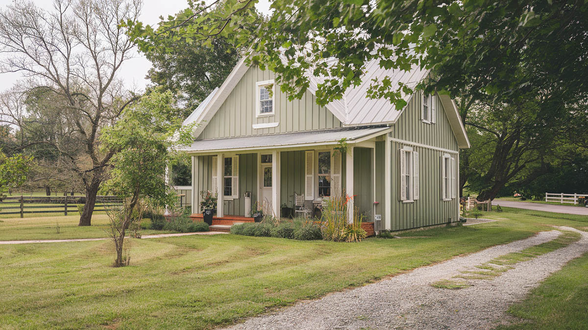
To keep your country home looking charming and inviting, it’s necessary to select colors that fit the theme and are inviting. Choosing the perfect exterior colors for your country home can really make it pop! The right hues not only enhance curb appeal but also affect the overall vibe and feel once you step inside. [toc] (Images generated using AI to showcase potential design ideas.)
Popular Exterior Color Palettes for Country Homes
While finding that perfect palette may seem daunting at first, there are some tried-and-true options that tend to work beautifully on country houses.

Upload a photo and get instant before-and-after room designs.
No design experience needed — join 2.39 million+ happy users.
👉 Try the AI design tool now
Classic Whites and Off-Whites: Classic White and gray neutrals reign supreme for good reason – they’re versatile and timeless. According to Architectural Digest, neutrals are the top choice among homeowners, with 23% choosing white and 19% going for gray. A soft white or gray pairs nicely with natural wood and stone accents.
When it comes to individual paint picks, Sherwin-Williams’ Alabaster or Benjamin Moore’s Chantilly Lace, are highly recommended by Southern Living as go-to products.
Earthy Neutrals: Beyond classic neutrals, consider warm, welcoming tones like light tans, creamy whites, or pale yellows. These colors complement rural surroundings and give off an inviting, cozy feel. Per the designers at Real Simple, neutral shades like white, light gray, and beige are always safe choices for a country-themed or ranch-style home that can appeal to potential buyers later on.
Soft Pastels: Light shades of sky blue, sage green, and buttery yellow work beautifully on siding or trim for an inviting farmhouse or cottage vibe.
Bold Accents: If you want your home to make more of a statement, go for bolder accent colors like cherry red, rich navy, or deep forest green. Paint your front door, window shutters, or decorative trim in one of these lush tones to give your home extra flair. For something bolder, forest greens and navy blues make dramatic statements. Red barns dotted along rolling hills prove just how eye-catching and rustic these rich hues can be.
Traditional Country House Color Palettes
When designing a traditional country home, you’ll want to choose a cohesive, welcoming color palette. Here’s a few different traditional styles and their color palettes to consider.
Warm Neutral Palette
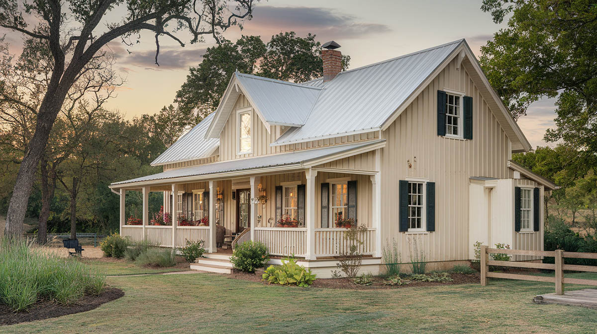
Popular choices for a warm, neutral theme include Benjamin Moore’s “Putnam Ivory,” a rich yet mellow creamy yellow; Sherwin-Williams’ “Accessible Beige,” a flexible soft beige that pairs well with many colors; and Farrow & Ball’s “String,” a light khaki hue with a classic sensibility.
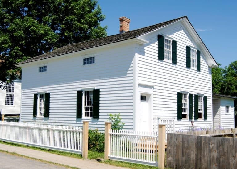
Crisp white trim helps frame the home’s architectural details and adds brightness. Benjamin Moore’s subtly warm “White Dove” is a popular choice, as is Sherwin-Williams’ soft, approachable “Alabaster” white. Shutters and front doors in deep, woodsy greens like Benjamin Moore’s “Essex Green” or Sherwin-Williams’ historic “Rookwood Dark Green” provide a bold accent that grounds the home.
Together, these colors create an inviting country house palette that feels pleasantly faded, well-loved, and rooted in pastoral heritage. The neutral main home body promotes harmony and flow between rooms, while moments of contrast in the bright white trim and emerald accents provide visual interest across the exterior façade. This versatile combination of colors suits many architectural styles while remaining quintessentially countryside.
Pastoral Whites
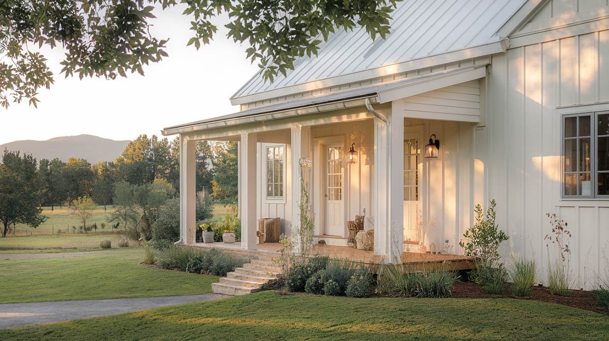
When it comes to picking paint colors for a traditional country home, it’s hard to go wrong with a versatile white palette accented by deep, classic shades on the doors and shutters. Creamy whites like Sherwin-Williams “Greek Villa” or Benjamin Moore’s “China White” give off a lovely, antique vibe perfect for pastoral living spaces. For trim, go with crisp clean whites like Benjamin Moore’s “Cloud White” or Sherwin-Williams’ “Pure White” to really make your millwork pop.
And for your shutters and front door, choose a rich, moody hue that grounds the home, like Benjamin Moore’s “Hale Navy” – a deep navy blue that looks stunning against white siding. Or make a bold statement with Sherwin-Williams “Tricorn Black,” which adds serious drama and cottage-chic style. Whether you prefer dark navy or black, painting these elements in a classic dark color is the perfect finishing touch on a country home. It creates delightful contrast against those pretty whites.
Heritage Colors
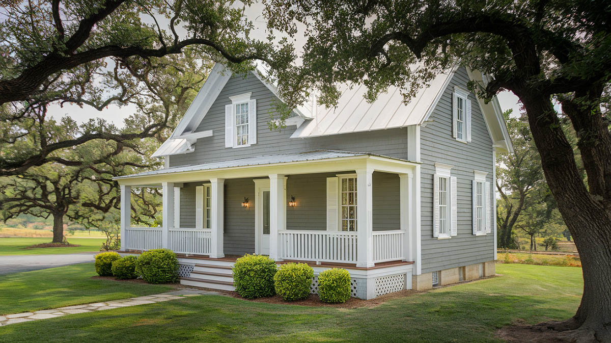
When designing a traditional country home exterior, certain heritage colors have stood the test of time. The main body or siding of the home often looks best in a neutral gray tone that exudes a sense of Colonial history. Popular and versatile hues like Sherwin-Williams’ “Colonial Revival Gray,” Benjamin Moore’s subdued and rocky “Stonington Gray,” or the gentle elegance of Farrow & Ball’s “Light Gray” give off a refined yet welcoming vibe.
For the exterior trim, doors and other accents, a bright crisp white provides pleasing contrast. Benjamin Moore’s “Simply White” with its well-balanced brightness or Sherwin-Williams’ clean and vivid “Extra White” allow the other colors to pop while framing windows and rafters with a fresh yet traditional sensibility.
Finally, rich country reds on the shutters, front door or even accent exterior walls hearken back to classic Americana barn designs. Benjamin Moore’s “Garrison Red” offers just enough earthiness to feel grounded and cozy, while Sherwin-Williams’ gorgeous, deep-toned “Red Bay” makes a bold statement befitting a gracious country manor.
Together, these heritage gray tones, bright whites and rich reds create an exterior color scheme that feels pulled straight from the pages of history – elegant, warm and inviting.
Soft Pastel Look
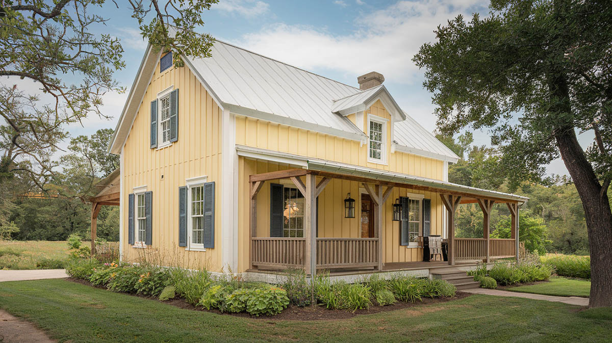
When it comes to picking paint colors for a traditional country home, you can’t go wrong embracing the style’s heritage hues or opting for pretty pastels. Classic country houses tend to use a soft buttery yellow, like Benjamin Moore’s cheerful “Yellow Rain Coat,” for main living spaces. This bright yet mellow tone adds cozy warmth. Or consider a gentle blue reminiscent of clear skies, such as Farrow & Ball’s airy “Pale Powder.” For main walls, a muted petal pink, similar to Sherwin-Williams romantic “Pink Shadow,” imparts a gentle femininity.
As for trim and molding, allow crisp white to stand out against the subtle wall colors by selecting a warm, ever-so-slightly creamy white, akin to Benjamin Moore’s versatile “Linen White” or the softly elegant tones of Sherwin-Williams “Creamy.” Trim in these gentle hues keeps things classic and refined.
Rather than stark brights, traditional country homes lean into soothing tones plucked from spring gardens and sun-washed meadows. Layers of gentle color washed over dark wood accents, brick fireplaces, and cozy textiles create a welcoming retreat blooming in understated beauty.
Sage Green
There are several attractive combinations that complement the earthy sage green hue beautifully. A classic and timeless look pairs the subtle vibrancy of sage – such as the green tones found in Benjamin Moore’s “Saybrook Sage” or Sherwin-Williams’ “Clary Sage” – with crisp, bright white trim. The clean contrast of a cloud white, like Benjamin Moore’s aptly named “Cloud White” or Sherwin-Williams’ popular “Pure White,” allows the green to stand out. For a softer contrast, a warm creamy white, similar to Benjamin Moore’s beloved “Swiss Coffee,” also makes an elegant trim pairing. Adding dark charcoal shutters and front door in a deep shade like Sherwin-Williams’ “Iron Ore” grounds the palette with a bold, yet classic accent.
To allow the home to blend naturally into the landscape, an exterior filled with warm, earthy tones creates a beautifully cohesive look. Match a dynamic green found in hues like Sherwin-Williams’ “Dried Thyme” or Benjamin Moore’s multi-dimensional “October Mist” with accents of rich browns and textured taupes found in Benjamin Moore’s “Ashley Gray” and Sherwin-Williams’ “Turkish Coffee.” Incorporate actual stone and brickwork in similar warm beige and brown tones as an accent material. Trim the home in a creamy pale neutral like Sherwin-Williams’ popular “Alabaster” to allow the deeper tones to shine.
Alternatively, play up the romantic charm of a sage green country house by complementing it with soft rosy pinks and antique purples. Pair the whimsical greens found in Benjamin Moore’s “Sage Mountain” or Farrow & Ball’s iconic “Calke Green” with the delicate femininity of Benjamin Moore’s dusky pink “First Light” or the quiet elegance of Sherwin-Williams’ light violet toned “Serious Gray.” Trim in an antique white, like the gentle white of Benjamin Moore’s aptly named “White Dove,” to complete the vintage vision.
Sky Blue
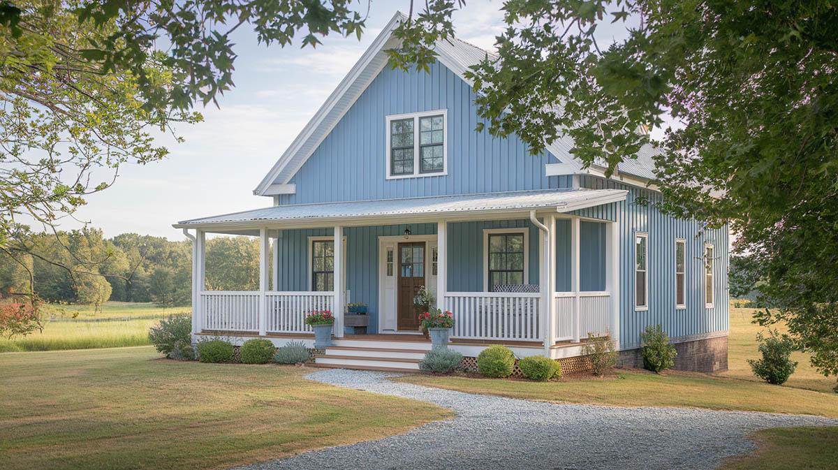
For a sky blue house, you have several classic options that can really make this cheerful hue sing. A coastal look pairs beautifully with a crisp, ocean-inspired palette. For the main sky blue body, try a soft robin’s egg tone like Benjamin Moore’s “Blue Bonnet” or Sherwin-Williams’ “Salt Water.” Then frame it with bright white trim – maybe Benjamin Moore’s popular “Chantilly Lace” or Sherwin-Williams’ “Extra White.” Finally, add a pop of deep navy blue on the shutters or front door. Hale Navy by Benjamin Moore has that nautical feel. Or for a more modern touch, go for Sherwin-Williams’ rich charcoal gray “Peppercorn.”
For a cozy country cottage vibe, warmth is key. So try a comforting sky blue like Benjamin Moore’s “Crystal Blue” or Sherwin-Williams’ affectionately-named “Sleepy Blue” for the siding. Trim in a creamy off-white, with Benjamin Moore’s “White Dove” or Sherwin-Williams’ “Alabaster” fitting the bill. Then make your entrance really inviting with a surprise bright black door, such as Benjamin Moore’s “Black Iron,” or echo the natural surroundings with a deep, earthy green like Sherwin-Williams’ “Mount Etna” on the shutters.
A fresh traditional scheme could incorporate a contemporary but versatile sky blue, like Sherwin-Williams’ “Rain” or Benjamin Moore’s “Harbor Haze,” with a cheerful accent color like Benjamin Moore’s vibrant butter yellow “Happiness” on your front door. Soft gray trim, such as Sherwin-Williams’ popular “Repose Gray,” keeps it timeless with a modern twist.
Buttery Yellow
A charming country home bathed in warm, buttery yellow evokes nostalgia of farmhouse living. When awash with this cheery hue, envision a bright sunny day with blue skies overhead. Now, let’s explore some delightful color combinations to truly make that yellow house pop.
For a classic country look, pair rich “Yellow Rain Coat” yellow from Benjamin Moore or bright “Butter Up” from Sherwin-Williams with crisp, snowy white trims. Contrast with deep emerald green shutters like Benjamin Moore’s “Essex Green” or crisp navy blue such as Sherwin-Williams “Naval”. This traditional scheme exudes pastoral vibes.
Seek vintage charm with soft sunny yellows like Benjamin Moore’s “Yellow Hibiscus” or mellow “Friendly Yellow” by Sherwin-Williams as the main house color. Trim in warm antique white tones like “White Dove” by Benjamin Moore or subtle “Alabaster” from Sherwin-Williams. Sage green accent shades comparable to Saybrook Sage by Benjamin Moore add earthy elegance while soft grays like Mindful Gray by Sherwin-Williams provide an elegant, weathered touch.
Lean into traditional New England-style luxury with elegant yellow hues reminiscent of lemon chiffon. Benjamin Moore’s refined “Philadelphia Cream” and warm “Jovial” tone by Sherwin-Williams set a cultured background. Contrast with deep, rich brown shutters, perhaps Benjamin Moore’s “Tudor Brown”, alongside weathered dark charcoal accents like Sherwin-Williams “Iron Ore”. This combo feels posh yet down-to-earth.
Modern Trends in Country House Exteriors
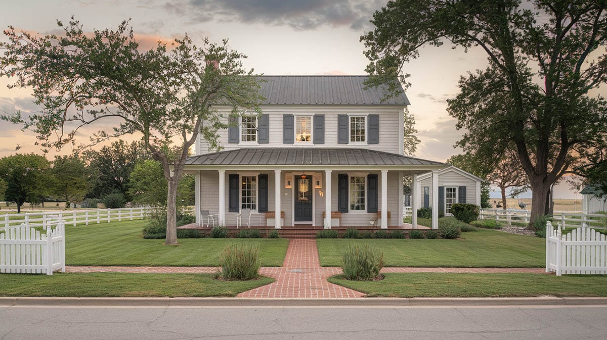
Country house exteriors are going through an edgy, eco-friendly transformation lately. Out with the traditional tans and pale yellows, in with daring dark hues and contrasting color combos.
Dark Hues: Deep blues, dark grays: According to trend forecasts, deep, moody shades like charcoal gray, darker blues and even black are popular exterior makeover choices. Some of these are currently trending in some areas, like the Hamptons, according to the New York Post.
What’s inspiring this shift towards the shadows? For starters, broody colors make a striking style statement while blending seamlessly into lush rural landscapes. They also give off an opulent, cutting-edge vibe — something sought-after these days even in pastoral settings.
Trending Colors in 2024 to 2025: Deep and moody hues like dark charcoals and forest greens are gaining popularity for home exteriors, as noted by Better Homes & Gardens
Two-Tone Schemes: One design approach that adds visual appeal is using a two-tone color scheme. This could mean pairing a light gray paint on the siding with a darker gray on the trim and accents. A black-and-white combo is the tried and true option for modern farmhouses. The contrast between the light and dark shades gives dimension and definition to the home’s facade.
Low-Voc Options: Beyond aesthetics, homeowners are now opting for virtuous paint options with low VOC levels that benefit both families and the environment. Combining these health-conscious and vividly colored choices is the two-tone trend, which employs darker shades on accents like trims against lighter backdrops.
Factors to Consider When Choosing Exterior Colors
When choosing, first, consider the architectural style of your home. Does it have a French Provincial vibe with brick or stone accents? Neutral tones are classic. Or maybe your home has historic charm – play up the era with era-appropriate colors to give it that nostalgic ambiance.
Next, observe how your home fits in with the surrounding landscape. Nestled in lush woods? Earthy browns and olive greens will blend right in. Bathed in sunshine? Go for lively pastels that will reflect the light. See how the natural colors already present can inspire your palette.
The local climate plays a role too. In hotter zones, lighter colors will help keep your rooms cooler by deflecting the sun’s rays. Whereas darker shades may fade faster under intense sunlight. And up north, deeper hues add welcomed warmth.
Finally, better check if your neighborhood or homeowners association has guidelines on colors. It would be a shame to fall in love with a palette only to be shot down. Best to get their input up front so you can choose from approved options.
Coordinating Trim and Accent Colors
Choosing the perfect trim and accent colors for your country home can seem tricky, but it doesn’t have to be!
Complementary Trim Colors: I find that going with complementary hues that coordinate and enhance the natural tones of your home is a foolproof approach. For trim, timeless whites or creams make an excellent choice to crisply define those clean lines and windows of your place, adding pleasing contrast against more saturated siding colors.
Natural Elements: If you have brick or stone details, use a color that highlights these organic features. A soft beige trim color beautifully lifts those natural elements.
Bold Accents: Now for the fun part – the accents! Consider painting your front door a saturated splash of red, yellow or navy blue. This eye-catching shade mixes things up while extending a warm welcome to visitors. If you have shutters and want a bolder look, follow suit by coloring them to match this door hue. It creates such a striking look!
Final Thoughts
Choosing exterior paint colors for a traditional country home is about reflecting both the landscape and your personal taste. Classic whites evoke clean farmhouses nestled in snow, while earthy beiges and grays blend with the natural hues of stone and timber. For those favoring a bolder palette, consider a rich green that connects to the surrounding meadows or an inviting, navy blue, yellow or red front door that punctuates a neutral facade.
When deciding on your palette, view color samples in both sunlight and shadow as the changing light can dramatically alter tones. Complement your primary color with trims and accents that provide pleasing contrast, opting for crisp white detailing on deeper hues. Don’t overlook practical considerations either – while trendy dark exteriors may suit modern tastes, lighter shades showcase intricate architectural details in traditional homes and are often easier to maintain.
Overall, allow your home’s existing personality and the surrounding landscape to guide your color selection. Neutrals please the eye while allowing unique details to shine through, yet a saturated accent provides a pop of individualism if done thoughtfully. Most importantly, choose colors that personally resonate with you, as this is a decision that endures over years of changing tastes.
To showcase highly specific designs, some images on this website use advanced AI-generation software to illustrate ideas and room inspiration. See our editorial policy to learn more.

