Designer Tips For Choosing the Perfect Color Palette for Your Room
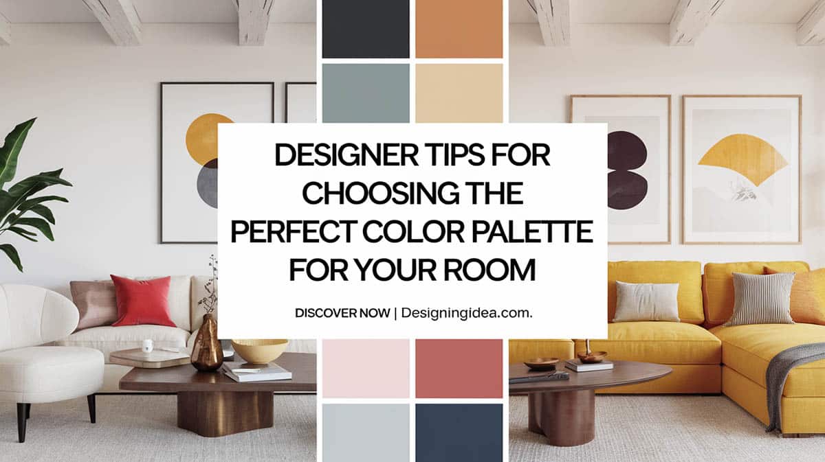
Utilizing the color wheel is an excellent starting point for creating a color palette perfect for any living space. It shows how colors influence and relate to one another. Creating the perfect color palette for a space requires some understanding of the basic principles and theories about color itself. Each color incorporated into the design scheme can significantly affect the mood, vibe, and character of each area in your home. This article provides interior designer tips on choosing the perfect color palette for your room.
Understanding Color Psychology for Interiors
Color Psychology is about how colors influence and affect emotions, perceptions, and actions. Different colors can trigger various feelings; understanding these connections can help establish the perfect ambiance in your space.

Upload a photo and get instant before-and-after room designs.
No design experience needed — join 2.39 million+ happy users.
👉 Try the AI design tool now
Hue refers to a shade of one particular color and each hue belongs to a family of colors. Primary hues are red, blue, and yellow. Mixing these different hues creates new colors like green, orange, and purple. One specific characteristic of hues is temperature – hues can be described as warm or cool colors.
Warm colors such as reds, oranges, and yellow hues promote a sense of warmth and intimacy making them perfect for social spaces like the living and dining area. Warm hues are known also for their vigorous, lively, and inviting attributes.
Red is especially known to help heighten energy and promote appetite, while orange brings a positive, happy, and vibrant atmosphere. Yellow, on the other hand, is often associated with enjoyment and can brighten up a room, creating a sense of pleasure.
Shades of blue, green, and purple are cool colors that stimulate a relaxing and calming effect. Usually these are the go-to hues for bedrooms and bathrooms since they offer a relaxed and serene ambiance.
Blue has unsurpassed characteristics often associated with calmness, clarity, and focus. Often associated with nature, green suggests a peaceful and balanced vibe which helps reduce stress and promote a sense of well-being. Meanwhile, the color purple emanates a sense of luxury, mystery, and sophistication which is also associated with royalty. Softer purple shades such as lavender can instill a calming vibe, while deep and bolder purple brings a sense of luxury and grandeur.
On the other hand, neutrals including whites, grays, browns, and black offer a sense of balance and a classic vibe making them the perfect choice for background applications or trim to any room. These colors can also be used as an accent color to provide a touch of depth and add an air of elegance. Neutral colors create a grounding effect and reduce overstimulation. These colors create a peaceful ambiance offering a sense of renewal and balance.
Last, but not least are the bright shades and vivid hues like deep reds, navy blues, and emerald greens. When used, these colors will create a striking impact and infuse a sense of drama into the atmosphere of a space. These vibrant hues can stimulate the senses giving off a feeling of alertness. However, designers recommend using intense shades in moderation as the best way to incorporate bold colors into your design as well as to alleviate the room’s color scheme.
Choosing a Room’s Base Color
Any color that you choose to be a base color will be the backdrop of your room and the primary hue in your color scheme. According to experts, when choosing a base color you should keep the following tips in mind:
The most important step is to start with your favorite color, this is the color that resonates with you the most. It is the color that you love and thus, will ensure that your space reflects your unique style.
Inspiration for base color can be found within our natural surroundings. Colors such as the hues of the ocean, the greens of the forest, or the tones of the desert, often evoke a sense of calmness and consistency.
Another factor to consider in choosing a base color is the room’s functionality and purpose. How the room will be used will influence the choice of the base color. For example, since the bedroom should be a tranquil space that is perfect for relaxation, the top backdrop color pick is blue. For a workspace, using yellow can boost motivation and help stimulate creativity.
Let existing elements that you already have lead the way as a reference to your design scheme. Get some base color ideas from the furniture, flooring materials, or any artwork you want to retain in the room to establish harmony and avoid clashing of colors. This allows you to have a strong groundwork for your color scheme making it easier to blend and incorporate other shades of colors.
The 60-30-10 Rule For Choosing Colors
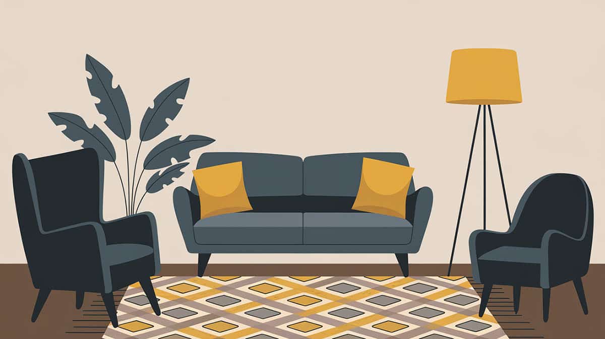
The 60-30-10 principle is the best guideline used by interior designers in creating a color palette guaranteed to have a well-balanced color distribution that creates a visually appealing ambiance.
This rule requires that the main or dominant color in the color palette covers about 60% of the room which dictates the overall mood and acts as the backdrop for the other colors. Designers often apply this main color on walls, large furniture, area rugs, and carpets.
The next color is the secondary color which helps enhance the dominant hue and makes up around 30% of the color scheme. When used in other design accessories like furniture upholstery, curtains, or bed linens, these secondary colors introduce a visual interest in the room.
While the remaining 10% of the color scheme is usually applied as an accent color. The accent color is the most striking color that helps highlight specific features that can draw attention to the room. The remaining 10% of the color palette can be distributed through artwork, or other decorative elements in order to have some contrast in the color scheme.
Working with Neutral Hues
Designers often recommend using neutral colors in interior palettes due to their timeless appeal. Neutral colors such as whites, beiges, grays, and taupe serve as a strong backdrop since they complement any design style and create a cohesive background wall color.
Designers usually mix these neutral shades or layer different shades to add depth and appeal to the room. Incorporating textures in your color palette is another design concept that uses different materials in neutral shades such as wood, fabrics, and other elements such as granite, quartz, sandstones, and marble. These neutral textures inspired by nature create a rich shade that offers a calm, organic, and welcoming atmosphere.
Neutrals can also be incorporated through the use of patterned fabrics or wallpaper adding a visual interest that is both sophisticated and elegant. Neutrals with warm undertones such as creamy white or warm beige offer a cozy and inviting ambiance while cool neutrals including soft grays and cool white will give the room a more modern and fresh appeal.
Lighting also plays an important element when working with neutrals. Consider the light source in each room and try to layer your ambient, task, and accent lighting to create drama and enhance the atmosphere of the room.
Creating Contrast with Accent Colors
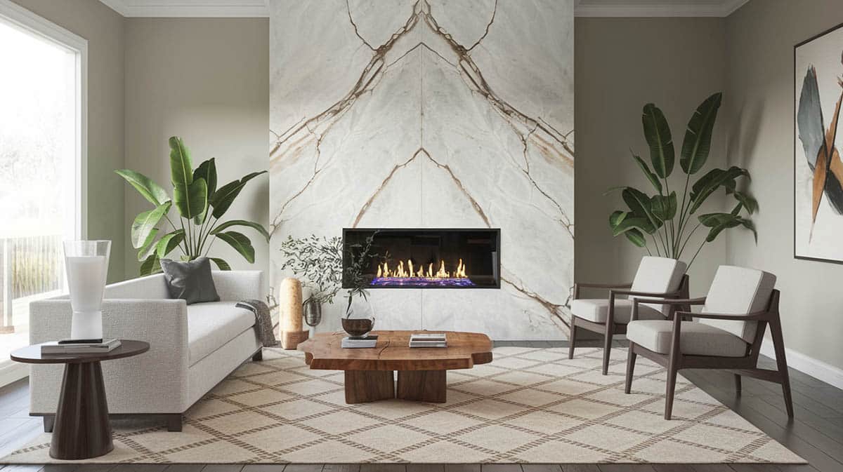
It is always about incorporating visual interest in designing any living space and creating contrast with accent colors is one way of effectively achieving this purpose. Accent colors stand out when you have a clean and neutral backdrop. Usually, an accent color with warm hues that are complementary to your base color works best such as mustard yellow or coral furniture upholstery or window treatment will create a stunning contrast with cool gray walls.
Nature-inspired colors like deep greens or rich browns will offer a contrasting effect against neutral backgrounds creating balance and harmony to the space.
Ideally, designers recommend using only 2 to 3 accent colors to avoid overwhelming the room and maintain cohesion within the color scheme and other design elements. Accent colors may be incorporated with design elements such as an accent chair, throw pillows, or artwork.
Incorporating patterns and textures, such as stripped fabrics or patterned rugs, as accents is another way designers add dynamic interest to the overall design concept and color scheme.
Try highlighting key areas in the room by using accent colors that help create a focal point. Using accent colors in furniture, fireplace, or accent walls will make these elements stand out and add character to the room.
Color saturation significantly influences the contrast attributed to accent colors. Vibrant and highly saturated colors make excellent accents. Combining and mixing these vibrant accents with different shades and saturations creates a dynamic contrast within your palette.
Color Harmonies and Schemes
Interior designers emphasize the importance of color harmony in creating a cohesive and appealing color scheme. They recommend understanding the color theory and referring to the color wheel to select the hues that will work well together in the room’s color scheme.
You can go for different complementary color combinations – these are colors that are directly opposite each other on the color wheel. Going bold in both shades will give your space a striking dramatic effect. However, according to color experts and designers, a more welcoming approach is to take one bold color and pair it with a softer complementary shade.
For example, using blue and orange as complementary color combinations – a deep cobalt blue paired with a soft pale orange creates a vibrant and dynamic contrast that can give your bedroom an inviting feel with a warm summer day vibe. Try combining a deep terracotta shade with a light soft blue palette for an easier look. You might also want to try a much more calming look, then we recommend going for a pale orange such as peach and matching it with a pale blue.
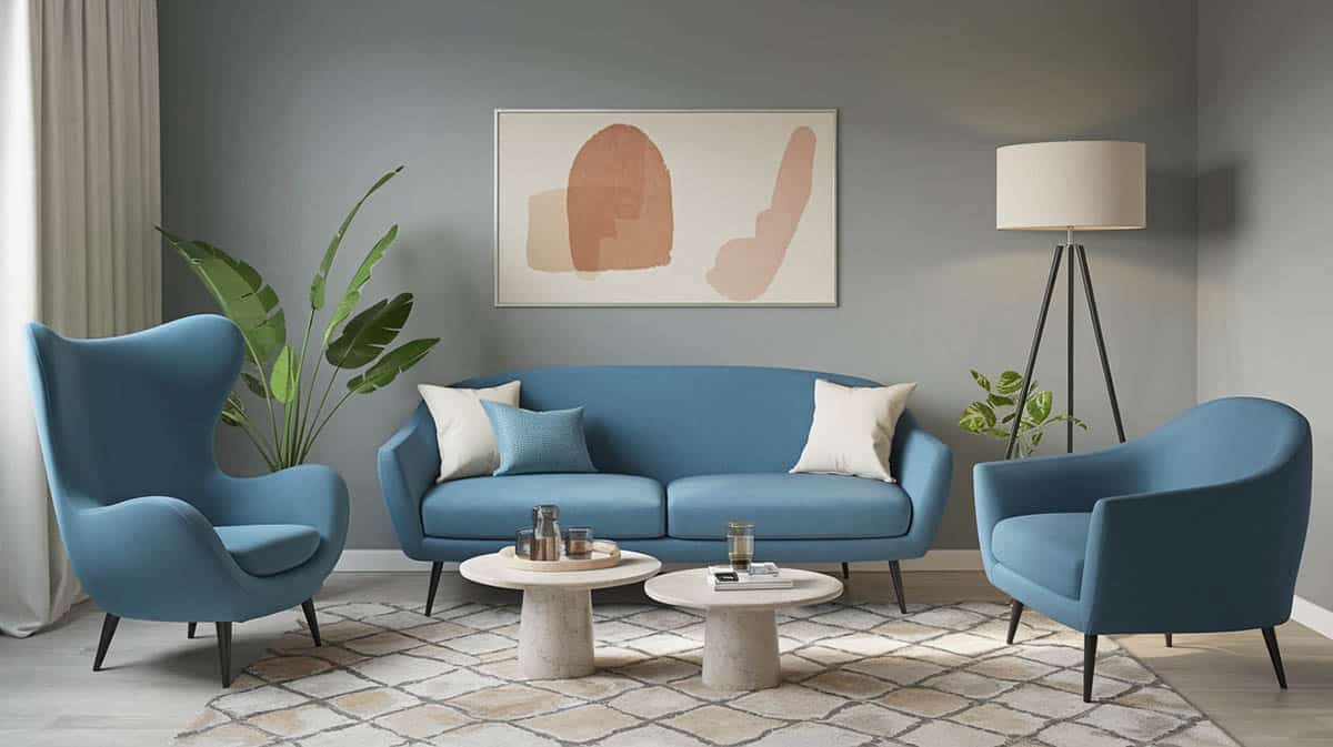
Another type of color scheme that is commonly used in interior design is the analogous color scheme which involves colors that are next to each other on the color wheel. Usually, analogous color schemes work best when using three colors composed of one dominant color which is usually a primary or secondary color, then a supporting color that is either a secondary or tertiary color, the third color is either a mix of the dominant and supporting color, and incorporating either black, white, or gray as a base color. Using neutral colors as a foundation in your color scheme will provide balance and harmony, allowing brighter colors to be highlighted without overwhelming the whole space.
One of our favorite analogous color schemes with a neutral background is the combination of blue, green, and blue-green. This is a fun combination to apply in any interior space because you can incorporate plants to stand for the green color, which will give you a natural and organic feel that is very welcoming. A neutral backdrop will ground your palette and add a calm, cozy, inviting vibe.
Then there’s the triadic color scheme which uses three colors of equal distance around the color wheel. The most common triadic color schemes are red, blue, and yellow. But before you shy away from these primary colors, designers recommend playing around with shades and tints of each color bringing in pink, maroon, navy, and gold in your living spaces creating a playful and sophisticated palette.
If you want a more unique and unconventional color palette, consider using these vibrant secondary colors of green, orange, and violet. Try incorporating this trio in your color scheme by picking a dominant pure hue and then distributing in accents the other two hues. You may also play around with their different tints and shades to soften the vibe. If you are into a more subtle and subdued color scheme, choose “in-between” colors on the color wheel such as pink, mint green, and yellow combo.
Last but definitely not the least, is the monochromatic color scheme which is a subtle mix of a single hue in a similar tone and saturation. These colors when blended create an eye-catching color harmony yet evoke a sense of calmness and tranquility. When using monochromatic colors designers often apply variation in the shade, tint, and tone of a single color to create interest and depth in the space.
Here is how I translate a monochromatic color scheme into interior design – start with a single color of your choice use it as a base color and apply it on the walls, then move up to choosing a darker variation of that color and use it on some furniture to add depth and dimension to the space. Finally, finish off with accents and design accessories in a lighter shade as well as incorporating different textures and finishes to enhance the visual interest in the room.
Although the monochromatic color scheme focuses on a single color, complementary and neutral colors can also be incorporated to create contrast and prevent the space from appearing too flat.
Choosing Colors for Different Rooms
When choosing colors for specific rooms, it is important to consider the room’s functionality, design style, and how the color will affect the ambiance.
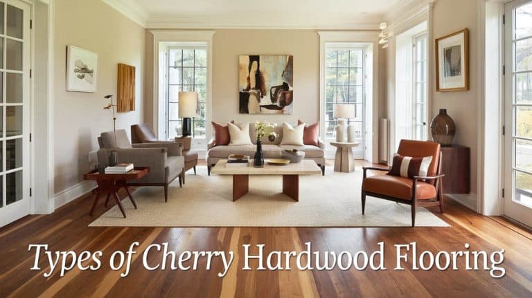
Since your living room is where you unwind and entertain guests it should reflect your personality and style. Soft and warm tones such as earthy neutrals or pastel shades can create an inviting, cozy, and intimate ambiance. Neutral colors also work well in the living room since they create a versatile backdrop for any design style. On the other hand, if you want a vibrant feel, bold colors such as deep blue, rich red, or gold can give the room an energetic vibe and add character to the room.
Dining Room colors usually call for rich warm hues that create an intimate setting and encourage conversation such as burgundy, navy, or forest green as well as stimulate appetite, this includes colors like deep red or mustard. Metallic tones like gold or copper can be incorporated as accents and in other design elements such as lighting fixtures or tableware to add elegance and sophistication.
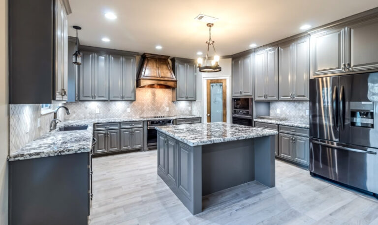
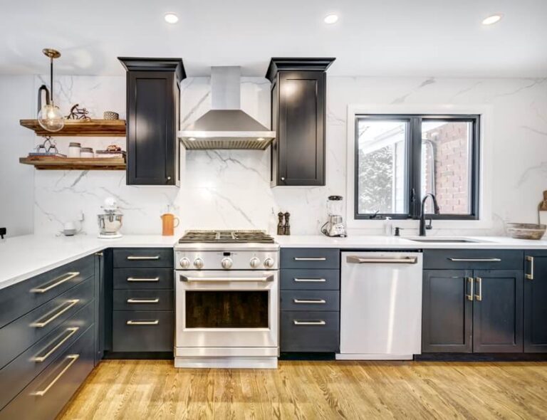
The kitchen is the heart of the home, and so my top picks for color scheme are energizing, cheerful colors like yellow, orange, or light green. Using light and bright colors creates an airy and inviting atmosphere. Smaller design elements such as backsplashes or appliances can be incorporated with bold colors for accent and a touch of character. One important designer tip is to consider the level of maintenance and choose a paint gloss level that is durable and easy-to-clean colors that can withstand kitchen wear and tear.
Your bedroom is your sanctuary, so choose colors that promote relaxation and restfulness. Calming colors like soft and muted tones of blue, green, lavender, or pastels are the best picks. Darker accent colors for walls such as navy or charcoal help create a cozy atmosphere. Using different textures in bedding and other design elements adds depth while keeping the ambiance peaceful and comfortable.
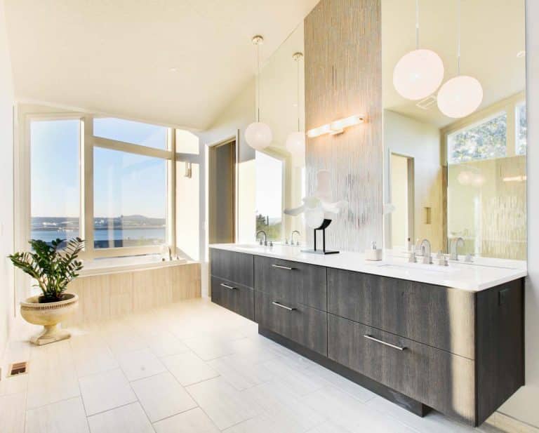
For bathrooms, I believe the functionality and the mood of the space are essential factors to consider. If you want bathtime to be a lavish experience, deeper shades of blue, green, or purple bring depth and a touch of luxury to the space. These colors offer a richness and elegance feel that transforms your bathroom into a sophisticated sanctuary. On the other hand, if you want your bathroom to make a statement that is both elegant and chic, try incorporating bold complementary colors and balance it with a neutral base color such as lemon yellow, sky blue, cherry red, and light gray.
Blending Patterns and Textures
Incorporating patterns and textures into your color palette can add depth and enhance the visual appeal of your space. One way of doing so is to layer your textures by combining different materials like wood, metal, fabric, and glass. For example, I would choose a velvet upholstery for your sofa, accessorize it with textured throw pillows and woven rug, and pair it with a sleek glass coffee table for contrast. You can also mix patterns and textures by incorporating them with the fabrics you use for cushions, throws, and curtains which will help you create a warm, inviting, and cozy atmosphere.
Combining different sizes of patterns such as large floral prints with small geometric patterns like stripes or chevrons creates balance while still having an interesting dynamic look. When integrating different types of patterns, ensure they are within the same color family to create harmony. This way, you will have a cohesive scheme while integrating diversity into your design style.
While blending patterns and textures brings out creativity in you, always remember to limit the number of patterns in a single space to maintain balance and avoid overwhelming the space. Aim for a mix of patterned and solid elements by highlighting one main pattern like in an eye-catching area rug to serve as a focal point or a wallpaper with a bold pattern for an accent wall and use a subtler pattern or solid element elsewhere to complement it. Incorporate textured painting techniques such as sponging or rag rolling as well as textured finishes like decals or panels to add depth to walls without a pattern.
Room Lighting and Its Impact on Color
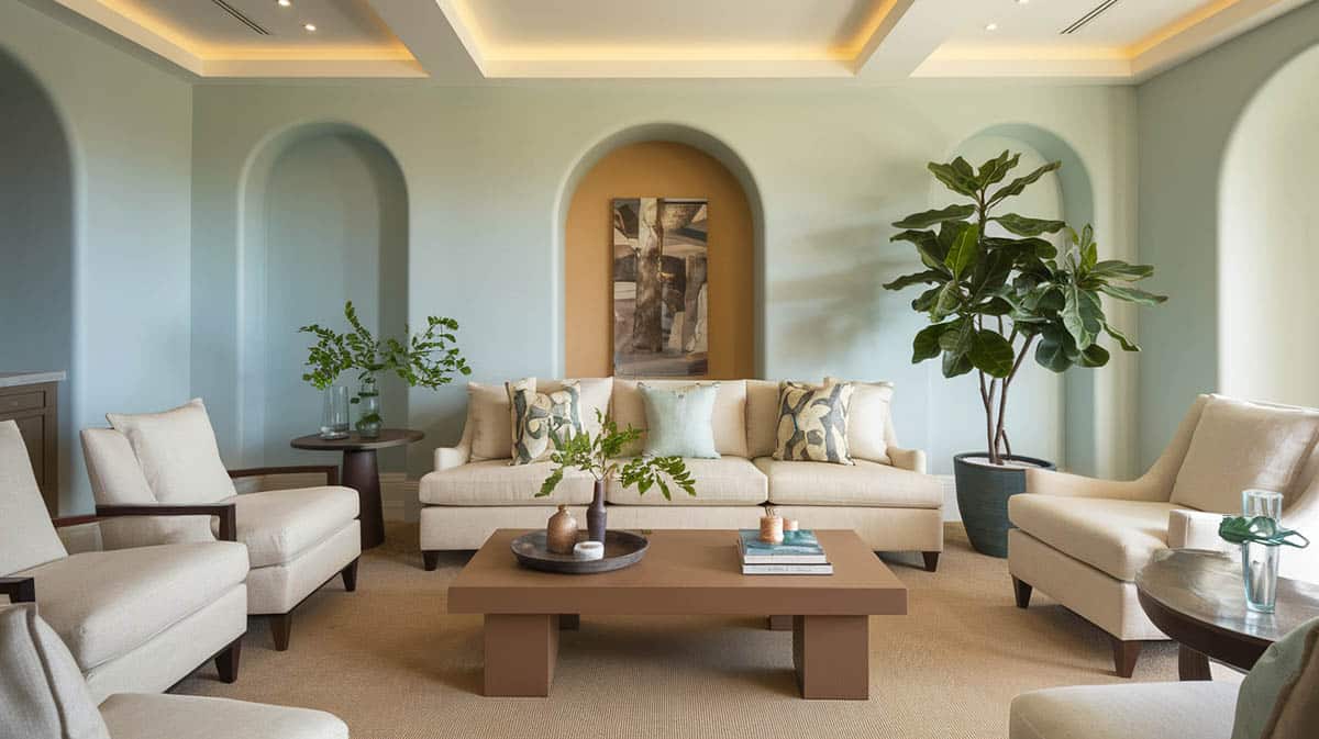
Lighting heavily influences how colors are seen in a space, and even small changes in the type and brightness of light can dramatically alter the impact of colors in a room.
Colors appear in their truest form if the rooms are filled with natural light. Thus, while the light shifts throughout the day, it can bring out different hues in your space at various times. For example, rooms that are north-facing tend to have cooler and more muted tone colors while south-facing rooms often appear warmer and more inviting.
On the other hand, artificial light can significantly influence how colors change their tone and vibrancy depending on their type and temperature. Warm light gives off a yellowish or amber hue and makes colors feel softer, creating an intimate and cozy space. Cool light, on the other hand, has bluish tones that enhance brightness, making colors appear sharper and more vibrant and offering a more energizing feel to the room.
Another factor to consider before choosing the paint colors for a particular space is the intensity of the light. Installing dim lights tends to mute colors while brighter lights can intensify the room’s colors. Consider layering your ambient, task, and accent lighting to create a dynamic ambiance. Plus, it will give you control over the room’s visual appeal and create a well-balanced atmosphere.
Room Color Palette Mistakes to Avoid
Many homeowners are playing it safe when choosing color palettes in their homes, and this is understandable. However, now you understand the theories behind colors and how choosing the right colors affects the ambiance in any living space.
To avoid color mistakes and create a harmonious and functional design scheme, always consider the room size and ceiling height when selecting your color palette. Colors that reflect light can make the room feel bigger, while darker colors often absorb light, which can make small rooms feel cramped.
Never underestimate the effects of natural and artificial lighting as well as the direction of how it illuminates your space since it can affect your color palette.
According to our in-house interior designers, a room with limited sunlight can intensify or deepen even a light-color paint; whereas a very light-color paint, when applied to a room that gets a lot of natural light, will appear washed out and overly subtle, thus losing its depth and richness.
Another common mistake is overlooking the undertones of your color palette since it can lead to clashes in your color scheme. Designers recommend creating a flat lay of the samples of your color palette in a room with ample sunlight and comparing them at different times of the day. You can get paint chips showing the exact LRV (light reflectance value), so you can determine what paint to use based on your environment. This technique will show you what colors complement one another. Remember that similar undertones work best together.
Inconsistency across your living spaces will result in a lack of color cohesion. Too many interior colors can create visual chaos – less is more. Stick to a consistent color palette to balance your design scheme, which is more relaxing and inviting. Incorporate neutral colors to ground your color scheme; this typically includes muted colors in various tones mixed with contrasting materials with grains or with different finishes and textures. Replication of colors can also bring harmony to your design scheme as it echoes your color palette flowing seamlessly from room to room.
Lastly, overlooking other design elements such as furniture, fixtures, and architectural details can lead to poor color choices that clash rather than complement each other. When your color scheme doesn’t align with your interior features and style it can make your space feel unbalanced and out of place.
By being aware of these common mistakes, you can bet on having a color palette that feels well-composed and inviting and a space that best serves its purpose.
Test Colors In Your Interior Before Committing
While painting may be the easiest and most affordable way to upgrade the look of your space, it is always a good idea to test paint colors before you invest money and time in applying them to the entire room. Keep in mind that paint swatches will look different on actual walls due to the texture of the walls and the way they interact with natural and artificial lighting.
Deciding on the flooring material and other permanent finishes before committing to any specific paint colors is best because it is easier to find colors that work well with your flooring choice.
The same goes for selecting colors for furniture or window treatments, it is best to get fabric samples and compare swatches to see how they blend into the room’s overall look. You can also try adding colors through smaller accessories such as cushions, throws, area rugs, and other decorative pieces and see how they enhance the space.
Testing colors before committing allows you to see how the colors influence the room’s spatial dimensions. Since colors influence the mood and ambiance of the room, testing various shades will enable you to choose the right hues and undertones that match the calming, energizing, or romantic vibe you want for the room.
In conclusion, choosing the ideal color palette requires an understanding of how colors impact the ambiance of the room. It is always best to apply the 60-30-10 rule of the principles of design when selecting your color scheme. Take into account important factors such as functionality and purpose of the space. Never underestimate the effect of natural and artificial lighting at various times throughout the day. We hope that with these designer tips, you will be confident enough to create a cohesive, stylish, and perfect space for you.
To showcase highly specific designs, some images on this website use advanced AI-generation software to illustrate ideas and room inspiration. See our editorial policy to learn more.

