White vs. Cream Kitchen Cabinets: Which Looks More Expensive?
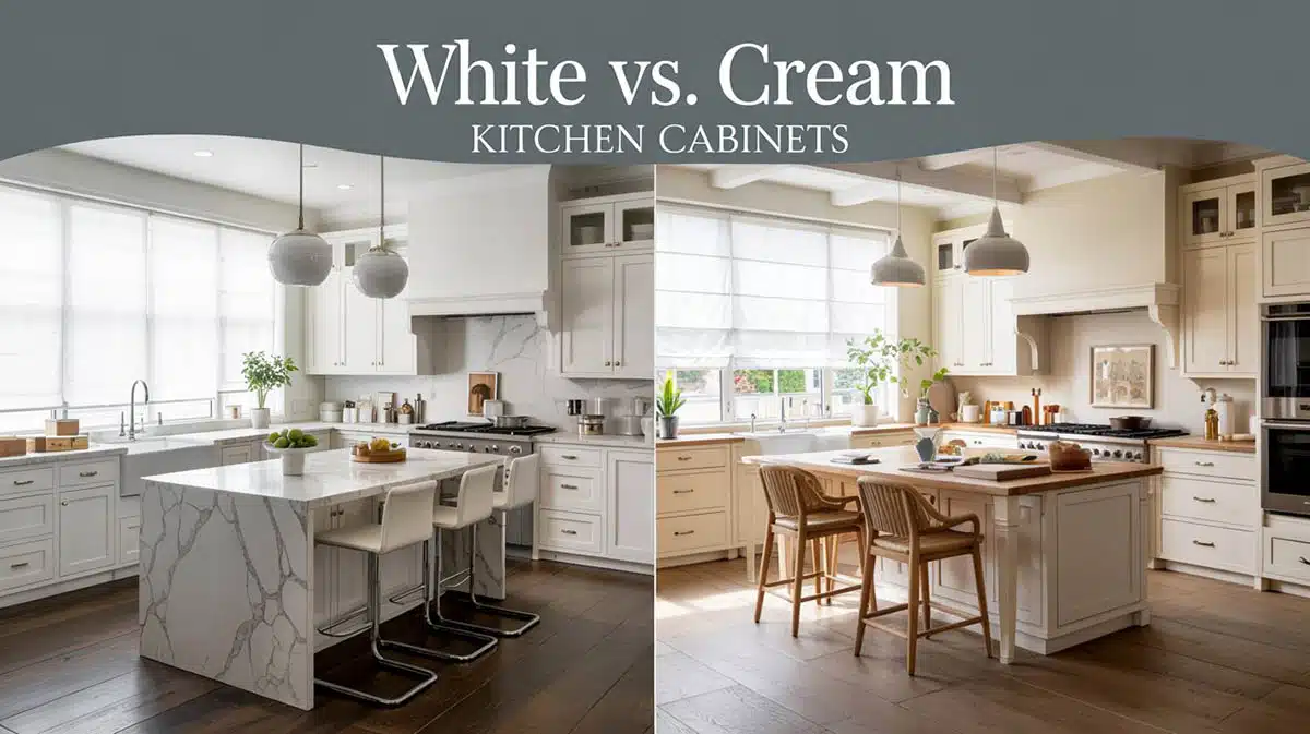
If you’re in the market for a kitchen remodel, you may have wondered how white vs. cream kitchen cabinets compare style-wise, and which looks more expensive. Having an expensive look in a kitchen isn’t all about the cabinet color alone. It’s also about what the color does in the room and how it works with the materials and finishes there. A cabinet finish reads more high-end when it looks like it’s intentional, layered, and calm, so that everything was chosen to work together with a designer’s eye. So which one looks more expensive: white or cream?
In most homes, a soft, warm white or a cream-leaning cabinet color often looks more expensive due to its depth and how it blends with natural materials. But a crisp white can absolutely look luxurious in the right setting, especially when paired with a strong contrast and the right architecture.

Upload a photo and get instant before-and-after room designs.
No design experience needed — join 2.39 million+ happy users.
👉 Try the AI design tool now
What actually makes cabinets look expensive?
Color is only a single piece of the puzzle. Here are some of the “rich-looking” elements that all add up, so people feel them as soon as they enter the kitchen:
- Undertones – The cabinetry should have undertones that match the fixed finishes, like your countertops, floors, and backsplash.
- Sheen – A paint finish that looks soft and not plasticky.
- Lighting – Your kitchen’s fixtures should support the color with warm or cool bulbs, depending on your tone.
- Details – Cabinets that have strong details in the form of hardware, panel style, trim depth, and hood design look elegant and exclusive.
- Contrast – A little contrast, even some that’s subtle, looks more custom.
If you’ve got all of those elements right, both white and cream can look expensive.
When white cabinets look more expensive
White cabinets tend to look the most designer-created when the whole kitchen feels tailored and contrast-driven.

Think: A bright white paint & dark stone & great hardware with intentional texture.
Designer Nina Lichtenstein says white remains popular because it offers “versatility” and “sophistication” and brightens a space. Homes and Gardens
A white-and-dark pairing often feels expensive because it looks sharper and more architectural. For instance, pairing white cabinetry with dark countertops will never go out of style because of their timeless look.
The biggest risk: going too white
The danger lies when you pick a bright, icy white without enough warmth elsewhere in the room; it can feel sterile and too stark on the senses.
Designer Jennifer McKissick put it like this: Sometimes they can end up feeling a little sterile if the white is too white, and she steers clients toward “slightly off-white.” Southern Living
If you want expensive white cabinets, go for white with a touch of softness, and add your warm touches through wood, metal, and lighting.
When cream cabinets look more costly
Cream, or even creamy off-white, often looks more expensive because it brings out both warmth and softness. This often leads people to associate the feeling with a custom, lived-in, but elevated home.

Featured designer Shea McGee describes a warm neutral kitchen as a design that’s “clean and fresh but layered with warmth and detail,” so it doesn’t feel “one-note.” Homes and Gardens
That “layered warmth” is exactly why cream can look and feel more premium. Cream also shines when you use its tones with warm fixed finishes, like beige stone, warm wood floors, and creamy tile, so it feels more blended and not thrown together by accident.
Color expert Maria Killam has a simple rule to help you avoid the “dirty white” problem: “Creamy fixed finishes = creamier cabinets. Greige walls = white or off-white trim.” Maria Killam
If your kitchen has warm, earthy permanent finishes, like creamy tile, beige stone, or warm-toned countertops, your cabinetry should lean toward cream to match. If that’s the case, one should break the usual rule of matching your trim color to your cabinets, and instead, pick a lighter coordinating trim.
This lets your primary wall color stay lighter; a pale neutral or greige works well, so that it doesn’t feel heavy. If you paint the walls in a lighter shade, but keep the trim too creamy, it may start looking a little “dingy” or dirty by comparison.
The biggest risk with cream: going yellow
Cream looks expensive when it’s soft and balanced, but it can also look dated when you go with a buttery or yellow tint. This is even more noticeable when its next to crisp whites in the form of your trim, backsplash, and countertops.
Do this at home to get the best results
- Grab a sheet of bright white printer/copy paper.
- Hold it right next to your cabinet paint sample.
- This will let you see the undertones and if the sample leans yellow/cream, gray/greige, pink, or blue.
If your “white” sample suddenly looks creamy next to paper, it’s not necessarily a bad thing; it just tells you what you’re working with.
The undertone test that prevents future regret
This is the part that many skip at their own peril, and it’s usually why the kitchen feels a little bit “off.”
Interior designer Cortney Bishop said it like this: Even with white, there are “hundreds and hundreds of whites,” and you don’t see how warm or cool it is until you compare it to a bright white reference (like a piece of paper). Better Homes & Gardens
Light matters more than you would think
The same cabinet color can look luxe in one kitchen design and flat in another, depending on the amount of natural daylight and the light fixtures.
Homebuilding quoted Richard Davonport, and he had this to say: “The key is to build warmth and definition so the space doesn’t feel sterile. That starts with the undertone.” Homebuilding
He also notes that paint finish can change the look; for example, using a matte/eggshell finish can appear softer and more natural.
Quick guidance:
- North-facing & low-light kitchens: Go with creamier whites since they often look better and soften cool light.
- South-facing & bright kitchens: Allow you to go cleaner & whiter, but still balance them with texture for best results.
Paint colors designers keep coming back to
If you want an expensive-looking kitchen without taking a chance with finding just the right undertone, here are popular choices that are warm without turning the room yellow.
- Benjamin Moore White Dove (OC-17)
- Sherwin-Williams Pure White (SW 7005)
- Benjamin Moore Simply White (OC-117)
- Sherwin-Williams Steamed Milk
- Sherwin-Williams Alabaster (SW 7008)
- Benjamin Moore Swiss Coffee (OC-45)
- Creamy whites in general (but not bright whites)
So, which looks more expensive?
Here’s the honest designer answer: A cream or warm white looks more expensive in most homes since it elevates the space with warmth, hides a lot of shadows, and pairs beautifully with common finishes like wood floors, brass, and warmer stone elements. White looks more expensive when it’s styled like a luxury kitchen with strong contrast, excellent natural and artificial lighting, stylish textures, and not-too-stark paint color.
If you’re still stuck choosing, a safe, expensive move is to go with a soft, warm white that reads white at first glance, and is not a true cream, or a bright, icy white. That’s the sweet spot designers keep recommending and always looks timeless.
Decision guide based on materials & finishes
Choose cream or warm white if:
- Your countertops have beige, gold, or cream warmth in them.
- Your floors are a honey oak, walnut, or are warm-toned.
- You want a cozy, classic, custom aesthetic instead of a stark-modern kitchen design.
Choose white if:
- Your counters are cool, such as white marble, with gray veining or charcoal shades.
- You want a modern-minimal or high-contrast look in your kitchen.
- You’re confident you can add warmth with wood, lighting, and texture.
What is your favorite when it comes to kitchens with white vs. cream cabinets? Share your thoughts in the comments to let others know.
To showcase highly specific designs, some images on this website use advanced AI-generation software to illustrate ideas and room inspiration. See our editorial policy to learn more.