Using Two Tone Kitchen Cabinets (Designer Tips & Ideas)
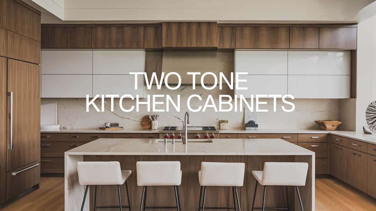
Two-tone kitchen cabinets are a style that is growing in popularity. They can increase visual interest in a space and let you bring your own unique personality to your design. Using two different-colored cabinets can be effective in many different kitchen designs, from traditional to modern. This design trend often works well when one color cabinet is the primary color or focal point and the other is used as an accent color. However, for bolder kitchen designs, one can opt for splitting two-tone cabinets equally with great results.
During the process of designing and selecting finishes, one might encounter a dilemma of not being able to choose between finishes and colors. Do you go for a classic white kitchen? How about a gunmetal gray for a more contemporary look? Or use a wood laminate finish to give it a more homey appeal? Or better yet, why not combine two of your favorite finishes? For those who are always torn between choices, you might not have to stress yourself out in choosing when you can simply do both.

Upload a photo and get instant before-and-after room designs.
No design experience needed — join 2.39 million+ happy users.
👉 Try the AI design tool now
The idea of two-tone kitchen cabinets is not new, but it does solve our typical design dilemma. Two-tone kitchen cabinets often refer to kitchens that have two different finishes, usually between the base cabinet and the overheads. It’s a simple design solution that makes the design more fun, dynamic and gives it a bit more contrast and balance. The advantage of going for a two-tone is that your kitchen will surely never look monotonous or boring, and it is also able to effortlessly achieve balance and appeal.
Two Tone Kitchen Cabinet Designs
There are so many cabinet and finish colors available in the market, and selecting from such a variety could be daunting. Here are some tips you can use when selecting your cabinet finishes:
Use a primary color and an accent color for your cabinets – An example of using an accent color as the second tone could be seen in having a primary kitchen cabinet color with the kitchen island in another. See more examples of contrasting kitchen islands here.
Determine floor/wall/ceiling finish of kitchen – refer to your base colors when selecting you cabinetry finish. It would be hand to put the laminate/veneer/wood samples right beside the final wall and floor color in order to visualize how they would look together. You can easily get laminate and veneer swatches from the market, so grab your options and place it beside the actual wall/floor/ceiling colors to see how they would look together.
Play with contrasts – light & dark, smooth & textured, plain & patterned, shiny & matte… There so many contrasting combos you can play around with!
Use white as a bridge between color combinations – A good rule of thumb in design for visual balance is the 60-30-10 rule. This means using 60 percent for the primary color, 30 percent as the secondary color and 10 percent for an accent color. Using white as the third choice can be an effective way to bring harmony & balance to the design.
Consider countertop color when selecting cabinet finishes – For more ideas about coordinating cabinets with countertops check out our kitchen cabinet styles page.
Consider zoning – if using a different finish for the base and overhead doesn’t work for you, you can try to separate the finishes into zones. Example: place your plain color on the main wall cabinets, then use wood for the kitchen island.
Use a color wheel – It’s a safe bet to use a color wheel and choose two complementary, adjacent, or analogous colors that work together well.
Consider darker cabinets on the bottom and lighter on the top – This can have the advantage of helping your kitchen space look larger with lighter color on top, and grounding the space with the dark color on the bottom.
In this post, there are some excellent examples of two tone kitchens you can take inspiration from:
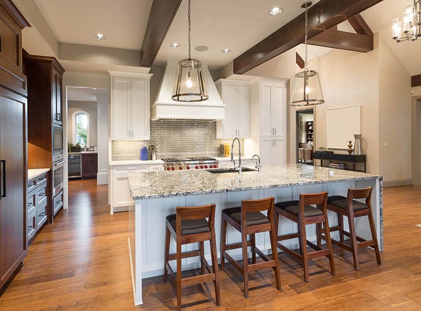
Mahogany kitchen cabinets lines the wall on the left side of the kitchen while the main kitchen is in white, emphasizing the difference in function of the two areas. The Mahogany bar stools also helps tie up the two finishes together.
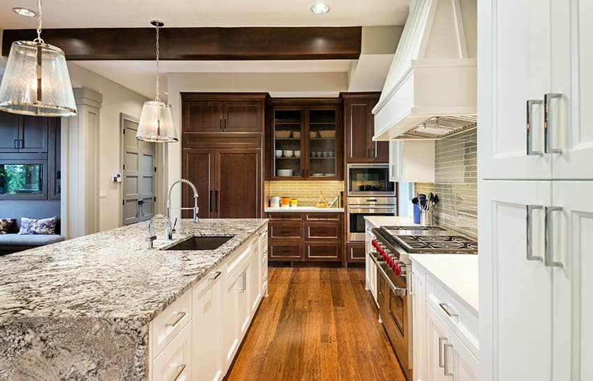
You can also observe that the Mahogany cabinets matches the color of the ceiling beams to make a cohesive color scheme. The main kitchen counters and the Mahogany counters also use the same materials for the backsplash and the countertop to emphasize that both are part of the kitchen.
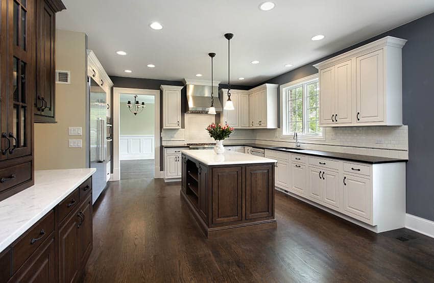
The contrast of dark walnut and white looks very appealing. This particular example has one side of the kitchen with white cabinets and black counters while the other side shows the opposite combo of dark walnut and white marble counters.
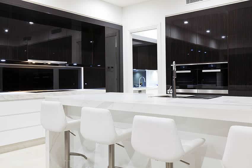
This modern minimalist kitchen combines black laminates & backpainted glass with white glossy laminates to create a bold contrast to the very simple kitchen design.
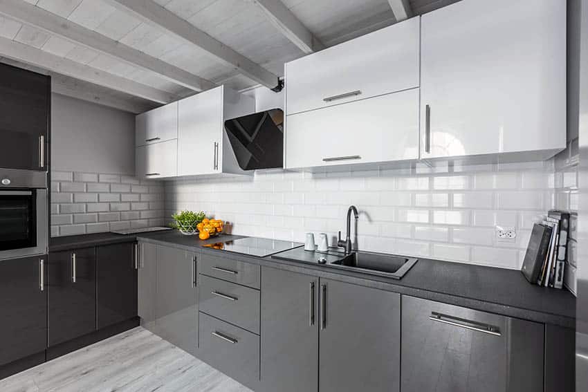
Achromatic color schemes look great with contemporary kitchens like this example. Aside from the black base & white overhead combination, the contrast between the the matte countertop and the glossy backsplash gives the design more depth.
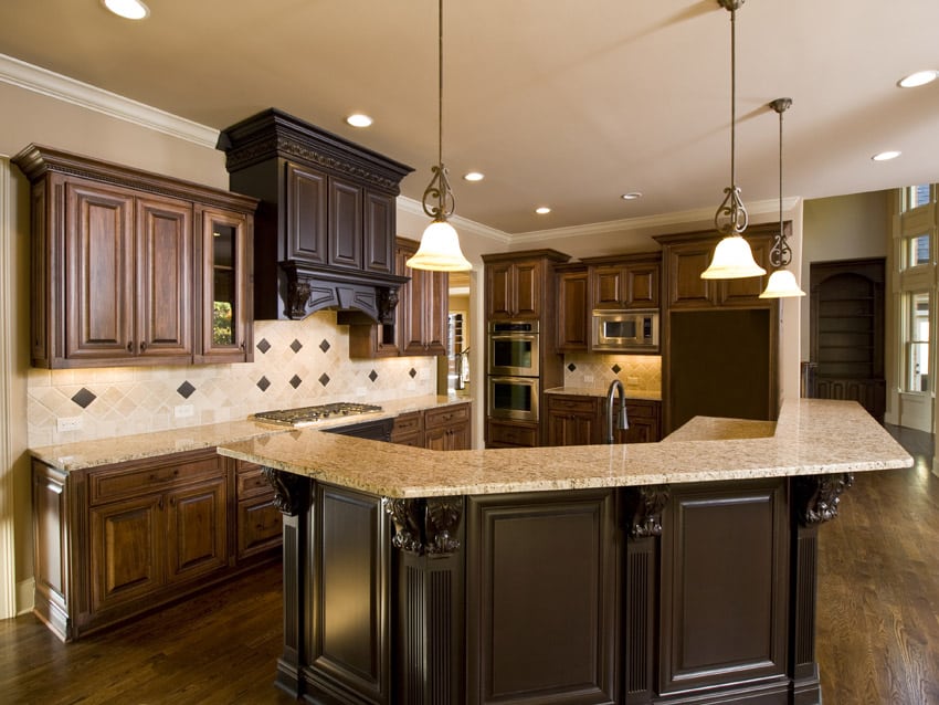
The previous examples showcased bold contrasting colors/finishes of two tone kitchens, but this example has a more subtle variation of finish, using golden walnut and wengue, creating a seemingly single tone kitchen finish.
Two Tone Cabinet Doors
Here we share a variety of kitchen designs with emphasis on two tone cabinet doors. This can often be achieved by using a distressing process, installing dramatic hardware or painting the recessed portions to emphasize the three dimensional look of the cabinet.
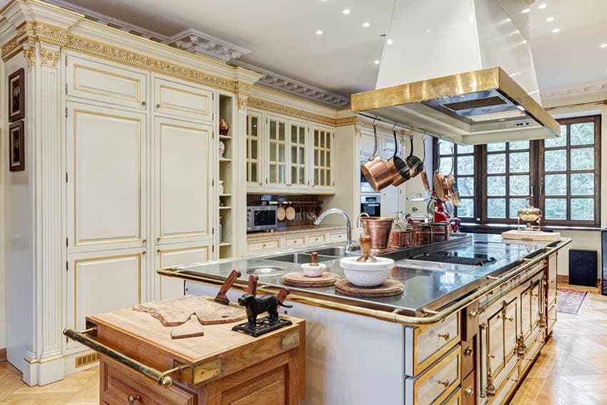
Aside from sectioning parts/areas of the kitchen with 2 different colors, another technique to create a two tone kitchen is by using it as an accent color. This Classic Corinthian inspired kitchen applies the second color on the trims & carving details. The gold paint against white gives it a really elegant & classic look, and it also further emphasizes the details put into the cabinetry.
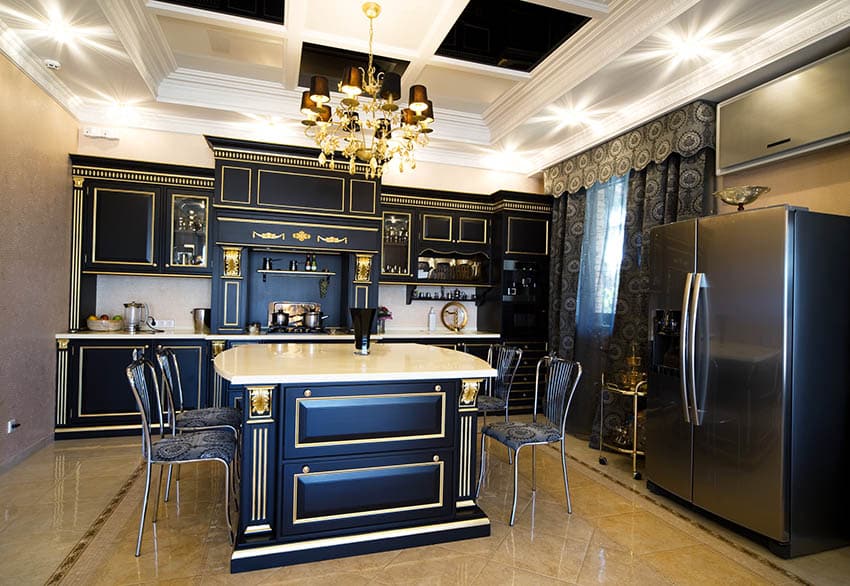
If you’re feeling bold and adventurous, paint over your classic style kitchen cabinets with black and create faux gilding by painting their trims and carvings with gold. The result is a very strong and unique look that would easily become a conversation piece in your home.
To showcase highly specific designs, some images on this website use advanced AI-generation software to illustrate ideas and room inspiration. See our editorial policy to learn more.

