Why One Wall Kitchen Designs Are Effective Layouts
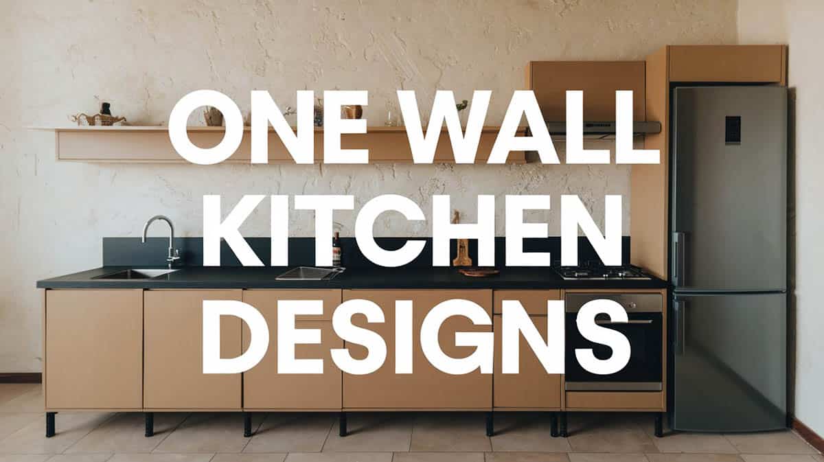
I often see one-wall kitchen designs in smaller homes, apartments, and lofts. Most of my designs for one-wall or single-line kitchens keep all the cabinets and appliances against one wall of the home to save space. This design can actually be very efficient due to the countertops’ proximity to appliances and the sink. In a common setup, I have the sink positioned between the refrigerator and the range, creating an effective zone for cleanup. The style is so popular that many new construction homes with open floor plans use one wall kitchen designs with an island for additional counter space.
One Wall Kitchen Layout
What is a one wall kitchen layout? Traditionally, kitchens follow the classic layout which conforms to the “work triangle” concept. To ensure the efficiency of a kitchen layout, the primary tasks which are carried out between the refrigerator, the sink and the range must be “connected” by a non intersecting imaginary three point line.

Upload a photo and get instant before-and-after room designs.
No design experience needed — join 2.39 million+ happy users.
👉 Try the AI design tool now
A three point line or kitchen work triangle enables the user to move between the major areas with minimal traffic and maximum efficiency. However, an even more basic approach is devised through the one wall kitchen layout, wherein all primary work zones are in a singular line set up, placed next to each other.
By definition a one wall kitchen layout is composed of a singular kitchen unit that is set up in one wall, covering all the basic needs in the kitchen. In this design, all the major components of the kitchen, namely the cooking area (range), the food preparation (sink) area and the storage area (refrigerator) are arrayed in one area.

The arrangement of the work zones are also interchangeable, but usually this follows a “refrigerator – sink – range” order. The reason as to why the sink is usually found in between is because it provides a convenient location for cleanup. This design also offers adequate counter space on both sides of the stove to make sure that accidents are avoided.
To make the most of a one wall kitchen layout, proper planning must be observed. The key to maximizing a one wall kitchen layout is to choose the right sizes of appliances to fit in the unit. Compact appliances such as a 24 inch refrigerator or a 24 inch range are perfect for this type of layout since it provides the users enough counter space for food preparation. Also, the one wall kitchen layout can be optimized through the use of an additional island.
Benefits of a Single Wall Kitchen
With its compact size as its main advantage, there are so many other reasons to go with a one wall kitchen. Here are some other benefits of a one wall kitchen layout design:
Compact size – One wall kitchen layouts are best known for their compact size, thus they are often dubbed as the “ultimate space saver” in the kitchen design scene. Also, the well integrated layout of a one wall kitchen makes it the top alternative for large kitchens and the first choice for houses with limited spaces.
Saves space – Since all the essentials are found in a single wall, a one wall kitchen layout makes room for other furniture pieces in your home. This is highly appropriate for homeowners who want to save space in the kitchen in order to accommodate a dining table with more seating area.
Also a one wall kitchen layout makes any home appear bigger and broader as the need for bulky kitchen units are eliminated. This type of kitchen layout is not only suited for small areas like apartments but for large houses with open floor plans as well. In some cases, a one wall kitchen layout also functions as an efficient secondary kitchen for large homes.
Cost effective – In terms of construction, a one wall kitchen layout reduces materials and labor costs significantly. Less budget is needed to manufacture this type of kitchen layout because it only makes use of one single bank of cabinets.
It is cheaper as compared to a U shaped kitchen, an L shaped kitchen or a galley kitchen because it requires less materials. Since there is less counter space needed, lower costs are incurred in completing the project as countertops usually take up a large amount of the overall budget. It is also the perfect investment because it gives you more than what you pay for, while catering to your needs.
Efficiency of work flow – A one wall kitchen layout also keeps your work flow running smoothly as the work zones are found next to each other. Since everything is closer together and the refrigerator, sink and range are side by side each other, a single work line is maintained, requiring less time and effort to accomplish tasks within the kitchen.
Also, it is easier to to cook because everything you need is within an arm’s reach. No need to walk around just to get your ingredients and to use your appliances. Smaller distances between the work zones equate to better functionality in the kitchen .
Easy to install – This type of kitchen layout requires less effort to build as the need to join and connect counters are eliminated. Although depending on the design, generally, there is less cutting when it comes to countertop material, less cabinets to assemble and less installation.
Plumbing and appliances are also banked in a single compact area. The one wall kitchen layout is also perfect for homeowners who want to try their hand at installing their own kitchen unit as it considered to be the easiest cooking space layout design to “DIY”.
Requires less maintenance – Less counter space means less area to clean. One wall kitchen layouts are easier to maintain compared to other layouts such as the U shaped kitchen, the L shaped kitchen or the galley kitchen.
This does not only pertain to everyday clean up, but to periodic maintenance for special finishes as well. In the event of a home improvement, there is less countertop to seal and fewer cabinets to repaint, consequently resulting in a substantial amount of savings too.
Maximizes small stations – The one wall kitchen layout is perfect for homeowners with limited living spaces. This type of layout is commonly found in homes where space is priced at a premium, like studios, pads, lofts, apartments and condominiums. A one-wall design utilizes small spaces effectively and provides all the basic things you need to perform tasks without taking up much space.
Can fit in narrow spaces – One wall kitchens are highly suited for houses with narrow areas and elongated spaces. This type is also prevalent in Southern style narrow houses.
Can be incorporated seamlessly into a the home – A one wall layout is easy to camouflage in the existing design of a house because of its size. If your house follows a seamless minimalist look, then this may be the right kitchen layout for you as it works well in producing smooth transitions.
Also, if you want to direct focus to other visual components in your house, a one wall design that matches the colors of the walls can help you do the trick. It doesn’t interfere much with other design elements unlike grand kitchen layouts. It can be easily designed into a sculptural piece that works as a stunningly unique art in the home, rather than looking like a fully functioning kitchen.
Perfect for contemporary and modern styles – If the prevailing style of your house is modern this design is perfect because it blends well with a contemporary setting. It has a “less is more” kind of approach when it come to culinary space design, conforming to minimalist aesthetics and compact setup.
Aesthetics – Just like other kitchen layouts, these designs are equally stunning. Its sleek look and chic flair adds an attractive visual component to any home.
Contributes a sense of openness to homes – Since the style offers maximum floor area, it gives houses an airy feel, a more breathable atmosphere and a greater sense of space. A house appears bigger and looks more welcoming and open.
Provides perfect opportunity to build smart storage solutions – It’s the perfect venue to take advantage of clever storage systems such as overhead cabinets and open shelves. To ensure adequate storage space for a single-line floor plan, add as many cabinets as possible.
Perfect for homeowners who have a busy lifestyle – If you are the type who is busy with work and barely has the time to cook meals in the kitchen, then this design is the perfect layout for you. This type of cooking space provides all the basic services needed by infrequent users, without having to compromise the living space. Of course, just because you don’t use the kitchen that often, doesn’t mean you don’t need one in your home.
Disadvantages of a Single Wall Kitchen Layout
There are still a number of drawbacks to a one-wall kitchen layout, although its positive features outweigh the negative ones. One primary concern to having this kitchen layout for your home is its size can be limiting. Compared to other types of kitchen layouts, this has less space for storage and has minimal counter space. This might be a major concern for homeowners who spend most of their time in the kitchen.
Another downside is that it does not allow multiple users in the kitchen at the same time. It is difficult for multiple cooks to work together at the same time because of its smaller space. At the most a one wall kitchen can accommodate 1 to 2 persons, unlike a U shaped or L shaped kitchen layout which can take in more simultaneous users. This type of layout is specifically designed for single users as it allows them to move comfortably, getting access to everything within their arm’s reach.
Also, a single-wall kitchen layout can sometimes affect the resale value of your home. Some potential buyers favor a grand and lavish space more compared to a minimal kitchen. Nowadays, homebuyers place a high value on kitchens and sometimes a one wall kitchen just doesn’t meet their demands.
Tips to Effectively Optimize a One-Wall Layout Kitchen
Here are some practical tips you can apply to make the most out of your one-wall kitchen:
Incorporate open shelves in your design – Open shelving saves space and makes space appear more breathable and spacious. This is the perfect type of storage for a compact one wall cooking area because it doesn’t feel too cramped.
Utilize multipurpose furniture – Multipurpose furniture is a smart solution that can enhance the functionality. A simple drop down table can double as a casual dining area, a working counter or a food preparation area.
Add a preparation island – If the space permits, the addition of an island can help you maximize the potential of your work surface. Whether the island is movable or built in, this smart design feature is guaranteed to provide more counter space that can serve multiple uses.
Ensure efficient use by following the right formation of cooking work zones – As mentioned above in this article, the arrangement of the work zones in a one-wall cooking area are interchangeable, however there is a prescribed formation that is proven to increase ease in terms of use. All work zones must be laid in the particular order of the “refrigerator-sink and range”.
Never place “hot” and “cold” areas next to each other – this pertains to the stove/cooktop and the refrigerator. The main reason for such is the possibility of a heat transfer as the refrigerator needs ample clearance in order to dissipate heat. From the standpoint of day to day use, placing the sink in between the refrigerator and the range makes it easier to clean up.
Kitchen Layout with One-Wall Design and an Island

As in any type of layout, the addition of an island allows you to get the fullest potential out of your kitchen. An island, whether built in or movable, boosts the functionality of kitchens by providing an extra space for multiple purposes – from food preparation, storage, entertainment, dining to specialized tasks.
An island is a freestanding working counter that is separate from the existing layout of the kitchen. It may built as the same height as the existing counters or at a bar counter height. Typically, an island is 36 inches to 90 inches in height depending on its use, while its general dimensions vary depending on the size and area of the kitchen.
Though the primary reason for adding an island is functionality, homeowners opt for it because it contributes visual aesthetics to a home. Serving as a focal point in design or a complementary decorative element to an existing counter, an island is guaranteed to beautify your space in so many ways.
Aside from enhancing the aesthetics of your home, an island is guaranteed to improve the working conditions in your kitchen. A one-wall design is more efficient when paired with an island because it allows you to apply the work triangle concept.
By setting up the sink at the center of the island and placing the refrigerator and range on a one-wall counter, an imaginary triangle is formed, permitting ease in accomplishing food preparation tasks in an orderly fashion. It also directs traffic without having to worry about people coming in the way of others.
Another advantage of a straight line style with an island is that it allows for additional users in the space. Unlike in the basic one-wall layout which only caters to a single person, tasks can now be shared because multiple users can be accommodated simultaneously. You can prepare meals while your guests sit in the island counter or you can invite your family members to bond with you while cooking.
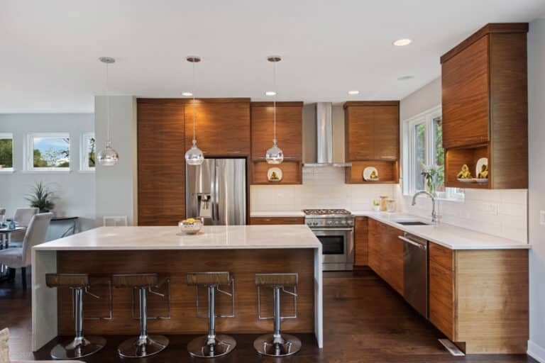
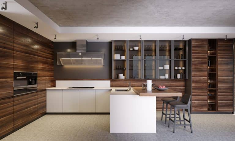
The one-wall cooking area with an island can be designed in a variety of ways. Depending on the use, the island can be furnished with different finishes such as natural stone, stainless steel or wood. If the island is intended to be used for casual dining and for entertaining guests, it can be finished at a bar counter height and set up with some bar stools.
To ensure adequate storage space, an island may be incorporated with some under-counter cabinetry. Adding a sink at its center gives the user an extra working space for cleaning up. While if to be utilized for specialized tasks like baking or bartending, the prep island may be set up with a wooden countertop for kneading. A small rolling table which easily tucks under the island can also be pulled out for different uses. There is no limit as to how this design feature will be used, that’s why it is considered to be a smart addition to a one wall kitchen design.
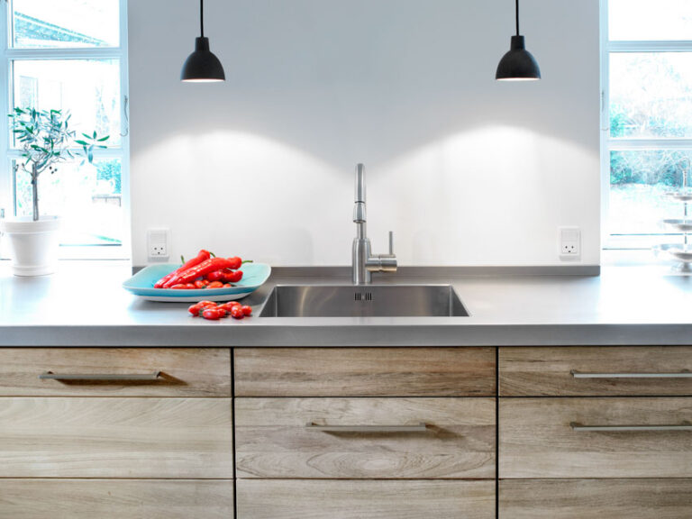
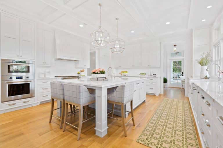
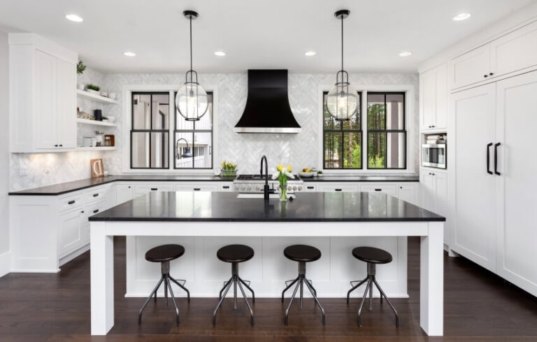
Related Kitchen Island Design Galleries You May Like:


Great pictures! Very helpful in visualizing what I want for my new kitchen to look like.
Thank you! These wonderful pics and helpful insights really helped me on deciding if a ‘one wall’ kitchen was right for me.