Designing Kitchen Islands with Columns
One of my many challenges as a designer is getting around structural supports. Sometimes, columns and beams are placed in such awkward places that it makes it a bit difficult to work around them, creating blockages in traffic or a huge, unesthetic obstruction. Columns and beams are structural supports that I can’t remove without ruining the building’s structural integrity. The best I can do is reinforce the support so that I can remove one, or you can just try to design your way around it (which is the safest option).
Depending on its position, there are many ways to work around an awkwardly placed column. Since kitchens are often placed along the corners or edges of the house, they are usually the space with support columns. A good designer can maximize the space despite the presence of a column. They can conceal it through various built-in storage or make it part of the design.

Upload a photo and get instant before-and-after room designs.
No design experience needed — join 2.39 million+ happy users.
👉 Try the AI design tool now
Often, a homeowner will want to remodel a closed-in galley culinary space and create an open-plan layout. Support beams can give a room structural support without the need to run an expensive beam across the space, potentially saving thousands of dollars in engineering and construction fees in the process.
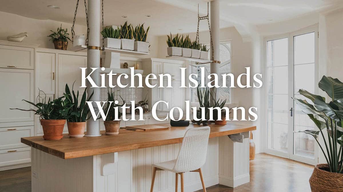
The example above shows a custom kitchen island with a column in the middle going up to the ceiling. To give a sense of symmetry, the column was at the center of the countertop’s depth. The island carcass was then built around this plain white column, which also adds a little bit of support.
Kitchen Island With Columns to the Ceiling
Another way to “hide” your columns is to match it with the culinary space or wall style so that it would look like it’s part of the design and not a structural element. You can do this by using paneling, or even simple paint finishes that matches the walls, cabinets or countertops , which would help blend it into the design of your kitchen. You can find kitchen design software to help lay out your ideas based on the size of your floor plan and the materials, finishes, and cabinetry you want.
Interior Designer Tips for Incorporating Columns Into Kitchen Islands
Treat the column as the island’s anchor point. Center your prep sink, range top, or butcher‑block chopping zone on the same axis as the post so it feels intentional rather than intrusive.
Create a built‑in banquette wrap. Box out the column with a three‑sided bench and a café‑height table; it turns a structural necessity into a cozy breakfast nook.
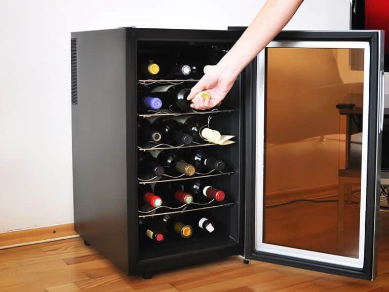
Add shallow display shelving. A 4″ to 6″ deep bookcase or wine rack built around the shaft makes use of otherwise dead space while visually slimming the column.
Echo the column’s footprint in the countertop shape. A soft radius or clipped corner on the worktop where it meets the post feels bespoke and eliminates sharp edges in tight clearances.
Run power and USB outlets through the cladding. If possible, the conduit may be concealed inside the boxed‑out column, providing discreet charging and small‑appliance plugs right at the island.
Use paneling or pilaster details to unify styles. Fluted MDF, shiplap, or applied molding ties the column to cabinet end panels and disguises any odd change in depth.
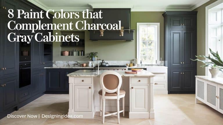
Employ contrasting finishes for a deliberate statement. Painting the column a rich charcoal or wrapping it in white oak veneer lets it read as a design element rather than a compromise.
Incorporate open legroom on one side. By cantilevering the countertop 12–15 inches beyond the boxed column, you gain bar seating without crowding traffic lanes.
Hide task lighting in a column‑hugging soffit. A slim drywall or wood “collar” around the top of the post can house LED strips that wash light down onto the work surface.
Add curved corbels or brackets for traditional kitchens. These not only reinforce the extended counter but also visually transition the eye from column to benchtop.
Mirror the column’s material elsewhere. Repeat the same wood species on floating shelves or use the same stone from your island waterfall edge on the fireplace surround for cohesion in open‑plan spaces.
Plan a dual‑function partition. If the column sits near a family room, integrate a low bookcase or media cabinet on the living room side while keeping a functional cabinet door on the kitchen side.
Recess some toe‑kick lighting around the post. A soft LED glow highlights the island footprint at night and makes the column feel lighter and more sculptural.
Consult a structural engineer before trimming. Occasionally, you can notch or slightly offset a non‑load‑bearing wrap, but always confirm load paths and shear resistance to avoid compromising safety.
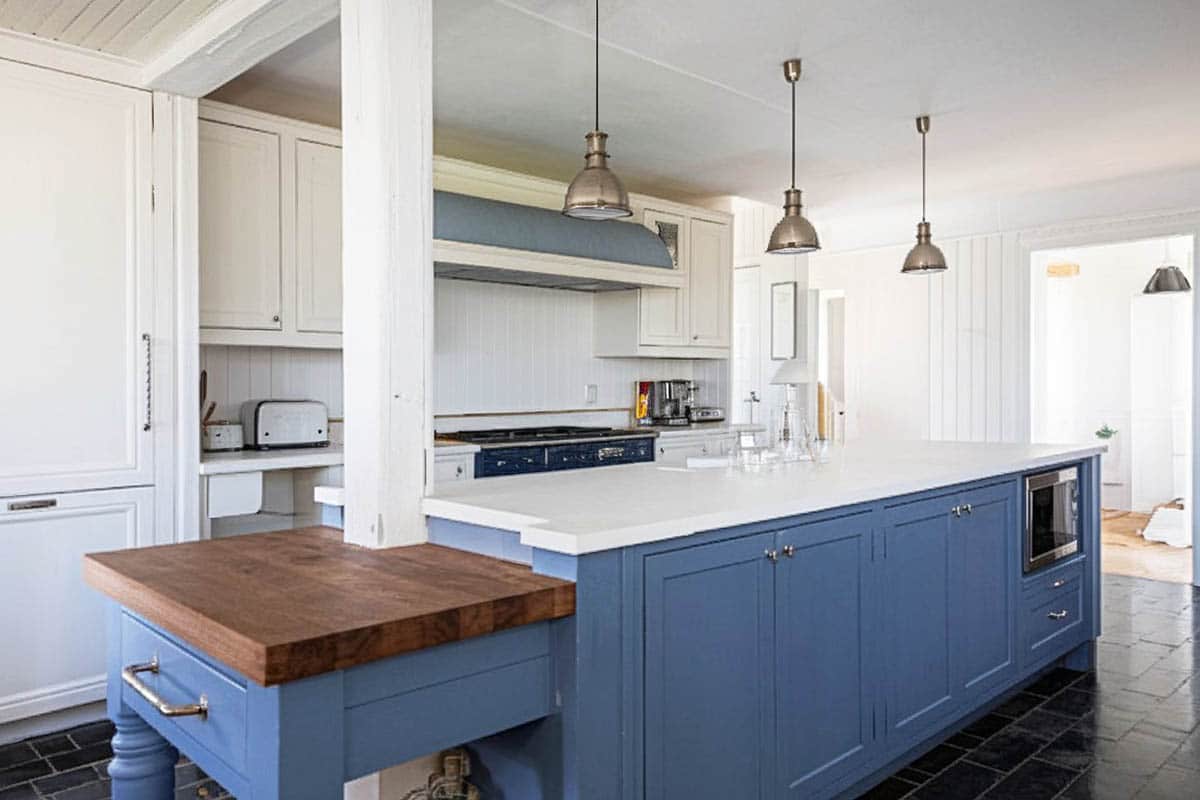
Because this kitchen space has a classic country-style design with detailed cabinet paneling, the column at the end of the island was also clad in white paneling to match the cabinets used to conceal the pantry storage & fridge. The result is that the column looks more like an archway placed there on purpose instead of an awkwardly-located column.

