What Are The Green Color Options For Kitchen Cabinets?

Kitchens are one of the spaces that are designed with longevity in mind. This is why they are often finished in very safe, basic colors and durable materials. The usual colors in this area are white, beige, gray, and various natural shades of wood. Very few are bold enough to defy the safety colors. Still, the few who do would be pleasantly surprised to find that there are colors you can use that would remain subtle and timeless in appeal, yet give this space a more unique personality.
Green, especially shades which are softer like sage, can give any space a very lively appeal while remaining very versatile and easy to decorate and update. Depending on your shade, these storage solutions can create many interesting looks in any interior design. The cool tone of this color gives a refreshing yet calm atmosphere, which is great for both big and small spaces. It instantly gives your space a unique look, and is surprisingly easy to pull off!

Upload a photo and get instant before-and-after room designs.
No design experience needed — join 2.39 million+ happy users.
👉 Try the AI design tool now
Green Painted Kitchen Cabinets
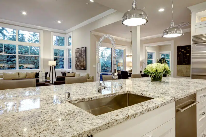
Below we share the most popular paint colors to consider. To experiment with this color and help find the shade you want there are many types of cabinet design software for this area in your house available. These programs will allow you to apply different shades of this color to cabinetry to visualize how it will look before you actually apply any paint.
It is no secret that this color complements yellow well. These antique-painted fixtures are definitely the perfect match for this space, as they use gold fixtures and a gorgeous yellow wood marble countertop. The combination of the natural edge of the countertop, the rustic look of the kitchen cabinets and the vintage features create an eccentric yet cohesive look. Paint can be distressed to give your space a more rustic and traditional feel. Distressing is commonly used for remodeling as a way to repurpose old storage without having to do a full costly replacement.
Designer Tips for Styling Green Cabinets
Choose the undertone first, then the shade. First, figure out whether you want a warm (yellow‑based) or cool (blue‑based) green before you even look at paint chips. A warm olive or moss feels cozy and pairs beautifully with brass; a cool sage or eucalyptus reads crisp and complements stainless steel.
Sample in at least two lighting conditions. Paint a foam‑core board and move it around the kitchen in both natural daylight and under task lighting. Greens can shift dramatically—olive may become khaki under LEDs, while mint can look almost gray on cloudy days.
Balance bold cabinetry with a quiet backdrop. If you select a saturated emerald, keep the surrounding walls, ceiling, and trim soft (think warm white or putty) so the room doesn’t feel visually busy. Conversely, pale sage cabinets can handle a textured backsplash or patterned cement tile.
Let hardware act as jewelry. Brushed brass warms up cool greens and reinforces a vintage vibe. Matte black adds graphic punch to mid‑tone olives. Brushed nickel or stainless steel feels go seamlessly with sea‑glass and eucalyptus tones.
Mix finishes for depth. Use a satin sheen on perimeter cabinets and a hand‑rubbed wax finish on the island. The subtle contrast turns a single‑color kitchen into a layered, bespoke space with depth.
Ground tall banks of cabinetry with natural material. A white oak plinth, butcher‑block worktop, or rift‑cut oak open shelf breaks up an expanse of green doors and adds organic warmth.
Introduce complementary accents in small doses. Terracotta planters, cognac leather stools, or a single art piece with blush undertones enliven green cabinetry without competing for attention.
Play with two tones of green. Pair a deeper hunter green on lower cabinets with a lighter sage on uppers for subtle visual hierarchy—especially effective in kitchens with limited natural light.
Confirm colorfastness with your countertop. Natural stones such as Calacatta marble pick up pale green veining that can clash with a cooler cabinet color. If in doubt, lean into engineered quartz with neutral or warm undertones.
Layer task and ambient lighting. Undercabinet LEDs (2700 to 3000 K) will prevent green paint from looking flat, while a statement pendant in aged brass or frosted glass over the island brings softness to the scheme.
Use glazing or lime‑washing for subtle age. For some extra character use a transparent glaze in taupe or gray settles into door profiles and softens bright greens, lending instant patina perfect for farmhouse or English cottage styles.
Don’t overlook the ceiling. Painting a tongue‑and‑groove ceiling a lighter tint of your cabinet color can make compact kitchens feel cohesive and taller. Keep it two tones lighter than the cabinetry for best results.
Protect bold greens with a durable topcoat. Kitchens are high‑traffic zones, for a long-lasting finish for your deep greens, go with a polyurethane or conversion‑varnish clear coat to prevent chipping and chalking.
Sage Green Kitchen Cabinets
Sage is light, cool and has a soft youthful vibe, making it a popular choice for those who want to use this color. It is lighter than many other options, so it’s very easy on the eyes and easy to match with other existing materials and finishes as well. Sage cabinets also have a very refreshing appeal, making any space look more youthful and fun.

This shade adds another interesting layer of element to any rustic-style space. Because rustic interiors use a lot of natural wood, warm tones and natural textures, the softness and neutrality of this color only helps accentuate the natural finishes used in this open concept area and dining space.
Cabinets above are in sage, and it definitely goes well with the white subway tiles on the backsplash and the white quartz countertops used. The result is a fun, yet clean design that has both a vintage and youthful appeal. Spaces with lots of stainless steel materials and details would also look good with this color. Using this shade instantly makes the space look more vibrant, bringing color despite the dullness of the stainless steel appliances.
Dark Green Kitchen Cabinets

Those who prefer a more calm and elegant look, adding a darker shade with a gray undertone will definitely serve you that modern yet subdued elegance. It shows how the darker shade of the color was able to produce a Revival-esque elegance with a modern silhouette. Both contemporary and transitional style spaces would benefit from the serene ambiance of light finishes. When applied here, a subdued lighter shade helps brighten up even small spaces and gives them a more youthful look.
Seafoam Green Cabinets

The popular shade for Coastal Style areas would be seafoam. This shade is a nice in-between of sky blue and mint, helping exude a very cool, tranquil and laid-back coastal vibe.
To showcase highly specific designs, some images on this website use advanced AI-generation software to illustrate ideas and room inspiration. See our editorial policy to learn more.