How to Choose Colonial House Colors For A Timeless Curb Appeal
Choosing the perfect colors for your Colonial home can seem daunting at first. You want to pick shades that speak to your personal taste but also honor the rich architectural history of these classic American dwellings. As the proud owner of one of these timeless homes, whether a stately Georgian manor or cozy Cape Cod, you have the opportunity to enhance your home’s beauty and preserve its heritage for generations through thoughtful color selection.
(Images generated using AI to showcase potential design ideas.)Popular Colonial House Paint Combinations
When it comes to choosing paint colors for your Colonial-style home, you can feel confident going with tried-and-true color combinations that have stood the test of time. Let’s explore some classic schemes as well as popular regional pairings.

Upload a photo and get instant before-and-after room designs.
No design experience needed — join 2.39 million+ happy users.
👉 Try the AI design tool now
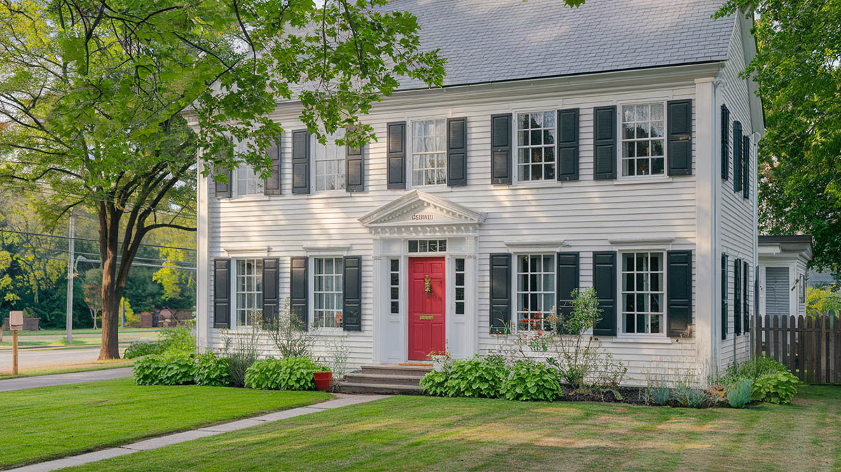
Classic White with Black Shutters
The quintessential Colonial look is the Classic White House. Think a pure bright white for the siding paired with crisp, bright white trim. The contrast of deep charcoal or black window shutters and front door against the white background creates a timeless, elegant look. This combo works well for all Colonial architectural styles, but it’s especially well-suited for Georgians and Federals.
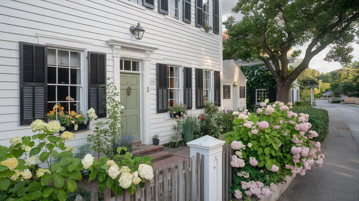
You can play around with this classic white house palette too. Try a soft white with an off-white trim or go for a warm white exterior with navy blue shutters. Pay attention to the undertones of the whites you select so they flow visually. An ivory white with dark green shutters is another great variation on this most classic of schemes.
Cream and Forest Green
For a warm traditional look, a creamy butter or light custard shade is an ideal neutral body color for a Dutch Colonial, Cape Cod, or similar colonial-inspired property. Complementing this warm foundation, crisp bright white or ivory trim pops against the neutral backdrop. Finally, a rich forest green hue on the shutters, front door, or other accents grounds the look with a classic sensibility. The cream walls produce a welcoming envelope of light around the home’s interior, while the green accents link it aesthetically to the natural surroundings. This combo works well for traditional decor styles.
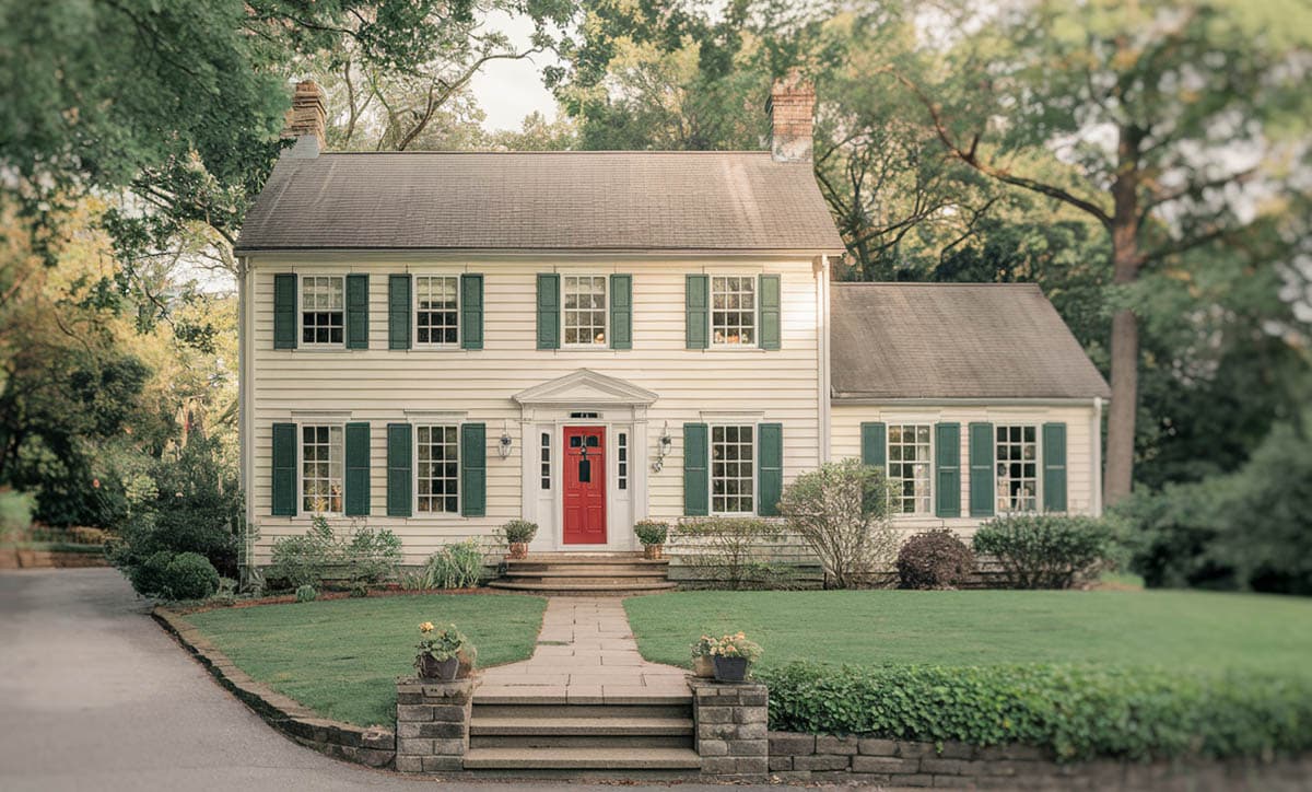
Popular variations on the cream and forest green theme incorporate analogous tones. Think pale sunlight yellow coupled with a deep hunter green for increased drama. Or try a pale gold body color with rich dark sage green trim and slate olive shutters. Other options include using a butter cream base with olive green accents.
Gray with White Trim
This sophisticated neutral palette allows the clean lines of the colonial architecture to truly shine while still feeling fresh and modern. The gray provides a cozy, approachable backdrop that complements virtually any setting from urban neighborhoods to rural landscapes. The white trim pops brightly against the gray background, accentuating charming details like shutters, gables, and corner boards. Black, navy or dark gray doors and shutters anchor the light colors while adding a dose of bold contrast.
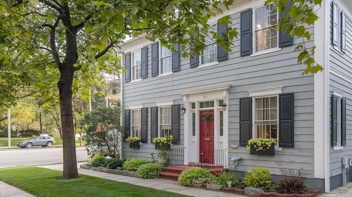
To give this classic color scheme a contemporary twist, try pairing a warm dove gray with cool crisp whites or go for an intense charcoal gray with creamy off-whites. Blue-grays work wonderfully with both bright and soft white trims.
Yellow with White and Black
It’s hard to go wrong with the tried and true combination of lively yellow paired with crisp white trim and solid black or deep forest green shutters and doors. This sunny scheme exudes cheerful optimism while still feeling grounded and dignified.
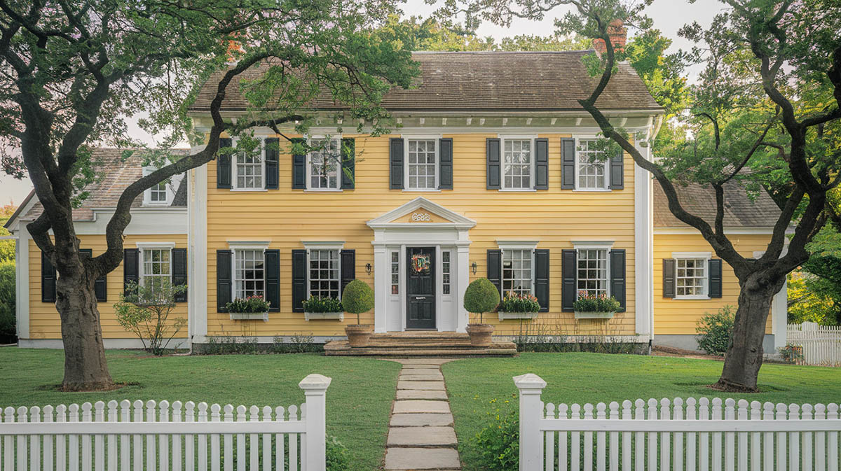
A pale yellow, sometimes called “Colonial yellow,” gives off a warm golden glow befitting historic homes of the 18th century. Set against bright white window sashes and corner boards, this buttery yellow hue hearkens back to the original shades that once graced stately Colonials across the South and Mid-Atlantic regions. The timeless black or hunter green accents punctuate the façade with a classic contrast that draws the eye to special architectural details.
Understanding The Colonial Home Color Palette
The first step is getting back to Colonial color basics. Colonial homes hold an important place in America’s architectural tradition with their simple yet refined beauty. Their classic color schemes have stood the test of time, balancing elegance and simplicity.
Whites and Off-whites
The foundation of the Colonial home color scheme lies in whites and off-whites which allow the home’s architectural details to shine.
Pure White – A pure, bright white is the most classic choice, representing cleanliness, light, and prosperity.
Soft White – For a slightly warmer white, there’s the soft white with its barely-there yellow undertones.
Antique Whites – With their subtle yellow hues this option evoke a historic, traditional feel.
Oyster White – Consider an oyster white with gray undertones for a more sophisticated mood.
Historical Neutrals
Beyond whites, historical neutrals make up the broader Colonial color family.
Light Gray – Light grays nicely complement urban settings and homes in northern regions.
Pale Yellow – This tone gives a nod to Southern Colonial styles.
Beige – These shades are always a practical choice as they hide dirt well and project a down-to-earth charm.
Warm Tan – Warm, earthy tans are especially well-suited for red brick Colonial homes, playing up the ruddy texture of the masonry.
Trim Colors
Let’s focus on two key trim elements – the window frames and cornices, as well as the columns and pillars on your front porch.
Your window frames set the tone for your home’s whole color scheme. Typically you’ll want to paint them in a lighter shade than the siding to make them pop. White remains the most popular choice for a classic, timeless look. But if stark white feels too bold for your liking, try a warmer cream or soft ivory tone instead. Just make sure that whatever hue you land on, you use it consistently across all the trim like the window sills, casings and cornices so everything coordinates.
The columns and pillars holding up your front porch are other important trim pieces to consider. Like the windows, painting or staining these details in a light white or off-white is common. If you feel like getting fancy though, choosing a pillar color with a slightly different sheen than the other trim can add nice visual punch. Just remember it has to tie together cohesively with the look of your porch ceilings and floors. You want visitors to feel like everything flows as their eyes travel upwards.
When it comes to picking paint colors for a colonial-style home, the trim and accents present fun opportunities to highlight architectural details and create visual interest.
Bright White – Going with a bright white is a popular choice for adding crisp, beautiful definition against darker siding.
Ivory – An ivory tone can also look lovely as a softer alternative.
Dark Gray – Feeling bold? Consider a rich, dark gray to lend a sophisticated air to lighter home exteriors.
Black – A clean black trim can add drama to frame windows and doors.
Accent Colors
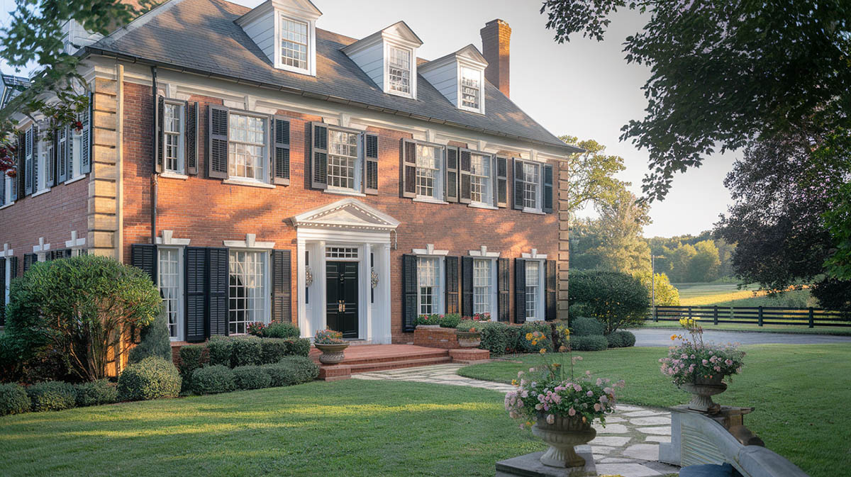
Beyond trim, carefully selected accent colors on items like shutters, the front door, or decorative posts can really make your home stand out. Traditionally, these eye-catching hues are bolder and brighter – reserved just for these special details rather than covering the entire house.
Shutters
Most designers recommend matching your shutters with the color of the front door. This creates a cohesive, welcoming look. Your shutters should also coordinate nicely with the roof color, rather than clashing.
Before making a final decision, step back and observe how the potential shutter color works with your existing landscaping. Do the vibrant reds of the azaleas match or fight with deep green options? Or does the cool gray siding need a shutter that packs visual interest?
Finally, test shutter color swatches against the main exterior house color. You want something that complements the overall aesthetic instead of blending in. The shutters will likely take up a bolder, brighter tone than the siding. A rich navy or tomato red, for example, allows your home’s architecture to really sing. Just be sure there’s enough contrast between shutter and body colors—you want them to stand out.
Doors
The entryways of colonial homes hold a special charm, often decked out in vivid whites that boldly outline door frames and catch the eye. Tracing the door’s rectangular form, the bright white pops against more muted siding and serves as a striking invitation inside.
Above, the porch ceiling calls for a lighter hue, like airy blue or white, to open up the space and reflect light. These pleasant tones nod to the transience of life outdoors, unlike the cozier rooms within. Underfoot, contrast comes by way of darker porch floors – forest greens, Cambridge grays or deep russets. Grounding shades prove practical for high traffic areas but need not detract from ornamental carvings adorning railings or spindles that showcase artistic detail.
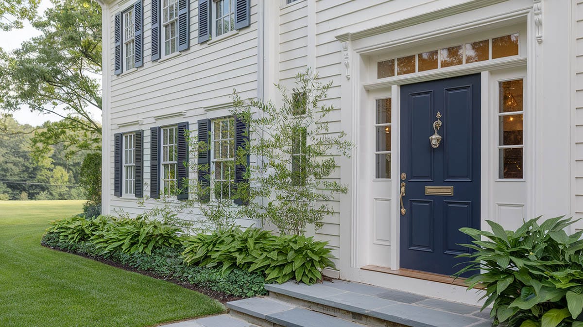
The front door serves as a home’s welcoming embrace so don’t be afraid to go bold as long as it fits with your overall theme.
Navy Blue – A welcoming navy blue door promises protection, good fortune and nautical spirit to coastal abodes.
Forest Green – This shade promotes natural serenity, growth and harmony.
Red – Homeowners seeking time-honored charm may prefer a deep, ox-blood red.
Burgundy Red – Bold and historical
Classic Black – For formal grandeur, classic black never fails to make a statement.
Aqua – An aqua blue door is also a great way to showcase your home’s unique personality. The choices are endless!
At the end of the day, the right trim and accent colors can highlight the best features of your colonial home.
Eaves And Fascia
When choosing a color for your home’s eaves and fascia boards, the most important design rule is to create a cohesive look with the other exterior details. These wooden architectural elements frame the roofline, so aim for a hue that complements the gutters and downspouts without matching them exactly.
Go for a color that adds some visual interest while remaining practical from a maintenance standpoint. Darker shades show dirt, so stay away from deep browns or blacks unless you don’t mind frequent touch-ups. On the other end, very light colors like white or cream fade faster under sunlight.
Overall, make sure your fascia color ties into the shade of your roof shingles or tiles. A similar tone, rather than an exact match, helps unify the exterior aesthetic.
The Three Color Rule
Choosing the perfect color scheme for a colonial style home is part art and part science. The key is to follow what designers call the “three color rule”. This simple guideline recommends splitting your palette into three tones that each serve specific purposes.
The main body color sets the overall tone. Go light and neutral here. Think tans, greys, whites – colors that let the details pop rather than fight for attention. With the body color taking up about 60% of the painted area, you want something versatile that works with various accents. Consider the natural light when picking a shade that won’t look too stark or gloomy.
Then you have your trim color at about 30%. This highlights architectural details like columns and railing by contrasting just slightly with the main scheme. Stay lighter than the body but pick something that complements both the neutral foundation and your bold accent tone. Lastly, choose an accent shade for 10% of the area. This adds visual interest to draw the eye to special features. Use strong, deep hues like black, navy or crimson since you need maximum impact in small doses.
The three color rule keeps it simple without limiting creativity. But feel free to tweak if historical accuracy calls for more colors or an elaborate Victorian has you itching to experiment.
Tips For Colonial Home Color Selection
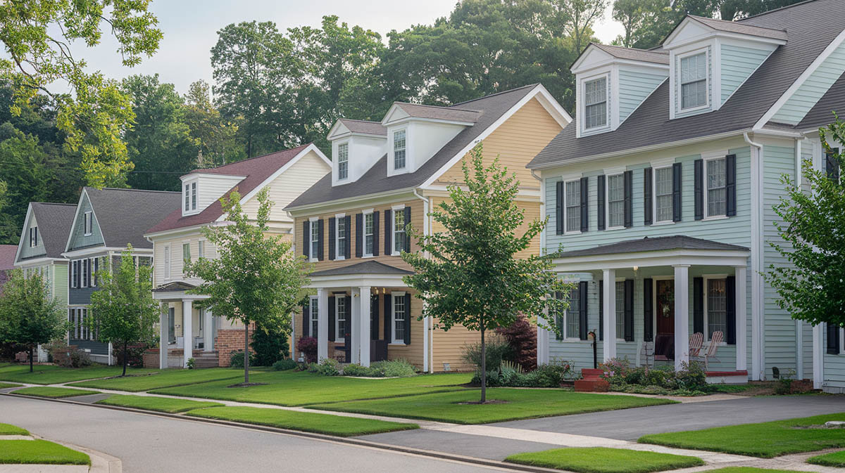
The key is to start by understanding what historical colors would have typically been used on homes in your region during the period yours was built. Do some research on American colonial architectural traditions – were lighter grays and tans more common in your area or rich deeper reds and greens? Take a walk around nearby neighborhoods with preserved colonial houses to scope out colors that work.
The specific colonial style of your house is a factor too. Classic Georgian colonials tend to pop with lighter, airy colors like creamy whites and soft yellows that embody their elegant, symmetrical style. On the other hand, the plainer early American look of Federal-style colonials can handle bolder crimson reds or deep forest greens without looking out of place. And the distinctive sloped rooflines of Dutch colonials seem right at home with warmer brown and orange tones drawn from the natural landscape.
When narrowing down your palette, also consider fixed elements that you can’t easily change like your roof color, any existing brick or stone details, and what colors your neighbors have picked. You want your new exterior to enhance, not clash with, these static visual features. The natural surroundings of your home, whether it’s nestled in woods or perched on a prairie, should provide inspiration too. Put together a shortlist of colonial-appropriate options tied aesthetically to your home’s unique look and landscape.
Practical Tips
- View your color samples from the street
- Consider the other Colonial home styles in the neighborhood
- Test colors at different times of day
- Factor in your landscaping colors
Choosing Main Body Colors
Let’s start with light colors. If you live in a warm climate, lighter tones like soft whites, grays, tans and pale yellows are smart choices that will reflect heat away from your home’s surface. In addition to keeping things cooler, lighter exteriors really showcase the architectural details of a Colonial design. Delicate trimwork, shutters and other accents pop visually against a soft backdrop. And don’t forget the illusion that lighter paint creates – colors on the softer, brighter end of the spectrum make a home appear larger!
Now for the downside of lighter paints – they show flaws more easily. Small dents, faded areas and dirt marks stand out clearly. So if perfectionism or low maintenance are priorities for you, we’ll need to go the darker route.
Deep, saturated hues like forest greens, navy blues and rich burgundies add bold drama and sophistication to a home. They beautifully hide minor exterior imperfections too! Just keep in mind that darker paint absorbs a lot of heat from sunlight, so it may not be ideal if you live in a particularly hot location. And since deeper colors fade more over time, refresh coats of paint are needed more frequently to keep things looking sharp.
Historical Colonial Paint Options
When it comes to choosing exterior colors for your colonial home, you have plenty of attractive, historically-appropriate options that span the subtle to vibrant color spectrum. Pure white remains the classic, timeless choice. Weathered gray evokes refined, coastal elegance and works especially well with white trim. For traditional Mid-Atlantic charm, opt for the iconic colonial yellow. Or consider a warm beige hue that flatters red brick facades. For a chic urban look, pale gray provides a sophisticated yet approachable feel.
In terms of sheen for your colonial facade, opt for flat or matte finishes to maintain that heritage appearance. While completely flat paint lacks durability, today’s “matte” finishes offer a hint of sheen for protection while retaining the traditional look. For easier maintenance without sacrificing charm, consider low-luster or eggshell sheens. Just avoid glossy surfaces on large areas of your home’s “body” for suitable colonial-era aesthetics. However, varying the sheen slightly between body and trim can provide pleasing visual contrast and depth.
Determining Your Colonial Sub-style
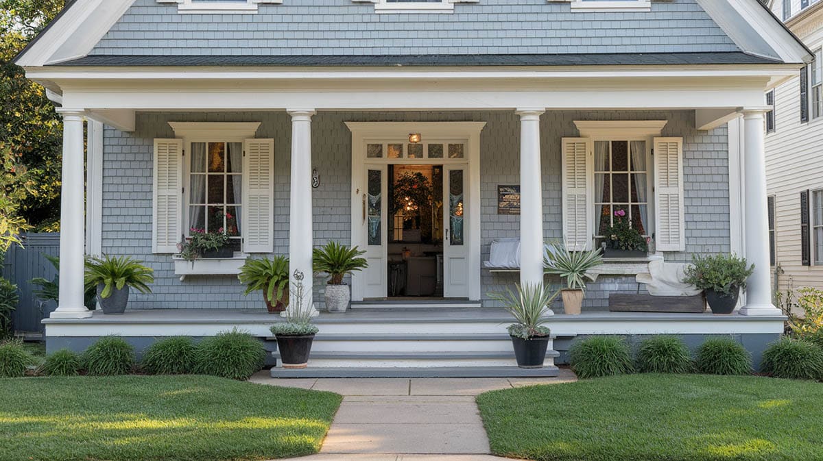
Each colonial subtype has its own design personality that lends itself to certain color palettes.
Georgian Colonial – For stately Georgian colonials with their symmetrical facades and prominent pediments, formal color schemes tend to suit them best. Go for a crisp white or soft butter yellow on the siding to let the elaborate crown moldings, pilasters and window treatments really shine. Carefully choose accent colors to highlight those refined architectural details without overpowering the look.
Federal Style – Perhaps your home leans towards the lighter and more feminine Federal Style, with swags, garlands and elliptical fanlights adding grace. Warmer antique whites or almond cream body colors allow the delicate embellishments to stand out. Touches of aqua or sage on the windows and cornice moldings can provide lovely contrast.
Dutch Colonial – The unmistakable gambrel rooflines of Dutch Colonials lend themselves to earthier color choices. Match the frequent brick or stone foundation elements with rich camel or tan siding. Crisp white trim helps define the iconic flared eaves.
Cape Cod – The understated Cape Cod colonials favor simple two-tone schemes. Go crisp white or dove gray for the siding to complement the quintessential shutters. Allow the natural cedar shingle texture to show through. With less ornate details, the Capes focus attention on handsome proportional balance.
Assessing Existing Home Materials
Choosing exterior colors for a colonial home requires carefully assessing the existing materials first.
Roof – The roof is a major element, as its color intensity and undertones will influence the options for the body and trim. For example, a very dark roof often pairs better with lighter body colors.
You’ll also want to factor in how much life your roof has left. If you know it will need replacing soon, you may opt for a body color that will work with a wider range of potential new roof materials down the road. When it comes to trim, pay attention to the subtle undertones in the roof color and select options that provide enough contrast without clashing.
Masonry Elements – Moving down the exterior, take note of the existing masonry elements like brick and stone. The reddish, brown, gray or other undertones will impact the colors that look cohesive. Additionally, consider the color of the mortar between bricks or stones when pulling together your whole color scheme. Pay attention to how weathered your masonry is currently and make sure your paint choices will complement the aged appearance rather than fight against it.
Fixed Elements – Finally, assess fixed features like window frames, the portion of foundation that shows, existing pathways and hardscaping, and permanent landscape elements. Your color palette should accent these seamlessly so they feel like an integrated part of the whole vision, not jarringly out of sync additions.
Environmental Considerations
You’ll want to think about how your climate and sun exposure will impact your color choice over time. Let’s start with hot climates. If you live somewhere sunny and warm, light colors have an advantage – they reflect heat away from your home’s exterior to help keep things cooler. Just keep in mind lighter colors may fade faster and show dirt, so you’ll trade off by having to repaint more often.
On the flip side, if you live with cold, snowy winters darker colors absorb heat from the sunlight, helping to warm your home. This sounds ideal, but darker exteriors also show winter grime from road splash and salt spray. Make sure to factor in how darker colors will weather over time and plan for seasonal maintenance.
Sun exposure plays a role too – specifically which direction your home faces. North-facing walls stay cooler as they only get indirect sunlight – so colors may appear cooler than you intended. South-facing walls take the brunt of sunlight, heating up surfaces so colors look warmer. And for east/west facing direction, colors will change dramatically as the sun moves across the sky. Take some large paint color swatches and view them at various times/walls to see these variations for yourself before deciding.
To Decide Take a Color Survey
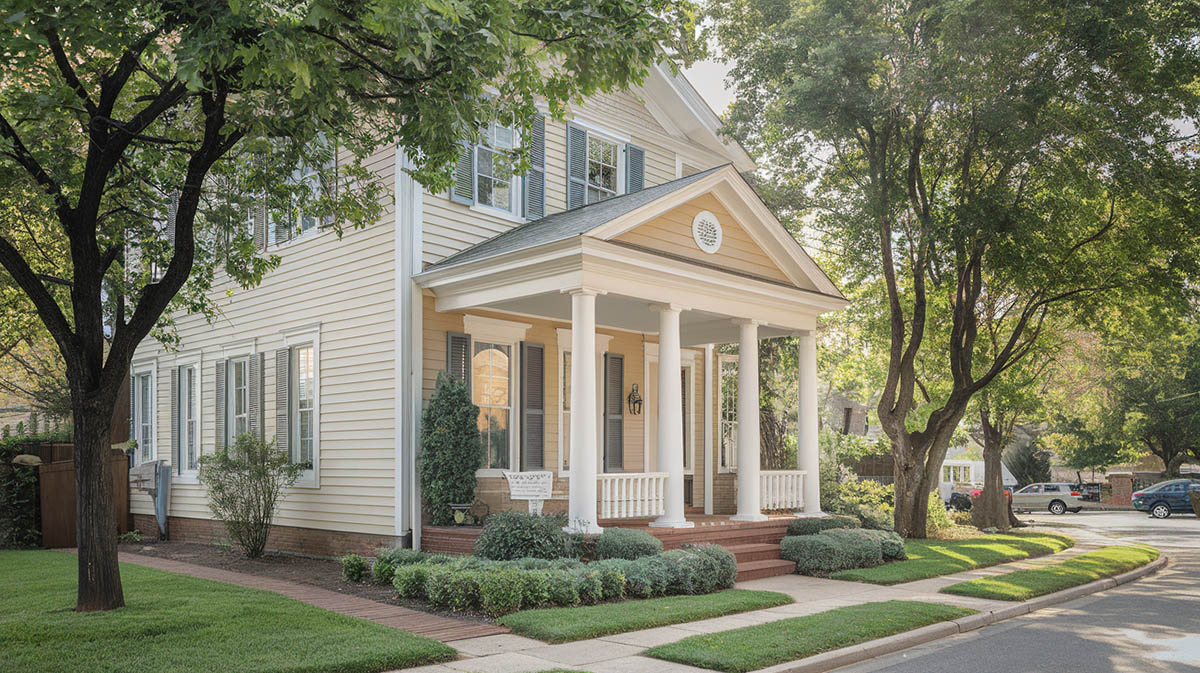
First, check out what hues surround you. Take a walk and jot down the color combos rocking on nearby houses. Some pleasing partnerships to note might be a pale grey with crisp white trim or a warm tan paired with rich brown shutters. And make mental notes of any shades that look disjointed or loud. The goal is to find tints that feel cohesive yet unique.
When considering the paint for your place, think about blending while still standing out. Maintaining neighborhood character is key – you don’t want your salmon pink house to stick out like a sore thumb! But choosing an exact color match to your neighbor’s pad feels dull. Aim for complementary rather than copycat. For example, if their door boasts cheery lemon yellow, consider a pale buttercream. It ties together the look without direct duplication.
Be sure to consider resale value too. While trendy hues might feel fun now, they could turn future buyers off. Timeless, subtle shades make for an easier sell down the road. And last, don’t forget to check if HOA regulations apply. Many associations restrict color choices and require approval applications before starting work. You’ll also want to confirm timing rules. Some mandate all painting happen on weekdays to avoid noise issues. Missing submission deadlines or choosing unapproved shades could mean paying fines or repainting immediately.
Test Before Committing To A Color
Testing colors thoroughly first is key before making a long-term commitment. Here’s my advice on how to get it right. Start by painting large sample swatches of potential colors—a 2×2 foot section works well. Check how the shades appear on your home throughout the day as sunlight changes. Colors shift quite a bit from morning light to afternoon brightness to evening dusk. And view the samples in different seasons too, since a color blending nicely with green summer trees may contrast harshly against bare winter branches.
Test palette options on various façades of the home too. A creamy white that flatters the front may look dull and cold on a shady north exposure. Don’t forget to look at how your neighbor’s house colors could clash or coordinate. It’s all about getting the full picture before finalizing your choices.
When selecting colors, keep in mind how each architectural element affects the overall look. For instance, neutral white or beige tones allow decorative shutters, front doors and other accents to really stand out. Bolder foundation colors contrast nicely with neutral siding. Just beware painting the body of the home too dark, as that obscures charming details. Referencing previous color schemes on historic Colonials in your area is a great source of inspiration too.
Let us know what you decided to use in the comments below or share your tips or questions with our readers.
To showcase highly specific designs, some images on this website use advanced AI-generation software to illustrate ideas and room inspiration. See our editorial policy to learn more.

