11 Cape Cod Interior Paint Colors For Seaside Serenity

Whether you live in a classic Cape Cod home or just love the coastal aesthetic, bringing those serene New England vibes into your interior is easier than you think. It all starts with paint color – trust me, the right shades can transform even the most basic rooms into breezy beach retreats. Like its exterior, the interior palette of Cape Cod houses incorporates relaxed and simple combinations of white, beige, and dominant hues. The tranquil colors are versatile, and one can inject more vibrant colors to personalize one’s living space.


Upload a photo and get instant before-and-after room designs.
No design experience needed — join 2.39 million+ happy users.
👉 Try the AI design tool now
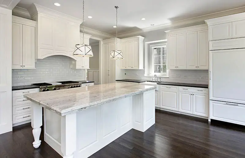
White – Sherwin Williams Pure White (SW 7005) – Crisp and Bright: The ultimate dichotomy among the colors, white, goes with the simplistic architecture of a Cape Cod home. The classic canvas creates a clean and spacious interior. Moreover, a brilliant white provides a continuous flow of spaces, creating a cohesive environment and an opportunity to inject more personalized elements.

Seapearl – OC-19 by Benjamin Moore. Take it from this designer – a white tone is the keystone of achieving that effortless Cape Cod charm. Think bright, welcoming and nautical-inspired. For those looking for a more muted choice, a soft, warm white like Benjamin Moore’s Seapearl creates an airy canvas that plays beautifully with natural woods and accents. For trim and cabinets, go for a semi-gloss to reflect light in the loveliest beachy way.

Beige – Sherwin Williams Dover White (SW 6385) – Soft and Placid: The neutral tone is a favorite choice for walls, ceilings, and other expansive areas in a Cape Cod home. Add a layered look with the same family color, such as tan or brown. Other neutral hues, such as black and white, also work with beige.

Ivory – Sherwin Williams Divine White (SW 6105) – Classic and Calming: The warm white tone is a familiar base option that’s in tune with Cape Cod homes’ cozy but simple charm. It is reminiscent of beach dunes and shells. It can be matched by coastal and sunset colors such as sky blue, mint, peach, and red.

Peach – Benjamin Moore Hathaway Peach (HC-53): : Bring back memories of childhood summers when a visit to the ice cream parlor was always a treat. The powdery soft paint can be incorporated in both social and private rooms creating a relaxed and calming ambiance.

Turquoise – Vaslpar Vintage Teal Ultra Premium (5010-9) – Energizing and Cool: A merging of two cool tones (blue and green), turquoise is a perfect base color for the interior as it matches well with the traditional Cape Cod colors, such as white, cream, and gray. The blue tint can convey that beachy vibe, energetic and casual. Turquoise can also be matched with pastel hues as well as vibrant colors.

Coastal Fog – 976 – Now, brilliant white may suit a seaside cottage, but not every room calls for such a bold blank slate. Welcome my dear friend coastal fog – the misty, tranquil mornings of Cape Cod bottled into paint form. This hazy light gray from Benjamin Moore invokes serenity in bedrooms and living spaces alike.

Mindful Gray – Prefer something a bit deeper but just as calming? Mindful Gray from Sherwin Williams beckons you to pause and unwind, equally at home in traditional or modern homes. White trim contrasts crisply as a Cape Cod classic, while choosing the same hue throughout feels fashionably contemporary.

Misted Green – Alright, for those craving a splash of color – let’s dip our toes into some cheerful greens. Think cooking apple green from Farrow & Ball, toasty and inviting like Grandma’s kitchen. Or cool off with Benjamin Moore’s Misted Green, a sage shade redolent of Cape Cod’s forests and meadows. Both colors marry beautifully with those requisite natural wood furnishes.

Water’s Edge – 1635 And we can’t forget the guiding inspiration itself – the sea! Benjamin Moore’s Water’s Edge dazzles with oceanic splendor without overwhelming. For straight up nautical, paint a built-in or accent wall in a bolder blue. Just balance it with plenty of bright white and natural textures. Trust me, nothing says “coastal living” quite like breezy blue and white.

Wythe Tan – CW-415 Alright landlubbers, earth tones have their place here too. Capture cozy cottage warmth with a toasty, versatile neutral like Wythe Tan or Edgecomb Gray. And don’t overlook an unexpected pop of buttery yellow or rosy pink to brighten up bedrooms and baths. The colors of seaside wildflowers never fail to delight!
Final tip – always preview paint under your unique lighting conditions before slathering those walls. The quality of light along the coast can dramatically impact hues. So paint up some swatches and live with them – morning, noon and night – to choose the perfect Cape Cod color story just for you. Just like with the exterior hues, let your home reflect the easy elegance of the New England shoreline with just a splash of paint!
To showcase highly specific designs, some images on this website use advanced AI-generation software to illustrate ideas and room inspiration. See our editorial policy to learn more.