10 Surprising Bathroom Colors That Complement Neutral Tiles
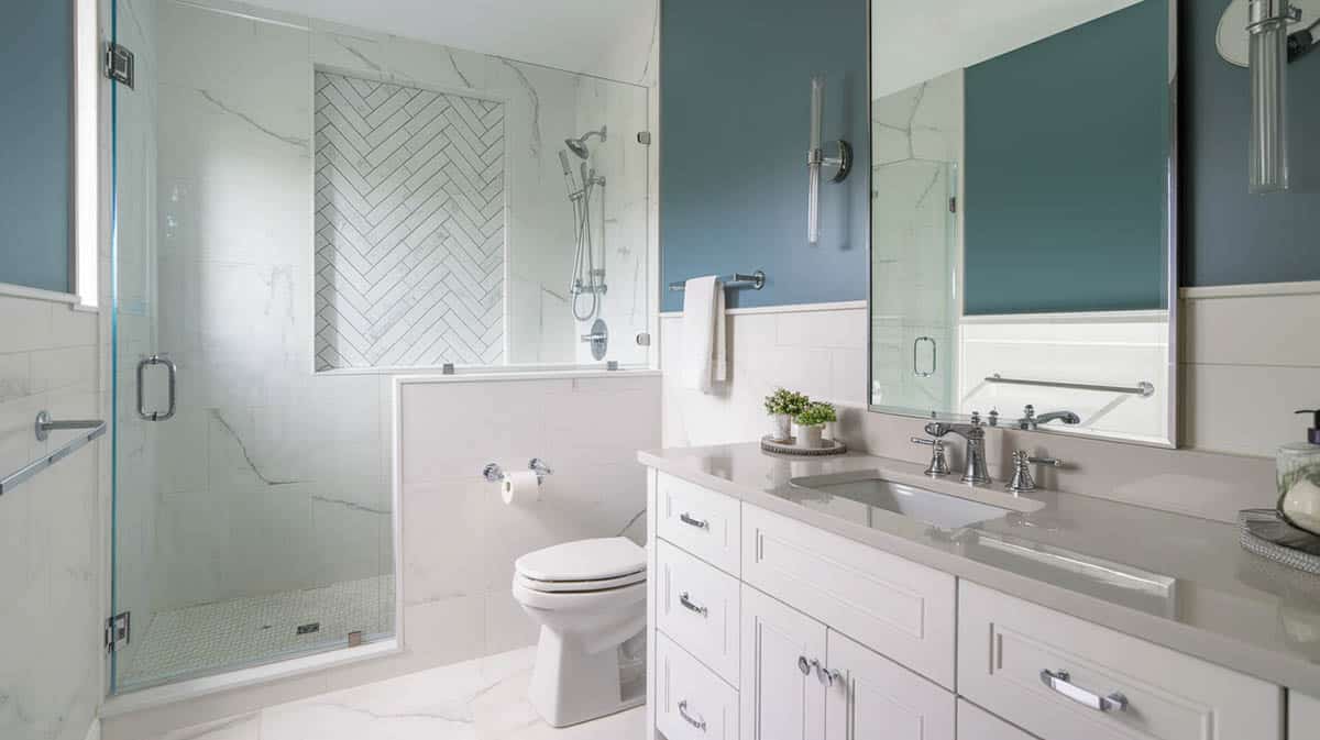
Creating a sophisticated bathroom palette begins with understanding how to expertly pair colors with neutral tiles. This focused guide will help you select and combine colors that enhance your neutral foundation while creating a cohesive, designer-inspired space.
Understanding Your Tile Tones
First, take a close look at your tiles. Are they warm beiges with hints of pink or yellow? Cool grays with subtle blue undertones? Or right in between with greige? The tone and intensity of your neutral tile is the foundation for selecting complementary hues for your paint.

Upload a photo and get instant before-and-after room designs.
No design experience needed — join 2.39 million+ happy users.
👉 Try the AI design tool now
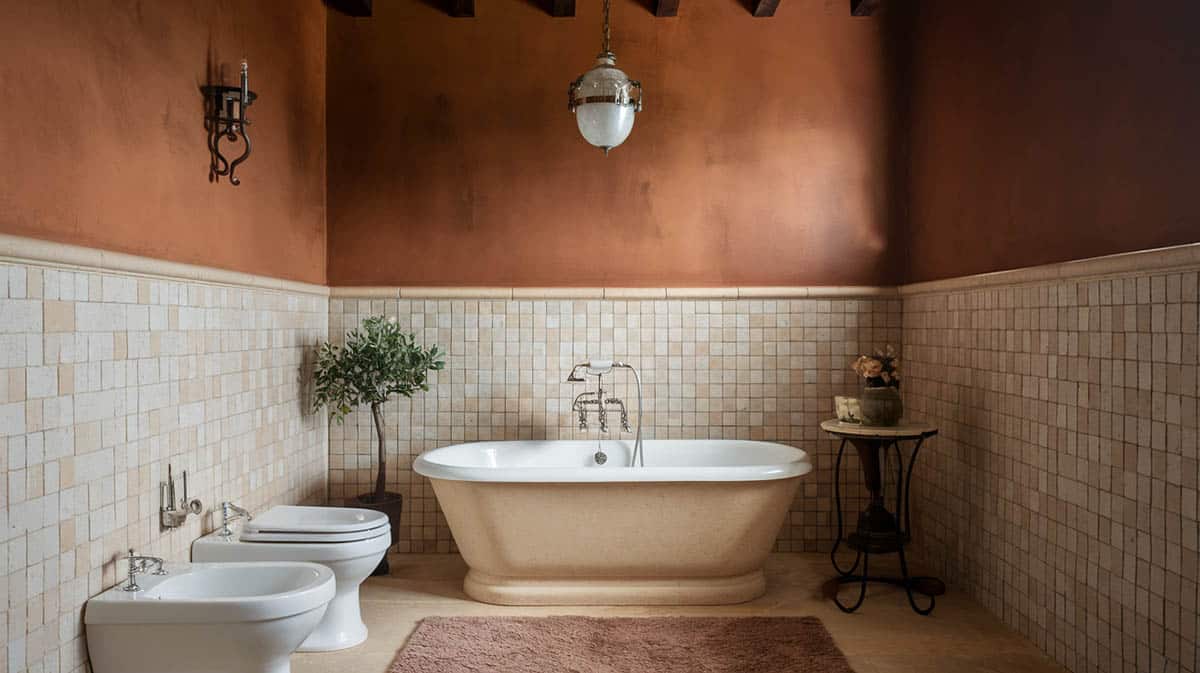
Warm Neutral Tiles: Beiges present subtle yellowish or pinkish undertones, forming a welcoming base. Creams exude soft golden qualities that heighten warmth. Taupes display refined brown-gray variations, perfect for modern aesthetics.
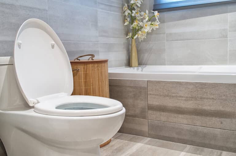
Cool Neutral Tiles: Grays showcase bluish or purple-ish undertones, ideal for contemporary visions. Whites range from crisp to soft, offering adaptability. Finally, greiges fuse warm and cool aspects for transitional rooms.
Color Selection Guide
Once you’ve determined whether your tiles lean warm or cool, you can more easily choose accent colors that enhance that base shade.
For Warm-Toned Neutral Tiles
When selecting a main wall color, to pair with warm-toned tiles, consider a soft terracotta which will add Mediterranean warmth while keeping things sophisticated. Or go for a greige (a mix between gray and beige) that provides subtle depth and allows your neutral tiles to really shine. Gentle sand is another great choice – this creamy, light tan shade perfectly transitions between the tiles and wall spaces for a seamless look. Feeling bold? Try a muted dusty rose which injects understated elegance without overwhelming the neutral palette.
Primary Wall Colors to Use:
- Soft Terracotta
- Warm Greige
- Gentle Sand
- Muted Rose
Accent Colors to Use:
Don’t forget to incorporate accent colors throughout the space as well. Deep bronze is flawless for hardware and fixtures, tying everything together with cohesive warmth. Or make a dramatic statement by bringing in burnt sienna through carefully chosen accessories and decorative objects. You can also add luxurious touches of warm gold or earthy amber elements to provide depth and interest while still allowing your neutral backsplash and floors to take center stage.
- Deep Bronze
- Burnt Sienna
- Warm Gold
- Earthy Amber
For Cool-Toned Neutral Tiles
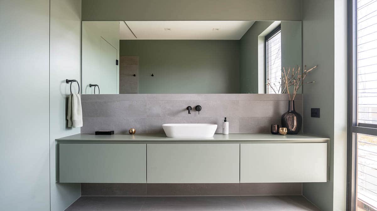
When working with cool-toned neutral tiles in your bathroom, you’ll want to select wall colors that enhance the sophisticated mood. Soft greens like sage add a natural yet modern touch of tranquility. For a more dramatic flair, consider a steel blue – it creates stylish depth and pops those sleek gray undertones. If you prefer an airy, elegant feel, go for a pale dove gray or soft pewter. These lighter shades blend seamlessly with your neutral tiles while lending a refined dimension.
Primary Wall Colors to Use:
- Sage Green
- Steel Blue
- Pale Dove
- Soft Pewter
Accent Colors:
When choosing accents, carefully chosen metallic touches in cool silvers are a foolproof complement. Or make a statement with the sophisticated contrast of navy blue accessories. Charcoal goes handsomely define architectural details for contemporary appeal. And don’t overlook the moody intrigue of slate gray accents – they can add visual interest in all the right places.
- Navy Blue
- Charcoal
- Slate
- Cool Silver
Tile Color Pairing Chart
| Tile Type | Primary Wall Colors | Accent Colors | Tips |
|---|---|---|---|
| Beige Tiles | – Warm Greige – Soft Sand – Muted Coral (use sparingly) |
– Terracotta (small decor) |
For pink undertones, add blush accents; for yellow undertones, earthy greens work best. |
| Cream Tiles | – Pale Butter – Soft Wheat – Light Cappuccino |
– Burnished Gold (mirrors) |
Pair with warm lighting to enhance tones. Use subtle grays for a modern look. |
| Taupe Tiles | – Warm Mushroom – Soft Mocha – Light Putty |
– Deep Brown (richness) |
Cool taupes pair well with greens/blues; warm taupes benefit from earthy tones. |
| Gray Tiles | – Sage Green – Steel Blue – Pale Dove |
– Navy Blue (towels/rugs) |
Use textures like wood/linen to warm up gray spaces. |
| White Tiles | – Soft Pearl – Pale Mist – Light Cloud |
– Cool Silver (modern) |
Layer warm woods/soft textiles to avoid a sterile feel. |
| Greige Tiles | – Warm Gray – Light Taupe – Soft Pewter |
– Slate (modern edge) |
Works well in minimalist or Scandinavian designs. Keep decor clean and simple. |
How Bathroom Vanities Contribute To the Color Choices
When designing your dream bathroom, don’t underestimate the power of your vanity to tie the whole room together. As a substantial fixture taking up prime real estate at eye level, your vanity often serves as a secondary dominant element behind the foundational neutral tiles.
Built-in vanities specifically have the visual weight to establish much of your color scheme. Since they likely occupy a large wall space and are permanent fixtures, think of them as part of your core color palette. Aim to coordinate any paint, wood tone, or materials with your neutral tile base. Matching or complementing your wall color is also key to create a cohesive flow. Your built-in vanity can be the bridge that brings together floor and wall.
Freestanding vanities have a bit more flexibility in terms of color. When made of natural wood tones or painted in neutral, soothing hues, they act as primary elements that stabilize the room. But don’t be afraid to use bolder complementary colors on a freestanding vanity to liven things up! Painted wood, materials blended with your tile and walls, or vanities serving as a transition piece between spaces allow for pops of color that make a statement while still feeling integrated. Beyond the vanity itself, consider accents in the hardware, mirrors, lighting and plumbing fixtures as opportunities to layer on extra personality.
Creating Your Color Story
When it comes to picking paint colors for a neutral-toned tiled bathroom, it can be tricky finding hues that work harmoniously together without feeling flat or boring. The key is identifying the subtle undertones in your tiles—whether warm grays, cool taupes, creamy whites, or light beiges and selecting a dominant color that enhances them.
For instance, a rich blue-green like Sherwin-Williams’ Rainwashed beautifully complements tiles with gray undertones, while a warm terracotta like Rustic Red enhances tiles with brownish hints. Use your chosen color as the primary shade on a feature wall to anchor the space. Then, introduce a secondary color in a lighter value, such as soft sage greens or dusty pinks, to balance and add dimension.
Accents are equally important in tying the look together. Incorporate metallics like brass or bronze to make the tiles pop, or add splashes of bolder color through hand towels, rugs, or small black-and-white graphic prints. Just be careful not to overwhelm the spa-like vibe you’re creating by making it too harsh.
Finally, balance darker and lighter tones throughout the space. Deep charcoal towels or dramatic navy walls can ground the design, while lighter elements like whitewashed wood shelves, quartz counters, or a white tub surround keep the space feeling airy and inviting. By combining tones and textures, you can create a bathroom that feels cohesive and works with your desired personality and sense of style.
To showcase highly specific designs, some images on this website use advanced AI-generation software to illustrate ideas and room inspiration. See our editorial policy to learn more.

