Bathroom Color Schemes (Choosing Hues For Walls & Finishes)
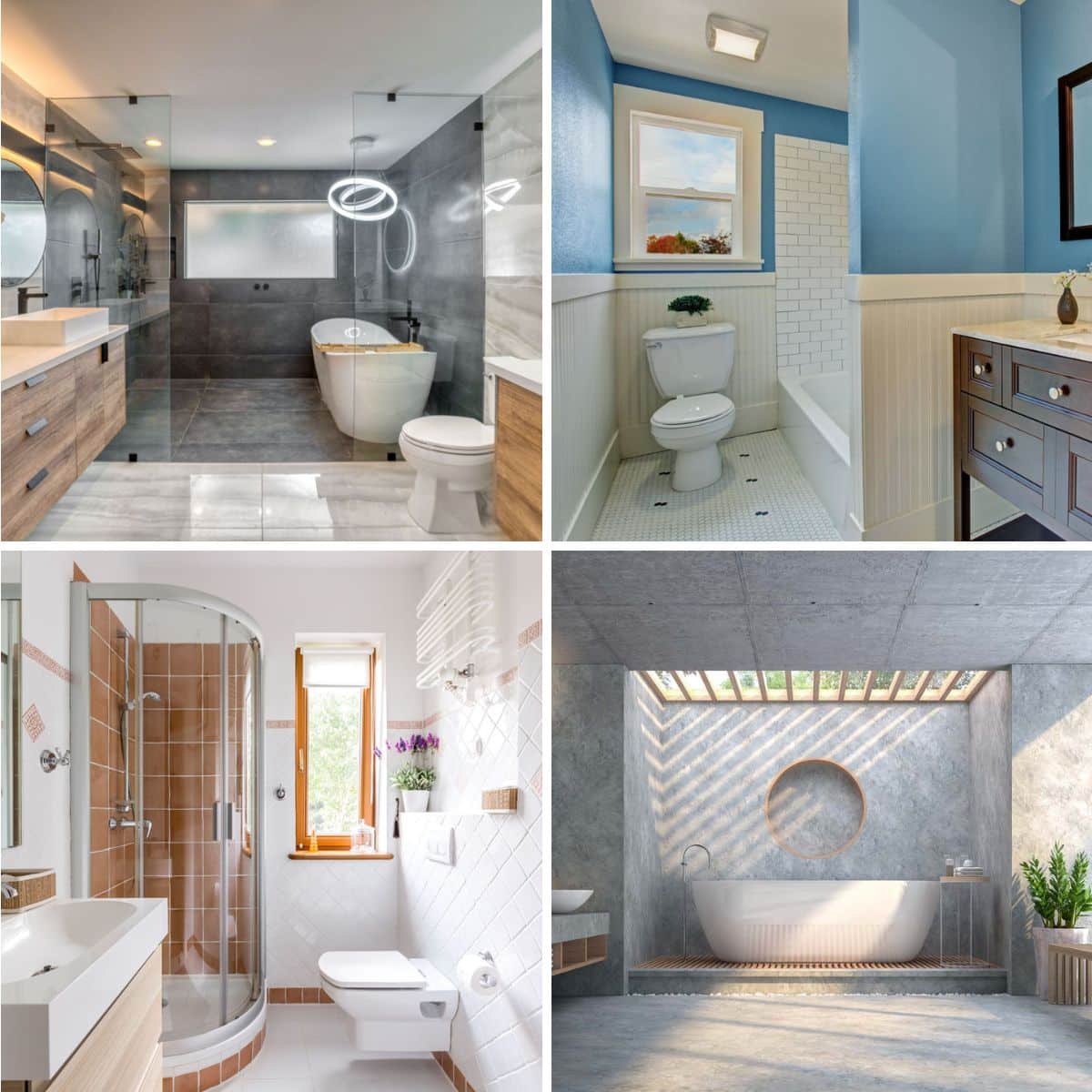
From blissful to surprising, there are a lot of bathroom color schemes to fit your mood and taste. In this article, we’ve listed trendy bathroom color schemes and included hues that fit best for small and large floor plans, walls, fixture finishes, accessories, and how you coordinate colors. Choosing a bathroom color scheme requires determining the layout size, the amount of natural light, and the overall aesthetic you wish to achieve.
Bathroom Color Scheme Basics

Upload a photo and get instant before-and-after room designs.
No design experience needed — join 2.39 million+ happy users.
👉 Try the AI design tool now
There are several approaches to selecting colors, and here is a breakdown of three popular color scheme strategies to consider:
Monochromatic: bathroom colors with variations or degrees of lightness and darkness in a single color create a calming and cohesive color scheme.
Analogous: If you need some variety but want to sustain a sense of unity among your bathroom elements, you can opt for analogous colors. These colors for your bathroom are adjacent to each other on the color wheel. So, for instance, you’ll see yellow, yellow, and orange.
Complementary: While they are of different colors, complementary colors can support, or as the name suggests, complement, an opposite color found in the color wheel. So red, yellow, and blue, the three primary colors, are complementary, as are your secondary colors (green and orange) and tertiary colors (blue-green).
Warm vs. Cool Tones: How to Choose?
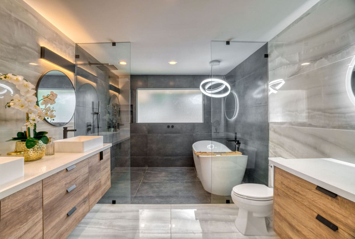
How much natural light does your bathroom receive?
A major consideration in color selection is how much light intensity your walls and other bathroom elements receive. A room that receives a lot of light may opt for medium tones to not overwhelm the space with glare.
If you love white, yellow, and other bright colors but receive a lot of light from fenestration, you might opt for matte surfaces. You’ll maintain the bright nature of the space while minimizing glare.
What are the activities you plan to do in your bathroom?
Aside from taking a shower and using the toilet, do you need good lighting for your vanity space? Doing make-up or shaving requires a good lighting system for safety and accuracy. Lighter tones, such as beige and white, are safe for various bathroom vanity sizes.
According to Marcia Walter, an international color consultant, colors that make you look good or flattering include pink hues, peach, and terra cotta. Avoid using deep yellow, green, and gray, Marcia added.
Do you have a layered lighting system?
In relation to how much natural light you receive, you’ll need to assess your lighting design. Lighting and color go hand in hand and can help enhance the space, depending on your desired atmosphere.
Layered lights mean you have more than one type of lighting fixture. This includes ambient lighting, task lighting, accent lighting, and natural light from different bathroom window types.
How do you feel when using your bathroom?
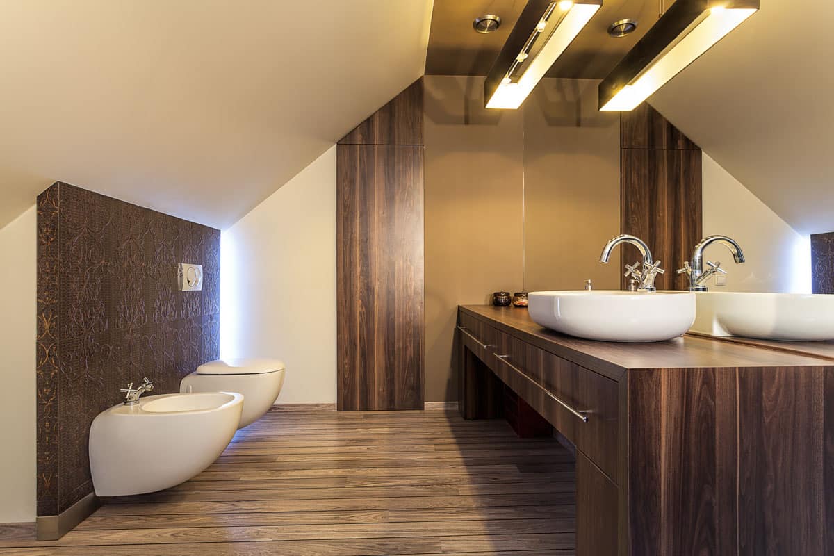
Do you feel cramped, or do you feel a void when you’re in the bathroom? You can utilize color to make a space feel wider than it is by introducing lighter and upbeat tones, or you can fill in the space of your large floor plan with darker and moodier hues.
While it is a general rule to use warm tones to create the illusion of space, you can also add depth with a dark tone depending on the shape of your floor plan as well as other bathroom design elements.
What ambiance are you aiming for?
Remember that each color evokes a variety of characteristics due to its temperature, culture or social association, and relation to other elements.
• Bathrooms with warm colors have longer wavelengths, so these colors seem to come forward. This makes them a great color for larger bathrooms, as it creates a cozy and stimulating backdrop.
• Bright and warm colors include bright reds, yellows, creams, and oranges and are ideal for kitchens, but if you prefer the cozy comfort of warm tones, then you can go with warm colors. Warm hues are also associated with energy, heightened emotions, and passion.
• With shorter wavelengths, bathrooms with cool tones recede, creating the illusion of space, making them great for limited bathroom sizes.
If you crave a calming personal space, you’ll love bathroom colors that have cool tones, such as greens, soft pastels, blues, and purples. These are refreshing colors that can be matched with neutral tones.
Can you mix warm and cool tones?
There are no fixed or definite rules when it comes to combining warm and cool tones, only recommendations from past designs. You can always mix warm and cool tones to fit your preferences, lifestyle, or taste. However, the key is to balance the two colors to create a more harmonious and functional color scheme.
Color Tips:
• Generally, warm colors are best for accents and accessories.
• Cool tones are best for walls and other wider surface areas due to their calming effect on the eyes.
• Juxtaposing two different elements captures your attention and balances each other’s characteristics.
• Remember that there are undertones to consider. For instance, whites have cool and warm undertones that affect the overall look, such as their brightness and effect when placed beside another color.
• Don’t forget about neutral tones. If you’re unsure of the colors to choose, neutral tones are safer options and can be used as primary colors or accents.
Where can you get inspiration for your bathroom color scheme?
Aside from the bathroom color schemes we listed here, you can get inspiration from showrooms featuring popular fixtures or material brands. You’ll find tons of inspiration online on social media, but the easiest place to take inspiration is from nature.
Paint companies also provide bathroom color swatches with images or walkthroughs in bathrooms using their paint colors. This simulated look makes it easier to visualize how it looks on the actual site.
Popular Color Combinations
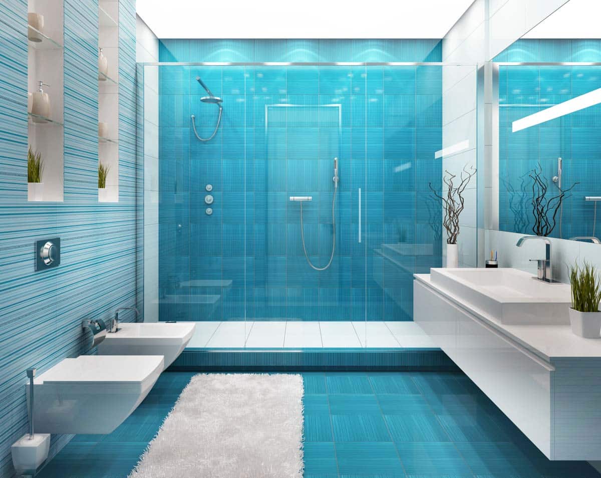
Seascapes of Layered Blue Greens: This popular bathroom color palette captures the serene blue greens of the sea as it contrasts with the light but warm sand hues.
The blue-green is easy to match with either a warm or cool tone, but you may want to go with chrome or silver hardware to match your seascape theme, while brass and other gold-tinted hardware look great for a more luxurious look. Seascapes are composed of layered blue greens from light to dark.
Colors:
#D5CEBC: Almond/Oats
#24657C: Calypso
#358193: Blue Green
#83BCBD: Medium Light Cyan
#A7CFC9: Teal
Moods and Penny Tiles: The popularity of penny tiles reignited our desire for textural richness in bathroom surfaces. Materials have improved greatly, making them more durable and resilient to cleaning agents, which means easier maintenance.
Penny tile floor and showers in varied colors present design options for owners, and we’re seeing everything from bejeweled walls to ombre installations. One of the best combinations for penny tiles is dark wood. Choose cool tones such as sky blue and mint for your penny tiles, then combine dark wood to create a moody and earthy look.
Colors:
#B87E56: Orange Copper
#B9703D: Dark Orange
#83BCBD: Aquamarine
#647066: Moss Green
#83948E: Green-Cyan
#A4B3AE: Light Green Cyan
Black and bold: When setting the scene, black and red are gorgeous backdrops for that warm, layered lighting. This bold bathroom color scheme can evoke a theatrical or glamorous look with the right decor accents. Rose gold, light brown, or bronze can further elevate the look and add sheen to the surfaces.
Though you can always add a velvety touch to your elements with glossy wall tiles, matte black has become a popular option for surface finishes as it evokes a more contemporary characteristic. Add tinges of red or light brown to warm up the color combination.
Colors:
#751924: Red
#04050A: Dark Brown
#F9F2E7: Off White
#9B6347: Brown
#B76E79: Rose Gold
Ombre Skies: The gradient-style color on walls is a popular option to capture that spa-like ambiance. It’s typically used for smaller bathrooms, as it gives the impression of a larger space. A popular color for that ombre wall is sage.
The ombre green tones remind us of the different green hues from the deep water through the light morning mist produced by bodies of water. An alternative to ombre walling is creating wall murals.
Colors:
#94A488: Sage Green
#61764B: Dark Green
#889480: Eucalyptus Green
#A2AA9B: Medium Light Green
#C0C8B9: Light Green
#DFE1DC: Gray Green
Trendy Color Combinations
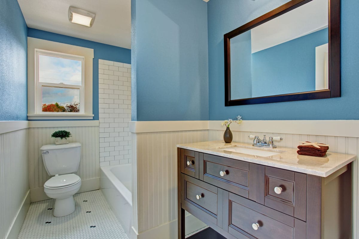
After carefully monitoring the Pantone Color of the Year’s official countdown tracker this week, it was a thrill to learn their official pick for 2024 is Peach Fuzz 13-1023, a soothing and gentle (of course) peach shade—a warm and subtle middle ground between orange and
Peach Fuzz with Cream, Oranges, and Beiges: Since its introduction as the Pantone color of the year, peach fuzz has gained popularity and is extensively used as an exciting replacement for beige colors. It’s a revitalizing color that can be combined with bright or neutral tones to achieve a calming atmosphere.
Peach Fuzz Hex Color: #FFBE98
Complementary: #98e3ff
Black and White, Silhouettes and Wallpapers: Playful wallpapers are in, and you’ll find that these single-lined drawings that are filling up whitewashed bathroom walls are interesting visuals. There’s an urban and youthful feel to it.
The black and white combo can be warmed down by adding wood textures, such as light brown wood, or glamoured up by using flesh-toned vinyl lined with gold. However, you can stay with the black and white tone instead and install geometric tiles, an art deco inspiration.
Dusty Pink and Gold are Warm and Luxurious: From a romantic whim of the past 70s boho, dusty pink has that earthy quality, but when paired with metals such as gold, it gives it a glamorous yet relaxed ambiance.
It’s a versatile tone and can be paired with the most used bathroom tones, such as white, beige, or black. With strategic lighting fixtures, you can either create a light and bright area or have a romantic and moody bathroom ambiance. Add gold linings or accents to break the matte and subdued tones.
Dusty Pink Hex Color: #cc8084
Complementary: #77d4d5
Coral Pink with White and Black, Casual or Glam Chic: Since the introduction of salmon and flamingo tones in interiors, we’ve seen a continuous love of feminine hues. No longer do we see pink tones only for princess-themed interiors. Coral pink is a gorgeous shade that combines the exciting nature of orange with passionate red, producing a darker pink, thus usually called coral red.
Coral pink, sometimes also called Congo pink, can be a perfect backdrop for geometric black and white to create that casual look for your bathroom space. However, you might also opt for a marble or granite finish or vanity to match a pink wall panel, then line it with black, white, or gold.
Coral Pink Hex Color: #F88379
Complementary: #72f0ff
Seafoam and Blue Grays, Layered Greens with Metallic Silver: Reminiscent of the colors of the deep sea, seafoam has a soft green tone with a mixture of blue and gray hues. The somewhat minty tone but earthy color gives a relaxing quality as a backdrop for bathrooms.
It can be paired with white for a simple contemporary bathroom or add accent tones such as yellow or white accents to define profiles. The outcome is an exciting and fresh bathroom color scheme that can fit any room size.
Seafoam Hex Color: #93e9be
Complementary: #ff7de0
Colors for Small Bathrooms
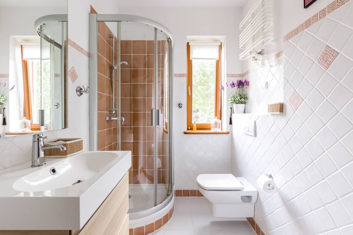
Light colors are the go-to hues for small bathroom ideas since you aim to prevent that cramped feeling in your limited space. However, even in small layouts, more opt to have bolder and brighter tones.
The aim is to showcase the small square footage, not conceal it, and instead utilize every corner of the space while providing a livelier atmosphere. You also have the option to paint bold and dark colors strategically to provide depth. Thus giving the perception of having a larger area.
Popular colors for small bathrooms include:
White: Its versatility, time endurance, and clean and neat appearance make it the perfect color to include in your color scheme. Choose accent colors to prevent that clinical look. The light and clean atmosphere gives the limited space room to breathe.
Deep Blue: Another cool tone, blue, makes it easy to associate with bathrooms because the color represents water in nature. This gives a feeling of freshness and renewal.
Warm Peach: A newer addition to popular bathroom colors, peach tones give off a warm and welcoming vibe. It is also as versatile as beige or cream, making it easy to combine with other colors. Add metallic tones or neutrals, such as gray or beige, to the warm peach.
Colors For Large Bathrooms
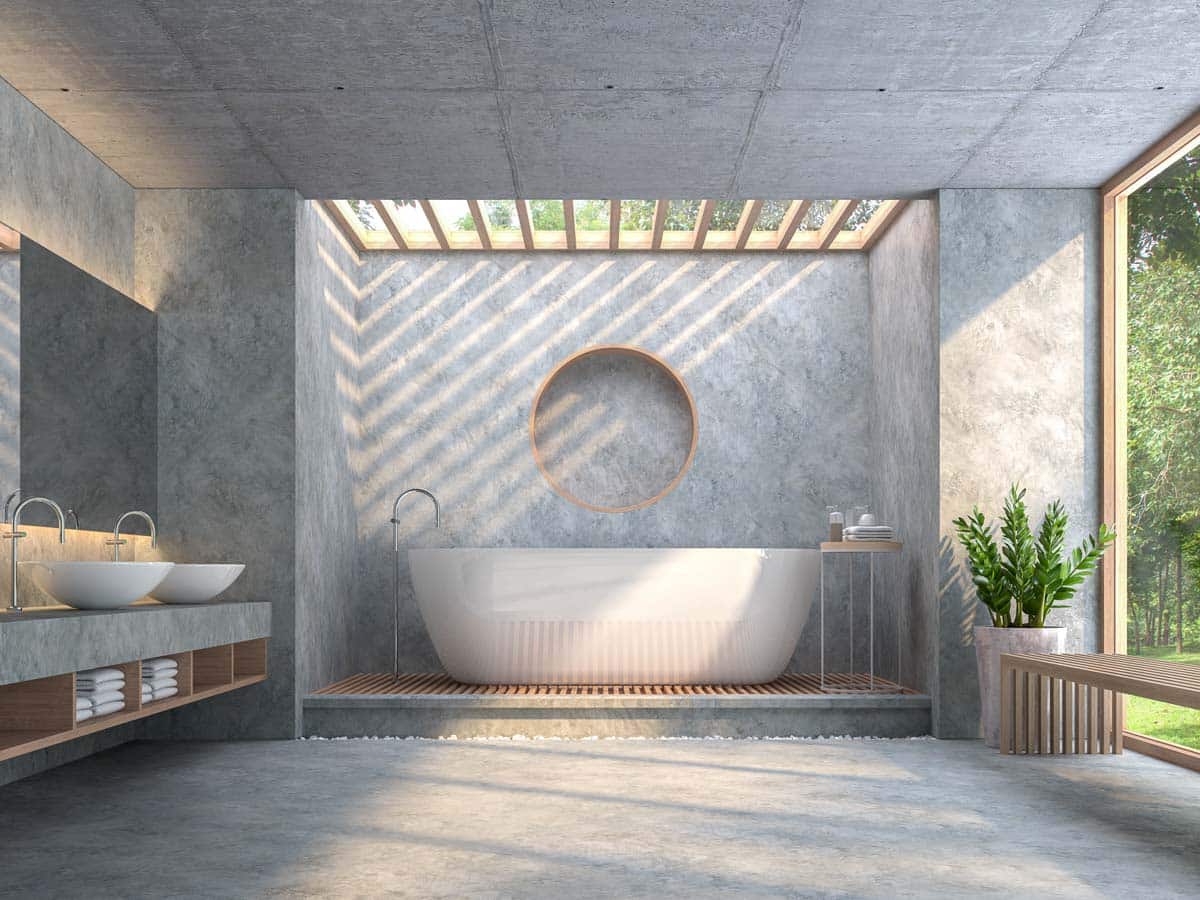
With a wider canvas, a large bathroom presents an opportunity to explore colors, and while painting the entire wall with darker tones is the norm, you may want to opt for sectioning color instead. Create focal points and emphasize elements with bold tones or create balance using the paint color.
Popular colors for large bathrooms include:
Parchment Colors: Creams, beiges, and other similar tones are warm and considered neutral tones since they are easily matched with various colors. Parchment tones can be applied generously and matched with warmer tones, such as peach and other sunset colors, to give life and contrast to your layered walls.
Keep your bathroom color scheme under control to maintain a calming, serene feel to the room. Color schemes are especially important in larger rooms, where the color interactions play out more dramatically. – Bathroom Ideas You Can Use: Secrets & Solutions for Freshening Up the Hardest-Working Room in Your House, Chris Peterson
Shades of gray: When you’ve got a natural stone to showcase with your floors or bathroom countertops, the aggregable gray shades are great options. With many gray colors and undertones, you’ll find the best shade to match your elements. The backdrop allows other elements to shine while pulling all the elements together, creating a cohesive look.
Choosing Colors For Bathroom Fixtures and Accessories
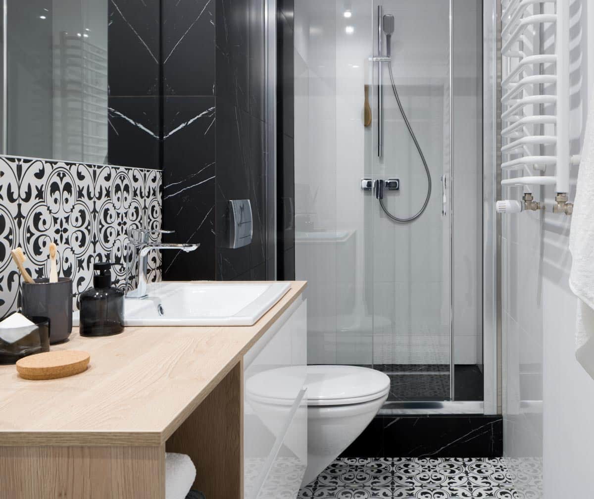
What are the common colors used in bathroom fixtures and accessories?
The common materials used in bathroom fixtures and accessories are based on the materials used. Bathroom hardware materials are mainly made from metal, plastic, ceramic, wood, and glass. One of the cheapest of the materials is usually made from zinc alloys.
So, with the variety of materials, expect many color options. However, due to their durability and versatility, metal materials like copper, stainless steel, aluminum, brass, and zinc alloy are the most popular.
Remember the rule of thumb about assigning colors to interiors?
You can choose between the 60-30-10 or the 70-20-10. The largest percentage of color goes to your main color, such as the walls, floors, and ceilings, while the secondary colors include cabinets and countertops.
The last 10 percent goes to your accents. These rules help narrow down your choices while also helping you find the right materials you need. It also prevents you from overcrowding your space.
A simplified version of the 60-30-10 or the 70-20-10 is the 70-30 rule. You can choose to have only two colors: one dominant color and a secondary color to create a minimalistic or modern look.
How Do You Coordinate Colors In A Bathroom?
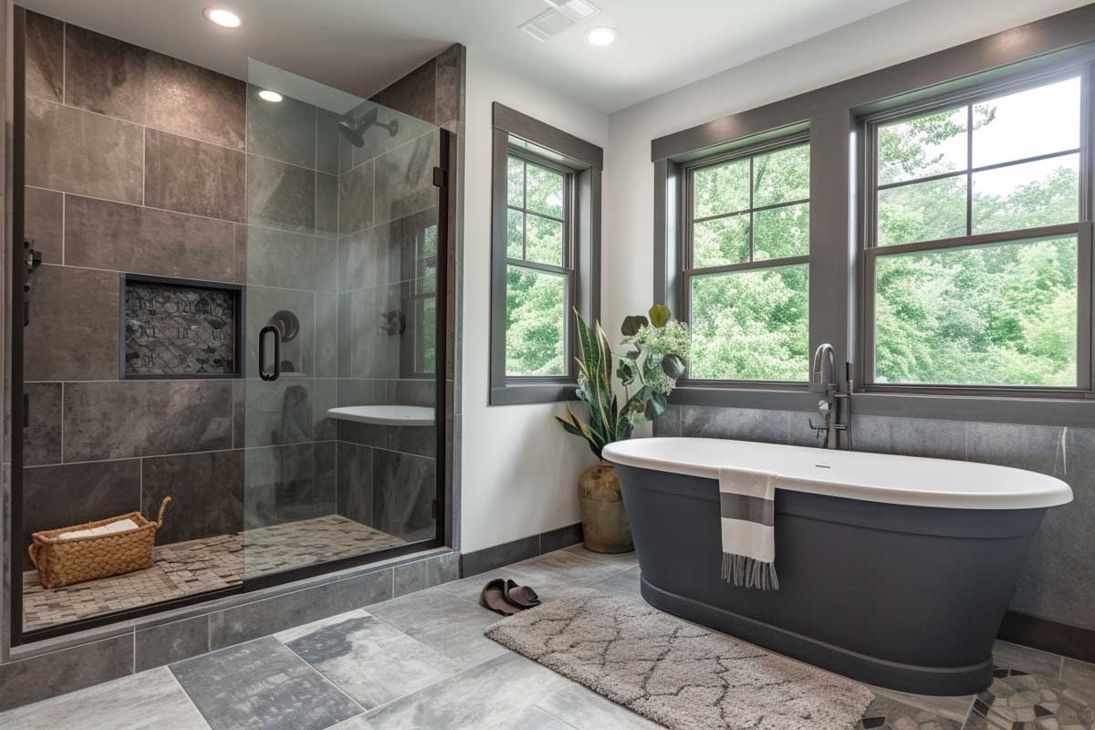
When coordinating colors in a bathroom, it’s good to know the basics of your colors, such as what analogous and complementary colors are. Analogous colors are great for layering colors since they have similar undertones.
So, for instance, blue and green are analogous to each other. You can layer your bathroom space with two or more tones of similar undertones. Masterfully picking the right colors in the interior takes some experience and good taste, but for beginners, you can always rely on these principles:
• Choose a single, dominant color.
• Choose a complementary color.
• Consider the functions of the room and your preferences.
• Natural and ambient lighting should also be taken into account.
See more related content in our article about green bathroom paint colors on this page.
To showcase highly specific designs, some images on this website use advanced AI-generation software to illustrate ideas and room inspiration. See our editorial policy to learn more.

