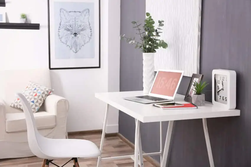
Home Office Paint Colors That Help You Focus

Most home offices don’t fail because they’re too small and cramped; they don’t work because something feels off. One of the most productive things you can do for your home office is set it up for success. Often, using the wrong paint color can create an unsettled feeling. In this guide, I share some important home office paint colors that help you focus, how warm vs. cool tones affect productivity, and how light levels and window direction change what a color looks like. In addition, you’ll see the paint shades real designers recommend so you can get the color that works for you.
The two things a good office color does

Upload a photo and get instant before-and-after room designs.
No design experience needed — join 2.39 million+ happy users.
👉 Try the AI design tool now
First, a good office color stays quiet, so your eyes aren’t constantly scanning the walls, causing distractions. Second, it works with your artificial and natural lighting, since the same shade can look different depending on the lighting level and the time of day when the sun hits it.
Before you choose a color, you’ll need to figure out what kind of focus you need
Cool colors (blues, greens, blue-grays)
These tones feel clean and are less visually noisy to the senses. If you’re constantly working on detail-oriented tasks like writing, spreadsheets, code, or anything that requires you to stay locked in for hours, cool tones are usually your go-to.
Sherwin-Williams mentions how “soothing blue” spaces feel more relaxed and collaborative.
- Cool tones are best for: Those wanting deep focus, analysis, and long computer sessions
- The drawback: If your room already has weak, cool light, such as north-facing, these can look cold and uninviting.
Warm colors (warm whites, greige, soft clay, blush tones)
Warmer paint makes a room feel more livable and works well for those who use their office as a guest room or if you’re in there all day. Another consideration is if you’re on camera and use Zoom a lot, warm neutrals look way better than a stark white, for example.
- Warm tones are best for: Those who are on camera making calls, reading, planning, hybrid guest rooms, and all-day comfort
- The drawback: Some tones like yellow-beige can feel overwhelming in midday bright sun and may be too much.
How your windows help make the call
People frequently mess up by just picking a color they like and painting without considering their window orientation and how it affects the paint.
North-facing or dim offices
North light is cool and consistent, but can also be kind of gray and flat. It can make a room feel darker than it actually is.
Patrick O’Donnell from Farrow & Ball is direct about it: “Leave cool blues and greens to one side” in north-facing rooms. He says colors with an undertone of red or yellow handle the cool light way better.
North-facing rule: In cool light, go warmer than you would think. Use warm whites, greige, warm taupe, or muted clay to help counter the cool cast. Or if you want drama, go with deeper shades, instead of pale blue-grays or icy hues. Pale & cool = sad. In north light, if you want blue/green, choose something with a hint of warmth.
South-facing or bright offices
Bright light does two things: it makes colors more intense and washes out softer neutrals.
South-facing rule: Strong natural light means you can safely use cooler colors more freely, without the room feeling too cold. Since cooler colors behave better here, you can use blue-grays, soft greens, and crisp neutrals to stay balanced.
Watch out for super-warm paint, like strong beige and yellow undertones, which can look extra golden during midday. Test these tones on multiple walls in the room at different times of the day to ensure they aren’t too intense.
East-facing
Windows facing East offer bright mornings, and softer afternoons. This provides great energy for early work. Your mid-tones work well in this environment. If you work a lot in the mornings, choosing a cooler or neutral paint can prevent the space from feeling overly sunny early on. Watch out for very light neutrals, as they can look washed out in the morning sun and seem dull later in the day.
West-facing
That warm afternoon glow is beautiful, but it can make warm paint feel very intense. A cooler neutral often balances this out. To take advantage of this afternoon’s warmth, pair it with cooler neutrals like blue-gray, green-gray, and greige with less yellow to help keep it from going orange. Test colors at 4 to 7 pm and test samples to see if they look good in the late-day glow.
Quick tip: use Light Reflectance Value (LRV)

Light Reflectance Value is basically how much light a color bounces back. It ranges over a 0–100 scale, with 0 representing an absolute black and 100 a pure white.
- High LRV (light colors): These help make small or dim offices feel more open
- Mid LRV: This is the sweet spot for most rooms
- Low LRV (dark): These are the cozy, serious tones that look stunning if you have good lighting
Example: Benjamin Moore Hale Navy has an LRV of 8.36. The low LRV indicates why it reads so rich and dramatic.
What actual designers say about choosing home office colors
Focus-friendly dark green: Interior designer Craig Gritzen at the Spruce mentions that he uses Farrow & Ball Studio Green because it makes spaces feel tailored and luxe. That tailored feeling is what helps you focus by providing more structure.
Gray-green as a calm backdrop: In the same Spruce article mentioned above, designer Elizabeth Ryan calls gray-green complementary and not demanding. This is exactly what you want behind your desk: a color that doesn’t compete for your attention.
Gentle gray for bringing personality without chaos: Designer Christine Vroom, in an article from Good Housekeeping, suggests Benjamin Moore Gentle Gray for a sunny office with a fun flair. Translation: it’s calm but not boring or distracting.
Focus producing neutrals for a clean desk, clean mind: Farrow & Ball literally frames their neutrals, like School House White, Wevet, and Pointing, around this idea of focus-producing hues. These white-toned paints are doing part of the mental organizing for you.
Paint Picks For A Focused Office
Cool & focused (best in bright rooms)
- Benjamin Moore Gentle Gray 1626 – soft blue-gray
- Sherwin-Williams Evergreen Fog SW 9130 – green-gray with a hint of blue
- Farrow & Ball Hague Blue No. 30 – deep blue with green undertones
How to keep cool from feeling cold: Add elements like warm wood, brass hardware, camel leather, and creamy trim.
Warm & steady (best for north-facing rooms or all-day work)
- Benjamin Moore Classic Gray OC-23 – ultra-light gray that reads like off-white
- Sherwin-Williams Alabaster SW 7008 – soft warm white (they’ve described it as offering “solace and revival to weary minds
- Farrow & Ball Setting Plaster No. 231 – dusty plaster pink that’s way more neutral than it sounds
If warm tones make you feel uneasy, paint the walls warm, and keep the trim and ceiling a clean white. This stops the room from feeling too beige.
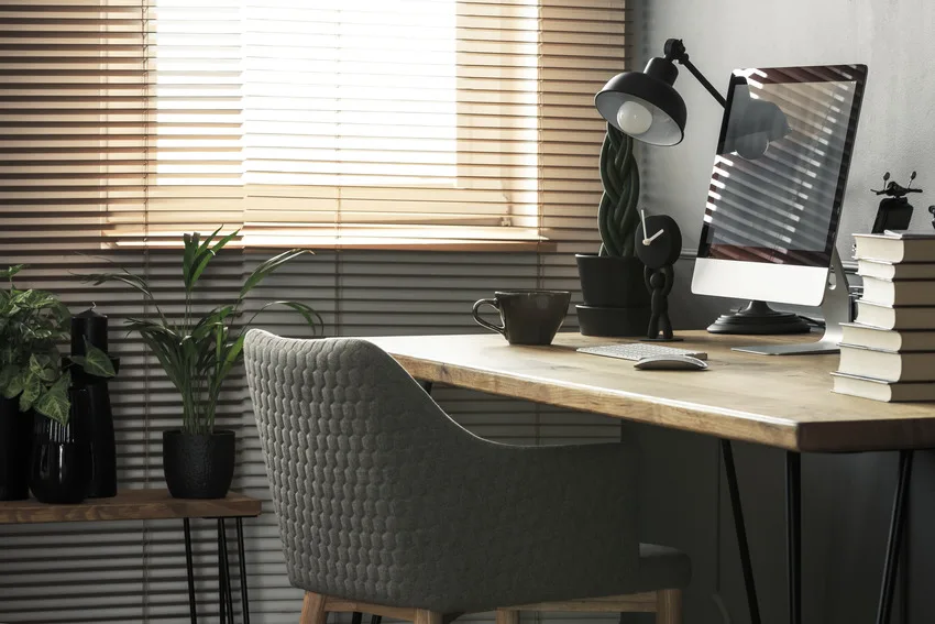
Deep, serious hues for the library office style
- Benjamin Moore Hale Navy HC-154 – classic navy
- Sherwin-Williams Granite Peak SW 6250 – deep blue with slate-gray undertones
Just consider: With dark walls, you’ll need controlled lighting. Get a good desk lamp and soft overhead light to prevent it from feeling too drab.
Paint finish to use for most home offices
- Eggshell or satin on walls (cleanable, wipeable, and not shiny)
- Flat/matte on ceiling (hides any weird imperfections or textures)
- If you’ve got kids or pets that leave fingerprints or smudges, consider going with a satin finish.
Mistakes that make colors feel wrong
- Picking based on how it looks on Pinterest or Instagram. That room most likely has different lighting than yours, so you should expect it to look different after you paint.
- Going too pale in an already dim room. These hues will look dull, cold, and sad if you don’t have enough light.
- Sampling only one wall. Make sure to test different walls, since what looks good on a bright sunny wall may look poor on one in the shadows.
- Consider your fixed finishes. Your furniture, area rug, and flooring can all play a big part in how your paint’s undertones look. Compare the paint chip next to these finishes to see how they look.
- Higher paint sheen = more reflection. For instance, a satin may look brighter than a matte finish in strong light.
- Bright white can increase the glare. If you’ve got lots of sunlight coming in and computer screens, a bright white may reflect too much. Use a slightly warm or soft white.
- If you’re on camera a lot, avoid going too dark. If you’ve only got one overhead light, this gets even worse. Make sure to use a front light if you’ve got a darker shade.
- Using too many different colors from your sitting position can be distracting. This could be your paint color, curtains, single accent wall, built-in etc. For better focus minimize the colors within view to cut down on visual noise.
- Too much contrast, like using bright white trim with saturated walls, can feel too visually busy when you’re trying to focus. This can have the effect of drawing your eye up to the edges of the room, which is unproductive for those who want to stay focused on their work.
To showcase highly specific designs, some images on this website use advanced AI-generation software to illustrate ideas and room inspiration. See our editorial policy to learn more.