Colors That Help You Sleep: Designer Bedroom Decorating Tips For A Restful Room

A good night’s sleep can be affected by your surroundings just as much as it can be affected by your physical being. Providing the correct colors in the room is an important factor when looking to increase sleep quality. Most bedroom paint colors, if used correctly, can be a great addition to a restful room. Some of the best colors to promote sleeping are listed below, as well as tips on how to use them to their full potential.
Sleep Color Comparison Chart
These six colors, all do six different jobs. Here’s what each one actually does once the lights go down to help you sleep, and the mistake people can make with each.
| Color | What It Does for Sleep | Shade to Use | Pairs Well With | Where People Go Wrong |
|---|---|---|---|---|
|
Gentle Blue |
The strongest performer. Blue reads as calm before you’ve even thought about it, and it tends to stretch sleep out longer. | Light or pastel blue on all four walls | White, warm wood, soft gray | Going too saturated. A deep navy is handsome but it stops feeling restful and starts feeling like a study. |
|
Muted Yellow |
Lifts the mood of the room. Good energy going in usually means better dreams coming out. | Pale butter yellow, used in moderation | Charcoal and mid gray | Forgetting it’s a warm color. Too much yellow makes a room feel physically hotter, which works against you at night. |
|
Peach |
Works on the body more than the mood. Those warm tones help muscles let go, and peach bounces light softly instead of glaring. | Soft, dusty peach | Cream, pale terracotta, linen | Picking a bright coral. At that point it belongs on one accent wall, not wrapped around the whole room. |
|
Silver & Gray |
Mimics moonlight, which quietly tells your body it’s time. It also reads cool, and your temperature is already dropping as you fall asleep. | Light cool gray with a silver undertone | Everything on this list | Drifting warm. A gray with too much beige in it loses the cool moonlight effect entirely. |
|
Pastel Pink |
Similar effect to yellow. It keeps the room feeling positive and soft, which carries into how well you rest. | Pale blush, nothing deeper | White wainscoting, soft purple | Sliding toward red. Anything that edges close to red on the wheel gets stimulating fast. |
|
Soft Purple & Lavender |
The one that feels like a weighted blanket. Deeper purple brings a sense of luxury and security, and dark walls remind the body that dark means sleep. | Lavender overall, deeper plum on one wall | Gray, silver, blue, pink | Letting it get heavy. Purple on every surface can feel oppressive, so break it up with gray. |

Gentle Blue

Blue is one of the best choices for an area of rest. Blue is best known for promoting calming and soothing feelings. Using blue in a bedroom is known to contribute to a longer and more peaceful sleep. A light or pastel blue is a great base color to paint walls while including some secondary colors as accents. With the color blue being so inviting and friendly different shades could also be used if no accent color is desired. See more blue and white bedroom designs on this page.
Soft pastel colors are good choices for children as well as adults – Holistic Sleep, Francis Buda
Muted Yellow

A soft yellow is another good choice for a restful night’s sleep as it is an upbeat and pleasant hue. Yellow is meant for good vibes and happy energy. This causes better sleep as it gives a positive spin to dreams and relaxation periods.
Paler and lighter colors yellows are suggested and are recommended in moderation, as they are on the warm color palette and have the potential to warm up the room if not careful.- interior designer Savannah.
Pairing softer yellows with grays is a popular combination as they complement each other and are both colors that help you sleep.
Peach
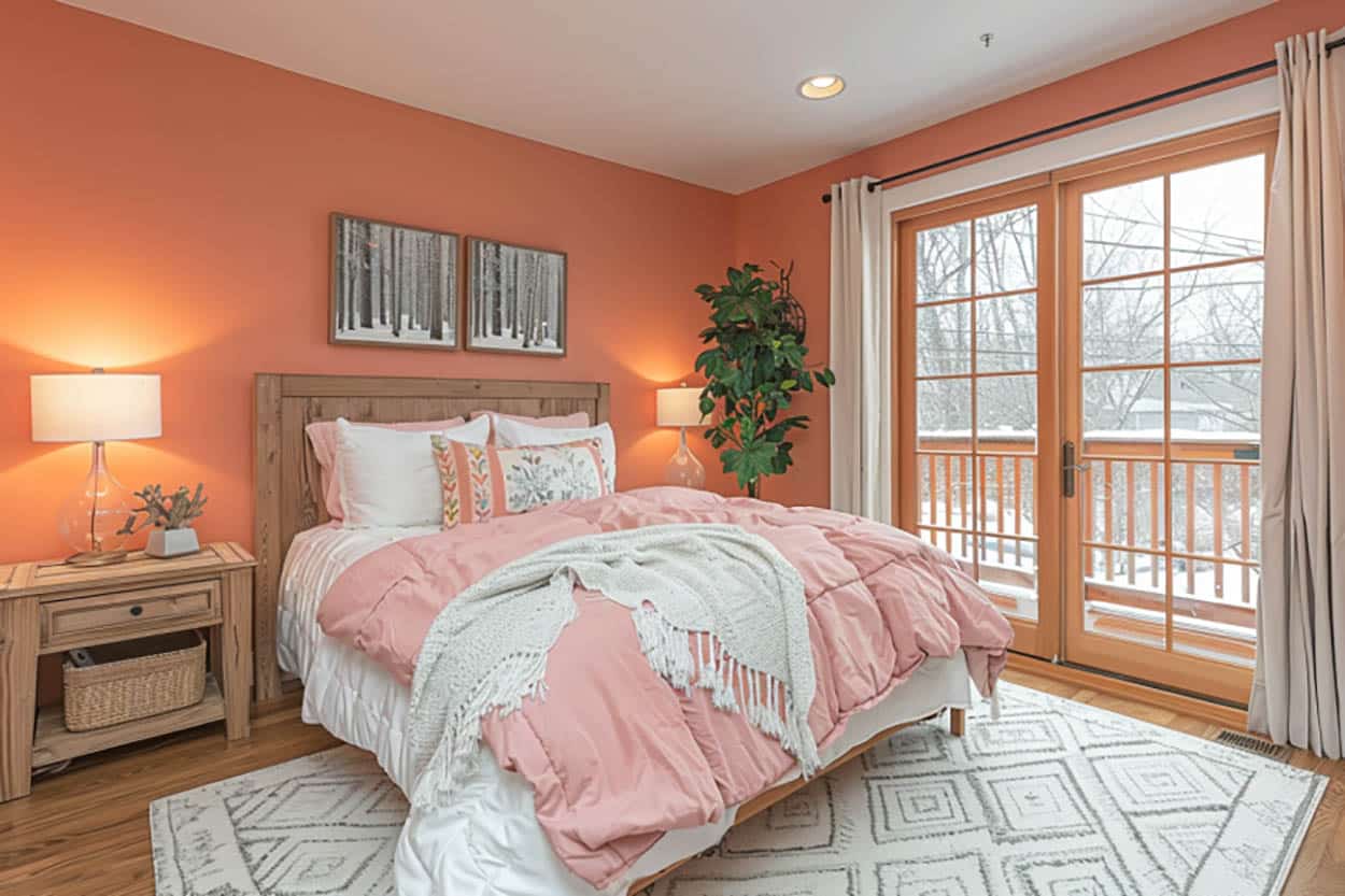
Though one may think peach is a louder color, its warm tones are actually used to promote relaxation, specifically for the muscles. Peach tones can be used with other complementary colors and pair great together; they can be used together to promote both relaxation and tranquility, making for a great area of rest.
Peach is often associated with cheerfulness and positivity, which may help in reducing stress and creating a pleasant environment for rest. The natural warmth of peach tones can make a room feel more inviting and cozy, which is ideal for a restful sleep environment.
Peach walls can reflect light in a gentle way, providing a soft illumination that isn’t too harsh or stimulating before bedtime. Though peach is good for relaxation and ease of muscle tension, it is important not to overuse an overly bright shade in the space. In that case, it is much better used as an accent.
Silver (and Grays)

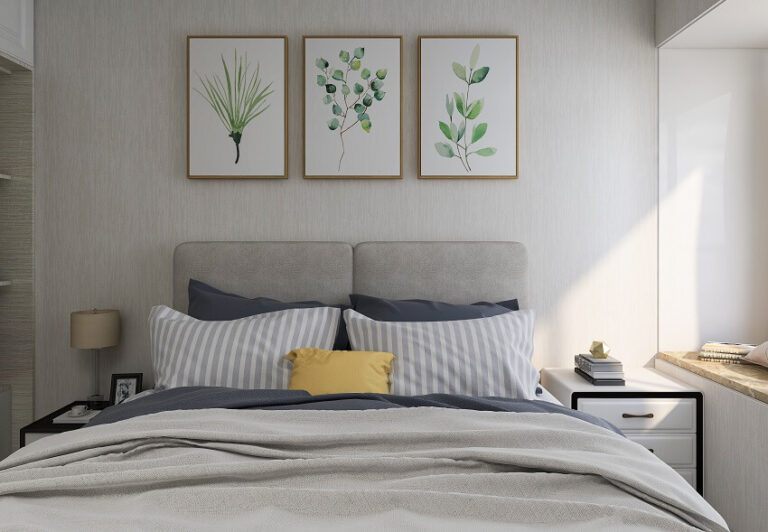
Silver and gray colors are a fantastic neutral to choose in rooms of rest. This neutral color gives off a cooler aesthetic compared to the other options of beiges. When sleeping the body temperature is working its way down, having a cool space with a bunch of comfy blankets helps promote rest and sleep.
Additionally, the colors of silver and gray can help mimic moonlight, which signals to the body that it is time to sleep. To let that body signal work, it is important to keep places of rest for primarily that.
Spending too much time in bed or the bedroom while doing other things (like watching tv, playing video games, or eating) can confuse the body into thinking the room is for activities other than sleeping, whether it is the hue of the moonlight or not. Incorporating cooler silvers and grays with any of the other mentioned colors make for a well rounded space all focused on rest.
Pastel Pinks

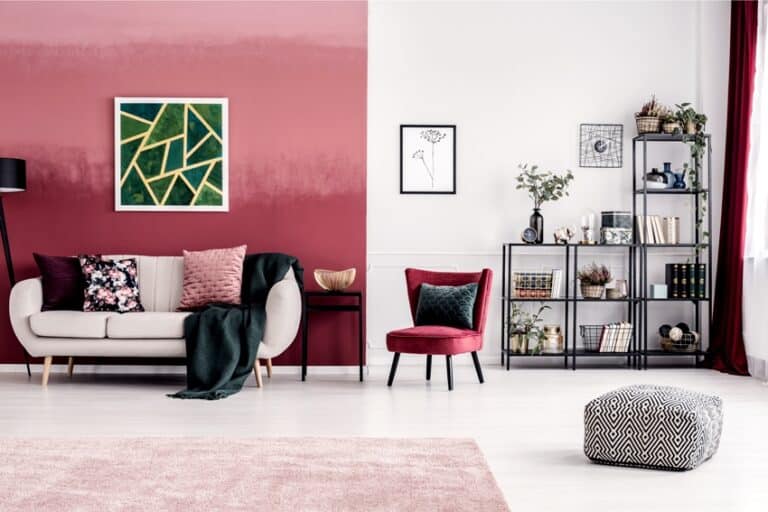
Pink has qualities similar to yellow. Pink is used to create a positive and happy environment, which promotes good dreams and feelings. This contributes to the quality of sleep that is commonly desired. As with other colors that include red in the making, it is important to stay away from any pink that is too deep or anything that gets closer to red on the color wheel. It is better to stick with paler and lighter shades to keep the room soft and inviting.
Soft Purple & Lavender

A deep purple can promote deep relaxation. It also gives a feeling of luxury that can promote sleep in the sense of safety and security. You have met all physical needs and now lay in a luxurious space, lessening worry and tension. Purple is a cool color that can help cool down a space when paired with colors like pink.
Purple is also a great addition to blue schemes as they partner well together. Using a deeper purple can also bring a heaviness to the space which can act similar to a weighted blanket in the sense that it promotes safety and deeper sleep.
Pairing with a gray or silver color can make the purple not so overwhelmingly heavy while still keeping a cool, safe area. Additionally, the darkness of the color can help remind the body that when it is dark, it is time to sleep. As mentioned previously, this only helps if you keep a sleeping area for just sleeping versus a multi-function space. See more purple bedroom ideas here.
To showcase highly specific designs, some images on this website use advanced AI-generation software to illustrate ideas and room inspiration. See our editorial policy to learn more.