Color Palette Tips: Unlocking the Secrets of Stunning Interior Design
There’s a subtle art to choosing the perfect color palette. With these tips you’ll get some tried and tested ideas to help you find the colors that are pleasing to you and evoke a sense of harmony and cohesion together. As we know, color can make or break an interior design. As a designer, mastering the art of choosing a harmonious, impactful color palette is essential. But where do you start in selecting that winning combination of shades and tones to transform your client’s space? Follow this designer’s blueprint to color palette perfection.
Start From What Inspires You
Draw inspiration from the colors you see in art, fashion, nature and even your client’s treasured belongings. Pay attention to how the shades interact. Is it high contrast or harmonious hues? Translate what you connect with into a tailored palette for your design.

Upload a photo and get instant before-and-after room designs.
No design experience needed — join 2.39 million+ happy users.
👉 Try the AI design tool now
Learn Your Color Theory
Understand the color wheel – it’s the artist’s toolkit. Learn the primary, secondary and tertiary colors. Know complementary shades that sit opposite on the wheel to create striking contrast. Discover analogous colors that are adjacent to seamlessly blend a palette. This theory helps balance color schemes.
Here’s a checklist to help:
- Primary colors: Red, blue, and yellow
- Secondary colors: Green, orange, and purple
- Tertiary colors: Combinations of primary and secondary colors
- Complementary colors: Colors opposite each other on the color wheel
- Analogous colors: Colors adjacent to each other on the color wheel
Use the 60-30-10 Rule
This interior design principle delivers the perfect palette template. Use 60% neutral, dominant shade – this flexibility allows walls to be repainted. 30% goes to secondary colors through furnishings and fabrics. Finally, 10% punchy or bold accent hues in artwork, cushions and decor prevents overwhelm.
Lighting Changes Everything
The right lighting takes a color palette from dull to dazzling. Natural and artificial light impacts shades. Test your combinations at different times of day. Ensure your colors complement the lighting to avoid a washed out or dark scheme.
With this designer’s guide, you now hold the blueprint to choosing winning, well-balanced and personality-packed color palettes. Simply start with inspiration, blend color theory, tailor the 60-30-10 rule and lighting test for interior design success.
Reflect Carefully On the Room’s Purpose
Before choosing a color palette consider carefully how you’ll be using the space. Bedrooms and bathrooms often benefit from cool, calming colors that promote relaxation. On the other hand, kitchens and living spaces can handle bolder, warmer colors that bring energy into the room. Home offices may incorporate muted shades or options like blue or green that can enhance mental focus.
Consider the Psychological Impact of Colors
In the same vein determining a room’s purpose, different colors can evoke various emotions and moods. Choosing a particular hue can evoke specific emotional responses and atmospheres which will work well when paired with a certain area in the home. Here are some examples:
Blues: Calm, and a promotes a feeling of serenity – Works well in a bedroom, office or bathroom. Avoid the kitchen and dining room as blue is known to be associated with feelings of appetite suppression. It may also appear less welcoming in a living room.
Greens: Nature, growth, and balance. Works well in the living area, kitchen, bathroom or home office for its connection to nature and calming vibe. Avoid areas such as formal dining rooms when it may appear too casual or bedrooms when using an energizing shade.
Reds: Energy, stimulation, and passion. For a bold look use it in the living area, home gym or dining room. Avoid in the bedroom and bathroom as the tone can be overwhelming and can detract from relaxation.
Yellows: Happiness, cheeriness and optimism. This happy shade works well in the kitchen, entryway and playroom where it can boost creativity and playfulness. However, avoid using it in the bedroom, home office or bathroom where it may feel distracting and too overstimulating.
Purples: Luxury, royalty and creativity. This alluring shade works great in a bedroom, in softer shades for living rooms or as a stimulating home office. Avoid use in the kitchen, bathroom or dining room due to its intensity.
Neutrals: Sophistication, versatility and timelessness. You can’t go wrong using neutral palettes in living rooms, bedrooms, offices or practically any other room you can think of. However, it may be too subtle for rooms that require a little more energy such as home gyms and playrooms.
Use Neutrals As a Base
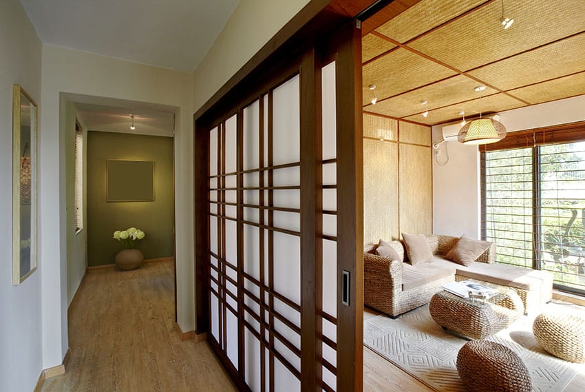
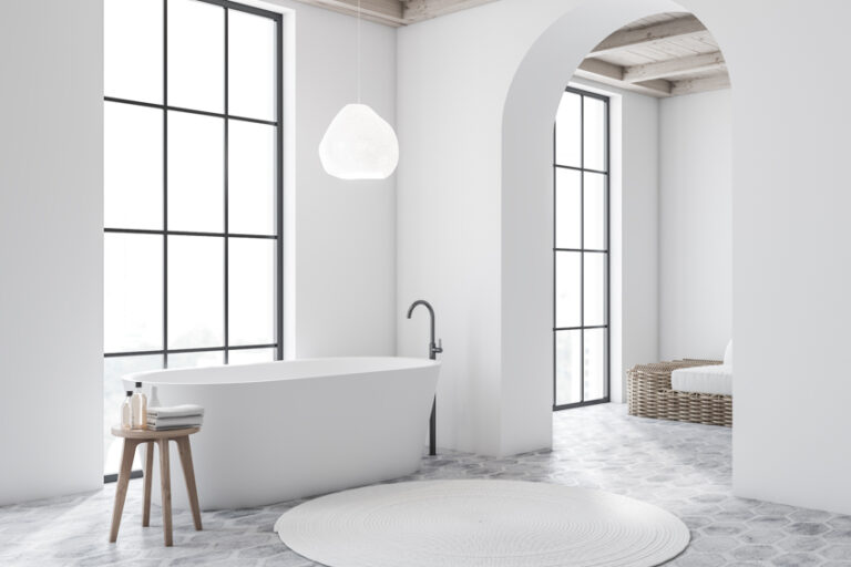
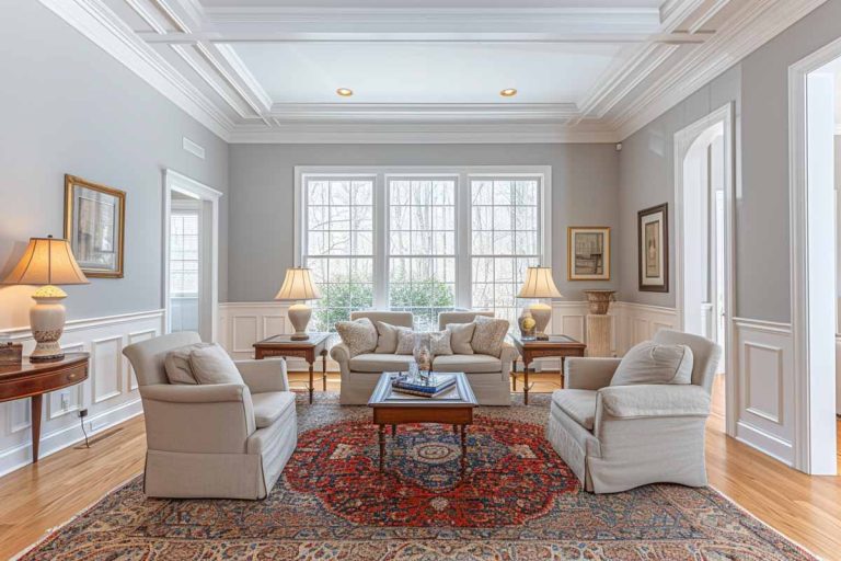
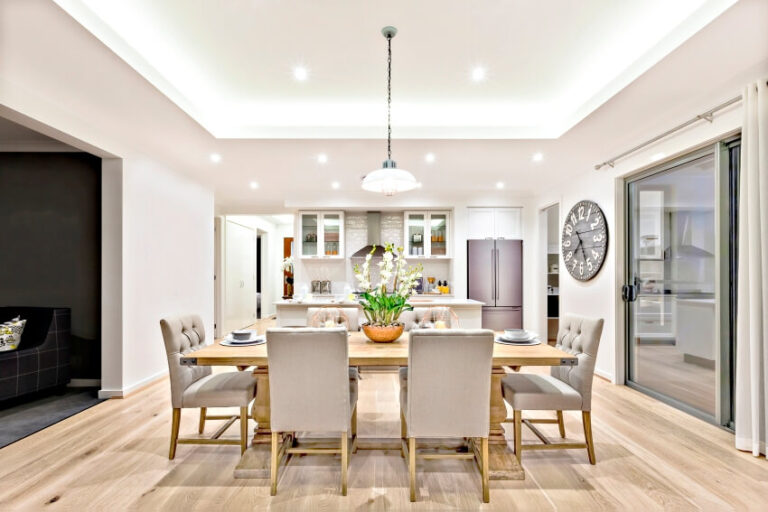
By employing neutral tones as a flexible base tone you can avoid overdoing color and help add balance. Whites, beiges and grays nicely tone down bolder accent hues. They also work well for open layout colors where continuity from room to room in needed. In addition, neutrals used for trim work work well with a wide variety of hues and offer flexibility and a classic aesthetic. Don’t forget to also consider textures and patterns when assembling a color scheme. Interesting fabrics, prints and materials add further depth and dimension to any palette.
Test Before Committing Yourself
Before finalizing any major color commitments, thoroughly test out your ideas using paint samples, swatches of fabrics, or digital visualization apps. Evaluate colors together in the actual room you will be designing combined with its lighting fixtures to best judge overall harmony. This will give you a true representation of what to expect. Avoid analysis paralysis though by also trusting creative instincts on suitable yet unexpected color combinations.
Ultimately, choosing an ideal color palette requires blending science-based guidelines with intuitive artistry. Through practice and applying these essential tips however, you’ll skillfully create palettes that delight clients and exhibit your mastery as a designer.
To showcase highly specific designs, some images on this website use advanced AI-generation software to illustrate ideas and room inspiration. See our editorial policy to learn more.

