Small Kitchen Design Ideas to Maximize Space
This gallery showcases small kitchen design ideas in a variety of styles. Those with a small kitchen space know it can be a challenge to create an efficient floor plan that looks attractive and remains functional. Below are many interior designs to give you ideas for getting more out of a small kitchen layout.
Small Kitchen Designs
So you want to make the most of your small kitchen space? Here are three simple tricks to help you maximize the space you have.

Upload a photo and get instant before-and-after room designs.
No design experience needed — join 2.39 million+ happy users.
👉 Try the AI design tool now
Make the most of your storage – Instead of closed cupboards or cabinets, try open storage. If you forgo doors on your cupboards or cabinets, this will allow people to see the walls behind and lend an illusion of space.
According to interior design writer Cheyenne Lentz, functionality should be the main focus when designing these small spaces. Look for storage solutions that utilize vertical real estate to open up the limited square footage. By using upper cabinets, racks, and shelving that extend to the ceiling, smaller kitchens can accommodate cooking equipment and accessories while maintaining an airy aesthetic.
Lentz also explains, selecting a unified interior design scheme allows a the design to feel connected to adjoining living areas, promoting a smooth cohesiveness between rooms regardless of size limitations. Concentrating on functional elements and deliberate décor allows compact kitchens to feel sizable, orderly and visually appealing.
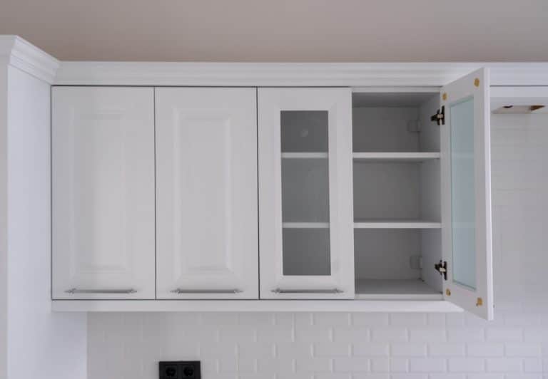
Use glass – Full or partial glass doors will allow people to look in and still lend an illusion of depth. Mirrors have long been used to create the illusion of space; mirrored cabinet doors will also save the same purpose. Recessed storage space, shelving that is flush with the wall or cupboards that recess into the wall, adds storage without consuming floor or air space.
Keep your storage space neat – Clutter takes up space, minimal clutter will help you navigate your layout easier and make the entire room seem neater. Neat, open shelves aren’t just storage space but attractive displays that lend character and atmosphere. Be creative with storage. Antique or decorative pot racks hung above your head free space and are a nice decorative touch. Baskets or trays to hold jars of condiments or essential utensils can ensure you locate what you need quickly without cluttering your countertops.
Design experts from Fade and Forge recommend utilizing creative storage solutions to maximize kitchen organization and efficiency. Installing pull-out pantries, magnetic spice racks, and drawer dividers is a smart way to optimize every inch of space. They also rely on folding and extendable furniture that can open up when needed or tuck strategically away for extra movement space.
Light but bright – Natural light makes a space seem more airy and spacious, use as much as you can. Windows should be uncluttered. Window dressings should be small and made of light material. An opaque shade or a gauzy valance is decorative while still letting in light.
White walls will reflect light and makes the walls seem to recede. A mostly white color palette, such as white walls and cabinets will create a seamless space. Your eyes will take everything in without seeing boundaries and edges. You can use several shades of white or contrasting textures to keep it from feeling to sterile or bland. If you don’t want to use all white, go with pastel or light colors.
A low-contrast color scheme, where you use several varying but similar colors, has a serene and expansive effect. When there is little difference between the colors of say the wall, the countertop and the woodwork, people’s eyes will glide over the surfaces and the movement will make them think the space is larger than it is.
Look down – If you want wood floors, make them light colored. Consider using alternating strips of light and slightly darker wood for a striped effect. Stripes lend length and having striped flooring can “stretch” the floor space. Striped rugs can also have the same effect. If you want to use tiles or vinyl, consider using elongated geometric patterns to draw the eyes either lengthwise of vertically. A good pattern to use would be oversized diamonds. Make sure the diamonds create diagonal lines that give your eyes a longer path to follow so that the room feels wider.
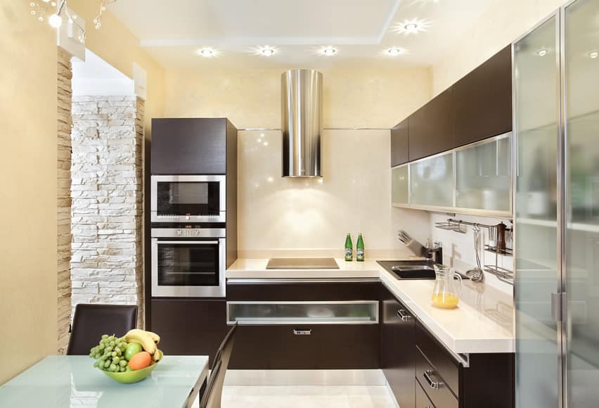
The tiny kitchen floor plan shown in the picture above uses a simple L-shape layout. The walls are in a refreshing light yellow color, and the ceiling is in white to help make the space appear bigger. The cabinets are devoid of ornamentation and moldings, but instead use wengue-stained wood cabinets. The lower portion of the overhead cabinet mixes the dark stained cabinetry with the use of frosted glass doors and stainless steel framing, while the appliances are low-profile stainless steel units. The countertop is solid-surface in an off white color, with a matching back-painted glass for its backsplash.
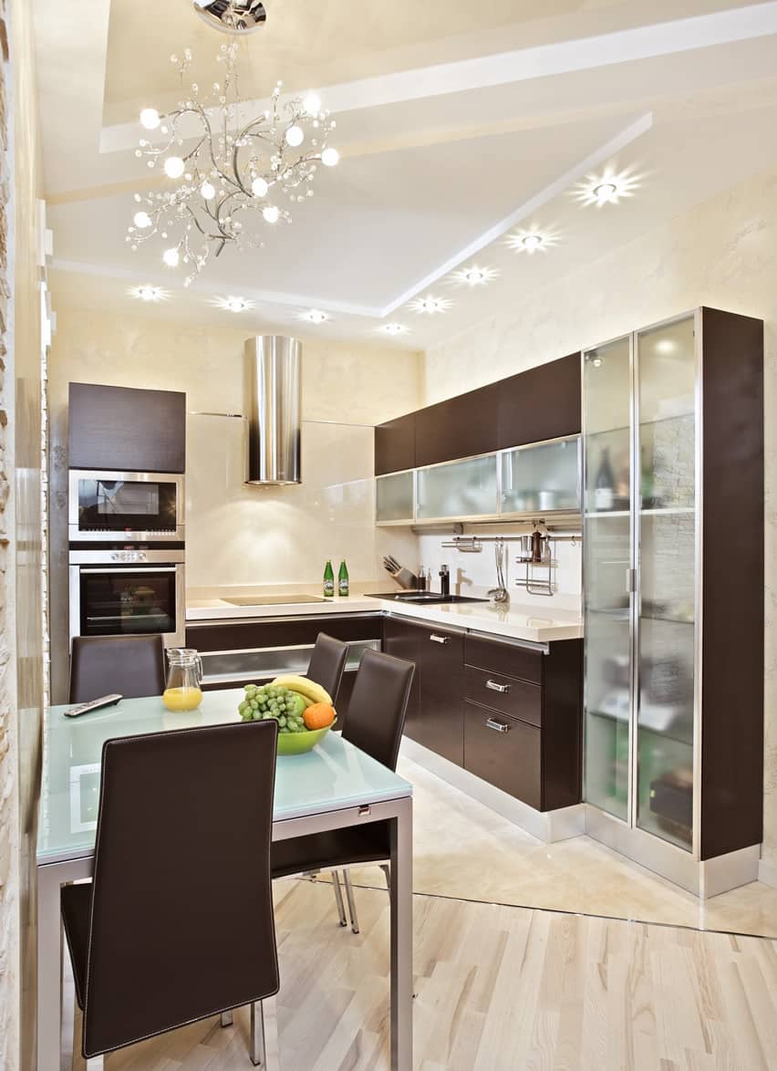
This is the second picture of the same L-shaped kitchen shown above. The unique design of the ceiling is also notable in this design, in which the flooring layout also follows. The kitchen’s porcelain stone tiles is separated from the small dining nook with a diagonal stainless steel tile trim which transitions into light beechwood engineered floors.
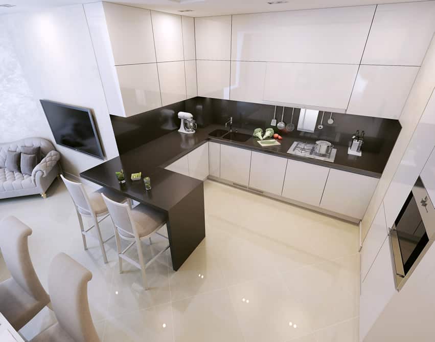
The minimalist design approach in this kitchen keeps the clutter at a minimum while providing the maximum possible space for food preparation. The eggshell white porcelain tiles help reflect light to illuminate the small space, and the push-to-open high-gloss cabinet doors keep everything clean and crisp-looking.
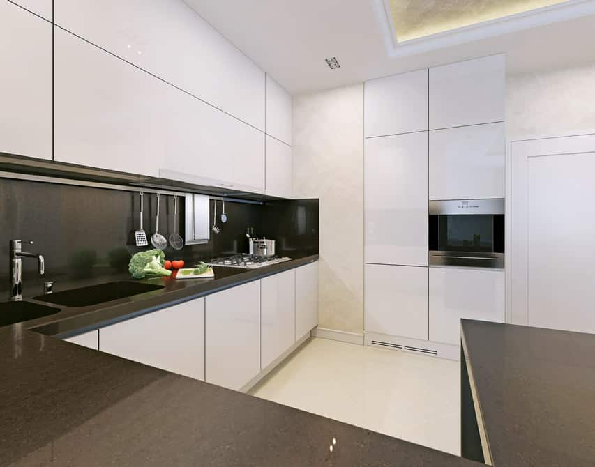
This second picture of this design set shows a closer look at the counters. The black galaxy solid-surface countertop pops out of the white cabinets well, and the same material is also used for the small bar/breakfast counter. The sink blends seamlessly with the countertop as it uses the same solid-surface material, and even the backsplash uses the same type of solid-surface. The exposed walls, to break away from the plain cabinets, are in off-white rag-rolled finish.
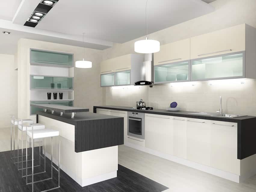
This modern kitchen design focuses on the whites and the blacks. Floor tiles are white porcelain tiles, with black accent porcelain tiles underneath the bar counter. For the ceiling, white is also the color of choice, while off-white paint was used on the walls. The under-counter cabinets and the pantry cabinet are all in white, while the overhead cabinets are in a cream shade with a combination of cream doors and glass doors. The countertop uses black solid-surface for a seamless finish.
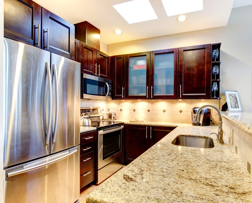
This tiny-packed layout was able to fit a French Door Refrigerator and a U-shaped kitchen with even a small bar counter/ledge. To help make the space appear bigger, walls were kept white, and even the backsplash color is white. The cabinetry are all solid wood stained in a red Mahogany color, with a Kashmere white granite countertop which helps reflect and bounce off light.
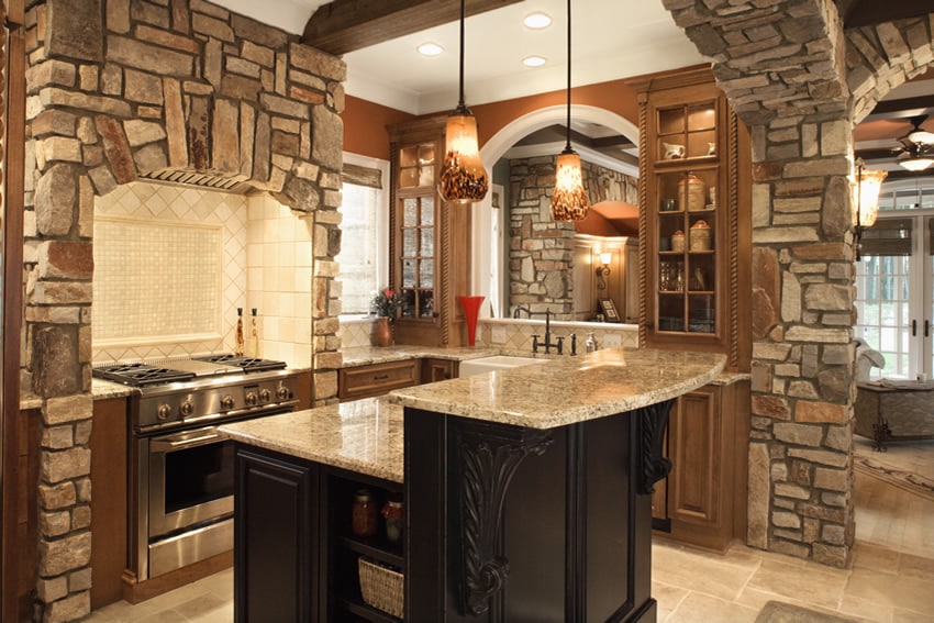
This kitchen gives the feel of an old palace’s basement, only that this one’s brighter and more welcoming. Its arches and columns are clad with natural stone masonry, with exposed wooden beams and white-painted ceilings, giving it that “raw” look. Walls are painted in a shade of brown that matches the natural Maple wood cabinets, while the door and window frames are all in white to visually separate it from the walls. Countertops uses gorgeous slabs of Beach white granite, and the wall behind the cooking range was finished with white mosaic tiles framed with diagonally-arranged ceramic tiles.
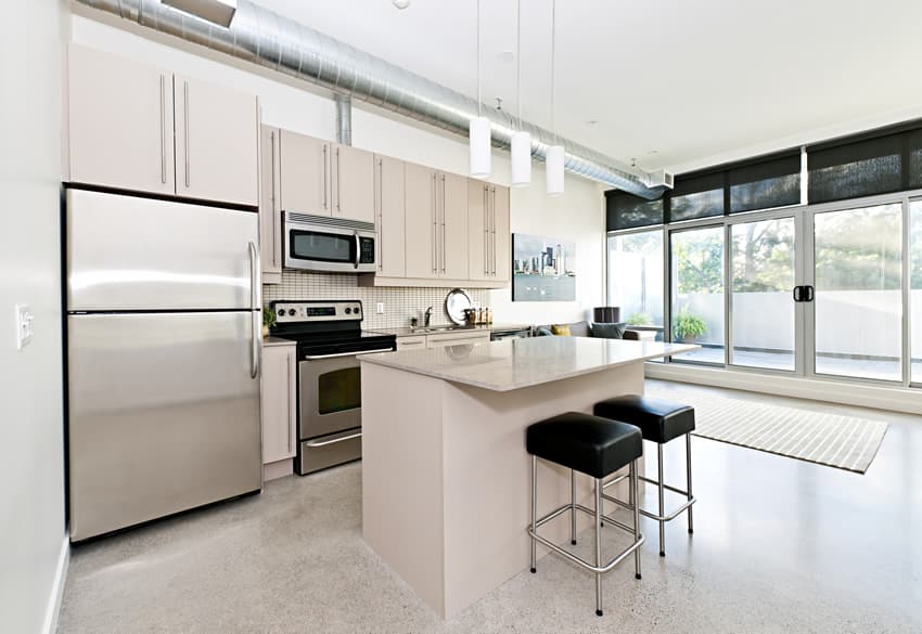
The charm of this kitchen is its raw and industrial appeal – gray terrazzo floors, white walls, white ceiling and exposed ducting pipes. However, it goes for the “cleaner” version of the industrial style with its choice of colors and finishes. The cabinets are painted in a light cream color with a cream granite countertop to match, while the backsplash mosaic tiles is also in a light cream color. Small room design ideas like this that have the benefit of an open floor plan can add an island for additional food prep space and a spot for eat-in dining.
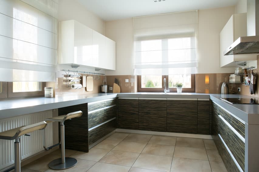
Another small kitchen which was able to maximize the multi-use potential of the space. Starting with the light cream ceramic tile floors, a similar light cream color goes up the walls and fades into the white ceiling. Cabinet doors are laminated with zebrawood with very modern continuous drawer handles. True to its minimalist aesthetics, countertop is laminated in gray, and overhead cabinets are in a high-gloss white finish, with a sienna graphicote backsplash. The gray laminated counter seamlessly goes around the space up to the surface of the small breakfast counter/nook.
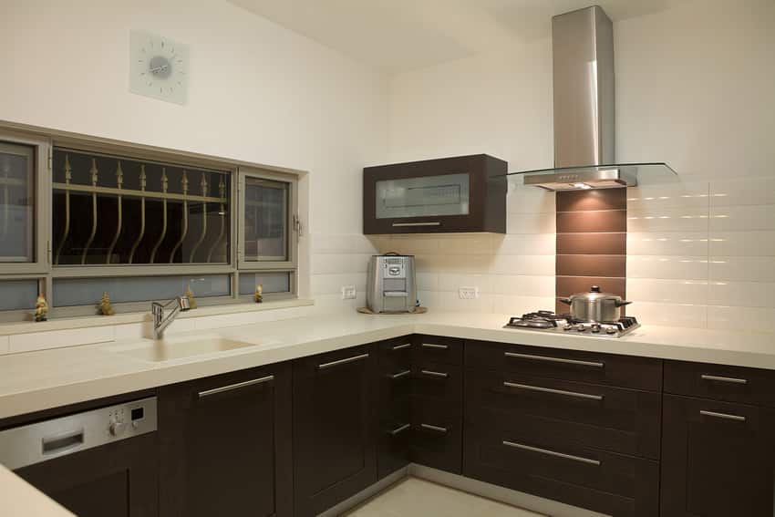
Typical of a modern style kitchen, this small layout adapts a wengue and white palette. Walls and ceiling are plain white, with white porcelain tile floors and white solid surface countertops. Paneled cabinetry are all in wengue finish with brushed stainless steel pulls and kickspace. Appliances would also be in stainless steel, and the backsplash uses a combination of dark brown and white ceramic tiles.
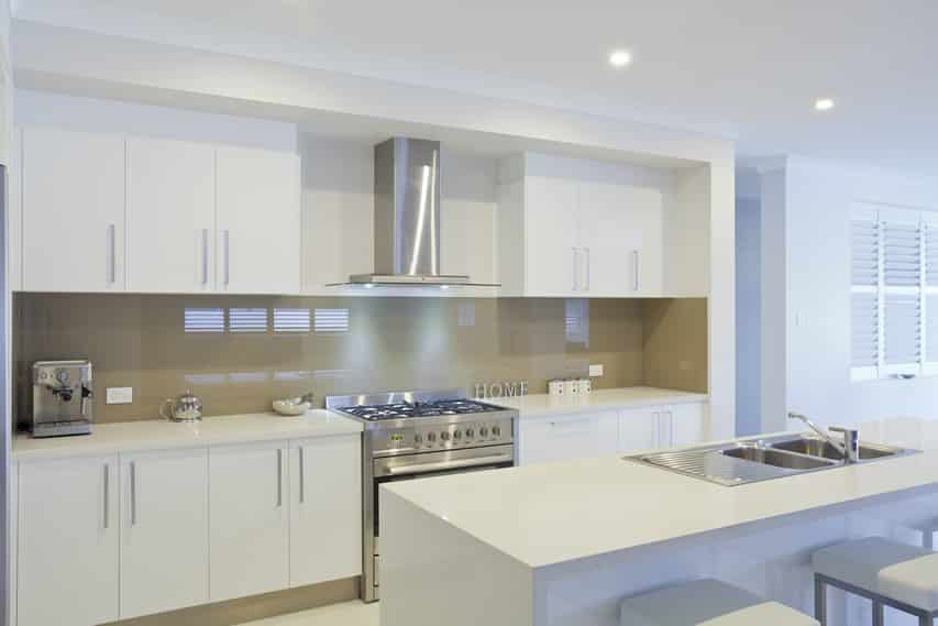
Fresh and light, this kitchen is the epitome of clean and modern design. It adapts a simple white and warm gray palette and has little to no ornamentation. It is a single line wall layout with an island bar counter, with white laminated cabinets and white solid-surface countertops. All cooking accessories are of brushed stainless steel, while the backsplash and kickspace uses warm gray graphicote glass.
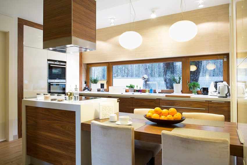
This modern kitchen design has a beautiful combination of colors and finishes, easy on the eyes and gives out a warm and welcoming feeling. Solid wood floors are of a neutral shade of beech wood, while all the wood elements uses a Golden Walnut color, giving the overall warmth and character to the design. Other elements like the custom kitchen island utilizes a lower area for eat in dining and an upper counter for meal preparation. The design’s countertop and the pantry/oven wall are all in white, while the overhead cabinets uses a cream shade of laminates and uses no hardware, making it blend into the wall.
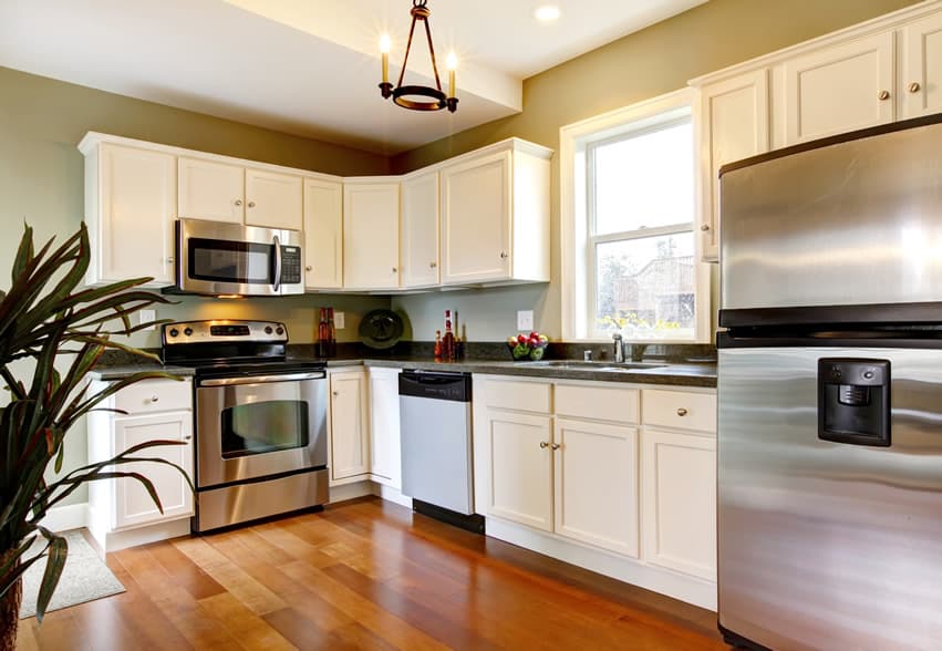
A kitchen design with the charms of both modern and classic design styles. The sage green walls gives an overall “aged” feel to the room and at the same time, helps make the eggshell white cabinets stand out. Black granite is the countertop material of choice to counterbalance the light appearance of the white cabinets, while the hardware used for the cabinets matches the rest of the appliances in brushed stainless steel finish. Floors are of solid Golden Oak, giving the room a warm glow.
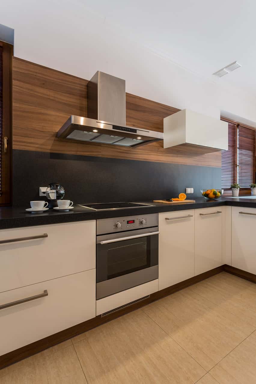
The most defining character of this modern kitchen design is its combination of Light Walnut wood panel and black solid surface for its walls/splashboard. While the cabinets are kept simple with white laminates and stainless steel hardware, the kickspace is noticeably clad in the same light walnut finish to contrast the light Beech wood ceramic floor tiles.
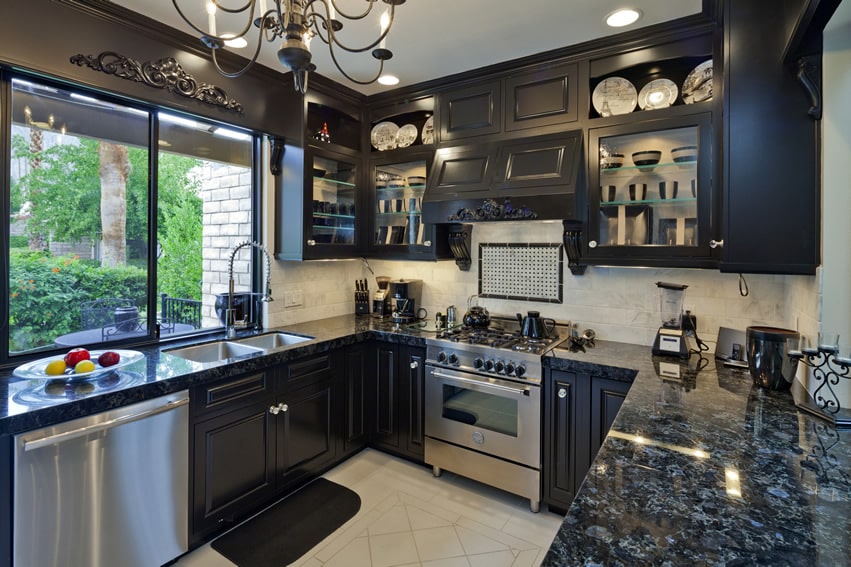
This kitchen has an interesting all-black neo-classic theme. The cabinetry has molding details and is all in a black satin finish with stainless steel hardware, while the countertop uses Blue Pearl Granite. To balance the darkness, the white ceramic floor tiles help bounce the light coming from the large windows and the artificial lights. Lastly, the backsplash uses white porcelain tiles to help brighten up the space.
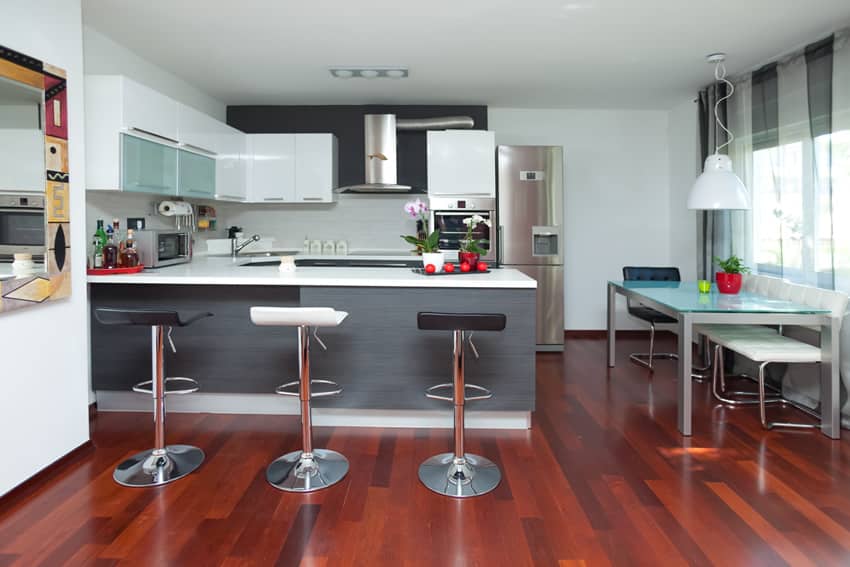
While the space’s floors use very bold rosewood, the walls and ceiling are all kept simple with white paint. Following a modern minimalist style, the kitchen cabinets are mostly high-gloss white combined with frosted glass and stainless steel, while the lower cabinets, including the bar counter, use gray wood laminates, making the white solid-surface counters stand out. White subway tiles were used for the backsplash, with white grout to help keep the look clean and simple.
This concludes our gallery of smart space stretchers for small kitchen design ideas. Make sure to check out our small kitchens with dark cabinets for many more exciting interior design images.
To showcase highly specific designs, some images on this website use advanced AI-generation software to illustrate ideas and room inspiration. See our editorial policy to learn more.

