After over a decade of working with interiors, I’ve heard of countless homeowners standing in their freshly painted rooms with that same confused expression: “This looked completely different on the chip!” The reason is their paint undertones. These are those elusive secondary hues that are hidden beneath a color’s surface, that only reveal themselves once you’ve put in the effort to apply gallons of paint to your walls. Understanding how these undertones work isn’t just helpful; it’s essential to get the look you want and avoid redoing hours of labor. Let’s take a closer look at how these paint undertones work, so you get it right the first time.
Think of paint color as having two different personalities. The overtone is what you see first, and this is the prominent color family, like beige, gray, or white. The undertone is the more subtle hue hiding underneath, which is often revealed under different lighting conditions. A “warm gray” might have brown or yellow undertones, while a “cool gray” could lean more toward a blue or purple shade.
Easily Create Your Own Room Makeover
Upload a photo and get instant before-and-after room designs. No design experience needed — join 2.39 million+ happy users. 👉 Try the AI design tool now
These subtle, hidden hues become even more obvious once they’re painted on the wall and dry, especially when natural light floods the room, or your lighting comes on at night. That’s why what looked like what you wanted in the store can suddenly look strange and very different from what you expected.
The Comparison Method For Finding Undertones
Here’s the tried-and-true technique I like to use for spotting undertones. First, you’ll never want to evaluate a color by itself. Place your paint chip next to a true neutral tone, like a pure white or true gray swatch. The undertone will then reveal itself to you so you can make a more informed decision.
For example, hold a “white” paint chip against a white piece of printer paper. Suddenly, you’ll see whether it’s leaning toward a peach, gray, yellow, or blue hue. That barely-there tint on the chip becomes much more visible when you have a reference point to compare it to. I also recommend comparing your top picks side by side. The coolest option from your choices will make the others look warm by comparison, and help you determine which direction each color leans.
Test in Your Actual Space
When you shop, you may have noticed that paint stores are flooded with artificial lighting designed to make everything look appealing. Your home is not a paint store, and its lighting will be quite different. The only way to truly understand how a color will behave is to test it in the room where you’ll use it.
Purchase sample pots of your top choices and paint large swatches that are at least two feet by two feet on different walls. Try painting these near windows, in darker corners, and on walls that receive different light exposure throughout the day. Then wait for these to dry and check how these samples look after at least 48 hours. It also pays to check them at different times of the day, such as in morning light, afternoon sun, and evening lighting. You’ll be amazed to see how dramatically the same color shifts from dawn to dusk. This way, you can get a complete idea of the color and its undertones to better understand how it reacts to your environment.
I also tell clients to look at their samples from different areas of their room. A color that looks perfect from the doorway might feel a lot different when you’re sitting on the sofa.
Common Undertone Problems
Certain paint colors are more prone to having undertone surprises. Let me save you from a few of the common problems you may experience.
Greige: This gray-beige tone sounds perfect in theory. However, in practice, greige can go rogue depending on its undertones. Some types lean more toward purple, like many popular neutrals from major brands, others pull you toward pink, and some reveal green notes. Always test your greige extensively before committing.
White: Perhaps no color category offers more variables than white. Whites can have undertones in yellow, gray, blue, pink, or even green. A white with warm undertones will make a north-facing room feel cozy, but it may feel more dingy or lean toward a cream in bright southern light. Cool whites create a crispness in bright spaces, but may feel stark and uninviting in rooms with limited natural light.
Gray: The go-to neutral of the past decade, and is famous for being tricky to work with, is gray. Many gray shades have strong purple or blue undertones that only emerge after being painted on the wall. Other types unexpectedly skew green, especially in rooms with lots of natural light, or brown. Using the wrong gray hue can make your space feel cold and unwelcoming, dark, or worse, accidentally lavender.
Consider Your Room’s Context
Paint color never exists by itself, and the undertones you use must work well with everything else in your design. To get the overall picture, take a look at your flooring first. If you have honey-toned hardwoods, they will amplify warm undertones and clash with any cool grays. If you have cool-toned tile or gray-washed floors, using warm beiges might look yellow and dated against them. Your wall color and flooring should exist in the same temperature family, and either be both warm or both cool.
Don’t forget about your fixed elements as well; these are the elements like countertops, tile, cabinets, and any built-ins you’re keeping and not replacing. A gray with blue undertones can make your beige granite countertops look orange. On the other hand, warm whites can clash with cool gray quartz. These color relationships matter more than the wall color to get a cohesive design.
Room-Specific Paint Undertone Guide
Choosing the right undertones for every space in your home
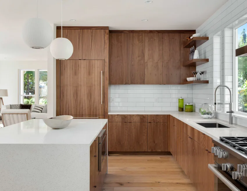
Kitchens
→Challenge: Cabinets, countertops, and appliances create complex color relationships
→White cabinets: Match the undertone of cabinets (cream with cream, cool with cool)
→Wood cabinets: Use warm undertones (yellow, peach) to complement
→Stainless steel: Cool grays work best, avoid yellows
→Pro tip: Artificial lighting dominates so test under your kitchen lights at night
→Flow: Should transition smoothly between room tones
Kids’ Rooms
→Flexibility: Choose undertones that work as the child grows
→Avoid: Overly saturated undertones (hard to decorate around)
→Best: Soft, muted undertones let décor provide personality
→Playrooms: Can handle brighter, bolder undertones
Fixed Element Quick Reference
Fixed Element
Element Color/Tone
Best Wall Undertone
Avoid
Flooring
Honey oak / warm wood
Warm (yellow, cream, peach)
Cool grays, blues
Flooring
Gray/whitewashed wood
Cool (gray, blue, green)
Yellow, orange, beiges
Countertops
Beige granite/marble
Warm neutrals
Cool grays (will look orange)
Countertops
Gray/white quartz
Cool (match exact undertone)
Warm yellows (will look dingy)
Tile
White subway tile
Match the tile’s undertone exactly
Mixing warm tile + cool walls
Cabinets
Cream/off-white
Warm whites, cream
Cool whites (creates contrast)
Cabinets
True white/bright white
Cool whites, light grays
Warm yellows (cabinets look blue)
Brick
Red/orange brick
Warm neutrals, greige with yellow
Cool grays, blues, purples
Open Floor Plan Warning
If your kitchen, dining, and living areas flow together, your undertones MUST be consistent across all spaces. Even if you’re using different paint colors, they should all share the same undertone temperature, such as being all warm or all cool.
The Light Direction Rule
This is one of the most important lessons I share with clients: the direction your windows face will affect which undertones will emerge. North-facing rooms receive cool, indirect light all day. This light brings out your cool tones and can make them appear almost icy. To counteract this, choose colors with warm undertones to add more balance and coziness.
South-facing rooms are flooded with warm, golden light that increases the strength of warm undertones, sometimes overdoing it. In these spaces, using cooler ones can provide more balance. East-facing rooms get more warm morning light but cool afternoon light, while west-facing rooms experience the exact opposite. These spaces need colors that work in both conditions, which usually means more neutral undertones.
What About Trim and Ceilings?
Here’s where undertones get even more interesting. Your wall’s color will look different depending on what’s put next to it. If you’re painting walls a warm neutral but keeping stark white trim, the contrast will make your walls feel more cream or beige than you expect. In addition, if your trim has warmer undertones and you choose cool gray walls, the gray might look more blue or purple. Many designers now recommend matching undertones across walls, trim, and ceilings for a cohesive look. So this means, if your walls are a warm white, your trim should also be a warm white. This matching technique creates consistent harmony rather than a contrast that may not work well.
Undertone Reference Chart
Paint Undertone Quick Reference Chart
Your blueprint for choosing paint colors with confidence
Common Undertones by Color Family
Whites
→Warm: Yellow, cream, peach
→Cool: Blue, gray, violet
→Neutral: Balanced, minimal tint
Grays
→Warm: Brown, taupe, greige
→Cool: Blue, purple, green
→True: Pure gray, no tint
Beiges
→Warm: Yellow, orange, pink
→Cool: Gray, violet (rare)
→Greige: Gray-beige blend
Greiges
→Warm: Taupe, brown, yellow
→Cool: Purple, mauve, blue
→Green: Unexpected olive notes
5-Step Testing Blueprint
1Compare to True Neutral: Hold your paint chip against a white paper to reveal hidden undertones immediately.
2Buy Sample Pots: Purchase 2 to 4 top choices. Never skip this step as it’s the only way to see real-world performance.
3Paint Large Swatches: Apply 2ft x 2ft samples on multiple walls (near windows, in corners, and at different exposures).
4Observe for 48 Hours: Check samples in the morning light, afternoon sun, and evening light. Note any dramatic shifts.
5Check Against Fixed Elements: View samples next to flooring, countertops, cabinets, and trim to ensure they work.
Light Direction Guide
Room Exposure
Light Quality
What Happens
Best Undertone Choice
North-Facing
Cool, indirect, consistent
Amplifies cool tones, can feel icy
Warm (yellow, peach, cream)
South-Facing
Warm, golden, abundant
Intensifies warm tones dramatically
Cool (blue, gray, green)
East-Facing
Warm morning, cool afternoon
Color shifts throughout the day
Balanced or slightly warm undertones
West-Facing
Cool morning, warm evening
Golden glow in late afternoon
Balanced or slightly cool undertones
Pro Tip: The Fixed Element Rule
Your wall color must harmonize with the elements you’re NOT changing out. Honey oak floors need warm undertones. Gray tile needs cool undertones. Mixing warm and cool creates an unintentional clash. When in doubt, match the temperature (warm vs. cool) of your largest fixed surface.
Red Flag Situations
Gray Looks Purple
→Issue: Strong violet undertone
→Cause: Warm lighting or beige surroundings
→Fix: Choose grays with brown or green undertones
White Looks Yellow
→Issue: Cream undertone in bright light
→Cause: South-facing room or warm floors
→Fix: Switch to white with gray or blue undertone
Beige Looks Pink
→Issue: Pink or mauve undertone emerging
→Cause: Cool light or gray-toned surroundings
→Fix: Choose beige with yellow or orange undertone
Greige Looks Green
→Issue: Hidden olive undertone
→Cause: Abundant natural light
→Fix: Choose greige with more gray or taupe
Remember: Context Is Everything
A paint color never exists by itself alone. The undertone that works beautifully in the store might clash in your home. Always test in YOUR space with YOUR lighting and YOUR fixed elements. The time and money spent on proper testing will save you from the painful process of repainting an entire room.
A Final Word on Trusting the Process
Reading undertones is a mix of science, art, and experience. Even after many years, I still have to sample based on the room conditions before making any final recommendations. The few dollars you spend on sample pots and a couple of hours of observation will save you from the trouble and expense of repainting an entire room.
It also pays to remember that paint trends come and go, but a color that works with your home’s natural light, existing finishes, and personal style will bring you more satisfaction in the long run. Take your time, and test thoroughly, so you get the color that you really want without having to redo everything.
To showcase highly specific designs, some images on this website use advanced AI-generation software to illustrate ideas and room inspiration. See our editorial policy to learn more.
Transcend your bathroom interior into a space of rejuvenation with a refreshing shade of green. Showstopping green-colored bathrooms have been popping up lately in our…
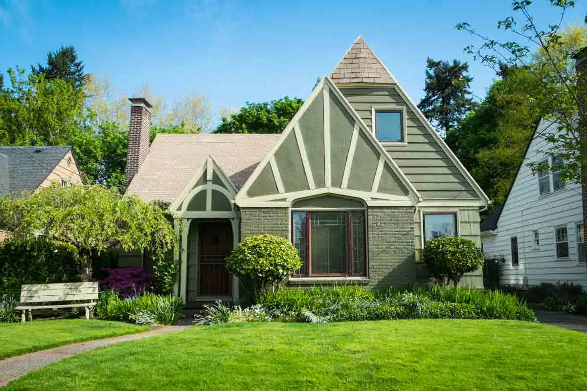
The ever-enduring charm of Craftsman-style homes continues to captivate homeowners and admirers alike. If you own a Craftsman-style home, complement the design with a fresh…
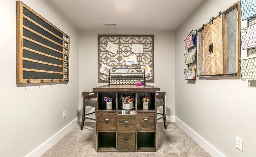
For the ardent crafter, having one’s own space is sublime, without distractions tinkering away through hours of the day or night. If you’re renovating or…
Knowing the best tips on what color curtains go with gray walls, such as classic white, emerald green, multi-colored bohemian style, and other window covering…