Color Wheel (Ultimate Color Matching Guide)
Welcome to our page on the color wheel and how to use it for matching colors for your interior design projects. In everyday life, our world is filled with colors. From green trees to white clouds, to yellow sunshine and gray storms, we are immersed in the beauty reflected by colors. Inspired by nature, we have adapted colors to our clothes, homes, personal grooming, toys, and educational materials. We have learned how to mix and match the colors to set a specific mood, theme, or genre.

The human eyes and brain translate millions of different colors. Studies show that we see 1000 levels of light dark, 100 levels of red-green, and 100 levels of yellow blue. It is definitely difficult to determine every single color there is. In interior design, the color wheel provides a visual representation of colors arranged according to their chromatic relationship. Also known as a color circle, the color wheel helps us see which colors mix well with others, and which don’t.
In interior design, colors are extremely important. The proper combination of colors translates to a specific purpose of a room. For example, bedrooms are usually made with cooler colors such as blue, gray, green, and purple. They send a message that the room is for relaxing and unwinding. However, rooms with maximum activity are decorated in brighter colors such as red, orange, or yellow. A room with black tones sends a message of seriousness, elegance, and power, which can be perfect for home offices or study. Orange tones translate to health, happiness, and youth which is great for kitchens or exercise rooms. Without knowing it, colors influence our moods by simply stepping into a room.

Upload a photo and get instant before-and-after room designs.
No design experience needed — join 2.39 million+ happy users.
👉 Try the AI design tool now
Color Wheel Chart
Origin of the Color Wheel
In 1666, Sir Isaac Newton conducted an experiment on a prism in which he discovered that pure white light contains more colors. This has been dubbed the first color wheel. Newton’s color wheel has 12 colors. Over the years, scientists and artists have made improvements to make the color wheel look like it does today.
Primary Colors
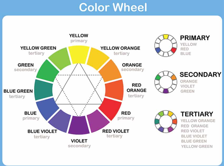
There are 3 primary colors: red, blue, and yellow. These colors cannot be made by mixing other colors. Primary colors are also known as basic colors simply because they are the base for other colors. On the color wheel, the secondary colors are located between two primary colors. They are the building blocks for all the other colors on the wheel.
Secondary Colors
These colors are made by mixing the primary colors. The 3 secondary colors are green, orange, and purple. Green is made from mixing blue and yellow. Orange is a product of mixing red and yellow, while red and blue create purple.
Tertiary Colors
Yellow-orange, red-orange, red-purple, blue-purple, blue-green, and yellow-green belong to the tertiary colors. These colors are created by mixing a primary color with a secondary color, which is why they have two names. Tertiary colors are also called intermediate colors. On the color wheel, tertiary colors are located between the primary and secondary colors.
Color Schemes
A color scheme is a term used to describe the logical combinations of colors on the color wheel. In interior decoration, it is a combination or arrangement of colors to fit a specific theme, style or genre. The main purpose of color schemes is to create style and appeal.
Monochromatic
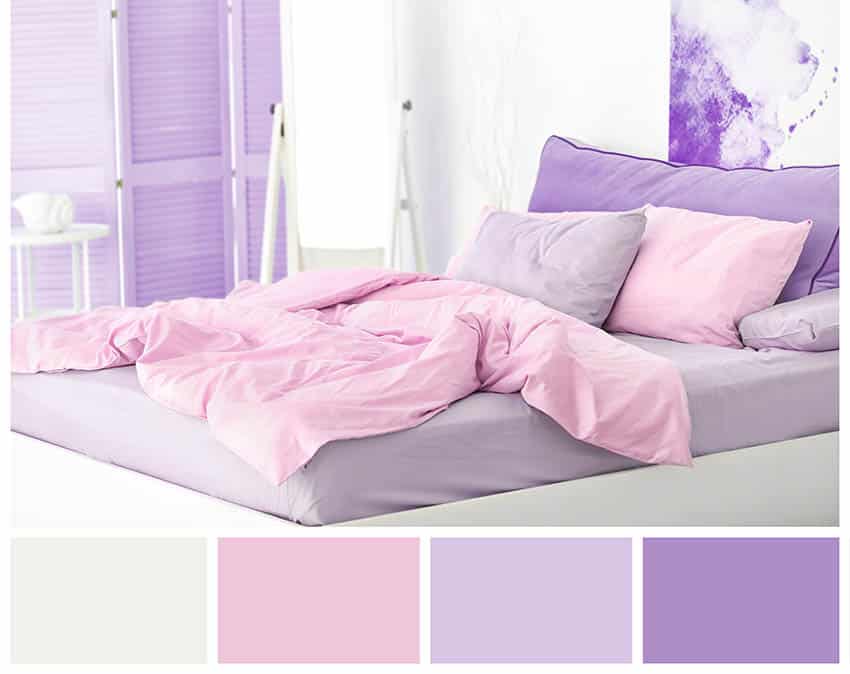
Monochromatic means that you will be using only one color ranging from its light shade to its darker shade. For example, if you want to use the color blue for your room in a monochromatic scheme, you may opt to have light blue walls and darker blue accents like pillows, accessories, rugs, and flowers.
Analogous Colors
Analogous colors comprise of 2 to 6 colors that sit next to or close to each other on the color wheel. There is usually one color that predominates. An example is blue-green, green, and yellow-green. These colors sit on the upper left side of the color wheel. In an analogous color scheme, there is always one dominant color, a second supporting color, and an accent color.
Color Wheel Complementary Colors

Complementary colors sit opposite each other on the color wheel. These colors, when paired together, bring out the best in each other. Complementary colors result in high-contrast colors. Examples of complementary colors are yellow and purple, blue and orange, and red and green. Complementary colors bring out the maximum contrast and maximum stability.
Split Complementary
Split complementary uses 3 colors. One of the three colors is the base color. The other two colors are opposites of the base color in the wheel. This combination of colors offers a contrast without the intensity of complementary colors. An example of split complementary is blue, yellow-orange, and red-orange. This scheme is perfect for beginners because it is pretty difficult to get it wrong. When you pick a base color, you just choose two colors opposite the wheel that are near each other, or what we call neighboring colors.
Tetradic Colors
The tetradic color scheme also known as double complementary colors is the most complicated scheme to balance. This scheme consists of four colors which is made up of two sets of complementary colors. An example of this scheme is blue, orange, yellow and violet. This scheme is considered the richest but the hardest to harmonize. If all of the four colors are balanced, the scheme will look unbalanced. The trick to this scheme is to choose one color to be dominant and then subdue the rest of the colors.
Triadic Colors
A triad is a combination of 3 colors that form a triangle in the center of the color wheel. Aside from the amazing contrast, they also create a balanced color scheme. An example of a triad scheme is yellow, blue and red. By looking at their placement on the color wheel, we can draw a triangle in the middle to form a triad. Another example is green, orange, and purple.
Nature Colors
As the name suggests, this color scheme takes inspiration from nature. The natural color scheme creates a harmonious design. An example is a flowering plant that has bright green leaves and bloody red flowers. Red and green in the color wheel is considered complementary. Another example is purple, blue, orange and pink which can be found in a bird’s feathers. Although these colors do not really fit in a specific scheme, they fit well together and create a beautiful harmony of colors.
Passive and Active Colors
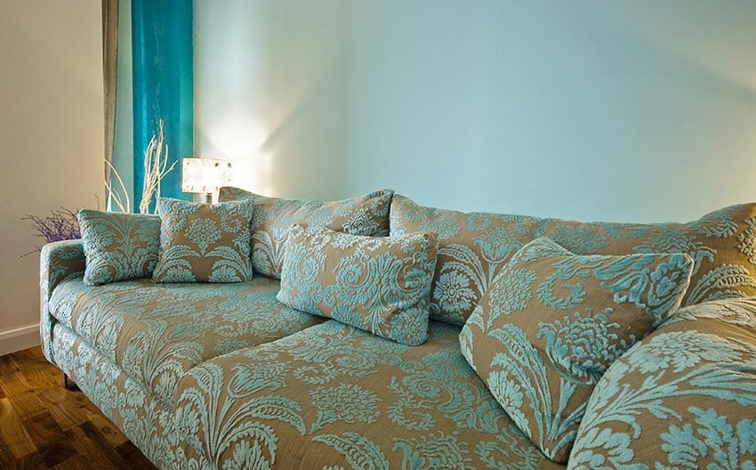
Colors are translated by our brains into emotions. When we enter a specific room, its wall colors and décor directly affect how we feel. Active colors are bright colors. They bring out excitement and are associated with energy, creativity, and movement. Active colors are considered warm colors. Warm colors include red, orange, and yellow. In a house, these colors are used for rooms with utmost activities such as the kitchen, children’s playroom, or home gym. They stimulate our mind and encourage us to move.
Warm colors translate to joy and happiness. For example, making a sunflower theme in the kitchen makes it look bright, sunny, and happy. Yellow is a popular color for kitchens. It also makes the space look bigger.
Passive colors are considered as cool colors. These colors are soothing, calming, and relaxing. Blue and green are considered as cool colors. Most neutral colors, or earth tones, are also considered as passive colors. They appear further away next to more active colors. Blues and greens remind us of the ocean or the mountains, which sends a signal to our brains that we need to relax and “cool down”. These colors are often used in rooms that are designed to rejuvenate the senses, like the bedroom or living room.
A perfect example of cool colors in a room is in a spa. Spas usually have blue and green colors with neutrals like grays, browns, and white. These colors tell our minds to slow down and relax. Meditation rooms are also often associated with cool colors. They provide the perfect background for relaxing the mind and body.
Light and Temperature
In physics, black and white colors make a difference in terms of temperature. It is a fact that white reflects light and black absorbs it. When the energy of light is absorbed, it is transformed into heat.
In warmer climates, it is best to use cool colors like blue, white, green, and earth colors. Aside from the fact that they look cooler, they also reflect heat from light so the temperature in the rooms are also much better. An example of this are beach houses. Beach houses are warmer because of the light being reflected by the ocean. Although the breeze from the ocean appears to be cooler, in theory being near the ocean is warmer than being inland. Beach houses are always painted and decorated in cool colors as a contrast to the warmer weather.
Places in colder climate are recommended to use warm colors. Warm colors absorb heat generated by light, so it makes the environment cozy and intimate. Warm colors also make a room more classic and timeless. Take the instance of a mountain retreat. Houses up in the mountains are often decked out in darker wood, rich reds and earthy browns. They give out a sense of warmth and coziness.
How to Use the Color Wheel
The color wheel is not just an inventory of colors. It is a guide used to create a color scheme that works. It basically removes the guesswork in choosing colors and gives an idea of how well colors will look when blended together. This is important not only in interior design but also in other forms of art, such as advertisements, printed media like books, and paintings.
Changing Colors with Neutrals
Once a basic color is selected, it is time to match it with others from the same family, either on the lighter side or on the darker side, by adding a neutral color. In interior design, this process becomes tint, shade, and tone.
Tint
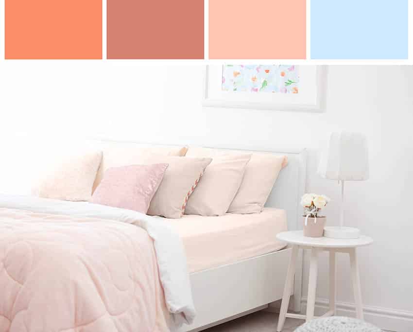
Tint is the mixture of a base color and white. This combination makes the base color lighter, which makes it less intense. These lighter colors are also referred to as pastels. They are considered calmer and quieter colors.
Shade
Shades are a result of adding black to a base color. The color becomes darker, richer and more intense. Black is a potent color, so when adding it to a base color, you should try a small amount at first. Black is not the only color that can be used to give a darker shade. Other dark colors, such as rich blues, grays, browns, and maroons, can also make a base color more intense. The best way to achieve the perfect shade is to experiment with small amounts of black or other darker colors. If the color becomes too dark and loses its original color, you can always add a little bit of white and the original color to bring it back to life.
Tone
Tone is created by adding both black and white to a color. Sometimes, grey is mixed with the base color. Depending on the amount of black and white added, the base color may either become lighter or darker. The result is a less saturated and less intense version of the base color. It is observed that tones are more realistic. In the real world, our colors are not as intense as those on the color wheel. Several factors affect colors around us, such as pollution, weather, and other natural elements. Tones can give subtle and complex qualities of a base color.
Creating a Balance
It can be tricky to balance warm and cool colors in a room. It is always best to combine the two and not just stick to one. The recommendation is to choose one base color first. For example, you want to use blue as the base color. Add splashes of warm colors by adding décor in darker colors, such as a black vase, a rich red rug, or a combination of light and darker pillows.
Creating a balance of contrasts keeps the room interesting, comfortable, and memorable. Let the color wheel and its combinations guide you in designing the perfect combination for the perfect room.
Related Interior Design Posts You May Like:
Granite Colors for Countertops – Best Interior Design Software – How to Choose Couch Colors – Free Paint Visualizer Programs
To showcase highly specific designs, some images on this website use advanced AI-generation software to illustrate ideas and room inspiration. See our editorial policy to learn more.

