2024 Best Paint Colors Of The Year: Case Study on Predictions & Trends
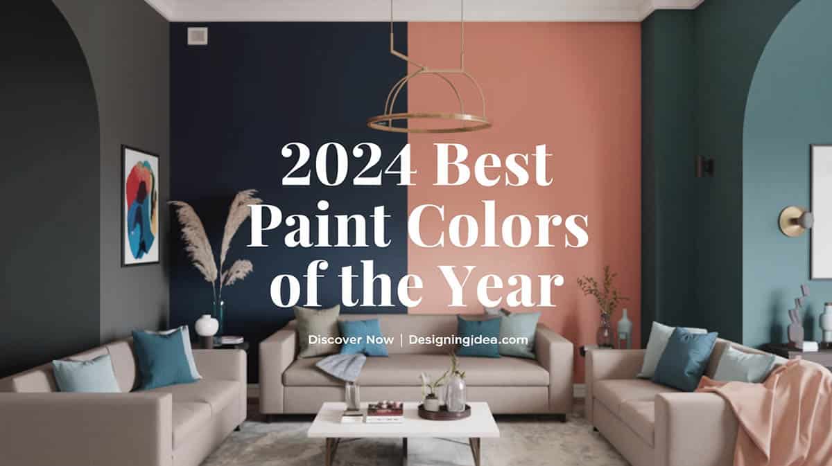
Get ready to infuse your home with an exciting array of paint colors in 2024! According to the paint pros, eclectic shades that capture current design trends will rule the year. Let’s dig into the exact hues that are poised to resonate most with homeowners this year. Here’s our look into the best paint colors of the year including predictions and future trends.
Industry Insights from Paint Manufacturers
Top paint manufacturers like Sherwin-Williams, Benjamin Moore, Pantone, and Behr have recently shared their top colors of the year to help you choose what to use, and they all reflect distinct moods and styles.

Upload a photo and get instant before-and-after room designs.
No design experience needed — join 2.39 million+ happy users.
👉 Try the AI design tool now
Sherwin-Williams: Upward SW 6239

This gentle blue radiates the very essence of tranquility with its airy atmosphere reminiscent of a clear spring sky. Upward falls decidedly on the “cool” end of the color spectrum. Its subtle gray undertones imbue any space with a breath of soft, musing quality. In the wand-like strokes of natural light, Upward appears more crisply azure; underneath artificial lighting, its blue notes sing gentle and subdued.
As a whole-room color, Upward flatters any design scheme with its adaptive nature. The soothing blue casts living rooms and bedrooms in a sanctuary-like veil, lowering heart rates and anxiety levels. It clears minds in home offices, sharpens focus for productivity. In kitchens and dining rooms, Upward conjures images of relaxing Sunday brunches out on the patio. As a ceiling color, Upward opens up small spaces, creates airy feelings of expansion in cavernous halls. For uniformity, Upward harmonizes perfectly with white trim or off-white wall colors.
Benjamin Moore: Blue Nova CC-860

In natural light, those sneaky undertones emerge even more, adding visual interest to an already gorgeous color. And while Blue Nova CC-860 makes a bold statement, it manages to remain refined enough for spaces craving a bit of splash without going overboard. It truly toes the line perfectly between dramatic and sophisticated.
You’re as likely to find this color splashed dramatically across an accent wall in a light-filled living room as you are grounding the mood in a cozy, relaxing bedroom. Its versatility spanning modern and traditional decors makes Blue Nova CC-860 a reliable choice any time you want to inject some life into a space. Pair it with crisp white trim and let the color pop even more.
No matter where you use it, Blue Nova CC-860 may appear brighter and more vibrant in natural light, taking on a deeper, more muted appearance under artificial lighting. But its room-energizing qualities shine through no matter the light.
Behr: Cracked Pepper PPU18-01

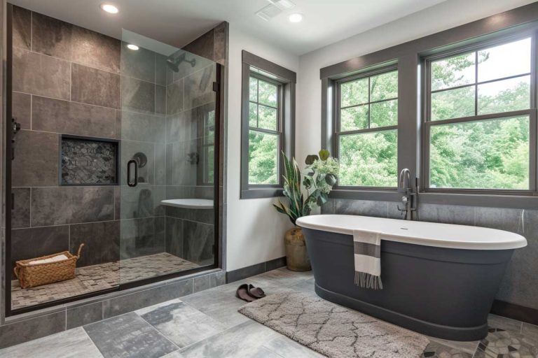
With its rich, deep charcoal gray hue that reads almost black, Behr’s Cracked Pepper paint color packs plenty of dramatic punch. But this shade maintains a subtle softness and approachability thanks to its warm brown undertones, preventing Cracked Pepper from feeling too stark or sterile.
Classified as a dark neutral, Cracked Pepper creates striking depth and dimension on walls and architectural details while remaining livable enough for most spaces. The color shifts slightly from a deep, moody gray in dim lighting to a slightly lighter, more neutral gray in bright natural light. This adaptability lets you use Cracked Pepper to set a sophisticated or sleek modern tone.
Popular applications for sultry Cracked Pepper include accent walls, interior doors, kitchen cabinets, exterior trim and accents, home offices, furniture pieces, powder rooms, or any area where you want to create focal point with a dash of drama. For a pulled-together look, pair Cracked Pepper with crisp whites, beiges, lighter grays, natural stone and wood tones, or metallic brass, silver or gold finishes.
Valspar: Renew Blue 8003-37D

Renew Blue is dynamic enough for kids’ spaces without being too juvenile. And its focus-boosting abilities make it ideal for home offices. No matter where you use it, Renew Blue pairs beautifully with crisp whites, light grays and creams, natural wood tones, deeper navy accents, and brushed metal hardware.
Pantone: Peach Fuzz (13-1023)

Peach Fuzz lives comfortably between pink and orange on the color wheel. But it’s not a bright, in-your-face orange or a bubblegum pink. This is a gentle, muted version with warm golden undertones. It falls into that “warm” temperature range – think sunlight streaming through curtains on a Sunday morning.
The nurturing softness of Peach Fuzz creates an instantly inviting mood wherever it’s used. In your home, it cultivates a welcoming sanctuary vibe, modern yet nostalgic at the same time. In fashion, the gender-neutral tone works beautifully in accessories and apparel. And in commercial spaces, Peach Fuzz encourages creative energy.
This cuddly color pairs perfectly with other cozy design elements too. Think warm whites, soft grays and deep chocolate browns. Sage greens complement it beautifully. And Peach Fuzz positively glows against navy blue accents and natural wood tones. Brassy gold or metallic touches glimmer elegantly beside it as well.
2024 Consumer Trends and Data Analysis
Data from consumer surveys and home improvement platforms further reinforce these color trends. According to Houzz’s 2024 Interior Design Trends Survey (source), homeowners are increasingly opting for bolder accent walls, particularly in sky-inspired hue or a deep watery blues and darker shades, signaling a preference for striking statements.
According to Homes & Gardens, interior design trends are shifting toward warmth and comfort – out with the cold grays and whites, and in with rich, earthy tones that envelop you in coziness. (source) Designers are embracing rich browns reminiscent of coffee and chocolate, terra cotta shades that conjure images of clay pots handcrafted in Tuscany, and muted sage and olive greens found in nature. These colors ground a room and give it a collected, curated feel, as opposed to stark, sterile whites that can feel cold and flat.
And it’s not just color trends that are shifting. Finish trends are also moving in a warmer direction. The sleek high-gloss finishes of yesterday are giving way to sophisticated, understated matte finishes that gently reflect light. Advancements in paint technology have made matte finishes more durable and scrubbable, making them practical for walls and trim rather than being relegated to ceilings and niche spaces. Matte finishes allow the textures of walls and furnishings to shine through and feel pleasant to the touch without the glare and fingerprints of gloss.
Furthermore, when preparing to list your home for sale, the paint colors on the walls may seem like a minor detail. However, real estate experts say that color choice can actually impact the value of your property in the eyes of potential buyers.
A recent report in the New York Post (source), cited findings that dramatic shades like fiery red or zingy lime green tend to turn off buyers rather than excite them. These bold colors make it harder for visitors to picture themselves living in the space. On the other hand, tried-and-true neutral tones like creamy whites, light taupes, and warm beiges have a soothing, welcoming effect.
Going with a palette of neutrals when staging your home allows buyers to envision making the space their own. While you may love that cherry-red accent wall in the dining room, going neutral can help maximize the number of buyers willing to take a closer look and make an offer. The colors you choose for your home can subtly influence that all-important first impression.
Conclusion
The best paint colors of 2024 reflect a desire for comfort, personalization, and boldness. From calming blues like Sherwin-Williams’ Upward to the dramatic elegance of Behr’s Cracked Pepper, these colors are transforming interiors across the globe. As consumer preferences continue to evolve, 2024 is all about embracing what feels authentic and inspiring within our personal spaces.
What are your thoughts on the paint picks of 2024? Let us know if you have or plan on using any of the colors shared here in the comments.
To showcase highly specific designs, some images on this website use advanced AI-generation software to illustrate ideas and room inspiration. See our editorial policy to learn more.

